An example of a good promotional site
Honestly, I’m bastard from Ford Mustang, I literally orgasm;) And it can be ... someday ... I will have one. In the meantime, periodically watching this monster only motivates me, forcing me to do more and better)

Yes, it's expensive, impractical in our realities ... (you can write me another thousand arguments), but today I went to a new site and ...
... and my soul literally warmed up) Once again.
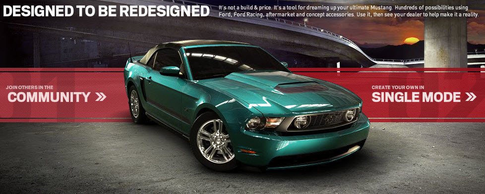
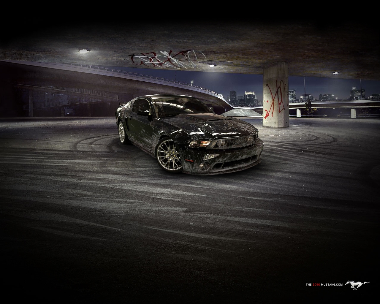
In general, in short - a flash siteallows for 10-15 minutes to plunge into the world of the owner of the last mustang. The world is very exciting - you can configure almost anything. I start from the color of the body, body kit, spoilers and air intakes (everything you can get on this car, ending with drawings and dirt on the body, the color of the sunset, the pattern of footprints on the ground and graffiti on the walls. Almost like in the underground;) You

can see the machine from two angles. When the stormy fantasy subsides - the result can be downloaded as wallpaper on the desktop, and the “designer” itself can be downloaded as a PDF so that in the service center you know exactly which details you need to achieve the drawn result.
The machine can be published in the gallery on the site, embedded in popular social services.

And the most important thing is that all this is done to disgrace beautifully and efficiently! Is that, a little slows down the site itself, but this is not the worst. Otherwise, everything is as it should be ideally (IMHO).
Having spent , like a child, half an hour on a dream, I get to work. Soon there will be a lot of interesting things and not only with reviews;) And Fords ... keep it up!
Good luck and a good week!

Yes, it's expensive, impractical in our realities ... (you can write me another thousand arguments), but today I went to a new site and ...
... and my soul literally warmed up) Once again.
In general, in short - a flash siteallows for 10-15 minutes to plunge into the world of the owner of the last mustang. The world is very exciting - you can configure almost anything. I start from the color of the body, body kit, spoilers and air intakes (everything you can get on this car, ending with drawings and dirt on the body, the color of the sunset, the pattern of footprints on the ground and graffiti on the walls. Almost like in the underground;) You

can see the machine from two angles. When the stormy fantasy subsides - the result can be downloaded as wallpaper on the desktop, and the “designer” itself can be downloaded as a PDF so that in the service center you know exactly which details you need to achieve the drawn result.
The machine can be published in the gallery on the site, embedded in popular social services.

And the most important thing is that all this is done to disgrace beautifully and efficiently! Is that, a little slows down the site itself, but this is not the worst. Otherwise, everything is as it should be ideally (IMHO).
Having spent , like a child, half an hour on a dream, I get to work. Soon there will be a lot of interesting things and not only with reviews;) And Fords ... keep it up!
Good luck and a good week!
