 July 7, 2009 at 14:08
WPF - using page navigation, adding controls to NavigationWindow
In WPF, it is possible to create applications with the ability to navigate, that is, using Navigation objects such as Page , NavigationService and NavigationWindow . Most examples on MSDN show how to use such objects in XBAP applications, but no one forbids us to create client applications using page navigation.
So, we will try to create such an application. We create a new WPF Application project, from there we delete the created Window1.xaml, add two FirstPage.xaml and SecondPage.xaml pages, and also specify in the App.xaml file the page from which our application will start:
StartupUri = "FirstPage.xaml" After starting, we should see a window of our application containing a navigation bar with buttons for moving forward and backward. Next, we need to create links that help us navigate from one page to another. This can be done in many ways. Add a UserControl to the project and call it ApplicationToolbar. The first opportunity with which we can navigate between pages is using NavigationService , we will create a method for handling button clicks with the following code: private void NavigationCommand_Executed (object sender, ExecutedRoutedEventArgs e)
{
NavigationService service = NavigationService.GetNavigationService (this);
service.Navigate (new Uri (e.Parameter.ToString (), UriKind.Relative));
} The method jumps to the page that is specified in the command parameters. In the xaml file of the ApplicationToolbar control, create a command, bind this method to it and point the buttons to this command to execute:
PresentationFramework.Aero with its theme. In order to view the BAML file (after compilation, the xaml file is packaged in baml - Binary Application Markup), you can use the Reflector program with the BamlViewer plugin , but as practice has shown, BamlViewer does not deal very well with decompilation: it does not correctly register the key names (Key) , incorrectly decrypts the Geometry data , even places the description of triggers before the description of the style content - because of which the elements are not in the triggers. In general, StyleExplorer handles the BAML decompilation task better . Here is a small screenshot of comparing these programs:
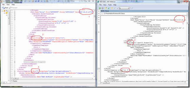
The most interesting thing is that the meaning of the style keys is really like that and are as seen in the screenshot - x: Key = "Ì". That is, in our styles, we can refer to the style with the key name ключа (if the style is connected). Why such strange key names are made is not clear (and it can also be seen that the BAML Viewer does not correctly recognize them). As a result, Style Explorer provides us with really working XAML text - for example, we can transfer all XAML text to our project and it will be valid, which is not the case with BAML Viewer. But we do not need all of XAML. We are interested in rewriting the NavigationWindow view, for this we will initially create a new Themes / General.xaml resource file in our project (you can choose any file name and directory). For our resource file to be available in the application, we must also include it in the App.xaml file, this is done like this:
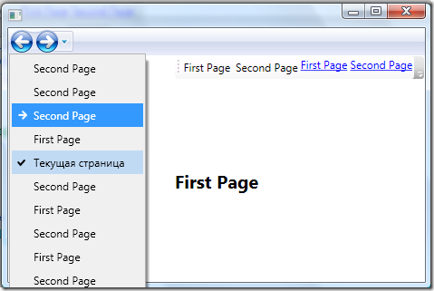
 As you can see, we have ensured that our ApplicationToolbar control is now located on the navigation panel.
Application source code: WPF_NavigationWindow.zip (12.64 KB)
So, we will try to create such an application. We create a new WPF Application project, from there we delete the created Window1.xaml, add two FirstPage.xaml and SecondPage.xaml pages, and also specify in the App.xaml file the page from which our application will start:
StartupUri = "FirstPage.xaml" After starting, we should see a window of our application containing a navigation bar with buttons for moving forward and backward. Next, we need to create links that help us navigate from one page to another. This can be done in many ways. Add a UserControl to the project and call it ApplicationToolbar. The first opportunity with which we can navigate between pages is using NavigationService , we will create a method for handling button clicks with the following code: private void NavigationCommand_Executed (object sender, ExecutedRoutedEventArgs e)
{
NavigationService service = NavigationService.GetNavigationService (this);
service.Navigate (new Uri (e.Parameter.ToString (), UriKind.Relative));
} The method jumps to the page that is specified in the command parameters. In the xaml file of the ApplicationToolbar control, create a command, bind this method to it and point the buttons to this command to execute:
* This source code was highlighted with Source Code Highlighter.
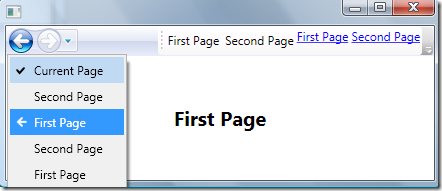
    First Page

    Second Page


* This source code was highlighted with Source Code Highlighter.PresentationFramework.Aero with its theme. In order to view the BAML file (after compilation, the xaml file is packaged in baml - Binary Application Markup), you can use the Reflector program with the BamlViewer plugin , but as practice has shown, BamlViewer does not deal very well with decompilation: it does not correctly register the key names (Key) , incorrectly decrypts the Geometry data , even places the description of triggers before the description of the style content - because of which the elements are not in the triggers. In general, StyleExplorer handles the BAML decompilation task better . Here is a small screenshot of comparing these programs:
The most interesting thing is that the meaning of the style keys is really like that and are as seen in the screenshot - x: Key = "Ì". That is, in our styles, we can refer to the style with the key name ключа (if the style is connected). Why such strange key names are made is not clear (and it can also be seen that the BAML Viewer does not correctly recognize them). As a result, Style Explorer provides us with really working XAML text - for example, we can transfer all XAML text to our project and it will be valid, which is not the case with BAML Viewer. But we do not need all of XAML. We are interested in rewriting the NavigationWindow view, for this we will initially create a new Themes / General.xaml resource file in our project (you can choose any file name and directory). For our resource file to be available in the application, we must also include it in the App.xaml file, this is done like this:
* This source code was highlighted with Source Code Highlighter.
* This source code was highlighted with Source Code Highlighter.
* This source code was highlighted with Source Code Highlighter.Application source code: WPF_NavigationWindow.zip (12.64 KB)