8 Features of a Successful User Interface
- Transfer
There is a lot of information about various user interface design methods that you can use when creating a website or program interface.
I have compiled a list of 8 characteristics that I consider to be the key to a successful user interface.
Accessibility is the most important design element! Essentially, the whole purpose of the user interface is to enable users to interact with your system. If a person cannot understand how your application works, he will only be confused and ultimately disappointed. That is why, when developing the interface of your application or website, be sure to make it intuitive for your user.
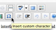
What does this button do? Hover over and read.
High workload is the enemy of a good user interface. It's easy to fall into the trap of over-availability - by adding more and more controls, you make a huge mistake - clutter up the interface. Your interface is growing, and the user will be forced to read a lot to understand what, where and for what is located.
Make things clear, but with minimal workload. If you can describe the possibilities in one sentence, instead of three, do it. When you can sign an element in one word, instead of two, do it. Save your users time, while convenience and minimalism require a lot of time, but your efforts will be rewarded.
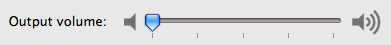
Sound control panel in OS X. Short and accessible, nothing more.
Many designers strive to make interfaces "intuitive." But what does “intuitively” really mean? This means that users must instinctively understand and reflect on the capabilities of the project. But how can you make something intuitive? You design things familiar to you, and what might seem obvious to you can be repulsive and difficult for users.
Ask your relatives and friends to take any actions through your interface, for example, order a product if your interface involves selling something. Observe each user’s action, the mistakes he makes. Thus, you will collect a number of omissions in the interface that complicate the interaction of the system with the user. And only after fixing the problem areas, your interface can be ready to work.

GoPlan's intuitive interface. The inscriptions on the tabs make it clear to the user the contents of the section.
Responsiveness means a few things. The website interface should be very fast. The long wait for the page to load is annoying. Make sure that the site loads as quickly as possible, even on slow Internet channels.
Also, responsiveness means some permanent form of user interaction. The interface should inform the user about what is happening. For example, you click the send message button. If a message is sent using AJAX, it would be wise to display the sending status, for example, “Sending ...”, “Message sent” or “Error sending message”. When the user sees the execution process, he feels calmer. This is especially noticeable on slow Internet channels.

While loading Gmail, a progress bar is displayed.
When choosing certain decisions when creating a design, take into account the type of page content. Different pages may contain different types of content. Adapt each page to its corresponding content, create controls that make it easier for the user to work with the site, and try to do it. But do not forget about minimalism!
Thus, having worked with your controls, the user will get used to them and further work with your resources will be a “mundane” thing for him.

MS Office controls that are different for each type of content.
Although this may be somewhat controversial, but I believe that a good interface should be attractive. Attractive user interface makes working with it pleasant. Yes, you can make the interface easy to use, efficient and responsive, and it will do its job perfectly — but if you add to this list of advantages also attractiveness, working with it will be a pure pleasure!
But it's hard to make an interface that everyone will like. Each has his own preferences, and what seems beautiful to one, will be disgusted by the other. However, users can be divided into some social / demographic groups, including groups of your target audience. For example, the interface for the “young mothers” group will be fundamentally different from the “auto parts sales managers”.

Google Chrome interface.
The user interface is a management tool. It provides access to various functions of your application or website. A good interface should enable the user to perform the action of interest to him with the least effort.
It is very important to understand what the user most often wants to perform on a particular page. No need to list all the features of your project, most often the user is interested in only a small part of this list.
Make sure that the user can instantly find the most useful and most required functions, this will greatly simplify his communication with the project.

The three most frequently performed actions on photos in the Apple iPhone are grouped together with instant access.
None and nothing is perfect. Be prepared for the fact that users will make mistakes when working with your project. This can happen either through your fault or through the fault of the user. You must correctly handle all possible errors - this will be one of the main indicators of the quality of your project. Do not punish the user - develop a “lenient” interface.
You must protect the data from accidental user actions. For example, if someone deletes important information, provide an opportunity to restore it. When a user navigates to non-existent pages, do not scare him with server errors, instead provide a list of alternative directions in which he can follow.
I like how Yandex page 404 was made .

Accidentally deleted important information in Gmail. Not a problem, we can undo the action!
By working to achieve one of these characteristics, you can create problems to achieve the other. For example, when trying to make the interface more understandable, you can add a lot of descriptions and explanations, which ultimately will make the interface even more cumbersome and inconvenient. Or trimming the material to achieve minimalism can make things incomprehensible to the average user. To achieve balance, you need skill and a lot of time, and remember that your design decisions are likely to be different in different projects. What is relevant for one may not be acceptable for another.
I am pleased to hear your comments about this article.
Original translation: 8 Characteristics of a successful user interface .
I have compiled a list of 8 characteristics that I consider to be the key to a successful user interface.
- Availability
- Minimalism
- Confidence
- Responsiveness
- Relevance to context
- Attractiveness
- Efficiency
- Condescension
Availability
Accessibility is the most important design element! Essentially, the whole purpose of the user interface is to enable users to interact with your system. If a person cannot understand how your application works, he will only be confused and ultimately disappointed. That is why, when developing the interface of your application or website, be sure to make it intuitive for your user.
What does this button do? Hover over and read.
Minimalism
High workload is the enemy of a good user interface. It's easy to fall into the trap of over-availability - by adding more and more controls, you make a huge mistake - clutter up the interface. Your interface is growing, and the user will be forced to read a lot to understand what, where and for what is located.
Make things clear, but with minimal workload. If you can describe the possibilities in one sentence, instead of three, do it. When you can sign an element in one word, instead of two, do it. Save your users time, while convenience and minimalism require a lot of time, but your efforts will be rewarded.
Sound control panel in OS X. Short and accessible, nothing more.
Confidence
Many designers strive to make interfaces "intuitive." But what does “intuitively” really mean? This means that users must instinctively understand and reflect on the capabilities of the project. But how can you make something intuitive? You design things familiar to you, and what might seem obvious to you can be repulsive and difficult for users.
Ask your relatives and friends to take any actions through your interface, for example, order a product if your interface involves selling something. Observe each user’s action, the mistakes he makes. Thus, you will collect a number of omissions in the interface that complicate the interaction of the system with the user. And only after fixing the problem areas, your interface can be ready to work.
GoPlan's intuitive interface. The inscriptions on the tabs make it clear to the user the contents of the section.
Responsiveness
Responsiveness means a few things. The website interface should be very fast. The long wait for the page to load is annoying. Make sure that the site loads as quickly as possible, even on slow Internet channels.
Also, responsiveness means some permanent form of user interaction. The interface should inform the user about what is happening. For example, you click the send message button. If a message is sent using AJAX, it would be wise to display the sending status, for example, “Sending ...”, “Message sent” or “Error sending message”. When the user sees the execution process, he feels calmer. This is especially noticeable on slow Internet channels.
While loading Gmail, a progress bar is displayed.
Relevance to context
When choosing certain decisions when creating a design, take into account the type of page content. Different pages may contain different types of content. Adapt each page to its corresponding content, create controls that make it easier for the user to work with the site, and try to do it. But do not forget about minimalism!
Thus, having worked with your controls, the user will get used to them and further work with your resources will be a “mundane” thing for him.
MS Office controls that are different for each type of content.
Attractiveness
Although this may be somewhat controversial, but I believe that a good interface should be attractive. Attractive user interface makes working with it pleasant. Yes, you can make the interface easy to use, efficient and responsive, and it will do its job perfectly — but if you add to this list of advantages also attractiveness, working with it will be a pure pleasure!
But it's hard to make an interface that everyone will like. Each has his own preferences, and what seems beautiful to one, will be disgusted by the other. However, users can be divided into some social / demographic groups, including groups of your target audience. For example, the interface for the “young mothers” group will be fundamentally different from the “auto parts sales managers”.
Google Chrome interface.
Efficiency
The user interface is a management tool. It provides access to various functions of your application or website. A good interface should enable the user to perform the action of interest to him with the least effort.
It is very important to understand what the user most often wants to perform on a particular page. No need to list all the features of your project, most often the user is interested in only a small part of this list.
Make sure that the user can instantly find the most useful and most required functions, this will greatly simplify his communication with the project.
The three most frequently performed actions on photos in the Apple iPhone are grouped together with instant access.
Condescension
None and nothing is perfect. Be prepared for the fact that users will make mistakes when working with your project. This can happen either through your fault or through the fault of the user. You must correctly handle all possible errors - this will be one of the main indicators of the quality of your project. Do not punish the user - develop a “lenient” interface.
You must protect the data from accidental user actions. For example, if someone deletes important information, provide an opportunity to restore it. When a user navigates to non-existent pages, do not scare him with server errors, instead provide a list of alternative directions in which he can follow.
I like how Yandex page 404 was made .
Accidentally deleted important information in Gmail. Not a problem, we can undo the action!
Conclusion
By working to achieve one of these characteristics, you can create problems to achieve the other. For example, when trying to make the interface more understandable, you can add a lot of descriptions and explanations, which ultimately will make the interface even more cumbersome and inconvenient. Or trimming the material to achieve minimalism can make things incomprehensible to the average user. To achieve balance, you need skill and a lot of time, and remember that your design decisions are likely to be different in different projects. What is relevant for one may not be acceptable for another.
I am pleased to hear your comments about this article.
Original translation: 8 Characteristics of a successful user interface .