Best Practices in the Design of News Social Networks
- Transfer
 How can you get daily news these days? Well ... it might be a visit to your favorite sites and blogs, but this is inefficient because these blogs do not have a strict sorting of updates. You may subscribe to them using RSS, which delivers all new articles directly to you, but in this case you will have to deal with all new articles yourself to find what is interesting to you. Another option today would be to visit a news social network.
Link aggregators of Social news sites whose primary function is to collect and share interesting links. This can be done by submitting the link by the user or automatically in the system. The aggregation aspect is only part of it, although this aspect also sorts the links. Again, this can be done by voting users and some mechanical algorithms (although in this case, can we really call this a “social” news site?). The end result is the same, however: the most interesting links go to the top, this feature makes social news sites a great alternative to RSS.
In this article I designed a showcase of some of the current social news sites that will determine trends and patterns in the design and offer some best practices needed when designing such sites. Let's start by looking at four popular social news sites and see comparisons in these samples.
Digg

Digg is the most popular social news network in particular using the design, which is often adapted by many of its competitors. Digg uses two layout columns: a list of stories on the left side and additional materials on the subject on the right side, such as a field of 10 stories. In the header, Digg shows a list of categories of stories, and the lower part is dedicated to sorting them. Thus, the user can select a category, say ... “Technologies”, and then sort them by “News” to see all the latest materials.
Propeller
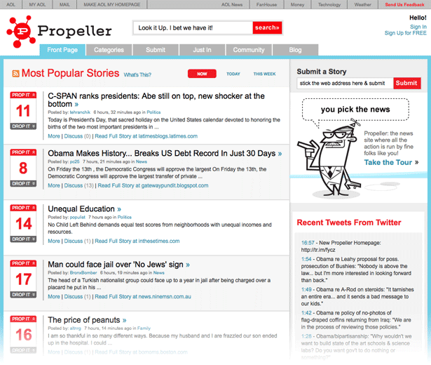
Propeller is a good example of how a site follows the Digg scheme pretty closely. These are two columns with a list of articles, on the left and in the middle of the content, the last tweets near Propeller or a list of the most commented stories.
Unlike Digg, Propeller uses horizontal line dividers between each story, as well as a striped background under the list for easier viewing. This may help, although I should note that a zebra is traditionally used to facilitate reading across multiple columns of a table, especially with a large number of columns. This is because you want to read a piece of data far from the original cell and use zebra stripes as a guideline to help you move your eyes without losing control of the row. In the case of Propeller, in which essentially only one column of data, the zebra effect is doubtful.
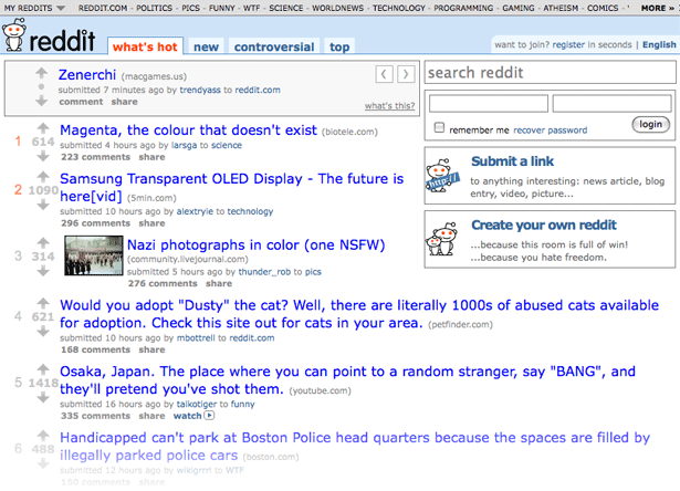
Reddit is an example of design like Digg. Reddit, in particular, allows you to focus on the content of the news. The main attention is concentrated so much that everything except the heading is minimized and allows you to see the main information first. This minimalist design allows visitors to quickly consume information, and the user can quickly browse through many headlines to find something interesting to them. Since Reddit has no field restrictions, each story takes up less space, thereby more headings can be displayed on the screen.
Reddit also has a unique element in the header of the first page: random output of stories. Like other social news sites, the latest story is posted in the next section. This section has less traffic than the cover page and some interesting stories may be lost. To fix this, Reddit shows random story titles from this section on the main page to give them a short exposure time to help them become popular.
Newsvine

Newsvine took a different approach to development. Unlike other social news sites that look like a list of headlines, Newsvine uses a magazine / newspaper scheme. The stories are accompanied by large photos with a description, and in some cases the content may show the details of the article.
One of the interesting elements of Newsvine is the heatmap action:
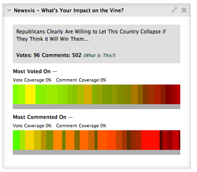
The diagram shows two bands: the most voted stories and the most talked about stories. Each is displayed in a set of blocks, all in different colors and sizes. Large blocks indicate the presence of additions to them or the largest number of votes, depending on the schedule, it indicates the age of the article: green - fresh, red - later. This visualization provides a unique way to view the content of Newsvine.
Now, let's look at some common interface elements present on social news sites:
Vote boxes
All social news sites have an article voting method, with the exception of objects that use automated sorting algorithms. The voting area is very important. You want to display it well enough to ensure a lack of readers, but at the same time you need to make it invisible and with a good enough interface to avoid distraction when viewing a list of headers.
Here are some examples of Vote boxes on popular news sites:
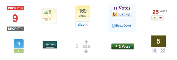
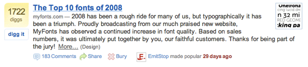
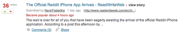
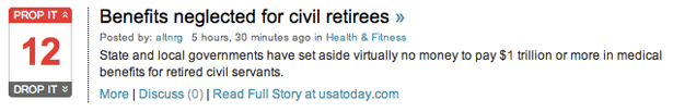
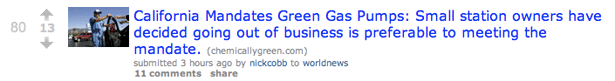
Each field consists of no more than four elements: publication rating, total votes, upgrade rating link and rating downgrade link. Most sites do not show ranking and simply display the total points, that is, how positive and negative votes are summed up. Speaking of the voice, most social news sites have a way to downgrade, as well as the ability to choose only one button to increase the rating. In these cases, when only the increase button is displayed, the link to “bury” (or downgrade) the publication is in a different place.
Story details
Each story has more than just the title and text of the article. The story as a whole displays: date, author, a short description, a link to the comments section and possibly an image.
Here are a few examples of how such news blocks display such blocks: The voting field is often located on the left side of the screen. This allows each story to remain consistent. A link to comments, as well as any other additional services, such as “follow this story” is located below the description (if any) or the title. Placing text details around the heading and making them gray, they are not distracting and make it possible to concentrate on the heading of the article, as a result of which it is much easier to view the list of stories, eyes can quickly move from one to the other.


Most social news sites display time as relative - for example, 10 hours ago. This makes sense because people want to see how fresh the story is, and are not particularly interested in the exact date and time when it was posted.
You will also notice that some sites display the domain where the link to which the heading is presented is presented, as a rule, after it is enclosed in brackets. This is useful because it allows visitors to understand what content they should expect. For example, if they see "youtube.com" as a source, they will know that this video. Well-known sources such as "nytimes.com" may also be one indicator of the quality and duration of a story. Despite the fact that the user will be able to see the source while viewing the title, displaying it in all cases does not interfere with quickly viewing the headers.
Pagination
Social news sites have thousands, and in some cases, millions of links submitted by users. It’s impossible to show all of these links at once, of course, you should show a small tool to allow users to view all the links. Links are usually paginated using pagination. Pagination is a method of dividing the content of information into several pages, you can usually see the output of the Pagination link complex at the bottom or top of the page, which allows you to go to the next or previous page, or select the page number manually.
Here are a few examples of Pagination on popular news sites:

There is, of course, an alternative to Pagination. Reddit only shows the next and previous page:

This method makes the transition easier, so you don’t have to think about which page to go to, just follow the “Next” link. There are only two links, so most of the time you just go to the next page. Having made such a method, you will get confused because you do not determine which page you are currently on.
Slashdot downloads more news on demand. Just click the "Advanced" button and the articles will be loaded below using AJAX:

Downloading headlines using AJAX eliminates the presence of a "first page" due to a quick jump to the top and bottom.
You have to choose the kind of Pagination, but you have to keep in mind something that your interface element will be used. Links to pages should be large and not only in the form of page numbers, use CSS for each element to give the link the appearance of a button. Define the appearance of the link of the current page so that the user is oriented where he is now. Finally, make links to the “previous” and “next” pages. Most of the time, your guests will view articles from the following pages, so that through these links you provide users with easy access to other information.
Comments
The final point of study are comments. Comments are an important element of a social news network as they allow discussions to arise around each story. A site that does not have the functionality of commenting on stories does not have further development; the possibility of discussion is an integral part of a social news site.
This is how the comments look on Digg:

Comment has a voting function, as well as a separate story. Voting control is located on the right of each comment, and fingers up or down serve as a toggle switch. The highest rated comments are located at the top of the list, which means that high quality discussions are always at the top, and any useless comments will be rejected.
There is another feature introduced in Digg that makes comments better: a tree. Each user can start their own discussion thread or respond to an existing comment. The comment tree is displayed minimized, you can expand the full branch by clicking on the link under the text of the root comment. All answers are saved in the root comment branch, you can also vote up or down. This makes it possible to raise interest in the commentary due to interesting answers.
Comments on Reddit are as follows:
Similar features here: voting and tree. Voting controls are located on the left side of each comment and work like arrows, up and down. Reddit allows you to make a deep branch, which means that replies to comments can also post their own responses related only to them. Moreover, this creates a comment tree, like so many options for opinions with your own discussions.
Let's finally see the comments in Newsvine:

Newsvine comes out with the same structure as Digg. Each comment can lead to many answers, but the answers themselves cannot have a response function. It looks pretty clean, but the discussion is getting tougher, whether it is good or not depends on what kind of discussion you want to see.
The appearance is a little different. Instead of just adding function fields to the left for each comment, Newsvine put the comments in blocks. Responses are also packaged in blocks and placed inside the parent window. This provides a clear relationship. Newsvine also allows you to vote for the root comment.
I think that these two elements: the ability to vote and the comment tree are important components to ensure a good discussion on social news sites. Voting acts as a filter to eliminate any uninteresting comments or spam in the top, and even close them (some sites hide comments with a negative score) and discussion threads will not allow you to deviate from the idea of interest. Such discussions have a strict policy regarding one comment topic, which cannot provide a more detailed comment tree.