 January 6, 2009 at 11:20
CSS flow control: creating a formatting context
Can not only control the flow properties
The article does not contain universal solutions, but it opens up to your eyes additional tools for flow control.
Here is the full translation of the paragraph on contextual formatting of block elements ( from the css specification ):
With floating and absolutely positioned elements, I think everything is clear; with '
In order not to duplicate, I will announce that the new code is used everywhere with the following style code originally written:
and markup: This code is rendered in browsers like this:

1.
So, let's look at what it’s capable of. We’ll fix firefox and ie (if there is hasLayout it works like that ) Let's figure out the extra horizontal space, add for IE and drop the text in Opera ( ). Vertical space is an IE bug that appears when combined with one element and another. It will even if you use it , it has nothing to do with it , and if it’s critical for you ... - I put the search for a solution on your shoulders, but for now I will use it . Unfortunately, not everything is as good as it seems: the problem is in the second ff, which can completely unpredictably display content inside containers with , and


2.
Now let's get started. Everything is great, safari is stupid - we ’ll write simply , but ie it doesn’t support it at all - then we’ll make it at least display like in all browsers. What’s ours - a) the width of the element is determined by the content b) the element does not let other elements go to its horizontal level Almost the same as , but you need to add a line break. We do all this for IE and immediately fix the known flaws. This method I would use. Moreover, if after the container there is not text or a string element, but a block element, there is no need to do line breaks in IE, and it is also worth noting that if the width of the container is known, then 1) it should not be used in IE
2) you do not need to do line wrapping for IE, because we do not simulate
3) you do not need a separate property to enable hasLayout, because width will enable it
3.
As I already wrote, float also creates a new formatting context. I'm not sure it will come in handy, but we should know. So how is this manifested?
delete

Since the browser creates a separate formatting context for these examples, as well as for absolute positioning, it can be assumed that for better performance the elements that the java script manipulates would be better placed not only in absolutely positioned containers, but also in any of the above.
Using these techniques you can solve the problems that are inherent in the properties
The same article on my site Flow control in CSS: creating a formatting context
clearor overflow . Perhaps you will find it useful to use display:inline-blockor display:table-cellthat can completely replace the one you mentioned overflow, eliminating the danger of indicating the dimensions of the element , as well as providing additional features. The article does not contain universal solutions, but it opens up to your eyes additional tools for flow control.
Here is the full translation of the paragraph on contextual formatting of block elements ( from the css specification ):
Floating (float), absolutely positioned, displayed as table cells (table-cell) or table headings (table-caption), row-block (inline-block) and elements withoverflowother thanvisible(except for cases when the value is inherited by the viewport) establishes a new context for formatting
With floating and absolutely positioned elements, I think everything is clear; with '
overflow' too. I’ll add right away that experiments with table headers did not lead to anything. In order not to duplicate, I will announce that the new code is used everywhere with the following style code originally written:
#sidebar{
width:30px;
height:200px;
background-color:#ddd;
float:left;
}
#content{
background-color:#dcd;
}
#content
.col{
float:left;
height:50px;
width:30px;
text-align:center;
background-color:#cdd;
}
#content2{
background-color:#ddc;
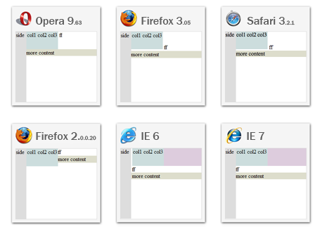
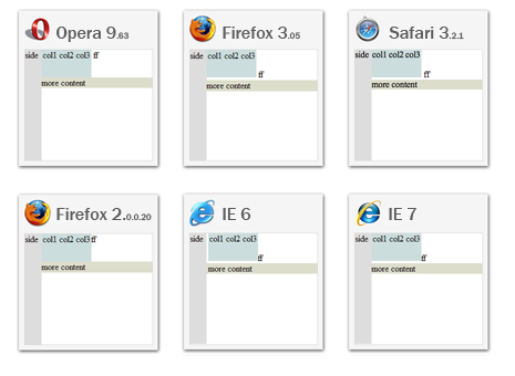
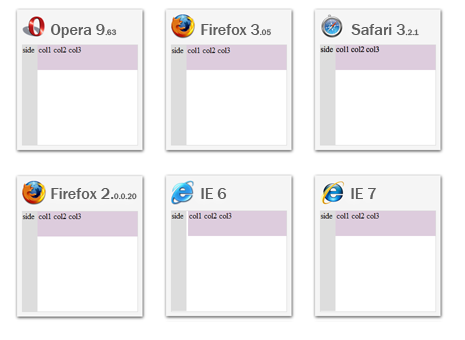
}and markup: This code is rendered in browsers like this:
col1
col2
col3
ff
more content
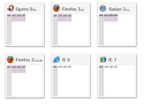
1. display:inline-block
So, let's look at what it’s capable of. We’ll fix firefox and ie (if there is hasLayout it works like that ) Let's figure out the extra horizontal space, add for IE and drop the text in Opera ( ). Vertical space is an IE bug that appears when combined with one element and another. It will even if you use it , it has nothing to do with it , and if it’s critical for you ... - I put the search for a solution on your shoulders, but for now I will use it . Unfortunately, not everything is as good as it seems: the problem is in the second ff, which can completely unpredictably display content inside containers with , and
display:inline-blockdisplay:inlinedisplay:inline-blockvertical-align:bottom*vertical-align:0%vertical-align:text-bottomhasLayoutfloatoverflow:hiddendisplay:inline-block*margin-left:-3px-moz-inline-box-moz-inline-stack-moz-inline-block. Although in this case, all columns with the property floatdisplayed normally.2. display:table-cell
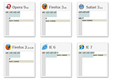
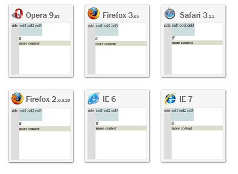
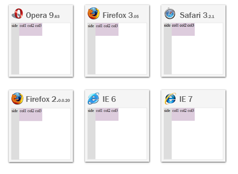
Now let's get started. Everything is great, safari is stupid - we ’ll write simply , but ie it doesn’t support it at all - then we’ll make it at least display like in all browsers. What’s ours - a) the width of the element is determined by the content b) the element does not let other elements go to its horizontal level Almost the same as , but you need to add a line break. We do all this for IE and immediately fix the known flaws. This method I would use. Moreover, if after the container there is not text or a string element, but a block element, there is no need to do line breaks in IE, and it is also worth noting that if the width of the container is known, then 1) it should not be used in IE
display:table-celltabletable-celldisplay:inline-blockdisplay-inline, because you define the width, not the content of the container 2) you do not need to do line wrapping for IE, because we do not simulate
display-inline3) you do not need a separate property to enable hasLayout, because width will enable it
3. Float
As I already wrote, float also creates a new formatting context. I'm not sure it will come in handy, but we should know. So how is this manifested?
float:leftthe one set for .colpulls them out of the stream and their container seems to contain nothing and, in fact, #content is not displayed unless it is set to width and height. To make sure, let's remove the background from .col(and also all subsequent tinsel): delete
background-color from
And now let's see what it will lead to (include, ie ) (ie, omit it for obvious reasons)
and finally (it’s possible )..coloverflow:hiddenhasLayouttablefloat:leftrightSince the browser creates a separate formatting context for these examples, as well as for absolute positioning, it can be assumed that for better performance the elements that the java script manipulates would be better placed not only in absolutely positioned containers, but also in any of the above.
Using these techniques you can solve the problems that are inherent in the properties
clearand overflow, as well as increase the performance of browsers that process your pages. The same article on my site Flow control in CSS: creating a formatting context