How we drew the graphics for Silverlight
 Once Microsoft came up with Silverlight technology . Then came people who liked this technology and they created a Silverlight user community . All communities are supposed to have a logo and a website with a beautiful design. Silverlight lovers are progressive people with a developed sense of style, so some style did not suit them. It so happened that the designers of Turbomilk studio responded to their call .
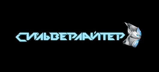
 Logo - should indicate the Russian language of the site, and of course elements of the official Silverlight technology logo (Alexander Porubov, Silverlight) should be recognizable (or clearly present) in it
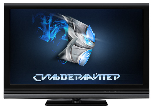
We thought a little and drew a bold (even aggressive) logo with Russian-language spelling. (formerly "silverlighter")
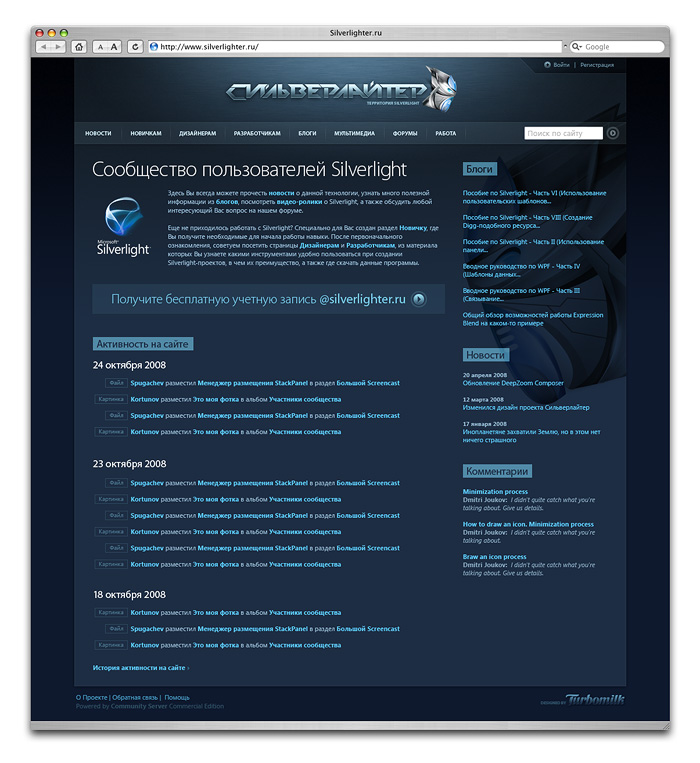
Based on the logo, we drew the site. In design, we decided not to leave the Silverlight technology site style in order to maintain continuity and family features. What is most important for a community site? Of course the forum! We have drawn special emoticon icons to diversify the communication of developers. To present the site at various conferences in the most favorable light, we drew a slide for presentation. In the end, everyone was very pleased. Whether to use Silverlight technology or not is up to you.