Animation in MooTools. Basics and more.
In this topic, I am going to bring all my knowledge about animation in MooTools together and consider topics that are more in-depth than just examples of using plug-ins. Theoretical information is valid not only for MooTools, but also for other frameworks. It will be interesting for beginners to get acquainted with the capabilities of the framework, and for those who continue to understand how it all works :). The article provides many examples, there are quite original ones, here are some of them: 1 , 2 , 3 . Enjoy your reading.
MooTools uses the Fx class to create animated effects. All classes that implement any kind of animation inherit from Fx. Helper methods for animation are defined in this class:
It is worth emphasizing that the Fx class itself is abstract, that is, it doesn’t animate anything, it only uses general data to implement the principles of animation. The direct animation is done by the heirs of Fx. Mostly, classes that animate various CSS properties of elements are used to animate elements on HTML pages. We will talk about these classes, and also consider the case of creating our own class, which implements the animation of non-CSS properties.
I hope that from the previous paragraph it became approximately clear that such a transition equation is the law by which the delta increment should be calculated. Fortunately, MooTools has a whole set of laws that will make the animation smooth, sharp, fading, jumping, etc., but this will not be enough for us - we will write our own equation. But more on that later. Now let's see what standard equations are:

And here is that jumping animation.


Quarter circle.

Elastic.

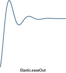
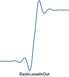
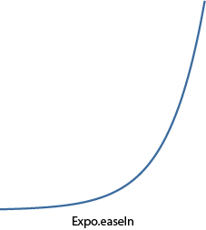
Exponential function.


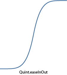
Fifth degree.


A piece of sinusoid.
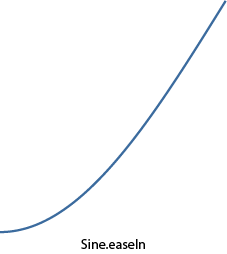


An example showing the use of various transition equations in animation can be found here .
And suddenly, among the whole variety of built-in equations, there is no need? Not a problem, you can always write your own, which we now do. Ideally, the equation should be such that with an argument equal to zero it returns 0, and with unity - 1. In this case, there will be no jumps of the animated parameter at the beginning and at the end of the animation.
As an example, I wanted to write an equation that simulates vibrations on an electrocardiogram. Of course, one could take points from someone’s cardiogram and interpolate them into a polynomial, for example (for such a program he even wrote in the third year :), but it would not be so accurate and resource-intensive (in large orders) at the end use. Therefore, the function turned out to be complicated. The entire conditional domain of definition (from 0 to 1) is divided into intervals, each of which has its own small function. The result is the following:

As you can see, the “quadro function” is defined on the first gap for a smooth rise from zero, then a set of straight lines with different slopes and lengths, and at the end a quarter of a circle for a smooth rise to one. Here's how it looks like curves:


Add this function to the Fx.Transitions object as follows:
Now you can use it by passing as the transition option (note: the example uses the Fx.Morph plugin, which will be discussed below, but for now it can simply be considered the successor of Fx, which understands all options in the constructor, which Fx understands):
There is only one element in the HTML code:
A living example lies here . Interesting effect: during the testing of the script I listened to Drum'n'Bass and it seemed that the beat of this heart occurs very in time with the music (try it yourself).
Ok, maybe we didn’t achieve the ideal human cardiogram, but we nevertheless wrote our function. As it turned out, this is not so difficult :).
However, there is a special syntax for creating chains. They are implemented in the Chain class. It contains as many as three methods:
The caterpillar itself is a regular div, which changes the CSS properties of left, top, width and height to create the effect of movement (oh, yes, its color also changes for realism). The caterpillar’s step will consist of two stages: the first is moving its head to the right place, and the second is pulling the tail to the head. The example uses Fx.Morph, which allows you to animate several CSS properties at the same time, which will be discussed in more detail below.
A living example here . And here is an example in no way related to chains - just a flight of fancy, but cool.
The method that responded to a mouse click instead of instantly changing the angle now calls the start method and passes into it the current value of the indicator rotation angle and the value of the angle it should be rotated after the animation ends:
That's all, we have an animated transition, which you can see here .
An example based on various transition equations is based on this class :
In the HTML code of the example, there are two drop-down lists, an animated ball and a button for every fireman.
means that two CSS properties will be animated: margin-left (from 0 to 10) and background-color (from '#EEE' to '# 555'). Ranges of values can be omitted, but only indicate the final value, then the current value specified in the element style will be taken as the initial value. An example is the use of Fx.Morph to create an animated menu:
You can also see the menu .
The official example .
The official example .
In the example below, the transparency of the array of elements changes when you hover over them, and the closer the element to what is currently under the cursor, the less its transparency, and the farther - the more:
Living example .
An interesting menu option from MooTools .
I hope that readers were interested in digging deeper into the implementation of animation in MooTools. Most of what is described here should apply to other frameworks.
Thanks for attention.
Animation in MooTools.
Basic principles. Class Fx.
So, today we will do the animation. First you need to understand how the principles of animation are implemented in MooTools. Animation in MooTools is a change in some property of an element over time (transition), for example, changing the CSS property of left is horizontal movement, and background-color is a smooth change in the fill color.MooTools uses the Fx class to create animated effects. All classes that implement any kind of animation inherit from Fx. Helper methods for animation are defined in this class:
- start - this method starts the transition.
- set - changes the value of the animated parameter. Called at every step of the transition. In terms of meaning, this is an abstract method, if it can be called that way, i.e. each animation plugin implementation must override set in its own way.
- cancel - cancels the current animation.
- pause - pauses the current animation.
- resume - resumes paused animation.
- fps - frames per second for animation. It characterizes, so to speak, the “smoothness” of the animation - the more it is, the “smoother” it is.
- unit - unit of measure, for example, "em", "px", "%". Used to transform CSS properties.
- link - an option that characterizes the behavior of the animation when start was called during the transition. It can take the following values ( example with different link values ):
- 'ignore' - all start calls during the animation are ignored. It is used by default.
- 'cancel' - the current animation will be stopped and a new one will be started with the parameters that came to start.
- 'chain' - all start calls during the animation will be added to the chain and their animation will begin immediately after the current one finishes.
- duration - the duration of the animation.
- transition is the transition equation. More transition equations will be considered below.
- The time elapsed from the start of the transition to the current moment is divided by duration, thus obtaining a number from 0 to 1 characterizing the progress of the animation. Let's call it progress.
- This number is passed to the transition function (to be discussed below). The result of computing the transition function is called delta.
- The value of the animated parameter is calculated as follows: param = (to - from) × delta + from, where from is the initial value of the parameter, to is the final value of the parameter. Obviously, for delta equal to 0 we get the initial value of the parameter, and for 1 - the final.
It is worth emphasizing that the Fx class itself is abstract, that is, it doesn’t animate anything, it only uses general data to implement the principles of animation. The direct animation is done by the heirs of Fx. Mostly, classes that animate various CSS properties of elements are used to animate elements on HTML pages. We will talk about these classes, and also consider the case of creating our own class, which implements the animation of non-CSS properties.
Transition Equations Writing your own equation.
You must admit that the animation of moving an element on a page would not look very nice if it would start abruptly and stop abruptly at the end of the path. This happens if the delta increment (which was mentioned above) remains constant throughout the entire time. This is called a linear transition, its equation is delta = progress. If we take several progress values from 0 to 1 sequentially and substitute them in the equation, we get a regular line that starts abruptly at 0 and ends abruptly at 1.I hope that from the previous paragraph it became approximately clear that such a transition equation is the law by which the delta increment should be calculated. Fortunately, MooTools has a whole set of laws that will make the animation smooth, sharp, fading, jumping, etc., but this will not be enough for us - we will write our own equation. But more on that later. Now let's see what standard equations are:
- Linear - direct (delta = progress).
- Quad is a quadratic function (delta = progress 2 ).
- Cubic - cubic function (delta = progress 3 ).
- Quart - delta = progress 4 .
- Quint - delta = progress 5 .
- Pow - the general power function delta = progress x (by default, the degree is 6).
- Expo is an exponential function (delta = 2 (progress - 1) × 8 ).
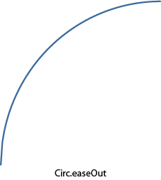
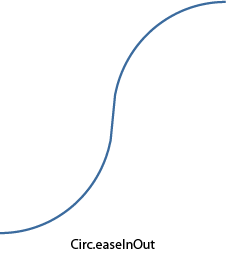
- Circ - a quarter of a circle (delta = 1 - sin (acos (progress))).
- Sine - a piece of a sinusoid (delta = 1 - sin ((1 - progress) × π / 2)).
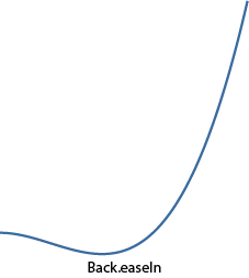
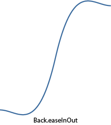
- Back - first pulls delta to minus, and then smoothly brings it to 1.
- Bounce - jumping transition.
- Elastic - elastic transition (the only association is elastic :).
- easeIn - used by default and does not change anything.
- easeOut - calculates the delta value using the formula 1 - transition (1 - progress), thus expanding the transition curve.
- easeInOut - until the middle of the transition, it calculates delta using the transtition (2 × progress) formula, and after - according to (2 - transition (2 × progress)) / 2, combining two curves in one transition: a straight line and a detailed one.


And here is that jumping animation.


Quarter circle.


Elastic.


Exponential function.


Fifth degree.


A piece of sinusoid.


An example showing the use of various transition equations in animation can be found here .
And suddenly, among the whole variety of built-in equations, there is no need? Not a problem, you can always write your own, which we now do. Ideally, the equation should be such that with an argument equal to zero it returns 0, and with unity - 1. In this case, there will be no jumps of the animated parameter at the beginning and at the end of the animation.
As an example, I wanted to write an equation that simulates vibrations on an electrocardiogram. Of course, one could take points from someone’s cardiogram and interpolate them into a polynomial, for example (for such a program he even wrote in the third year :), but it would not be so accurate and resource-intensive (in large orders) at the end use. Therefore, the function turned out to be complicated. The entire conditional domain of definition (from 0 to 1) is divided into intervals, each of which has its own small function. The result is the following:

As you can see, the “quadro function” is defined on the first gap for a smooth rise from zero, then a set of straight lines with different slopes and lengths, and at the end a quarter of a circle for a smooth rise to one. Here's how it looks like curves:


Add this function to the Fx.Transitions object as follows:
    Fx.Transitions.extend({

      Heartbeat: function(x){

        if (x < 0.3)

          return Math.pow(x, 4) * 49.4;


        if (x < 0.4)

          return 9 * x - 2.3;


        if (x < 0.5)

          return -13 * x + 6.5;


        if (x < 0.6)

          return 4 * x - 2;


        if (x < 0.7)

          return 0.4;


        if (x < 0.75)

          return 4 * x - 2.4;


        if (x < 0.8)

          return -4 * x + 3.6;


        if (x >= 0.8)

          return 1 - Math.sin(Math.acos(x));

      }

    });
Now you can use it by passing as the transition option (note: the example uses the Fx.Morph plugin, which will be discussed below, but for now it can simply be considered the successor of Fx, which understands all options in the constructor, which Fx understands):
      var fx = new Fx.Morph($('Heart'), { transition: Fx.Transitions.Heartbeat, duration: 900, link: 'chain' });


      // Производим анимацию 10 раз.

      for (var i = 0; i < 10; i++){

        // Увеличиваем сердце.

        fx.start({

          'width': 265,

          'height': 238,

          'margin-left': -20,

          'margin-top': -20

        });


        // Уменьшаем сердце.

        fx.start({

          'width': 225,

          'height': 198,

          'margin-left': 0,

          'margin-top': 0

        });

      }
There is only one element in the HTML code:

A living example lies here . Interesting effect: during the testing of the script I listened to Drum'n'Bass and it seemed that the beat of this heart occurs very in time with the music (try it yourself).
Ok, maybe we didn’t achieve the ideal human cardiogram, but we nevertheless wrote our function. As it turned out, this is not so difficult :).
Chains. The clutch of animated transformations.
Very often it is necessary to specify several consecutive transformations so that each following is carried out after the end of the previous one. If you simply call them sequentially, then by default each subsequent call will be ignored (see the link option of the Fx class). If link is set to 'chain', then all subsequent calls will be added to the chain and will be executed sequentially.However, there is a special syntax for creating chains. They are implemented in the Chain class. It contains as many as three methods:
- chain - appends the function to the end of the chain.
- callChain - Calls the next function in the chain and removes it from the chain.
- clearChain - clears the chain.
The caterpillar itself is a regular div, which changes the CSS properties of left, top, width and height to create the effect of movement (oh, yes, its color also changes for realism). The caterpillar’s step will consist of two stages: the first is moving its head to the right place, and the second is pulling the tail to the head. The example uses Fx.Morph, which allows you to animate several CSS properties at the same time, which will be discussed in more detail below.
    var CaterpillarController = new Class({

      // Реализуем методы Chain в классе.

      Implements: Chain,


      // Максимальный и минимальный размеры гусеницы.

      largeSize: 200,

      smallSize: 10,


      // Конструктор.

      initialize: function(caterpillar){

        this.caterpillar = $(caterpillar);


        // Создаем для элемента гусеницы экземпляр Fx.Morph со сцеплением последующих вызовов start.

        this.fx = new Fx.Morph(this.caterpillar, { duration: 900, transition: Fx.Transitions.Expo.easeOut, link: 'chain' });


        // Как только завершается анимация второго этапа шага гусеницы вызываем следующую функцию в нашей цепи.

        this.fx.addEvent('chainComplete', this.callChain.bind(this));


        return this;

      },


      // Этот метод отвечает за один шаг гусеницы.

      // На вход передается измерение (dimension: горизонтальное — true, вертикальное — false)

      // и направление (direction: положительное — true, отрицательное — false).

      move: function(dimension, direction){

        var dimensions = this.caterpillar.getCoordinates();

        var options1, options2;


        // Формируем объекты с опциями для двух этапов шага гусеницы.

        if (dimension){

          // Движение по горизонтали.

          if (direction){

            options1 = { 'width': dimensions.width + this.largeSize };

            options2 = { 'left': dimensions.left + this.largeSize, 'width': this.smallSize };

          } else {

            options1 = { 'left': dimensions.left - this.largeSize, 'width': this.largeSize + this.smallSize };

            options2 = { 'width': this.smallSize };

          }

        } else {

          // Движение по вертикали.

          if (direction){

            options1 = { 'height': dimensions.height + this.largeSize };

            options2 = { 'top': dimensions.top + this.largeSize, 'height': this.smallSize };

          } else {

            options1 = { 'top': dimensions.top - this.largeSize, 'height': this.largeSize + this.smallSize };

            options2 = { 'height': this.smallSize };

          }

        }


        // Расширим объекты добавив в них свойство для изменения цвета (для пущей реалистичности).

        $extend(options1, { 'background-color': '#7CCB26' });

        $extend(options2, { 'background-color': '#4C9004' });


        // Стартуем два этапа шага

        // (второй этап начнется после окончания первого, вспоминаем link равный 'chain').

        this.fx.start(options1);

        this.fx.start(options2);


        return this;

      }

    });


    window.addEvent('domready', function(){

      // Следующая последовательность вызовов move опишет восьмерку.

      new CaterpillarController('Caterpillar').move(true, true).

        chain(function() { this.move(false, true); }).

        chain(function() { this.move(true, false); }).

        chain(function() { this.move(false, true); }).

        chain(function() { this.move(true, true); }).

        chain(function() { this.move(false, false); }).

        chain(function() { this.move(true, false); }).

        chain(function() { this.move(false, false); });

    });
A living example here . And here is an example in no way related to chains - just a flight of fancy, but cool.
Animation of own variables.
So far, we have used the animation of various CSS properties. But, as I pointed out at the beginning of the article, the Fx class can be used to animate anything. Therefore, it would be nice to try writing your Fx heir. As a basis, we take an improved version of the rheostat script, which I wrote about in this topic . What can be animated in it? For example, the angle of rotation of the indicator. Recall that if you make a single click on the rheostat, the indicator immediately appears in the place of pressing. But what if you animate this transition? It would be funny, and you just need to write a few lines :). So, what do you need to create a full-fledged Fx descendant:- Add Extends: Fx to the class description for inheritance.
- pass options to the base constructor.
- redefine the set method to apply the value of the animated parameter to the “physics” of the parameter, in this case, turn the indicator by the angle value.
- call start to start the animation.
  set: function(now){

    // now — текущее значение угла во время анимации.

    this.oldMouseAngle = this.mouseAngle = this.angle = now;

    this.updateIndicatorPosition();

  }
The method that responded to a mouse click instead of instantly changing the angle now calls the start method and passes into it the current value of the indicator rotation angle and the value of the angle it should be rotated after the animation ends:
  captureMouse: function(e){

    this.captured = true;


    var mouseAngle = this.getMouseAngle(e);

    if ((mouseAngle >= this.options.minAngle) && (mouseAngle <= this.options.maxAngle))

      // Стартуем анимацию перехода индикатора в место клика.

      this.start(this.angle, mouseAngle);

  }
That's all, we have an animated transition, which you can see here .
Standard animated plugins.
Fx.Tween.
This class is the simplest class that animates any CSS property of an element. To work, he needs a link to the animated element, the name of the animated CSS property, and a range of values. Creation example: var myFx = new Fx.Tween(element, [, options]);
An example based on various transition equations is based on this class :
      // Здесь мы будем менять CSS-свойство top у элемента с идентификатором 'Ball'.

      var fx = new Fx.Tween('Ball', { property: 'top', duration: 900, link: 'cancel' });

      var transitionSelect = $('Transition');

      var modifierSelect = $('Modifier');

      var test = $('Test');


      // При возникновении одного из следующих событий запустить анимацию.

      modifierSelect.addEvent('change', startAnimation);

      transitionSelect.addEvent('change', startAnimation);

      test.addEvent('click', startAnimation);


      function startAnimation(){

        // Получаем имя перехода в виде 'sine:in'.

        fx.options.transition = transitionSelect.value + modifierSelect.value;


        // Двигаем шарик с выбранным переходом.

        fx.start(60, 400);

      }
In the HTML code of the example, there are two drop-down lists, an animated ball and a button for every fireman.
Fx.Morph.
It is used more often than Fx.Tween because it can animate several CSS properties of an element at the same time. The constructor is almost the same as Fx.Tween, except for the absence of the property option; instead, an object is passed to the start method that describes which CSS properties to animate and in which ranges. For instance: morph.start({
'margin-left': [0, 10],
'background-color': ['#EEE', '#555']
});
means that two CSS properties will be animated: margin-left (from 0 to 10) and background-color (from '#EEE' to '# 555'). Ranges of values can be omitted, but only indicate the final value, then the current value specified in the element style will be taken as the initial value. An example is the use of Fx.Morph to create an animated menu:
      var menuHeadItems = $$('#Menu .MenuHeadItem');


      menuHeadItems.each(function(item, i){

        var morph = new Fx.Morph(item, { duration: 900, transition: Fx.Transitions.Elastic.easeOut, link: 'cancel' });


        // Для каждого пункта меню стартуем анимацию с прогрессивной задержкой 100i ms.

        // Анимируется два параметра: opacity и margin-left. Таким образом элемент "выезжает"

        // слева одновременно с изменением прозрачности до 1.

        morph.start.delay(i * 100, morph, {

          'opacity': [0, 1],

          'margin-left': 0

        });


        item.addEvents({

          // При наведении курсора мыши отодвигаем элемент и делаем его темнее.

          'mouseenter': function(){

            morph.start({

              'margin-left': 8,

              'background-color': '#DDD'

            });

          },

          // При уведении курсора мыши возвращаем элемент в исходное состояние.

          'mouseleave': function(){

            morph.start({

              'margin-left': 0,

              'background-color': '#EEE'

            });

          }

        });

      });
You can also see the menu .
The official example .
Fx.Slide.
Quite a useful class when you need something to leave or drop in from somewhere. The designer is very similar to all the previous ones, so I won’t dwell on it. I can only say that he understands a few more options, the most important of which is mode, which determines the direction of the "exit": vertical or horizontal. Based on this class, two more examples with animated menus are made: the first and second .The official example .
Fx.Elements.
Allows you to conveniently animate any number of CSS properties for any number of elements at once. An array of elements is passed to its constructor, over which transformations will be performed. And all the charm lies in the start method - an array of objects for conversion is passed there. It turns out that each element from the array passed in the constructor corresponds to an element of the object from the array passed to start. Thus, mass animation of elements is carried out.In the example below, the transparency of the array of elements changes when you hover over them, and the closer the element to what is currently under the cursor, the less its transparency, and the farther - the more:
      var elements = $$('#ElementsContainer .Element');

      var elementsFx = new Fx.Elements(elements, { duration: 500, link: 'cancel' });


      elements.each(function(element, i){

        // При наведении курсора на элемент пересчитываем прозрачность соседей.

        element.addEvent('mouseenter', function(){

          var arg = {};


          // Для всех соседних элементов вычисляем значение их прозрачности

          // на основании их удаленности от текущего.

          elements.each(function(element, j){

            arg[j] = { opacity: 1 - Math.min(Math.abs(i - j), 5) / 8 };

          });


          // Стартуем изменение прозрачности.

          elementsFx.start(arg);

        });

      });
Living example .
An interesting menu option from MooTools .
I hope that readers were interested in digging deeper into the implementation of animation in MooTools. Most of what is described here should apply to other frameworks.
Thanks for attention.
