Youtube is experimenting with design again.
Hi % username% ! By tradition, without fanfare, Google gave the opportunity to look at the new experimental interface of YouTube.
Here he is :
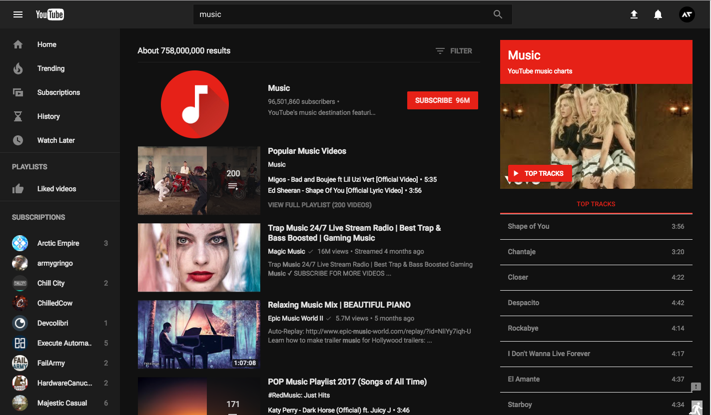
This time, the changes affected not only the player. The guys from Google have tried almost all the elements of the UI.
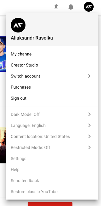
The user menu now looks like this:
Added a new mode - Dark Mode (activated in the settings):

And, in fact, makes the interface dark :

From the pleasant, right here (in the settings) you can now change the language and location :


Also worked significantly on the design of channels :

And, slightly, updated the video page :

Of the unpleasant - somehow irrational, they used the place. Many unnecessary indents, and in general - the whole UI has become more spacious and has begun to occupy more space.
And how is this thing to try and / or use?
Option 1 :
Option 2 :
Option 3 :
Particularly lucky users can activate a new interface using the "Try something new!" Feature. To do this, go to the TestTube section and activate the new user interface.

Thanks for attention. All new and good design!
Here he is :
This time, the changes affected not only the player. The guys from Google have tried almost all the elements of the UI.
The user menu now looks like this:
Added a new mode - Dark Mode (activated in the settings):
And, in fact, makes the interface dark :
From the pleasant, right here (in the settings) you can now change the language and location :
Also worked significantly on the design of channels :
And, slightly, updated the video page :
Of the unpleasant - somehow irrational, they used the place. Many unnecessary indents, and in general - the whole UI has become more spacious and has begun to occupy more space.
And how is this thing to try and / or use?
Option 1 :
- Opening YouTube
- Open the dev tools (press F12)
- Open the console (press Esc)
- We enter in the console
document.cookie="PREF=f6=4;path=/;domain=.youtube.com"; - Enter
Option 2 :
- Install the extension
- Opening YouTube
- Open the expansion menu
- Click on the parameter
PREF - Change the value to
al=en-GB&gl=GB&hl=en-GB&f1=50000000&f5=30030&f6=4 - We use
Option 3 :
Particularly lucky users can activate a new interface using the "Try something new!" Feature. To do this, go to the TestTube section and activate the new user interface.
Thanks for attention. All new and good design!
Only registered users can participate in the survey. Sign in , please.