Text readability - statistics collection
Colleagues, all of you have the opportunity to help yourself first of all in order to at least clarify the issue of readability of text on web pages (of course, at the current time with current monitors and screen resolutions).
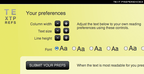
Linda Fane collects statistics on the preferences of the appearance of a text block on a special page “Text Prefs”. On the page you need to select the font and click on the buttons for increasing / decreasing the font size, line spacing and column width, creating the text block most readable for you on this monitor. The stronger we promote this page of Linda, the more complete the statistics (albeit English-speaking, but it will be at least something; maybe someone will decide to make Cyrillic? ).
After the statistics are published, I undertake to report to this blog. The link was discovered through the I Love Typography blog , for which thanks to John Bordley.