New design "VKontakte"

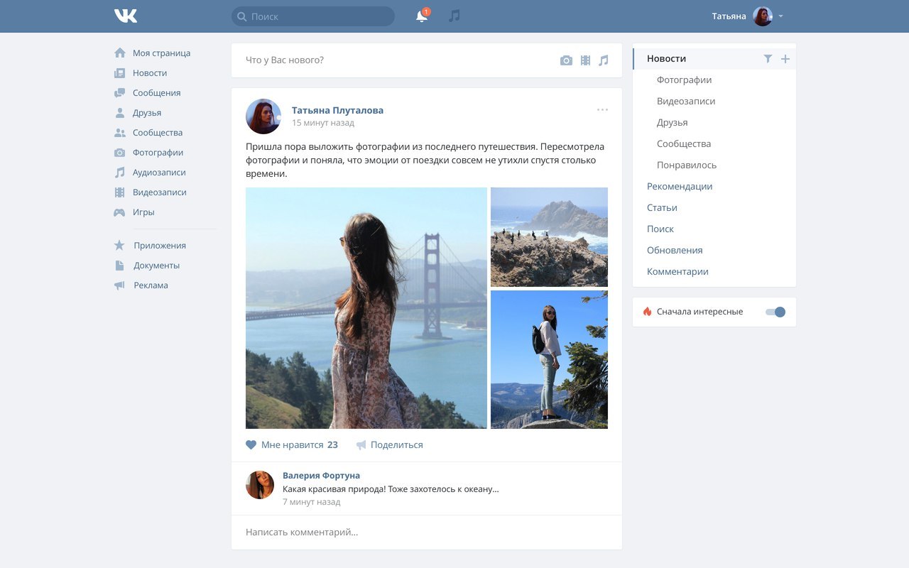
For the first time since its opening in October 2006, the social network VKontakte updated its design . The layout of the site is adapted to the most popular screen resolution of 1366x768 pixels instead of the previous 800x600. Changed the site header and design of absolutely all sections.
The beta version of the new interface is still running in beta testing, you can optionally activate it from this page (then you can roll back).
“We have increased the width of the screen and the fonts, got rid of unnecessary details and made the site easier to read. Added additional space for new useful features. We also updated the left menu: reduced the names of the items, added icons and moved up the most popular sections - News and Messages, - the official blog says (yes, the official blog resumes today). - Entries in the tape have become more noticeable. News lists are now in a separate block on the right along with search and comments. It became easier to turn on the smart news feed - switching to the “Interesting first” mode is right under this block. ”

The main principle of VKontakte design is that it looks like on all devices.
We prepared for changes for a long time and thoroughly, studying and thinking through each element. Competition for the updated interface was announced back in July 2014. Work lasted a year and a half.
Messages
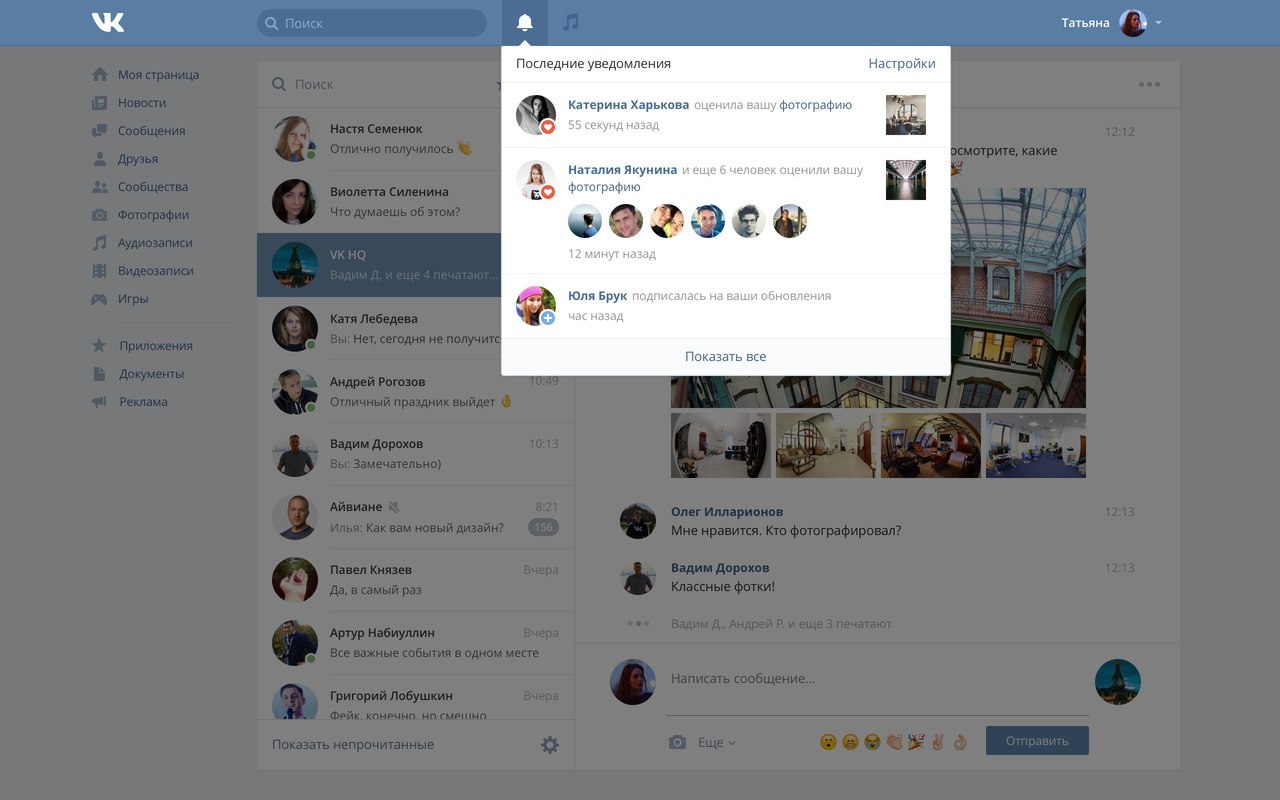
Unread messages are marked with a blue dot, which disappears after reading, and online status with a green dot.

Notifications
On the pages of people and communities, you can now subscribe to notifications of new entries, so as not to miss important news. When a new event appears at the “bell” icon, a red indicator will appear in the site header.

Photo
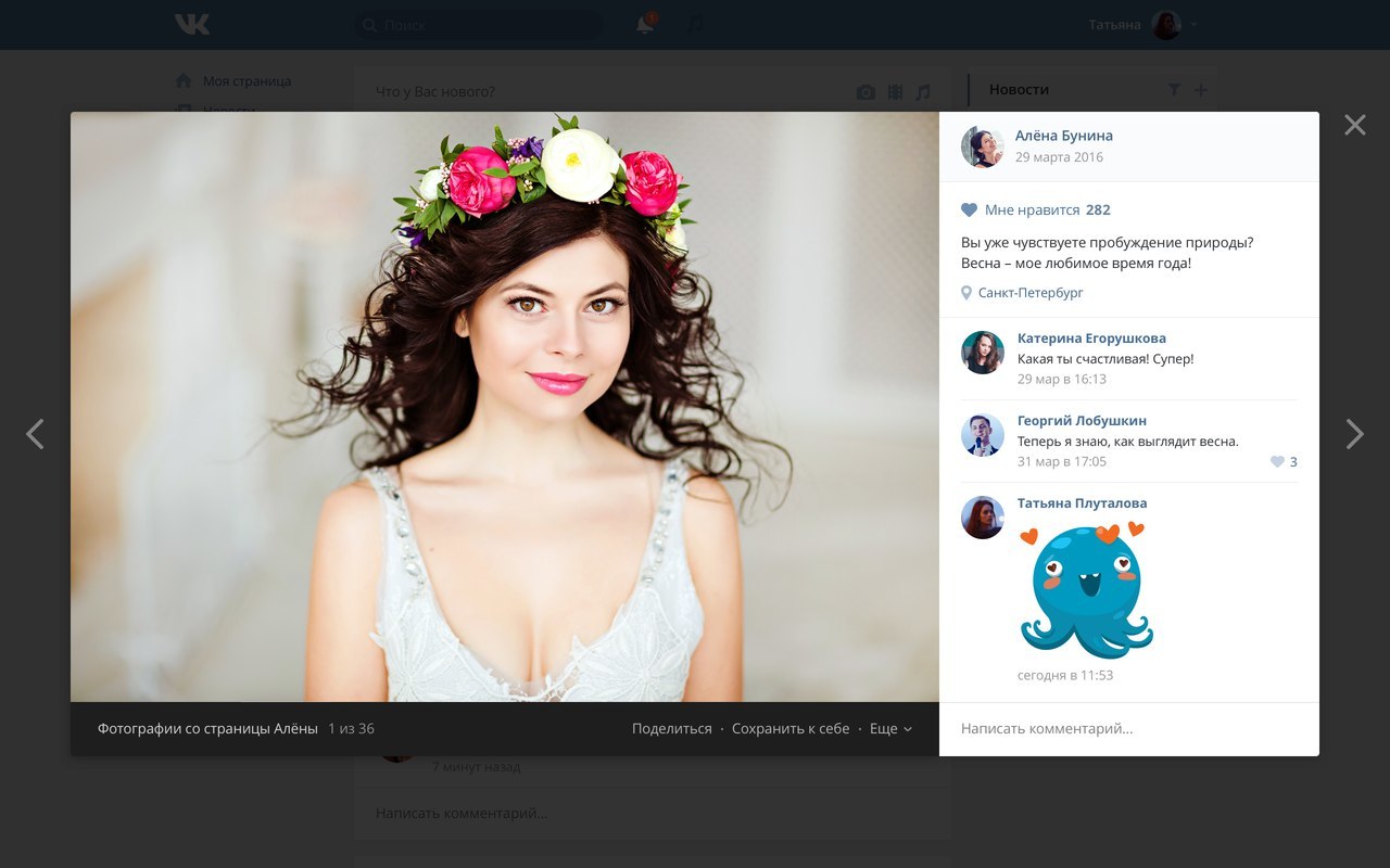
Photos have become larger, and the viewing is organized in a horizontal layout.

Pavel Durov
From the basement of the site removed the link to the founder of the project.

Gradually, the new design will be rolled out for all users of the social network.
See also:
What's wrong with VKontakte redesign
