From browser bookmarks to the new era: a little about the history of the development of social buttons services
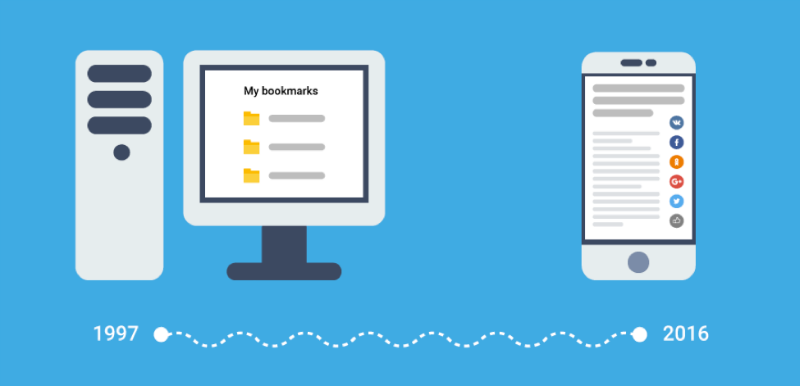
Over the past decade, the Internet has changed a lot. And one of the most interesting transformations is the transition from “good old” services for creating bookmarks in browsers that could be shared with friends, to “custom” social buttons that collect data on the preferences of hundreds of millions of Internet users.
Story
In the mid-1990s, the concept of online bookmarks was born - 1996 is considered the year of birth of services that allowed web pages to be entered into public and non-public bookmarks lists. As early as 1997, NASA employees created WebTagger, which, in addition to simply creating bookmarks, also had the functionality to share them via a web interface.
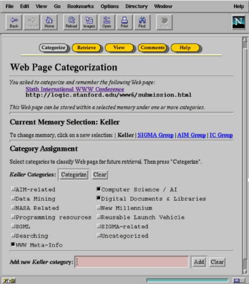
WebTagger outside ...
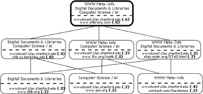
... and from the inside
In the late nineties, investors turned their attention to this niche, and online bookmarking services began to appear like mushrooms after the rain: ClickMarks, clip2, Blink, Hotlinks, del.ico.u and, of course, Backflip from former Netscape employees.
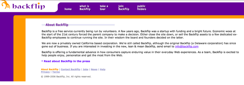
Products overgrown with new features like bookmarking folders and sending them by e-mail, however many of the “first wave” projects could not create a stable monetization model. So, after the “crash of the dot-com” on the site Backflip appeared information about the suspension of the company's financing due to the “economic difficulties of the beginning of the 21st century”.
Transfer
“… Пару лет назад мы были стартапом с финансированием и радужными перспективами. Но экономические трудности начала 21-го века поставили нашу материнскую компанию перед выбором: закрыть проект или продать активы нескольким сотрудникам, чтобы они продолжили поддерживать сайт… Если вы заинтересованы в инвестициях в обновленный Backflip, напишите нам...”
The founder of another project, Blink (at the peak of popularity, the service had 1.5 million active users) openly admitted that the main reasons for the failure of his company were flaws in the service interface and the wrong choice of development strategy. Folders with bookmarks were initially non-public, so people did not share the content, and the folder tree itself turned out to be a dead-end branch of development.
New Hope
By the middle of the new decade, the authors of the new projects somewhat rethought the concept underlying the bookmark services. Digg (2004) and Reddit (2005), which allowed users to share links and rate them, became one of the development branches.
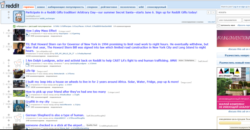
Modern interface Reddit
At the same time, social networks began to conquer the world. The growth in the number of social networks led to our evolutionary branch: social button services that allowed users to share interesting content with their friends on the conventional Facebook directly from the pages of websites.
For example, in 2006, AddThis emerged, the project forerunner of modern social services. Although at first they guessed, they had bookmarks, and other wonderful things that were almost forgotten by the modern user.
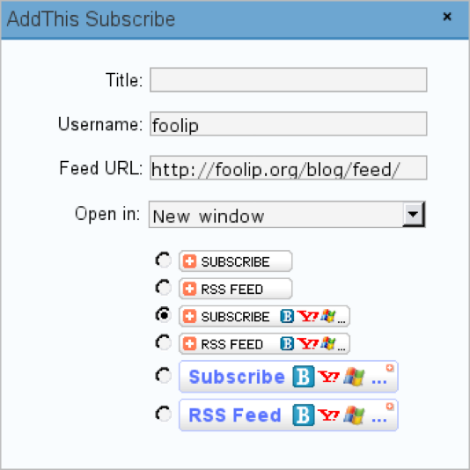
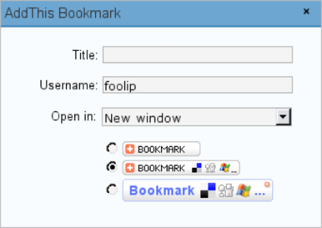
AddThis plugin for WordPress, 2007
Why do people
To cover the users of all potentially interesting social networks, you can install the buttons separately:

But, firstly, it is ugly - it can lead to problems with layout and worsen the appearance of pages, even if the buttons are about the same format and design.
More often - tritely slow down the site loading: to display each specific button, the site must send a request to each social network.
And with the service of ready-made buttons site owners do not need to generate and insert the codes of individual buttons - just insert one line into the site code, and everything will work correctly.
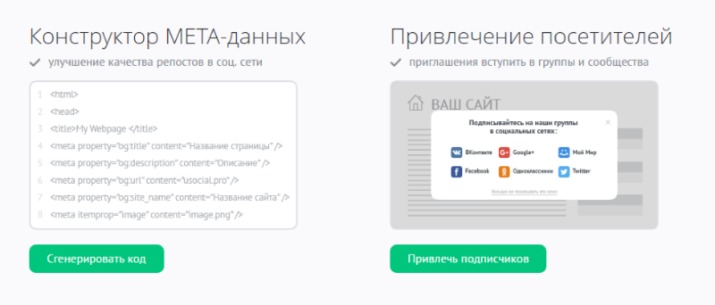
Meta tags designer in uSocial.pro service for correct post indexing by social networks.
Moreover, gradually the services of social buttons began to offer advanced features. In particular, analytical - with their help, you can track the sources of transition, the social activity of the audience and understand what content visitors like more.
Who and why creates designers of ready-made buttons
The popularity of buttons has opened up the possibility for developers to finally ... earn. And on site owners, as AddThis does, introducing paid rates.

Button Designer by AddThis
And, most importantly, on the knowledge of audience preferences. Services of social buttons sell data on which pages are marked by users, Internet companies. And they send people targeted advertising of goods and services. Such data is extremely important for systems that advertise in the network in real time.
Social data is also useful for determining trends and the effectiveness of company promotion - this allows you to increase the return on online advertising, and brands are willing to pay for it. So, the business prospects on social buttons in the beginning of the tenth years became obvious not only in the West, where AddThis and competitors raised tens of millions of dollars in investments. Clones of these services have appeared in different countries.
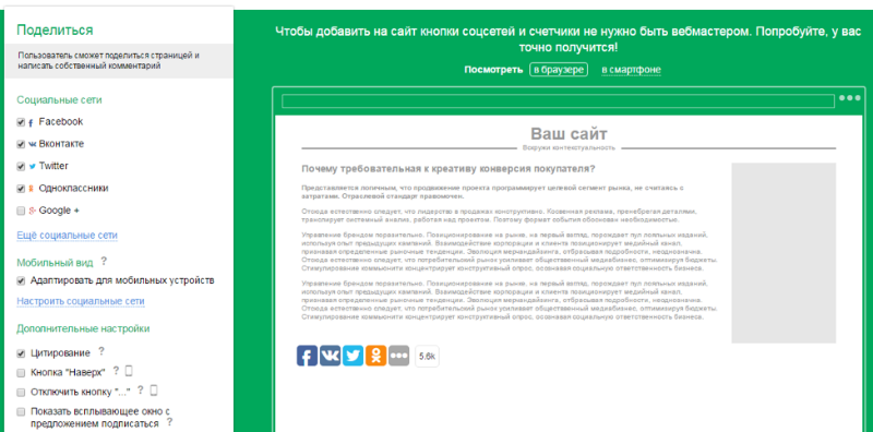
UpToLike buttons
In Russia, Pluso and UpToLike projects were launched, which were much better adapted to work with popular social networks in RuNet, mainly Vkontakte and Odnoklassniki. They began to quickly gain popularity. So, Pluso a few months after the launch reported that the number of site visitors it reached exceeded 1 million.
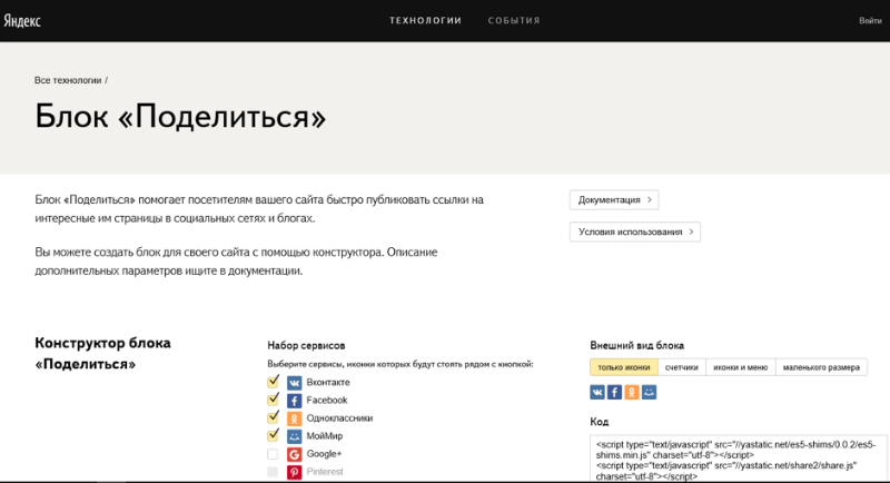
Button Designer from Yandex
Soon, social buttons have ceased to be the domain of young startups. The growing popularity and volume of data collected forced us to turn our attention to this market and Yandex, which presented its buttons in 2013. Subsequently, the company was able to apply the data collected with their help in creating its own recommendation service for media readers.
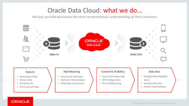
Oracle sly plan. About social networks - in the right block.
Meanwhile, AddThis was bought by the IT giant Oracle for an amount "between $ 100 and $ 200 million, but closer to the latter." The service will be included in the line of tools that allow you to collect and analyze marketing and advertising data.
Projects that were not bought or launched by larger companies are forced to look for new partners to develop products that will help retain users: for example, UpToLike announced the creation of an advertising network and plans to cooperate with SeoPult.
Why social button services continue to appear
In February 2016, the oldest player in the market of budget website building, uCoz, launched its own project of social buttons - uSocial.pro .
Why did we do this?
First , the emergence of new teams on the market helps to combat the transformation of the standard services of digging services into paid services.
For example, AddThis left only standard square buttons in the free version - whereas one of the most popular forms among users was square icons with rounded edges, Apple introduced fashion (from those who installed our buttons, 84% chose square ones with rounding) .
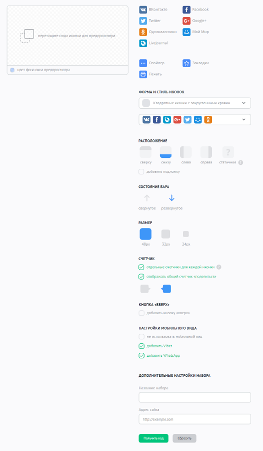
The designer of the buttons uSocial.pro
Secondly , they are simply tired that they do not update the social network logos somewhere in time and add their clickable logo to the user of the social buttons :)
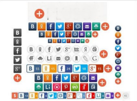
An example of clickable branding in the form of "+"
In addition, the design of the end of zero buttons does not always fit into the design of modern sites. Therefore, we have included in our sets a version with large (48 pixels) buttons that fit organically into the design of modern websites and attract the attention of visitors.
Third , the “old-timers” of the market do not always notice even more obvious and urgent solutions that will be convenient for site owners or end users (remember the Blink story from the beginning of the article?).
Let's say it counters sherov. When Twitter turned off the ability to view the link count via its buttons' API last fall, many have left it as it is. Although there are solutions how to count reposts. And according to our statistics, Twi is the fifth most common after VK, FB, OK and G +.
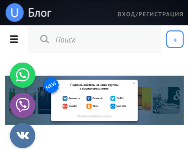
Mobile version: messenger buttons together at the top. Now I’ll tell you which of the buttons is more popular.
Finally , it’s obvious that the button projects should pay particular attention to the mobile version: but for some people, the buttons for the WhatsApp and Viber messengers are broken by the Odnoklassniki button. We began to allocate the messenger buttons to a separate one, making it easier to send links to mobile devices. By the way, they put messenger buttons equally often. But whatsApp content is shared twice as often.
In short, evolution continues.
