FLProg + Nextion HMI. Lesson 1
- Tutorial
Good day.
I want to tell about one very interesting project of ITEAD STUDIO - a color LCD display + a resistive touch sensor with its own controller, controlled by the UART “Nextion HMI”. This project appeared on the Indiegogo crowdfunding platform and, with a stated $ 20,000, the project raised more than $ 45,000.
One FLProg user sent me a sample of such a panel for review. Having started working with her, I was delighted with her capabilities, at a very affordable price. In terms of capabilities, it comes very close to industrial HMI panels, and its editor is almost a complete SCADA system. Therefore, I have integrated the control of this panel into the FLProg project.
In this series of lessons, I will explain how to work with this panel and manage it from the FLProg program. The first lesson will be devoted to the program Nextion Editor and the creation of a visualization project in it.
To begin, I will provide a table of characteristics of various models of the panel
| NX3224T024_011R | NX3224T028_011R | |
|---|---|---|
| The size | 2.4 " | 2.4 " |
| Resolution | 320 * 240 | 320 * 240 |
| Touch Panel | Rtp | Rtp |
| Number of colors | 65536 | 65536 |
| Flash (MB) | four | four |
| Ram (byte) | 2048 | 2048 |
| Description | wiki.iteadstudio.com/NX3224T024 | wiki.iteadstudio.com/NX3224T028 |
| NX4024T032_011R | NX4827T043_011R | |
| The size | 3.2 " | 4.3 " |
| Resolution | 400 * 240 | 480 * 272 |
| Touch Panel | Rtp | Rtp |
| Number of colors | 65536 | 65536 |
| Flash (MB) | four | sixteen |
| Ram (byte) | 2048 | 2048 |
| Description | wiki.iteadstudio.com/NX4024T032 | wiki.iteadstudio.com/NX4827T043 |
| NX8048T050_011R | NX8048T070_011R | |
| The size | 5.0 " | 7.0 " |
| Resolution | 800 * 480 | 800 * 480 |
| Touch Panel | Rtp | Rtp |
| Number of colors | 65536 | 65536 |
| Flash (MB) | sixteen | sixteen |
| Ram (byte) | 2048 | 2048 |
| Description | wiki.iteadstudio.com/NX8048T050 | wiki.iteadstudio.com/NX8048T070 |
Download the Nextion Editor program on the manufacturer's website .
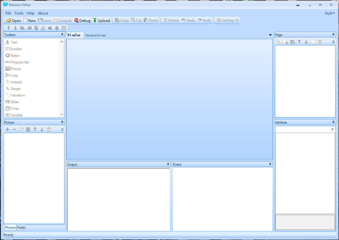
The main window of the program.
When creating a new project (“File” -> “New”), you first need to select the storage location and the name of the new project. After that, you will be prompted to select the panel model used, the screen orientation, and the necessary encoding.

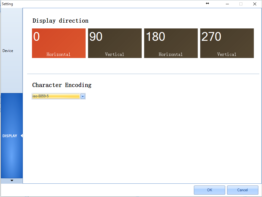
To support Russian characters, you must use the iso-8859-5 encoding.
Consider a program window with an open project.
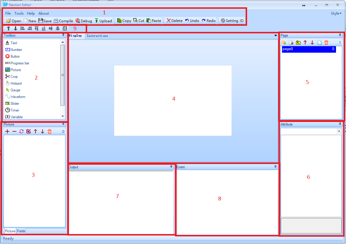
Window areas:
- Main menu.
- Library of elements.
- Image Library / Font Library.
- Display area
- List of project pages
- The zone for editing attributes of the selected element.
- Compilation output window.
- A window for entering the code to be executed when an event occurs.
- The menu controls the alignment and order of elements.
Immediately after creating the project, the first page with index 0 will be created with the default name “page0”. This name can be changed by double-clicking on it and entering a new name. The page name must be unique within the project. After entering the new name of the page, press “Enter”.
Consider the page list menu (5).
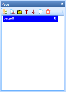
 - Add page.
  - Delete page. Page indexes will be recalculated to eliminate voids.
  - Paste the page before the highlighted. Page indices will be recalculated to ensure consistency from top to bottom.
  - Raise the page in the list up. Page indices will be recalculated to ensure consistency from top to bottom.
 - To lower the page in the list down. Page indices will be recalculated to ensure consistency from top to bottom.
  - Copy the selected page. A copy of the selected page will be added to the bottom of the list.
  - Delete all villages.
 When selecting a page in the list, in the attribute editing area (6) it will be possible to change the parameters of the page.
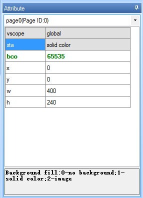
If you select a specific attribute, additional information on the attribute will be displayed at the bottom of this zone.
I have not fully mastered or understood the need for all the attributes available in the editor, so I will only talk about those I figured out.
Page attributes.
- vscope - Visibility. Possible values:
- local - visibility within this page.
- global - visibility on all pages. I do not understand the purpose of this attribute in the context of the page.
- sta - Background fill mode. Possible values:
- no background - no fill. When displaying a page in this mode, the previously rendered page will appear as the background.
- solid color - solid color fill, specified using the attribute “bco”
- image - use as a background image. The image with the index specified in the “pic” attribute is used as a picture. Accordingly, this image must first be loaded into the image library (3). The image in size should match the screen resolution of the panel. If the image exceeds the panel size, an error will be displayed and the image will not be superimposed; if the image size is smaller than the panel, the page drawn earlier will be visible on the unclosed areas of the screen
The following attribute depends on the background fill mode.
In the “no background” mode, this attribute is missing.
In “solid color” mode, this is the “bco” attribute. It determines how the background color of the page will be filled. The value of this attribute displays the color code in the Hight Color format. Double-clicking on this field opens the color selection window.
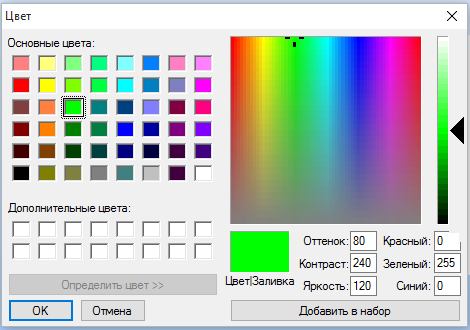
This window is used to set the values of all attributes associated with the color.
In the “image” mode, this is the “pic” attribute. It determines which image is used for the background of the page. Double-clicking on the value field of this attribute opens the image selection window.
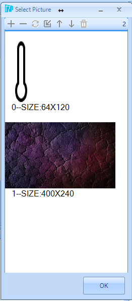
This window is also used in the program to set the values of all attributes associated with the image.
The remaining attributes show page sizes, and are editable, but I do not advise touching them, since the page’s behavior in this case is not predictable.
Now consider the image library and font library. They are in zone 3 on the tabs “Picture” and “Fonts”, respectively.
“Picture” tab.
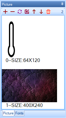
The tab shows the images uploaded to the project, as well as their index and size.
Tab menu.
 - Add image. Clicking this button will open the standard window for selecting an image file on the disk. Possible multiple choice.
  - Delete the selected image. Image indices will be recalculated to eliminate voids.
 - Replace the selected image. Clicking this button will open a standard window for selecting an image file on the disk. The selected image will replace the selected one, not only in the library, but also in those places where it is used.
  - Insert a new image before the selected one. Clicking this button will open a standard window for selecting an image file on the disk. The selected image is inserted before the selected one. Image indices will be recalculated to ensure consistency from top to bottom.
  - Raise the image in the list up. Image indices will be recalculated to ensure consistency from top to bottom.
  - Move the image down the list. Image indices will be recalculated to ensure consistency from top to bottom.
  - delete all images.
“Fonts” tab.
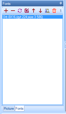
This tab displays the fonts used in the project. In order to add a font to a project, you must first generate a font file using the “Font Generator” tool. This tool is called from the main menu of the “Tools” -> “Font Generator” program.
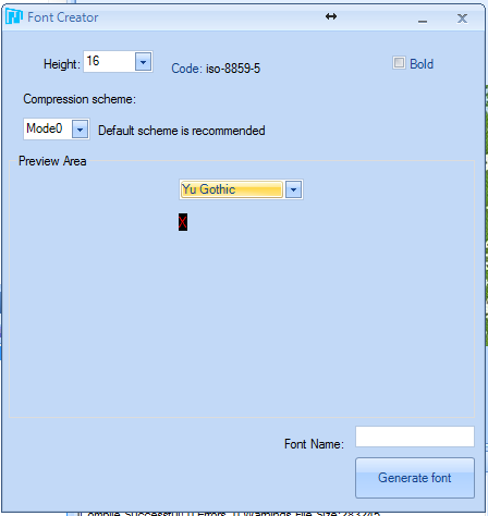
In the window of this tool, you need to select the font size, select the source font from the system, the scheme (I honestly did not understand what it is) and enter the name of the font that will be displayed in the list of fonts. Then click the “Generate font” button. This will ask for the place to save the font and the file name. The font file is saved with the extension “.zi”. When you close the “Font Generator” window, you will be prompted to immediately add the generated font to the project font library.
Tab menu.
- Add a font. Clicking this button will open the standard font file selection window on the disk. Possible multiple choice. - Delete the selected font. Font indices will be recalculated to eliminate voids. - Replace the highlighted font. Clicking this button will open the standard font file selection window on the disk. The selected font will replace the selected one, and not only in the library, but also in the places where it is used. - Paste the new font before the highlighted one. Clicking this button will open the standard font file selection window on the disk. The selected font is inserted before the selected one. Font indices will be recalculated to ensure consistency from top to bottom.- Raise the font in the list up. Font indices will be recalculated to ensure consistency from top to bottom. - Lower the font in the list down. Font indices will be recalculated to ensure consistency from top to bottom.  - Pre preview selected font. - remove all fonts.
 Now consider the library of elements (2).
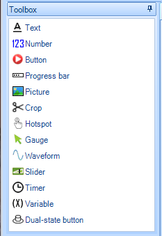
Items are added to the project by clicking on it. Graphic elements are added to the position 0 @ 0, the timer and the variable in the line below the screen area.
Almost all graphic elements have the attributes “objname”, “vscope” and “sta”. In short, I have already talked about the last two in the context of the page. I will expand the story a little.
- “Objname” is the name of the element. Used when writing code and when requesting attributes via UART.
The “vscope” attribute determines the availability of an element for changing its attributes and can have two values:
- “Local” - it is possible to read and change the attributes of an element only if the page on which it is located is active. This applies both to the code executed on the panel itself and to requests via the UART.
- “Global” - element can be read and changed at any time. This applies both to the code executed on the panel itself and to requests via the UART. When using this attribute value, you must ensure that the name is unique throughout the project.
The “sta” attribute defines the background fill mode for the element and can have the following values:
- “Solid color” - fill the background with a solid color.
- “Image” - use the picture as a background. The size of the element is adjusted to the size of the picture.
- “Crop image” is the literal translation of the “cut image”. The meaning is closest to a transparent background. Ideology is like that. The image is taken as the background, but it is superimposed at the zero coordinates of the page. As the background of the element, an area of the image is used that coincides with the projection of the element onto the page area. But it is easier to try than to explain.
In the list of attributes (6), some of them are shown in green. These attributes are available for reading and writing with the help of the code executed on the panel itself, and with the help of commands via the UART. Attributes shown in black are modified only through the editor during the project development phase.
Consider the available items.
 - The field with the text.
Item Attributes:
- “Objname”
- “Vscope”
- “Sta”
- “Bco” is the fill color of the background. This attribute appears when you select the value “solid color” in the attribute “sta”
- “pic” – индекс картинки для фона. Этот атрибут появляется при выборе значения “image” в атрибуте “sta”
- “picс” – индекс вырезанной картинки для фона. Этот атрибут появляется при выборе значения “crop image” в атрибуте “sta”
- “pco” – цвет надписи. Значение атрибута – код цвета в формате Hight Color, которым будет написан текст
- “font” – индекс шрифта, которым будет написан текст.
- “xcen” – Горизонтальное выравнивание. Возможные значения:
- 0 – по левому краю
- 1 – по центру
- 2 — по правому краю
- “ycen” – вертикальное выравнивание. Возможные значения:
- 0 – по верху
- 1 – по центру
- 2 – по низу
- “txt” – отображаемый текст
- “txt-maxl” – максимальная длинна текста. Если передать в атрибут “txt”значение длинной больше чем значение этого атрибута, лишние символы в конце отрежутся.
- “x” и “y” – координаты вставки текста
- “w” и “h” – ширина и высота прямоугольника, в который вписывается текст.
 - A field with a numeric value.
 Item Attributes:
- “objname”
- “vscope”
- “sta”
- “bco” – цвет заливки фона. Этот атрибут появляется при выборе значения “solid color” в атрибуте “sta”
- “pic” – индекс картинки для фона. Этот атрибут появляется при выборе значения “image” в атрибуте “sta”
- “picс” – индекс вырезанной картинки для фона. Этот атрибут появляется при выборе значения “crop image” в атрибуте “sta”
- “pco” – цвет надписи. Значение атрибута – код цвета в формате Hight Color которым будет написано число.
- “font” – индекс шрифта, которым будет написано число.
- “xcen” – Горизонтальное выравнивание. Возможные значения:
- 0 – по левому краю
- 1 – по центру
- 2 — по правому краю
- “ycen” – вертикальное выравнивание. Возможные значения:
- 0 – по верху
- 1 – по центру
- 2 – по низу
- “val” – отображаемое значение. Может отображать числа от 0 до 4294967295. Не умеет отображать отрицательные значения.
- “lenth” –длинна числа как строки. Возможные значения от 0 до 10. При нуле – длинна числа определяется автоматически, в остальных случаях, если длинна числа переданного в как значение атрибута “val” больше значения “ lenth ” спереди числа дописываются недостающие нули, а если длинна числа переданного в как значение атрибута “val” меньше значения “ lenth ” спереди числа отрезаются лишние символы.
- “x” и “y” – координаты вставки элемента
- “w” и “h” – ширина и высота прямоугольника, в который вписывается число.
 - Button without fixing.
 Item Attributes:
- “objname”
- “vscope”
- “sta”
- “bco” – цвет кнопки в не нажатом положении. Этот атрибут появляется при выборе значения “solid color” в атрибуте “sta”
- “bco2” – цвет кнопки в нажатом положении. Этот атрибут появляется при выборе значения “solid color” в атрибуте “sta”
- “pic” – индекс картинки кнопки в не нажатом положении. Этот атрибут появляется при выборе значения “image” в атрибуте “sta”
- “pic2” – индекс картинки кнопки в нажатом положении. Этот атрибут появляется при выборе значения “image” в атрибуте “sta”
- “picс” – индекс вырезанной картинки кнопки в не нажатом положении. Этот атрибут появляется при выборе значения “crop image” в атрибуте “sta”
- “picс2” – индекс вырезанной картинки кнопки в нажатом положении. Этот атрибут появляется при выборе значения “crop image” в атрибуте “sta”
- “pco” – цвет надписи на кнопке в не нажатом положении. Значение атрибута – код цвета в формате Hight Color.
- “pco2” – цвет надписи на кнопке в нажатом положении. Значение атрибута – код цвета в формате Hight Color.
- “font” – индекс шрифта, которым будет написана надпись на кнопке.
- “xcen” – Горизонтальное выравнивание. Возможные значения:
- 0 – по левому краю
- 1 – по центру
- 2 — по правому краю
- “ycen” – вертикальное выравнивание. Возможные значения:
- 0 – по верху
- 1 – по центру
- 2 – по низу
- “txt” – текст надписи на кнопке.
- “txt-maxl” – максимальная длинна надписи на кнопке. Если передать в атрибут “txt”значение длинной больше чем значение этого атрибута, лишние символы в конце отрежутся.
- “x” и “y” – координаты вставки кнопки
- “w” и “h” – ширина и высота кнопки.
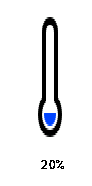
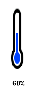
 - Progress bar. Displays a ruler filled to the specified percent value. A very interesting solution is implemented when applying images. There are two images. For example, a thermometer. On one it is empty (0%), on the other it is full (100%).
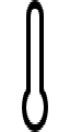

After linking it to the element, the progress bar, depending on the set value, shows a part of the first image and a part of the second.
Item Attributes:
- “objname”
- “vscope”
- “sta” – возможные значения: “solid color” и “image”
- “dez” – направление. Возможные значения:
- “horizontal” – по горизонтали
- “vertical” – по вертикали
- “bco” – цвет при при заполнении 0%. Этот атрибут появляется при выборе значения “solid color” в атрибуте “sta”
- “рco” – цвет при при заполнении 100%. Этот атрибут появляется при выборе значения “solid color” в атрибуте “sta”
- “bpic” – индекс картинки кнопки при заполнении в 0%. Этот атрибут появляется при выборе значения “image” в атрибуте “sta”
- “ppic” – индекс картинки при заполнении в 100%. Этот атрибут появляется при выборе значения “image” в атрибуте “sta”
- “val” – наполнение. Возможные значения: от 0 до 100.
- “x” и “y” – координаты вставки прогресс бара
- “w” и “h” – ширина и высота прогресс бара.
 -Picture
Item Attributes:
- “objname”
- “vscope”
- “pic” – индекс картинки.
- “x” и “y” – координаты вставки картинки
- “w” и “h” – ширина и высота картинки.
 - Cut image.
 Item Attributes:
- “objname”
- “vscope”
- “picс” – индекс картинки.
- “x” и “y” – координаты вставки картинки
- “w” и “h” – ширина и высота картинки
 - Invisible button.
 Item Attributes:
- “objname”
- “vscope”
- “x” и “y” – координаты вставки картинки
- “w” и “h” – ширина и высота картинки
 - Arrow indicator. Displays an arrow rotated at a given angle.
Item Attributes:
- “objname”
- “vscope”
- “sta” Возможные значения: “solid color” и “crop image”
- “bco” – цвет фона. Значение атрибута – код цвета в формате Hight Color. Этот атрибут появляется при выборе значения “solid color” в атрибуте “sta”
- “picс” – индекс вырезанной картинки на фоне. Этот атрибут появляется при выборе значения “crop image” в атрибуте “sta”
- “val” – значение угла поворота стрелки от 0 до 360.
- “wid” – толщина стрелки. Значение от 0 до 5.
- “pco” – цвет стрелки. Значение атрибута – код цвета в формате Hight Color.
- “x” и “y” – координаты вставки элемента
- “w” и “h” – ширина и высота элемента.
 - Schedule. The element builds a graph by points, code transmitted to it, executed on the panel or via UART. Supports up to four graphs displayed simultaneously. From my point of view, the element has not yet been completed. The reason for this opinion will be described below.
Item Attributes:
- “objname”
- “vscope”
- “dir” – направление построения. Возможные значения:
- “left to right” – слева направо
- “right ti left” – справа налево
- “sta”
- “ch” – количество отображаемых каналов. Возможные значения от 1 до 4.
- “bco” – цвет фона. Значение атрибута – код цвета в формате Hight Color. Этот атрибут появляется при выборе значения “solid color” в атрибуте “sta”
- “pic” – индекс картинки фона. Этот атрибут появляется при выборе значения “image” в атрибуте “sta”
- “picс” – индекс вырезанной картинки на фоне. Этот атрибут появляется при выборе значения “crop image” в атрибуте “sta”
- “рco0” – цвет графика канала 1.
- “рco1” – цвет графика канала 2. Этот атрибут появляется при значении атрибута “ch” более 1.
- “рco2” – цвет графика канала 3. Этот атрибут появляется при значении атрибута “ch” более 2.
- “рco3” – цвет графика канала 4. Этот атрибут появляется при значении атрибута “ch” более 3.
- “x” и “y” – координаты вставки графика
- “w” и “h” – ширина и высота графика.
 - Slider
Item Attributes:
- “objname”
- “vscope”
- “mode” – направление слайдера. Возможные значения:
- “horizontal” – по горизонтали
- “Vertical” – по вертикали
- “sta”
- “psta” – режим рисования курсора слайдера. Возможные значения:
- “solid” – прямоугольник залитый сплошным цветом.
- “image” – в качестве курсора используется изображение.
- “bco” – цвет фона. Значение атрибута – код цвета в формате Hight Color. Этот атрибут появляется при выборе значения “solid color” в атрибуте “sta”
- “pic” – индекс картинки фона. Этот атрибут появляется при выборе значения “image” в атрибуте “sta”
- “picс” – индекс вырезанной картинки на фоне. Этот атрибут появляется при выборе значения “crop image” в атрибуте “sta”
- “рco” – цвет курсора. Этот атрибут появляется при выборе значения “solid” в атрибуте “psta”
- “рic2” – индекс картинки курсора. Этот атрибут появляется при выборе значения “image” в атрибуте “psta ”
- “wid” – ширина курсора.
- “hig” – высота курсора.
- “val” – значение соответствующее положению слайдера.
- “maxval” – максимальное величина значения слайдера.
- “minval” – минимальная величина значения слайдера
- “x” и “y” – координаты вставки графика
- “w” и “h” – ширина и высота графика.
 -Switch with two fixed positions.
Item Attributes:
- “objname”
- “vscope”
- “sta”
- “bco0” – цвет переключателя в положении 0. Этот атрибут появляется при выборе значения “solid color” в атрибуте “sta”
- “bco1” – цвет переключателя в положении 1. Этот атрибут появляется при выборе значения “solid color” в атрибуте “sta”
- “pic0” – индекс картинки переключателя в положении 0. Этот атрибут появляется при выборе значения “image” в атрибуте “sta”
- “pic1” – индекс картинки переключателя в положении 1. Этот атрибут появляется при выборе значения “image” в атрибуте “sta”
- “picс0” – индекс вырезанной картинки переключателя в положении 0. Этот атрибут появляется при выборе значения “crop image” в атрибуте “sta”
- “picс1” – индекс вырезанной переключателя в положении 1. Этот атрибут появляется при выборе значения “crop image” в атрибуте “sta”
- “val” – положение переключателя. Возможные значения 0 и 1
- “x” и “y” – координаты вставки кнопки
- “w” и “h” – ширина и высота кнопки.
Now we will consider not displayed elements. When added to a page, they are not added to the screen, but are located on a special editor panel.
 - variable. It is used to use data storage for calculations performed in the code directly on the panel. Depending on the type, it stores either a numeric value or a string
Item Attributes:
- “objname”
- “vscope”
- “sta” — тип переменной. Возможные значения:
- “Number” – переменная хранит числовое значение
- “String” – переменная хранит строковое значение
- “val” – числовое значение переменной. Этот атрибут появляется при выборе значения “Number” в атрибуте “sta”
- “txt” – строковое значение переменной. Этот атрибут появляется при выборе значения “String” в атрибуте “sta”
- “txt-maxl” –максимальная длинна строкового значения переменной. Этот атрибут появляется при выборе значения “String” в атрибуте “sta”
 -Timer. Invokes the “Timer Event” call periodically after a specified time.
Item Attributes:
- “objname”
- “vscope”
- “tim” – период срабатывания таймера в миллисекундах. Возможные значения от 50 ms. до 65535 ms.
- “en” – работа таймера. При значении 0 – отсчёт времени остановлен, при значении – 1 работает.
The behavior of global and local elements.
When drawing the page to which they are attached, local elements are always initialized with the values assigned at the time of project development. While the page is being displayed, these values can be changed using the executable code on the panel or via UART, but when switching to another page, all changed attribute values are reset to those set during development. Attribute values of global elements do not change when moving from page to page.
The “Waveform” element (Graph) does not work in global mode and in any case behaves as local. When you go to the page to which it is attached, it is always drawn empty, and with the settings set during development. Most likely, since the Nextion HMI project is quite young, this element is simply not finished.
Writing executable code on the panel.
The code is executed on the panel, and has an event basis. That is, the code itself is written in the event handlers of the elements and executed when the corresponding events occur.
To begin, consider the events taking place on the panel.
Page Events:
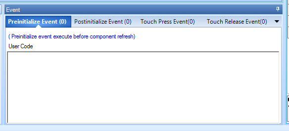
- Preinitialize Event - the event occurs before the page is rendered.
- Postinitialize Event - the event occurs immediately after the page is rendered.
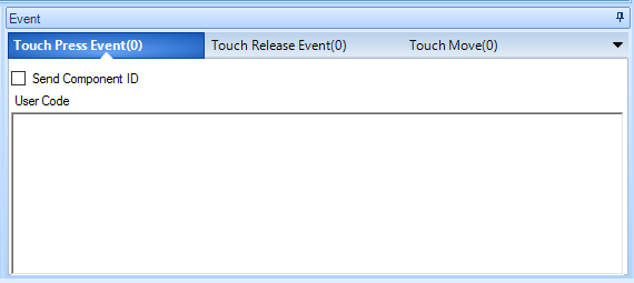
- Touch Press Event - the event occurs when you click on the screen in a place free from other elements. When you click on an element, the event is called from him.
- Touch Release Event - the event occurs after the release of the previously pressed area of the page free from other elements.
All elements, except for those that are not displayed, have two event handlers - clicks and drops.
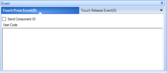
- Touch Press Event - an event occurs when an item is clicked.
- Touch Release Event - the event occurs after releasing the previously pressed element.
The Slider element (slider) has a “Touch Move” event that occurs each time the cursor moves to one position.
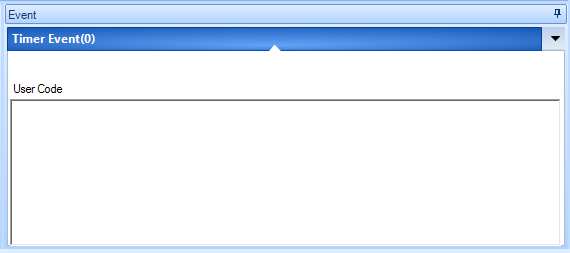
The Timer element has a single timer event handler - “Timer Event.”
Operation commands and conditional operators supported by the
Go to
page argument page - go to page. The argument can be either the name or the page index.
Example - clicking on the button takes you to page1 with the index 1. The command is written in the handler of the Touch PressEven event:
page page1or
page1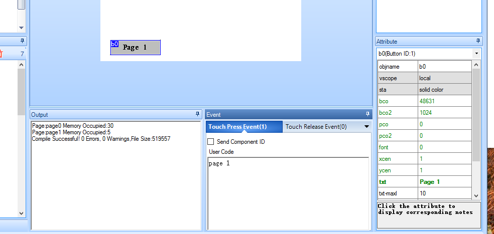
Write or read attribute value
Read argument value
element name.argument
or
page name. element
name.argument Writing a value to an argument
element name.argument = value
or
page name. element name.
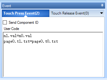
argument = value Example: By pressing the button, the value of the argument “val” from the field with a numerical value with the name “n0” is rewritten into the argument “val” of the field with a numeric value with the name “n1”. Also, from the “txt” argument of the text field with the name “t0”, the line will be overwritten into the “txt” argument of the text field with the name “t1”. All items are on a page named “page0”.
Type conversion
cov value1, value2, is long where:
- value1 - source attribute, for example, n0.val
- value2 - receiver attribute such t0.txt
- length - the length of the line. If set to 0, auto detect. If there is a conversion from a number to a string, this is the length of the target attribute; if the string is converted to a number, this is the length of the source attribute.
If the types of the attribute of the source and attribute of the receiver are the same, a compilation error will be generated
Examples.
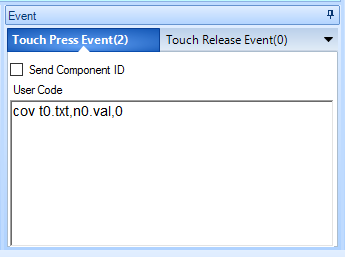
- The value of the attribute “txt” (string) of the text field “t0” is converted to a number when the button is pressed and written to the argument “val” (number) of the field with the numerical value “n0”
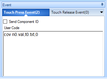
- The value of the attribute “val” (number) of the field with the numerical value “n0” is converted to a number when the button is pressed and is written to the argument “txt” (string) of the text field “t0”
Mathematical operations.
The operations of addition (+), subtraction (-), multiplication (*) and division (/) are supported. It is necessary to take into account that the panel can work only with positive integer numbers.
Example.
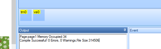
When you press the button, the timer starts working and adds one to the value of the “n0” numeric field. When you release the button, the score ends.
Timer Settings “tm0” The
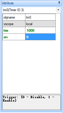
argument “tim” is 1000 ms. When the timer is running, the “Timer Event” event is called once every 1000 milliseconds.
The “en” argument is 0. By default, the timer is disabled.
The code in the event “Touch Press Event” digging.
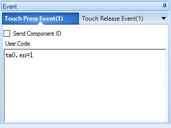
When the button is pressed, the value “t” of the “tm0” timer is set to 1. That is, the timer is turned on.
The code in the event “Touch Release Event” digging.
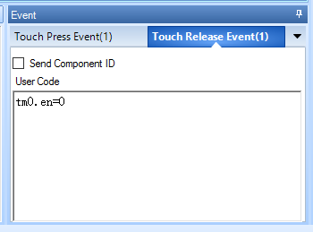
When the button is released, the value of the “en” argument of the timer “tm0” is entered 0. That is, the timer is turned off.
The code in the “Timer Event” event of the “tm0” timer.
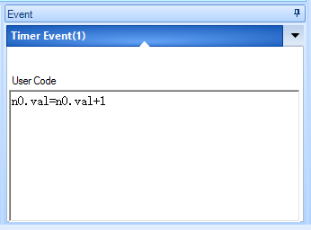
Each time the timer is triggered, the unit “val” of the digital field “n0” is added to one and written into the same argument.
Conditional statements
Record examples:
if(t0.txt==”123456”)
{
рage 1
}
If the value of the attribute “txt” of the text field “t0” is “123456”, then go to the page with the index 1.
if(b0.txt==”start”)
{
  b0.txt==”stop”
} else
{
  b0.txt==”start”
}
If the value of the attribute “txt” of the button “t0” is equal to “start”, then we write the value “stop” to this attribute, otherwise we write the value “stop” to this attribute.
if(b0.txt==”1”)
{
  b0.txt==”2”
} elseif (b0.txt==”2” )
{
  b0.txt==”3”
}else
{
  b0.txt==”1”
}
If the values of the attribute “txt” of the button “t0” are equal to “1”, then we write the value “2” to this attribute otherwise: (if the values of the attribute “txt” of the button “t0” are equal to "2, we write to this attribute value" 3 "otherwise we write in this attribute value is "1").
Possible comparison operators:
- For numeric values
- > more
- <less
- == equals
- ! = not equal
- > = greater than or equal to
- <= less or equal
- For string values
- == equals
- ! = not equal
Nested “()” and communication operators are not allowed, for example, the following construction cannot be used: if (j0.val + 1> 0). To solve such problems it is necessary to use variables.
Nested “if” and “else if” are supported.
Debugging project.
The Nextion Editor includes a project simulator. To start it, you need to press the “Debug” button (
 ) of the main menu. In this case, the project will be compiled and opened in the simulator where you can check the work of the project.
Download project in the panel.
There are two methods for loading a project into a panel.
The first method is via the UART. This requires a USB adapter -> UART. We connect it in accordance with the table.
| Nextion HMI | USB -> UART |
|---|---|
| + 5V | + 5V |
| Rx | Tx |
| Tx | Rx |
| GND | GND |
In the editor, click the “Upload” button (
 ) in the main menu. At the same time the project is compiled and the loading window opens.
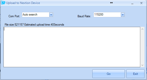
You can immediately install the port under which the adapter is installed in the system, you can leave auto search. Click “GO” and the project starts loading into the panel.

In the case of large projects, especially with large resources in the form of images and fonts, the load time can reach several minutes. After the download is complete, the panel will reboot and go into operation.
I only used this boot method, but there is another way using the Miro SD card.
I'll tell you the theory. The card must be formatted in FAT32 format. In the editor, click the “Compile” button (
 ). In case of successful compilation in the output window of the compilation results (7) there should be no red lines.
After that, in the Main Menu, open the “File” item and select the “Open build folder”.

A folder with the compiled project files will open. Select the file with the name of our project and the extension “.tft” in the head directory of the SD card. File with this extension on the map must be one. Then we insert the card into the panel disconnected from the power supply and supply power to it. When power is applied, the panel will detect the card in itself, and if it finds a file with the extension “.tft” on it, it will start downloading the project from it. The loading process will be displayed on the screen. After the download is complete, you must disconnect the power from the panel and remove the SD card.
Of course, I did not tell all the features of the Nextion HMI panel, but only those that I myself encountered in the process of integrating panel support into the FLProg program. More details about the panel can be found on the site wiki.iteadstudio.com/Nextion_HMI_Solution .
In the following lessons I will explain how to organize the interaction of the Nextion HMI and Arduino panels using the FLProg program.
Thanks for attention