Responsive app design for every user
I am of the opinion that mobile applications should be more personalized. I do not need some functions, others I use more often. But for some reason we equalize everyone under one comb, so that we can cater to more people a little bit. A little further in terms of personalization went news feeds and social. Networks that provide unique content to everyone.
But what if we go even further and provide people with a personalized UI besides the content ?!
Concept
Logic
Calibration Step
A person uses the application.
And the program itself analyzes the number of clicks on each element and gives the elements a specific gravity.
The step of smooth implementation
After the initial calibration, we can carefully implement the most popular request to the main page, in a separate block.
Element verification phase
We analyze the frequency of visits and determine whether the element is worth staying on the main page.
And if it is worthy and often used, then we are considering the option of expanding this cell, so that the user performs the target action even faster.
Application implementation
example A good example is banking applications.
Why?
Here I will try to show at the sketching stage how I see it should be. If the post is interesting, then I will already make a demo application on iOS.
Scenarios
Each person has his own scripts that he performs. They are not always logical, and the task of the application is to facilitate the way to achieve this goal.
Scenario 1 : I often transfer money to the same person (younger brother, child, wife).
We can add a block with the ability to quickly transfer to him.
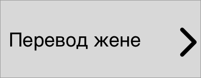
But the block itself can evolve like Pokemon. If we see that they are often used.
Block 2 level:
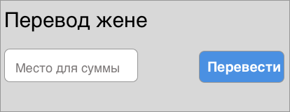
Here we can already transfer directly from the cell itself by clicking on the transfer button. The
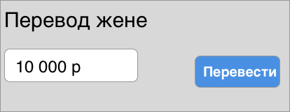
application understands that this function is not only often used, but the amount is the same, so we go further and change the cell so that the default for this operation is set amount.
Block Level 3
Scenario 2 Once a month I pay for an apartment, a date trigger is already triggered here.
The application understands that at about this date every month I give money for an apartment.
And it’s logical for us to show exactly this block on this day on the main screen and after the payment is made, remove it.
Scenario 3 I close the loan after receiving sn.
Trigger. I received a sn on the card and the application understands that usually after this action for a day or two I close the loan that hangs on me.
A credit payment now appears in the block.
Scenario 4 I use chat with support
Often, if we correspond in a chat with support, then this process is not fast, we can minimize the application several times, go about our business and come back later, so we can put it on the first screen during communication with the chat. Since we know when he started the conversation and when, in principle, he solved the problem.
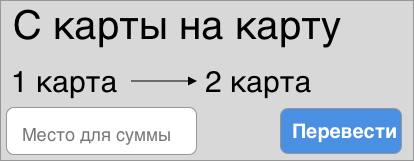
Scenario 5: I withdraw money from a current account to a card A
trigger is triggered on the receipt of r / s money and I suppose I always distribute it between my cards:
I wanted to convey the idea that the user experience can be improved by trying to help him complete what he wants as quickly as possible Of course, it will be more difficult for us as developers, but it will be appreciated by our customers. Tell me, what do you think of this approach?
But what if we go even further and provide people with a personalized UI besides the content ?!
Theory
Concept
- The application itself understands what you often use and brings often-used functionality to the first screen.
- Arranges the elements according to the degree of importance on the page so that you would not need to reach your thumb with it.
- Depending on how often this element is used, its content will also vary greatly
- There are also triggers: a push notification has arrived, a specific date or user action. This trigger has its own specific weight, which is assigned to an individual element for a short time.
Logic
Calibration Step
A person uses the application.
And the program itself analyzes the number of clicks on each element and gives the elements a specific gravity.
The step of smooth implementation
After the initial calibration, we can carefully implement the most popular request to the main page, in a separate block.
Element verification phase
We analyze the frequency of visits and determine whether the element is worth staying on the main page.
And if it is worthy and often used, then we are considering the option of expanding this cell, so that the user performs the target action even faster.
Practice
Application implementation
example A good example is banking applications.
Why?
- They are multifunctional.
- Most of the functions I as a user do not need at all, but others may be more important.
- Some functions may be needed, only at a certain moment
- Everyone uses these applications, so it’s easier to understand the concept.
Here I will try to show at the sketching stage how I see it should be. If the post is interesting, then I will already make a demo application on iOS.
Rough Exiz Application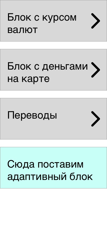
Scenarios
Each person has his own scripts that he performs. They are not always logical, and the task of the application is to facilitate the way to achieve this goal.
Scenario 1 : I often transfer money to the same person (younger brother, child, wife).
We can add a block with the ability to quickly transfer to him.
But the block itself can evolve like Pokemon. If we see that they are often used.
Block 2 level:
Here we can already transfer directly from the cell itself by clicking on the transfer button. The
application understands that this function is not only often used, but the amount is the same, so we go further and change the cell so that the default for this operation is set amount.
Block Level 3
Scenario 2 Once a month I pay for an apartment, a date trigger is already triggered here.
The application understands that at about this date every month I give money for an apartment.
And it’s logical for us to show exactly this block on this day on the main screen and after the payment is made, remove it.
Scenario 3 I close the loan after receiving sn.
Trigger. I received a sn on the card and the application understands that usually after this action for a day or two I close the loan that hangs on me.
A credit payment now appears in the block.
Scenario 4 I use chat with support
Often, if we correspond in a chat with support, then this process is not fast, we can minimize the application several times, go about our business and come back later, so we can put it on the first screen during communication with the chat. Since we know when he started the conversation and when, in principle, he solved the problem.
Scenario 5: I withdraw money from a current account to a card A
trigger is triggered on the receipt of r / s money and I suppose I always distribute it between my cards:
I wanted to convey the idea that the user experience can be improved by trying to help him complete what he wants as quickly as possible Of course, it will be more difficult for us as developers, but it will be appreciated by our customers. Tell me, what do you think of this approach?