5 great ways to animate React apps in 2019
- Transfer

Animation in React applications is a popular and discussed topic. The fact is that there are a lot of ways to create it. Some developers use CSS by adding tags to HTML classes. Great way, it is worth using. But, if you want to work with complex types of animations, you should take the time to study GreenSock, it is a popular and powerful platform. There are also many libraries and components for creating animations. Let's talk about them.
This article discusses five ways to animate React applications:
- CSS
- ReactTransitionGroup;
- React-animations
- React-reveal;
- TweenOne and Ant Design.
Skillbox recommends: The on-line educational course "Profession Java-developer" .
We remind you: for all readers of “Habr” - a discount of 10,000 rubles when registering for any Skillbox course using the “Habr” promo code.
All examples are available in the repository (from here sources are inserted into the article instead of pictures, as in the original article).
CSS
This method was mentioned at the very beginning, and it is really good. If instead of importing JavaScript libraries and using it, the assembly will be small, the browser will not need many resources. And this, of course, affects application performance. If your animation should be relatively simple, pay attention to this method.
An example is an animated menu:
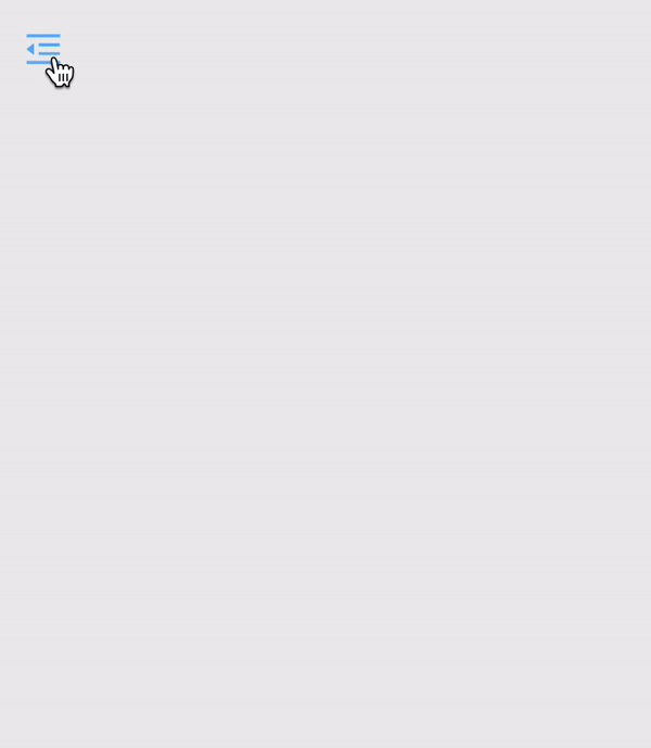
It's relatively simple, with a CSS property and a trigger like className = "is-nav-open" for the HTML tag.
There are several ways to use this method. For example, create a wrapper over the navigation, and then invoke field changes. Since navigation has a constant width of 250px, the width of the wrapper with the margin-left or translateX property should be the same width. If you need to show navigation, add className = "is-nav-open" for wrapper and move wrapper to margin-left / translateX: 0 ;.
Ultimately, the animation source will look like this:
export default class ExampleCss extends Component {
    handleClick() {
        const wrapper = document.getElementById('wrapper');
        wrapper.classList.toggle('is-nav-open')
    }
    render() {
        return (
             this.handleClick()}/>

                        Lorem ipsum dolor sit amet, consectetur adipisicing elit.
                        Beatae ducimus est laudantium libero nam optio repellat
                        sit unde voluptatum?

        );
    }
}
And here are the CSS styles:
.wrapper {
    display: flex;
    width: 100%;
    height: 100%;
    transition: margin .5s;
    margin: 0 0 0 -250px;
}
.wrapper.is-nav-open {
    margin-left: 0;
}
.nav {
    position: relative;
    width: 250px;
    height: 20px;
    padding: 20px;
    border-right: 1px solid #ccc;
}
.nav__icon {
    position: absolute;
    top: 0;
    right: -60px;
    padding: 20px;
    font-size: 20px;
    cursor: pointer;
    transition: color .3s;
}
.nav__icon:hover {
    color: #5eb2ff;
}
I repeat, if the animation is relatively simple, then this method is the main one. Users will appreciate the performance of the browser.
ReactTransitionGroup
The ReactTransitionGroup component was developed by the ReactJS community team. With it, you can easily implement basic CSS animations and transitions.
ReactTransitionGroup is designed to change classes when changing the component life cycle. It has a small size, it needs to be installed in the package for the React application, which will slightly increase the overall assembly size. In addition, you can use CDN.
The ReactTransitionGroup has three elements, these are Transition, CSSTransition and TransitionGroup. To start the animation, you need to wrap the component in them. Style, in turn, needs to be written in CSS classes.
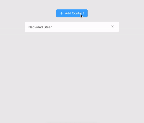
Here is the animation, and then the way to implement it.
The first step is to import the CSSTransitionGroup from react-transition-group. After that, you need to wrap the list and set the transitionName property. Each time you add or remove a child in a CSSTransitionGroup, it gets animated styles.
{items}
When setting the transitionName = "example" property, the classes in the style sheets must begin with the name of the example.
.example-enter {
    opacity: 0.01;
}
.example-enter.example-enter-active {
    opacity: 1;
    transition: opacity 300ms ease-in;
}
.example-leave {
    opacity: 1;
}
.example-leave.example-leave-active {
    opacity: 0.01;
    transition: opacity 300ms ease-in;
Above is an example using ReactTransitionGroup.
You also need logic, and two methods for implementing the example of adding a contact list.
The first handleAdd method - it adds new contacts, gets a random name, which it then puts into the state.items array.
To remove a contact by index in the state.items array, use handleRemove.
import React, { Component, Fragment } from 'react';
import { CSSTransitionGroup } from 'react-transition-group'
import random from 'random-name'
import Button from './button'
import Item from './item'
import './style.css';
export default class ReactTransitionGroup extends Component {
constructor(props) {
super(props);
this.state = { items: ['Natividad Steen']};
this.handleAdd = this.handleAdd.bind(this);
}
handleAdd() {
let newItems = this.state.items;
newItems.push(random());
this.setState({ items: newItems });
}
render () {
const items = this.state.items.map((item, i) => (
- this.handleRemove(i)}
/>
));
return (
React animations
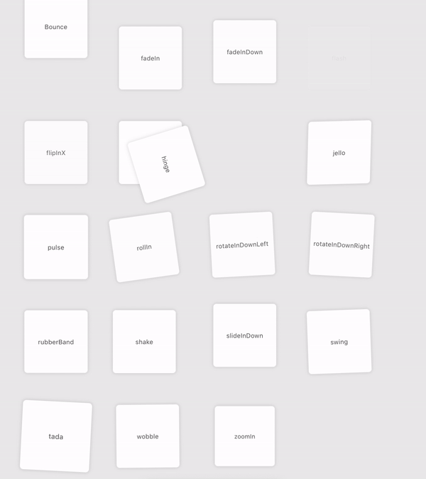
React-animations is a library that is built on animate.css. It’s easy to work with, she has many different animation collections. The library is compatible with any inline-style library that supports the use of objects to define the main frames of an animation, including Radium, Aphrodite or styled-components.
I know what you think:

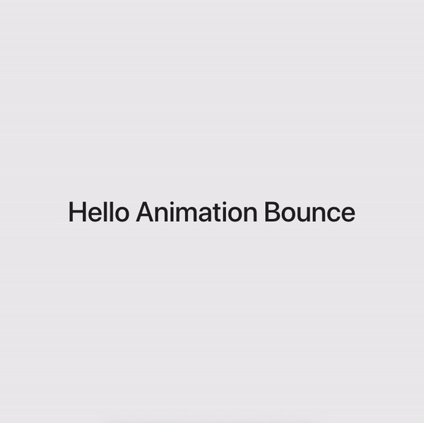
Now let’s check how it works on the example of bouncing animation.
First, import the animation from react-animations.
const Bounce = styled.div`animation: 2s $ {keyframes` $ {bounce} `} infinite`;
Then, after creating the component, we wrap any HTML code or component for animation.
Hello Animation Bounce
Example:
import React, { Component } from 'react';
import styled, { keyframes } from 'styled-components';
import { bounce } from 'react-animations';
import './style.css';
const Bounce = styled.div`animation: 2s ${keyframes`${bounce}`} infinite`;
export default class ReactAnimations extends Component {
render() {
return (
Hello Animation Bounce
Everything works, the animation is very simple. In addition, there is a great solution for using bounce animation when scrolling - react-animate-on-scroll .
React-reveal
The React Reveal framework has basic animations, including fading, reflection, scaling, rotation, and more. It makes it possible to work with all animations using props. So, you can specify additional settings, including position, delay, distance, cascade and others. Other CSS effects can be used, including server-side rendering and high-order components. In general, if you need scroll animation, you should use this framework.
import Fade from 'react-reveal/Fade';
Title
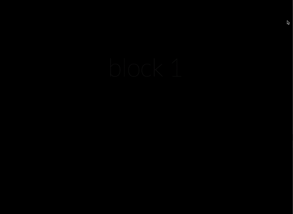
There are five blocks in total, each of them has a full-screen page and a title.
import React, { Component, Fragment } from 'react';
import Fade from 'react-reveal/Fade';
const animateList = [1, 2, 3, 4, 5];
export default class ReactReveal extends Component {
render() {
return (
{animateList.map((item, key) => (
{`block ${item}`}
);
}
}
const styles = {
block: {
display: 'flex',
alignItems: 'center',
justifyContent: 'center',
width: '100%',
height: '100%',
background: '#000',
borderBottom: '1px solid rgba(255,255,255,.2)',
},
title: {
textAlign: 'center',
fontSize: 100,
color: '#fff',
fontFamily: 'Lato, sans-serif',
fontWeight: 100,
},
};Now we introduce the constant animateList. The array includes five elements. After using the map array method, it is possible to render any element in Fade components by inserting elements into the header. Styles that are defined in the styles constant get short CSS styles for both the block and the header. Above are five blocks with Fade animation.
TweenOne and animation in Ant Design
Ant Design is a React UI library that contains a large number of useful and easy to use components. It is suitable if you need to create elegant user interfaces. Developed by Alibaba, which uses the library in many of its projects.
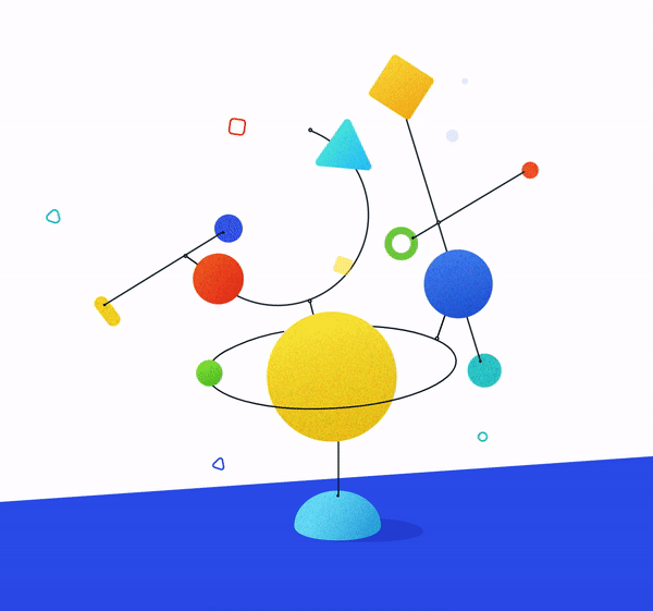
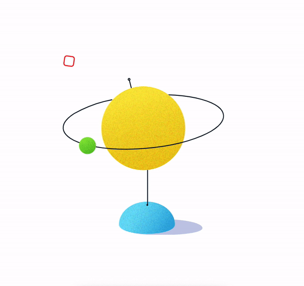
The example has quite a few animated components. Most of them have similar animations, so an example implementation will be simpler than the above. This will include only a ball, a green ball and an additional element, for example, a red square.
The animation uses the TweenOne component, which needs PathPlugin to correctly set the trajectory. All this will work only if you put
PathPlugin in TweenOne.plugins.
TweenOne.plugins.push(PathPlugin);The main animation options are as follows:
- duration - animation time in ms;
- ease - smoothness of animation;
- yoyo - change of movement forward and backward with each repetition;
- repeat - repeat the animation. You need to use -1 for endless animation;
- p - the coordinates of the path for the animation;
- easePath - coordinates of the smooth path for animation.
The last two parameters are very specific, but do not worry about them, everything works as it should.
const duration = 7000;
const ease = 'easeInOutSine';
const p =
  'M123.5,89.5 C148,82.5 239.5,48.5 230,17.5 C220.5,-13.5 127,6 99.5,13.5 C72,21 -9.5,56.5 1.5,84.5 C12.5,112.5 99,96.5 123.5,89.5 Z';
const easePath =
  'M0,100 C7.33333333,89 14.3333333,81.6666667 21,78 C25.3601456,75.6019199 29.8706084,72.9026327 33,70 C37.0478723,66.2454406 39.3980801,62.0758689 42.5,57 C48,46.5 61.5,32.5 70,28 C77.5,23.5 81.5,20 86.5,16 C89.8333333,13.3333333 94.3333333,8 100,0';
const loop = {
  yoyo: true,
  repeat: -1,
  duration,
  ease,
};
Now you can start creating the animation object.
- redSquare contains the loop parameters plus the Y coordinate, duration and delay.
- greenBall contains the path with the parameters of the object x, y - the value of p. In addition, duration, repetition and smoothness are a function of TweenOne.easing.path, which has two parameters.
- path - easePath.
- lengthPixel is a curve that is divided into only 400 sections.
- track - an oval with axes, it has cycle styles and a rotation parameter.
const animate = {
  redSquare: {
    ...loop,
    y: 15,
    duration: 3000,
    delay: 200,
  },
  greenBall: {
    path: { x: p, y: p },
    duration: 5000,
    repeat: -1,
    ease: TweenOne.easing.path(easePath, { lengthPixel: 400 }),
  },
  track: {
    ...loop,
    rotate: 15,
  },
};
You also need to pay attention to the TweenOne component. All components will be imported from rc-tween-one. TweenOne is a basic component with basic proprs and animated props, which are animations. Each TweenOne has its own animation parameters, such as redSquare, track, greenBall.
import React from 'react';
import TweenOne from 'rc-tween-one';
export default function BannerImage() {
    return (

    );
  }
Yes, it looks scary, but the animation using this method is simple.
All you need to do is describe the animation rules and transfer them to the TweenOne component.
To achieve different goals, different approaches are needed. This article examined several solutions that can be used in a large number of projects. Your business is to choose the right one.
Skillbox recommends:
- Two-year practical course "I am a PRO web developer . "
- Online course "C # developer from scratch . "
- Practical annual course "PHP-developer from 0 to PRO" .