Avoiding lying with statistics: the basics of data visualization

I have often heard the opinion that the task of analysts is to show frankly “sad” figures in such a way as if everything is going according to plan. Perhaps this is happening somewhere, but in gamedev the opposite is true. We need to provide the most objective data so that the right decisions are made in the project. And make this data understandable.
This is often more difficult than luring with beautiful graphics.
Therefore, I have compiled several basic principles of visualization that I apply in my work (a list of sources at the end). It is useful if you are writing reports, preparing for a presentation or just want to convey the meaning of some numbers. The main thing: to make a good schedule, you do not need to be a talented artist or masterfully own matplotlib / ggplot2. Go.
Why is plain Excel (and sometimes pencil and paper) enough for a good graph?
This stems from the sole purpose of visualization - to convey your idea. Therefore, right away: there are no “beautiful” or “right” schedules - either they help convey an idea or not. And if not, no matter how beautiful the schedule is, it is not needed.
The process of creating a schedule that will achieve its goal can be divided into 4 steps [1]:

It all starts with an idea. What do you want readers or viewers to understand? Based on this, the type of diagrams is selected, then attention is drawn to important places and everything that interferes with conveying the thought is removed.
Now more about each item.
Idea
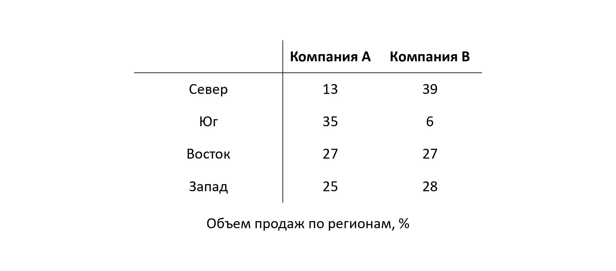
Let's start by formulating the idea and how it affects the graphics. Look at a canonical example: a “Sales by Region” sign with a very simple data set (8 digits, 2 companies) [2].
In this form, it is difficult to understand and no idea follows directly from it:
To show important connections easier and more clearly, we need a diagram. And depending on the type of chart chosen, a completely different thought will come to the fore.
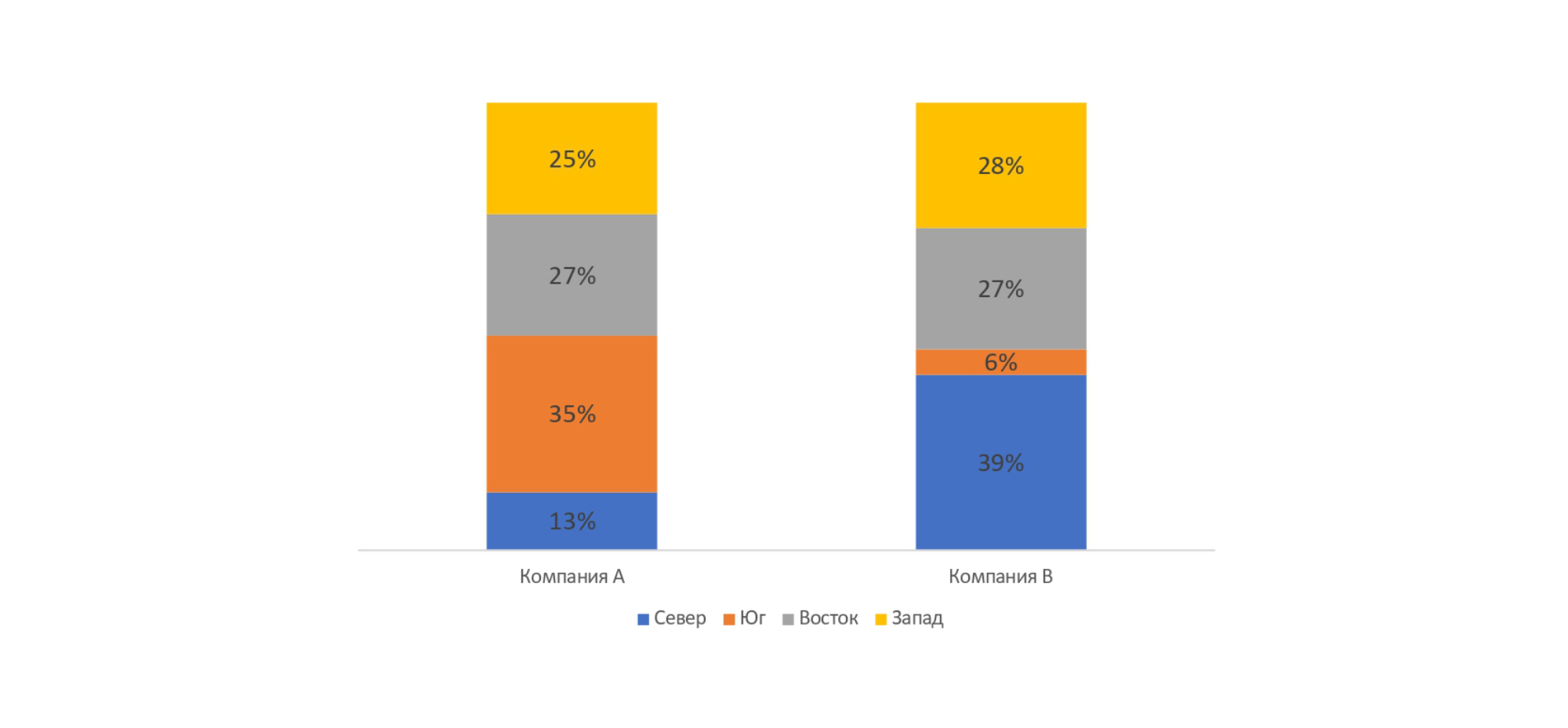
For example, the only thing we can consider at a first glance at the chart above is that the sales structure of the two companies is different. To read any other information, you have to understand deeper, and this does not help to convey the idea.
Another graph, the same data:
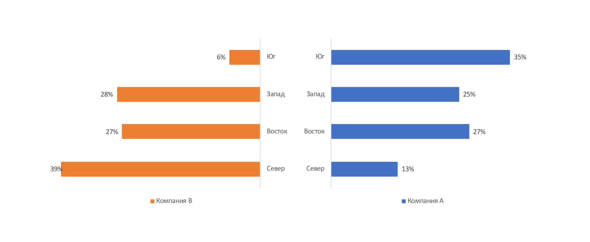
Here, in addition to the difference in structure, we already show how companies share sales shares in different regions. If you read it from left to right (as most people will do), the thought will be as follows: company B (left) has the smallest share of sales in the south, and company A (right) has the largest share. And vice versa in the north.
Another graph:
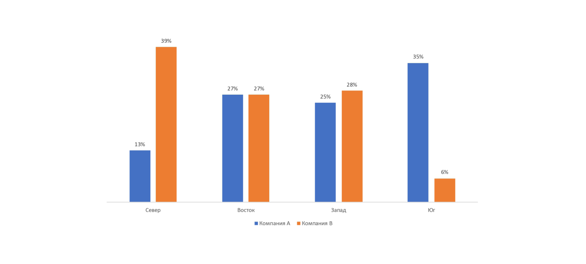
If we use a histogram of this type, then attention will primarily be drawn to comparing the companies with each other: in terms of revenue in the north, company B is ahead of company A, in the east and west they compete, and in the south, company B is behind Companies A. The
same data, only 8 digits, but depending on the filing, they express different ideas.
Therefore - first we formulate a thought, and then choose the appropriate type of diagram.
Chart types
Let's go through the most common types of diagrams (which you can find in Excel, any BI or other analytical tools) and see what kind of comparisons (and which ideas) are best used for them [2].
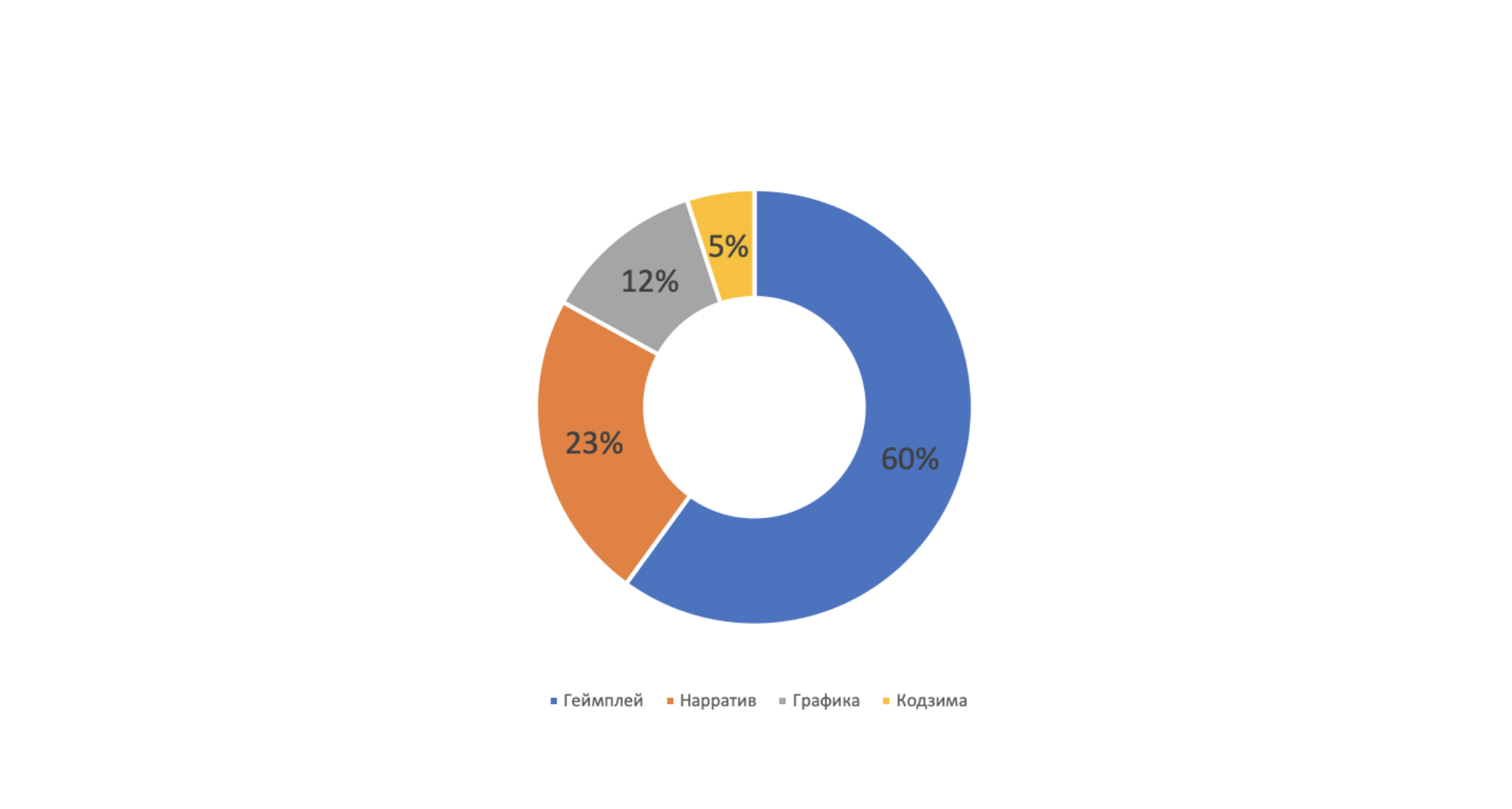
Pie Chart
Let's start with the “favorite” pie chart and variations (donut charts). In the classical interpretation, its main goal is to compare shares when showing a static structure.
The components of a good game
But there is also an opinion that the main purpose of this diagram is advertising and beautiful pictures.
In many ways, it’s Pie Charts that have been letting business consultants sell 30-page presentations for several million years ago. Not? Here are the first pictures at the request of "consulting", "analytics", "BI":
Pie Charts, they are everywhere
Almost no advertising image can do without pie charts (or their varieties). This is not so much a tool as a symbol.
And for real data visualization, it is not suitable.
Firstly, the scope of this diagram is very narrow. A static structure needs to be shown not so often - a small number of cases. And secondly, many people do not read well the shares in pie charts, especially if someone makes them voluminous (craziness). And thirdly, the same type of comparison can be expressed in other diagrams and it will only get better.
Therefore - it is better to forget about pie charts. Well, if you are doing advertising or want to add solidity to your presentation, then the option is not so bad.
Bar chart (horizontal)
She is a bar chart and serves for positional comparison. It clearly shows which of the alternatives is better, who takes which place and how they relate in rank.
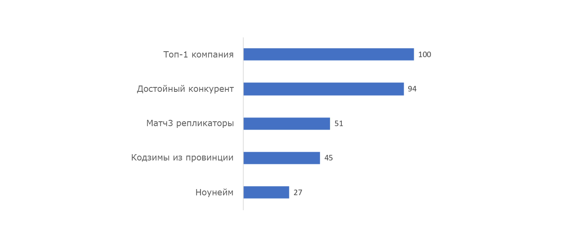
Positional Comparison A
bar chart is ideal for ratings. And which is very convenient - long names easily fit into the legend. In other types of charts, this may interfere.
Line Chart
The next type is classic. Line Chart in Russian is often called simply a "chart".
It is used for a temporary comparison, when you need to display how the indicator changed over time, whether the dynamics were different for different indicators and so on.

Comparison of the dynamics of indicators
What to look for when creating a Line Chart:
- The adequacy of the time period. Otherwise, the chart will turn into an unreadable mess.
- The number of lines. More than five or seven lines - a taboo, no one will understand them.
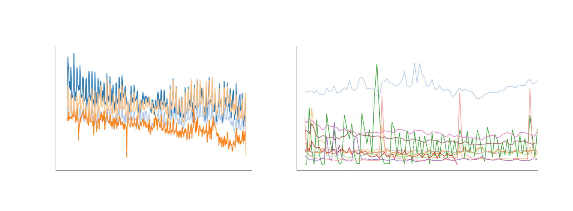
On the left is too long a time period, on the right is a “noodle” of lines - Scale. Be careful, Line Chart is loved by those who are going to trick with the help of data [3].

Classics of lies - games with scale.
For example, if you show the schedule on the left at the presentation of the board of directors and call it retention, the project will probably be closed. In fact, everything is not so bad: on the right is the same chart, but with a reasonable scale, it becomes clear that the “drop” of the indicator is simply a fluctuation. In the opposite direction, this also works, by increasing the scale, you can hide the obvious deterioration of the indicator.
In summary, Line Chart is a very useful chart type. Especially in game development, where it is necessary to constantly monitor indicators, show changes in dynamics and monitor the development of projects.
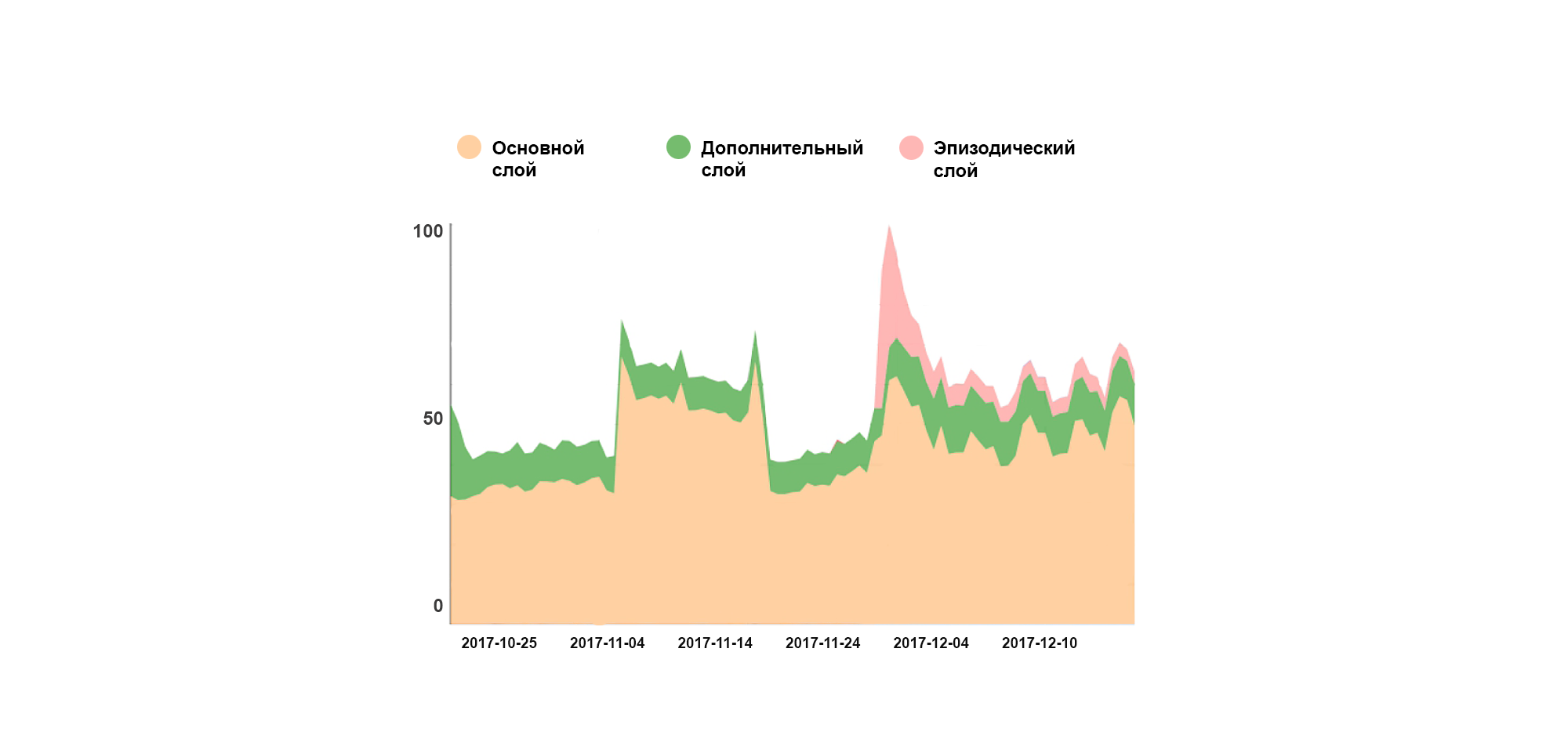
Area Chart
The next type, Area Chart, is used to display the structure in dynamics. What is there to pay attention to? Again - if we do an abundance of layers, then the graph becomes unreadable. Remove extra layers and leave only the most important (how to do this, we’ll talk a little further):
Histogram
Histograms are a “universal hammer”. This type of chart has many variations that can be used in a variety of situations:
- temporary comparison;
- frequency distribution;
- comparison of shares (hello to pie charts);
- contribution to the overall dynamics;
- comparison of alternatives and more.
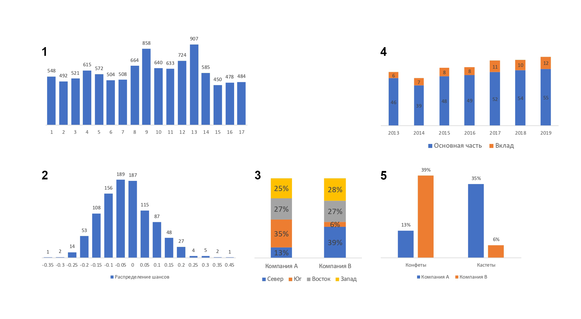
For this versatility, the histogram pays a limitation - only a small number of periods or comparisons can be displayed on it. Otherwise, the schedule becomes unreadable and ceases to fulfill its task.
Bottom line: bar charts, Area Chart and Line Chart can cover 90% of data visualization needs. It is enough to study these three tools and follow the same 4 steps to make excellent diagrams that will help convey your thoughts to the audience.
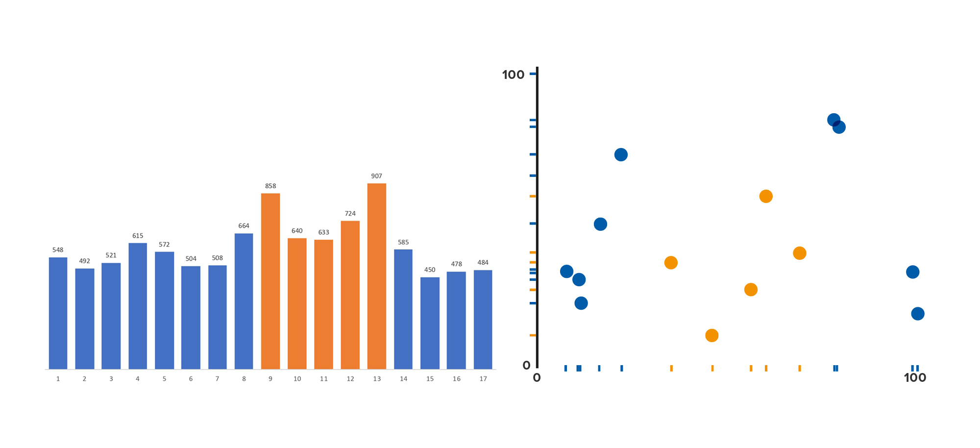
Scatter chart
For dessert, consider scatter charts or a “map”. The advantage of this type is that it contains a lot of indicators. It has two axes, point size, color, and symbol - all of which can potentially display an additional dimension. But the more measurements are crammed in, the more difficult it will be to read. In printed documents, when people can sit and figure it out, this is permissible, but when speaking, it is better to use no more than 2-3 measurements.

Available options: point position, color, size and symbol
Emphasis and attention management
The formulated idea and the right type of chart is half the success. But besides this, we want the reader or viewer to immediately look at the right place. How to emphasize?
Arrow
The simplest way that is often neglected is the arrow. Cheap and cheerful, but fully fulfills its task. Almost any screenshot tool can set an arrow. With it you can always draw the attention of the viewer to the desired graph element.

Frame
Another option from the "cheap" - highlighting the frame. It is used when they talk about a certain time period and want to highlight the dynamics of the indicator.
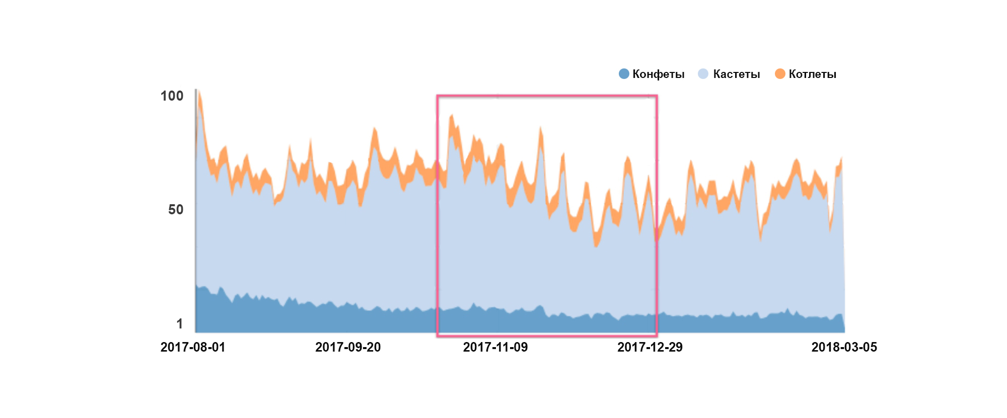
A good example is the graph from the beginning of the article when I talked about games with scale - you can talk about both small changes and the big picture.

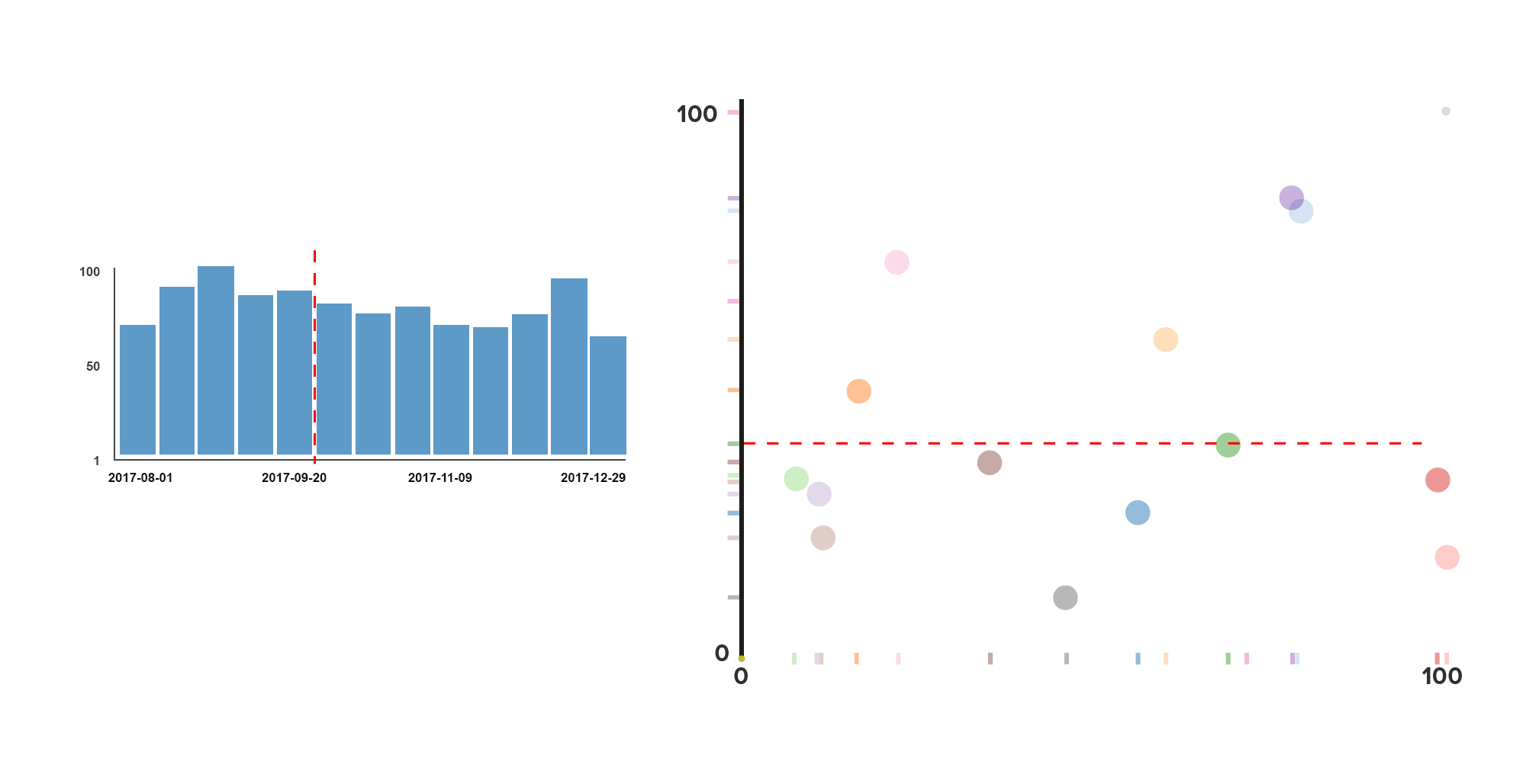
Delimiters
Essentially, separator lines are a variation on the border. They are useful when we want to highlight “before / after” periods when showing dynamics. Or, for example, a “corridor” of interesting values in a scatter plot.
Color
A little more effort requires color highlighting. But it looks "tidier."
Dynamics of indicators in a specific period
Another variation in color highlighting is when we highlight the parts of the chart that interest us with a brighter shade:

Remove excess
The last step is to remove the excess elements. Everything that will distract and interfere with conveying the main idea.
Back to the Area Chart example. In this type we remove unnecessary layers. If you want to highlight that income shows an increase in only one category, then all other layers can be hidden.
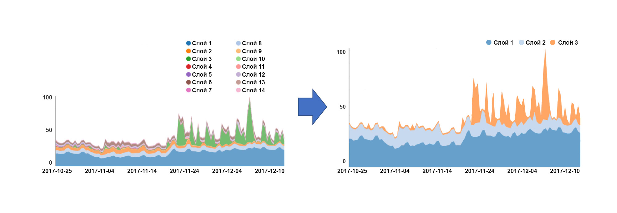
Collapse Layers
Many analytics tools by default make graphs with lines and a scale. Instead of forcing the viewer to correlate the height of the columns and the scale, we can specify the numbers on each column separately and remove the lines that are no longer needed. Will look tidier.

Always reduce units and round to significant digits. If we are talking about millions, then hundreds and dozens are definitely not needed. Firstly, it will be less distracting to the viewer, and secondly, it will be easier to fit the numbers on the chart.
And finally, if suddenly the resulting schedule still does not help you get the message across, then remove it altogether. Why overload a presentation or report with useless ballast?
Sources
So far, it has been possible to briefly walk through the most basic principles, but the topic of data visualization is much broader. If she is interested, then I recommend that you familiarize yourself with the sources without which this article would not exist:
[1] Alexander Bogachev, “Charts that convince everyone . ” The book is still in process, the chapters are gradually laid out by the author on the site, but what is there is already very useful.
[2] Gene Zhelyazny, "Speak in the language of diagrams . " The classic of data visualization, who wrote this book when the charts were still drawn by hand and you had to immediately think how to make it right.
[3] Darrell Huff, "How to Lie Using Statistics . " No less classic work about data manipulation.