 July 11, 2019 at 14:00
The state of css
In the annual survey, The State of JavaScript , developers talk about what they use here and now. The questions there are familiar and familiar to the front-end community. In 2019, the poll “ The state of CSS ” appeared, which introduced developers into a stupor. It turns out that many technologies are not familiar to developers, although most of them are already actively used. Perhaps the developers use the usual tools and technologies, and do not seek to apply something new? Perhaps there are simply no tasks for new technologies? Why use CSS Grid, CSS Multi columns, where it’s easier to build everything on Flexbox? Perhaps it’s all about the old people, and the jones don’t even know about Flexbox and Float and do not participate in the polls?

Sergey Popov ( popovsergey), the leader of League A, the speaker and organizer of the conferences asked these questions, conducted his mini-survey and even received results from the organizers of The State of CSS. Sergey processed, structured, and got all the information from the front-end community: who knows what and uses, where typesetters learn and how much they earn, which technologies are relevant, and which ones need to be recycled, and what to study in order to use the full power of CSS. The transcript of the report is one of the versions of the report on the current state of CSS, together with the original report “ The state of CSS ” will tell you where to move and what technologies to apply.
Caution, under the cut a lot of diagrams and pictures, really a lot, but they are all about the case. In good quality, they are here .
The "The state of JavaScript" poll looks like this.
You can open and see the results for the past year - what is used, what is popular, what is not, and what only seems unpopular.
The new poll “The state of CSS” contains basic, basic things, but I saw a lot of questions from those who went through it:
- What is it? And what's that? And I don’t know about that.
It turned out that the basic concepts in CSS are perplexing.
I wanted to collect information about what is surprising and talk about what CSS is today and in what state it is. We will get to know him again, so that the 2020 survey will cause less surprise.
“The state of CSS” was launched in the winter. The survey interested me, but I did not have the opportunity to collect all the information from global access. Therefore, in the wake of hype, I discovered my alternative through social networks.
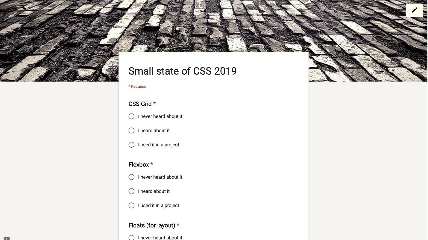
She almost completely copied The State of CSS. 110 respondents answered and got this result.
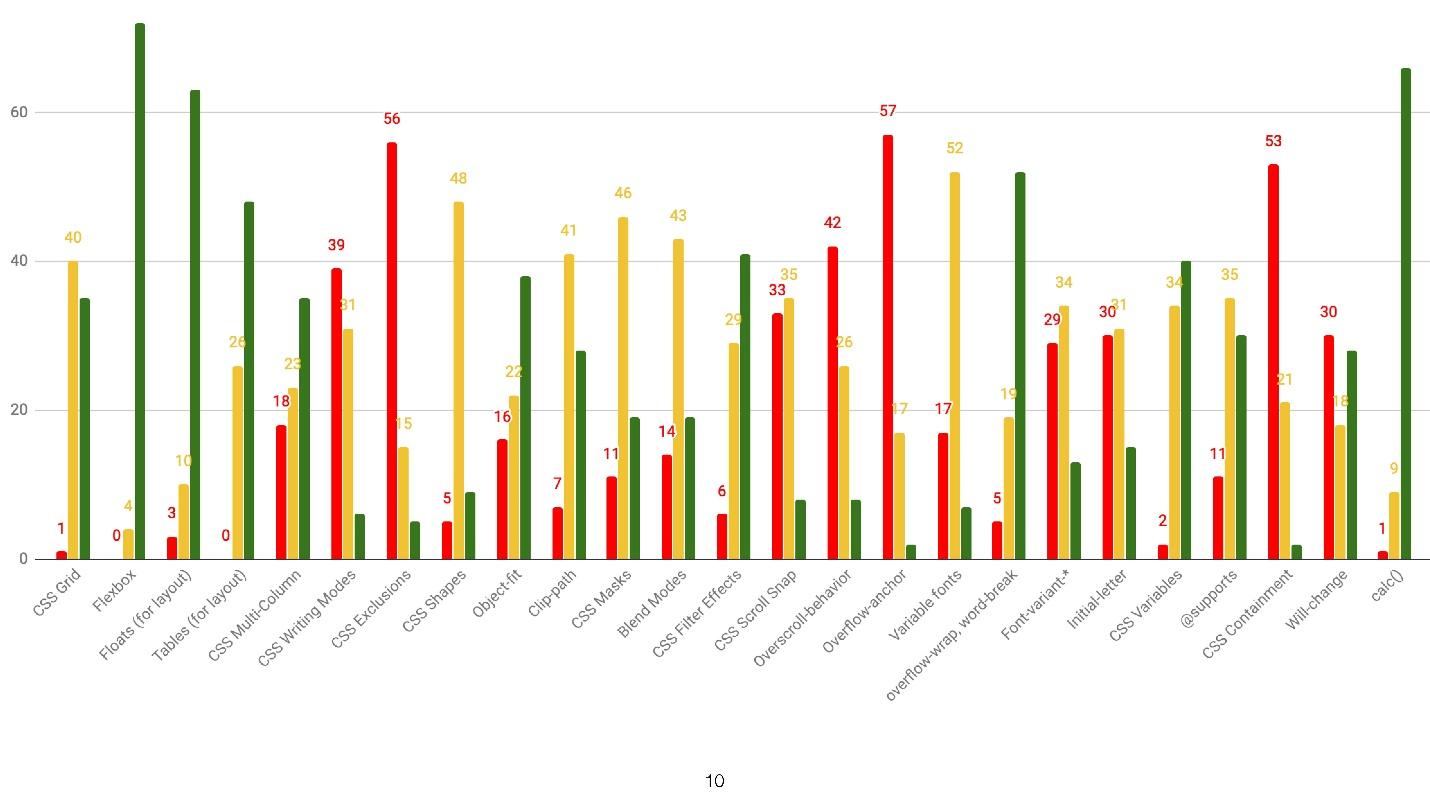
This distribution by features: green - I use, red - I do not know, yellow - I know, but I do not use. On May 23, I wrote a query to the team that launched the original “The state of CSS” and asked for the results. Fortunately, they answered me and sent me what I wanted.
I included this data. The volume of work was large, since the results are not parsed YAML files. A couple of sleepless nights - and the report is ready, which is divided into several sections.
Features are divided into a large number of subsections. I chose the most important ones that we use every day.
The CSS state is noticeable even in “The state of CSS” questions. The survey asks about Flexbox, CSS Grid, CSS Multi columns, writing modes and exceptions. All! Nothing more. No questions about Float and meshing.
Where is the float? Float is used for its intended purpose - to wrap text with pictures inside. The technology was not originally created for meshing. This coders adapted Float for themselves.

Where is the inline-block?It seems to me that inline-block was conceived as an alternative to Float, but it turned out what happened. It is good for solving small problems. Although there is Flexbox, and I do not understand why inline-block is needed. I don’t remember when I last wrote it, so he went to the same place as Float.
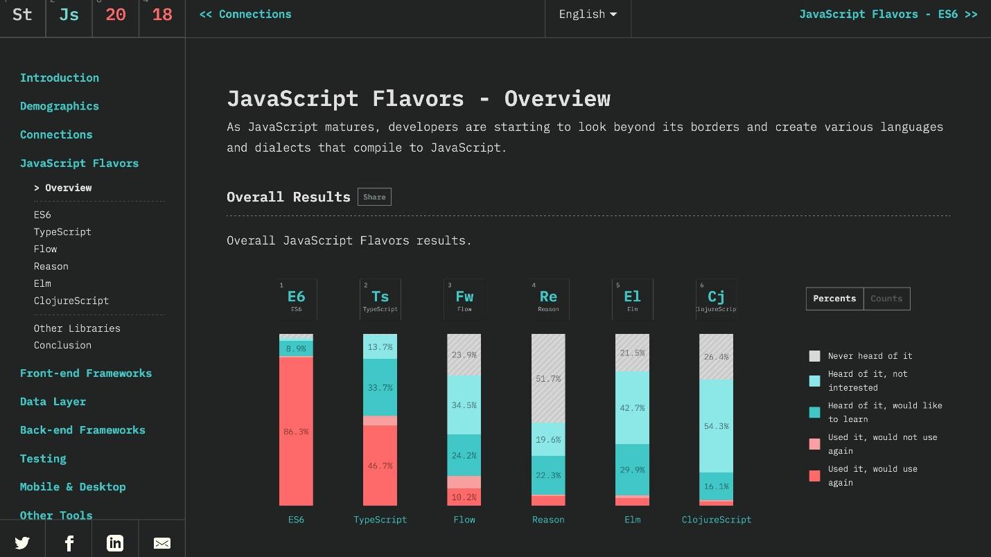
So, let's look at the actual statistics of The State of CSS, in which 11,000 developers were polled.
Used by 94%, heard 4% and not heard by 1% of developers.
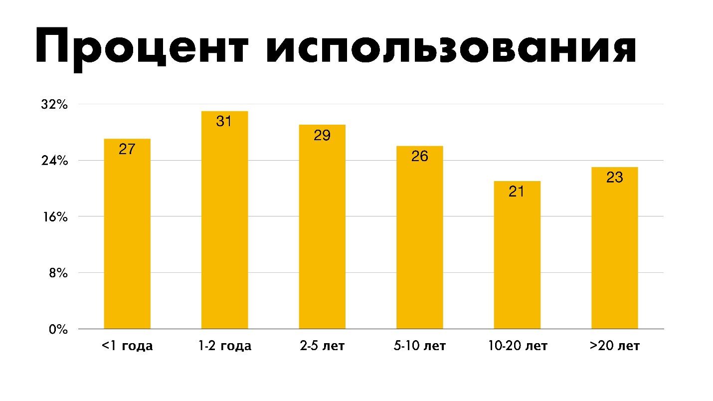
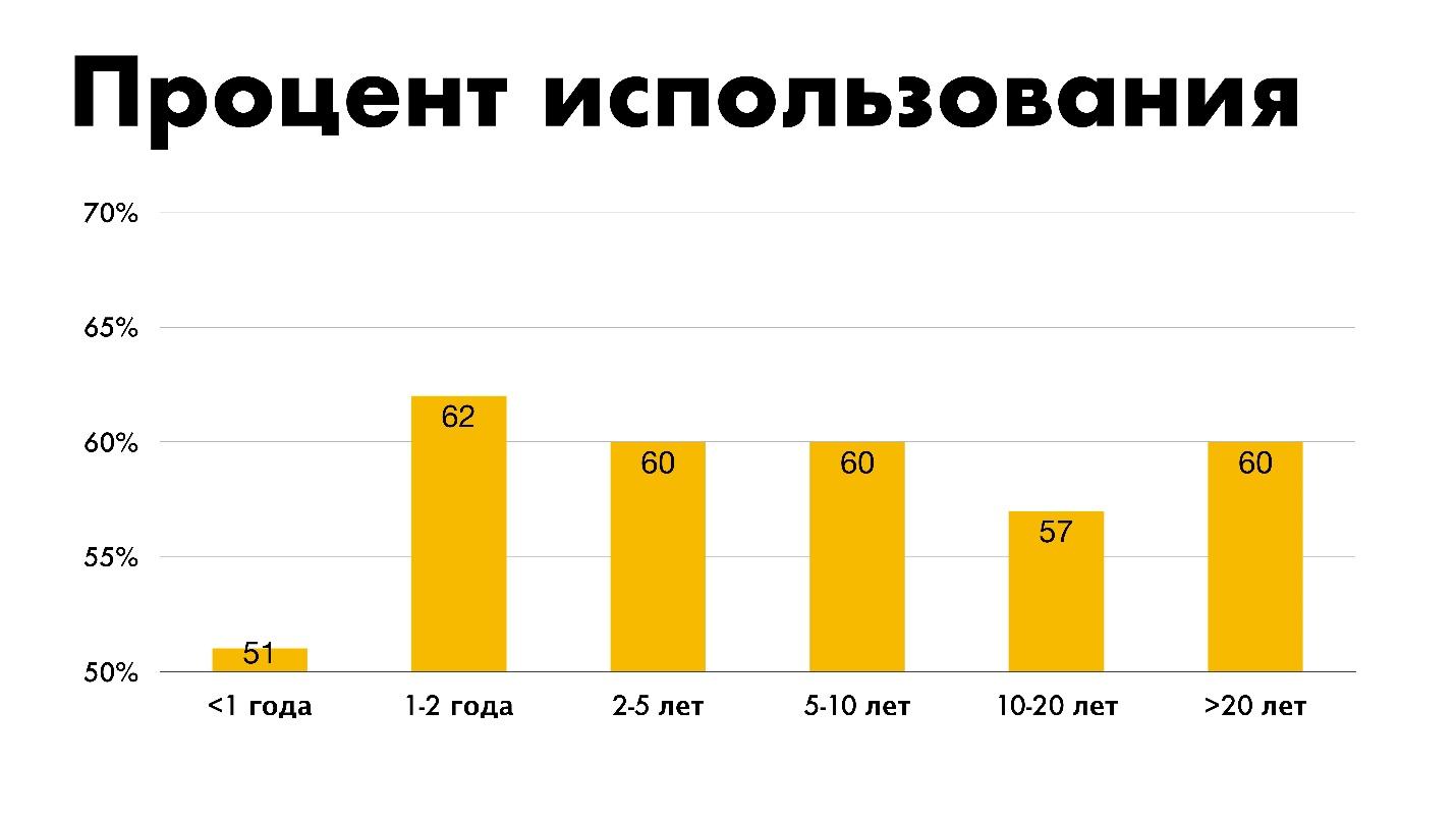
The statistics of during what period of experience people use this or that technology is funny. People with less than a year of experience use Flexbox less than everyone else. Perhaps in the wake of hype they are doing everything on the Grid.

The support is great. I will not focus on Internet Explorer. We all know how to layout for it, especially to deal with Flexbox.
With Grid, everything is interesting. Only 2% of people do not know about it, but 55% use it. Almost half of the respondents - 43% - still do not use the Grid for some reason.

The distribution shows that between people with different experiences there is no difference. Experience in this case does not affect the use of technology.
Now Grid can and should be used for global layout of the site, changing layouts with one property, for complex grids and components. For the task to create something integral: the whole grid or complex, to make up a small element with a very fine distribution grid, use the Grid.
Grid has great support. There is support for IE. In extreme cases, you can use polyphiles - but better not.
Use 28%. With multi-speakers it’s interesting - 41% didn’t hear about them as technology, which is strange. The technology is as simple as possible and allows you to build text columns without additional wrappers and crutches. Just set the number of columns.
The text is arranged in columns and automatically wraps on the next line.

There are many flexible settings. For example, to set the size of the column.
Then the text will not line up according to the specified number of columns, but there will be as many of them as it fits to the end of the screen. When the screen is reduced, everything is automatically rebuilt.
Use and learn technology. For example, for two columns of text, instead of wrapping them in a div, then use Flexbox or Grid.
You can draw lines.
You can break columns with headers:

Everything is done by one property. Now the technology is being actively introduced, because it is engaged in by Rachel Andrew. At one time, she began to popularize it, since then multicolumns have been used.
The graph shows that the more experience, the more actively multicolumns are used.

Perhaps this is logical. Is it strange if experienced developers use less different technologies? Beginners are clearly not up to multicolumns - there are Flexbox, Grid, React. But this does not mean that juniors cannot use multicolumns now and change statistics.
The speakers have good support, but not without jambs. In one browser, fine, in the other not. But almost 98%, subject to restrictions, is good support. More than Grid.
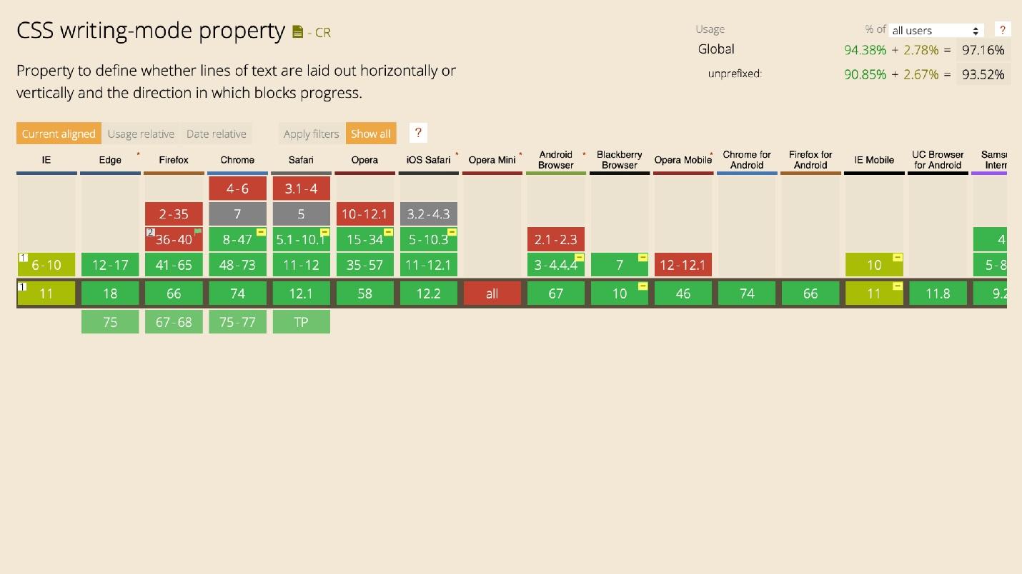
CSS Writing Modes . Almost no one heard about this technology - 73% of respondents, and only 17% use it.
There are 4 writing systems. They are characterized by the direction of writing and reading characters vertically and horizontally. This is a complex topic, so just show the pictures.
Latin based is a standard system: read from left to right and from top to bottom.
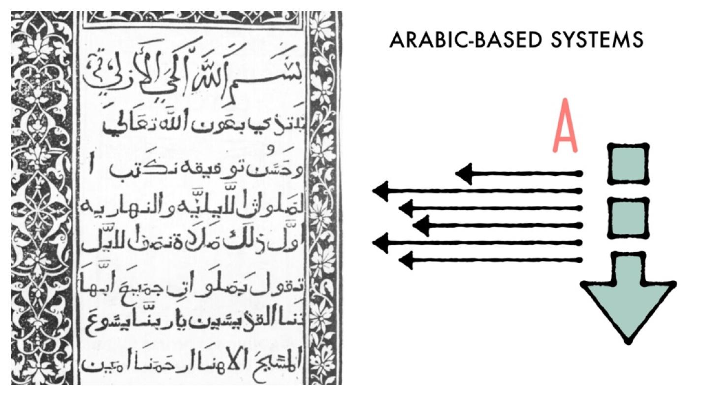
Arabic based - from right to left and from top to bottom.
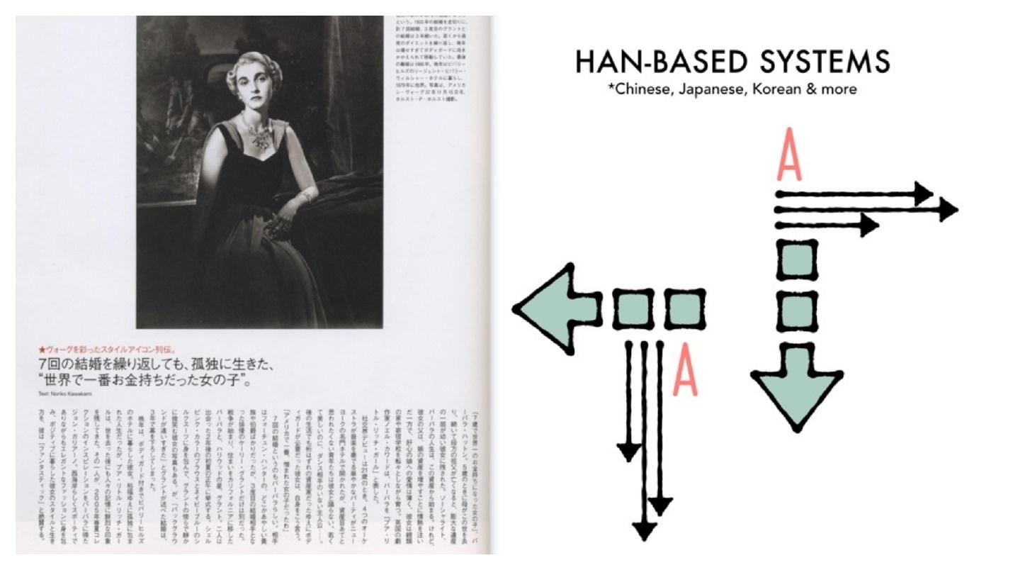
Han based is an Asian group, it can be different.
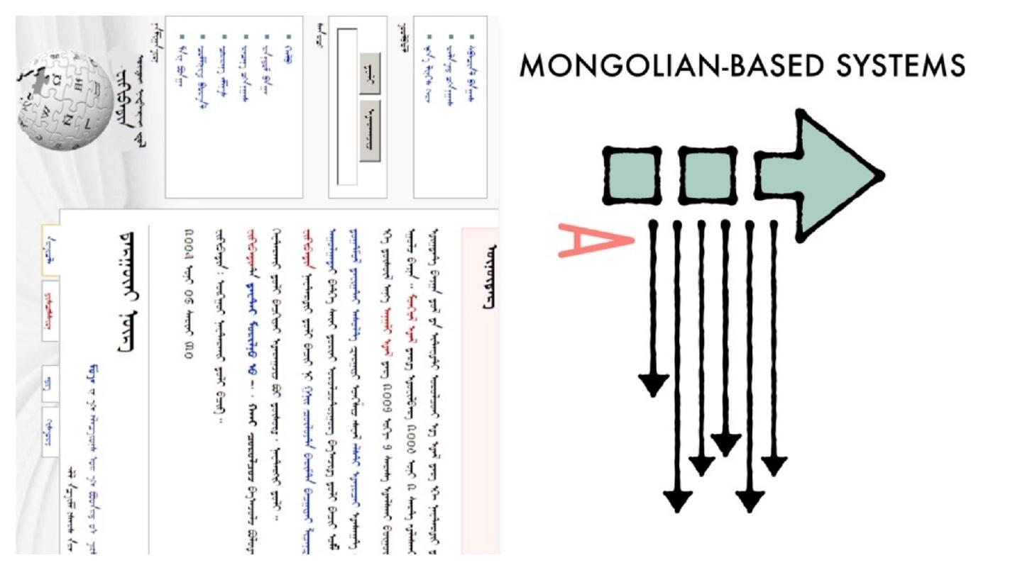
Mongolian based - Mongolian system. It’s hard to read because it’s unusual. Fortunately, it is not often necessary to deal with it.
It is not enough just to translate the interface into another language - to make a YAML or JSON file that will store information in two languages. Most likely, you have to turn everything over. But I'm not talking about that.
With writing mode, it's easy to build interfaces that you would implement in a different way. For example, for a vertical inscription, you can use transform, rotate, insert a picture along with three others, and with the help of direction this is performed by one property.

More great examples of sending a letter.

Cool interfaces!

They don’t set such tasks every day, but even the simplest ones make up easier than with transform or rotate. Not that transform is complicated, but with CSS Writing Modes is more correct.
Jane Simmons has a huge lab. In it, she publishes everything that she does, and she does something non-stop. Onlinea bunch of examples with routing modes, combining in standard interfaces, application where you did not think to use them at all. Look - you will find many discoveries.
The distribution shows that the more experience, the more likely the use of the distribution mode. However, the percentage of those who use is very small. Not because the technology is bad or the developer does not want to use - there are few cases. This is not a daily task. However, apply.
With support, everything is fine.
CSS Exclusions. Almost no one heard about this technology - 79%, and only 7% use it. I included CSS Exclusions in a fan review. This is a special technology for IE. Edge dragged her to him, apparently by inheritance. The new Edge is likely to be.

This is a cool technology, but for some reason it has not received distribution, except for IE. This is an easy way to adjust the flow around an element that is outside the stream. Put the top layer on top of the content using positioning absolute, relative or fixed.
For example, take the text and the cube. If you apply the property
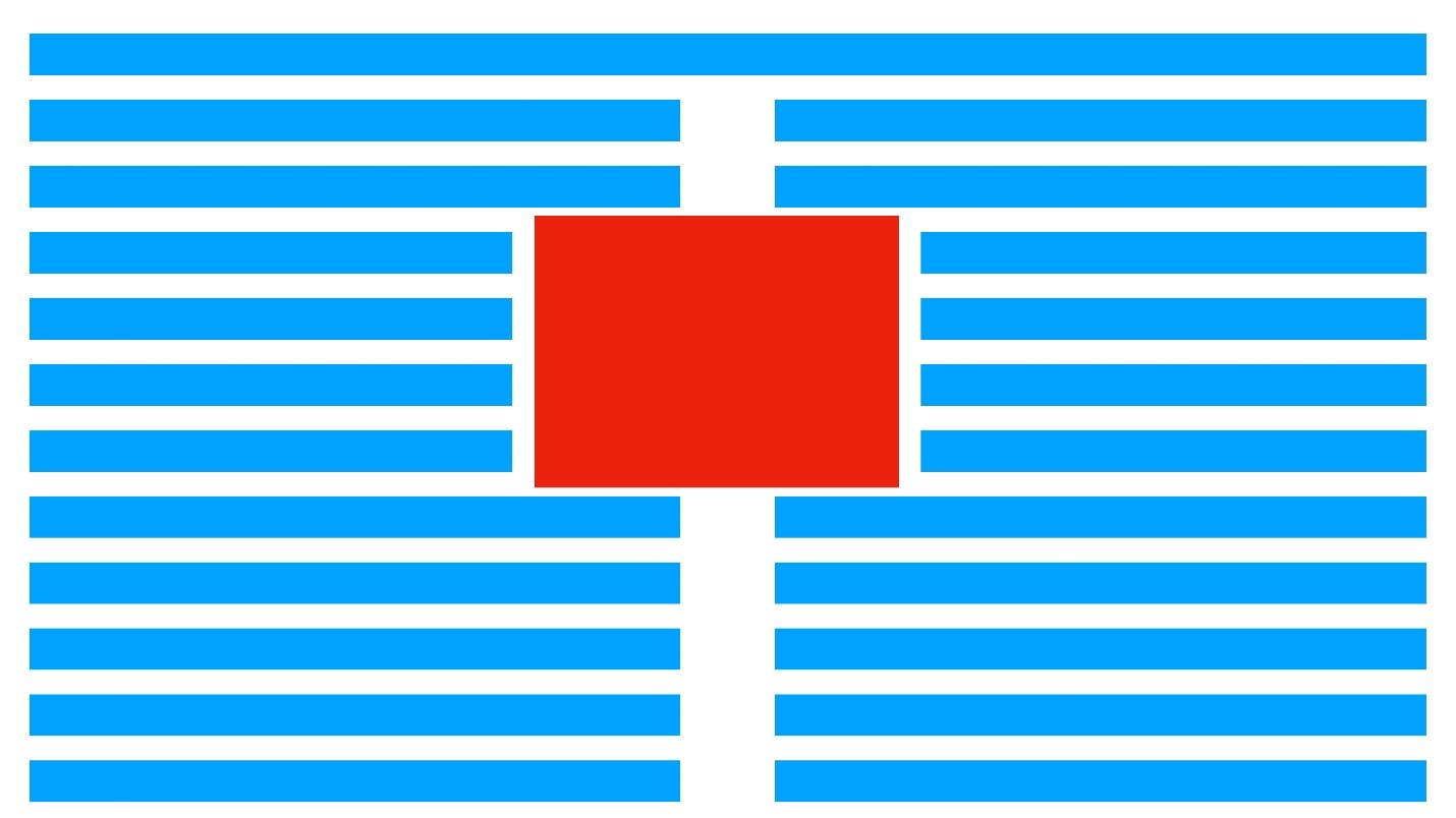
This is not just an element that is inserted into the content - it is an element that is positioned on top with absolute positioning. This works in IE.

I removed Exclusions simply because you most likely will not use them. Although it is possible if you are installing under IE.
The diagram shows how roughly these technologies should be used.
Most grids are built using it. Grid is advancing, but not intended to destroy Flexbox. His task is to build a global layout and work with him. Multicolumns and writing modes are used where you need it.
The fewer cases, the lower the percentage of use: multicolumn for text, writing modes for complex places, where in the interface it is easier to do than using transform. Of course, there is no diagonal text mode.
CSS Transitions - smoothly changing properties. Use 95%, heard 4% and did not hear 1%. CSS Transforms - rotations, up-and-down shifts, spreads, 3D-transformation - the same percentage. CSS Animations - use 90%, and 9% heard. A little more complicated - keyframes, interactive - use less. CSS Will Change is
applied to all this . With this technology is already more difficult. It seems that everyone knows the animations, but no one heard about it - 58%.
This is a dangerous technology, but in the light of the current state of CSS, you need to know and use it. CSS Will Change allows you to prepare your browser before changing the state of an element. The browser will be able to prepare for this optimization, for example, redrawing.
Imagine that the browser is preparing for something. You can use CSS Will Change to indicate that the scroll will be changed.
This allows you to add specific optimization to your site. But technology has problems.
Use the property sparingly and not everywhere! If there is a Transition on each element near CSS Will Change, this does not mean that you can go through each element and write CSS Will Change and the name of the element that will change. This is even worse than simple optimization.
Do not bet on each item . Try to put CSS Will Change before changing the element and remove after. Ideally, prepare a browser script before complex animation. Before starting the animation, add CSS Will Change, after the animation - remove. This is probably the best use of technology possible. You can simply attach it with an asterisk: CSS Will Change all - and that’s all !, but it’s better not to.
The schedule is funny. I imagine it this way: people who have 5 to 10 years of experience say: “Yes, CSS Will Change here, under the asterisk!” And then a little later it subsides and the technology is used more moderately.
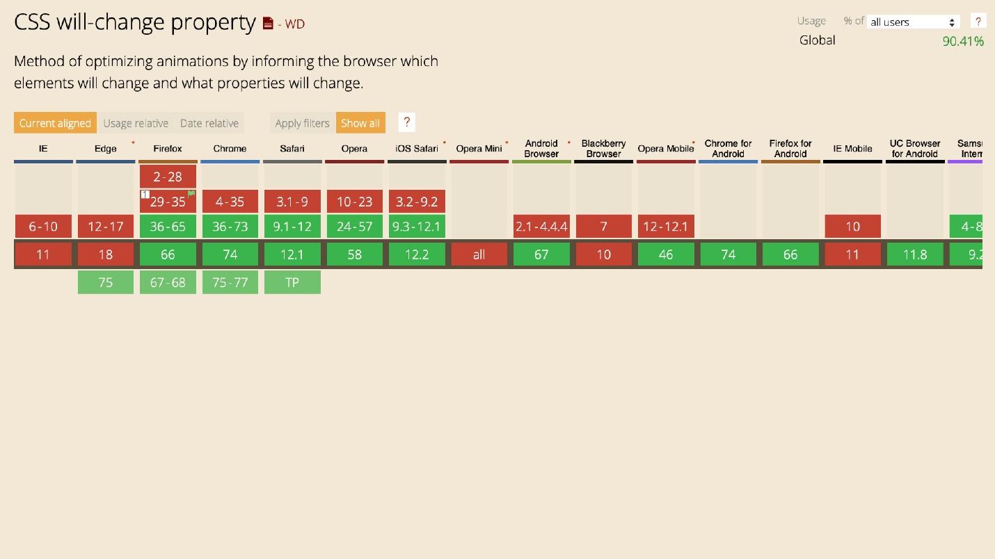
IE, Blackberry, Opera Mini do not support CSS Will Change, but for everything else it can be used now.
I will not talk about font-face and its support - everyone knows this.
Variable fonts have a problem. Almost half of the developers - 44% - have heard of them, but only 26% use it. Fonts are still in draft draft status, but they have good support.

Connect one font, put bold and italics. Everything is done automatically by one property. This is good for both optimization and use. You do not need to drag along with Google Fonts, a bunch of Latin, Arabic and other styles.
The technology is designed to replace familiar fonts. Perhaps in your assembly there was a file of one of the preprocessors with a bunch of font-faces that could be changed. Surely you added cycles and created everything with a cycle.
The percentage of use is flat. The technology is fresh, so even beginners know about variable fonts and try to use it.
To use variable fonts, the designer must know about them. If the designer used a custom font in 25 styles, you simply can not repeat all this with a variable font. The designer will see your pixel perfect, put a ruler on the head, and force to redo.
Strange, but 29% of people use the Initial letter, and 35% heard about it. In my sample, the percentages are different: they use 20%, they heard 41%, they did not hear 39%.
When I voiced my numbers, they did not believe me that 20% of people use technology. Although it is simple and allows you to set the initial letter with two properties.
Here size is the number of lines the character occupies, and position is the line that starts.
Another variant.
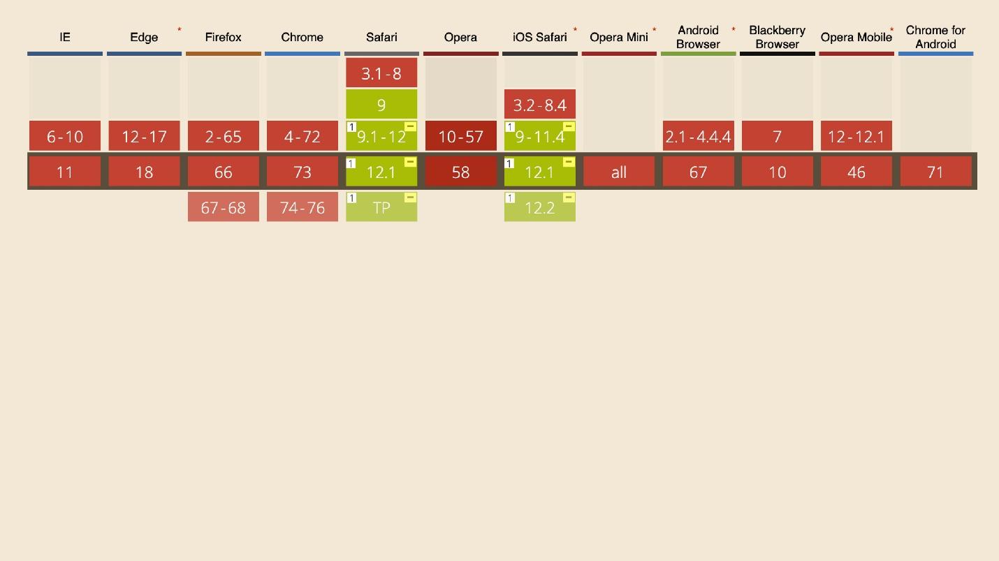
Such tasks are rare, but it is not position or budding either. One problem with this technology is that I do not know any of the 20% of people who use it. It is supported only in Safari with slight restrictions in the form of a prefix, even in mobile versions. This is a special killer feature for Safari.
Then comes all the beauty about which I once gave reports and which no one applies.
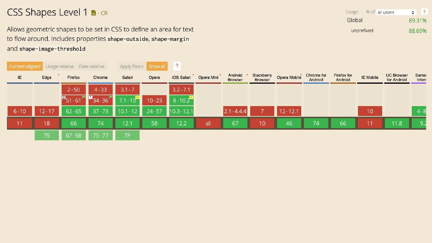
CSS Shapes use very little - only 22%, although the technology has good support.
In general, all the technologies in this “beauty” section are about the same. With the help of forms, you can create cool things.
I once said that the web lacks journalism. At one time, we lowered the bar level of interfaces. They all became the same, standard layouts appeared, and Bootstrap, which creates layouts with one button. There is no more magic.
Surprisingly, 37% have not heard about Object fit. However, almost everyone who heard it is using it, which is 42%. The technology has good support.
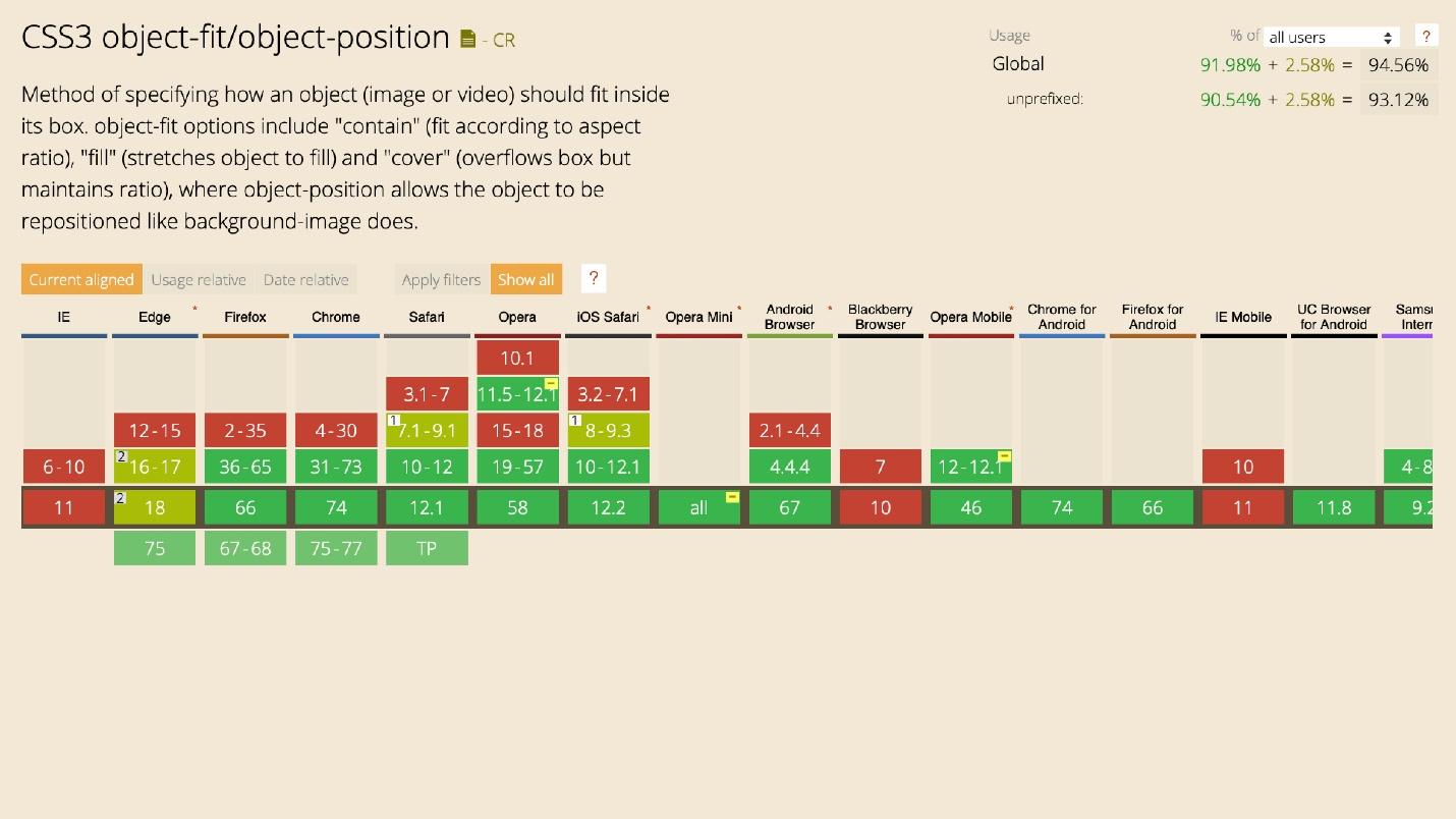
Create an image, set its object-fit property, and the picture behaves inside as if it had a background property.
Used by 39%, and heard 40%. Clip path has a bunch of limitations.
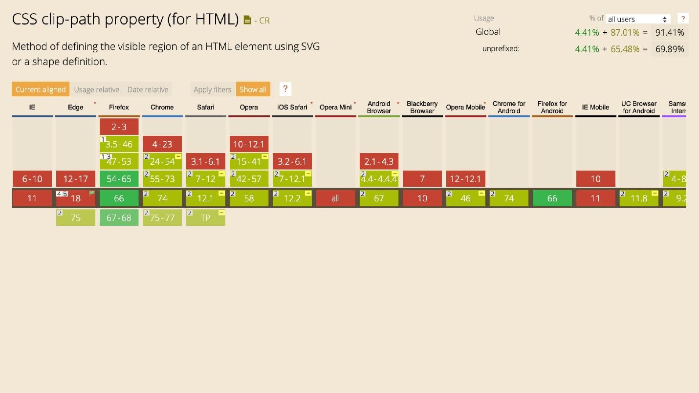
Technology allows you to add beauty. It indicates which part of the image will be visible.

There are two ways to display a picture of a certain shape on a site: cut the picture in the editor or paste a figure on top of the site on the picture. Then any picture will take the form of a figure. So does the clip path. It is more comfortable.
Use 26%, but not heard 28%. Masks are similar to Clip path. Almost the same property.
I want to focus on two details.
Only 37% of people know about Object fit , although this is the most supported technology listed. It may come in handy most often. For example, you want to embed a picture in a rectangle. Layout designer uses style, background image, background cover - horror. Why is solving simple problems difficult? There is no need - with Object fit everything is beautiful and simple. It is a pity that this is the most unknown technology presented, although it may be needed every day.
Perhaps designers do not pose complex tasks . You cannot use all this stuff if there are three columns in the interface layout.
For example, to make a triangular picture, the image in the editor is inserted into the triangle. And so every time, again and again. Although the problem is solved by the same Shape.
Yes, in IE technologies will fall off, but by the principle of progressive improvement, they will work somewhere. If IE does not support forms, why not set the images square for it.
Scroll snap controls the scroll behavior. Only 12% use it, and 48% have heard it.
This is an interesting technology. For example, there is horizontal scrolling. When we scroll through the content, it stops at the place we scroll to. Using the Scroll snap, the page will automatically scroll to the border of the element on which it stopped, no matter how tall it is.
Horizontal center alignment also works.
You twist the horizontal scroll, and the element always remains in the center, no matter what size it is. This is a great example that you can avoid using JavaScript for simple tasks.
The technology has good support to think about using. It’s not worth adding everywhere, but it will work somewhere.
Overscroll behavior. This is a cool technology that only 21% of respondents know about. Use even less - 20%.
If you scroll inside the modal window, everything that is in the background should be static. Sometimes the modal window is loaded to the bottom, there is an interception and the scroll goes out.
When using Overscroll Behavior this will not happen.
This applies not only to modal windows, but also to scrolling inside interfaces.
Overflow anchor is another property that prevents scrolling until the DOM tree is fully loaded and rendered. Imagine a situation: you have uploaded a site that looks like this.

There is a picture in the pink block, but it did not load. JavaScript loaded and the anchor worked to a specific element. When the picture is loaded, the element will fall down, but at the same time the scroll will remain in the same place. This is standard behavior.
The anchor property allows you to be fixed on the element. The page does not twitch if something is loaded from above while viewing.
Anchor is great for mobile devices. When you go to a news site, leaf through, read an article, and from above the advertisement is loaded, the text jumps - do you think what is happening?
It can be applied to body and other elements.
CSS Variables. Use 60%, heard 35%. Great support besides any dinosaurs.
The percentage of use is equal, but beginners do not favor - they already have enough problems.
Supports . Use 37%, heard 36% and not heard 27%. There is only one problem with supports - it is not supported in IE. Where he is needed the most, he is not.
CSS Supports helps you make great fallbacks with CSS Grid on Flexbox. I only use CSS Grid and use it.
Again, the older the developer, the more he uses the technology because he understands its coolness and importance.

Calc . Everything is simple here: it works everywhere and is well known - 86% of popularity.
Except for exceptions and the Initial letter, because they are only for Safari.
If something is not supported, use fallbacks, supports, or even polyfiles, but rarely. Use plugins that drive one into another.
We pass to the most interesting.
Bootstrap . Strange distribution - the camp was divided equally into those who use and those who do not. It's funny that one percent of Bootstrap is interesting, but it does not use it. There are still 11 percent who are interested. Personally, I do not favor Bootstrap.

BEM . It is strange that in the information field people do not know about any technologies. The survey focuses more on America and Europe, maybe they don’t know about BEM or use something better - Atomic CSS.

Atomic CSS is an interesting technology, but I do not use it.
It's funny that in the methodologies there were free answer options and two people marked Shadow DOM as a methodology. I do not understand what they had in mind. In terms of distribution, SASS is still in first place, as it was 9 years ago when I entered the profession. Stability.
Autoprefixer - 64 people, PUG - 7 people, and Gulp - 3 people were also noted as a preprocessor.
Someone wrote a tearful request in a free answer.
- CSS needs to implement features and remove the need for processors.
This is a request to get rid of preprocessors and implement all the features in CSS itself, which is happening now.
The choice was over and I was very angry - there is no option "I do not use preprocessors." Is there someone who abandoned them?
Browsers I doubt the statistics, because 100% of people use the development of Google Chrome. The counter even broke - it was 101%.
I specifically added Opera and IE <11 here because 11% and 7% of people still suffer from them.
Mobile browsers are used to develop Safari iOS, Chrome Android, Chrome iOS, Firefox Android. Two percent of people still support Opera Mini, which does not support anything.
Device . Everyone has to typeset under the desktop, a little less for mobile, and even less for tablets. Now it is not clear where the tablet is, and where is the phone. Is iPhone XS a tablet or a phone?
Only 13% of people test layout in screen readers, This is bad. Three typeset under TV and one at a time - under the clock and the console. Apparently, this is one and the same person. I did not set percentages, but the number of people for contrast, although from the point of view of the schedule this is not true.
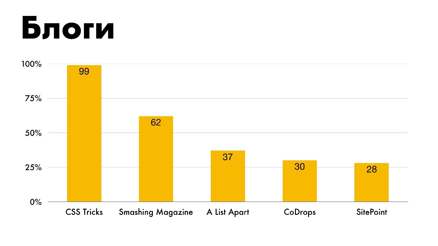
Blogs . It lists everything I personally studied, except SitePoint.
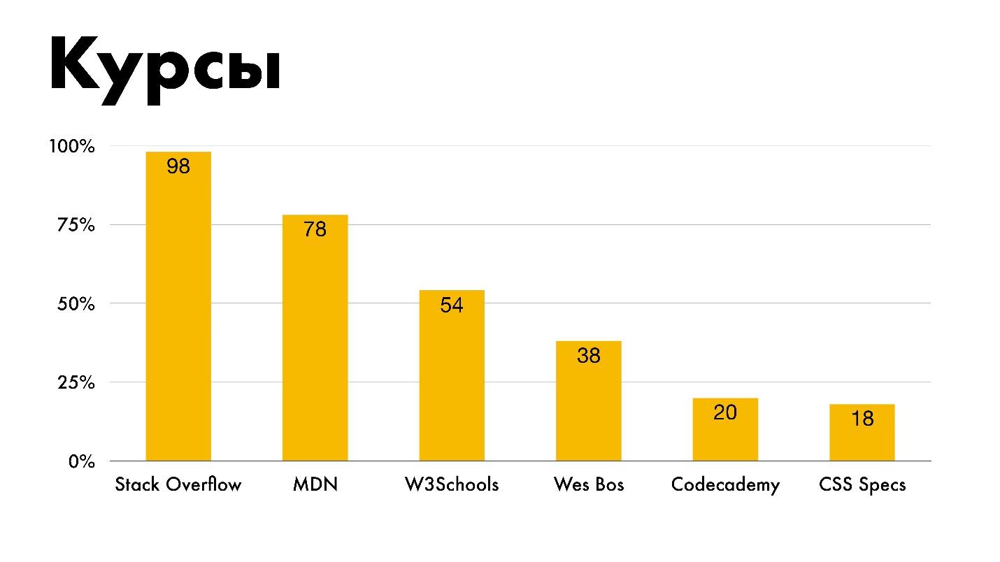
Courses. Most learn from Stack Overflow, which is good. Unfortunately, our representatives are absent. The choice was from what was on the chart, and it was not possible to write your own option in the fields.
I specifically highlighted that 18 people use CSS specifications as courses. Old school.
Easy to learn . Legend:
The greater the experience of developers, the more they agree that CSS is easy to learn.
Speed of development . 11% is the answer “Bad” to the question of CSS development speed.
Utility classes . If you don’t know what it is, then consider Atomic CSS or to left / to right tools in Bootstrap to be utilitarian classes.
Nesting . This schedule infuriates me. Most people for nesting input are Nesting, and I am categorically against it. But even if I am against it, I will show the schedule. I am impartial - use whatever you want at your own peril and risk!

CSS - YaP? 14% of people are sure that they write in a programming language.

Enjoyment.Most people enjoy their work, which is good. We will sympathize with 4% of the unfortunate. For them, CSS is a pain. Perhaps these are those who make up for Opera Mini and watches.

People mark three as lost technologies. The first is parent selectors. These are CSS pseudo-selectors that allow you to influence the parent element, depending on whether there are children within it with certain conditions or not. Here I agree. The second technology is Houdini, which is still in its infancy. The third is Mixins . Few people find CSS missing.

The annual salary . Perhaps you will have a heart attack - an annual salary of thousands of dollars.
I converted to rubles and marked myself in the first group. Where 5% do not get anything for CSS: either they don’t pay extra, or they work for the idea.
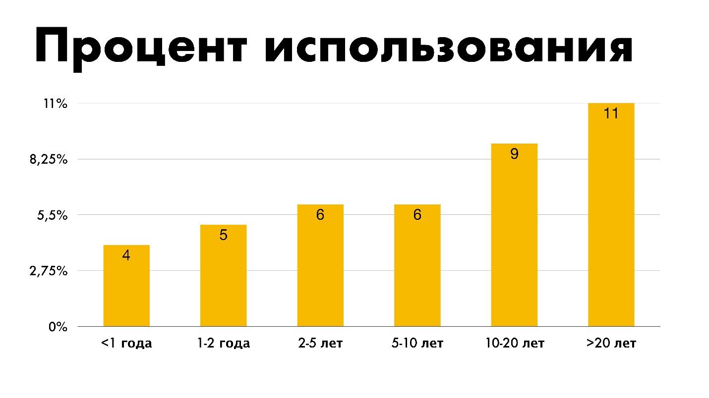
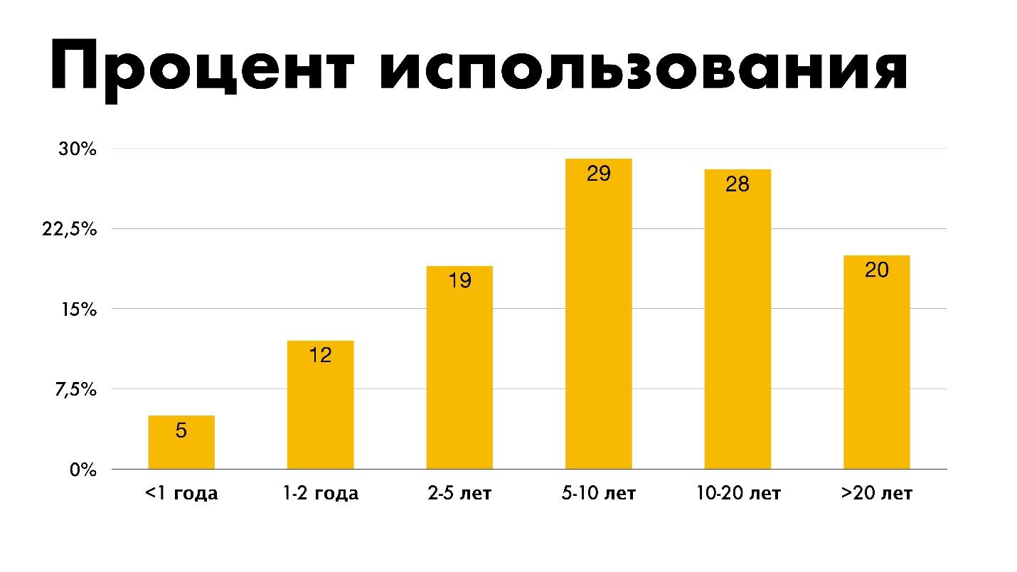
Work experience . Wave distribution.
At first I thought about where 20 years of experience? Was 20 years ago CSS? It turns out that almost 2020 is already ...
Sergey Popov ( popovsergey), the leader of League A, the speaker and organizer of the conferences asked these questions, conducted his mini-survey and even received results from the organizers of The State of CSS. Sergey processed, structured, and got all the information from the front-end community: who knows what and uses, where typesetters learn and how much they earn, which technologies are relevant, and which ones need to be recycled, and what to study in order to use the full power of CSS. The transcript of the report is one of the versions of the report on the current state of CSS, together with the original report “ The state of CSS ” will tell you where to move and what technologies to apply.
Caution, under the cut a lot of diagrams and pictures, really a lot, but they are all about the case. In good quality, they are here .
The "The state of JavaScript" poll looks like this.
You can open and see the results for the past year - what is used, what is popular, what is not, and what only seems unpopular.
The new poll “The state of CSS” contains basic, basic things, but I saw a lot of questions from those who went through it:
- What is it? And what's that? And I don’t know about that.
It turned out that the basic concepts in CSS are perplexing.
I wanted to collect information about what is surprising and talk about what CSS is today and in what state it is. We will get to know him again, so that the 2020 survey will cause less surprise.
“The state of CSS” was launched in the winter. The survey interested me, but I did not have the opportunity to collect all the information from global access. Therefore, in the wake of hype, I discovered my alternative through social networks.
She almost completely copied The State of CSS. 110 respondents answered and got this result.
This distribution by features: green - I use, red - I do not know, yellow - I know, but I do not use. On May 23, I wrote a query to the team that launched the original “The state of CSS” and asked for the results. Fortunately, they answered me and sent me what I wanted.
I included this data. The volume of work was large, since the results are not parsed YAML files. A couple of sleepless nights - and the report is ready, which is divided into several sections.
- Features
- Tools that are used to write and use CSS.
- Environment: browsers and devices for writing and testing.
- Resources through which people learn.
- A couple of funny opinions about CSS from the people who do it.
- Demographic data is not the most technical layer.
CSS Features
Features are divided into a large number of subsections. I chose the most important ones that we use every day.
The CSS state is noticeable even in “The state of CSS” questions. The survey asks about Flexbox, CSS Grid, CSS Multi columns, writing modes and exceptions. All! Nothing more. No questions about Float and meshing.
Where is the float? Float is used for its intended purpose - to wrap text with pictures inside. The technology was not originally created for meshing. This coders adapted Float for themselves.
Where is the inline-block?It seems to me that inline-block was conceived as an alternative to Float, but it turned out what happened. It is good for solving small problems. Although there is Flexbox, and I do not understand why inline-block is needed. I don’t remember when I last wrote it, so he went to the same place as Float.
So, let's look at the actual statistics of The State of CSS, in which 11,000 developers were polled.
Flexbox
Used by 94%, heard 4% and not heard by 1% of developers.
The statistics of during what period of experience people use this or that technology is funny. People with less than a year of experience use Flexbox less than everyone else. Perhaps in the wake of hype they are doing everything on the Grid.
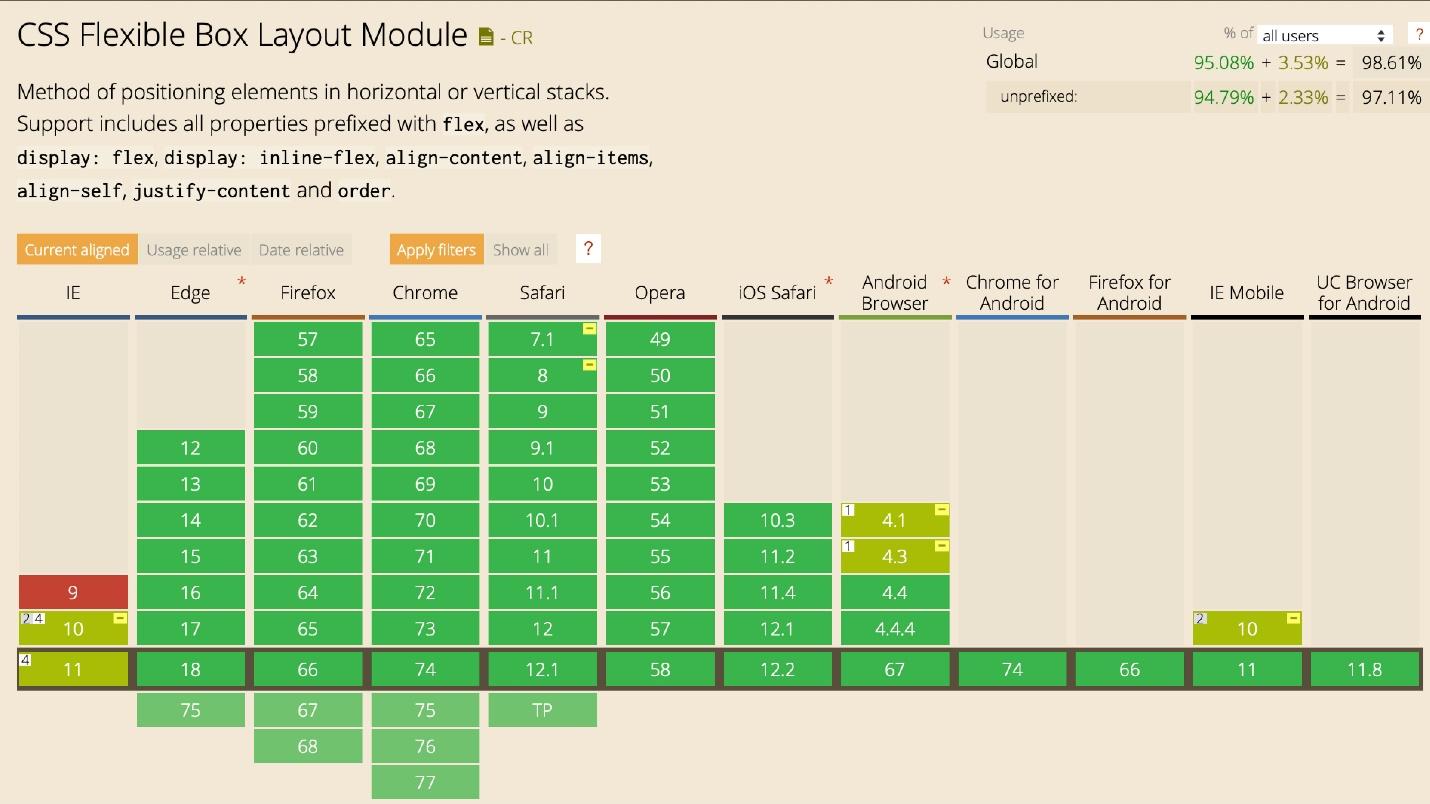
The support is great. I will not focus on Internet Explorer. We all know how to layout for it, especially to deal with Flexbox.
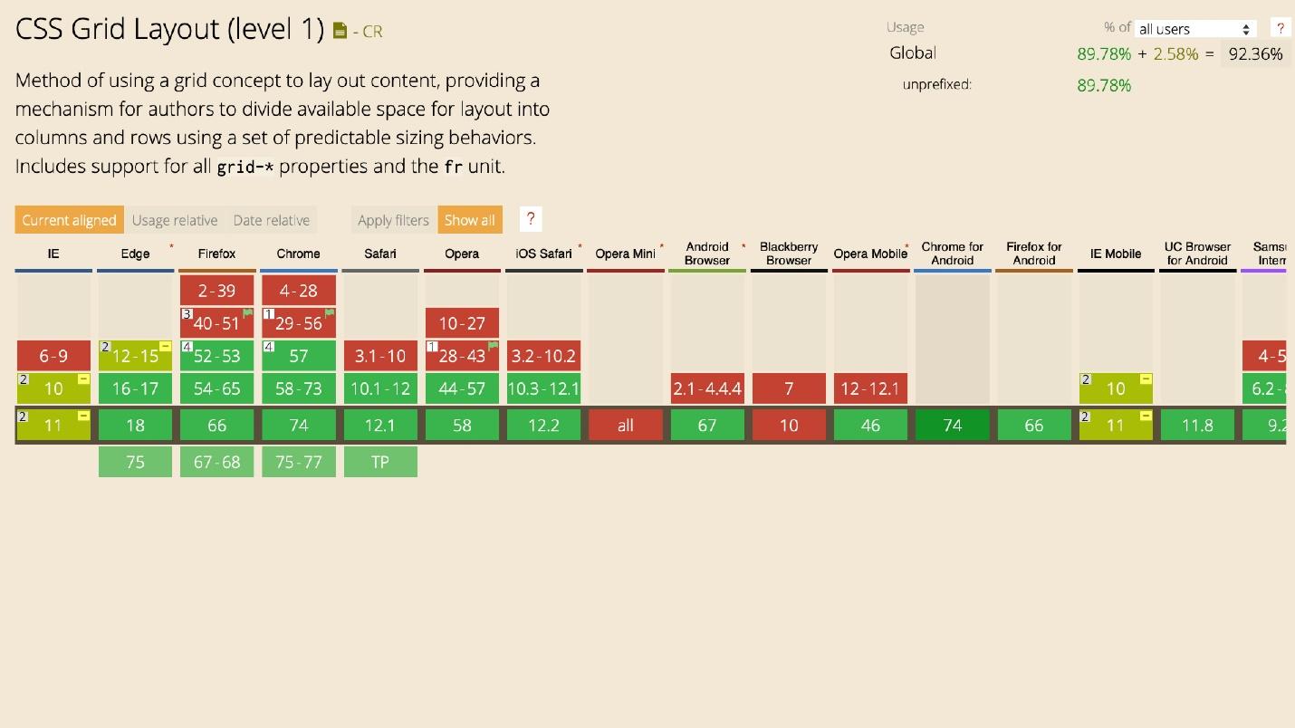
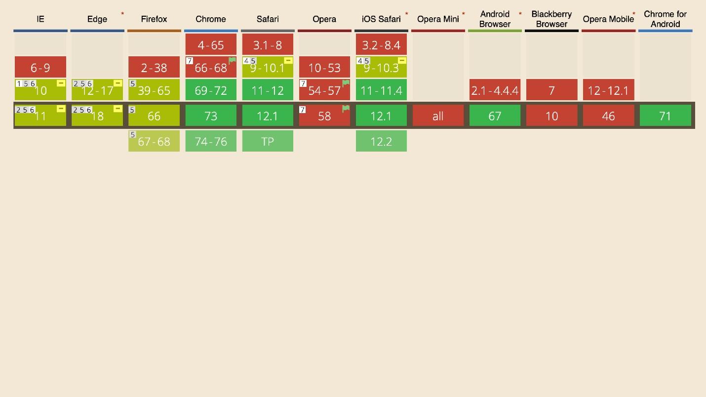
CSS grid
With Grid, everything is interesting. Only 2% of people do not know about it, but 55% use it. Almost half of the respondents - 43% - still do not use the Grid for some reason.
The distribution shows that between people with different experiences there is no difference. Experience in this case does not affect the use of technology.
Now Grid can and should be used for global layout of the site, changing layouts with one property, for complex grids and components. For the task to create something integral: the whole grid or complex, to make up a small element with a very fine distribution grid, use the Grid.
Grid has great support. There is support for IE. In extreme cases, you can use polyphiles - but better not.
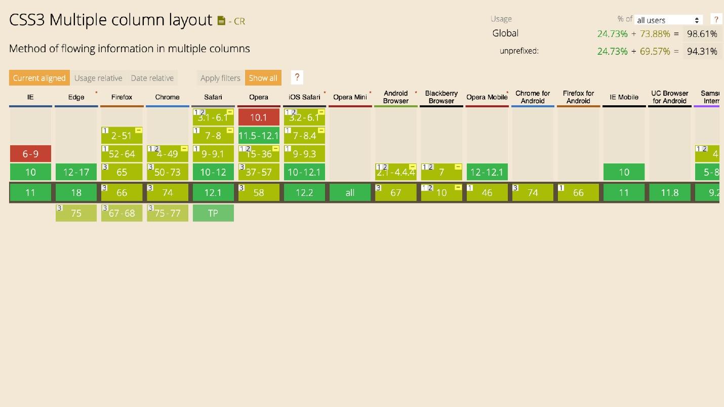
CSS Multi columns
Use 28%. With multi-speakers it’s interesting - 41% didn’t hear about them as technology, which is strange. The technology is as simple as possible and allows you to build text columns without additional wrappers and crutches. Just set the number of columns.
article {
    column-count: 2;
}
The text is arranged in columns and automatically wraps on the next line.
There are many flexible settings. For example, to set the size of the column.
article {
    column-width: 150px;
}
Then the text will not line up according to the specified number of columns, but there will be as many of them as it fits to the end of the screen. When the screen is reduced, everything is automatically rebuilt.
Use and learn technology. For example, for two columns of text, instead of wrapping them in a div, then use Flexbox or Grid.
You can draw lines.
article {
    columns: 2 200px;
    column-gap: 20px;
    column-rule: 1px dotted #000;
}
You can break columns with headers:
h2 {
    column-span: all;
}
Everything is done by one property. Now the technology is being actively introduced, because it is engaged in by Rachel Andrew. At one time, she began to popularize it, since then multicolumns have been used.
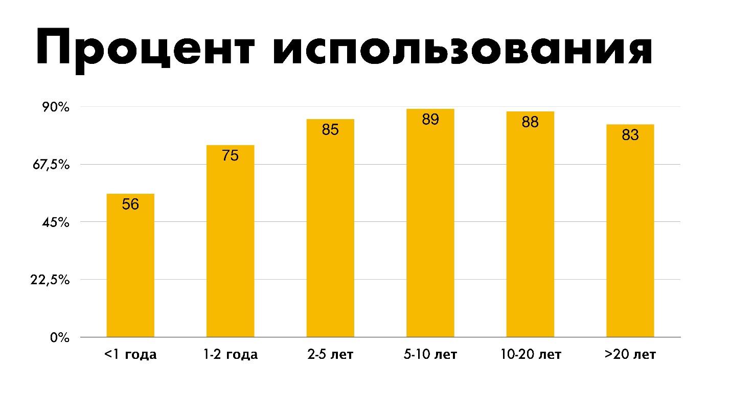
The graph shows that the more experience, the more actively multicolumns are used.
Perhaps this is logical. Is it strange if experienced developers use less different technologies? Beginners are clearly not up to multicolumns - there are Flexbox, Grid, React. But this does not mean that juniors cannot use multicolumns now and change statistics.
The speakers have good support, but not without jambs. In one browser, fine, in the other not. But almost 98%, subject to restrictions, is good support. More than Grid.
Writing modes
CSS Writing Modes . Almost no one heard about this technology - 73% of respondents, and only 17% use it.
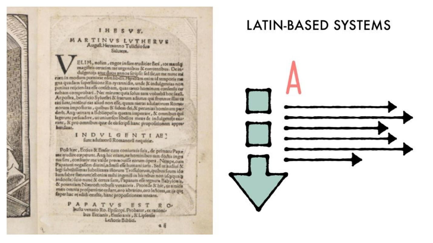
There are 4 writing systems. They are characterized by the direction of writing and reading characters vertically and horizontally. This is a complex topic, so just show the pictures.
Latin based is a standard system: read from left to right and from top to bottom.
Arabic based - from right to left and from top to bottom.
Han based is an Asian group, it can be different.
Mongolian based - Mongolian system. It’s hard to read because it’s unusual. Fortunately, it is not often necessary to deal with it.
It is not enough just to translate the interface into another language - to make a YAML or JSON file that will store information in two languages. Most likely, you have to turn everything over. But I'm not talking about that.
html {
    writing-mode: horizontal-tb;
    writing-mode: vertical-rl;
    writing-mode: vertical-lr;
    writing-mode: sideways-rl;
    writing-mode: sideways-lr;
}
With writing mode, it's easy to build interfaces that you would implement in a different way. For example, for a vertical inscription, you can use transform, rotate, insert a picture along with three others, and with the help of direction this is performed by one property.
More great examples of sending a letter.
Cool interfaces!
They don’t set such tasks every day, but even the simplest ones make up easier than with transform or rotate. Not that transform is complicated, but with CSS Writing Modes is more correct.
Jane Simmons has a huge lab. In it, she publishes everything that she does, and she does something non-stop. Onlinea bunch of examples with routing modes, combining in standard interfaces, application where you did not think to use them at all. Look - you will find many discoveries.
The distribution shows that the more experience, the more likely the use of the distribution mode. However, the percentage of those who use is very small. Not because the technology is bad or the developer does not want to use - there are few cases. This is not a daily task. However, apply.
With support, everything is fine.
CSS Exclusions. Almost no one heard about this technology - 79%, and only 7% use it. I included CSS Exclusions in a fan review. This is a special technology for IE. Edge dragged her to him, apparently by inheritance. The new Edge is likely to be.
This is a cool technology, but for some reason it has not received distribution, except for IE. This is an easy way to adjust the flow around an element that is outside the stream. Put the top layer on top of the content using positioning absolute, relative or fixed.
For example, take the text and the cube. If you apply the property
wrap-flow: both, then on both sides the text will flow around the cube. This is not just an element that is inserted into the content - it is an element that is positioned on top with absolute positioning. This works in IE.
I removed Exclusions simply because you most likely will not use them. Although it is possible if you are installing under IE.
The diagram shows how roughly these technologies should be used.
Flexbox is the foundation.
Most grids are built using it. Grid is advancing, but not intended to destroy Flexbox. His task is to build a global layout and work with him. Multicolumns and writing modes are used where you need it.
The fewer cases, the lower the percentage of use: multicolumn for text, writing modes for complex places, where in the interface it is easier to do than using transform. Of course, there is no diagonal text mode.
Animations and Transformations
CSS Transitions - smoothly changing properties. Use 95%, heard 4% and did not hear 1%. CSS Transforms - rotations, up-and-down shifts, spreads, 3D-transformation - the same percentage. CSS Animations - use 90%, and 9% heard. A little more complicated - keyframes, interactive - use less. CSS Will Change is
applied to all this . With this technology is already more difficult. It seems that everyone knows the animations, but no one heard about it - 58%.
This is a dangerous technology, but in the light of the current state of CSS, you need to know and use it. CSS Will Change allows you to prepare your browser before changing the state of an element. The browser will be able to prepare for this optimization, for example, redrawing.
Imagine that the browser is preparing for something. You can use CSS Will Change to indicate that the scroll will be changed.
div {
    will-change: scroll-position;
    will-change: transfrom;
}
This allows you to add specific optimization to your site. But technology has problems.
Use the property sparingly and not everywhere! If there is a Transition on each element near CSS Will Change, this does not mean that you can go through each element and write CSS Will Change and the name of the element that will change. This is even worse than simple optimization.
Do not bet on each item . Try to put CSS Will Change before changing the element and remove after. Ideally, prepare a browser script before complex animation. Before starting the animation, add CSS Will Change, after the animation - remove. This is probably the best use of technology possible. You can simply attach it with an asterisk: CSS Will Change all - and that’s all !, but it’s better not to.
The schedule is funny. I imagine it this way: people who have 5 to 10 years of experience say: “Yes, CSS Will Change here, under the asterisk!” And then a little later it subsides and the technology is used more moderately.
IE, Blackberry, Opera Mini do not support CSS Will Change, but for everything else it can be used now.
Fonts
I will not talk about font-face and its support - everyone knows this.
Variable fonts
Variable fonts have a problem. Almost half of the developers - 44% - have heard of them, but only 26% use it. Fonts are still in draft draft status, but they have good support.
Variable fonts are the ability to use just one font with an infinite number of styles.
Connect one font, put bold and italics. Everything is done automatically by one property. This is good for both optimization and use. You do not need to drag along with Google Fonts, a bunch of Latin, Arabic and other styles.
The technology is designed to replace familiar fonts. Perhaps in your assembly there was a file of one of the preprocessors with a bunch of font-faces that could be changed. Surely you added cycles and created everything with a cycle.
The percentage of use is flat. The technology is fresh, so even beginners know about variable fonts and try to use it.
To use variable fonts, the designer must know about them. If the designer used a custom font in 25 styles, you simply can not repeat all this with a variable font. The designer will see your pixel perfect, put a ruler on the head, and force to redo.
Initial letter
Strange, but 29% of people use the Initial letter, and 35% heard about it. In my sample, the percentages are different: they use 20%, they heard 41%, they did not hear 39%.
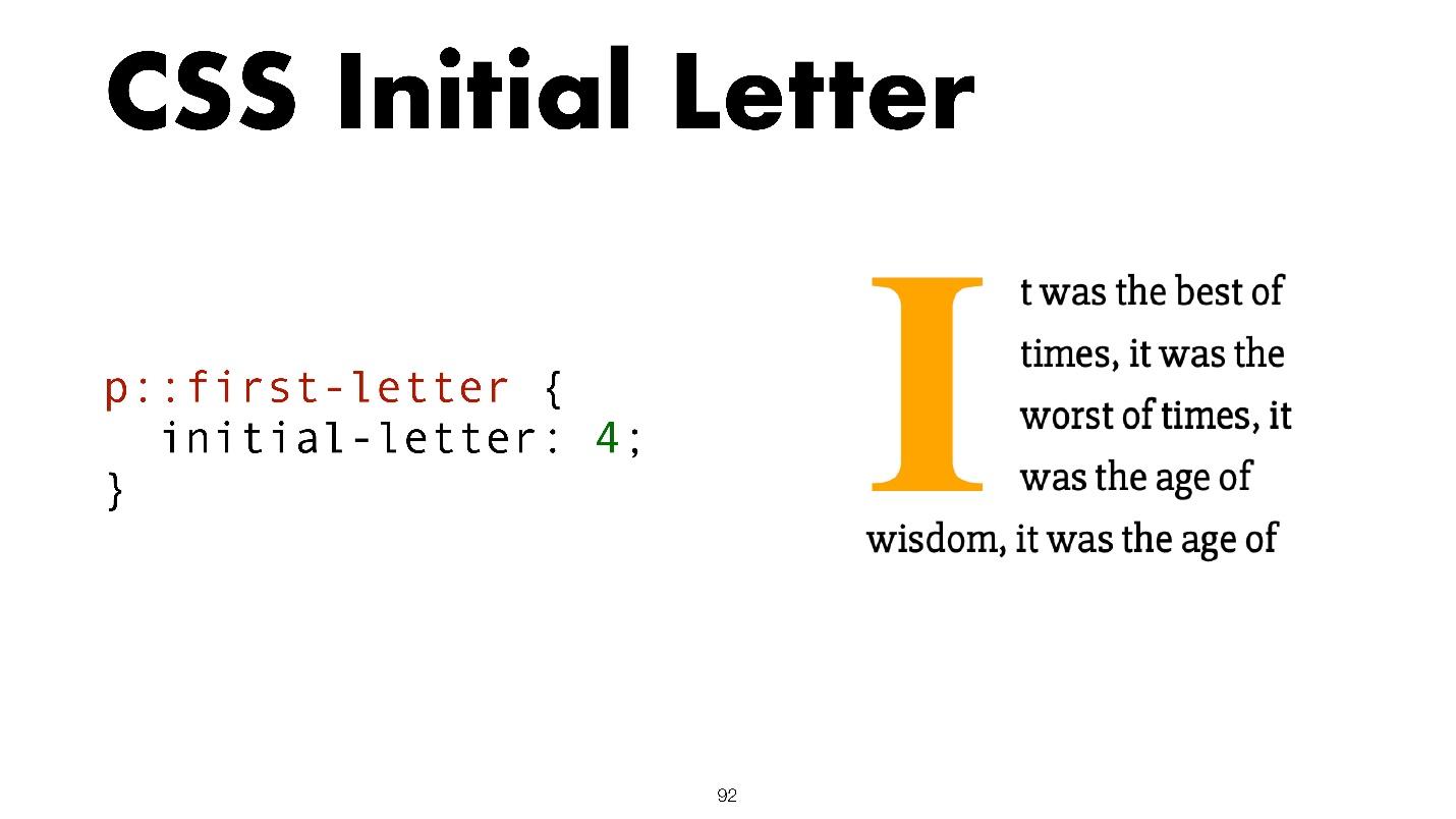
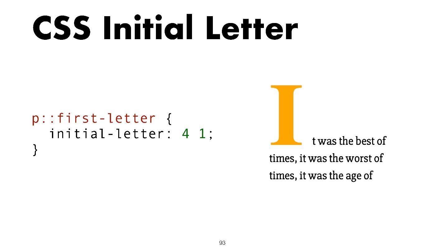
When I voiced my numbers, they did not believe me that 20% of people use technology. Although it is simple and allows you to set the initial letter with two properties.
p {
    initial-letter: size position;
}
Here size is the number of lines the character occupies, and position is the line that starts.
Another variant.
Such tasks are rare, but it is not position or budding either. One problem with this technology is that I do not know any of the 20% of people who use it. It is supported only in Safari with slight restrictions in the form of a prefix, even in mobile versions. This is a special killer feature for Safari.
Shapes and graphics
Then comes all the beauty about which I once gave reports and which no one applies.
CSS Shapes
CSS Shapes use very little - only 22%, although the technology has good support.
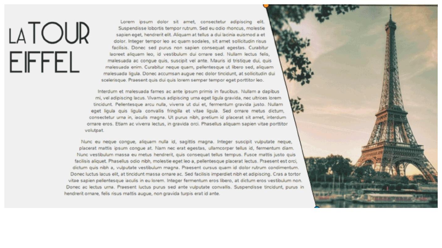
In general, all the technologies in this “beauty” section are about the same. With the help of forms, you can create cool things.
img {
    shape-outside: polygon(0 0, 100% 0, 100% 100%, 30% 100%);
}
I once said that the web lacks journalism. At one time, we lowered the bar level of interfaces. They all became the same, standard layouts appeared, and Bootstrap, which creates layouts with one button. There is no more magic.
Object fit
Surprisingly, 37% have not heard about Object fit. However, almost everyone who heard it is using it, which is 42%. The technology has good support.
Object fit is a background-cover for inline images.
img {
    object-fit: cover;
}
Create an image, set its object-fit property, and the picture behaves inside as if it had a background property.
Clip path
Used by 39%, and heard 40%. Clip path has a bunch of limitations.
Technology allows you to add beauty. It indicates which part of the image will be visible.
There are two ways to display a picture of a certain shape on a site: cut the picture in the editor or paste a figure on top of the site on the picture. Then any picture will take the form of a figure. So does the clip path. It is more comfortable.
CSS Masks
Use 26%, but not heard 28%. Masks are similar to Clip path. Almost the same property.
Summary
I want to focus on two details.
Only 37% of people know about Object fit , although this is the most supported technology listed. It may come in handy most often. For example, you want to embed a picture in a rectangle. Layout designer uses style, background image, background cover - horror. Why is solving simple problems difficult? There is no need - with Object fit everything is beautiful and simple. It is a pity that this is the most unknown technology presented, although it may be needed every day.
The popularity of technology does not guarantee its use.
Perhaps designers do not pose complex tasks . You cannot use all this stuff if there are three columns in the interface layout.
Front-end tenders solve simple tasks difficult.
For example, to make a triangular picture, the image in the editor is inserted into the triangle. And so every time, again and again. Although the problem is solved by the same Shape.
Yes, in IE technologies will fall off, but by the principle of progressive improvement, they will work somewhere. If IE does not support forms, why not set the images square for it.
Interactivity
Scroll snap controls the scroll behavior. Only 12% use it, and 48% have heard it.
scroll-snap-type
scroll-padding
scroll-snap-align
This is an interesting technology. For example, there is horizontal scrolling. When we scroll through the content, it stops at the place we scroll to. Using the Scroll snap, the page will automatically scroll to the border of the element on which it stopped, no matter how tall it is.
.container {
    scroll-snap-type: y mandatory;
}
.child {
    scroll-snap-align: start;
}
Horizontal center alignment also works.
.container {
    scroll-snap-type: x mandatory;
    scroll-padding: 50%;
}
.child {
    scroll-snap-align: center;
}
You twist the horizontal scroll, and the element always remains in the center, no matter what size it is. This is a great example that you can avoid using JavaScript for simple tasks.
The technology has good support to think about using. It’s not worth adding everywhere, but it will work somewhere.
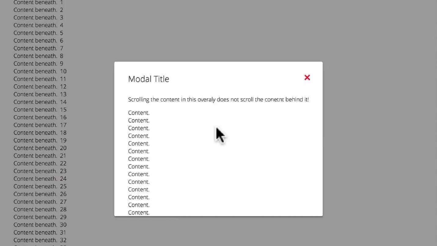
Overscroll behavior. This is a cool technology that only 21% of respondents know about. Use even less - 20%.
If you scroll inside the modal window, everything that is in the background should be static. Sometimes the modal window is loaded to the bottom, there is an interception and the scroll goes out.
When using Overscroll Behavior this will not happen.
.container {
    overscroll-bahavior: none;
}
This applies not only to modal windows, but also to scrolling inside interfaces.
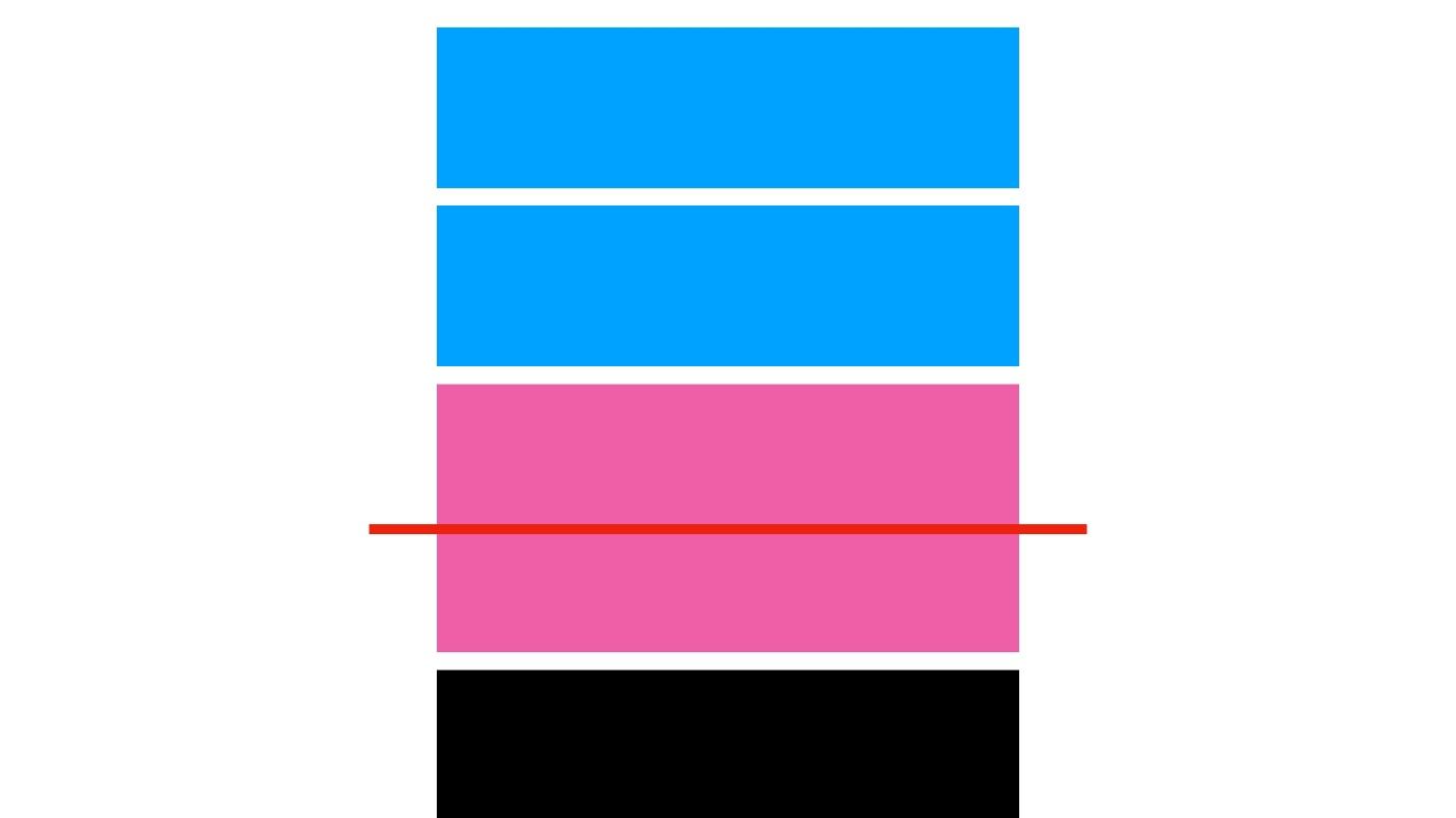
Overflow anchor is another property that prevents scrolling until the DOM tree is fully loaded and rendered. Imagine a situation: you have uploaded a site that looks like this.
There is a picture in the pink block, but it did not load. JavaScript loaded and the anchor worked to a specific element. When the picture is loaded, the element will fall down, but at the same time the scroll will remain in the same place. This is standard behavior.
The anchor property allows you to be fixed on the element. The page does not twitch if something is loaded from above while viewing.
body {
    overflow-anchor: auto | none;
}
Anchor is great for mobile devices. When you go to a news site, leaf through, read an article, and from above the advertisement is loaded, the text jumps - do you think what is happening?
It can be applied to body and other elements.
Other
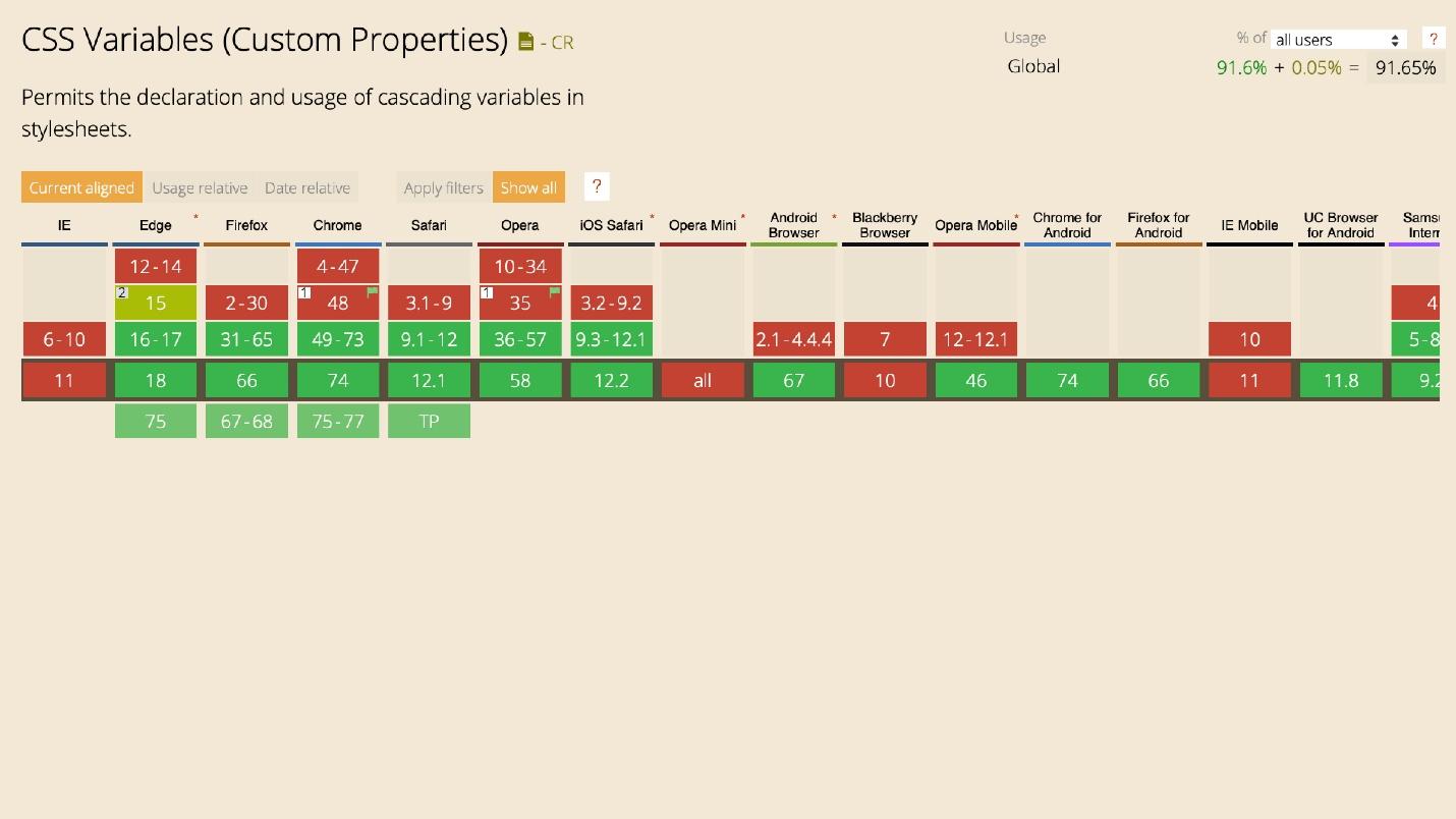
CSS Variables. Use 60%, heard 35%. Great support besides any dinosaurs.
The percentage of use is equal, but beginners do not favor - they already have enough problems.
Supports . Use 37%, heard 36% and not heard 27%. There is only one problem with supports - it is not supported in IE. Where he is needed the most, he is not.
CSS Supports helps you make great fallbacks with CSS Grid on Flexbox. I only use CSS Grid and use it.
Again, the older the developer, the more he uses the technology because he understands its coolness and importance.
Calc . Everything is simple here: it works everywhere and is well known - 86% of popularity.
Nothing prevents the use of almost all the features above, except for barriers in the head. They can and should be used now.
Except for exceptions and the Initial letter, because they are only for Safari.
If something is not supported, use fallbacks, supports, or even polyfiles, but rarely. Use plugins that drive one into another.
Tools
We pass to the most interesting.
Bootstrap . Strange distribution - the camp was divided equally into those who use and those who do not. It's funny that one percent of Bootstrap is interesting, but it does not use it. There are still 11 percent who are interested. Personally, I do not favor Bootstrap.
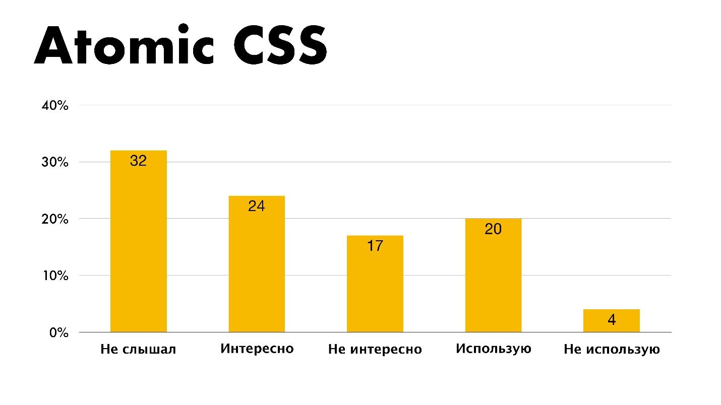
BEM . It is strange that in the information field people do not know about any technologies. The survey focuses more on America and Europe, maybe they don’t know about BEM or use something better - Atomic CSS.
Atomic CSS is an interesting technology, but I do not use it.
Preprocessors
It's funny that in the methodologies there were free answer options and two people marked Shadow DOM as a methodology. I do not understand what they had in mind. In terms of distribution, SASS is still in first place, as it was 9 years ago when I entered the profession. Stability.
Autoprefixer - 64 people, PUG - 7 people, and Gulp - 3 people were also noted as a preprocessor.
Someone wrote a tearful request in a free answer.
- CSS needs to implement features and remove the need for processors.
This is a request to get rid of preprocessors and implement all the features in CSS itself, which is happening now.
The choice was over and I was very angry - there is no option "I do not use preprocessors." Is there someone who abandoned them?
Environment
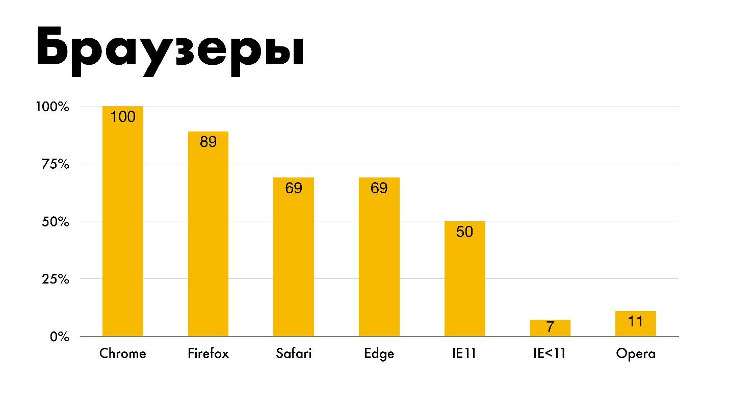
Browsers I doubt the statistics, because 100% of people use the development of Google Chrome. The counter even broke - it was 101%.
I specifically added Opera and IE <11 here because 11% and 7% of people still suffer from them.
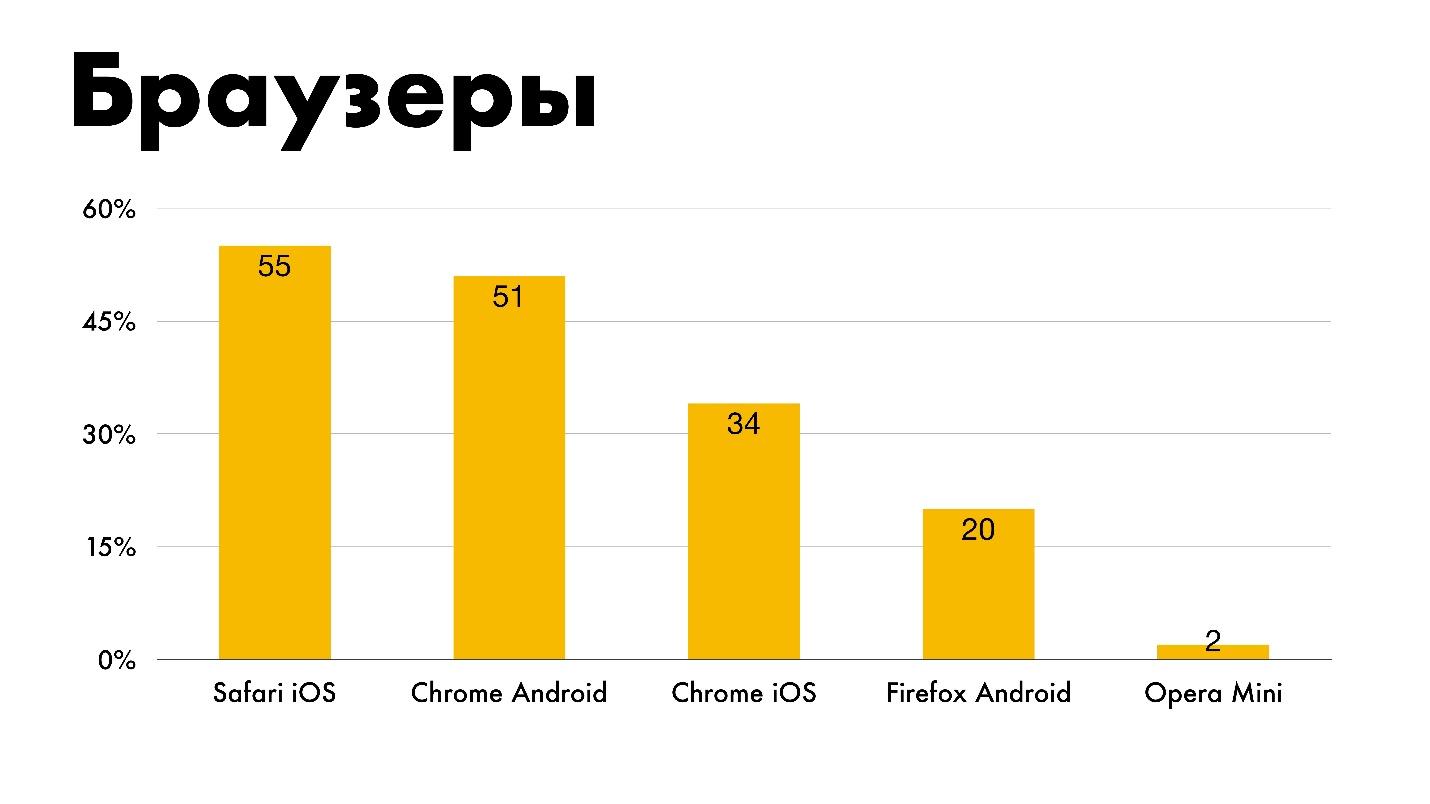
Mobile browsers are used to develop Safari iOS, Chrome Android, Chrome iOS, Firefox Android. Two percent of people still support Opera Mini, which does not support anything.
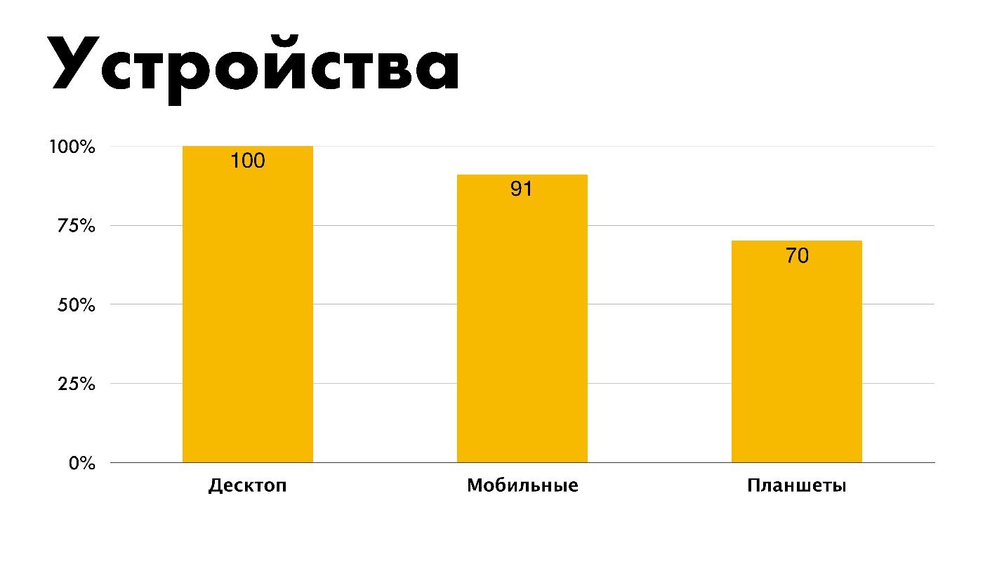
Device . Everyone has to typeset under the desktop, a little less for mobile, and even less for tablets. Now it is not clear where the tablet is, and where is the phone. Is iPhone XS a tablet or a phone?
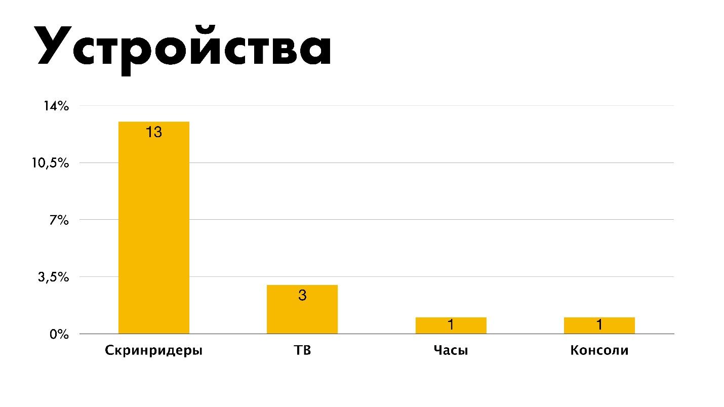
Only 13% of people test layout in screen readers, This is bad. Three typeset under TV and one at a time - under the clock and the console. Apparently, this is one and the same person. I did not set percentages, but the number of people for contrast, although from the point of view of the schedule this is not true.
Resources
Blogs . It lists everything I personally studied, except SitePoint.
Courses. Most learn from Stack Overflow, which is good. Unfortunately, our representatives are absent. The choice was from what was on the chart, and it was not possible to write your own option in the fields.
I specifically highlighted that 18 people use CSS specifications as courses. Old school.
Opinions
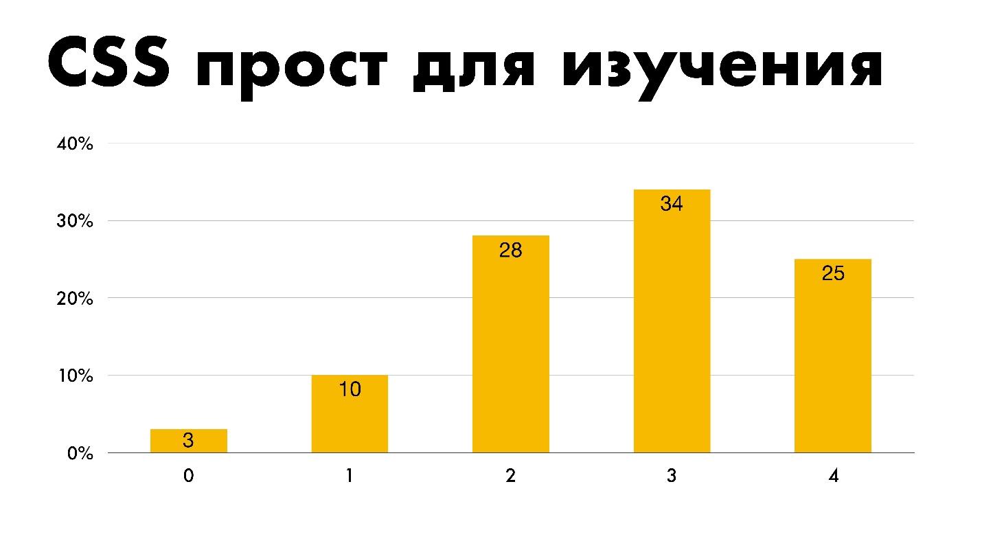
Easy to learn . Legend:
- 0 is not;
- 1 - rather not;
- 2 - neither yes nor no - I do not know;
- 3 - rather yes;
- 4 - yes.
The greater the experience of developers, the more they agree that CSS is easy to learn.
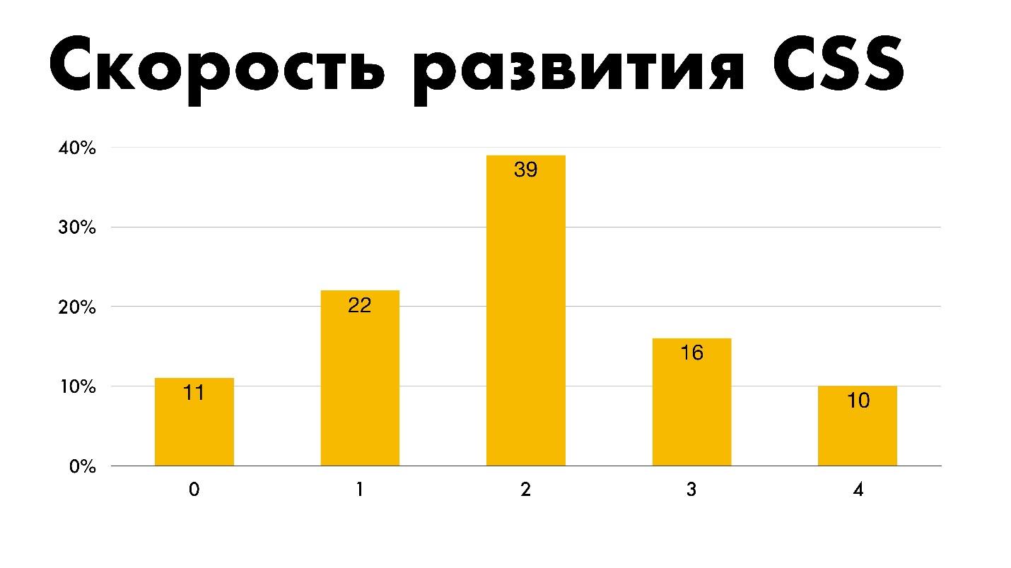
Speed of development . 11% is the answer “Bad” to the question of CSS development speed.
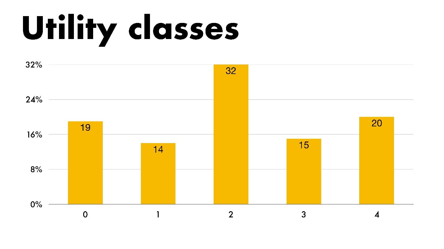
Utility classes . If you don’t know what it is, then consider Atomic CSS or to left / to right tools in Bootstrap to be utilitarian classes.
Nesting . This schedule infuriates me. Most people for nesting input are Nesting, and I am categorically against it. But even if I am against it, I will show the schedule. I am impartial - use whatever you want at your own peril and risk!
CSS - YaP? 14% of people are sure that they write in a programming language.
Enjoyment.Most people enjoy their work, which is good. We will sympathize with 4% of the unfortunate. For them, CSS is a pain. Perhaps these are those who make up for Opera Mini and watches.
Lost technology
People mark three as lost technologies. The first is parent selectors. These are CSS pseudo-selectors that allow you to influence the parent element, depending on whether there are children within it with certain conditions or not. Here I agree. The second technology is Houdini, which is still in its infancy. The third is Mixins . Few people find CSS missing.
Personal data of respondents
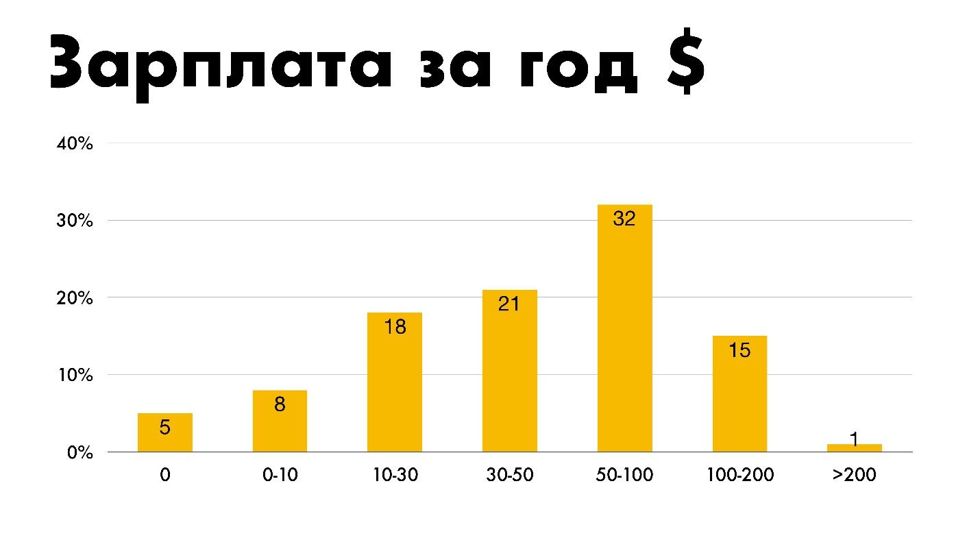
The annual salary . Perhaps you will have a heart attack - an annual salary of thousands of dollars.
I converted to rubles and marked myself in the first group. Where 5% do not get anything for CSS: either they don’t pay extra, or they work for the idea.
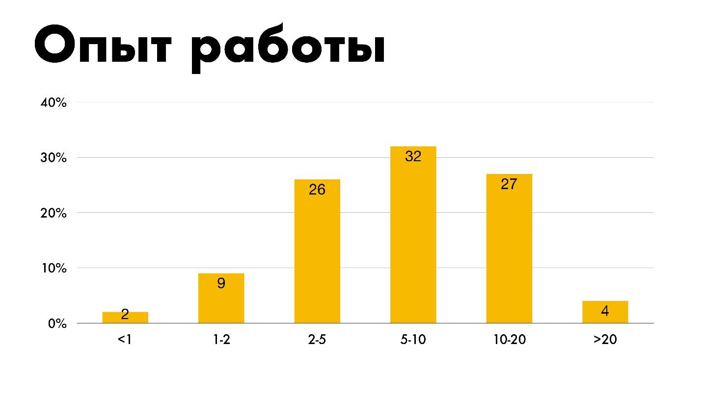
Work experience . Wave distribution.
At first I thought about where 20 years of experience? Was 20 years ago CSS? It turns out that almost 2020 is already ...
Sergei Popov talks not only about the front end, but also about managing the team. At Saint TeamLead Conf 2019, Sergey will present the topic “How to work with juniors?” : Who is a junior, what hides, what is he afraid of and what to prepare for by hiring newcomers to work.
If you liked the report, come October 13 and 14 to FrontendConf 2019 at Digital October. Presentations on CSS, JS, frameworks, interfaces, web graphics on a technology site in the center of Moscow in a historic building on the embankment are ideal. Book your tickets , in August the price will rise. If you want to share experience, something useful for the community - submit applications by August 30. See you at FrontendConf 2019!