Can money do everything? Usability audit of the site for three million
When I meet another story about how “innovative” startups merge millions to create a service, and then their website looks like something unintelligible, I sincerely indignant. And after reading the article about multitasking and symbiosis from the co-founder and operating director of “Tnomer”, he fell into the sediment. € 3 million was learned, and the site apparently did not have enough.

Users associate impressions of interaction with the site with the impressions of the company itself. A simple, convenient and understandable website forms an appropriate attitude towards the company.
Attracting visitors, for example, with the help of expensive contextual advertising, the site has only a few seconds to create an impression and convince the user to stay at least another moment.
What impression does the site of the company with an investment of 3 million euros, consider in usability auditing. Each problem is accompanied by recommendations that can help to look at your project from the other side, making it more convenient and more pleasant for users.
We first consider the problems related to the entire site as a whole.
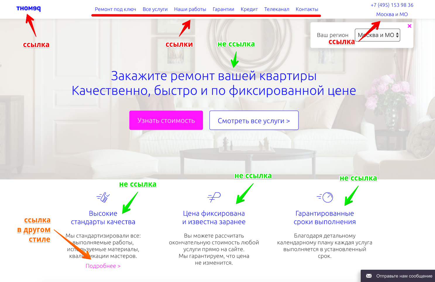
Adjacent style of highlighting links and headers. The lack of a unified system of color coding of links. Corporate blue color is used to highlight the links in the "header of the site" and some other interface elements and to highlight titles at the same time. As a result, users do not understand which element is the link, and which is the title or accent content, until they hover the mouse or click on a mobile device. All this causes cognitive tension, which can affect both the desire to continue the interaction and, as a result, the conversion, and trust in the brand as a whole. In addition, the problem is aggravated by the fact that highlighting a blue is a common solution.
Another problem is the selection of links in the corporate color of fuchsia without any visible dependence.
Use different styles for titles and links. Bring all the links on the site to a single style. In this case, the style of the links in the top menu may differ from the general style, since this interface element is well recognized by users regardless of color.

Different design style buttons target action. On the site at the same time there are buttons filled with the corporate color of fuchsia and buttons filled with the corporate blue color. One of the basic rules of a user-friendly interface involves the design of elements of the same order of importance in a single style.
Apply a single style of key action buttons. In terms of contrast and readability, it is better to use the blue version of the button. Depending on the degree of importance of the button, it is allowed to change its size while preserving the basic identification.
The second step of calculating the cost of repairs is one of the key actions on the site, which, according to the developers, probably should convert gullible visitors into leads.
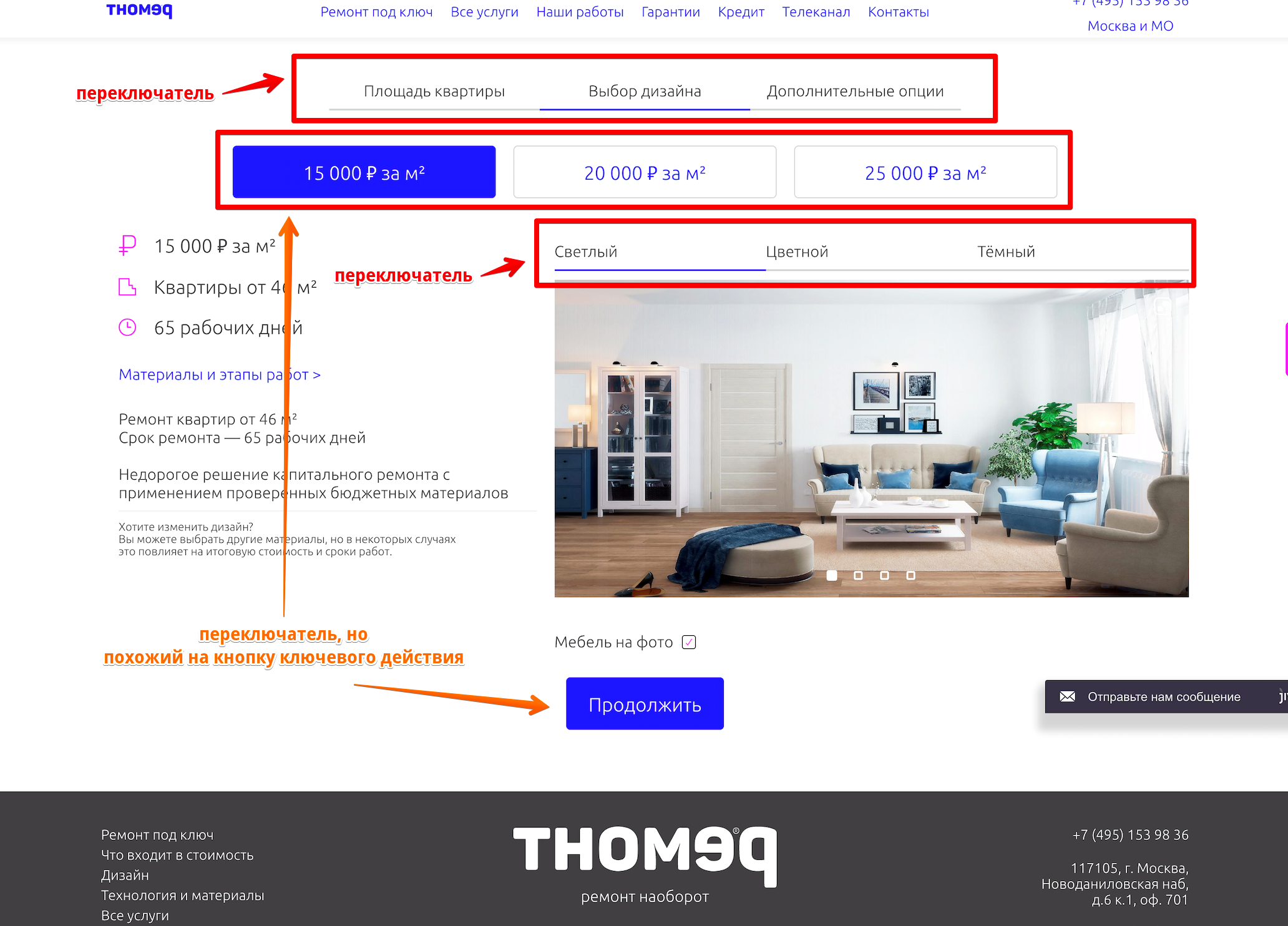
Incorrect application of styles of the navigation interface elements.
The top switch is actually a progress bar, reflecting the user's current stage and the remaining steps. The representation of this element in the form of a progress bar does not negate the possibility of simply switching between steps, but it builds up a clear hierarchy of elements and makes the interaction more conscious.
The price switch visually combines the styles of two interface elements at once: the target action button and the secondary action buttons, and at the same time has a behavior completely unusual for these interface elements. Selecting the active element in the form of a target action button (fill in blue) suggests the possibility of pressing and waiting for some kind of system response.
Design the first switch in the appropriate style for his tasks: progress bar. Bring the price switch to the style of other switches on the site.

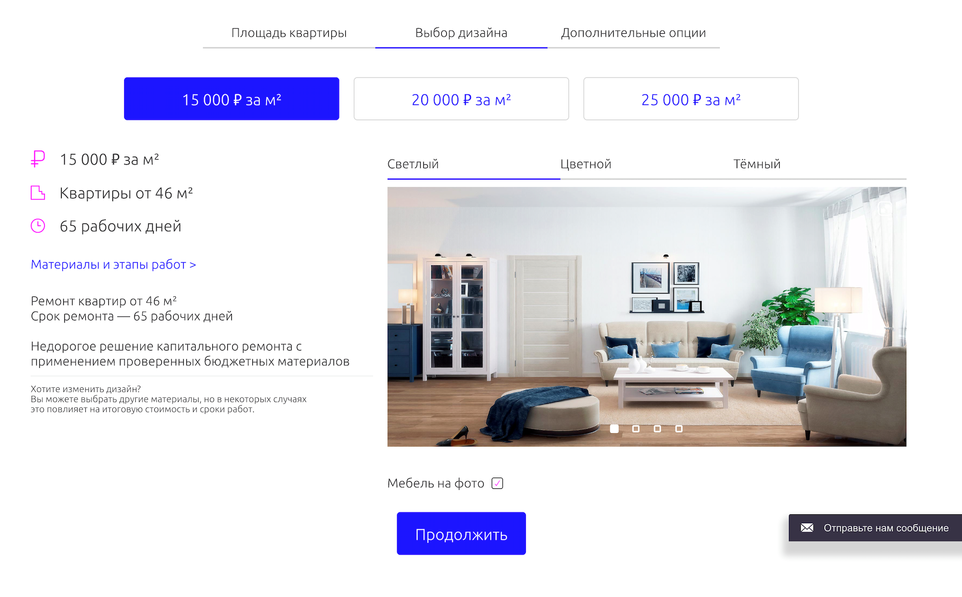
Is the switch above the picture and the dots in the picture the same or do they perform different actions?
The interior style switch and the render switch of the selected style are not well separated. It is not clear before interacting with the render switch of the selected style, the entire style will be switched, or another photo from the current style will be shown. In addition, the generally accepted solution is to use basic navigation elements between the pictures in the form of arrows (placed on the left and right sides). Without navigation arrows, the user has to aim the mouse cursor at a sufficiently small square to switch the next picture.
Strengthen the visual separation of the switches, add arrows for easier switching of pictures of the selected style. Or use an interface solution that does not require the use of active image style switches.
It is not clear what the user will receive for the selected cost per square meter of repair. The emphasis in the interface is made precisely on the cost, and it is higher than the average for the market, and the reason for this price is not justified.
The key concept of the project: repair on the principle of "all inclusive" is not mentioned on the calculator. Apparently, it is assumed that the user already knows about this, but, most likely, it will not be so.
A number of questions arise:
Partial answers to these questions are given in the interface using the link “Materials and stages of work”, but interaction with this link interrupts the cost calculation process and gives rise to new questions.
Revise the page interface based on the needs of the target audience. Focus on the key idea of the project: “all inclusive”. Shifting the focus from cost to the desired result may be a more effective solution.
Exclude interruption options in the process of calculating the cost of repair (switching to other pages, for example, “Materials and work steps”), for example, by opening the contents in a pop-up.

The “additional options” step requires a high level of expertise from the user, and does not significantly affect the cost of repairs. The lack of visualizations and clear explanations raises even more questions. In which case you need to dismantle the finish? What happens if you do not select the “Entrance door” item, it will not be at all, or will they install something “standard”? What is an installation? (“Why do I need a sculpture in the bathroom?” - not all users understand the meaning of specialized terms).
Revise the importance of the items presented. Ensure that each of the proposed items is sufficiently understandable by adding descriptions and pictures that are understandable to the average user.
Lack of cost justification. At the final step, the client receives the final cost of repairs. But, due to the lack of sufficient transparency at the previous stages, he does not understand what exactly is included in the total amount: only work; work and materials; work, materials and furniture? All inclusive or something basic? And against the background of these questions, the application form looks unconvincing and does not motivate to interact with it.

Add a clear justification for the calculated cost of repair. Once again recall the key idea of the project: "all inclusive". Provide sufficient motivation to interact with the application form.
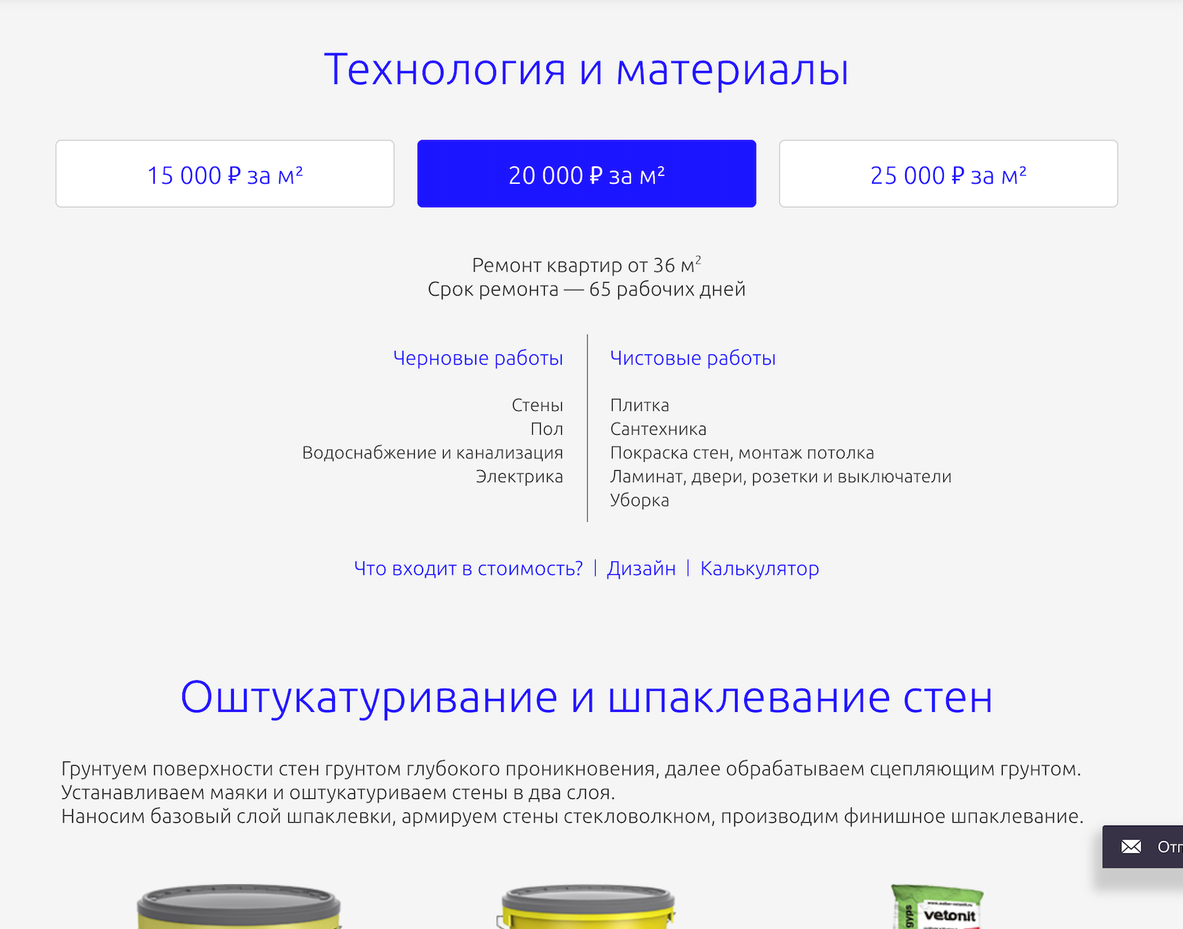
The content of the pages “Technology and Materials” is part of the cost justification in the repair calculator, but it is implemented as separate pages, which breaks the logic of the calculator and violates the integrity of the proposal.
Combine the repair calculator and materials within a single interface.

“What are all these banks talking about? How do they differ from cans in repair options cheaper / more expensive? Do I need to do something with them? Select? ”Page
content requires a high level of expertise from the user. It is assumed that he is sufficiently versed in finishing materials to make a decision on the choice of a package of services. Some materials (for example: options for flooring or doors) are quite simple to choose, but since they are represented by a single “sheet” with less understandable materials (for example, some denominations of soil or putty), the clear points go unnoticed by the user.

“Hmm, can I choose something here? Is this all there is or are there other options? Only three gray tiles? And I want a yellow one! ”
First of all, focus on user-friendly finishing materials. In the case of finishing materials, for which choice is expected, to provide an appropriate representation of the interface.
Switching prices changes the set of proposed materials. At the same time, the user does not have a simple opportunity to compare several sentences and understand a significant difference.
Ensure a clear dependence of the materials on the package price Perhaps the refusal to divide into packages in the direction of interaction with end materials will allow you to more easily make a choice and get a rationale for the final cost.
The presence of a channel on conventional television can be a strong competitive advantage and deserves special positioning. Let's see how the site developers have coped with it.
When interacting with the site it is not clear what is meant exactly the channel on television. If the user has not previously interacted with this TV channel, he will not understand that the company has a TV channel, and not a more classic YouTube channel for the Internet.
It is more obvious to position that the company has its own television channel and explain the way to interact with it.

The current presentation of the air is not read properly. It seems that these are anchor links to the parts of the video presented on the left. But clicking on the list has no effect. Is something not working?
Modify the presentation of the broadcast program, eliminating false interpretations of the interface.
Late offer to become a member of the program. The user has not yet understood which TV channel is being discussed.
Change the presentation of the first screen in the direction of the presentation of the channel itself and only then offer to participate in the shooting.
Portfolio repairs made is one of the main ways to increase the credibility of the company.
On the page "Our work" there is no focus on examples of work. The page is overloaded with redundant interface elements, diverting attention from the most important: photo and video works.
Shift the focus to content that confirms the presence of a portfolio: photos and videos. Even with a small or missing portfolio, you can create a sense of its presence in sufficient volume. Make the photos larger, turn them into short stories. Post more videos - both with customer reviews and apartments in the process of repair.
The content of the “All Services” page shows the company's services in a new role: this is not “repair - all inclusive”, but the services of some kind of DES.
Comprehensive repair services "Turnkey repair", "rough repair" and others are placed together with the services of domestic repair: "Window sills", "Air conditioners", "Video intercoms" and others.
Services of different levels and sizes are located without any systematization. Such an arrangement may, on the one hand, make it difficult to interact with the list and the search for the necessary, on the other - to create a false impression of the service itself: “Hmm, what do they do at all?”.
Segment the services according to one of the grounds understood by the target audience, but avoid any other interpretation of the service idea.
Ambiguous service names (for example, “Window Sills”, “Video Intercom”, “Installation”) do not form an exact idea of the essence of the offer and require a high level of involvement.
Call the services in such a way as to convey the correct essence of the service: "turnkey solution"

This is how most users see the first screen. “We have studied the market - breathe freely” does not form a meaningful value proposition.
The page does not convey the essence of the service. What exactly is offered, buy air conditioning, install air conditioning or something else? A high level of engagement is required to understand the essence of the service. And the idea of hiding the cost at the very end does not look successful against the background of the rest.
Immediately on the first screen it is simple and understandable to explain the main essence of the service, how it works, what is its cost. And only after that reveal specific details and nuances.
In general, the site is so bad that I would not pay attention to it if it were not for information on the amount of investment in the service. Naturally, it is not known what part of the budget went to the site, but this once again confirms that even big money does not save from the probability of spoiling everything.
Why it happens? This is an attempt to save and make all inhouse? Error in choosing a contractor? Or just other priorities? What do you think?
ps How interesting are articles of this format? Sometimes I get bombed and I do a usability audit of random projects. To direct my energy in a useful way, you can offer an audit of your site or mobile application. I will choose interesting projects and make an audit for free. You can leave a request through private messages.
ps 2This material was first published by me on vc.ru and now, thanks to WD-40 , is available on Habré. Thank you, WD-40!
Users associate impressions of interaction with the site with the impressions of the company itself. A simple, convenient and understandable website forms an appropriate attitude towards the company.
Attracting visitors, for example, with the help of expensive contextual advertising, the site has only a few seconds to create an impression and convince the user to stay at least another moment.
What impression does the site of the company with an investment of 3 million euros, consider in usability auditing. Each problem is accompanied by recommendations that can help to look at your project from the other side, making it more convenient and more pleasant for users.
Global problems
We first consider the problems related to the entire site as a whole.
Problem
Adjacent style of highlighting links and headers. The lack of a unified system of color coding of links. Corporate blue color is used to highlight the links in the "header of the site" and some other interface elements and to highlight titles at the same time. As a result, users do not understand which element is the link, and which is the title or accent content, until they hover the mouse or click on a mobile device. All this causes cognitive tension, which can affect both the desire to continue the interaction and, as a result, the conversion, and trust in the brand as a whole. In addition, the problem is aggravated by the fact that highlighting a blue is a common solution.
Another problem is the selection of links in the corporate color of fuchsia without any visible dependence.
Recommendation
Use different styles for titles and links. Bring all the links on the site to a single style. In this case, the style of the links in the top menu may differ from the general style, since this interface element is well recognized by users regardless of color.
Problem
Different design style buttons target action. On the site at the same time there are buttons filled with the corporate color of fuchsia and buttons filled with the corporate blue color. One of the basic rules of a user-friendly interface involves the design of elements of the same order of importance in a single style.
Recommendation
Apply a single style of key action buttons. In terms of contrast and readability, it is better to use the blue version of the button. Depending on the degree of importance of the button, it is allowed to change its size while preserving the basic identification.
Repair cost calculator (step 2: design selection)
The second step of calculating the cost of repairs is one of the key actions on the site, which, according to the developers, probably should convert gullible visitors into leads.
Problem
Incorrect application of styles of the navigation interface elements.
The top switch is actually a progress bar, reflecting the user's current stage and the remaining steps. The representation of this element in the form of a progress bar does not negate the possibility of simply switching between steps, but it builds up a clear hierarchy of elements and makes the interaction more conscious.
The price switch visually combines the styles of two interface elements at once: the target action button and the secondary action buttons, and at the same time has a behavior completely unusual for these interface elements. Selecting the active element in the form of a target action button (fill in blue) suggests the possibility of pressing and waiting for some kind of system response.
Recommendation
Design the first switch in the appropriate style for his tasks: progress bar. Bring the price switch to the style of other switches on the site.
Problem
Is the switch above the picture and the dots in the picture the same or do they perform different actions?
The interior style switch and the render switch of the selected style are not well separated. It is not clear before interacting with the render switch of the selected style, the entire style will be switched, or another photo from the current style will be shown. In addition, the generally accepted solution is to use basic navigation elements between the pictures in the form of arrows (placed on the left and right sides). Without navigation arrows, the user has to aim the mouse cursor at a sufficiently small square to switch the next picture.
Recommendation
Strengthen the visual separation of the switches, add arrows for easier switching of pictures of the selected style. Or use an interface solution that does not require the use of active image style switches.
Problem
It is not clear what the user will receive for the selected cost per square meter of repair. The emphasis in the interface is made precisely on the cost, and it is higher than the average for the market, and the reason for this price is not justified.
The key concept of the project: repair on the principle of "all inclusive" is not mentioned on the calculator. Apparently, it is assumed that the user already knows about this, but, most likely, it will not be so.
A number of questions arise:
- examples of interiors are the actual proposal (I will receive just such a repair and have to choose from those presented on the website) or are these just examples (see how it can be)?
- furniture presented in the interior is included in the cost of repair or displayed for example?
- repair for 15 thousand worse repair for 20? Is it possible to get a repair similar to the examples for 25 thousand, but for 15?
Partial answers to these questions are given in the interface using the link “Materials and stages of work”, but interaction with this link interrupts the cost calculation process and gives rise to new questions.
Recommendation
Revise the page interface based on the needs of the target audience. Focus on the key idea of the project: “all inclusive”. Shifting the focus from cost to the desired result may be a more effective solution.
Exclude interruption options in the process of calculating the cost of repair (switching to other pages, for example, “Materials and work steps”), for example, by opening the contents in a pop-up.
Repair cost calculator (step 3: additional options)
The “additional options” step requires a high level of expertise from the user, and does not significantly affect the cost of repairs. The lack of visualizations and clear explanations raises even more questions. In which case you need to dismantle the finish? What happens if you do not select the “Entrance door” item, it will not be at all, or will they install something “standard”? What is an installation? (“Why do I need a sculpture in the bathroom?” - not all users understand the meaning of specialized terms).
Recommendation
Revise the importance of the items presented. Ensure that each of the proposed items is sufficiently understandable by adding descriptions and pictures that are understandable to the average user.
Problem
Lack of cost justification. At the final step, the client receives the final cost of repairs. But, due to the lack of sufficient transparency at the previous stages, he does not understand what exactly is included in the total amount: only work; work and materials; work, materials and furniture? All inclusive or something basic? And against the background of these questions, the application form looks unconvincing and does not motivate to interact with it.
Recommendation
Add a clear justification for the calculated cost of repair. Once again recall the key idea of the project: "all inclusive". Provide sufficient motivation to interact with the application form.
Pages Technology and Materials
Problem
The content of the pages “Technology and Materials” is part of the cost justification in the repair calculator, but it is implemented as separate pages, which breaks the logic of the calculator and violates the integrity of the proposal.
Recommendation
Combine the repair calculator and materials within a single interface.
Problem
“What are all these banks talking about? How do they differ from cans in repair options cheaper / more expensive? Do I need to do something with them? Select? ”Page
content requires a high level of expertise from the user. It is assumed that he is sufficiently versed in finishing materials to make a decision on the choice of a package of services. Some materials (for example: options for flooring or doors) are quite simple to choose, but since they are represented by a single “sheet” with less understandable materials (for example, some denominations of soil or putty), the clear points go unnoticed by the user.
“Hmm, can I choose something here? Is this all there is or are there other options? Only three gray tiles? And I want a yellow one! ”
Recommendation
First of all, focus on user-friendly finishing materials. In the case of finishing materials, for which choice is expected, to provide an appropriate representation of the interface.
Problem
Switching prices changes the set of proposed materials. At the same time, the user does not have a simple opportunity to compare several sentences and understand a significant difference.
Recommendation
Ensure a clear dependence of the materials on the package price Perhaps the refusal to divide into packages in the direction of interaction with end materials will allow you to more easily make a choice and get a rationale for the final cost.
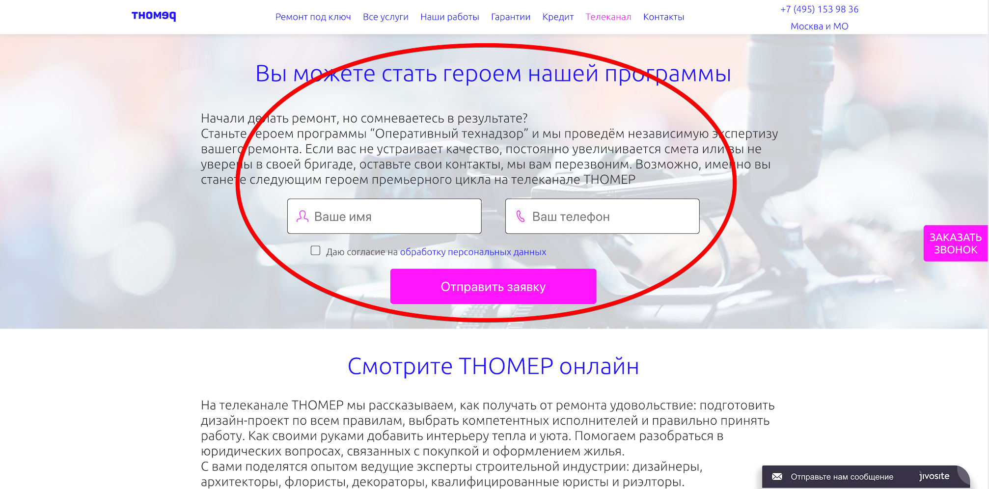
The TV Channel page and the block on the main “TV Channel”
The presence of a channel on conventional television can be a strong competitive advantage and deserves special positioning. Let's see how the site developers have coped with it.
Problem
When interacting with the site it is not clear what is meant exactly the channel on television. If the user has not previously interacted with this TV channel, he will not understand that the company has a TV channel, and not a more classic YouTube channel for the Internet.
Recommendation
It is more obvious to position that the company has its own television channel and explain the way to interact with it.
Problem
The current presentation of the air is not read properly. It seems that these are anchor links to the parts of the video presented on the left. But clicking on the list has no effect. Is something not working?
Recommendation
Modify the presentation of the broadcast program, eliminating false interpretations of the interface.
Problem
Late offer to become a member of the program. The user has not yet understood which TV channel is being discussed.
Recommendation
Change the presentation of the first screen in the direction of the presentation of the channel itself and only then offer to participate in the shooting.
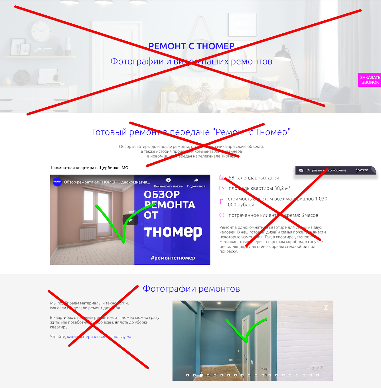
Page "Our work"
Portfolio repairs made is one of the main ways to increase the credibility of the company.
Problem
On the page "Our work" there is no focus on examples of work. The page is overloaded with redundant interface elements, diverting attention from the most important: photo and video works.
Recommendation
Shift the focus to content that confirms the presence of a portfolio: photos and videos. Even with a small or missing portfolio, you can create a sense of its presence in sufficient volume. Make the photos larger, turn them into short stories. Post more videos - both with customer reviews and apartments in the process of repair.
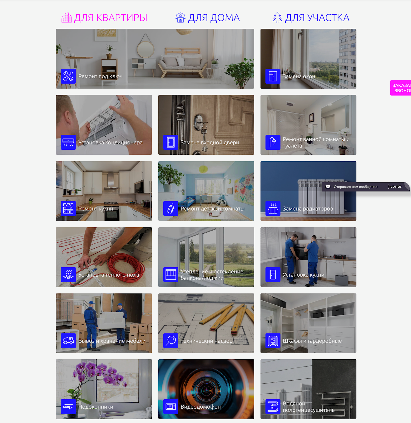
Page "All Services"
The content of the “All Services” page shows the company's services in a new role: this is not “repair - all inclusive”, but the services of some kind of DES.
Problem
Comprehensive repair services "Turnkey repair", "rough repair" and others are placed together with the services of domestic repair: "Window sills", "Air conditioners", "Video intercoms" and others.
Services of different levels and sizes are located without any systematization. Such an arrangement may, on the one hand, make it difficult to interact with the list and the search for the necessary, on the other - to create a false impression of the service itself: “Hmm, what do they do at all?”.
Recommendation
Segment the services according to one of the grounds understood by the target audience, but avoid any other interpretation of the service idea.
Problem
Ambiguous service names (for example, “Window Sills”, “Video Intercom”, “Installation”) do not form an exact idea of the essence of the offer and require a high level of involvement.
Recommendation
Call the services in such a way as to convey the correct essence of the service: "turnkey solution"
Pages of a particular service (for example, installation of air conditioning)
Problem
This is how most users see the first screen. “We have studied the market - breathe freely” does not form a meaningful value proposition.
The page does not convey the essence of the service. What exactly is offered, buy air conditioning, install air conditioning or something else? A high level of engagement is required to understand the essence of the service. And the idea of hiding the cost at the very end does not look successful against the background of the rest.
Recommendation
Immediately on the first screen it is simple and understandable to explain the main essence of the service, how it works, what is its cost. And only after that reveal specific details and nuances.
What does all of this mean?
In general, the site is so bad that I would not pay attention to it if it were not for information on the amount of investment in the service. Naturally, it is not known what part of the budget went to the site, but this once again confirms that even big money does not save from the probability of spoiling everything.
Why it happens? This is an attempt to save and make all inhouse? Error in choosing a contractor? Or just other priorities? What do you think?
ps How interesting are articles of this format? Sometimes I get bombed and I do a usability audit of random projects. To direct my energy in a useful way, you can offer an audit of your site or mobile application. I will choose interesting projects and make an audit for free. You can leave a request through private messages.
ps 2This material was first published by me on vc.ru and now, thanks to WD-40 , is available on Habré. Thank you, WD-40!