8 tricks for working with CSS: parallax, sticky footer and others
From a translator: Bret Cameron 's article on CSS tricks was translated for you . Many points will be useful not only for beginners, but also for experienced developers.
This article is about CSS techniques that I learned about and exclaimed: “Aahhhh!” Hope you make a couple of discoveries too.
CSS is a specific technology. At first glance, it seems very simple. But some effects, which in theory seem simple, are not such in practice.
I will show you some tricks and talk about how to use them in CSS. The article itself is not about complexity. On the contrary, it is designed to make your work more comfortable.
Skillbox recommends: A two-month hands -on course, "Profession Frontend-developer . "
We remind you: for all readers of Habr - a discount of 10,000 rubles when registering for any Skillbox course according to the Habr promotional code.
1. Sticky footer
Despite the ease of implementation, it can become a stumbling block for novice developers.
In most projects, you want the footer to remain at the bottom of the screen, regardless of the amount of content, and adapt to different viewing conditions.
Before CSS3, this effect was difficult to achieve without knowing the exact height of the footer. But now this is not a problem, it’s best to use Flexbox to create a sticky footer. Namely, take the flex-shrink property, so you will be sure that the footer will retain its size.
At size 0, it will not compress at all.
2. Hover magnification
This effect is a great way to draw the user's attention to a clickable image. When he moves the cursor over the picture, it slightly “rises” while maintaining the same size.
In order to make such an effect, we need a wrapper div, they need to wrap the image tag in HTML.
In addition, for the effect to work, you need to set the width and height of the element, and also make sure that its overflow is set to hidden. After that, you can apply any type of transformation.
3. Permanent Night Mode
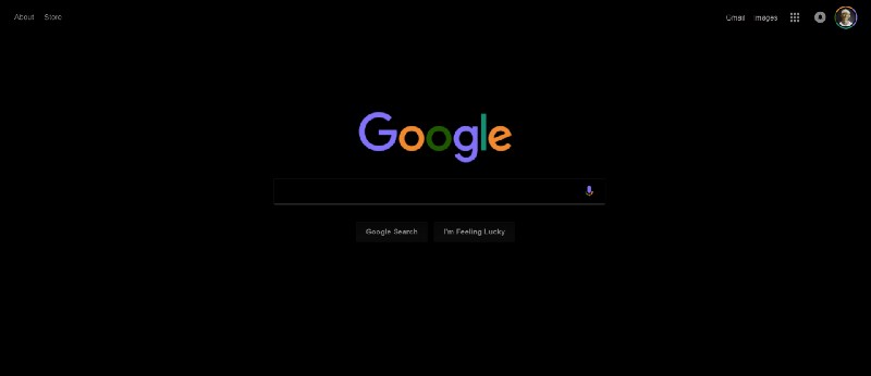
If you need a quick way to set the night mode for your site, then use the invert and hue-rotate filters.
filter: invert () can take values from 0 to 1. 1 is an inversion, white turns black.
filter: hue-rotate () changes the color content of your elements so that they maintain a more or less the same level of separation from each other. Values range from 0 to 360 degrees.
If you combine these effects inside the body tag, you can quickly get a night skin for the site (the background in this case needs to be set color).
Here is an example:
body {
    background: #FFF;
    filter: invert(1) hue-rotate(210deg);
}
Using these settings, you can turn the Google start page into this.
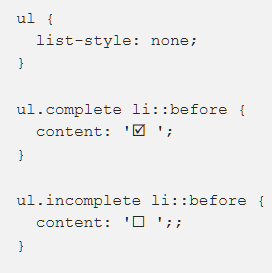
4. Custom bullets
To create custom shootouts for a list, you can use content along with the :: before pseudo-element.
In the CSS below, I use the two classes .comlete and .incomplete to distinguish between two types of shootouts.
Bonus: breadcrumbs in navigation.
There are many ways to get interesting effects using the content property, but I could not resist and added another.
Since slashes and other characters used to separate breadcrumbs are stylistic, it makes sense to define them in CSS. As in many other examples in this article, the effect is based on the last-child pseudo-class. It is only available in CSS3:
.breadcrumb a:first-child::before {
  content: " » ";
}
.breadcrumb a::after {
  content: " /";
}
.breadcrumb a:last-child::after {
  content: "";
}
5. Parallax images
This popular effect attracts the attention of users. It is worth using if you want to animate a page while scrolling.
While regular images change location when scrolling, parallax images remain in place.
CSS example (CSS only)
Here, background-attachment: fixed is an integral element, it binds the position of the background image to a specific position. The picture remains in place, while the window from which it is visible scrolls. It seems that the picture is behind the entire site. In order to replace this effect with the opposite, specify background-attachment: scroll.
CSS + JavaScript
6. Animation with cropped images
As with the sticky footer, before CSS3, it was difficult to make animations with cropped images. Now we have received object-fit and object-position, which together allow you to resize the image without affecting the aspect ratio of the image.
Previously, you had to use an image editor. The great advantage of CSS3 is the ability to make resizing images a part of the animation.
Here is an example with a tag. In this case, you can take advantage of the: checked pseudo-class, and JavaScript is not needed.
7. Blend Modes
If you are familiar with Photoshop, you are well aware of the benefits of blending modes to achieve various interesting effects. But did you know that these same modes are also available in CSS?
Here are examples of using blend modes for Medium pages with background-color - lightblue and blend-mode - difference:

You can use these modes not only for working with the background. The mix-blend-mode property allows you to mix elements with the background. So, for example, using mix-blend-mode - color-dodge and the background lightsalmon you can get this effect.
Prior to CSS3, it was hard to believe that sites could look like this.
Yes, there is a problem with Chrome 58+ that renders elements set in transparent or tags incorrectly. A quick fix is to add background-color - white.
8. Pinterest style - imageboard
CSS Grid and Flexbox greatly simplified the creation of various types of responsive layouts, allowing you to easily center elements on the page vertically.
But they are practically useless in Pinterest style image boards, where the vertical arrangement of each element changes depending on the height of the element above it.
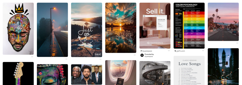
The best way to achieve this is to use a set of CSS column properties. They are most often used to create several columns of newspaper-style text, but there is another use case.
To make it work, you need to wrap the elements in a div and set the column-width and column-gap properties.
Then, to prevent separation of the elements between the two columns, add the column-break-inside parameter:
An example above is the use of the: not () pseudo-class. Used here: hover.
What tricks do you use when working with CSS? Indicate them in the comments - I'm sure it will be useful to all readers.
Skillbox recommends:
- Practical course "Mobile developer from scratch . "
- Online course "C # Developer with 0" .
- Practical course Python developer from scratch .