Design Science
“Every scientist, of course, bears a part of professional responsibility for the promotion of public understanding of science”
Attraction of design to science
Design can be more beneficial to science than science to design An

exercise in a preparatory course at the Ulm School of Design. 1958-59
Design and science have a difficult relationship. Or, more precisely, design has an uneasy relationship with science. Science, on the other hand, has almost no relationship with design, and it usually does not pay any attention to worries and anxieties in the design world.
Historically, the design has almost nothing to do with science. As is easily understood by name, decorative and applied art, which is one of the foundations of modern design, was closer to art as such than to science. Designers and artists often study at the same faculty at a university and think almost equally. During the 20th century, art inspired design, and sometimes vice versa. For many, design was above all a desire for an elegant and expressive aesthetics of the products and objects that surround us in our daily life.
Therefore, historically, design is much closer to the visual arts than to science. But everything is not so simple.
The translation was made with the support of the EDISON Software company, which is professionally engaged in web development and recently redesigned its website .
While aesthetics was and is the main theme of design - science and technology have always played an important role in the history of design. Scientific discoveries have led to the emergence of new technologies, new materials and new social spaces. But it was the development and design that made these technical innovations possible and accessible to the general public. Therefore, it can be argued that the design makes scientific progress visible and usable.
This process was not limited to natural sciences. In 1925, Otto Neurath created the Vienna Method of Graphic Statistics, which in 1934 became ISOTYPE - a symbolic way of presenting quantitative information. Together with designers Marie Neurath (née Reidemeister) and Gerd Arnz, Otto Neurath wanted to create a new visual language that would try to explain the complexity of the world in a picturesque form. Their purpose was to communicate social and scientific data in a form understandable to the general public.
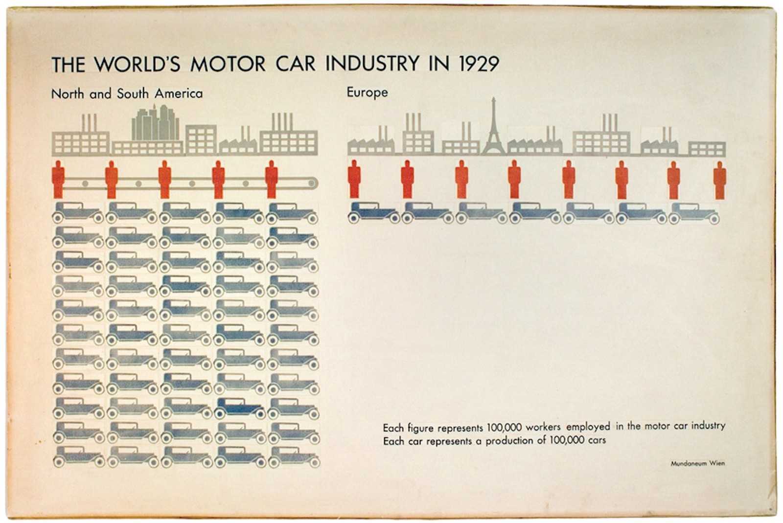
A typical example of ISOTYPE info graphics. Pay attention to the conveyor belt on the left!
Otto Neurath was an ardent follower of logical positivism. He believed in empirical observation and in the creation of rational reasons for philosophical discourse. He was known for interrupting philosophical debates, shouting “metaphysically!” If the root of the argument was not empirical observation. Therefore, he, of course, was not the one who was interested in expressive aesthetics and artistic interpretation of the design. Still, ISOTYPE is a very important milestone in the history of graphic design.
ISOTYPE's great achievement was the transfer of complex statistical data using a formalized visual design language that allowed observers to quickly understand the relationship between symbols and data. In his pioneering book International Picture Language (internationally, image description language), Neurath states that visual languages cannot replace verbal languages, but it also demonstrates the power of signs and images when it comes to explaining a complex process or transmitting statistical data. Thus, ISOTYPE is one of the first attempts to use design to transfer scientific data - in this case mainly to transfer data from the social sciences and from history.
This “rationalistic” approach to design was subsequently also held at the Ulm / Ulm School of Design (Ulm School of Design). In 1953, the Ulm School of Design accepted its first students. From the very beginning it was clear that this was not only a superficial aesthetic. The design had a social and political responsibility. And he could cope with this responsibility only by becoming more objective - and more scientific.
Exercise at the preparatory course at the Ulm School of Design. Student: John Lottes; Instructor: Anthony Froshaug; 1958-59; Provided by HfG-Archiv / Ulmer Museum
An important part of design training at the Ulm School of Design was the creation of a theoretical basis and a rational reason for design decisions. In addition, not only the approach to design problems was methodical, but also the goals and objectives of the design process. According to the ideas and ideals of the Ulm School of Design, design should be involved in social and intellectual progress. The question of whether the design approach at the Ulm school of design was “scientific” is still one of the main topics of scientific discussions, but it can be said with confidence that this approach introduced the form of intellectual questioning in the design process, which is still actively used .
The scientific community has never been particularly interested in the world of design. But in the second half of the 20th century, it was recognized that science has a communication problem. In 1985, the Royal Society published a report titled “Public Understanding of Science,” which had a tremendous impact on people. The report recognizes the importance of sharing research results with the general public. Although the term “design” is occasionally mentioned, it can be noted that the report repeatedly mentioned the relationship between design and science.
The responsibilities of the design are fairly obvious. The reflection of the history, process of science and its results for the general public is a rather difficult design task. In this context, the design offers great capabilities and capabilities. Whether it’s creating a museum exhibition, an infographic design, or an interactive simulation experiment, the design can convey scientific ideas in an intelligent, informative, and adorable way. To achieve this, the designer must work closely with scientists and correspondents and convey the correct message and the appropriate level of complexity.
In this sense, design interprets science and turns this interpretation into a specific artifact. This interpretation is very important for finding a suitable textual, visual and interactive form of a scientific statement.
However, it is important to note that this process cannot be one-sided. Science also has its own responsibilities. Although the report "Public Understanding of Science" states that "every scientist certainly has a part of professional responsibility for promoting the public understanding of science," it also noted that "within the scientific community, there is still aversion associated with involvement in Mass. "Thirty years have passed, and the situation has not changed. Every designer who has ever worked with a scientist knows that the transfer of scientific information is a really complicated business.
We must recognize that scientific progress has reached a level of depth and complexity that is difficult to explain. It is almost impossible to convey every aspect. String theory is simply not trivial. Climate research is associated with many uncertainties. In addition, science is highly specialized. There are many scientific disciplines and subdisciplines. And even similar disciplines sometimes do not understand each other. But we must also recognize that in order to achieve a better public understanding of science, the scientific community should cooperate more with writers and designers.
If science wants to play a more active role in public debates, folk culture and universal education, it needs to adapt and get a better idea of the design strategies. Public understanding of science is teamwork. And in this work design plays an important role.
Therefore, in the past, attempts to make the project more scientific and to use design to make science more understandable have dominated the relationship between science and design.
All this, of course, is wonderful. But I think design is capable of more. I believe design can contribute to scientific progress. Design can be part of science and should be. Instead of introducing science into design, I propose to introduce design into science.
Design - and in particular, interactive design - has many qualities, strategies and methodologies that can make a significant contribution to scientific progress. This statement is probably surprising - and for some offensive - because “design” is still associated with such things as marketing, advertising, surface aesthetics, luxury, and commercialism. Although this association is not entirely erroneous, it completely ignores aspects of design that are extremely valuable to science: innovation, consumer focus, deep aesthetics, problem solving, contextual awareness. And, as I mentioned earlier, even the intuitive aspects of the design process are not irrational.
Instead of explaining these aspects in detail, it is probably better to demonstrate the power and possibilities of design in a scientific context, illustrating this statement with concrete examples. We have been cooperating with scientists for many years in the interface development program in Potsdam. Thanks to our developments, we have contributed to research projects and brought new advantages to scientific work.
The following development projects demonstrate the power and possibilities of design in science and draw your attention to them.
Design in Natural Sciences
Organ Generator - Computerized Design in Biology
Roman Gracie
In the process of writing his master's thesis, Roman Gracie collaborated with a group of researchers who are studying the possibilities of 3D printing of organic tissue. He identified a number of research questions and problems that can be solved with the help of design. Since he was fully accepted into the team, he worked very closely with the researchers and created a number of impressive contributions for the project.
Bio-printing is a fairly new technology. It allows for the growth of living tissues in layers and is currently used to create individually designed mini-organs. Further development of this technology is aimed at printing fully functional organs for medical transplantations. The printer used in this project was Cellmicks Cellmaker, which uses stereolithography and specific biological “inks” to print complex mini organs. It has a resolution of up to 10 microns.
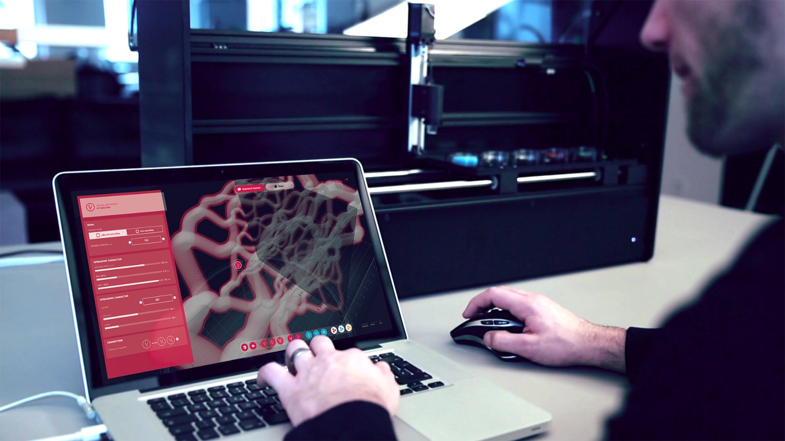
The prototype of the Bloodline Alpha 1 software for the Cellbricks 3D bio-printer
The starting point for the thesis was the development of a software interface for modeling a 3D bioprinter. Although this topic in itself was a peculiar challenge, it turned into a prototype of the Bloodline Alpha 1 application, and the thesis quickly developed into a more complex study. Roman raised many questions regarding the form of these organoid bodies. He applied the principles of generative design to the vascular aspects of organoid bodies and created a parametric system that allowed him and the research team to create a large number of different models based on the same generating principles. This system created a flexible but controlled environment for further experiments.
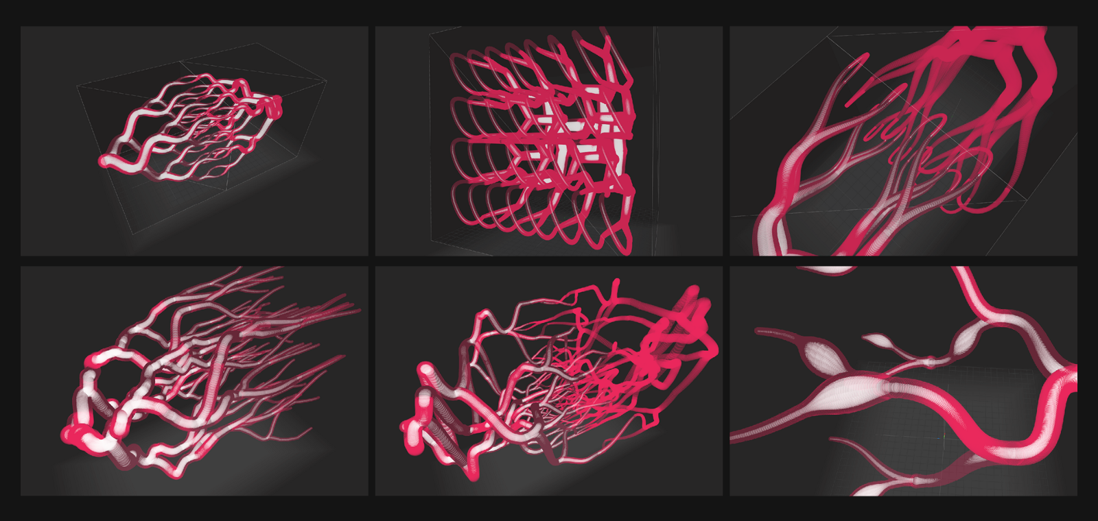
Results of building vascular systems using generative design
This system was reflected in the interface and interactive design of the main software application for modeling the data of organoid bodies - the so-called "building blocks" of organs.
Based on the ideas derived from the development of the system and the software interface, Roman was able to push design issues a step further. He addressed the probing question of how print organs could look and work if they existed outside the human body.
Our bodies are the repetition of models on complex organic surfaces in three dimensions. These patterns are based on the location of functional units in the dense spatial structures of the human body.
“Organ Generator” demonstrates the importance of including designers in a research group. Project contributions are highly dependent on the scope of the project and the quality of the results. In this project, the design does not simply reflect the scientific information and optimizes the programming interface. The design explores the inherent issues and opportunities of the project. Thus, design affects science - and vice versa.
Thesis project “Organ Generator”, Interface Development Program, University of Applied Sciences of Potsdam
Managers: Professor Boris Muller and Professor Matthias Kron
Partners: Cellbricks GmbH and Intuity Media Lab GmbH
Design in the humanities
VIKUS Viewer
Catherine Glinka, Christopher Pitch and Professor Dr. Marian Dork
Over the past few years, a number of cultural institutions have digitized their collections. In many cases, the media databases in which collections are stored contain detailed and high-quality content. But databases often lack interfaces for working with digitized material. There are not enough tools for studying, visualizing, organizing and understanding cultural collections that help scientists in their work.
The goal of the VIKUS research project is to investigate the role of data visualization and graphical user interfaces in the study and examination of digitized cultural collections. Our team of researchers designs, develops and evaluates interactive systems that support academics and academics working with cultural collections.
One of the results of the VIKUS project is the interactive visualization of VIKUS Viewer performed by Past Visions.
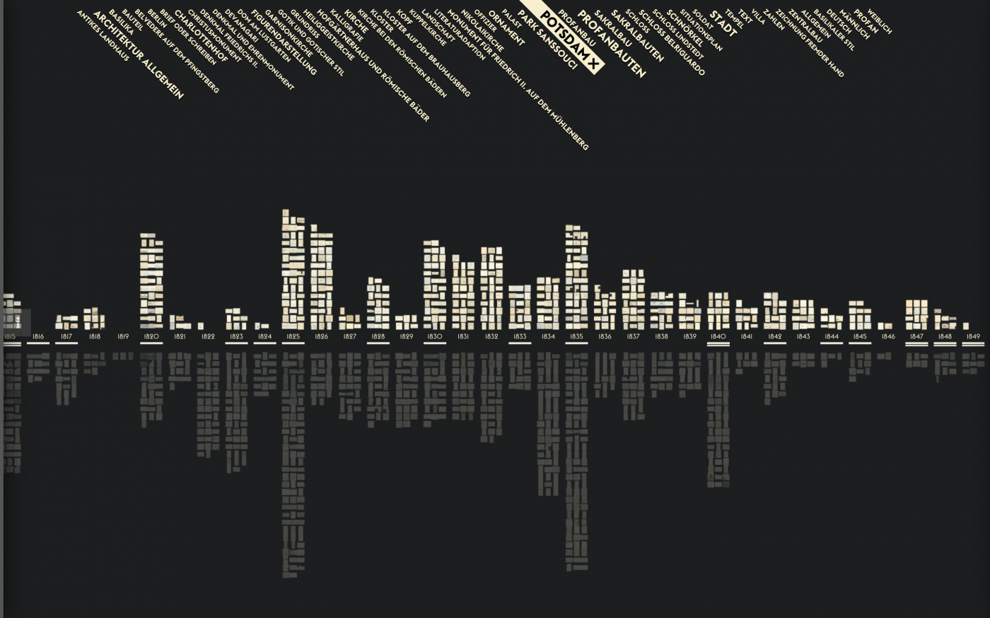
Visualization of historical drawings of Friedrich Wilhelm IV.
The visualization is based on the digital collection of drawings by Friedrich Wilhelm IV of Prussia (1795-1861). The drawings reflect his personal ideas about art and architecture, as well as literary influences or contemporary events such as wars and revolutions. The database contains 1492 high-resolution images, which include drawings, sketches and corresponding metadata.
Interactive visualization provides users with several ways to organize, study and coordinate images. Its implementation is similar to a dynamic canvas on which the drawings are distributed by year or according to similarity. Tools for interactive filtering and scaling make visualization very flexible and very powerful, as users can seamlessly move from high-level views to clusters and close-ups.
This visualization allows cultural scientists to see the collection and explore it according to temporal and thematic aspects without abstract representation of individual drawings in the form of common figures. Interactive visualization reveals both temporal and thematic structures in the collection and provides an opportunity to explore scans of individual high-resolution drawings.
VIKUS Viewer provides culturologists with an innovative, valuable and efficient way to work with digital cultural collections. It is a well-developed research tool that generates new ideas that would otherwise be lost or imperceptible.
Just as technology provides scientists with new technological tools for measuring, recording and analyzing, design provides science with new conceptual tools for researching and evaluating data.
Design in Climate Impact Studies
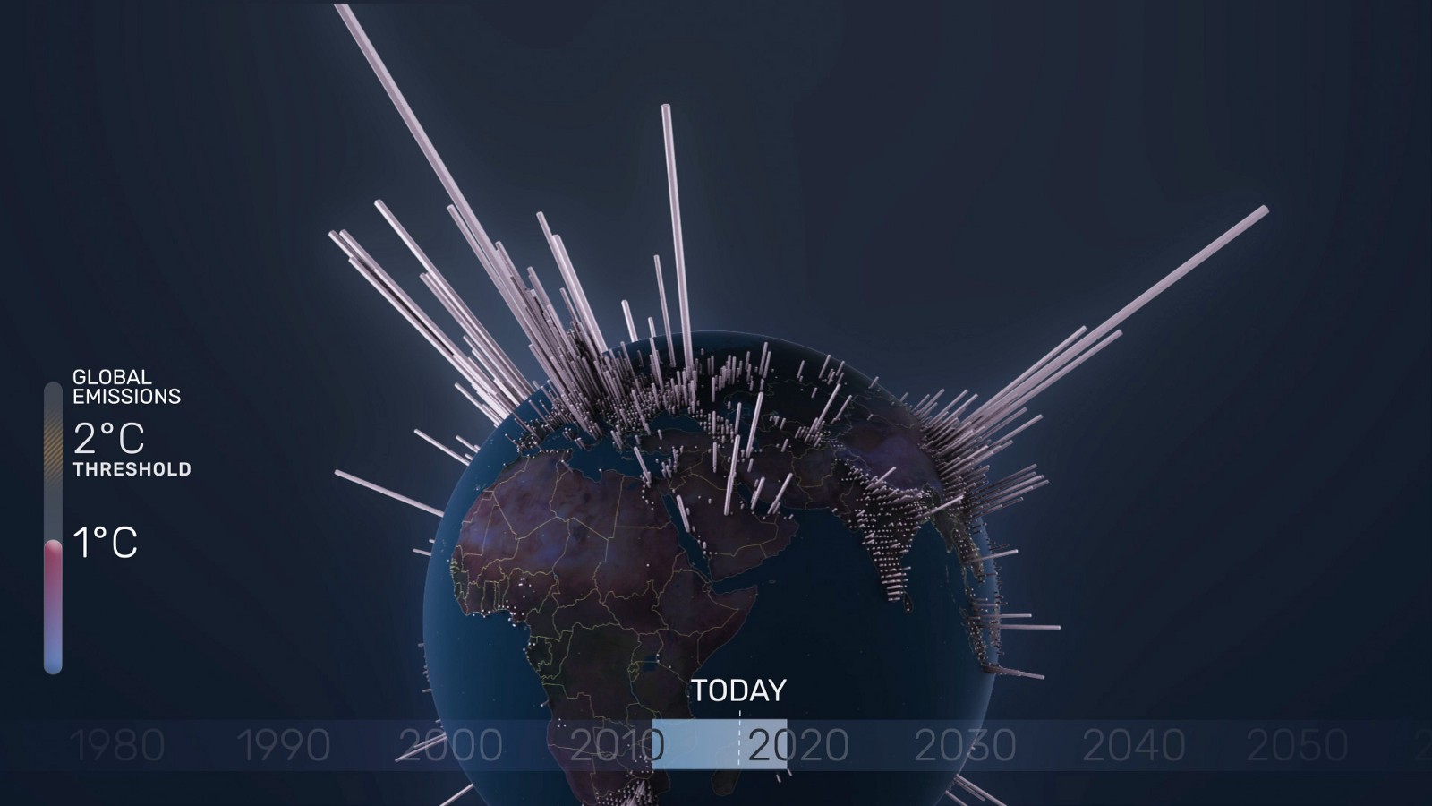
A brief history of CO2 emissions
Julian Brown, Dr. Elmar Crigler, Professor Boris Muller, and others.
Climate change is one of the most important tasks of the 21st century. This problem creeps in unnoticed, since it is a gradual process that has been going on for many years. Climate change is widely discussed only when disasters such as hurricanes or massive flooding occur. But this is a serious threat to global stability, which needs to be understood and with which you need to do something.
As my colleague Elmar Kriegler from the Potsdam Institute for Climate Change Research (PIK) explains: “Climate change is already happening today (with warming by 1 degree from pre-industrial times) and even if we take into account that the Paris Agreement will be successfully implemented, the temperature increase will continue until the middle century (the temperature will rise by half a degree or a little more until 2050). Therefore, some catastrophes can not be avoided, such as increased storms, heat and drought, rising sea levels, bleaching coral reefs, but the goal is to avoid the worst
Greenhouse gas emissions are one of the major problems underlying climate change. Together with the Potsdam Climate Change Institute, the Urban Complexity Lab of the University of Applied Sciences of Potsdam has developed a short film on CO2 emissions and global warming. In our film, A Brief History of CO2 Emissions, we present the geographical distribution and historical measurement of carbon dioxide emissions.
We literally wanted to show where and when CO2 was emitted over the past 250 years - and where emissions can be effected over the next 80 years if no action is taken. By visualizing the global distribution and the amount of accumulated CO2, we were able to create an impressive image that very clearly demonstrates the dominant areas of CO2 emissions and time intervals. The short film format also gave us the opportunity to provide context and tell a story. Thus, the data is not only visualized, but also part of the story. We believe that this combination of facts and narration is an excellent format for informing a wide audience about the causes and consequences of climate change.
Our goal was not only to increase awareness of climate change, but also to correlate facts and data. This was possible only through collaboration with climatologists. The team from the Potsdam Institute for Climate Change Studies chooses the most recent and authoritative sources of information on this topic. One of the important sources was data from the Carbon Dioxide Information Analysis Center. It provides the longest time series of “net” (i.e., spatially distributed) CO2 emissions from fossil fuel combustion and cement production.
Although our short film is primarily a transfer of scientific information and a good example for “public understanding of science”, cooperation with researchers from the Potsdam Institute for the Study of Climate Change turned out to be informative and inspiring for both parties. This generated the SENSES project, which will address the challenges of visualizing global climate change scenarios on a larger scale.
Conclusion
Science is one of the most important foundations of our modern world. This is true not only for the natural sciences, but also for the humanities. Initially, the design stood between art and technology. But with the growth of digital technology, it has become more relevant to a wider range of topics and issues. We have reached a point where design - as a discipline - can contribute to scientific progress; and he really became a part of science.
One of the most important contributions is, of course, visualization in the widest sense of the word. Designers - image makers. And today, images play a very important role in the transfer of scientific information and in the scientific work itself. If your scientific work is related to images of any kind, you are dealing with design issues. To address these issues with scientific integrity requires designers.
But besides creating images, design can also play an important role in scientific work. Designers are taught to solve problems and be co-authors. As the Organ Generator project showed, designers can make a valuable contribution to a research project.
Therefore, science must be combined with design - and vice versa. For this to happen, both areas must be more open and must interact with each other. The scientific community must understand “design” not only as an assistant in the sense of “public understanding of the sciences”, but also as an area capable of contributing to scientific work. The same rule works for design. If design takes responsibility for what is happening in the world, it needs to integrate more with scientific disciplines and impart to the sciences the qualities inherent in design.
This will not leave the design unchanged. This will challenge how we teach design and how we apply it today. We will need new spaces where design and science can meet on equal terms. We will need new forms of research funding that require the involvement of designers. We need to recognize the potential of excellence in the collaboration of science and design.
I firmly believe that designers, as specialists in disseminating information, as people who solve problems, as authors of images, as creators and co-authors, can make an important and valuable contribution to scientific progress.
This essay was reviewed by my colleague Marian Dirk. He is an experienced computer scientist and I am an experienced interactive designer. Working together in the Urban Complexity Lab, we are a living example of successful cooperation in the field of science and design!
Thank you Marian Dyork.