11 best fonts for programming
- Transfer
Many articles and sites compare fonts for programming - these are all excellent resources. So why am I raising this topic again? Because he himself was always lost in dozens of fonts and could not figure out which is better. So I tried a lot of fonts and chose the following for you. They are quite popular and easy to get. And most importantly, all of these fonts are free!
I ranged fonts by the following indicators:
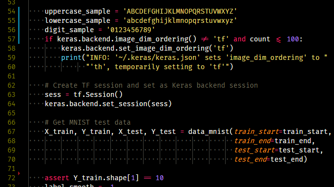
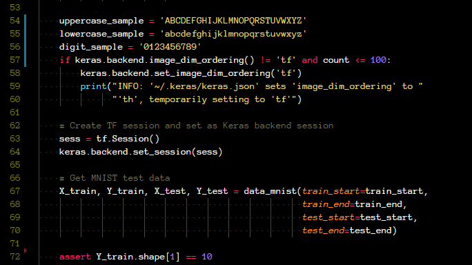
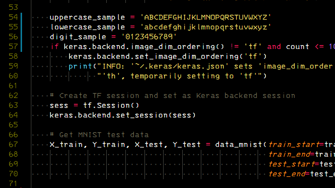
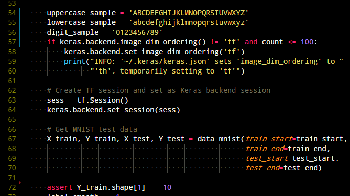
All screenshots are made in VSCode on one piece of code. Unless otherwise indicated, size is set everywhere
Hack is a free font specifically designed for source code and based on the Bitstream Vera and DejaVu projects.
Derived font from Bitstream Vera. This is also a good option with a free license. Sans Mono clearly distinguishes between
Monaco was used by default in OSX before the release of Snow Leopard. Symbols differ well, so it’s hard to confuse
Source Code Pro was developed by Adobe. In general, the text looks sharper than other fonts, not to mention the good distinguishability of characters.

Menlo is the new default font on macOS for Xcode and Terminal. It is a derivative of DejaVu Sans Mono. Personally, I like Monaco more, since I have been using OSX for a long time, but Menlo is also a good choice for programming.

Addition: Menlo is no longer the default font on macOS. In the High Sierra version, the default font was changed to San Francisco Mono, which is also a great choice for programming. Thanks to Ivan Kantarino and p13t3rm .
Consolas is the default font in Visual Studio. It is very popular because it comes with Windows. Personally, I do not really like the symbol
Space Mono is designed by Colophon Foundry and is a great monospace font. I note two drawbacks: 1)

FiraCode supports ligatures, that is, it can combine two or more characters into one character to facilitate reading code. Pay attention to
Note: to activate ligatures in VSCode, add the following line.
I like Anonymous Pro because it gives a typewriter feel. In addition, here the symbol
The IBM 3270 is based on the font used in the IBM 3270 console, released by IBM in 1971. This font is great for programming and is made in retro style (although it is not entirely familiar to me).
Please note that this font is relatively small, so I suggest increasing the font size and reducing the line height to make it more readable on the screen.
Droid Sans is created for Android and is very beautiful. But the biggest problem is that it does not have zero with a slot,
Addition: For Droid Sans Mono, options have been created where there is a zero with a strikethrough and a dot. Thanks hawtre smith .
Thank you for reading! I hope this article helps you find a new font for the IDE or console! Please recommend this article to others if you like it!
ADDITION:
I received feedback on other fonts for programming. Yes, they are all wonderful, totally agree! The main goal of this article is to provide an initial base for those who have little experience with a variety of fonts, so I will try to keep a minimal list and not overload people. But thanks to everyone for the feedback. With pleasure I will try in the daily work the font that you mentioned.
I ranged fonts by the following indicators:
- How to distinguish similar characters, such as
0O,1lI. - Is the font easy to read (line width, character width / height).
- And my personal preferences!
All screenshots are made in VSCode on one piece of code. Unless otherwise indicated, size is set everywhere
"editor.fontSize": 14.1. Hack
Hack is a free font specifically designed for source code and based on the Bitstream Vera and DejaVu projects.
0Oand 1lIclearly distinguishable, and the font as a whole is easy to read. I especially liked the zero with a vertical slot.2. DejaVu Sans Mono
Derived font from Bitstream Vera. This is also a good option with a free license. Sans Mono clearly distinguishes between
0Oand 1lI. The dot inside is 0not as noticeable as the Hack, but overall the font is convenient.3. Monaco
Monaco was used by default in OSX before the release of Snow Leopard. Symbols differ well, so it’s hard to confuse
0Oand 1lI. I like this font because of its special style, as if returning to OSX again (now I mainly use Ubuntu).4. Source Code Pro
Source Code Pro was developed by Adobe. In general, the text looks sharper than other fonts, not to mention the good distinguishability of characters.
5. Menlo
Menlo is the new default font on macOS for Xcode and Terminal. It is a derivative of DejaVu Sans Mono. Personally, I like Monaco more, since I have been using OSX for a long time, but Menlo is also a good choice for programming.
Addition: Menlo is no longer the default font on macOS. In the High Sierra version, the default font was changed to San Francisco Mono, which is also a great choice for programming. Thanks to Ivan Kantarino and p13t3rm .
6. Consolas
Consolas is the default font in Visual Studio. It is very popular because it comes with Windows. Personally, I do not really like the symbol
l, because it is easily confused with 1.7. Space Mono
Space Mono is designed by Colophon Foundry and is a great monospace font. I note two drawbacks: 1)
lcan be confused with 1; 2) ,does not differ from .the font size of 14 points.8. FiraCode
FiraCode supports ligatures, that is, it can combine two or more characters into one character to facilitate reading code. Pay attention to
!=, <=and ==the screenshot. Personally, I'm used to the original characters, and ligatures confuse me a bit. But someone may like this font. Note: to activate ligatures in VSCode, add the following line.
"editor.fontLigatures": true,9. Anonymous Pro
I like Anonymous Pro because it gives a typewriter feel. In addition, here the symbol
<is narrower than in Hack, so it looks more like a sign.10. IBM 3270
The IBM 3270 is based on the font used in the IBM 3270 console, released by IBM in 1971. This font is great for programming and is made in retro style (although it is not entirely familiar to me).
Please note that this font is relatively small, so I suggest increasing the font size and reducing the line height to make it more readable on the screen.
"editor.lineHeight": 20,
"editor.fontSize": 14,
11. Droid Sans Mono
Droid Sans is created for Android and is very beautiful. But the biggest problem is that it does not have zero with a slot,
0and therefore it is Onot distinguishable. Addition: For Droid Sans Mono, options have been created where there is a zero with a strikethrough and a dot. Thanks hawtre smith .
Thank you for reading! I hope this article helps you find a new font for the IDE or console! Please recommend this article to others if you like it!
ADDITION:
I received feedback on other fonts for programming. Yes, they are all wonderful, totally agree! The main goal of this article is to provide an initial base for those who have little experience with a variety of fonts, so I will try to keep a minimal list and not overload people. But thanks to everyone for the feedback. With pleasure I will try in the daily work the font that you mentioned.