Gini coefficient. From economics to machine learning
An interesting fact: in 1912, Italian statistician and demographer Corrado Gini wrote the famous work “Variability and Variability of a Character”, and in the same year “Titanic” sank in the waters of the Atlantic. It would seem that what is common between these two events? It's simple, their consequences are widely used in the field of machine learning. And if the Titanic dataset does not need an introduction, then we will talk in more detail about one remarkable statistic, first published in the work of an Italian scientist. I want to note right away that the article has nothing to do with the Gini Impurity coefficient, which is used in decision trees as a criterion for the quality of a partition in classification problems. These coefficients are in no way related to each other and there are approximately the same total between them,
The Gini coefficient is a quality metric that is often used in evaluating predictive models in binary classification problems under conditions of strong imbalance in the classes of the target variable. It is it that is widely used in the tasks of bank lending, insurance, and targeted marketing. To fully understand this metric, we first need to plunge into the economy and figure out why it is used there.
The Gini coefficient is a statistical indicator of the degree of stratification of a society relative to any economic feature (annual income, property, real estate) used in countries with developed market economies. Basically, the level of annual income is taken as a calculated indicator. The coefficient shows the deviation of the actual distribution of income in society from their absolutely equal distribution between the population and allows you to very accurately assess the uneven distribution of income in society. It is worth noting that a little earlier than the birth of the Gini coefficient, in 1905, the American economist Max Lorenz in his work “Methods for measuring the concentration of wealth” proposed a method for measuring the concentration of well-being of society, later called the “Lorentz Curve”. Next we will show
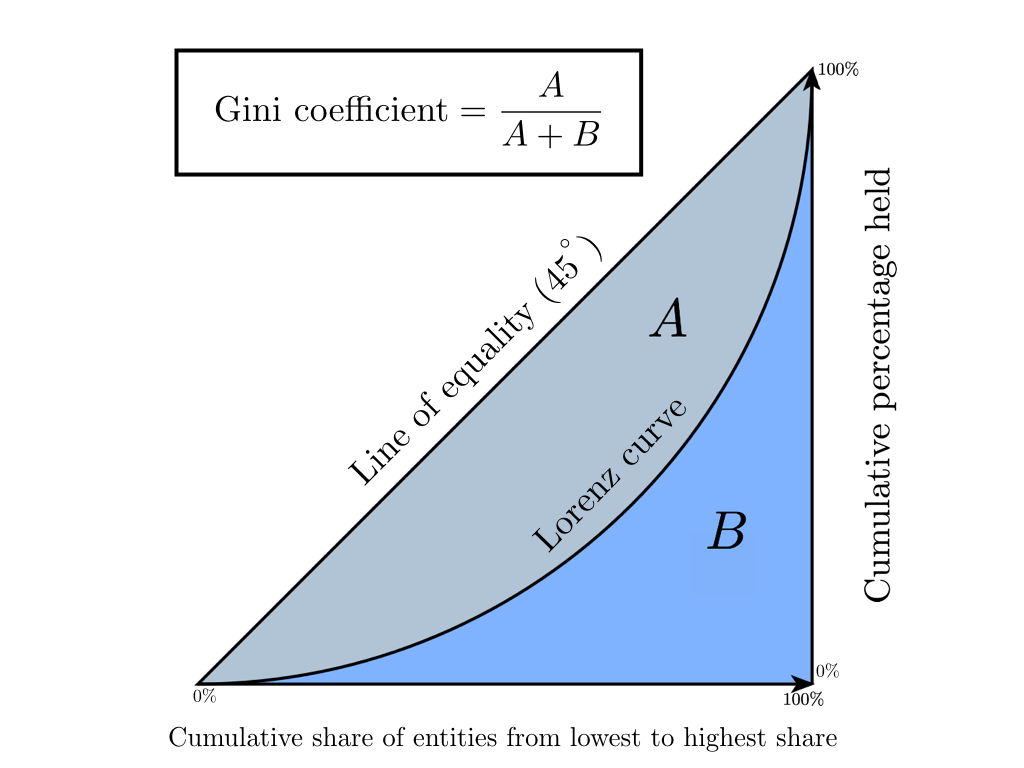
The Lorenz curve is a graphical representation of the share of total income attributable to each population group. The diagonal line on the graph corresponds to the “line of absolute equality” - the income of the entire population is the same.
The Gini coefficient varies from 0 to 1. The more its value deviates from zero and approaches unity, the more income is concentrated in the hands of individual population groups and the higher the level of social inequality in the state, and vice versa. Sometimes a percentage representation of this coefficient is used, called the Gini index (the value varies from 0% to 100%).
There are several ways in economics to calculate this coefficient, we will focus on the Brown formula (first you need to create a variation series - to rank the population by income):
Where - number of inhabitants
  - cumulative share of the population,
  - cumulative share of income for
Let's look at the above with a toy example in order to intuitively understand the meaning of these statistics.
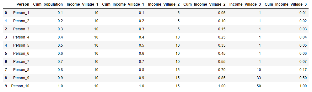
Suppose there are three villages, each of which has 10 inhabitants. In each village, the total annual income of the population is 100 rubles. In the first village, all residents earn the same amount - 10 rubles a year, in the second village the income distribution is different: 3 people earn 5 rubles, 4 people 10 rubles each and 3 people 15 rubles each. And in the third village, 7 people receive 1 ruble per year, 1 person - 10 rubles, 1 person - 33 rubles and one person - 50 rubles. For each village, we calculate the Gini coefficient and construct the Lorentz curve.
We will present the initial data on the villages in the form of a table and immediately calculate and for clarity:
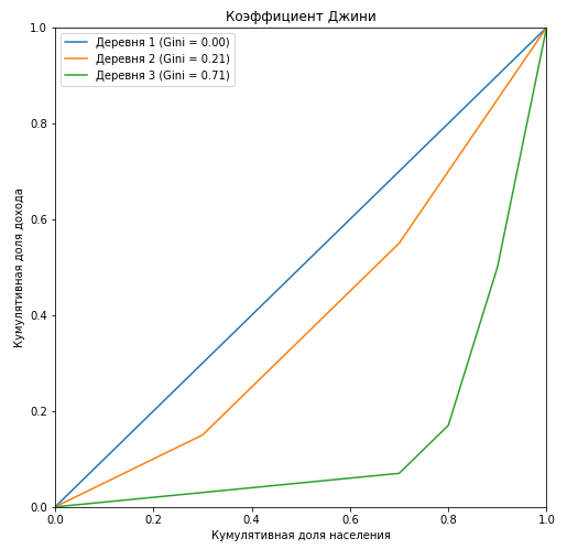
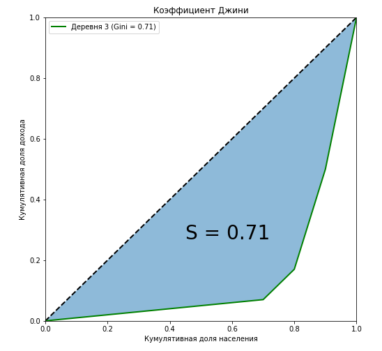
It can be seen that the Lorentz curve for the Gini coefficient in the first village completely coincides with the diagonal (the “line of absolute equality”), and the greater the stratification among the population with respect to annual income, the larger the area of the figure formed by the Lorentz curve and the diagonal. We show by the example of the third village that the ratio of the area of this figure to the area of the triangle formed by the line of absolute equality is exactly equal to the value of the Gini coefficient:
We have shown that along with algebraic methods, one of the methods for calculating the Gini coefficient is geometric — calculating the area fraction between the Lorentz curve and the line of absolute equality of income from the total area under the direct absolute equality of income.
Another important point. Let's mentally fix the ends of the curve at the points and
and  and begin to change its shape. It is quite obvious that the size of the figure will not change, but by doing so we transfer the members of society from the “middle class” to the poor or the rich without changing the ratio of income between classes. Take for example ten people with the following income:
Now we apply Sharikov’s “Select and Share!” Method to a person with an income of “20”, redistributing his income proportionally between the other members of society. In this case, the Gini coefficient does not change and remains equal to 0.772, we just pulled the “fixed” Lorentz curve to the abscissa axis and changed its shape:
Let's dwell on another important point: when calculating the Gini coefficient, we do not classify people as rich and poor, it does not depend on who we consider to be a pauper or an oligarch. But suppose that we faced such a task, for this, depending on what we want to get, what our goals are, we will need to set an income threshold that clearly divides people into rich and poor. If you saw in this an analogy with Threshold from binary classification problems, then it’s time for us to move on to machine learning.
It should be noted right away that, having come to machine learning, the Gini coefficient has changed a lot: it is calculated differently and has a different meaning. Numerically, the coefficient is equal to the area of the figure formed by the line of absolute equality and the Lorentz curve. There are also common features with a relative from the economy, for example, we still need to build the Lorentz curve and calculate the area of the figures. And most importantly, the algorithm for constructing the curve has not changed. The Lorentz curve also underwent changes, it was called the Lift Curve and is a mirror image of the Lorentz curve relative to the line of absolute equality (due to the fact that the ranking of probabilities does not increase, but decrease). We will analyze all this with the next toy example. To minimize errors in calculating the area of figures, we will use scipy functionsinterp1d (interpolation of a one-dimensional function) and quad (calculation of a certain integral).
Suppose we solve the binary classification problem for 15 objects and we have the following distribution of classes:
Our trained algorithm predicts the following probabilities of attitude to class “1” on these objects:
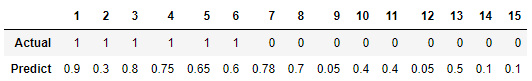
We calculate the Gini coefficient for two models: our trained algorithm and an ideal model that accurately predicts classes with a probability of 100%. The idea is this: instead of ranking the population by income, we rank the predicted probabilities of the model in descending order and substitute the cumulative fraction of the true values of the target variable corresponding to the predicted probabilities in the formula. In other words, we sort the table by the line “Predict” and consider the cumulative share of classes instead of the cumulative share of income.

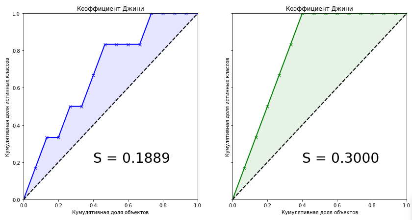
The Gini coefficient for the trained model is 0.1889. Is it a little or a lot? How accurate is the algorithm? Without knowing the exact value of the coefficient for an ideal algorithm, we cannot say anything about our model. Therefore, the quality metric in machine learning is the normalized Gini coefficient , which is equal to the ratio of the coefficient of the trained model to the coefficient of the ideal model. Further, under the term "Gini coefficient" we mean exactly this.
Looking at these two graphs, we can draw the following conclusions:
We came to the most, perhaps, interesting point - the algebraic representation of the Gini coefficient. How to calculate this metric? She is not equal to her relative from the economy. It is known that the coefficient can be calculated by the following formula:
I honestly tried to find the conclusion of this formula on the Internet, but did not find anything. Even in foreign books and scientific articles. But on some dubious websites of statisticians, the phrase came across: “This is so obvious that there’s nothing to discuss. It’s enough to compare the graphs of Lift Curve and ROC Curve, so that everything immediately becomes clear . A little later, when he himself derived a formula for the connection of these two metrics, I realized that this phrase is an excellent indicator. If you hear or read it, it is only obvious that the author of the phrase has no understanding of the Gini coefficient. Let's take a look at the Lift Curve and ROC Curve graphs for our example:
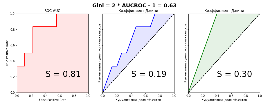
It is clearly seen that it is impossible to catch the connection from the graphical representation of metrics, so we prove the algebraic equality. I managed to do this in two ways - parametrically (by integrals) and non-parametrically (through Wilcoxon-Mann-Whitney statistics). The second method is much simpler without multi-story fractions with double integrals, so we will dwell on it in detail. For further consideration of the evidence, we define the terminology: the cumulative share of true classes is nothing but the True Positive Rate. The cumulative share of objects is in turn the number of objects in the ranked row (when scaling to an interval - respectively, the proportion of objects).
To understand the proof, you need a basic understanding of the ROC-AUC metric - what it is generally about, how the graph is built and in what axes. I recommend an article from the blog of Alexander Dyakonov “AUC ROC (area under the error curve)”.
We introduce the following notation:
The parametric equation for the ROC curve can be written as follows:
When plotting the Lift Curve on the axis we set aside the proportion of objects (their number) pre-sorted in descending order. Thus, the parametric equation for the Gini coefficient will look like this:
Substituting expression (4) into expression (1) for both models and transforming it, we will see that expression (3) can be substituted into one of the parts, which in the end will give us a beautiful formula for normalized Gini (2)
In the proof, I relied on the elementary postulates of Probability Theory. It is known that numerically the AUC ROC value is equal to the Wilcoxon-Mann-Whitney statistics:
Where - the response of the algorithm on the i-th object from the distribution "1",
  - the answer of the algorithm on the j-th object from the distribution “0”. You
can find the proof of this formula, for example. It is
interpreted very intuitively: if you randomly extract a pair of objects, where the first object will be from distribution “1” and the second from distribution “ 0 ", then the probability that the first object will have a predicted value greater than or equal to the predicted value of the second object is equal to the AUC ROC value. Combinatorially it is easy to calculate that the number of pairs of such objects will be: .
.
Let the model predict possible values from the set
  where
where  and
and  - some kind of probability distribution, the elements of which take values on the interval
 ![$[0,1]$](https://habrastorage.org/getpro/habr/formulas/a5d/538/f83/a5d538f83bd73f9d1c9e8338db9a398a.svg) .
.
Let be the set of values that objects take
  and
and  . Let be
 the set of values that objects take
  and
and  . Obviously, the sets and may intersect.
We denote as the probability that the object will matter
  , and
, and  as the probability that the object will matter . Then
 and
and 
Having a priori probability for each sample object, we can write a formula that determines the probability that the object will take a value :
We define three distribution functions:
- for objects of class "1"
- for objects of class "0"
- for all objects of the sample
An example of how distribution functions for two classes in a credit scoring problem might look:
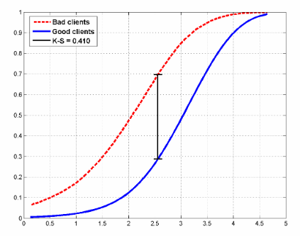
The figure also shows the Kolmogorov-Smirnov statistics, which is also used to evaluate models.
We write the Wilcoxon formula in a probabilistic form and transform it:
We can write a similar formula for the area under the Lift Curve (remember that it consists of the sum of two areas, one of which is always 0.5):
And now we will transform it:
For an ideal model, the formula is written simply:
Therefore, from (8) and (9), we obtain:
As they said at school, which was required to prove.
As mentioned at the beginning of the article, the Gini coefficient is used to evaluate models in many areas, including banking lending, insurance, and targeted marketing. And there is a very reasonable explanation for this. This article does not set itself the goal of dwelling on the practical application of statistics in a particular area. Many books have been written on this subject; we will only briefly go over this topic.
Around the world, banks receive thousands of applications for a loan every day. Of course, it is necessary to somehow assess the risks that the client may simply not repay the loan, therefore, predictive models are being developed that assess the probability that the client will not repay the loan by the attribute space, and these models must first be evaluated and If the model is successful, then choose the optimal threshold (threshold) of probability. The choice of the optimal threshold is determined by the policy of the bank. The task of analysis when choosing a threshold is to minimize the risk of lost profits associated with the refusal to issue a loan. But in order to choose a threshold, you must have a quality model. The main quality metrics in the banking sector:
I don’t know how things are in Russia, although I live here, but in Europe the Gini coefficient is most widely used, in North America - Kolmogorov-Smirnov statistics.
In this area, everything is similar to the banking sector, with the only difference being that we need to divide customers into those who submit an insurance claim and those who do not. Consider a practical example from this area, in which one feature of the Lift Curve will be clearly visible - with highly unbalanced classes in the target variable, the curve almost perfectly coincides with the ROC curve.
A few months ago, Kaggle hosted the Porto Seguro's Safe Driver Prediction competition, in which the task was just to predict the Insurance Claim - submitting an insurance claim. And in which I, by my own stupidity, missed the silver by choosing the wrong submit.

It was a very strange and at the same time incredibly informative competition. And with a record number of participants - 5169. The winner of the competitionMichael Jahrer wrote code only in C ++ / CUDA, and this is admired and respected.
Porto Seguro is a Brazilian car insurance company.
The dataset consisted of 595,207 lines in the train, 892,816 lines in the test and 53 anonymous signs. The ratio of classes in the target is 3% and 97%. We will write a simple baseline, since this is done in a couple of lines, and we will build graphs. Please note that the curves coincide almost perfectly, the difference in the areas under the Lift Curve and ROC Curve is 0.005.
The Gini coefficient of the winning model is 0.29698.
For me, the mystery is still what the organizers wanted to achieve by recognizing the signs and doing an incredible data preprocessing. This is one of the reasons why all models, including the winning ones, essentially turned out to be garbage. Probably just a PR, before no one in the world knew about Porto Seguro except Brazilians, now many know.
In this area, you can best understand the true meaning of the Gini coefficient and Lift Curve. For some reason, almost all books and articles give examples of email marketing campaigns, which in my opinion is an anachronism. Let's create an artificial business task from the sphere of free2play games . We have a database of users who once played our game and, for some reason, fell off. We want to return them to our game project, for each user we have a certain attribute space (time in the project, how much he spent, to what level he reached, etc.) on the basis of which we build the model. We evaluate the model by the Gini coefficient and build the Lift Curve:

Suppose that as part of a marketing campaign, we are in one way or another establishing contact with a user (email, social networks), the price of contact with one user is 2 rubles. We know that Lifetime Value is 5 rubles. It is necessary to optimize the effectiveness of the marketing campaign. Suppose there are 100 users in the sample, of which 30 will return. Thus, if we establish contact with 100% of users, we will spend 200 rubles on a marketing campaign and get an income of 150 rubles. This is a campaign failure. Consider the Lift Curve chart. It is seen that in contact with 50% of users, we are in contact with 90% of users who will return. campaign costs - 100 rubles, income 135. We are in the black. Thus, Lift Curve allows us to optimize our marketing company in the best way.
The Gini coefficient has a rather funny, but very useful interpretation, with which we can also easily calculate it. It turns out that numerically it is equal to:
Where, the number of permutations that must be done in the ranked list in order to get a true list of the target variable,
  - the number of permutations for the predictions of a random algorithm. Let's write an elementary sorting with a bubble and show it:
Thus:
We see that we got the value of the coefficient, as in the toy example considered above.
Hopefully the article was helpful and dispelled some myths regarding this quality metric.
The Gini coefficient is a quality metric that is often used in evaluating predictive models in binary classification problems under conditions of strong imbalance in the classes of the target variable. It is it that is widely used in the tasks of bank lending, insurance, and targeted marketing. To fully understand this metric, we first need to plunge into the economy and figure out why it is used there.
Economy
The Gini coefficient is a statistical indicator of the degree of stratification of a society relative to any economic feature (annual income, property, real estate) used in countries with developed market economies. Basically, the level of annual income is taken as a calculated indicator. The coefficient shows the deviation of the actual distribution of income in society from their absolutely equal distribution between the population and allows you to very accurately assess the uneven distribution of income in society. It is worth noting that a little earlier than the birth of the Gini coefficient, in 1905, the American economist Max Lorenz in his work “Methods for measuring the concentration of wealth” proposed a method for measuring the concentration of well-being of society, later called the “Lorentz Curve”. Next we will show
The Lorenz curve is a graphical representation of the share of total income attributable to each population group. The diagonal line on the graph corresponds to the “line of absolute equality” - the income of the entire population is the same.
The Gini coefficient varies from 0 to 1. The more its value deviates from zero and approaches unity, the more income is concentrated in the hands of individual population groups and the higher the level of social inequality in the state, and vice versa. Sometimes a percentage representation of this coefficient is used, called the Gini index (the value varies from 0% to 100%).
There are several ways in economics to calculate this coefficient, we will focus on the Brown formula (first you need to create a variation series - to rank the population by income):

Where
- number of inhabitants - cumulative share of the population, - cumulative share of income for Let's look at the above with a toy example in order to intuitively understand the meaning of these statistics.
Suppose there are three villages, each of which has 10 inhabitants. In each village, the total annual income of the population is 100 rubles. In the first village, all residents earn the same amount - 10 rubles a year, in the second village the income distribution is different: 3 people earn 5 rubles, 4 people 10 rubles each and 3 people 15 rubles each. And in the third village, 7 people receive 1 ruble per year, 1 person - 10 rubles, 1 person - 33 rubles and one person - 50 rubles. For each village, we calculate the Gini coefficient and construct the Lorentz curve.
We will present the initial data on the villages in the form of a table and immediately calculate
and for clarity:Python code
import pandas as pd
import numpy as np
import matplotlib.pyplot as plt
%matplotlib inline
import warnings
warnings.filterwarnings('ignore')
village = pd.DataFrame({'Person':['Person_{}'.format(i) for i in range(1,11)],
                        'Income_Village_1':[10]*10,
                        'Income_Village_2':[5,5,5,10,10,10,10,15,15,15],
                        'Income_Village_3':[1,1,1,1,1,1,1,10,33,50]})
village['Cum_population'] =  np.cumsum(np.ones(10)/10)
village['Cum_Income_Village_1'] =  np.cumsum(village['Income_Village_1']/100)
village['Cum_Income_Village_2'] =  np.cumsum(village['Income_Village_2']/100)
village['Cum_Income_Village_3'] =  np.cumsum(village['Income_Village_3']/100)
village = village.iloc[:, [3,4,0,5,1,6,2,7]]
village
Python code
plt.figure(figsize = (8,8))
Gini=[]
for i in range(1,4):
    X_k = village['Cum_population'].values
    X_k_1 = village['Cum_population'].shift().fillna(0).values
    Y_k = village['Cum_Income_Village_{}'.format(i)].values
    Y_k_1 = village['Cum_Income_Village_{}'.format(i)].shift().fillna(0).values
    Gini.append(1 - np.sum((X_k - X_k_1) * (Y_k + Y_k_1)))
    plt.plot(np.insert(X_k,0,0), np.insert(village['Cum_Income_Village_{}'.format(i)].values,0,0),
             label='Деревня {} (Gini = {:0.2f})'.format(i, Gini[i-1]))
plt.title('Коэффициент Джини')
plt.xlabel('Кумулятивная доля населения')
plt.ylabel('Кумулятивная доля дохода')
plt.legend(loc="upper left")
plt.xlim(0, 1)
plt.ylim(0, 1)
plt.show()
It can be seen that the Lorentz curve for the Gini coefficient in the first village completely coincides with the diagonal (the “line of absolute equality”), and the greater the stratification among the population with respect to annual income, the larger the area of the figure formed by the Lorentz curve and the diagonal. We show by the example of the third village that the ratio of the area of this figure to the area of the triangle formed by the line of absolute equality is exactly equal to the value of the Gini coefficient:
Python code
curve_area = np.trapz(np.insert(village['Cum_Income_Village_3'].values,0,0), np.insert(village['Cum_population'].values,0,0))
S = (0.5 - curve_area) / 0.5
plt.figure(figsize = (8,8))
plt.plot([0,1],[0,1],linestyle = '--',lw = 2,color = 'black')
plt.plot(np.insert(village['Cum_population'].values,0,0), np.insert(village['Cum_Income_Village_3'].values,0,0),
             label='Деревня {} (Gini = {:0.2f})'.format(i, Gini[i-1]),lw = 2,color = 'green')
plt.fill_between(np.insert(X_k,0,0), np.insert(X_k,0,0), y2=np.insert(village['Cum_Income_Village_3'].values,0,0), alpha=0.5)
plt.text(0.45,0.27,'S = {:0.2f}'.format(S),fontsize = 28)
plt.title('Коэффициент Джини')
plt.xlabel('Кумулятивная доля населения')
plt.ylabel('Кумулятивная доля дохода')
plt.legend(loc="upper left")
plt.xlim(0, 1)
plt.ylim(0, 1)
plt.show()
We have shown that along with algebraic methods, one of the methods for calculating the Gini coefficient is geometric — calculating the area fraction between the Lorentz curve and the line of absolute equality of income from the total area under the direct absolute equality of income.
Another important point. Let's mentally fix the ends of the curve at the points
and and begin to change its shape. It is quite obvious that the size of the figure will not change, but by doing so we transfer the members of society from the “middle class” to the poor or the rich without changing the ratio of income between classes. Take for example ten people with the following income:![$ [1, 1, 1, 1, 1, 1, 1, 1, 20, 72] $](https://habrastorage.org/getpro/habr/formulas/772/06c/f99/77206cf993fb0e9ecbdff5612199831b.svg)
Now we apply Sharikov’s “Select and Share!” Method to a person with an income of “20”, redistributing his income proportionally between the other members of society. In this case, the Gini coefficient does not change and remains equal to 0.772, we just pulled the “fixed” Lorentz curve to the abscissa axis and changed its shape:
![$ [1 + 11.1 / 20, 1 + 11.1 / 20, 1 + 11.1 / 20, 1 + 11.1 / 20, \\ 1 + 11.1 / 20, 1 + 11.1 / 20, 1 + 11.1 / 20, 1 + 11.1 / 20, 1 + 11.1 / 20, 72 + 8.9 / 20] $](https://habrastorage.org/getpro/habr/formulas/cc1/0aa/f19/cc10aaf19abdde6a1d8070d8b29b68de.svg)
Let's dwell on another important point: when calculating the Gini coefficient, we do not classify people as rich and poor, it does not depend on who we consider to be a pauper or an oligarch. But suppose that we faced such a task, for this, depending on what we want to get, what our goals are, we will need to set an income threshold that clearly divides people into rich and poor. If you saw in this an analogy with Threshold from binary classification problems, then it’s time for us to move on to machine learning.
Machine learning
1. General understanding
It should be noted right away that, having come to machine learning, the Gini coefficient has changed a lot: it is calculated differently and has a different meaning. Numerically, the coefficient is equal to the area of the figure formed by the line of absolute equality and the Lorentz curve. There are also common features with a relative from the economy, for example, we still need to build the Lorentz curve and calculate the area of the figures. And most importantly, the algorithm for constructing the curve has not changed. The Lorentz curve also underwent changes, it was called the Lift Curve and is a mirror image of the Lorentz curve relative to the line of absolute equality (due to the fact that the ranking of probabilities does not increase, but decrease). We will analyze all this with the next toy example. To minimize errors in calculating the area of figures, we will use scipy functionsinterp1d (interpolation of a one-dimensional function) and quad (calculation of a certain integral).
Suppose we solve the binary classification problem for 15 objects and we have the following distribution of classes:
![$ [1, 1, 1, 1, 1, 1, 0, 0, 0, 0, 0, 0, 0, 0, 0, 0] $](https://habrastorage.org/getpro/habr/formulas/961/cf6/9a6/961cf69a6d9bdedeb297a920787ff4b6.svg)
Our trained algorithm predicts the following probabilities of attitude to class “1” on these objects:
We calculate the Gini coefficient for two models: our trained algorithm and an ideal model that accurately predicts classes with a probability of 100%. The idea is this: instead of ranking the population by income, we rank the predicted probabilities of the model in descending order and substitute the cumulative fraction of the true values of the target variable corresponding to the predicted probabilities in the formula. In other words, we sort the table by the line “Predict” and consider the cumulative share of classes instead of the cumulative share of income.
Python code
from scipy.interpolate import interp1d
from scipy.integrate import quad
actual = [1, 1, 1, 1, 1, 1, 0, 0, 0, 0, 0, 0, 0, 0, 0]
predict = [0.9, 0.3, 0.8, 0.75, 0.65, 0.6, 0.78, 0.7, 0.05, 0.4, 0.4, 0.05, 0.5, 0.1, 0.1]
data = zip(actual, predict)
sorted_data = sorted(data, key=lambda d: d[1], reverse=True)
sorted_actual = [d[0] for d in sorted_data]
cumulative_actual = np.cumsum(sorted_actual) / sum(actual)
cumulative_index = np.arange(1, len(cumulative_actual)+1) / len(predict)
cumulative_actual_perfect = np.cumsum(sorted(actual, reverse=True)) / sum(actual)
x_values = [0] + list(cumulative_index)
y_values = [0] + list(cumulative_actual)
y_values_perfect = [0] + list(cumulative_actual_perfect)
f1, f2 = interp1d(x_values, y_values), interp1d(x_values, y_values_perfect)
S_pred = quad(f1, 0, 1, points=x_values)[0] - 0.5
S_actual = quad(f2, 0, 1, points=x_values)[0] - 0.5
fig, ax = plt.subplots(nrows=1,ncols=2, sharey=True, figsize=(14, 7))
ax[0].plot(x_values, y_values, lw = 2, color = 'blue', marker='x')
ax[0].fill_between(x_values, x_values, y_values, color = 'blue', alpha=0.1)
ax[0].text(0.4,0.2,'S = {:0.4f}'.format(S_pred),fontsize = 28)
ax[1].plot(x_values, y_values_perfect, lw = 2, color = 'green', marker='x')
ax[1].fill_between(x_values, x_values, y_values_perfect, color = 'green', alpha=0.1)
ax[1].text(0.4,0.2,'S = {:0.4f}'.format(S_actual),fontsize = 28)
for i in range(2):
    ax[i].plot([0,1],[0,1],linestyle = '--',lw = 2,color = 'black')
    ax[i].set(title='Коэффициент Джини', xlabel='Кумулятивная доля объектов',
              ylabel='Кумулятивная доля истинных классов', xlim=(0, 1), ylim=(0, 1))
plt.show();
The Gini coefficient for the trained model is 0.1889. Is it a little or a lot? How accurate is the algorithm? Without knowing the exact value of the coefficient for an ideal algorithm, we cannot say anything about our model. Therefore, the quality metric in machine learning is the normalized Gini coefficient , which is equal to the ratio of the coefficient of the trained model to the coefficient of the ideal model. Further, under the term "Gini coefficient" we mean exactly this.

Looking at these two graphs, we can draw the following conclusions:
- Predicting the ideal algorithm is the maximum Gini coefficient for the current data set and depends only on the true distribution of classes in the problem.
- The figure area for an ideal algorithm is:

- Predictions of trained models cannot be greater than the coefficient value of an ideal algorithm.
- With a uniform distribution of the classes of the target variable, the Gini coefficient of the ideal algorithm will always be 0.25
- For an ideal algorithm, the shape of the figure formed by the Lift Curve and the line of absolute equality will always be a triangle
- The Gini coefficient of the random algorithm is 0, and the Lift Curve coincides with the line of absolute equality
- The Gini coefficient of a trained algorithm will always be less than the coefficient of an ideal algorithm
- The values of the normalized Gini coefficient for the trained algorithm are in the range .
- The normalized Gini coefficient is a quality metric that needs to be maximized.
2. Algebraic representation. Proof of linear relationship with AUC ROC
We came to the most, perhaps, interesting point - the algebraic representation of the Gini coefficient. How to calculate this metric? She is not equal to her relative from the economy. It is known that the coefficient can be calculated by the following formula:

I honestly tried to find the conclusion of this formula on the Internet, but did not find anything. Even in foreign books and scientific articles. But on some dubious websites of statisticians, the phrase came across: “This is so obvious that there’s nothing to discuss. It’s enough to compare the graphs of Lift Curve and ROC Curve, so that everything immediately becomes clear . A little later, when he himself derived a formula for the connection of these two metrics, I realized that this phrase is an excellent indicator. If you hear or read it, it is only obvious that the author of the phrase has no understanding of the Gini coefficient. Let's take a look at the Lift Curve and ROC Curve graphs for our example:
Python code
from sklearn.metrics import roc_curve, roc_auc_score
aucroc = roc_auc_score(actual, predict)
gini = 2*roc_auc_score(actual, predict)-1
fpr, tpr, t = roc_curve(actual, predict)
fig, ax = plt.subplots(nrows=1,ncols=3, sharey=True, figsize=(15, 5))
fig.suptitle('Gini = 2 * AUCROC - 1 = {:0.2f}\n\n'.format(gini),fontsize = 18, fontweight='bold')
ax[0].plot([0]+fpr.tolist(), [0]+tpr.tolist(), lw = 2, color = 'red')
ax[0].fill_between([0]+fpr.tolist(), [0]+tpr.tolist(), color = 'red', alpha=0.1)
ax[0].text(0.4,0.2,'S = {:0.2f}'.format(aucroc),fontsize = 28)
ax[1].plot(x_values, y_values, lw = 2, color = 'blue')
ax[1].fill_between(x_values, x_values, y_values, color = 'blue', alpha=0.1)
ax[1].text(0.4,0.2,'S = {:0.2f}'.format(S_pred),fontsize = 28)
ax[2].plot(x_values, y_values_perfect, lw = 2, color = 'green')
ax[2].fill_between(x_values, x_values, y_values_perfect, color = 'green', alpha=0.1)
ax[2].text(0.4,0.2,'S = {:0.2f}'.format(S_actual),fontsize = 28)
ax[0].set(title='ROC-AUC', xlabel='False Positive Rate',
              ylabel='True Positive Rate', xlim=(0, 1), ylim=(0, 1))
for i in range(1,3):
    ax[i].plot([0,1],[0,1],linestyle = '--',lw = 2,color = 'black')
    ax[i].set(title='Коэффициент Джини', xlabel='Кумулятивная доля объектов',
              ylabel='Кумулятивная доля истинных классов', xlim=(0, 1), ylim=(0, 1))
plt.show();
It is clearly seen that it is impossible to catch the connection from the graphical representation of metrics, so we prove the algebraic equality. I managed to do this in two ways - parametrically (by integrals) and non-parametrically (through Wilcoxon-Mann-Whitney statistics). The second method is much simpler without multi-story fractions with double integrals, so we will dwell on it in detail. For further consideration of the evidence, we define the terminology: the cumulative share of true classes is nothing but the True Positive Rate. The cumulative share of objects is in turn the number of objects in the ranked row (when scaling to an interval
- respectively, the proportion of objects). To understand the proof, you need a basic understanding of the ROC-AUC metric - what it is generally about, how the graph is built and in what axes. I recommend an article from the blog of Alexander Dyakonov “AUC ROC (area under the error curve)”.
We introduce the following notation:
- - The number of objects in the sample
- - The number of objects of class "0"
- - The number of objects of class "1"
 - True Positive (the correct answer of the model on the true class is “1” at a given threshold)
  - False Positive (incorrect response of the model to the true class “0” at a given threshold)
  - True Positive Rate (ratio to )
  - False Positive Rate (ratio) to )
  - The current index of the item.
Parametric method
The parametric equation for the ROC curve can be written as follows:

When plotting the Lift Curve on the axis
we set aside the proportion of objects (their number) pre-sorted in descending order. Thus, the parametric equation for the Gini coefficient will look like this:
Substituting expression (4) into expression (1) for both models and transforming it, we will see that expression (3) can be substituted into one of the parts, which in the end will give us a beautiful formula for normalized Gini (2)
Nonparametric Method
In the proof, I relied on the elementary postulates of Probability Theory. It is known that numerically the AUC ROC value is equal to the Wilcoxon-Mann-Whitney statistics:


Where
- the response of the algorithm on the i-th object from the distribution "1", - the answer of the algorithm on the j-th object from the distribution “0”. You can find the proof of this formula, for example. It is
interpreted very intuitively: if you randomly extract a pair of objects, where the first object will be from distribution “1” and the second from distribution “ 0 ", then the probability that the first object will have a predicted value greater than or equal to the predicted value of the second object is equal to the AUC ROC value. Combinatorially it is easy to calculate that the number of pairs of such objects will be:
. Let the model predict
possible values from the set where and - some kind of probability distribution, the elements of which take values on the interval . Let be
the set of values that objects take and . Let be the set of values that objects take and . Obviously, the sets and may intersect. We denote
as the probability that the object will matter , and as the probability that the object will matter . Then and Having a priori probability
for each sample object, we can write a formula that determines the probability that the object will take a value : 
We define three distribution functions:
- for objects of class "1"
- for objects of class "0"
- for all objects of the sample


An example of how distribution functions for two classes in a credit scoring problem might look:
The figure also shows the Kolmogorov-Smirnov statistics, which is also used to evaluate models.
We write the Wilcoxon formula in a probabilistic form and transform it:

We can write a similar formula for the area under the Lift Curve (remember that it consists of the sum of two areas, one of which is always 0.5):

And now we will transform it:

For an ideal model, the formula is written simply:

Therefore, from (8) and (9), we obtain:

As they said at school, which was required to prove.
3. Practical application
As mentioned at the beginning of the article, the Gini coefficient is used to evaluate models in many areas, including banking lending, insurance, and targeted marketing. And there is a very reasonable explanation for this. This article does not set itself the goal of dwelling on the practical application of statistics in a particular area. Many books have been written on this subject; we will only briefly go over this topic.
Credit scoring
Around the world, banks receive thousands of applications for a loan every day. Of course, it is necessary to somehow assess the risks that the client may simply not repay the loan, therefore, predictive models are being developed that assess the probability that the client will not repay the loan by the attribute space, and these models must first be evaluated and If the model is successful, then choose the optimal threshold (threshold) of probability. The choice of the optimal threshold is determined by the policy of the bank. The task of analysis when choosing a threshold is to minimize the risk of lost profits associated with the refusal to issue a loan. But in order to choose a threshold, you must have a quality model. The main quality metrics in the banking sector:
- Gini coefficient
- Kolmogorov-Smirnov statistics (calculated as the maximum difference between the cumulative distribution functions of “bad” and “good” borrowers. The figure above shows the distributions and these statistics)
- Divergence coefficient (this is an estimate of the difference in the mathematical expectations of the distributions of scoring points for “bad” and “good” borrowers, normalized by the variances of these distributions. The higher the value of the divergence coefficient, the better the quality of the model.)
I don’t know how things are in Russia, although I live here, but in Europe the Gini coefficient is most widely used, in North America - Kolmogorov-Smirnov statistics.
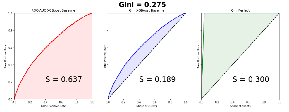
Insurance
In this area, everything is similar to the banking sector, with the only difference being that we need to divide customers into those who submit an insurance claim and those who do not. Consider a practical example from this area, in which one feature of the Lift Curve will be clearly visible - with highly unbalanced classes in the target variable, the curve almost perfectly coincides with the ROC curve.
A few months ago, Kaggle hosted the Porto Seguro's Safe Driver Prediction competition, in which the task was just to predict the Insurance Claim - submitting an insurance claim. And in which I, by my own stupidity, missed the silver by choosing the wrong submit.
It was a very strange and at the same time incredibly informative competition. And with a record number of participants - 5169. The winner of the competitionMichael Jahrer wrote code only in C ++ / CUDA, and this is admired and respected.
Porto Seguro is a Brazilian car insurance company.
The dataset consisted of 595,207 lines in the train, 892,816 lines in the test and 53 anonymous signs. The ratio of classes in the target is 3% and 97%. We will write a simple baseline, since this is done in a couple of lines, and we will build graphs. Please note that the curves coincide almost perfectly, the difference in the areas under the Lift Curve and ROC Curve is 0.005.
Python code
from sklearn.model_selection import train_test_split
import xgboost as xgb
from scipy.interpolate import interp1d
from scipy.integrate import quad
df = pd.read_csv('train.csv', index_col='id')
unwanted = df.columns[df.columns.str.startswith('ps_calc_')]
df.drop(unwanted,inplace=True,axis=1)
df.fillna(-999, inplace=True)
train, test = train_test_split(df, stratify=df.target, test_size=0.25, random_state=1)
estimator = xgb.XGBClassifier(seed=1, n_jobs=-1)
estimator.fit(train.drop('target', axis=1), train.target)
pred = estimator.predict_proba(test.drop('target', axis=1))[:, 1]
test['predict'] = pred
actual = test.target.values
predict = test.predict.values
data = zip(actual, predict)
sorted_data = sorted(data, key=lambda d: d[1], reverse=True)
sorted_actual = [d[0] for d in sorted_data]
cumulative_actual = np.cumsum(sorted_actual) / sum(actual)
cumulative_index = np.arange(1, len(cumulative_actual)+1) / len(predict)
cumulative_actual_perfect = np.cumsum(sorted(actual, reverse=True)) / sum(actual)
aucroc = roc_auc_score(actual, predict)
gini = 2*roc_auc_score(actual, predict)-1
fpr, tpr, t = roc_curve(actual, predict)
x_values = [0] + list(cumulative_index)
y_values = [0] + list(cumulative_actual)
y_values_perfect = [0] + list(cumulative_actual_perfect)
fig, ax = plt.subplots(nrows=1,ncols=3, sharey=True, figsize=(18, 6))
fig.suptitle('Gini = {:0.3f}\n\n'.format(gini),fontsize = 26, fontweight='bold')
ax[0].plot([0]+fpr.tolist(), [0]+tpr.tolist(), lw=2, color = 'red')
ax[0].plot([0]+fpr.tolist(), [0]+tpr.tolist(), lw = 2, color = 'red')
ax[0].fill_between([0]+fpr.tolist(), [0]+tpr.tolist(), color = 'red', alpha=0.1)
ax[0].text(0.4,0.2,'S = {:0.3f}'.format(aucroc),fontsize = 28)
ax[1].plot(x_values, y_values, lw = 2, color = 'blue')
ax[1].fill_between(x_values, x_values, y_values, color = 'blue', alpha=0.1)
ax[1].text(0.4,0.2,'S = {:0.3f}'.format(S_pred),fontsize = 28)
ax[2].plot(x_values, y_values_perfect, lw = 2, color = 'green')
ax[2].fill_between(x_values, x_values, y_values_perfect, color = 'green', alpha=0.1)
ax[2].text(0.4,0.2,'S = {:0.3f}'.format(S_actual),fontsize = 28)
ax[0].set(title='ROC-AUC XGBoost Baseline', xlabel='False Positive Rate',
              ylabel='True Positive Rate', xlim=(0, 1), ylim=(0, 1))
ax[1].set(title='Gini XGBoost Baseline')
ax[2].set(title='Gini Perfect')
for i in range(1,3):
    ax[i].plot([0,1],[0,1],linestyle = '--',lw = 2,color = 'black')
    ax[i].set(xlabel='Share of clients', ylabel='True Positive Rate', xlim=(0, 1), ylim=(0, 1))
plt.show();
The Gini coefficient of the winning model is 0.29698.
For me, the mystery is still what the organizers wanted to achieve by recognizing the signs and doing an incredible data preprocessing. This is one of the reasons why all models, including the winning ones, essentially turned out to be garbage. Probably just a PR, before no one in the world knew about Porto Seguro except Brazilians, now many know.
Target marketing
In this area, you can best understand the true meaning of the Gini coefficient and Lift Curve. For some reason, almost all books and articles give examples of email marketing campaigns, which in my opinion is an anachronism. Let's create an artificial business task from the sphere of free2play games . We have a database of users who once played our game and, for some reason, fell off. We want to return them to our game project, for each user we have a certain attribute space (time in the project, how much he spent, to what level he reached, etc.) on the basis of which we build the model. We evaluate the model by the Gini coefficient and build the Lift Curve:
Suppose that as part of a marketing campaign, we are in one way or another establishing contact with a user (email, social networks), the price of contact with one user is 2 rubles. We know that Lifetime Value is 5 rubles. It is necessary to optimize the effectiveness of the marketing campaign. Suppose there are 100 users in the sample, of which 30 will return. Thus, if we establish contact with 100% of users, we will spend 200 rubles on a marketing campaign and get an income of 150 rubles. This is a campaign failure. Consider the Lift Curve chart. It is seen that in contact with 50% of users, we are in contact with 90% of users who will return. campaign costs - 100 rubles, income 135. We are in the black. Thus, Lift Curve allows us to optimize our marketing company in the best way.
4. Bubble Sort
The Gini coefficient has a rather funny, but very useful interpretation, with which we can also easily calculate it. It turns out that numerically it is equal to:

Where,
the number of permutations that must be done in the ranked list in order to get a true list of the target variable, - the number of permutations for the predictions of a random algorithm. Let's write an elementary sorting with a bubble and show it:
Python code
actual = [1, 1, 1, 1, 1, 1, 0, 0, 0, 0, 0, 0, 0, 0, 0]
predict = [0.9, 0.3, 0.8, 0.75, 0.65, 0.6, 0.78, 0.7, 0.05, 0.4, 0.4, 0.05, 0.5, 0.1, 0.1]
data = zip(actual, predict)
sorted_data = sorted(data, key=lambda d: d[1], reverse=False)
sorted_actual = [d[0] for d in sorted_data]
swaps=0
n = len(sorted_actual)
array = sorted_actual
for i in range(1,n):
    flag = 0
    for j in range(n-i):
        if array[j]>array[j+1]:
            array[j], array[j+1] = array[j+1], array[j]
            flag = 1
            swaps+=1
    if flag == 0: break
print("Число перестановок: ", swaps)
Number of permutations: 10Combinatorially, it is easy to calculate the number of permutations for a random algorithm:

Thus:

We see that we got the value of the coefficient, as in the toy example considered above.
Hopefully the article was helpful and dispelled some myths regarding this quality metric.