How to use gamification in analytics
Any game assumes that it has a plot, character and actions that the character performs to develop the plot. Games are used everywhere in education from kindergarten to business games at work, all this is explained by the fact that this approach helps to quickly and easily learn material. But we all know that any BI-systems are aimed at quickly and clearly conveying to the end user a large amount of information, or the so-called key performance indicators. The concept of the game has long been used in analytics, they just call it all “storytelling”. How to apply it in real life situations? Does storytelling solve current problems arising in the implementation of BI-systems?

If you believe the data in the free Wikipedia encyclopedia, then the key performance indicators are enterprise performance indicators that help the organization achieve strategic and tactical goals . But, it seems to me, these tools have long lost their purpose. Let's try to ask ourselves: “Why did we create KPI?” KPIs were created to track changes and influence the outcome. But instead, indicators have become our worst enemies. Sometimes it seems that not indicators work for the benefit of business efficiency, but the whole business works for indicators. And we ourselves had a hand in this.

Each new data source, as it seemed to us, required monitoring - and we made a report. A new problem is the new KPI. We put all this into dashboards, assembled, like Frankenstein, from various units that define business in their own way. Then systems were formed from dashboards. But these systems, like stampers, produced a large number of indicators without reflecting the real relationships of the business. Every day in the system becomes tens and hundreds of times more data. How are we going to control this? More analysts? More reports? Quantity is not equal to quality.
I have been suffering from BI addiction for eight years. In this article I will try to rethink the approach to analytics and tell how my team works. How to learn to understand the behavior of the system? Stop analyzing it in a disassembled state.

Any analytics should be built of three main components - Data, Story, Visualization .
The plot data helps you easily get into the business context and understand even the most specialized information. Raw data does not give us the opportunity to track, for example, the optimization of financial flows. Because Data + Story is not just numbers, it is a digital reflection of business content.
If now you are still thinking about your dirty aggregated indicators, then visualization will help you rethink this.
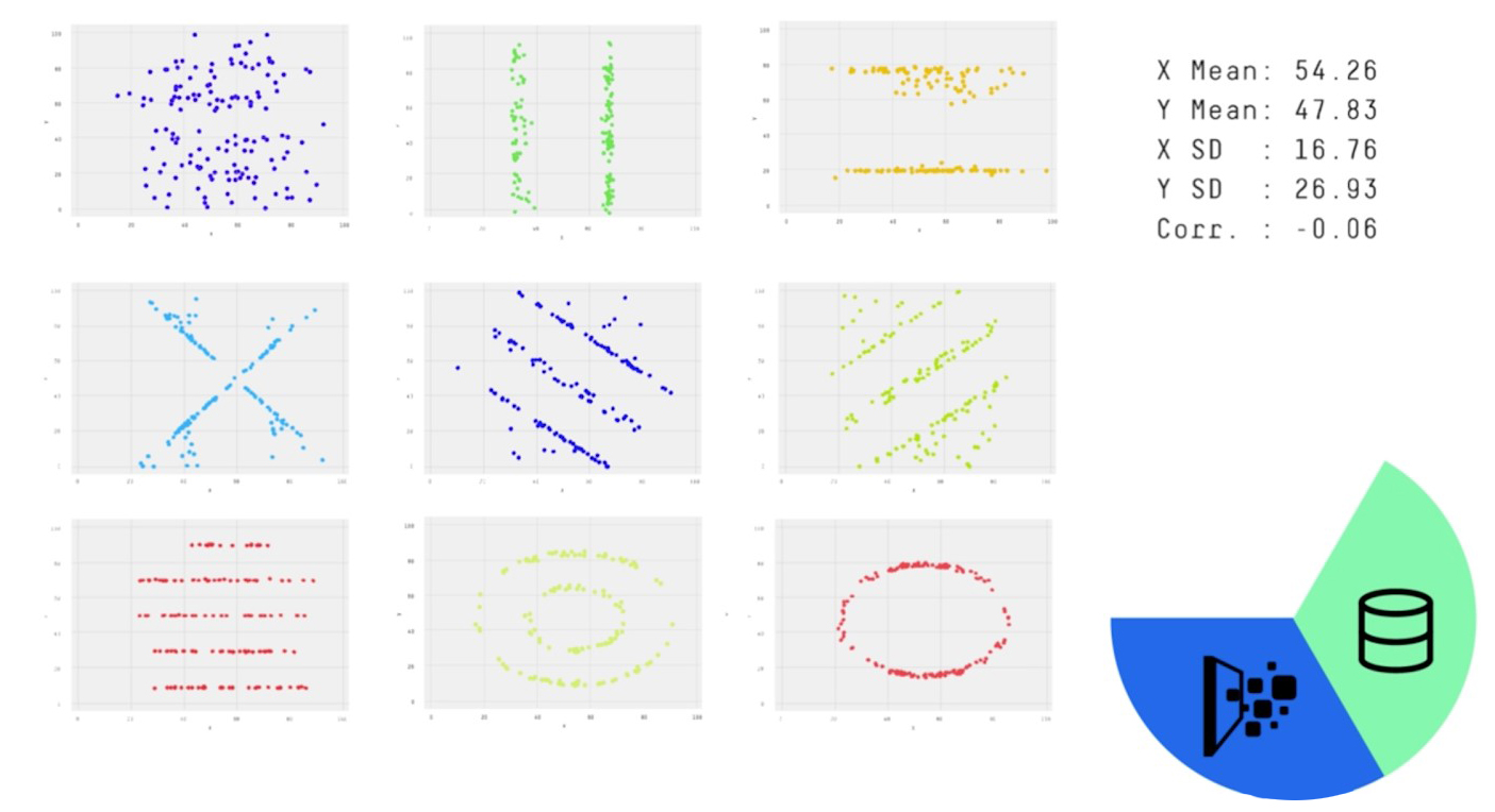
Here are nine specialties with the same average salary and their real visualization. Read more about how to get such a visualization here . The power of combining Visualization and Data is the ability at a glance to identify a problem on real data - without auxiliary KPI tinsel.
Visualization + The plot is the third and most massive technique that only a few were able to skillfully apply in business. Contextual visualization is designed to engage in the subject area so that any user can immerse themselves in a report \ / example \ / history. The same story can always be told badly.
Netflix, HBO, and other entertainment companies have long exploited this idea - they combine a beautiful picture and an exciting story. After that, they collect data from each viewer and adjust to their likes. Now they are pioneers of analytics of plot visualization of data. Thus, they get the most effective system management tool.
What if your report could be rebuilt depending on how long you looked at the indicator, how often you sent it to colleagues and what filters you apply in different situations?
We abandoned piecewise analytics and came up with related analytics. That it can fully reflect the business environment in the form in which it works every day. Before that, we also made mistakes - stamped indicators. Now, using Data, Story and Visualization, we create analytical systems in which all elements are connected.
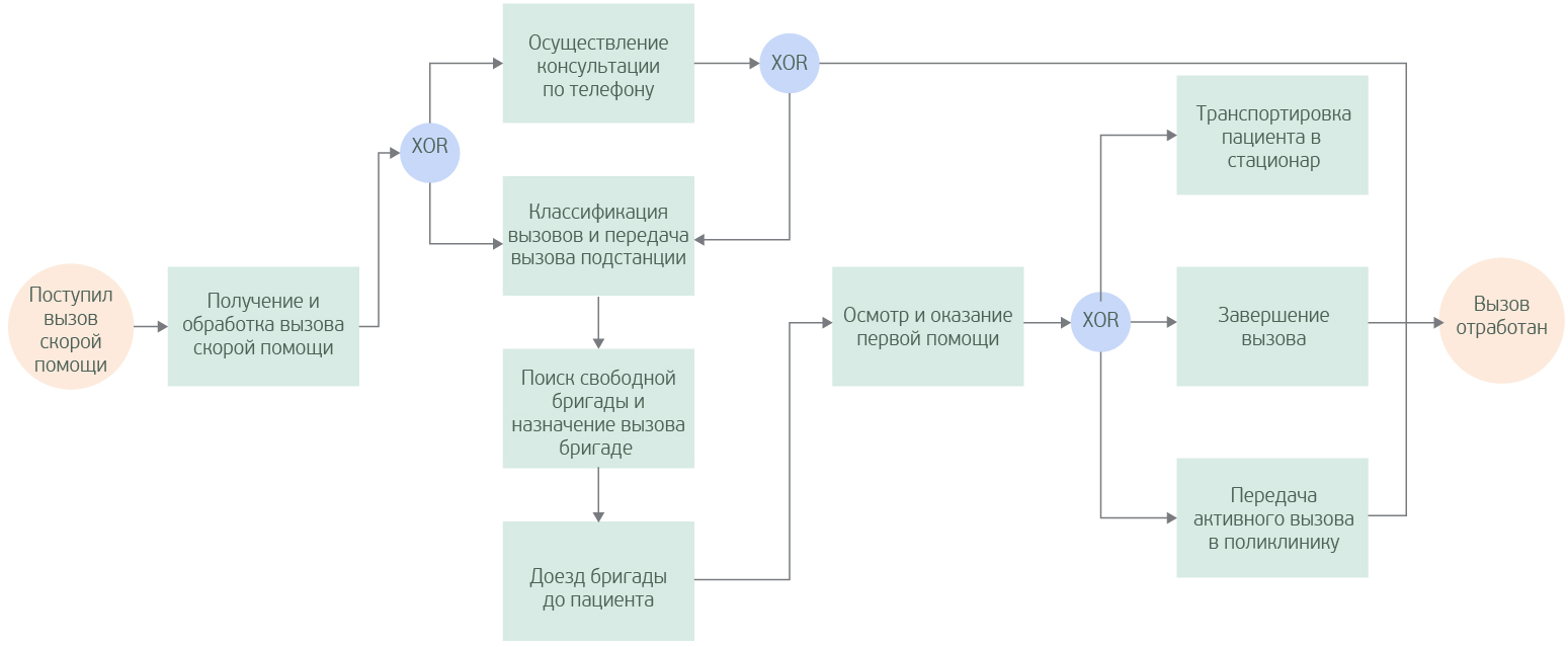
The ability of an analytical application to explain a problem or scope using process-developing visualization elements can be called storytelling .
One business process can be described, for example, by a diagram and many reports, or it can be presented as an interactive tool that allows you to observe communications and immediately receive details. Each for himself will choose his own method, but they can be compared.
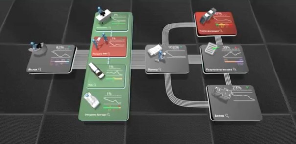
In the video, watch a recording of how one of our demo applications works. All data and indicators are fictitious. Any matches are random.
Storytelling in analytics can give:
Before we started using this approach to analytics, we always tried to answer the questions:
Now such questions no longer arise. When the data is arranged in an appropriate natural environment, you forget about such problems as a nightmare.
In our painstaking work of creating BI projects, we use a set of products collected under the completely new Russian brand IDVP. Connect to With this , carry out calculations helps us IDVP.Data, test hypotheses on Visualization , stand plot , it helps us online reporting module IDVP.Analytics and the need to build an interactive 3D model (a film about the data), we use IDVP.Platform3D.
An American engineer, a pioneer in the field of data visualization, as well as the director of the American Statistical Association, Willard British, tried 100 years ago to do something that technology did not allow.
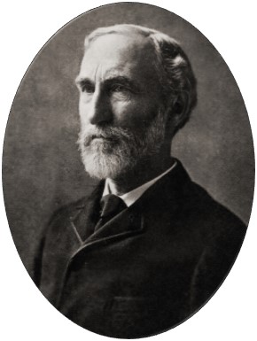
In the preface to the first edition of his book Graphic Representation of Facts (1914), he wrote: “Millions of dollars are spent annually collecting facts in the deceptive hope that the facts collected will automatically lead to an improvement in the conditions being studied. But we see that when it comes to the final result, no matter how valuable the exact data and real facts are, one way or another way of representing them is of much greater importance. Undoubtedly, the foundation of the building plays a huge role, but not the foundation, and the building built on it is the goal of our aspirations. As the building relates to the foundation, the proper way of displaying the facts relates to the facts themselves. ”
Image and data can never immerse you in an understanding of a business without a storyline.
What is the problem
If you believe the data in the free Wikipedia encyclopedia, then the key performance indicators are enterprise performance indicators that help the organization achieve strategic and tactical goals . But, it seems to me, these tools have long lost their purpose. Let's try to ask ourselves: “Why did we create KPI?” KPIs were created to track changes and influence the outcome. But instead, indicators have become our worst enemies. Sometimes it seems that not indicators work for the benefit of business efficiency, but the whole business works for indicators. And we ourselves had a hand in this.
Each new data source, as it seemed to us, required monitoring - and we made a report. A new problem is the new KPI. We put all this into dashboards, assembled, like Frankenstein, from various units that define business in their own way. Then systems were formed from dashboards. But these systems, like stampers, produced a large number of indicators without reflecting the real relationships of the business. Every day in the system becomes tens and hundreds of times more data. How are we going to control this? More analysts? More reports? Quantity is not equal to quality.
I have been suffering from BI addiction for eight years. In this article I will try to rethink the approach to analytics and tell how my team works. How to learn to understand the behavior of the system? Stop analyzing it in a disassembled state.
We are looking for a solution without tinsel
Any analytics should be built of three main components - Data, Story, Visualization .
The plot data helps you easily get into the business context and understand even the most specialized information. Raw data does not give us the opportunity to track, for example, the optimization of financial flows. Because Data + Story is not just numbers, it is a digital reflection of business content.
If now you are still thinking about your dirty aggregated indicators, then visualization will help you rethink this.
Here are nine specialties with the same average salary and their real visualization. Read more about how to get such a visualization here . The power of combining Visualization and Data is the ability at a glance to identify a problem on real data - without auxiliary KPI tinsel.
Visualization + The plot is the third and most massive technique that only a few were able to skillfully apply in business. Contextual visualization is designed to engage in the subject area so that any user can immerse themselves in a report \ / example \ / history. The same story can always be told badly.
Netflix, HBO, and other entertainment companies have long exploited this idea - they combine a beautiful picture and an exciting story. After that, they collect data from each viewer and adjust to their likes. Now they are pioneers of analytics of plot visualization of data. Thus, they get the most effective system management tool.
How do we see the way out
What if your report could be rebuilt depending on how long you looked at the indicator, how often you sent it to colleagues and what filters you apply in different situations?
We abandoned piecewise analytics and came up with related analytics. That it can fully reflect the business environment in the form in which it works every day. Before that, we also made mistakes - stamped indicators. Now, using Data, Story and Visualization, we create analytical systems in which all elements are connected.
The ability of an analytical application to explain a problem or scope using process-developing visualization elements can be called storytelling .
One business process can be described, for example, by a diagram and many reports, or it can be presented as an interactive tool that allows you to observe communications and immediately receive details. Each for himself will choose his own method, but they can be compared.
In the video, watch a recording of how one of our demo applications works. All data and indicators are fictitious. Any matches are random.
Storytelling in analytics can give:
- understanding of business processes at a glance,
- the ability to research scenarios and create solutions in script format,
- cost savings (no erroneous KPIs, dozens of analysts to generate pointless reports!)
Before we started using this approach to analytics, we always tried to answer the questions:
- How much information can we perceive in the form of KPI and tables?
- How many tables and indicators can fit on one report? Is it necessary to place everything on one report or is it better to do several? If new problems (indicators) arise, will it be necessary to make new reports? Or is it better to modify the old ones?
Now such questions no longer arise. When the data is arranged in an appropriate natural environment, you forget about such problems as a nightmare.
In our painstaking work of creating BI projects, we use a set of products collected under the completely new Russian brand IDVP. Connect to With this , carry out calculations helps us IDVP.Data, test hypotheses on Visualization , stand plot , it helps us online reporting module IDVP.Analytics and the need to build an interactive 3D model (a film about the data), we use IDVP.Platform3D.
The plot as a key to understanding
An American engineer, a pioneer in the field of data visualization, as well as the director of the American Statistical Association, Willard British, tried 100 years ago to do something that technology did not allow.
In the preface to the first edition of his book Graphic Representation of Facts (1914), he wrote: “Millions of dollars are spent annually collecting facts in the deceptive hope that the facts collected will automatically lead to an improvement in the conditions being studied. But we see that when it comes to the final result, no matter how valuable the exact data and real facts are, one way or another way of representing them is of much greater importance. Undoubtedly, the foundation of the building plays a huge role, but not the foundation, and the building built on it is the goal of our aspirations. As the building relates to the foundation, the proper way of displaying the facts relates to the facts themselves. ”
Image and data can never immerse you in an understanding of a business without a storyline.
Do you want to work with us? We have vacancies for analysts!