January 30, 2018 at 11:03
Anatomy of a Thousand Fonts
- Transfer

Translation of the article The anatomy of a thousand typefaces .
Even years after the release of Avatar, something remains that even Ryan Gosling cannot handle - using the Papyrus font in the movie logo. In a skit shot by Saturday Night Live , the font designer opens a menu, iterates through the fonts, and randomly selects Papyrus.
The main problem with choosing fonts is at the same time too many and too few options.
On the one hand, choosing only from system fonts can lead to a bad decision, because nothing interesting is represented among standard fonts.
Web font libraries with hundreds and thousands of titles, on the other hand, are staggering in abundance, sometimes leading to paradoxical font choices.
The bitter taste of the font selection menu
In the average menu, fonts are sorted by name, but are not interconnected: the font created for bold headings is followed by a font designed for small screen interfaces, followed by an artsy handwritten font for wedding invitations. And you have to waste time scrolling through the entire list from beginning to end, or simply choose the first suitable font from the beginning of the list and round off.
Obviously, such an interface solution was created not for systematic work, but for endless surprises. And although many people like surprises, but still I want to influence the success of finding a good font.

Menu for selecting fonts from the “Papyrus” video. Limited choice, all kinds of styles, but far from the best fonts of all possible.
A systematic approach to finding fonts
There are various ways to limit redundancy. Before analyzing font files, glyphs, and metadata tables, let's first talk about classification, selected lists, and anatomy.
1. Classification
There is a sophisticated font classification system. The simplest division into categories: serif fonts, grotesque (sans-serif), monospaced, script (handwritten) and display fonts. Typically, these categories are used as filters on different font sites:

But even these simple filters still pose us with too many fonts to choose from. More gradual gradations are already appearing here, for example, serif fonts are divided into transitional, humanistic and Gothic.
Sometimes these subcategories are available as tags. But sometimes authors of font sites generally ignore them. Perhaps there are too many categories? Perhaps users simply do not understand all these details? Or simply the authors do not have complete and consistent information for a detailed classification of fonts?
2. Selected Lists
An alternative way to put things in order is to rely on other people's knowledge: you can use lists of fonts selected by someone. Such lists are, for example, on Fontshop . You can find here collections sorted by decades, by degree of similarity or by scope.
Similar lists are also on Typekit , TypeWolf and FontsInUse . This is a great idea, and you can recommend everyone start compiling their own font lists that you've already worked with or seen. In the future, these developments will be very useful to you.
3. Anatomy
The most difficult thing in finding a good font is to focus on the design features and understand what properties make the font good or special. Fortunately, there are plenty of books on font design, fonts, and typography. These books can teach us how to create fonts, how to choose and use them.
For example, the book “ The Anatomy of Type ” by Stephen Coles. It contains information about 100 well-designed headsets. To describe the quality of fonts, Stephen uses terms such as the height of lowercase letters (x-height, x-height), width , weight , ball terminal , serif shape, and many others.

“The Anatomy of Type“ is a graphic guide to Stephen Coles on 100 headsets. A wonderful book to study the history and design features of popular headsets.
But only 100 fonts are described here, but what about the rest? What about installed on your computers? And used on the network? What are their x-heights, widths, weights and contrasts? How can I find out?
Inside the font file: lack of metadata
Before I started coding, I thought it was possible to quickly get the right information about font properties. Theoretically, each font file should contain different metadata tables with the name, author name, supported languages and visual properties. The most obvious are the width, weight, and font class . There you can find information about the x-height, the height of the capital letters, the average width of the character, the upper and lower remote elements of the letters. Another set of metadata called Panose describes even more properties: serif shape, proportion, contrast, and more. To view all this information, you can use font design applications, for example, Glyphs:

Screenshot of the font information panel. Here is the name of the family, name of the designer, link, version, date. You can also see the range of Unicode and Panose data. A 10-digit code describes many characteristics, but the information is not always available, as it is entered by the designer or creator of the file. In the right screenshot, you can see metrics such as upper and lower extension elements, x-height and angle of inclination.
But the availability of this information depends on how responsibly the font creator approached his work. Some font files have a lot of data, but often there is not enough information, especially in free or open source fonts. And even if there is information in the file, it may be incorrect or incomplete.
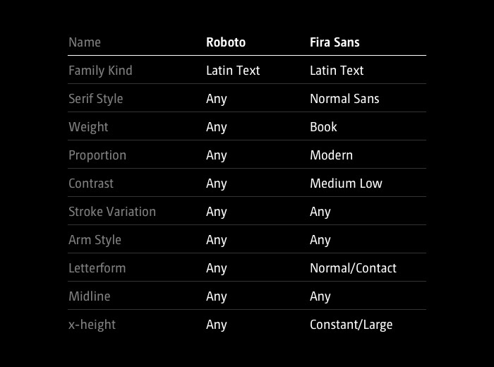
Comparison of Panose data for Roboto and Fira Sans fonts, both available on Google Fonts. For Fira Sans, a lot of information is indicated, and for Roboto - a little. This metadata cannot be used to compare fonts.
DIY: Analyzing fonts with opentype.js
Let's analyze the font files and figure out how to automatically extract the necessary information. Files have different formats, but you can almost always find versions in TTF (TrueType Font).
In files of the OTF format (OpenType), you can find information about additional properties, for example, ligatures. There are additional metadata in the WOFF (Web Open Font Format) files, and the fonts are stored in compressed form.
Thanks to opentype.js, you can analyze font files directly in your browser using JavaScript. Opentype.js provides access to the vector information of all the typesetters included in the file, as well as to the main metrics and metadata tables.
Font Characteristics Database
Below we will look at how you can measure the contrast, x-height, width and weight of all fonts from the Google Fonts library. The same methods can be applied to other font libraries, such as Typekit or fonts on your computer.
Contrast
Contrast describes the ratio of thin to thick strokes of a character. There are fonts with low contrast, for example, squared, or many grotesques created for interfaces, for example, Roboto or San Francisco. And there are fonts with high contrast, for example, Bodoni or Didot. To measure contrast, we can look at the contours of the letter “o” and compare the largest and smallest distance between the inner and outer contours.

The contrast of the font can be measured in the thickest and thinnest part of the letter “o”.
This simple and easy-to-compare letter almost always consists of two parts. She is a good candidate for evaluating font contrast (note: the “o” shape is simple only at first glance, in fact it is quite difficult to draw well, because the strokes should smoothly change their thickness).

Using opentype.js, it’s convenient to get data for rendering characters as SVG elements. For example, you can draw the outer and inner contours separately. Then, using one algorithm, you can go through each circuit, measuring the distance between them. After that, we calculate the ratio between the longest and shortest distances, and voila - we got the contrast value by which the fonts can be compared.
x-height
x-height is an important characteristic that can be an indicator of readability and subjectively perceived font size. Usually this parameter is measured as the height of the lowercase letter "x".

x-height can be measured using the information provided by opentype.js.
opentype.js for each character provides the yMax parameter .
In addition to the absolute measurement of x-height, it may be necessary to compare the x-height and the height of the protruding risers. That is, get values like "x-height is 60% of capital letters."
So that the values obtained can be used for comparison (in some fonts 1000 units are used per Em (typographic unit of measurement), in others 2048), it is necessary to normalize them and compare them with a range from 0 to 1.
Width / Proportion
Using this value, you can evaluate the density of the font. How tight is it, compressed, or, on the contrary, stretched, free? It would be possible, for example, to measure the width of the letter “M” in different fonts, but then the overall size or x-height would have to be taken into account. In addition, in some fonts, “M” is very specific and not typical of the rest of the character set.
You can also calculate the average character width based on a reference word like “Hamburgefontsiv”. This is a good option, but you still need to do the normalization, taking into account the overall design and font height.
Another approach is to determine the proportion of the letter “o”. This gives us surprisingly good values by which you can compare the widths of different headsets.

Weight
To measure weight, you can display a lowercase “o” on the HTML page, fill it with black, and the background with white. Then calculate the ratio of black and white pixels. For a handwritten or very thin font, this value will be very small, and for a heavy, bulky font, the ratio will be large. The results are quite satisfactory, but they can be further improved by measuring the full width of the characters.

Distance
If all font characters have the same width, such a font is called monospaced. It is important to note that to determine the width we do not have to look at the characters themselves. Even in a monospaced font, the dot symbol visually takes up less space than “m”. Therefore, you must consider the advanceWidth property , which describes the invisible fields around the character. Surprisingly, Google Fonts uses the term monospaced as a definition of style, not a technical property. Fonts like Lekton or Libre Barcode are generally not monospaced, although technically they are.
Similarity
Having received a table of values, we can normalize them and calculate the distances in order to assess the similarity of the fonts. Here is the simplest version of the calculation, but the result will be better if you increase the accuracy of the data. In addition, a person can evaluate the similarity of fonts differently than an algorithm for which all characteristics are the same. In this case, we must take into account some properties to a greater extent than others.
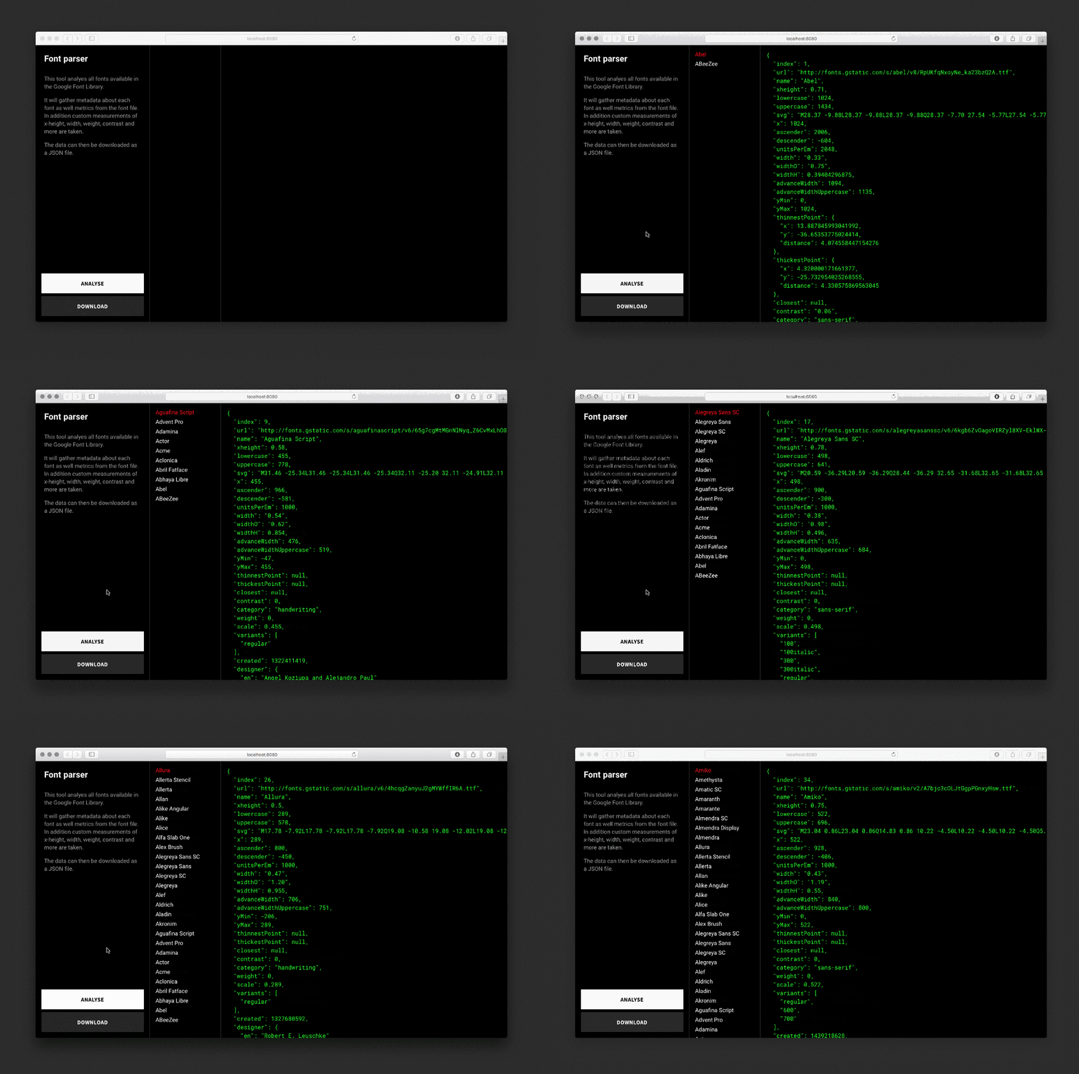
The parser analyzes each font, draws invisible SVGs and background elements, takes measurements and saves the data in a JSON file.
Demo
An interface is written to access the database. Fonts can be viewed in the form of a grid with a cell of different sizes in order to capture many fonts at once or to evaluate some of them in more detail.
Fonts can be sorted by weight, x-height, contrast, width, name and number of styles. Charts show the distribution of values and can be used to filter out specific values. For each font, there is a detailed display with several examples, symbols, metrics, Panose data, and a listing of similar fonts.

Dataset
For some reason, some fonts do not load in Safari, so I recommend using Chrome.
Discoveries
You can explore the dataset yourself for similarities and inconsistencies. If you set low contrast and the presence of serifs, the program will display all the block fonts. If you set a low x-height, then the output will consist mostly of handwritten fonts. Very high values are typically found in fonts consisting solely of capital letters.
Outcasts
When choosing extreme values, very strange fonts usually “come out”. As a rule, they belong to the category of screen fonts.
Unpleasant differences
A grid view reveals the terrible differences between baselines and alignments. Some fonts categorically do not fit into the grid. And even if the differences are small, it becomes obvious that a simple font replacement in the project is hardly possible, except for a few popular fonts with a very similar structure.
The golden mean
It is curious that the program often puts the frequently used fonts, which are considered good, into a list of similar ones. If you adjust the filters, you can reduce the list by about half, but all popular fonts will remain. So if you need to filter out weird and extreme fonts, just pick averages.
Forked Fonts
There are fonts that are called differently, but look exactly the same. Some of them are forks with an extended character set to support different languages, for example, Alegreya & Sahitya.
Number of styles
Number of font styles is a good indicator of its quality. Variable fonts are already looming on the horizon , and it is quite possible that the future is with endless customization. But until then, it is recommended to work with fonts belonging to several styles. So sorting a collection by the number of styles is a good way to find out about the best fonts available.
Summary
This is a rather complicated approach to finding fonts. In general, search results depend on the quality of fonts and related data. If you use only Google Fonts, then you are very limited, because there are not the best fonts in their class. When analyzing Typekit content, it turned out that the interface has performance problems when working with so many fonts. You need to use caching and preloading, but this has not yet come to hand.
You can get a good idea of the contents of font files and missing data without any neural networks. The more you do this, the more clearly you realize the scale of the font history and the industry standing on its shoulders.
Opportunities
What can be done with this dataset:
- Find replacement fonts of similar width or style.
- Based on x-height, automatically adjust font sizes and line heights.
- Find font combinations based on their similarities or differences.
- Create your own font selection menu for the Avatar movie poster designer.
- ...
application
Additional materials
Panose Classification Metrics Guide
1991 Guide detailing how to measure individual characters to get matching metrics. Unfortunately, these measurements must be done manually, which will take a lot of time.
Taking The Robots To Design School, Part 1 by Jon Gold
In May 2016, Jon Gold wrote about his approach to font analysis. He covered topics such as rule-based design, AI, and matching datasets to designer tools.
Google Fonts Tools
A set of open source font analysis tools on the Google Fonts website. For example, to determine the angle of the font.
Font bakery
This is a set of Python tools for checking TrueType files and metadata files for fonts with Google Fonts.
Why not just use data from web font services?
All such services - for example, Typekit, Google Fonts, Fontstand, Fontshop, MyFonts and so on - have their own filter sets with varying degrees of customization. The API of these services for each font provides a different amount of information.
For example, for the Roboto font from the Google Fonts web API, you can get the grotesque category and font options. https://gist.github.com/getflourish/d79836b0bebb6b44f76389b623fd7dc1
The Typekit API also provides width, x-height, weight, classification, contrast, uppercase letters and recommendations.
https://gist.github.com/getflourish