Hello! My name is Dmitry Grigorov. I work as a front-end manager at Raiffeisenbank in the RBO PRO team. I will tell and show you how you can creatively apply these CSS features. In the article we will consider the following topics:
Backgrounds and frames;
Shapes
Visual effects.
Backgrounds and frames
In the first topic, “Backgrounds and Frames,” I will tell you what currentColor is in CSS3 , how to make transparent frames, several frames, what flexible positioning of the background is. In the second topic, “Shapes”, I will give methods for creating various kinds of rectangles using css. In visual effects, I will consider examples of the imposition of various color tones. And in the topic "User Interaction" I will show how to make an interactive comparison of images.
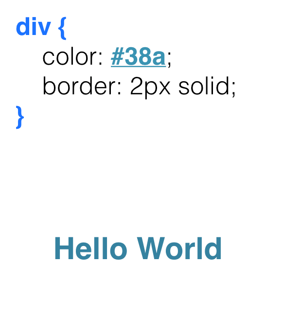
What color do you think the border of the block with the text “Hello world” will be?
Same blue? Yes, right. And why?
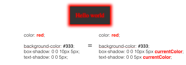
The color will be the same # 38A because CSS has such a nice variable like currentCollor, which takes its color value from the color property . And if we do not give a color border, outline-, text-shadow, box-shadow , then by default we get the same color as the property in color .
In the figure below, you can see that currentColor can be transmitted, either explicitly or not at all.
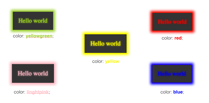
The variable currentColor provides us with a very convenient code and complies with the principles of DRY (don't repeat yourself - do not repeat). And as shown in the following figure, changing only the color property , for the block with the code that was presented above, we get a different display of the element.
Translucent frames
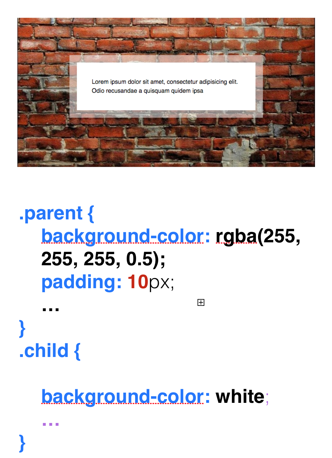
If someone had asked me before how to make a translucent frame, I would answer: “Easy! I would make two diva blocks: parent and child. And already in the parent I would set some padding: 10px and background-color: rgba (255, 255, 255, 0.5) (translucent), which would be the color of my transparent border. " But this can be done much easier.
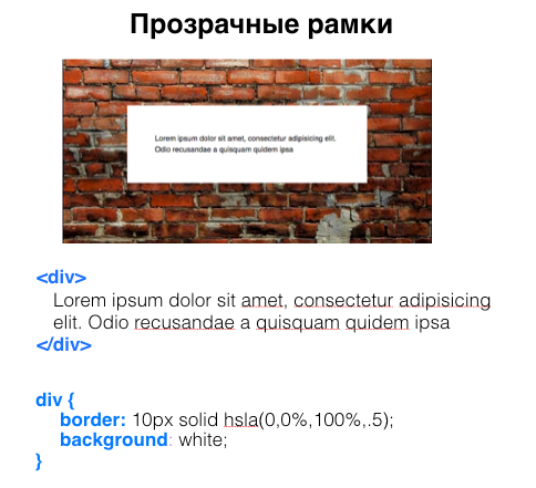
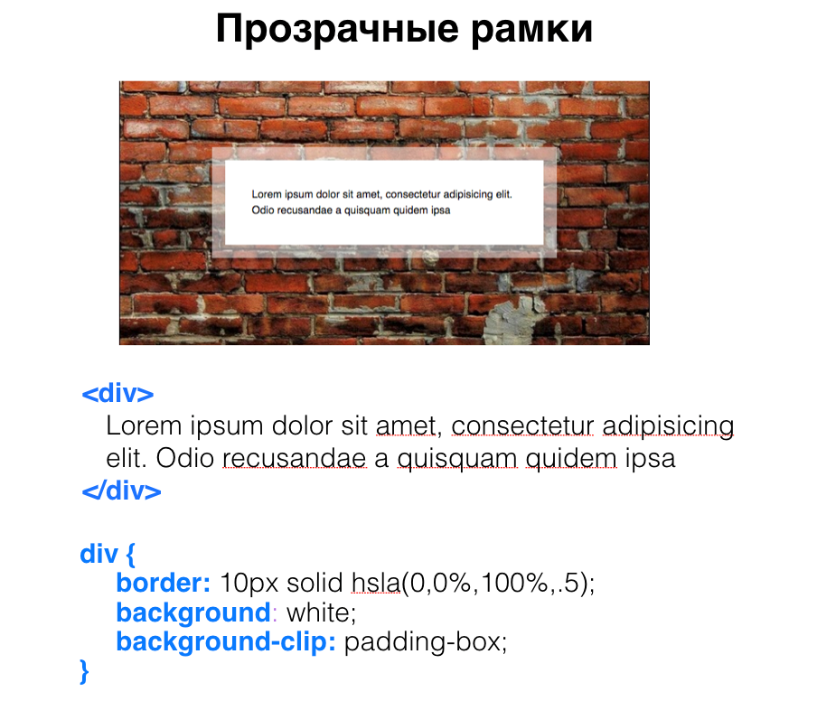
What if we just pass a translucent border to our frame? We won’t get anything good. Why? The CSS has a property such as background Used-clip , and many people forget about its existence. Background-clip is responsible for the distribution of the background and has three values: border-box (default), content-boxand padding-box .
By default, it has a border-box , which means that our background will go under our frame, and we will not see the same transparency that was passed to border , since we have our background under our border. Also in the background-clip you can transfer the content-box , which will mean that our background is distributed under our content. But here we pass the padding-box and get just such a transparent frame.
Several frames
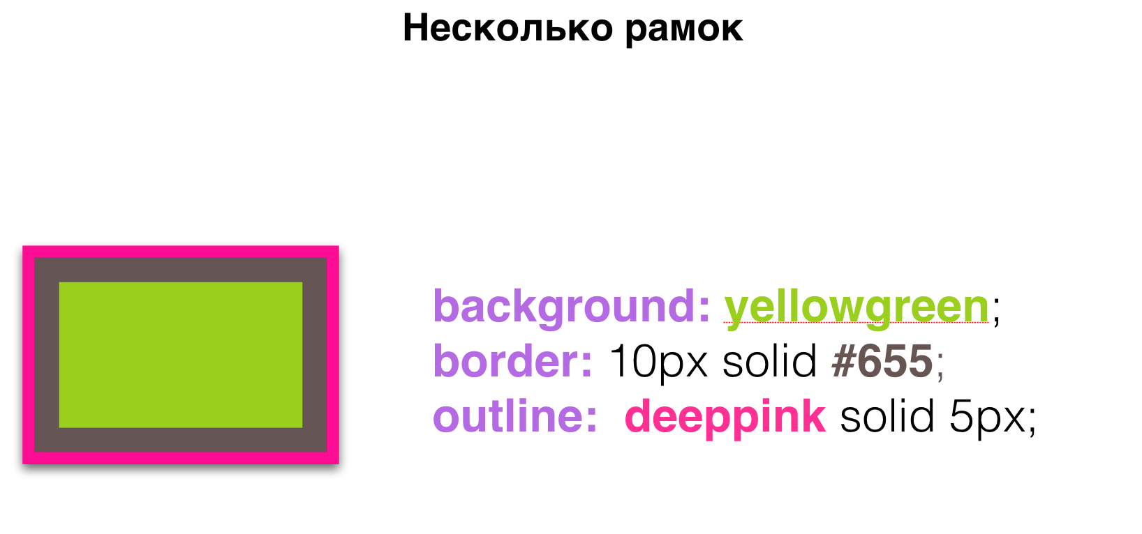
We can create several frames in two ways, one using border and outline . Border and Outline are good, but with them we can only make two frames.
But what if we need much more frames, for example 3, 4 or more, then shadows come to our aid.
All of us have come across the box-shadow property . Many people know that if you pass a zero vertical offset (v-offset) , zero horizontal offset (h-offset) , zero blur (blur) and a fourth parameter called the spread radius (spread radius), which makes the shadow bigger, you get something that looks like a frame. And so you can create as many frames as you want, separating them with a comma.
Flexible background positioning
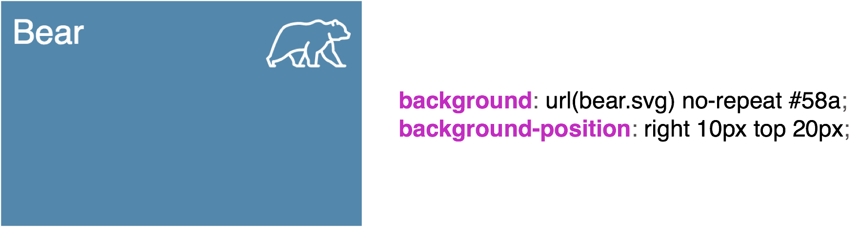
The next topic is flexible background positioning. Many of us have encountered such a problem as placing a picture on our background. You can position it using the background-position . I want to note that keywords such as right, top, bottom, left in CSS have been updated. Now, when we write right 10 px and bottom 20 px for our picture, this will mean that we indent 10 px on the right and 20 px on the bottom .
Similarly, if we write background-position: right 10 px top 20 px , then we get indentation on the right 10 px , on top 20 px .
Using flexible positioning, you can place several pictures in our background. We tell them all no-repeat and with the help of keywords scatter in different angles. That’s so cool. everything is supported perfectly, use it.
Striped Background
Talk about creating a background. Usually, to create some kind of non-uniform background, we resort to the use of various pictures that are made using visual editors. Or the designer drew a picture for us, we inserted it, and everything is beautifully displayed for us.
But a simple striped background can be done with just CSS.
We all know what a standard gradient looks like.
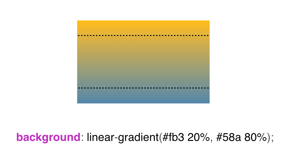
But what if we set the distribution boundaries for this gradient?
Then at the edges we will see a solid color.
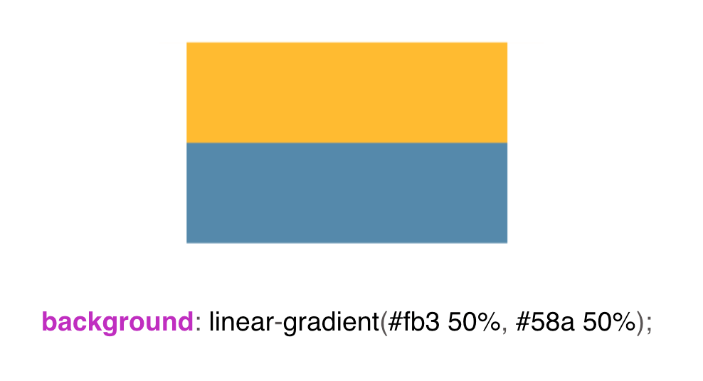
But what if we reduce the gradient to one point?
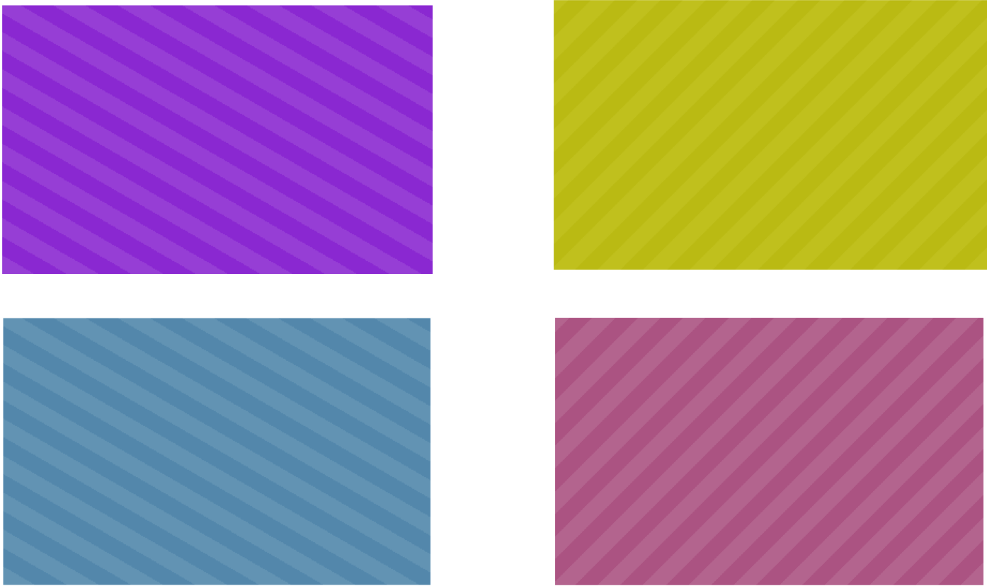
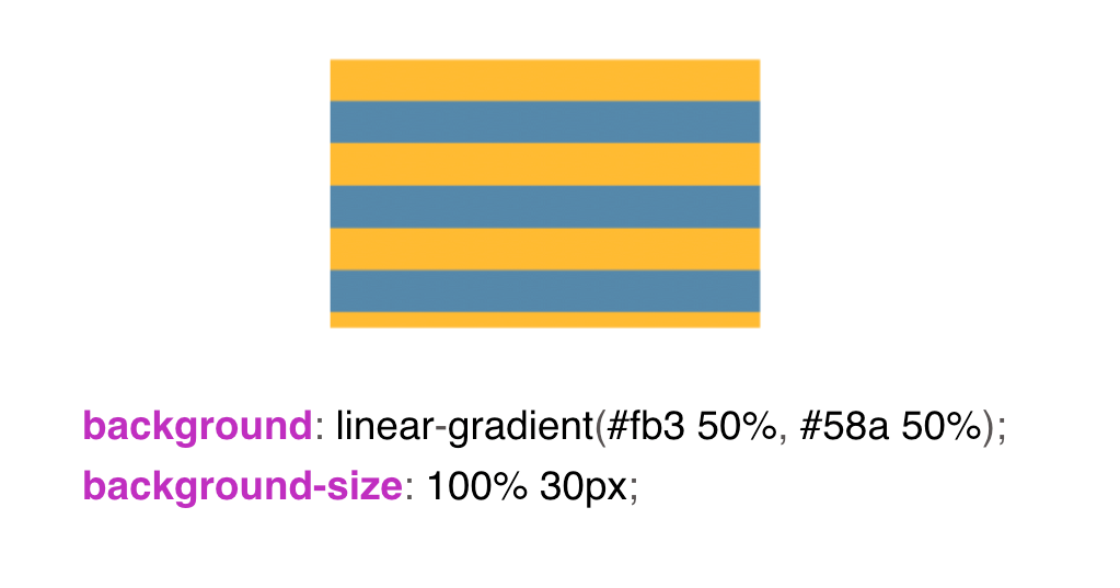
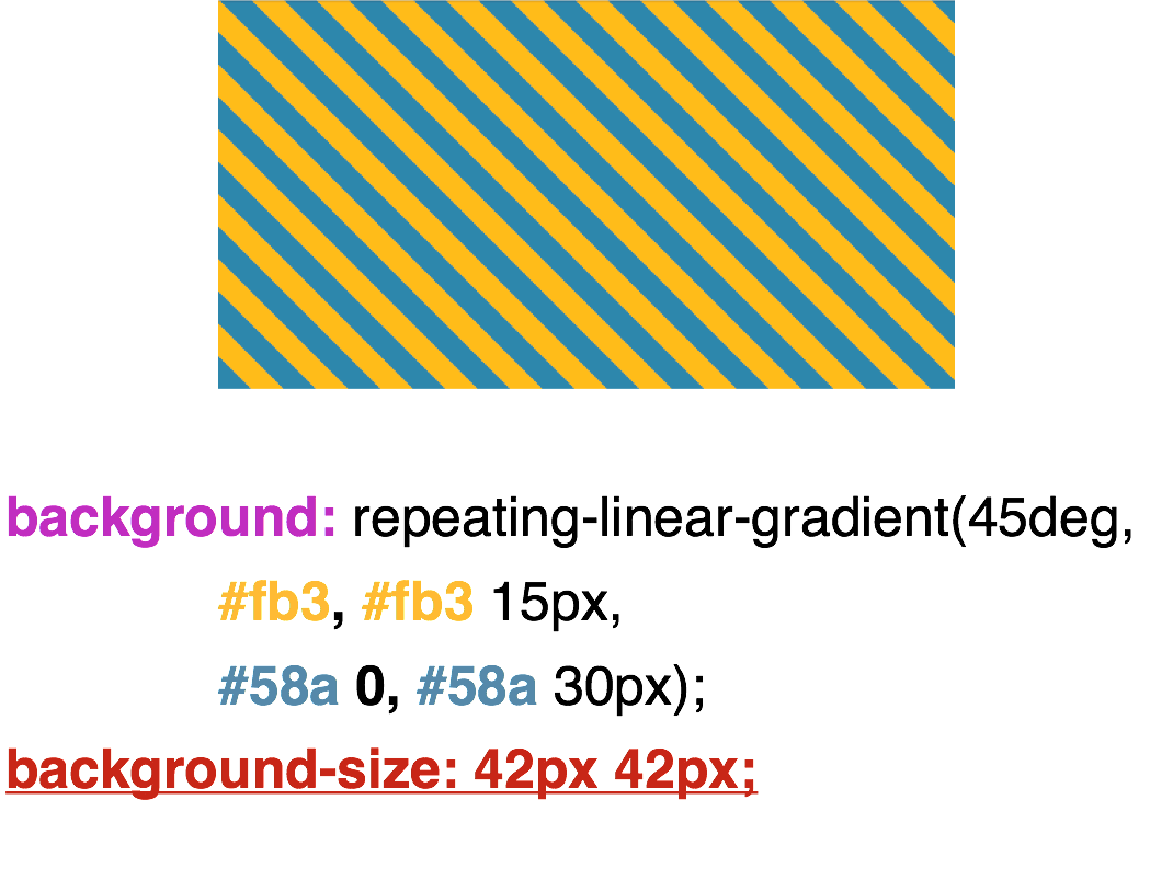
We will see just two stripes. These two stripes will be the basis of our striped background. Next, set background-size: 30px . One strip will be 15 px and the second also 15 pxsince the gradient is divided 50/50 . And we get such a striped background.
In order to make one strip larger and the other smaller, we set 30% for yellow and 0 for blue . What does this zero mean? 30% of us, of course, will be yellow. But what does this 0 mean , can anyone say? Essentially, this is just the remaining distance of our background-size . That is, 30% of 30px - this is about 9px , we will fill with yellow, and the rest of the blue.
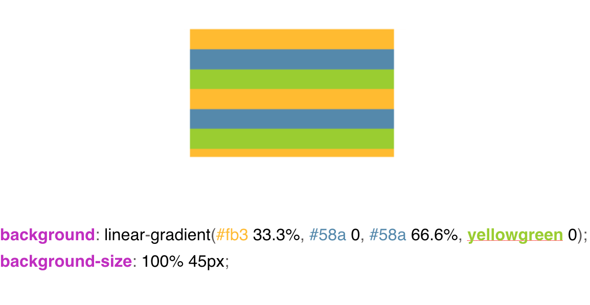
In order to draw several colors in our background, we are faced with a situation such as an intermediate repetition of colors. That is, I say to our yellow color: fill me with 33% of our background with yellow, and fill the remaining part with blue. Then I say to blue: no, fill up to 66% , and fill everything else with yellow-green, and we get 3 colors in our background.
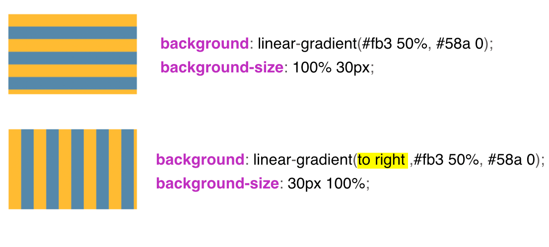
In order to make vertical stripes - all the same, only we change the background-size and the linear-gradient keyword appears to right . Also, instead of the keyword, we can insert 90 ° and everything will be displayed as it should.
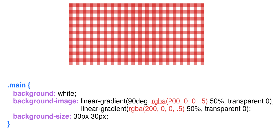
If we combine horizontal and vertical stripes together, we get such a background in the grid.
We have a square background-size , we pass our gradients through a comma into the background-image and get the background in the grid.
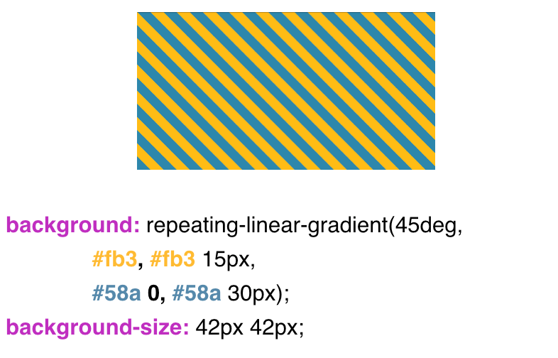
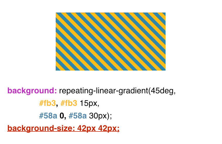
With the background in the diagonal strip a little more complicated. Here we no longer use the usual linear-gradient , we use repeating-linear-gradient here . Please note that our background extends to 30 px , and the background-size we have is square 42px by 42px . Why is it still 42?
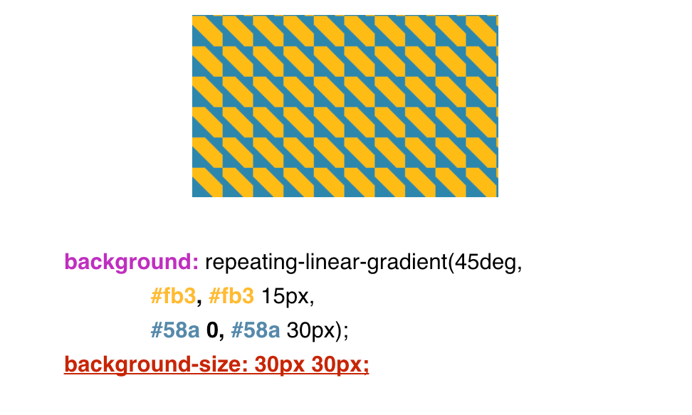
What if we give something else? For example, 30px instead of 42px.
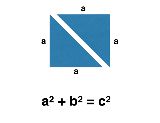
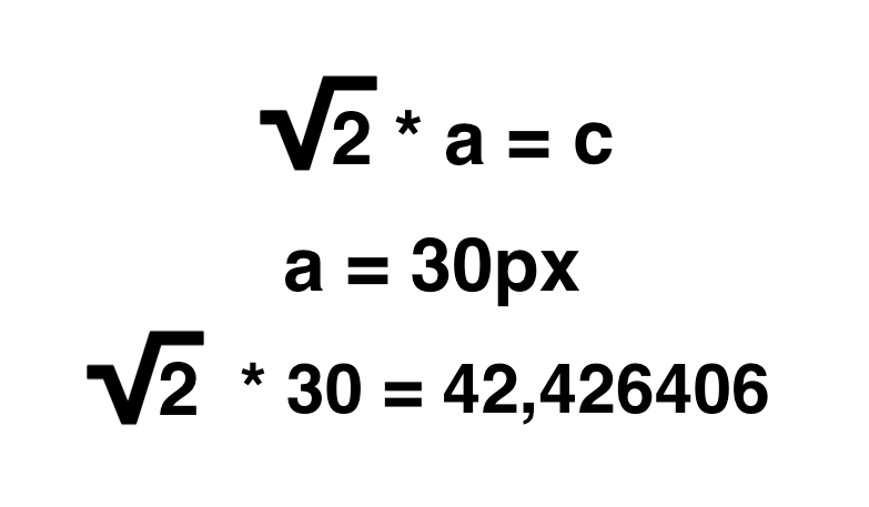
Why is it still 42px. Ordinary school math comes to the rescue.
We know that our background is a square, and the square consists of two isosceles triangles. Further we make some mathematical transformations, but at the same time remember that our background extends up to 30px .
We substitute 30 into our formula and get about 42 . Round to a lesser extent. We get such a background, diagonal stripes.
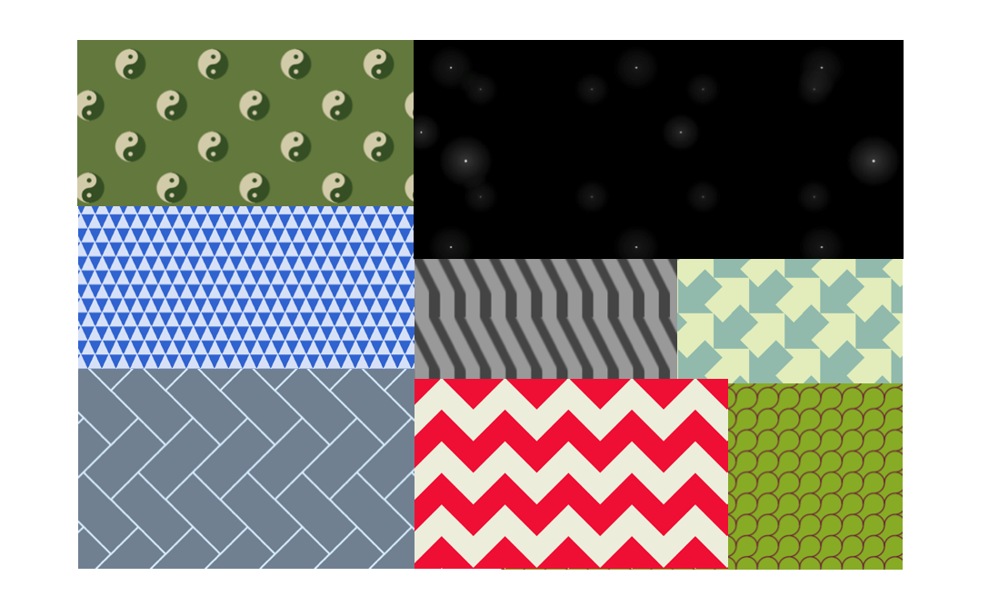
The author of CSS Secrets, Lea Veru, a member of the w3c web consortium, has a selection of backgrounds that she implements with gradients.
Examples that Lea Veru implements. Examples implemented by Bennett Fili.
Figures
And I will start this topic with parallelograms.
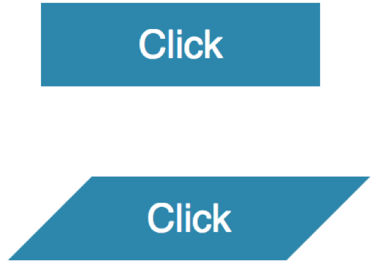
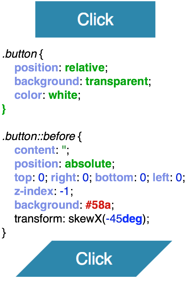
All of us know what parallelograms look like. A parallelogram is, first of all, a non-standard rectangle, whose angles should not always be straight. In order to make beveled corners, you can do with the before pseudo- class . We set the relative positioning ( position: relative ) to the button class , and absolutely position the pseudo- class before . We set the background pseudo - class , do the transformation with skewX and get such beveled corners.
In order to make a trapezoid - all the same, similarly. Only here we pass perspective and rotateX. And we get such a trapeze.
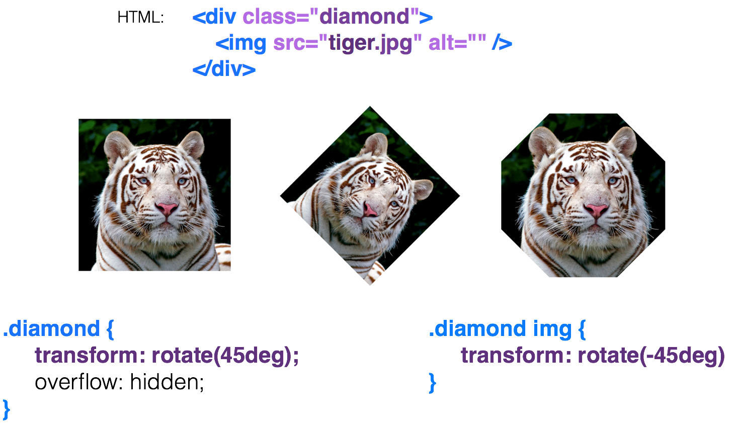
A diamond-shaped image can be made in various ways. One of them is also using transformation. That is, we have a parent div, and an image is embedded in it.
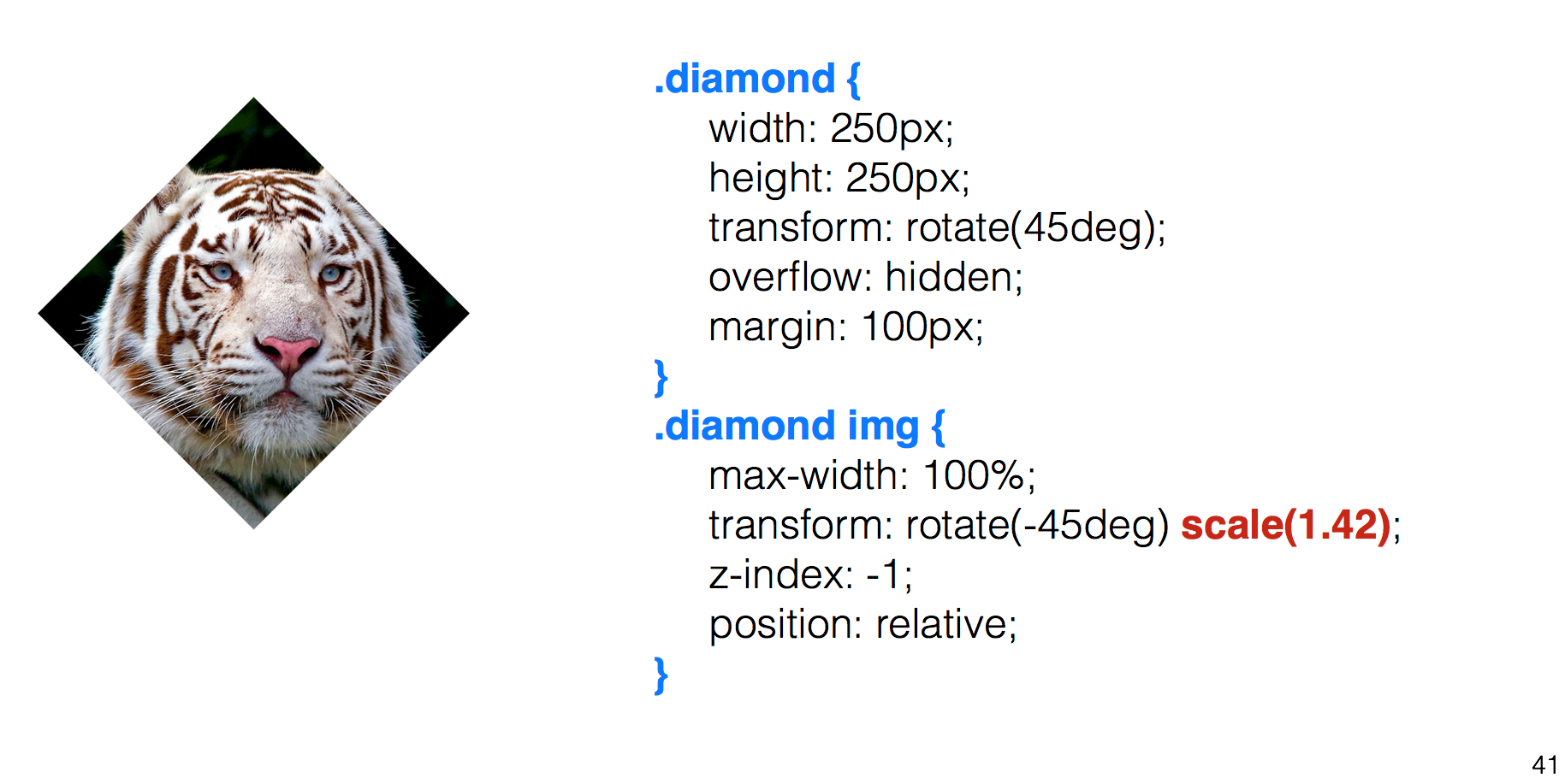
We rotate the parent div by 45 degrees , and we already get a rhombus, but the image bent too. We want to return it to its normal form and rotate our image back to -45 degrees . The result is a hexagon. Why? And because we have two rectangles here, and they cut corners. In order to make it exactly a rhombus, we simply set scale (1.42) , enlarge our image and get such a rhombus.
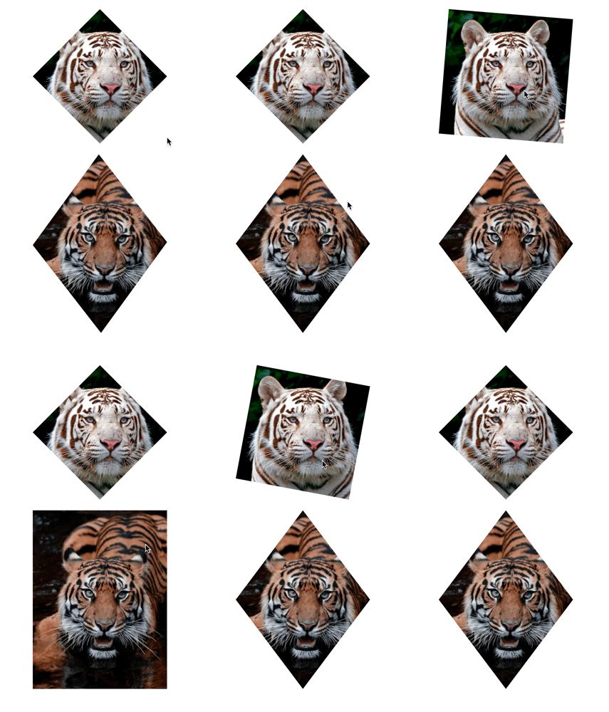
A diamond-shaped image can also be made using clip-path . There we can transfer various names such as circle , polygon and others. Here I use the landfill. I pass to the polygon the middle of each side of the square, and with hover-e I return the points to the corners of the square and get such an animation. This is a very good property.
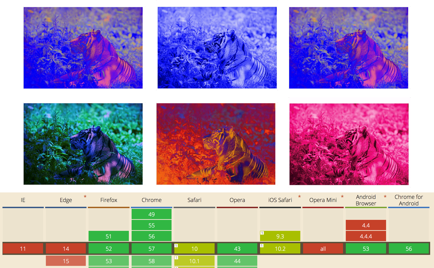
It supports animation, but unfortunately it is very poorly supported by browsers. It is supported only by Chrome and Firefox.
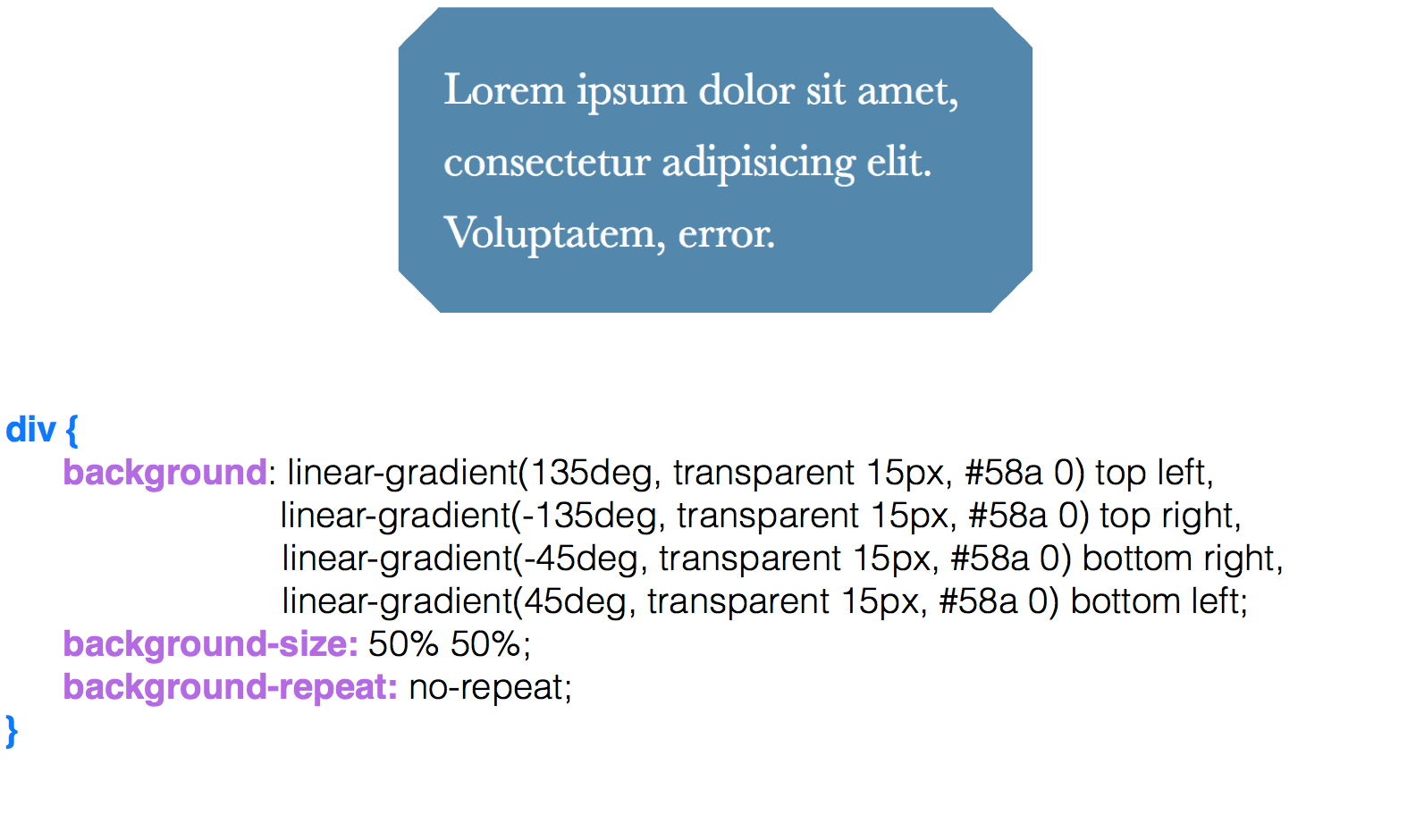
How to make cut corners? Recall the theme of the striped background. It’s exactly the same with gradients. We essentially divide our background into 4 parts. We have 4 gradients that we scatter using flexible positioning at different angles and paint them from transparent to blue. And we get the cut corners.
In order to make cut corners inward, a radial-gradient is used here . The only things that appear here are keywords such as circle at top left to arrange circles in different angles. Again, we arrange 4 parts, using keywords, in their places and get such angles.
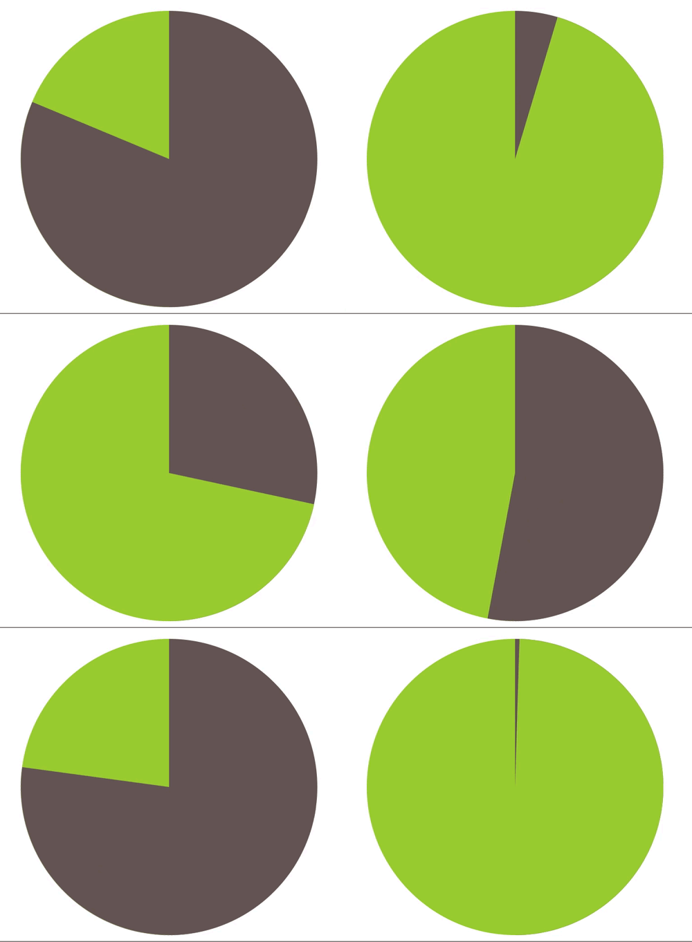
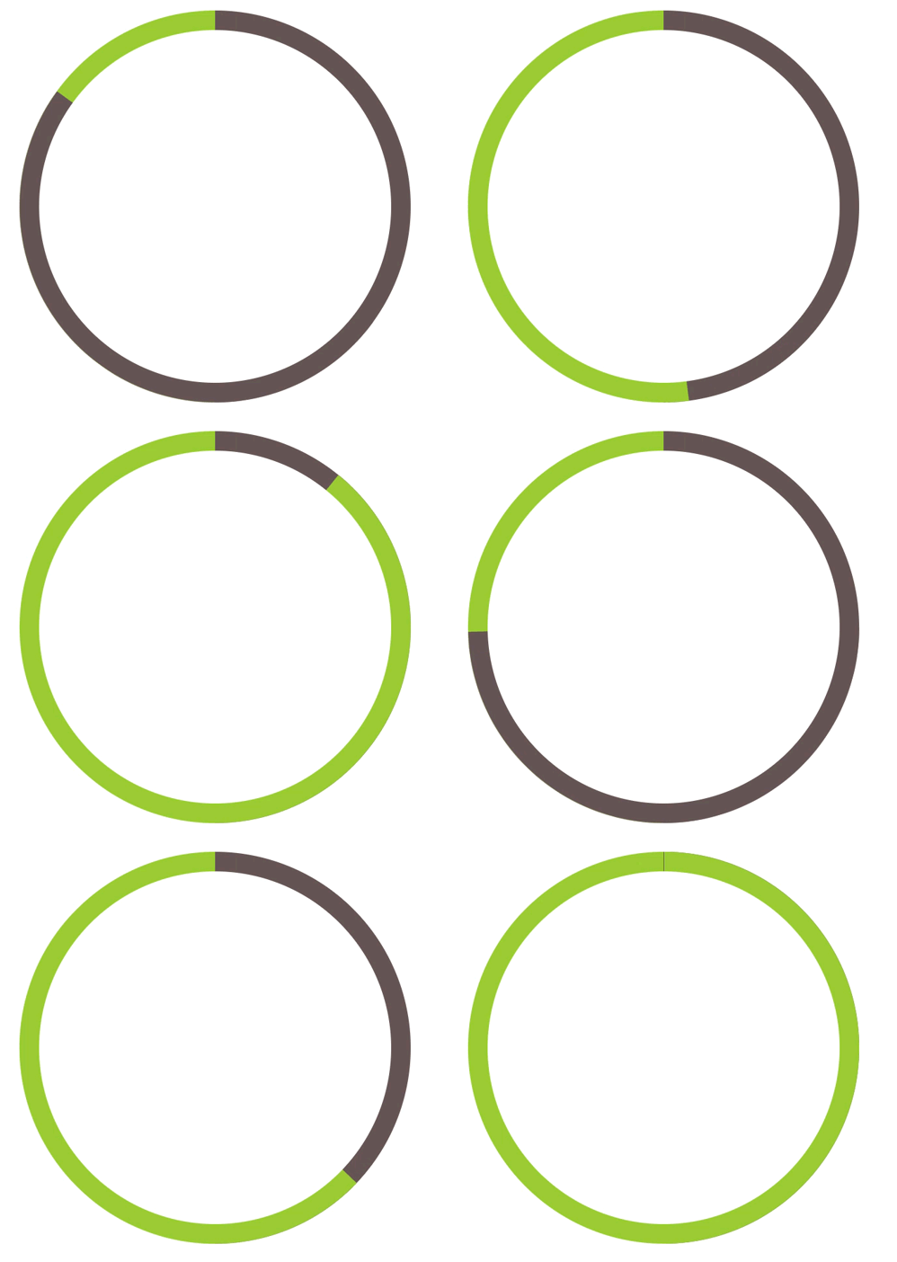
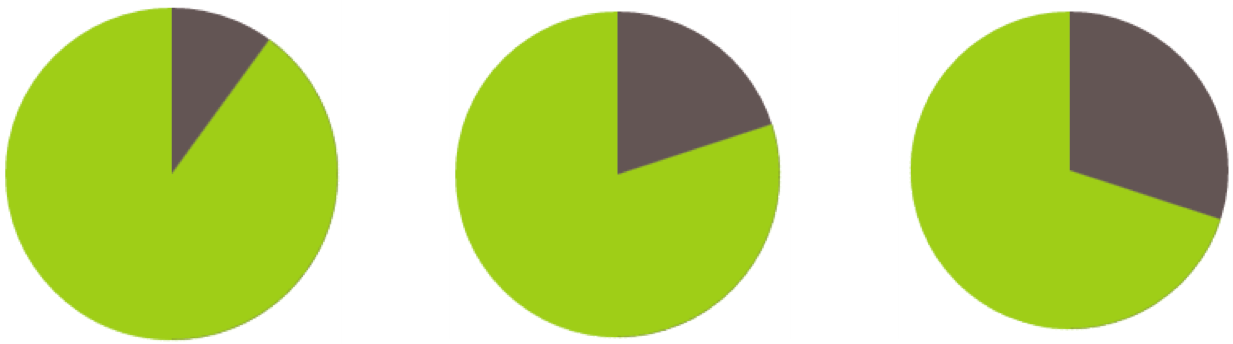
How to make simple pie charts with CSS alone. Usually, to create pie charts, we use some kind of framework, for example, d3.js. But a simple pie chart can be done in CSS.
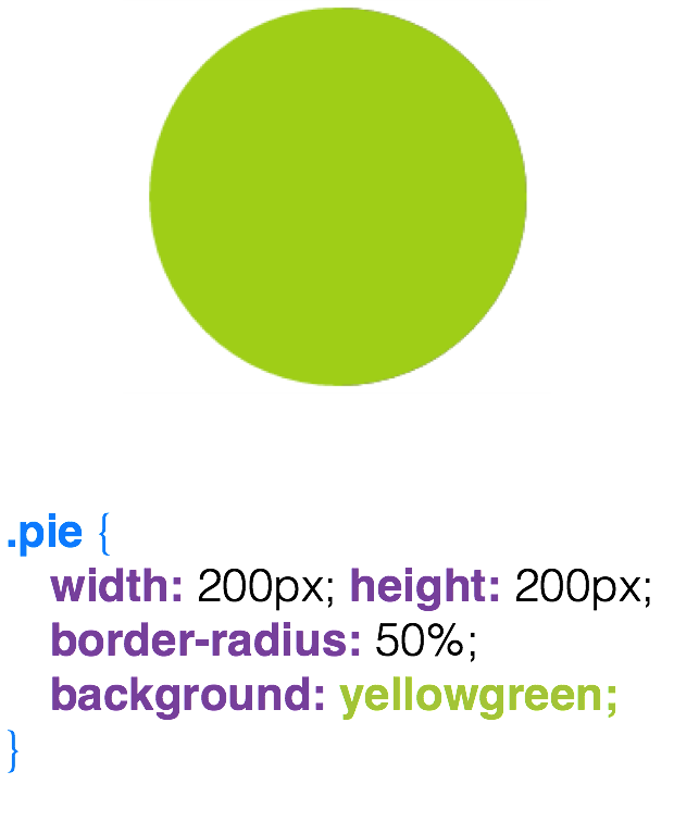
We have a block, we make a circle out of it.
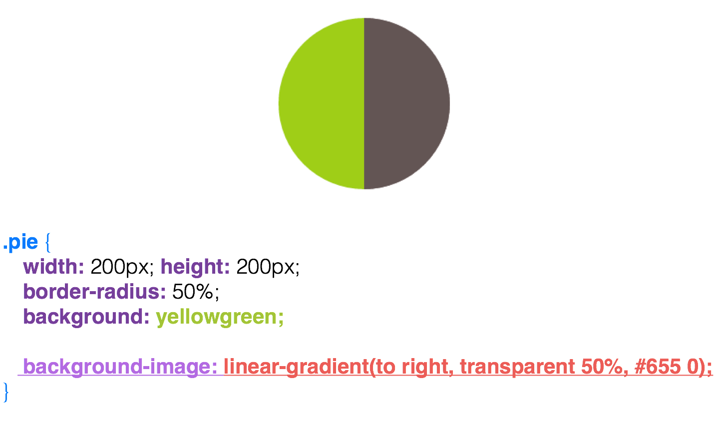
Half the circle is painted in brown.
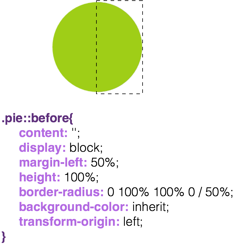
Next, we make a pseudo-class, which we paint over in the same green color that is already in the block.
In fact, just moving this pseudo-class, we already get some kind of sector diagram, but only up to half, since the other part is green.
I will describe such an interesting approach if we pass a negative animation-delay to our blockand at the same time leave the animation-play-state in the paused state, you can notice that the state of our element is changing. And if our animation plays up to 4s (4 seconds), and we write in the -2s styles , then we will get a half-lost state, and our circle will be half-filled.
Visual effects
Color overlays can be done in various ways, I will give two examples: the first of them is color overlay using filters. With the help of filters, we can impose many shades, but to achieve any specific will be a problem for many. And then a property like background-blend-mode comes to the rescue .
And let's move on to a much more adaptive way: this is background-blend-mode .
It is more adaptive, because it can not only impose the desired colors, but also mix, and this property is perfectly animated. Plus, with it we can make various color effects.
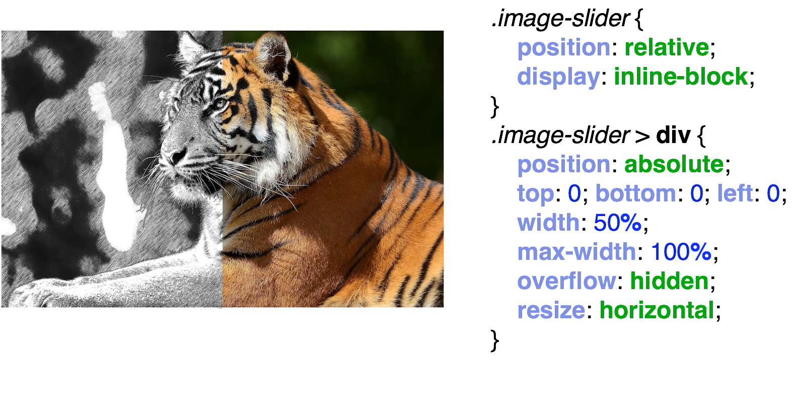
Pay attention to the layout, to HTML. We have a container, image-slider , and it has one image that is nested in a div and the other is not nested. For the parent container, we set position: relative , and for the image embedded in the div , we will work with it, we set position: absolute and a width of 50% . Most importantly, we do resize: horizontal to it .
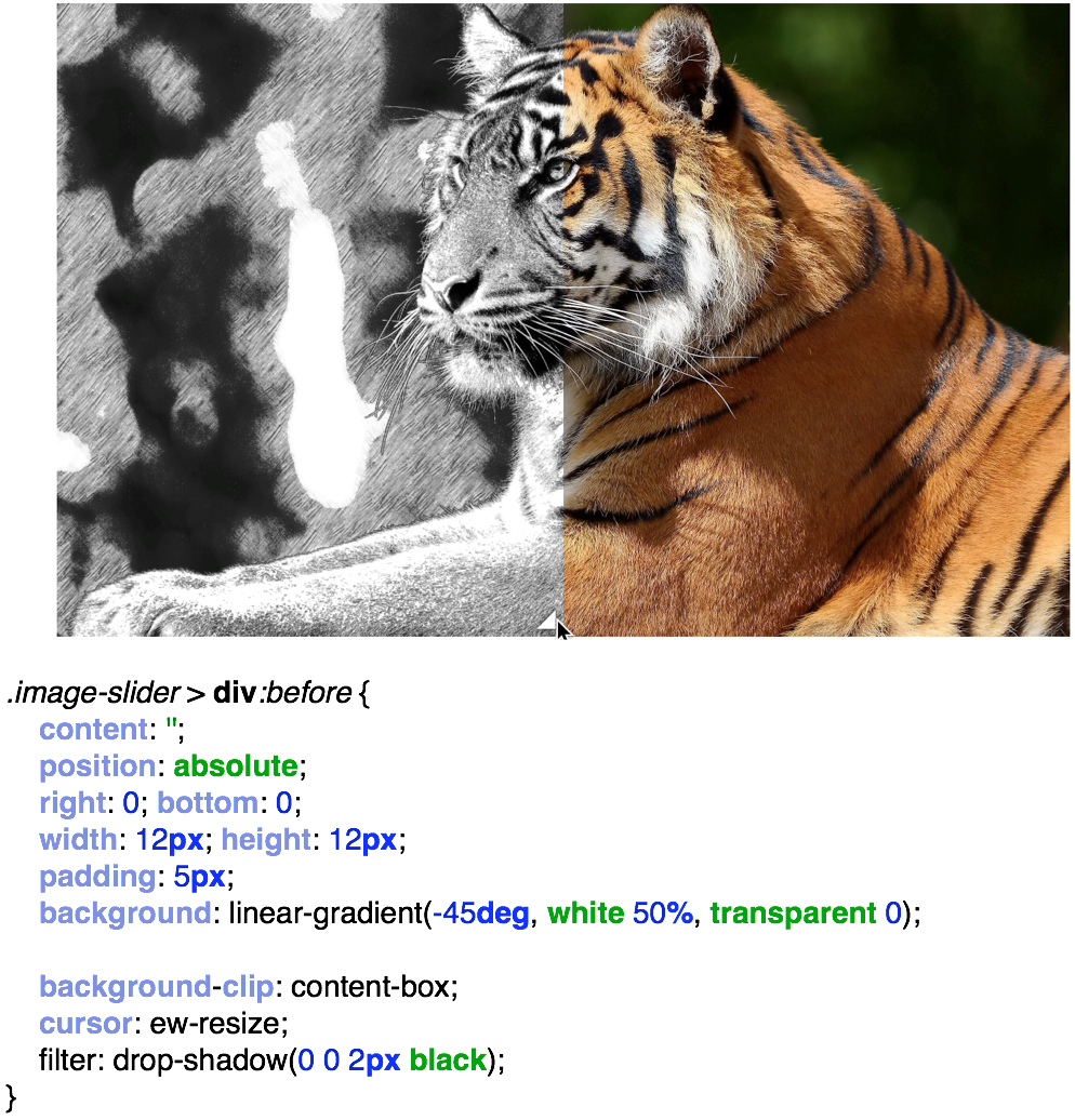
With this resize we will have an interactive comparison. Since I have a very good resolution, we do not see such a bug that occurs due to resize: horizontal. We have a slider that resembles the resize slider of the textarea HTML element . In order to remove it, we simply paint it with a pseudo-class and tie cursor: ew-resize on it .
I want to note that the article was based on the book Css Secrets. Better Solutions to Everyday Web Design Problems . Although it has already been released a long time ago, I highly recommend reading this book. You will learn much more from this book than I presented here and truly try out the many secrets of CSS live.
 January 17, 2018 at 18:10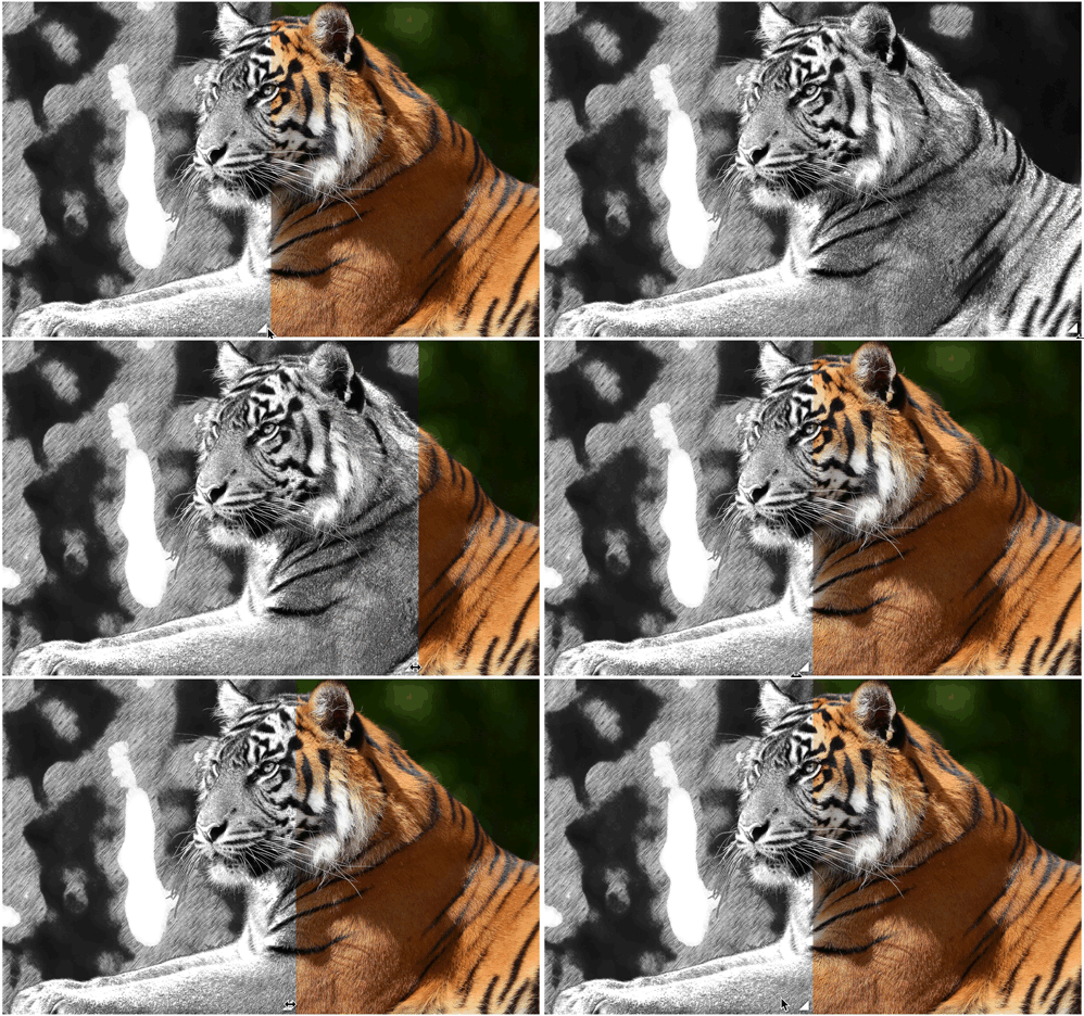














 img {
max-width: 250px;
margin: 20px;
clip-path: polygon(50% 0, 100% 50%, 50% 100%, 0 50%);
transition: all 1s;
}
img:hover {
clip-path: polygon(0 0, 100% 0, 100% 100%, 0 100%);
}
img {
max-width: 250px;
margin: 20px;
clip-path: polygon(50% 0, 100% 50%, 50% 100%, 0 50%);
transition: all 1s;
}
img:hover {
clip-path: polygon(0 0, 100% 0, 100% 100%, 0 100%);
}