October 31, 2017 at 18:39
Helping the taxi service: logo redesign and corporate identity
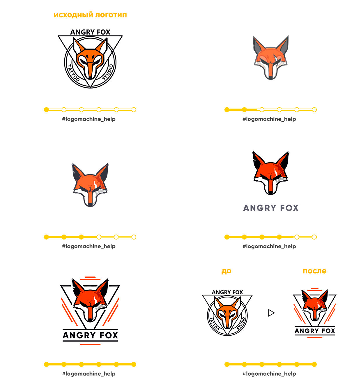
There is a #logomachine_help heading in our community where we help with design tips. Using the examples of participants, we give advice on graphics, composition, explain errors. Our section is not a complete redesign, but express help to improve the design. Usually it looks like this:
We noticed that mistakes are often repeated and made separate releases with small “help” . And once a month they decided to play big - to do a real redesign for one of the lucky ones. This time, Taxi Bonus became such a lucky winner, whose corporate identity we will correct today. The “Taxi Bonus” had such a logo:

Let's start in order: the first problem is that the logo is in no way supported by the corporate identity. There is just a sign, but with the help of just a logo it’s difficult to brand something.
However, for a taxi service it is very important to be able to brand: how is the site? business cards drivers? in the end the cars themselves? With one logo, without a corporate color, elements - it is difficult to become recognizable.
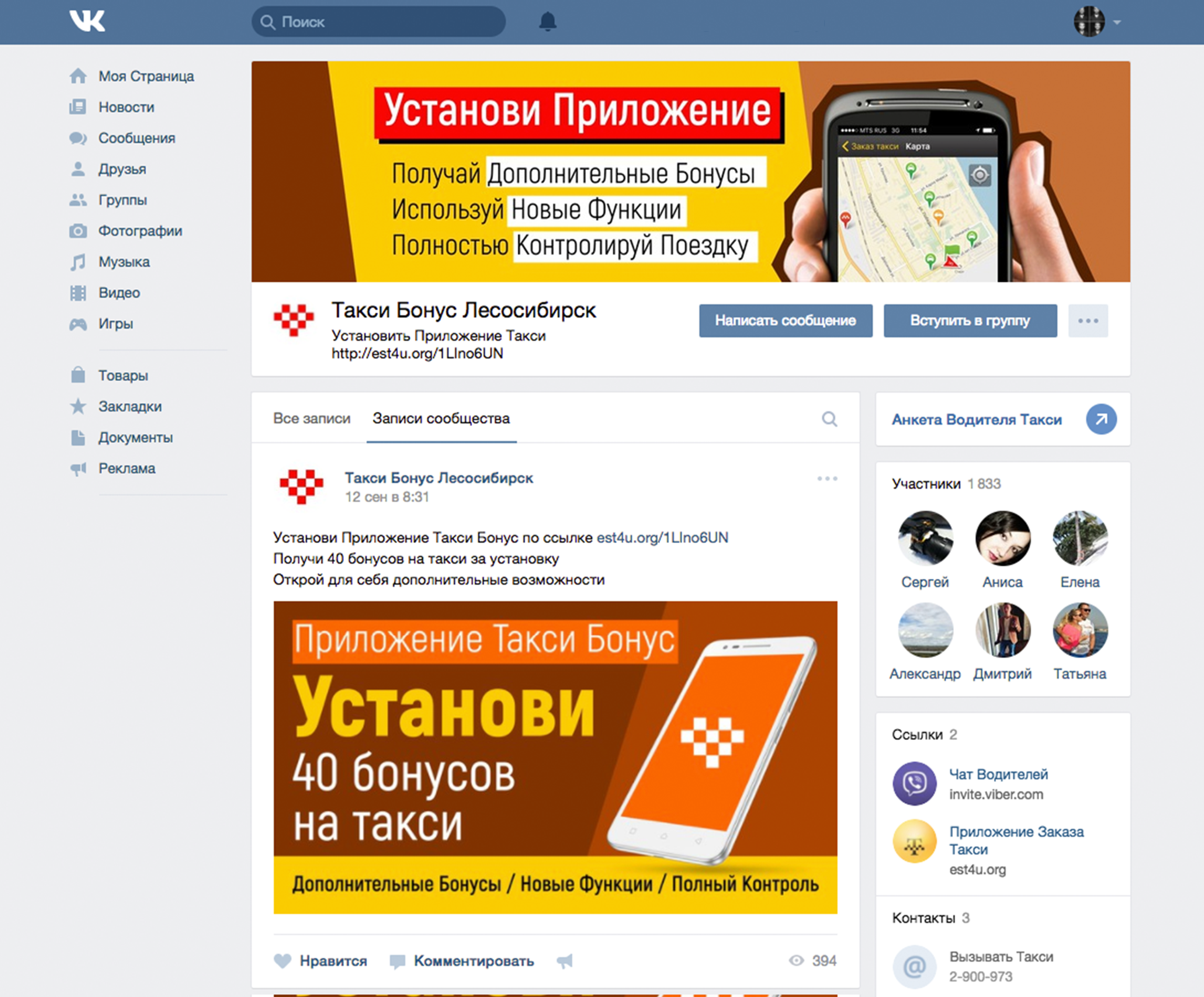
The second problem of the “Taxi Bonus” - everything, including social networks and printed matter, is decorated in different styles. The logo is real chaos. Sometimes it is written in different fonts, sometimes the word "taxi" disappears. How can you remember such a logo if it is elusive and always looks different? Vkontakte
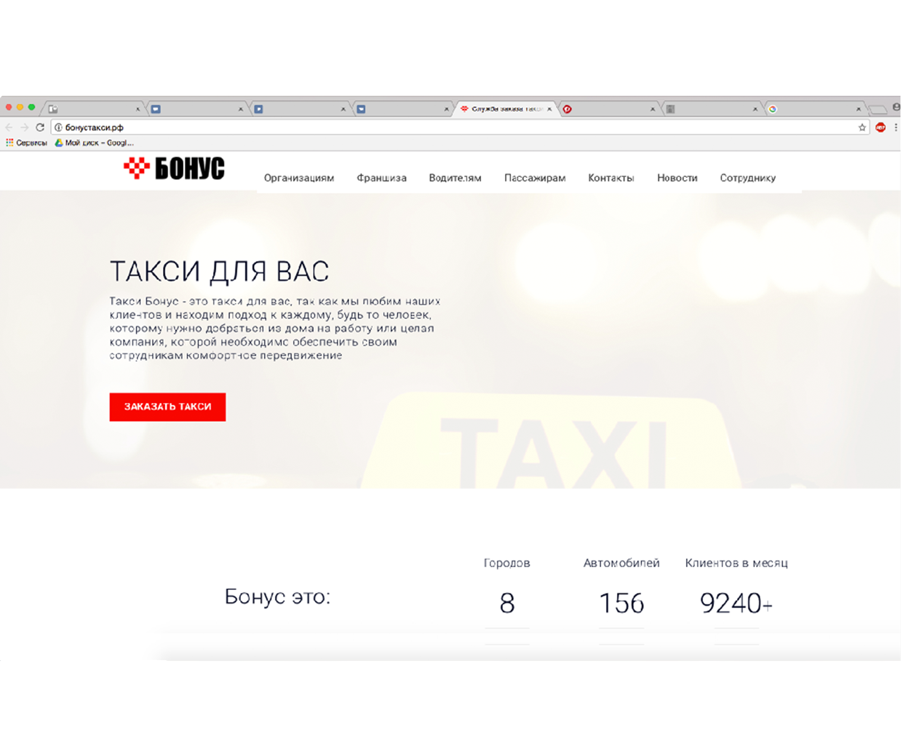
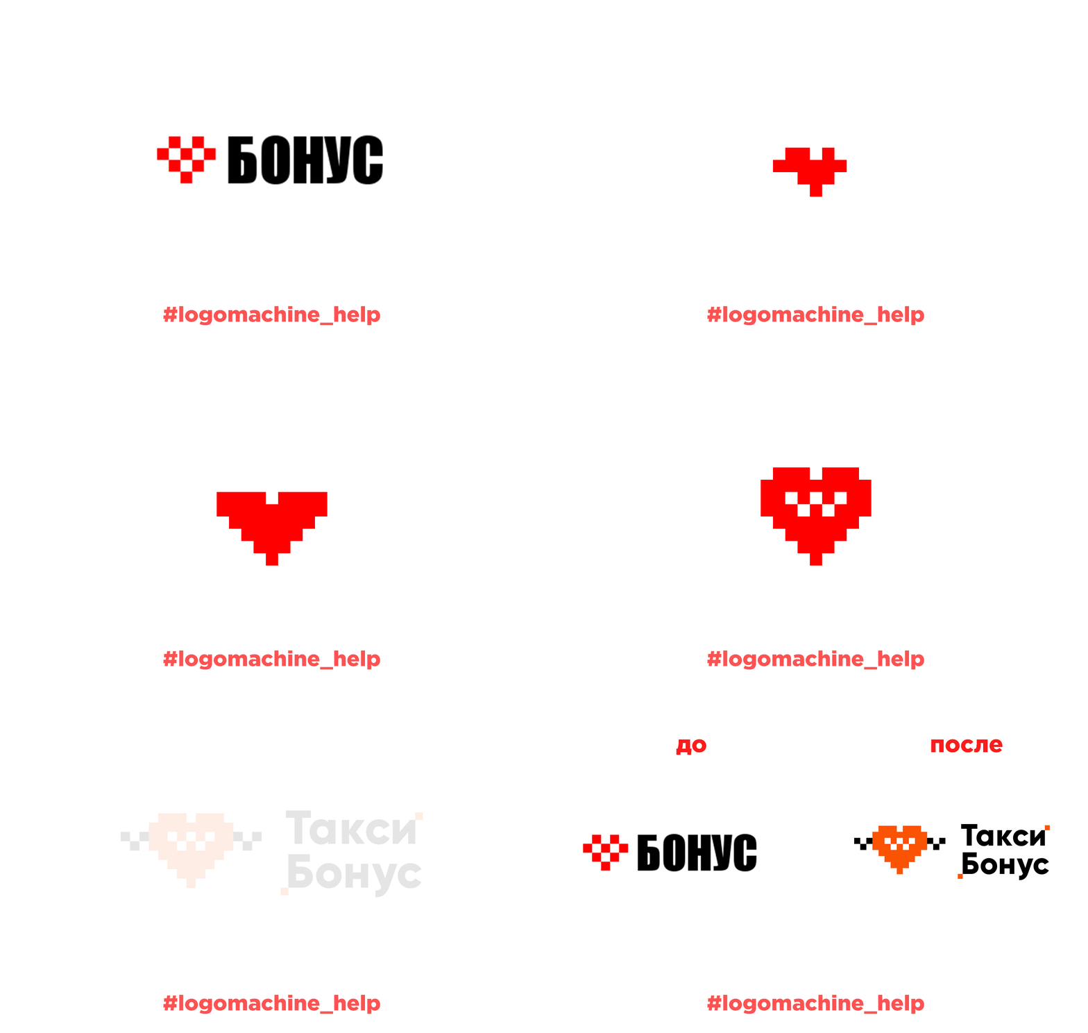
site Printed products There is another nuance - the heart shape is lost due to the pixel style if it is reduced or increased:
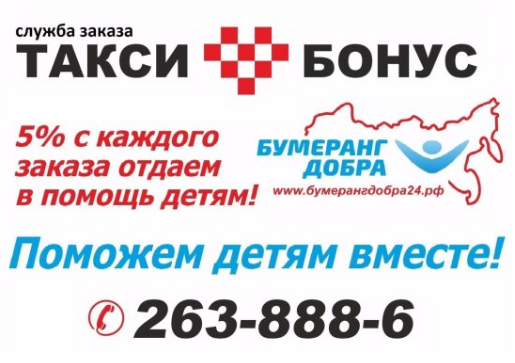

And the red color, combined with the heart, is more likely to be associated with a hospital or pharmacy than with a taxi. Again, all this greatly affects the brand recognition.
Solution for Bonus Taxi
We start with an idea. Since this is a redesign, we will not change it much. We simply “twist” it to the desired state - we will make it classic and modern at the same time, and we will also use pixel art in the entire corporate identity.
Sign The
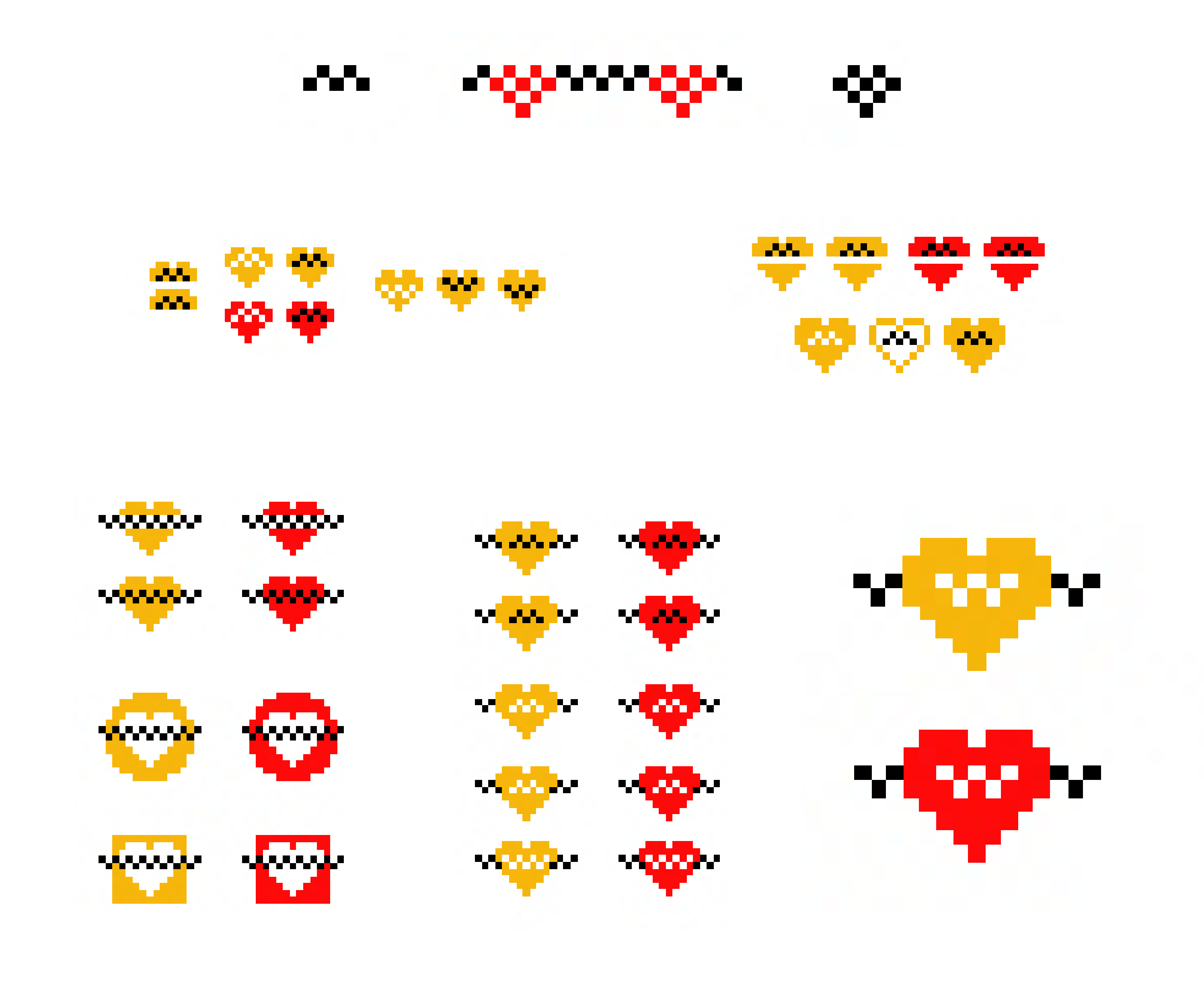
sign lacks "weight", colored elements break up when the logo is enlarged or reduced. This is easy to fix - you need to increase the sign, and place taxi checkers inside the heart. To continue this corporate history, we made checkers along the edges of the sign, now it can be used as a corporate element.
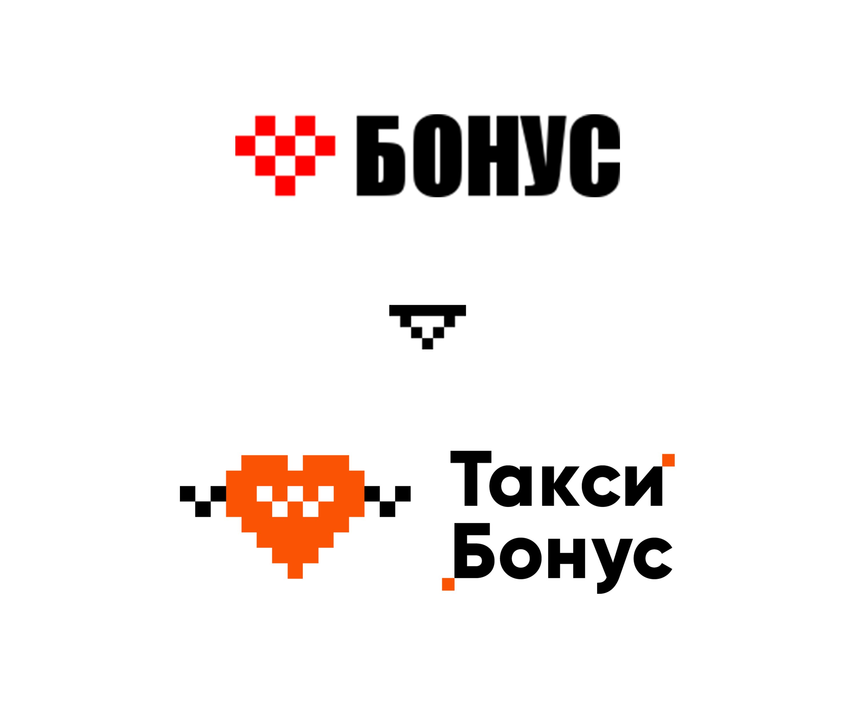
Ideas and the process of changing the sign: The
pixel-style taxi can be continued in this way: make a light box.
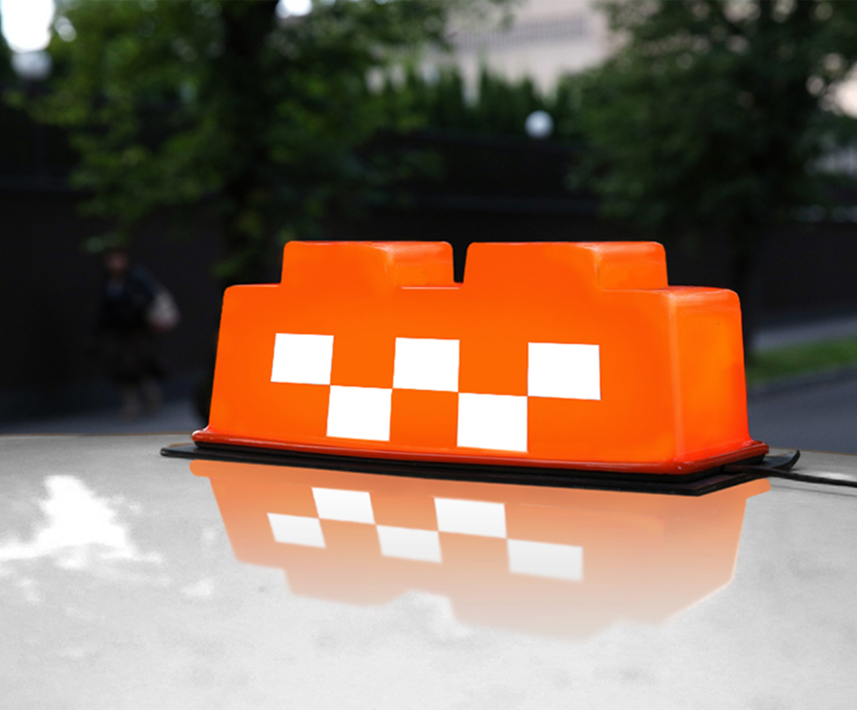
Of course, this is a decent investment. But it will work positively - it can become a feature of the service, and a taxi will be recognizable day, night and in any weather.
Fonts The
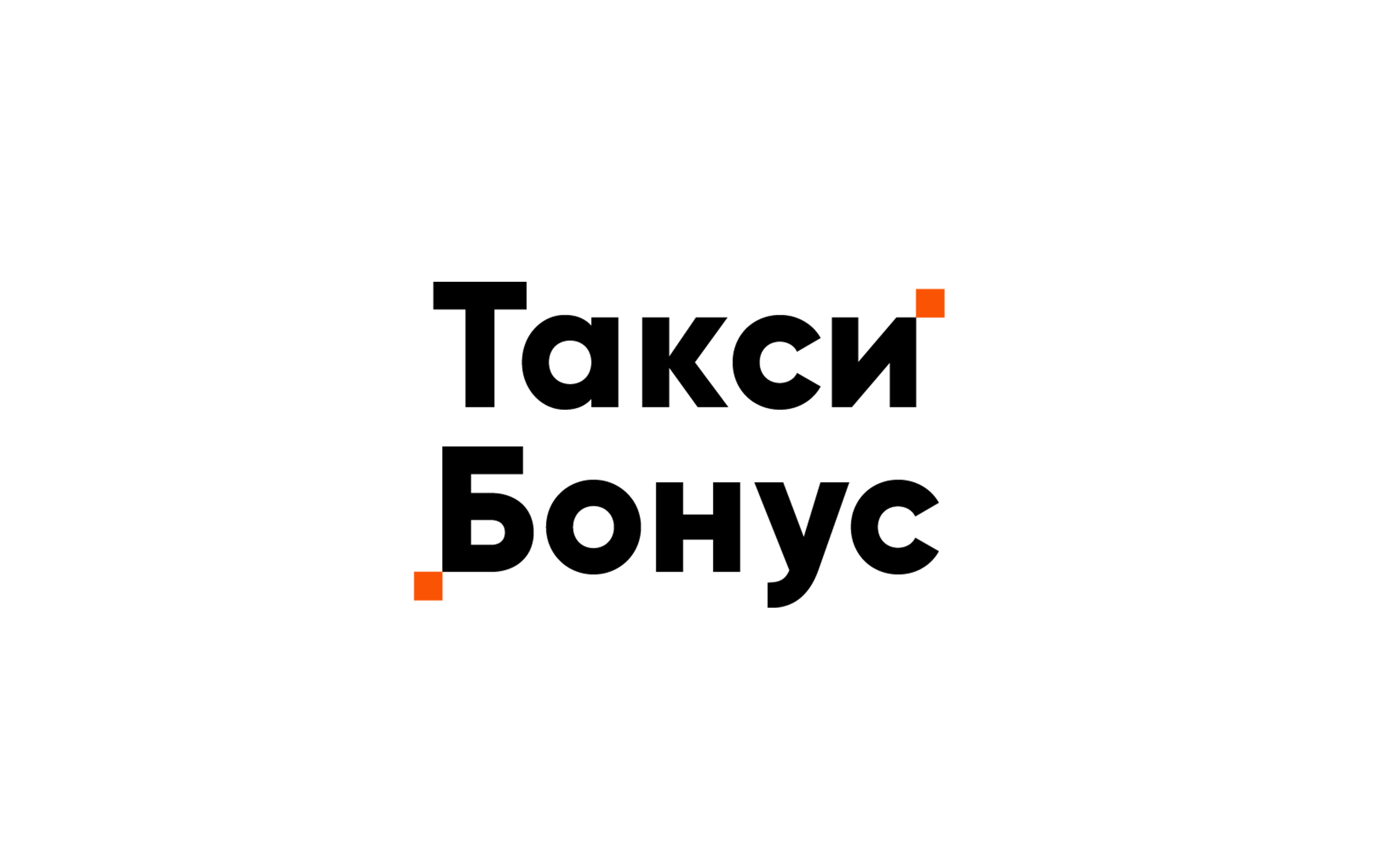
sign turned out to be interesting and quite active, so you won’t have to play with fonts here. We select a simple font, and so that it can be used separately from the sign, we add proprietary “pixels”:
Layout
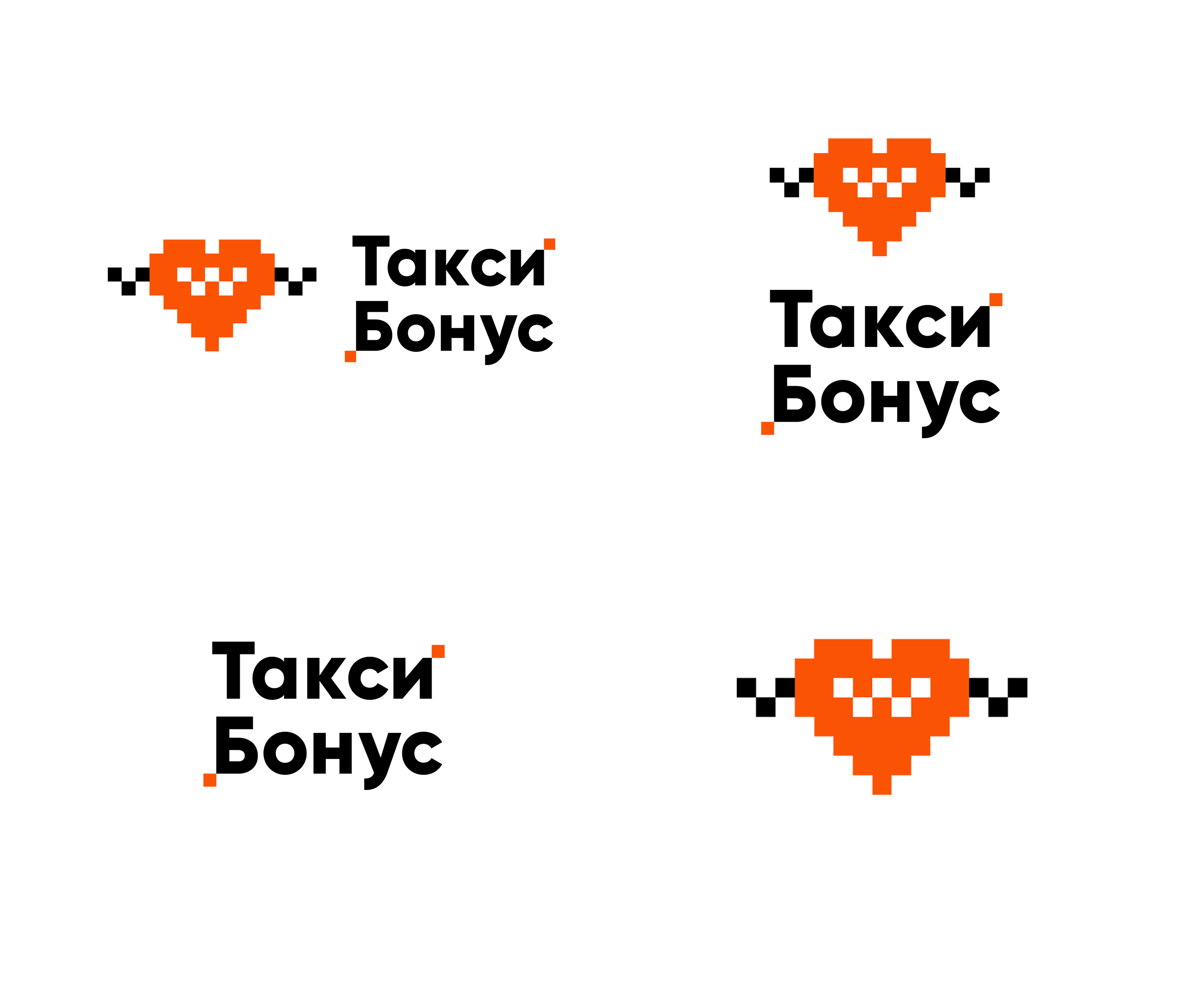
Logos are usually used in different ways: on a site, signboards, in booklets and other media. The sign must be able to adapt to each shape and size in order to look organic.
For this, the layout of the logo is needed - we think over the options in advance: if the logo is on a vertical surface, on a horizontal or will it not be possible to use it completely?
We made layout options for all occasions:
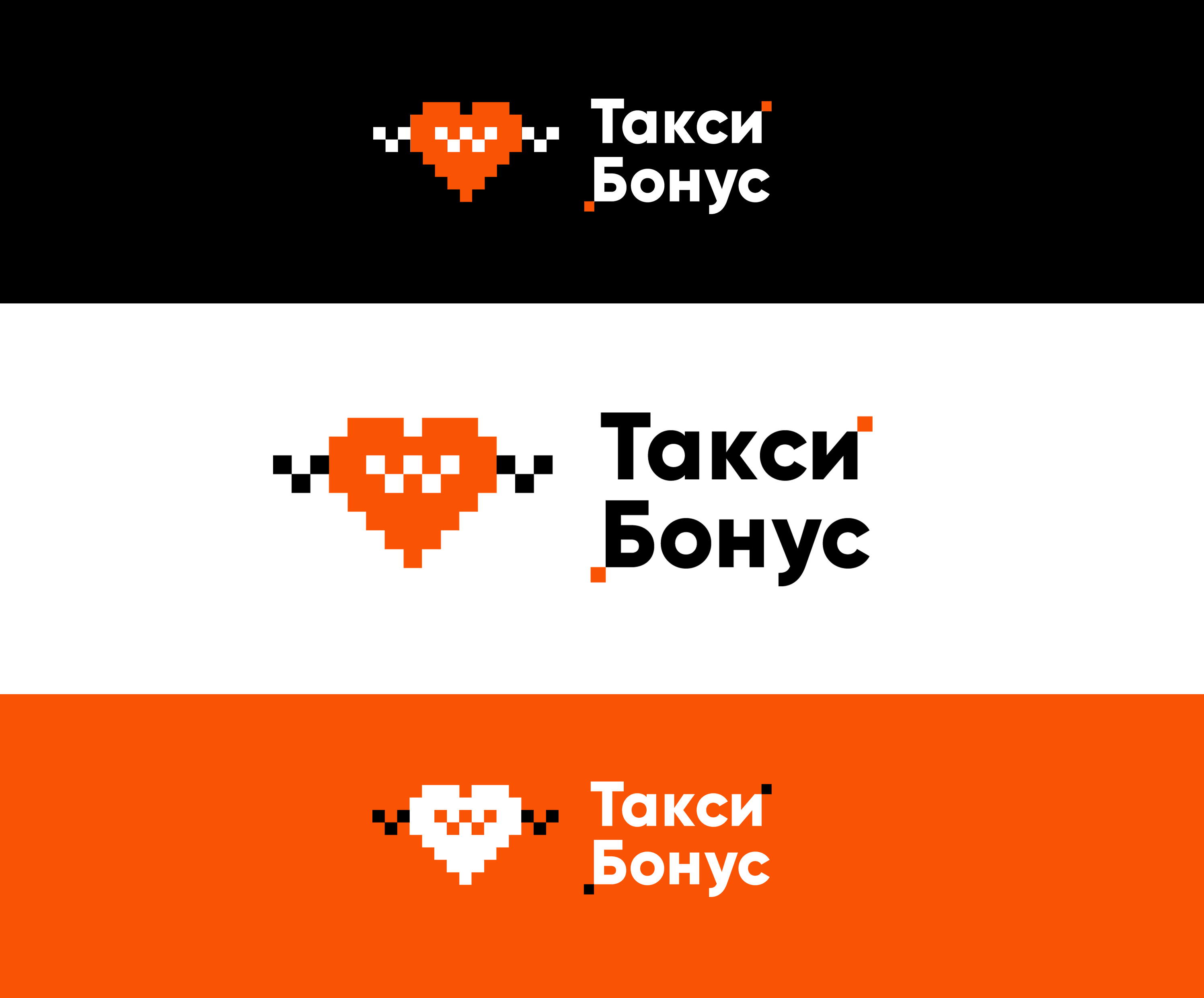
It is still important to understand how the logo will look on different backgrounds: dark, white, color. There will not always be an option to use the sign on only one background:
In the corporate style, we continued the theme of pixel art. In the beginning, they decided to try on a new design for the main carrier of the “Bonus Taxi” - a car.
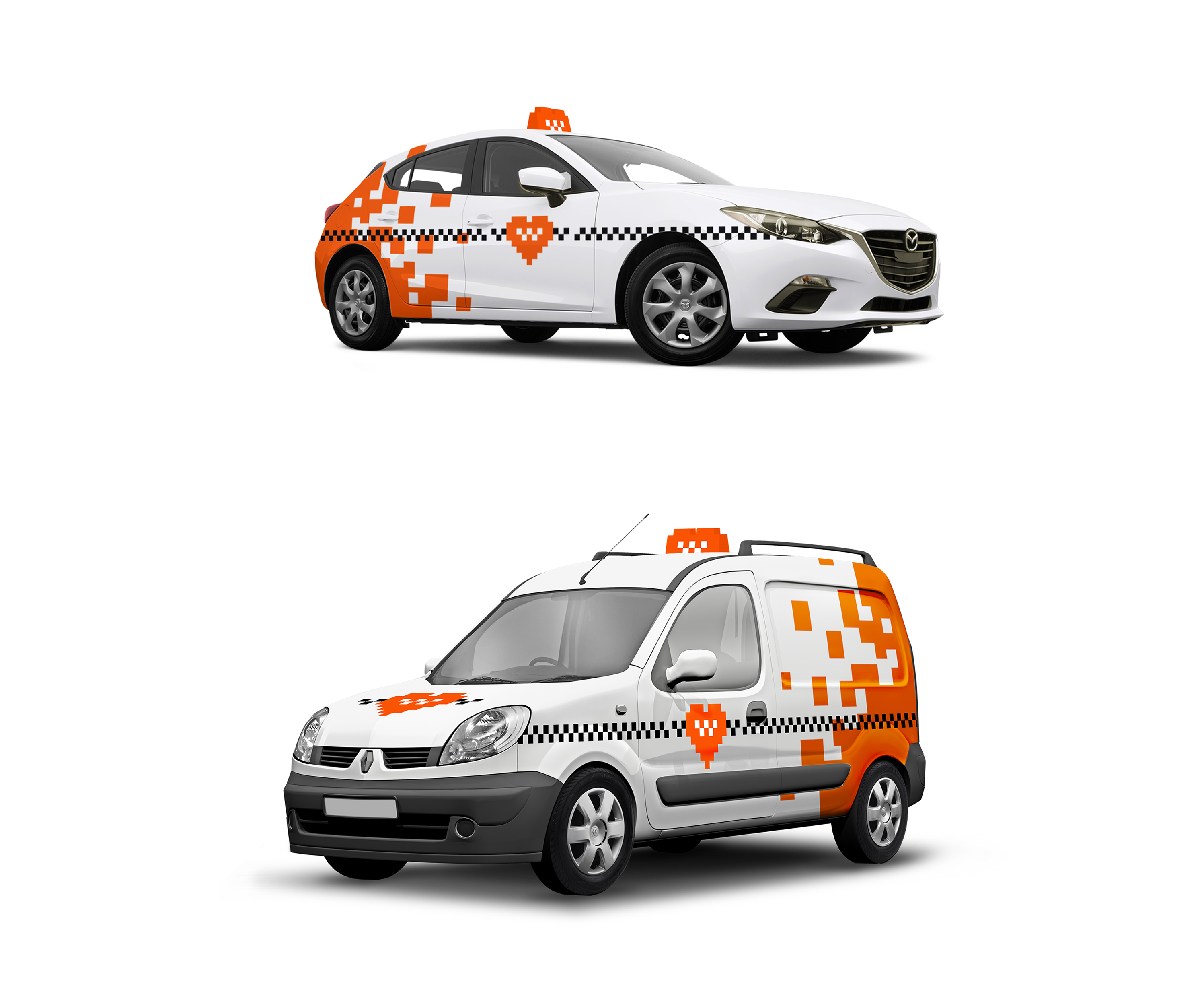
But there was a problem: the original red color of the company turned the car into an ambulance, and the pixel pattern into splashes of blood. The usual "taxi" yellow - also gave poor associations.
Therefore, we chose orange as the main color. Warm and bright color made the corporate identity recognizable and juicy. The whole history of the selection can be seen on the sketches:
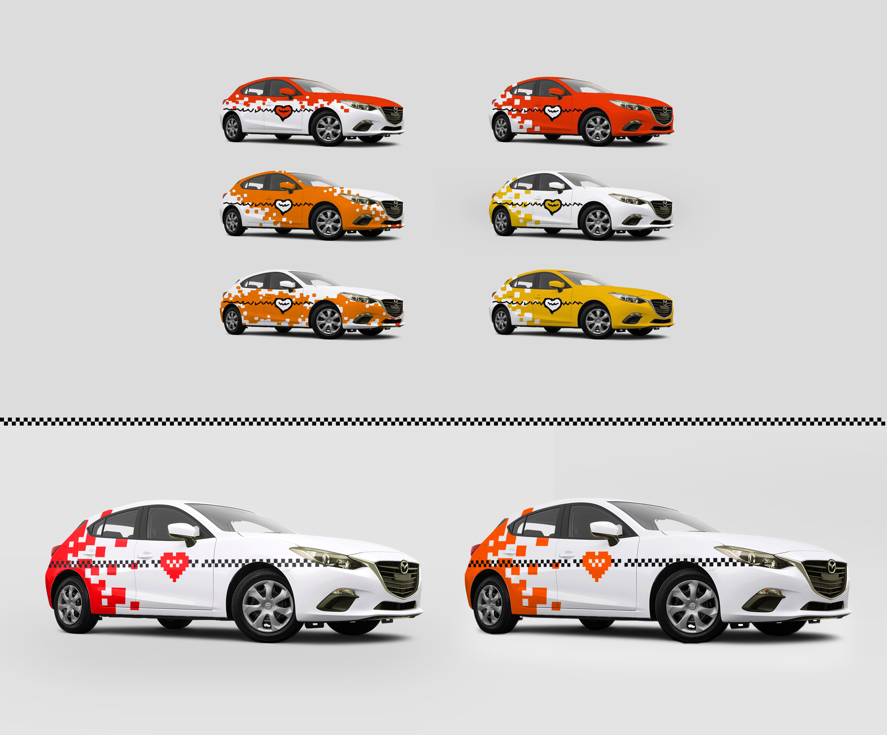
As a result, the cars turned out like this:
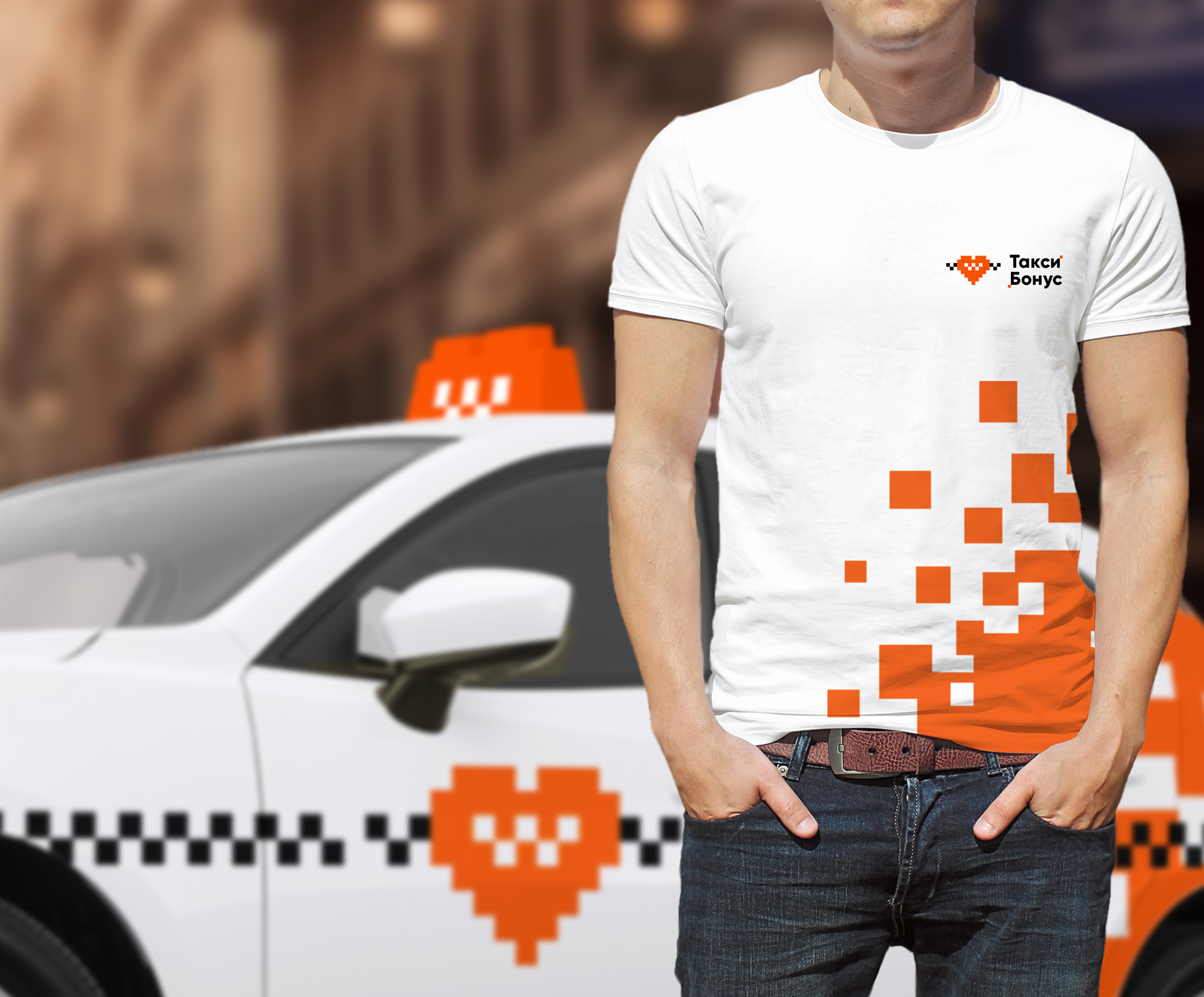
You can also make branded T-shirts for a taxi, it’s not difficult, but it will be easy to remember:
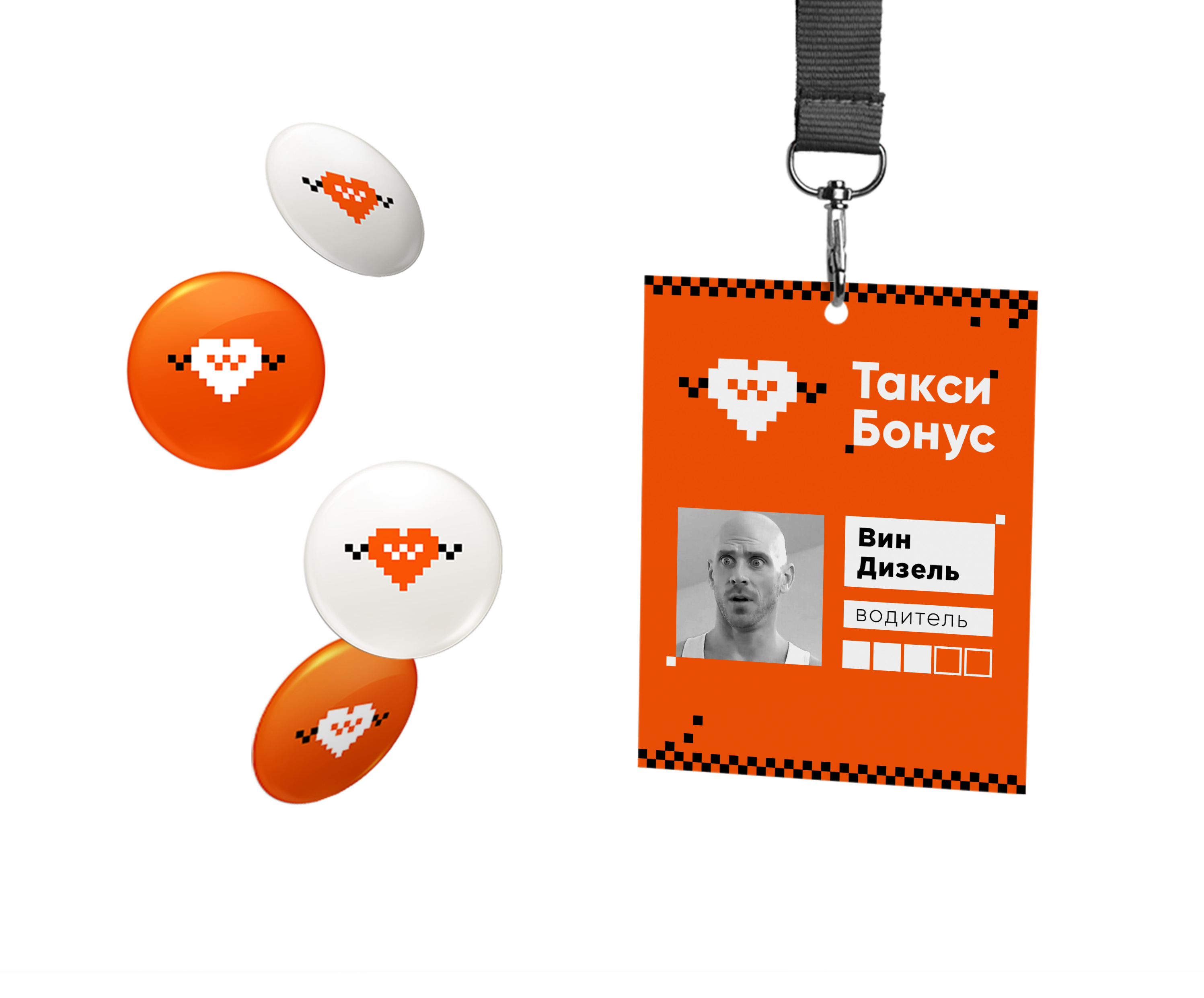
What else can I use for a taxi? For example, branded badges.
How can they help? But what if they are distributed to clients, drivers? Imagine how many people can become a walking advertisement for a service.
Business cards, discount flyers are also important for the service:
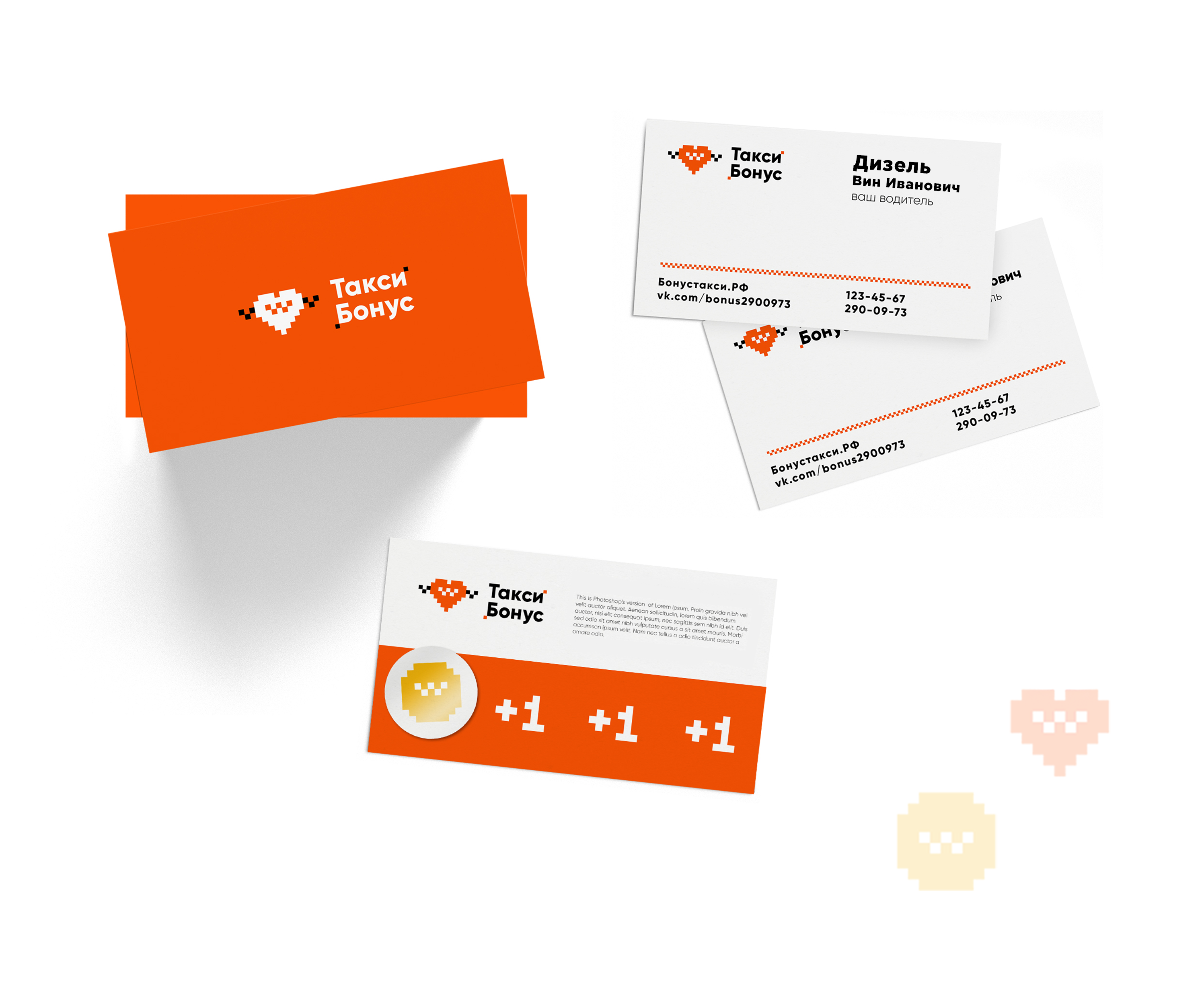
Having received a business card or hearing about the Taxi Bonus company, a person will try to find it on the Internet. And, when he finds a site or Vkontakte group, he should not have doubts about the fact that this is exactly the company that he heard about and that he was looking for.
To do this, we tried on the corporate identity on the company’s website, and for the Vkontakte group we made an example of the design of the post:
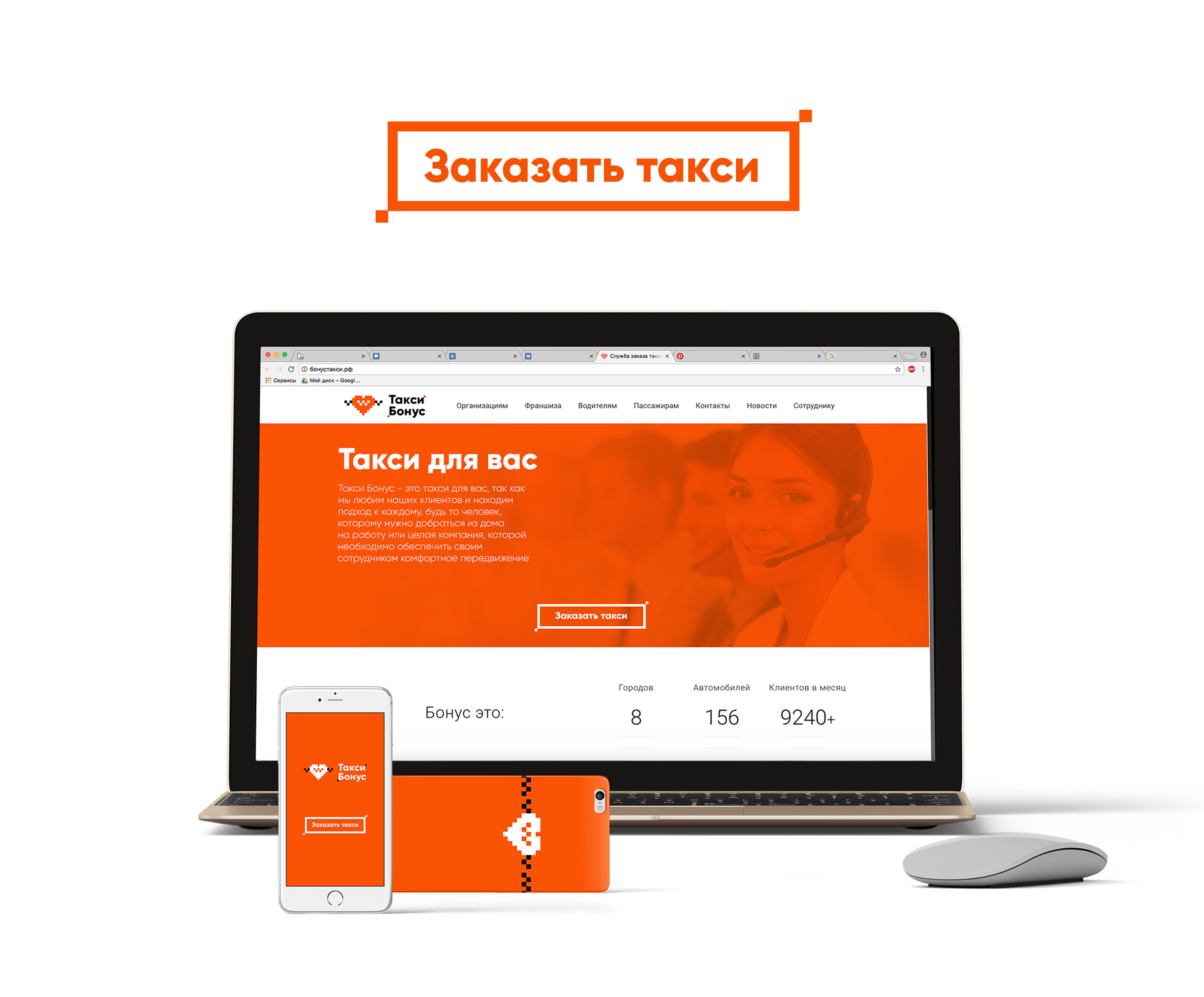
Website and mobile application
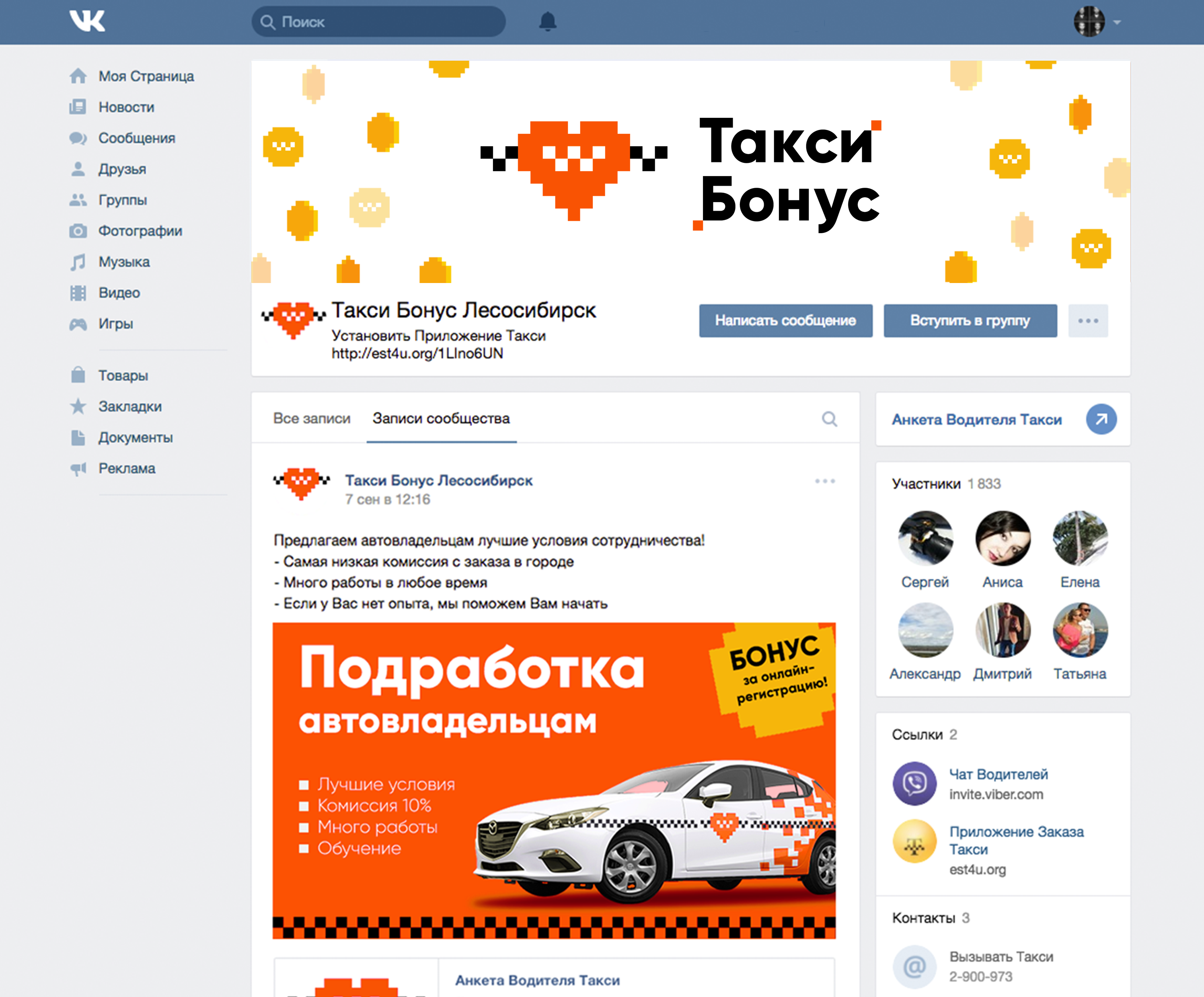
VK Group The
form of the bonus coin, which we used as an element of corporate identity, can be used for animation on the website or in the application:

Total
- After refinement, the logo acquired the correct shape and color. This will help “Taxi Bonus” to be recognizable, as well as eliminate the possibility of confusion with other taxi services.
- Now the sign can be used both in large and in small size, without loss of readability, and the font part will be the same everywhere. The logo can be arranged both in the horizontal version and in the vertical one.
- The company has branded elements and color combinations, this allows us to understand that we have the same company, and not several different ones, as it was before.
If you want to participate in our section, then send your design directly in the comments or in our public VK . As always, good luck to you and your projects!
Prepared by Slepchevich Victoria for Logomachines