Best UX and Web Design by Behance Users
The editors of the blog “Netologiya” have compiled a selection of the coolest works by designers at Behance: to be inspired and seek ideas for development. We love such collections, so if you have something to tell about cool designers (or you are a cool designer yourself) - write to our editors, we are happy to work together. We decided to distinguish two categories of work: UX and user interaction and web design.
Moscow studio has created a site for the Museum of lunar exploration. An extraordinary project, designed in black and white, gained more than 92 thousand views, 10 thousand likes and more than 500 comments.
The project is very cool thought out from the graphic component and its tonality to the interface. The result was a verified harmony, where user experience is taken into account to the smallest detail, and the graphics perfectly complement. Well, the performance style itself is beyond praise.
Explore The Moon was made using Adobe products: Photoshop, Illustrator and After Effects, as well as using Maxon Cinema 4D.
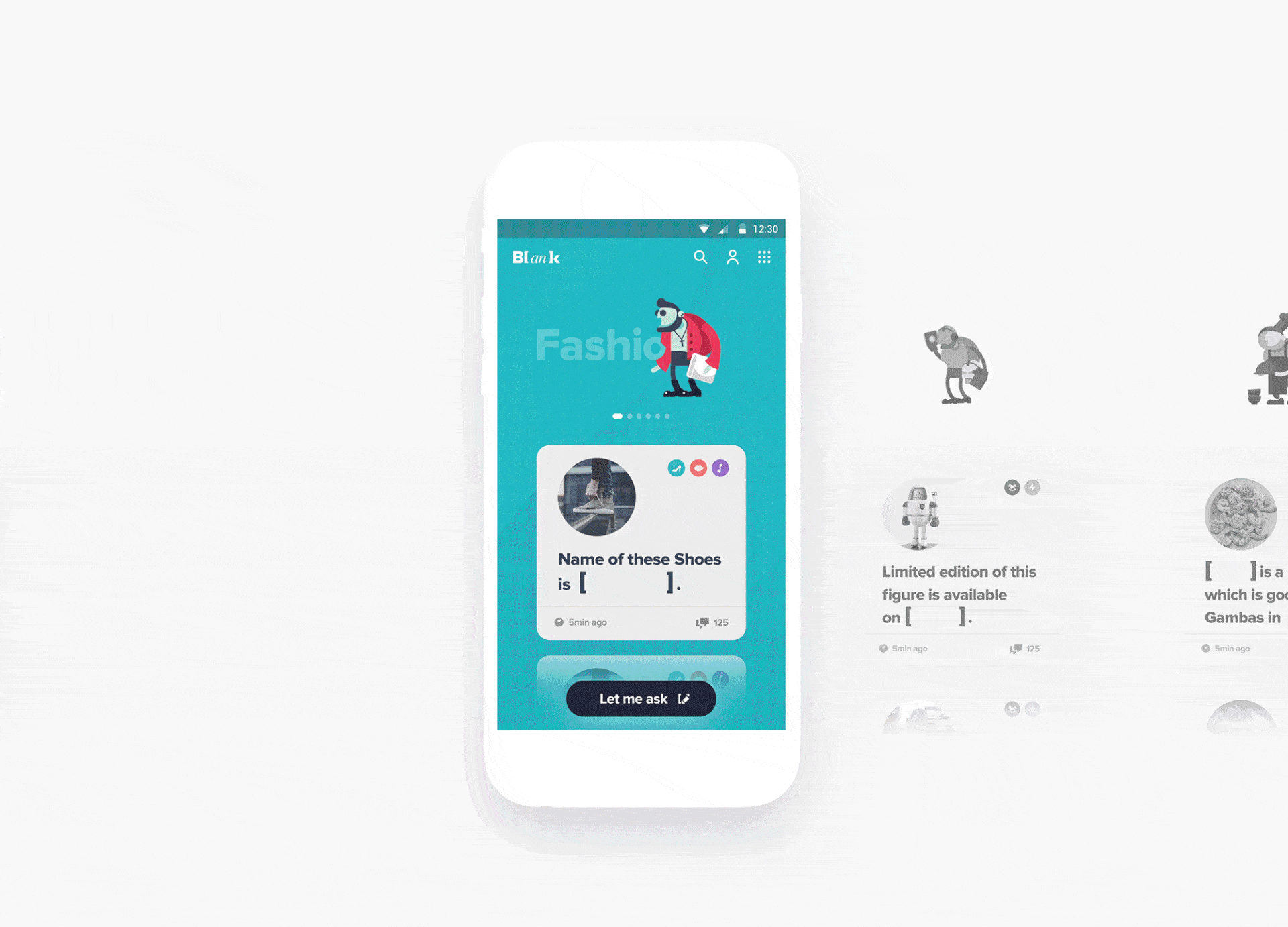
Blank is a special shopping service developed by a designer from Seoul, Korea. The project scored more than 142 thousand views, 14 thousand likes and more than a thousand comments.
A nontrivial idea for a shopping offer: introducing a request in square brackets. Specially designed font and graphic effect. At the same time, the user has convenient navigation, a beautiful picture, thoughtful animation that does not distract from the performance of targeted actions.
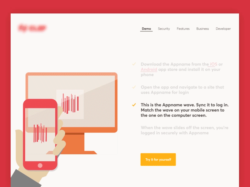
We think that few people have not seen this concept invented by the Polish team. A stunning concept and great performance gathered 71 thousand views, 8 thousand likes and more than 300 comments on Behance.
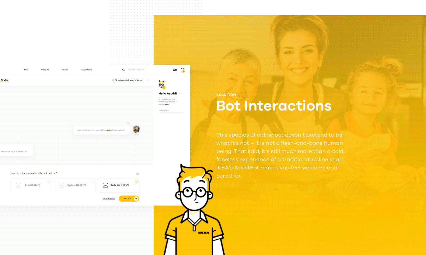
The whole charm of the idea is that the absolute user experience is taken into account and the whole concept is made explicitly by Ikea fans. In the first place is the user and his convenience. And the entire graphic design is tailored precisely for the user, and not for the sake of beauty, as often happens. And, which is one of the most important things: almost all user steps are taken into account, and the whole concept was developed step by step. And - right step by step:
When creating the concept, four Adobe products were used: After Effects, Premiere Pro, Photoshop, Illustrator.

The same team that made the concept for Ikea decided to encroach on the holy of holies - Trello. It turned out great! At Behance, the redesign gained over 113 thousand views, 11 thousand likes and about 500 comments.

What is a huge plus redesign? In that it is more thoughtful design, execution and visualization. Trello in the version of Netguru Team is more reminiscent of the correct task for sprints. If you recall that initially - it was an Internet variation of the kanban board. In addition, the redesign looks clear, clean, lightweight and oriented to the user and his needs.

The Chinese designer came up with a new training application. Beautiful, lightweight, convenient for any user with a bunch of features and amazing graphics. The project scored 64 thousand views, 7300 likes and more than 300 comments on Behance.
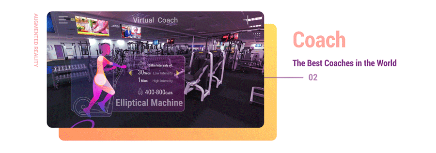
The concept offers augmented reality that helps the user interact with it in terms of physical activity. It offers training, takes into account the state of the body, calculates the optimal load.
At the same time, there are excellent statistics in terms of graphical and practical components, and in addition, the user is once again at the forefront. Even the moments of how to conveniently use a smartphone are taken into account: horizontally or vertically.
When creating the concept, Photoshop, Illustrator and After Effects were used.
A site and branding for an architectural studio with 140 thousand views, 22 thousand likes and 350 comments. The project was created using four Adobe products: Photoshop, Illustrator, Muse, Dreamweaver.
All branding and the site are built on the wow effect and the desire to create pure minimalism based on the products of the company for which the order was placed. Designers managed to do this. Another thing is that when you view it again, the picture stops catching your eye and becomes completely mundane.

The interface of the site of the famous game was created by the American studio Dtail and the Russian designer, representing it, Stanislav Hristov. The project has collected more than 120 thousand views, 7 thousand likes and 450 comments.

It may seem that the project is not something outstanding. Therefore, Behance even caused controversy about how it could be done differently and more provocative and stunning the imagination. But, nevertheless, it is impossible to deny that the designer delightfully conveyed the style of the product and transferred it to the web, awarding with modern colors and showing the depth of the design (3D effect).
The portal was created with just one Photoshop and many hand tools: Wacom Tablet, Adobe CC 2015, Apple IMac, Wacom Bamboo Tablet, Wacom Cintiq.
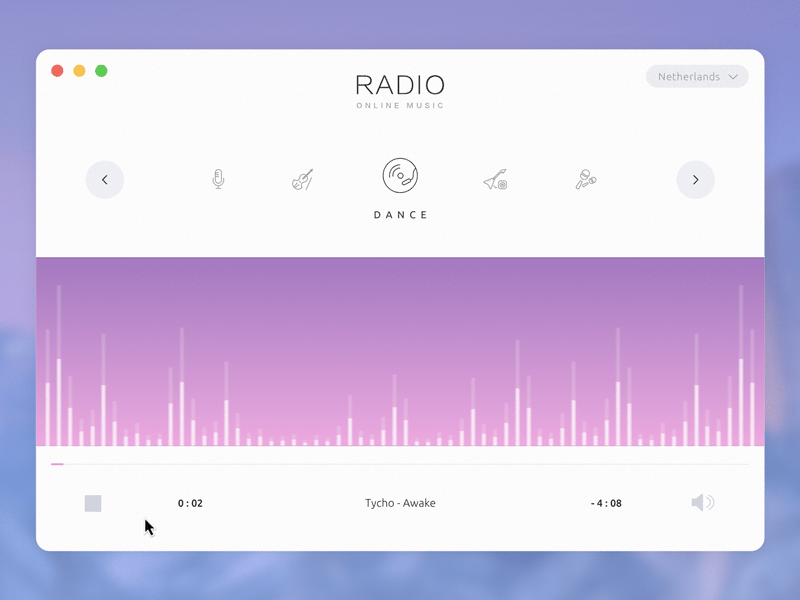
The famous American studio from San Francisco is constantly appearing in the top according to Behance users. For example, this collection has gained more than 280 thousand views, 26 thousand likes and more than 655 comments.
Ramotion possesses indisputable authority not because it specializes in web design and graphics and loves the wow effect, but because it skillfully combines this with knowledge and research of user behavior and interests. For this, and loved.
Studio designers use three Adobe products: Photoshop, Illustrator, After Effects and Sketch.

A regular site of a furniture store from a Russian designer managed to get more than 50 thousand views on Behance, four thousand likes and 200 comments.
The whole secret is that the designer skillfully uses minimalism, giving it clear shapes and allowing the design to breathe, once again not forgetting about the user and his convenience. The site was created using the Sketch App and Principle.

The next project of Russian designers was created again only with the help of Sketch and Principle, gained 32 thousand views, 2200 likes and more than 150 comments.
All the design salt is in the user's fixation with signatures, making announcements before scrolling. A competent approach, taking into account the specifics of the customer company, and, of course, visual cleanliness. All that is needed in principle.
If you are a designer or designer, we invite you to the Behance Portfolio Review on October 29 to Moscow . Specialists, experts and talented beginners in design will gather at the new site of Netology - Campus.
In the Lectures section, we’ll talk about the trends and prospects of UX design; Personal Review section will be devoted to expert advice: anyone can get advice from a professional; Well, actually in the main section - Review - there will be a design review of the best projects. Experts will be: Avito art director Sergey Gridnev, Maps.me product designer Igor Tomko, Topos UX director Dmitry Andronov. To participate in Review, you must submit an application and pass a preliminary selection.
Holders of the coolest Netology portfolio will be provided with free training on the Product Designer profession program.
And if you are not from Moscow, you can, for example, see our design courses . Good luck
UX and user interaction
Explore the Moon by 108 Studio
Moscow studio has created a site for the Museum of lunar exploration. An extraordinary project, designed in black and white, gained more than 92 thousand views, 10 thousand likes and more than 500 comments.
The project is very cool thought out from the graphic component and its tonality to the interface. The result was a verified harmony, where user experience is taken into account to the smallest detail, and the graphics perfectly complement. Well, the performance style itself is beyond praise.
Explore The Moon was made using Adobe products: Photoshop, Illustrator and After Effects, as well as using Maxon Cinema 4D.
Blank by Jaejin Bong
Blank is a special shopping service developed by a designer from Seoul, Korea. The project scored more than 142 thousand views, 14 thousand likes and more than a thousand comments.
A nontrivial idea for a shopping offer: introducing a request in square brackets. Specially designed font and graphic effect. At the same time, the user has convenient navigation, a beautiful picture, thoughtful animation that does not distract from the performance of targeted actions.
Shopping made personal: IKEA online experience concept from Netguru Team
We think that few people have not seen this concept invented by the Polish team. A stunning concept and great performance gathered 71 thousand views, 8 thousand likes and more than 300 comments on Behance.
The whole charm of the idea is that the absolute user experience is taken into account and the whole concept is made explicitly by Ikea fans. In the first place is the user and his convenience. And the entire graphic design is tailored precisely for the user, and not for the sake of beauty, as often happens. And, which is one of the most important things: almost all user steps are taken into account, and the whole concept was developed step by step. And - right step by step:
- highlighting problems;
- brainstorm;
- user survey;
- finding solutions to problems;
- script testing;
- visual component.
When creating the concept, four Adobe products were used: After Effects, Premiere Pro, Photoshop, Illustrator.
Redesign Trello (Atlassian) by Netguru Team
The same team that made the concept for Ikea decided to encroach on the holy of holies - Trello. It turned out great! At Behance, the redesign gained over 113 thousand views, 11 thousand likes and about 500 comments.
What is a huge plus redesign? In that it is more thoughtful design, execution and visualization. Trello in the version of Netguru Team is more reminiscent of the correct task for sprints. If you recall that initially - it was an Internet variation of the kanban board. In addition, the redesign looks clear, clean, lightweight and oriented to the user and his needs.
AR Virtual Fitness Coach App by Daz Qu
The Chinese designer came up with a new training application. Beautiful, lightweight, convenient for any user with a bunch of features and amazing graphics. The project scored 64 thousand views, 7300 likes and more than 300 comments on Behance.
The concept offers augmented reality that helps the user interact with it in terms of physical activity. It offers training, takes into account the state of the body, calculates the optimal load.
At the same time, there are excellent statistics in terms of graphical and practical components, and in addition, the user is once again at the forefront. Even the moments of how to conveniently use a smartphone are taken into account: horizontally or vertically.
When creating the concept, Photoshop, Illustrator and After Effects were used.
Web design
Fivecell Architects by Lucasz Drozdz and Sebastian Bednarek
A site and branding for an architectural studio with 140 thousand views, 22 thousand likes and 350 comments. The project was created using four Adobe products: Photoshop, Illustrator, Muse, Dreamweaver.
All branding and the site are built on the wow effect and the desire to create pure minimalism based on the products of the company for which the order was placed. Designers managed to do this. Another thing is that when you view it again, the picture stops catching your eye and becomes completely mundane.
Destiny by Dtail Studio
The interface of the site of the famous game was created by the American studio Dtail and the Russian designer, representing it, Stanislav Hristov. The project has collected more than 120 thousand views, 7 thousand likes and 450 comments.
It may seem that the project is not something outstanding. Therefore, Behance even caused controversy about how it could be done differently and more provocative and stunning the imagination. But, nevertheless, it is impossible to deny that the designer delightfully conveyed the style of the product and transferred it to the web, awarding with modern colors and showing the depth of the design (3D effect).
The portal was created with just one Photoshop and many hand tools: Wacom Tablet, Adobe CC 2015, Apple IMac, Wacom Bamboo Tablet, Wacom Cintiq.
A selection of works on web design Ramotion
The famous American studio from San Francisco is constantly appearing in the top according to Behance users. For example, this collection has gained more than 280 thousand views, 26 thousand likes and more than 655 comments.
Ramotion possesses indisputable authority not because it specializes in web design and graphics and loves the wow effect, but because it skillfully combines this with knowledge and research of user behavior and interests. For this, and loved.
Studio designers use three Adobe products: Photoshop, Illustrator, After Effects and Sketch.
Furnita by Cyril Kim
A regular site of a furniture store from a Russian designer managed to get more than 50 thousand views on Behance, four thousand likes and 200 comments.
The whole secret is that the designer skillfully uses minimalism, giving it clear shapes and allowing the design to breathe, once again not forgetting about the user and his convenience. The site was created using the Sketch App and Principle.
Texx from Russian designers
The next project of Russian designers was created again only with the help of Sketch and Principle, gained 32 thousand views, 2200 likes and more than 150 comments.
All the design salt is in the user's fixation with signatures, making announcements before scrolling. A competent approach, taking into account the specifics of the customer company, and, of course, visual cleanliness. All that is needed in principle.
From the editors
If you are a designer or designer, we invite you to the Behance Portfolio Review on October 29 to Moscow . Specialists, experts and talented beginners in design will gather at the new site of Netology - Campus.
In the Lectures section, we’ll talk about the trends and prospects of UX design; Personal Review section will be devoted to expert advice: anyone can get advice from a professional; Well, actually in the main section - Review - there will be a design review of the best projects. Experts will be: Avito art director Sergey Gridnev, Maps.me product designer Igor Tomko, Topos UX director Dmitry Andronov. To participate in Review, you must submit an application and pass a preliminary selection.
Holders of the coolest Netology portfolio will be provided with free training on the Product Designer profession program.
And if you are not from Moscow, you can, for example, see our design courses . Good luck