October 17, 2017 at 01:58
Hacking the visual system: 11 optical illusions in graphic design
- Transfer
Is the rabbit hole deep?

How many minutes will it take you to understand what the chip is?
Francis Bacon in 1620 divided the sources of human errors that stand in the way of knowledge into four groups, which he called "ghosts" or "idols" (lat. Idola).
Under the cut - a visual demonstration of the vulnerability of our brain to attacks through visual input. I present to you a translation of an article by product designer and front-end developer Balraj Chana, about how you can use / neutralize the effect of optical illusions.

Aligning a triangle based on a centroid (barycenter).
Icons can be deceiving, especially with complex geometry and odd proportions. Not all icons in a set are symmetrical, pixel perfect, or contain compatible proportions. Some icons require direct intervention, and first of all, this awesome play button.
Placing a triangle inside a curved or straight reservoir may make the element optically inappropriate. The reason for this is the effect known as the illusion of the cross section of a triangle . The center of mass of a triangle is calculated based on its minimum bounding box . Therefore, if you need to place a point exactly in the middle of the height of an equilateral triangle, then optically it will appear much higher.
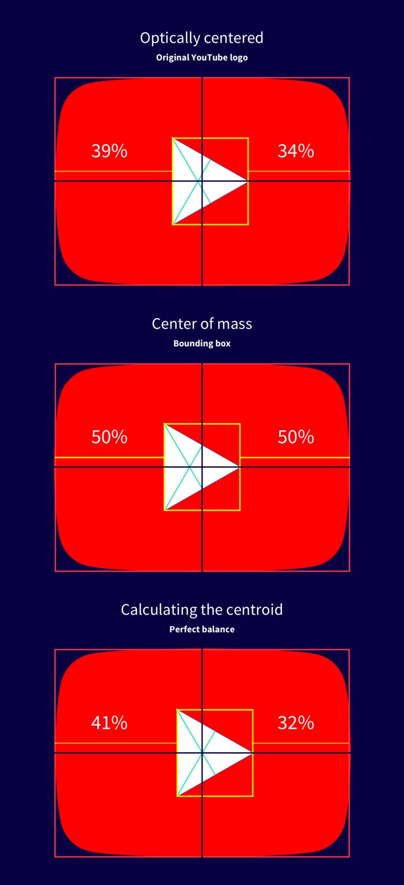
Which option is mathematically centered?
There are two theories for this exciting illusion:
In order for the triangle inside the container to be optically centered, it is necessary to find the centroid (barycenter) of the triangle, calculating the point of intersection of the lines connecting each vertex with the midpoint of the opposite side. Here is a formula that you can use:

Formula to find the centroid of a triangle.
The centroid can be 1/3 of the distance from each side to the opposite peak. This method can also be applied to many other forms.
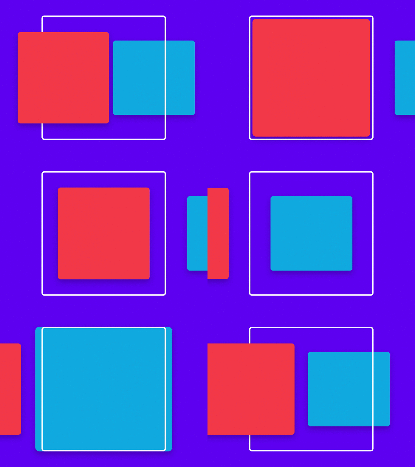
Vertical-horizontal illusion.
Squares are fundamental building blocks of any design system. They can be seen in material design maps, Facebook posts, Pinterest pictures, and the Dribble community.
After moving a square into a sketch, sometimes it's worth looking twice to see if each side has equal proportions. If you look closely enough, you will see that the vertical sides seem longer than the horizontal ones. Like a square is actually a rectangle! But, in fact, this is a perfect 1: 1 square. This is called a vertical-horizontal illusion .

The post image on Facebook is a 1: 1 square.
It is truly fascinating that the perception of this illusion depends on culture and gender. People living in developed cities tend to be more susceptible than people living in rural areas. This is due to the fact that residents of rural areas, as a rule, are used to living in round houses.
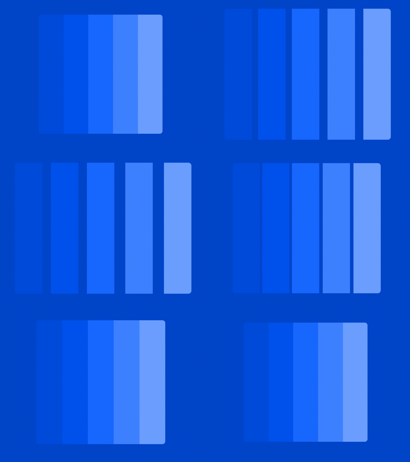
Mach bands.
Placing shades of the same color next to each other was a common trend in the era of flat design. Looking carefully, you may have noticed a false shadow appearing between the faces of each contrasting shadow. This illusion is known as the Mach Strip . Not a single shadow was added to the image, our eyes simply perceive it.
Shadows appear between the faces of each row.
A technical explanation for the occurrence of this effect is associated with side braking, which means that the darker area falsely appears even darker, and the lighter - even brighter.
Although this effect is quite invisible in the world of graphic design, it is possible to prove its effect - it can become a real hindrance for dentists. X-rays produce grayscale images used to analyze abnormal intensity deviations. Mach bands can provide a false positive diagnosis if it is not correctly identified.
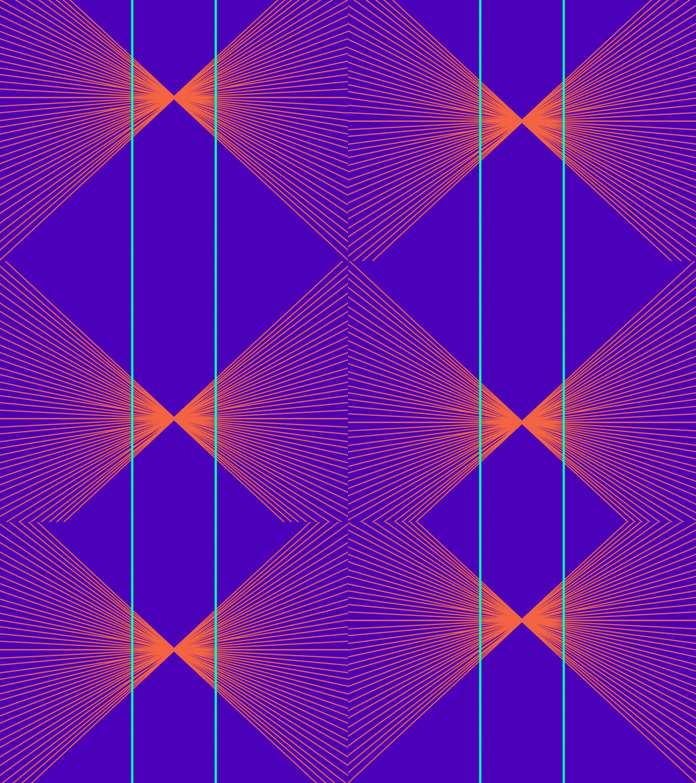
The illusion of Goering.
Have you ever come across a logo containing very thin lines or a background image with tiny dots that move or pulsate while you scroll? If so, this is due to the effect of specular frequencies, called the Moire pattern , where two mesh patterns overlap, causing false movements .
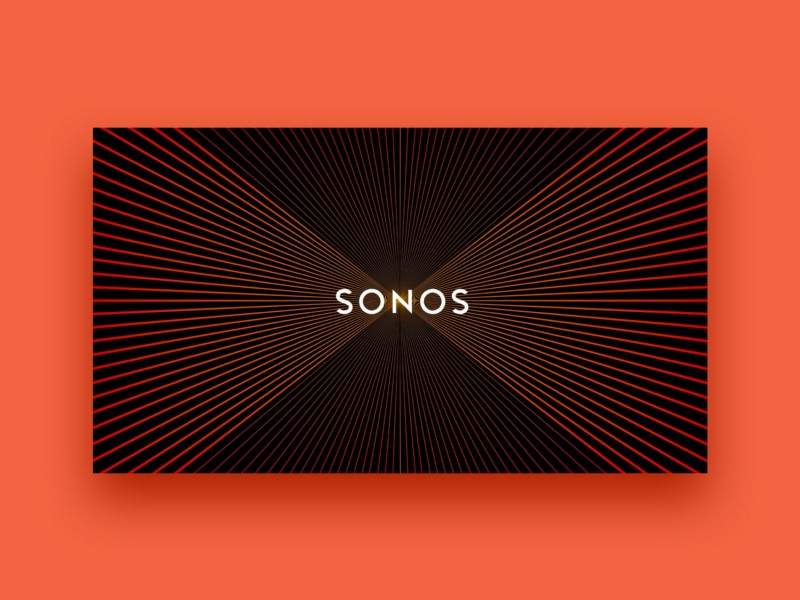
Scroll up and down to feel the effect of vibration.
This is a very cool effect, although Moire is not an optical illusion per se, it is an interference figure. The Sonos logo example uses a combination of Moire patterns , Goering's illusion, and illusory movements.. This sensory technique is quite popular in the art of " Op-art ."

Grid of Herman.
The illusion of Herman’s grid is quite popular, and it can be seen in layouts that contain a grid of squares placed on a high contrast background. If you look directly at any square, you will see a ghostly ball at the intersection of neighboring squares. But if you look at the intersection itself, the ball will disappear.

The reason for this effect is secondary braking. Simply put, the ability of an excited neuron to lower neighboring neurons in the last direction.

Contrasting illusion.
Placing two objects of the same color on different contrasting backgrounds can cause them to appear in different colors. This phenomenon is known as contrast illusion . Contrast is believed to be king , but not everyone perceives it the same way.
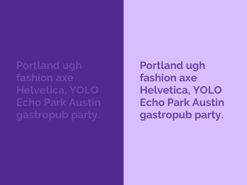
The color of the text is exactly the same on both sides, but it doesn’t seem like that.
Unfortunately, there is no established theory about why this illusion occurs, but many studies speculate why. One of the reasons is secondary braking , which is responsible for the Hermann and Mach Strip grid.
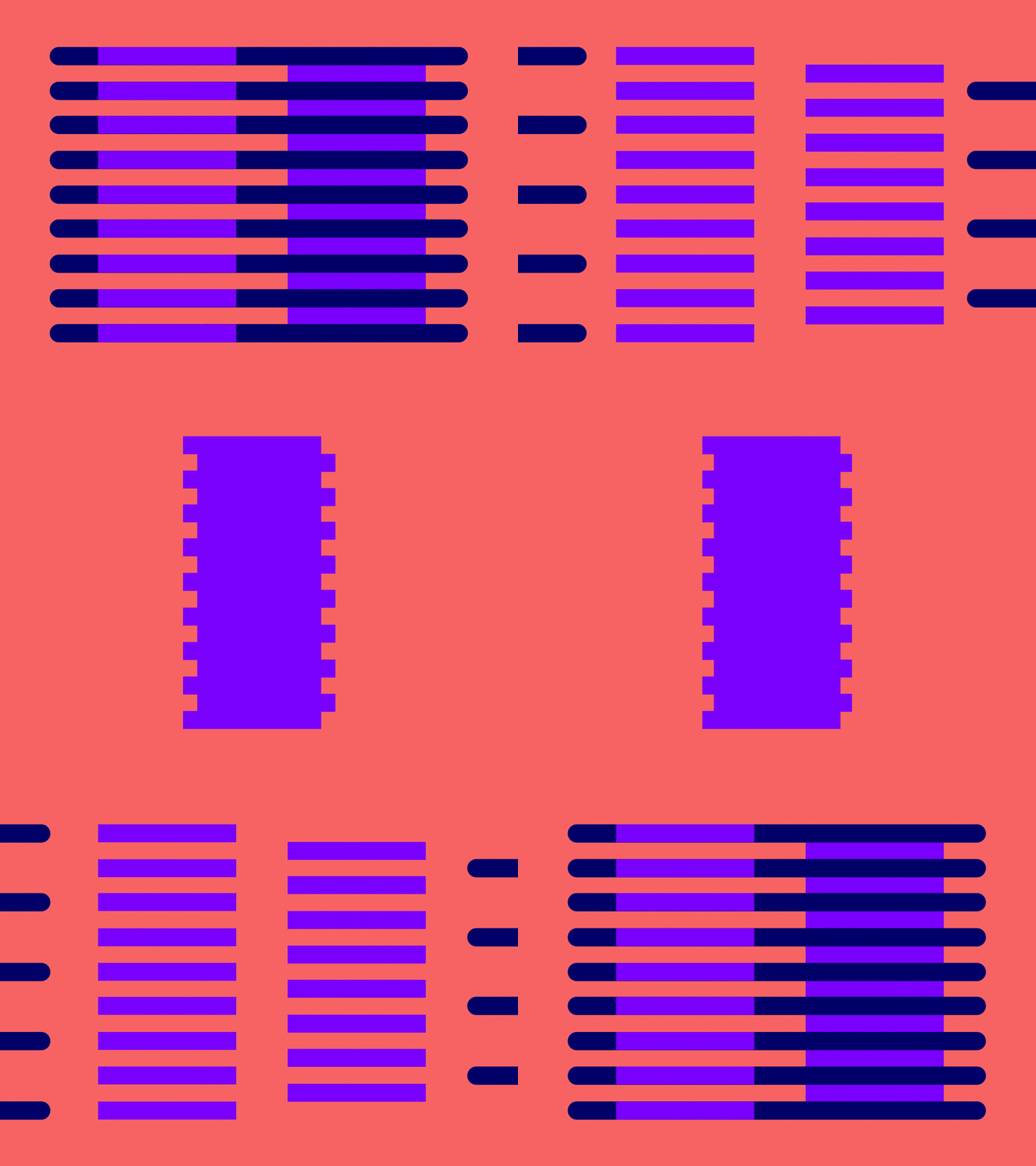
The Illusion of Manker-White.
This illusion is rather insignificant, but nonetheless fascinating. Looking at the gif above, the purple blocks on the left appear lighter than on the right. But it was revealed that both blocks actually reflect the same amount of light.

The reason for the Manker-White illusion ... you guessed it ... side drag.
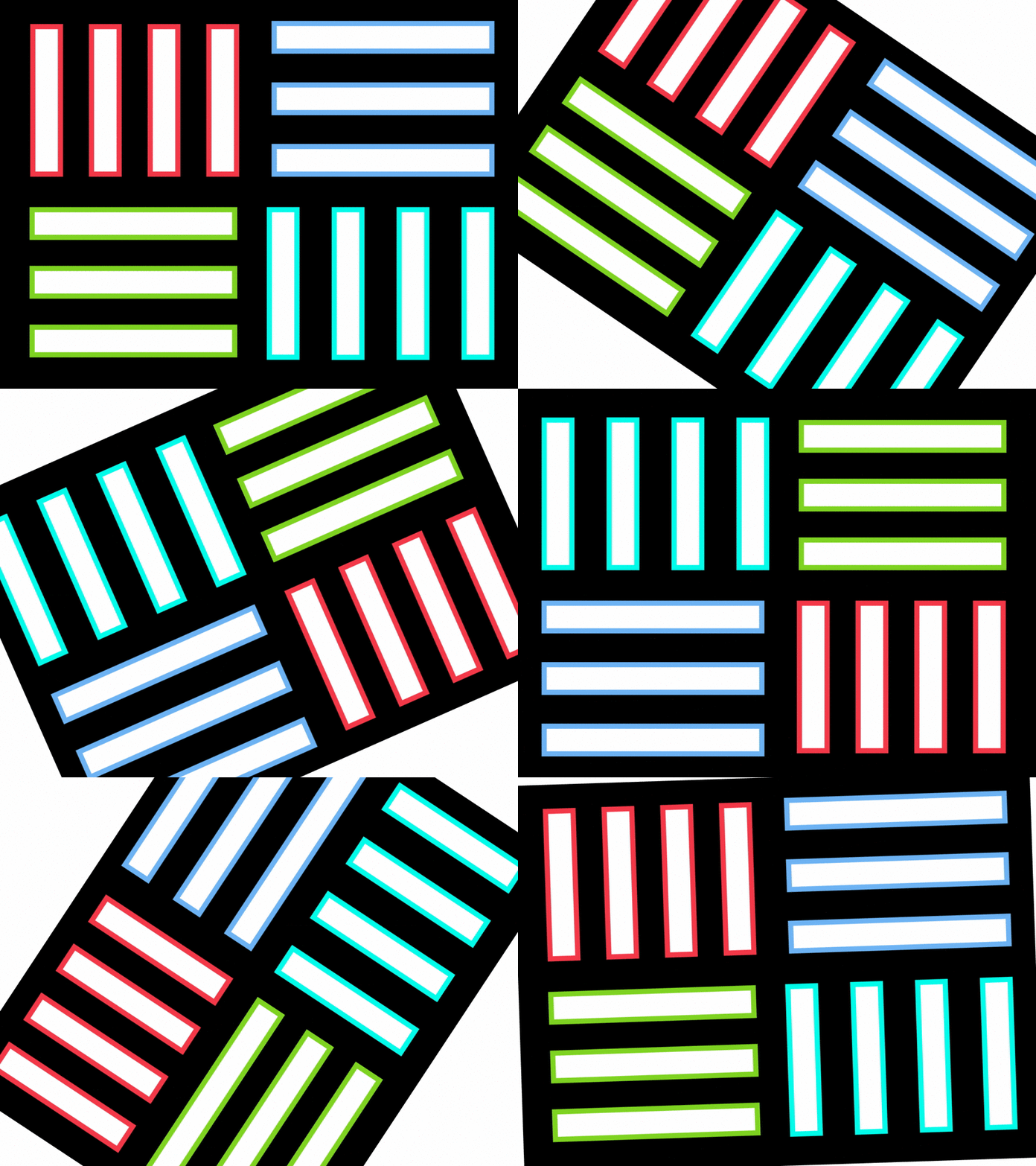
Illusion Watercolor.
There were times when I added a border to an object, and then I wondered: "When did I also change the background color?" If you look closely, you will notice that the pale area acquires a much lighter shade due to the color of the border. Very surprised if I say that that bright area is actually white?
This visual phenomenon, known as the watercolor illusion , depends on a combination of brightness and color contrast of the contour lines.

The white area inside the button seems to absorb a slight hue depending on the color of the border .

The Illusion of Justrow.
This illusion arises when working with curved objects. It seems that these two elements are different in size, but upon closer inspection, they are, in fact, the same size.
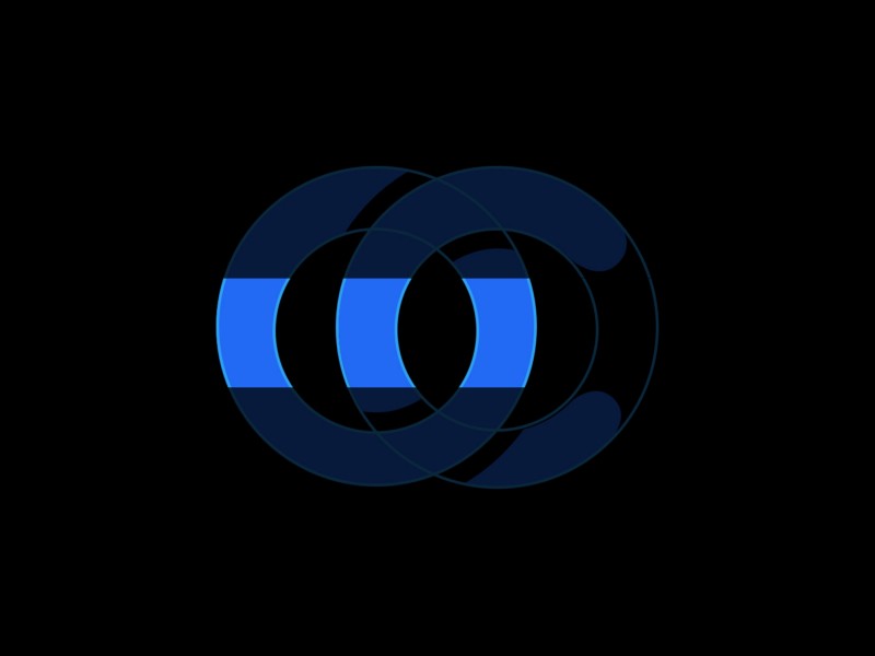
This illusion manifests itself during the creation process because some identically curved faces may look smaller than others .
How is this possible? Well, this is known as Justrow's illusion , and there is no final explanation for why we perceive segments differently. One explanation is that our brain does not see the difference in the size of the large and small radius. In other words, because of the short side, the long one seems long, and vice versa.
The illusion of Cornwall.
In addition to the illusion of contrast and the illusion of the Mach Bands , the Cornesvith illusion uses a gradient with a center line to give the impression that on one side the image is actually darker than on the other. But in fact, they are the same! You may find that when sections are placed in parallel, both sides are actually identical.
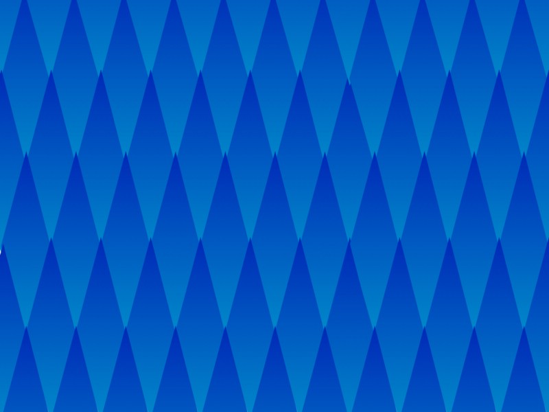
Each rhombus has the same gradient, but it seems that they are getting darker (from top to bottom).
This illusion produces a similar effect on the two above-mentioned illusions, but actually differs in two important aspects:

A slip for optimal visual perception.
Typographers will realize that to create a font, you need to rely more on design intuition rather than logical thinking. The mathematical positioning of each character based on its metric height will make the whole word disproportionate in terms of visual perception. Common practice involves a process called overshooting . Simply put, oversizing is the process of resizing individual characters to achieve optical balance.
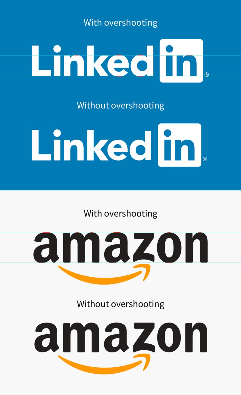
Without exceeding, the letter “e” on LinkedIn and the letter “z” on Amazon are not optically balanced.
Looking at the famous logos above, you can see that some of the characters are not within the baseline and height-X. Typographers must manually optically adjust each character for the best result.
But why do we need excesses in the print shop?
The reason why the excess is required is due to one of the most popular optical illusions in the world - the Mueller-Layer illusion . This visual phenomenon says that placing a chevron at each end of a line segment can result in one segment being shorter or longer depending on the direction of the chevron. This classic illusion proves the inaccuracy of human perception .
Have you encountered any other optical illusions that have perplexed you?
If you want to learn more about visual perception or improve your skills as a designer, I would recommend gestalt psychology .
Noteworthy:
Translation: Alya Blankmer
How many minutes will it take you to understand what the chip is?
Francis Bacon in 1620 divided the sources of human errors that stand in the way of knowledge into four groups, which he called "ghosts" or "idols" (lat. Idola).
- The "ghosts of the race" stem from human nature itself; they do not depend on either culture or individuality. "The human mind is likened to an uneven mirror, which, mixing its nature with the nature of things, reflects things in a curved and disfigured form."
- “Ghosts of a cave” are individual perception errors, both inborn and acquired. “After all, in addition to the mistakes inherent in the human race, everyone has his own special cave, which weakens and distorts the light of nature.”
- "Ghosts of the square (market)" is a consequence of the social nature of man, - communication and use of language in communication. “People are united by speech. Words are established in accordance with the understanding of the crowd. Therefore, a poor and absurd statement of words miraculously besieges the mind. ”
- "Ghosts of the theater" - this is a false idea about the structure of reality that is acquired by a person from other people. "At the same time, we mean here not only general philosophical teachings, but also the numerous principles and axioms of sciences that gained strength as a result of tradition, faith and carelessness." [ Wikipedia ]
Under the cut - a visual demonstration of the vulnerability of our brain to attacks through visual input. I present to you a translation of an article by product designer and front-end developer Balraj Chana, about how you can use / neutralize the effect of optical illusions.
1. The Illusion of the Section of the Triangle
Aligning a triangle based on a centroid (barycenter).
Icons can be deceiving, especially with complex geometry and odd proportions. Not all icons in a set are symmetrical, pixel perfect, or contain compatible proportions. Some icons require direct intervention, and first of all, this awesome play button.
Placing a triangle inside a curved or straight reservoir may make the element optically inappropriate. The reason for this is the effect known as the illusion of the cross section of a triangle . The center of mass of a triangle is calculated based on its minimum bounding box . Therefore, if you need to place a point exactly in the middle of the height of an equilateral triangle, then optically it will appear much higher.
Which option is mathematically centered?
There are two theories for this exciting illusion:
- Incorrect scaling of constants . The illusion contains promising signals that increase the perceived size of more distant objects, for example, an equilateral triangle can be perceived as a flat picture of the road, observed in perspective, with the top vertex lying at infinity and the bottom base, perceived as the closest part of the road.
- Center of gravity . If the observer is asked to find a point in the middle, it will end up with finding a centroid that has equal areas above and below it. The centroid of an equilateral triangle is well below the midpoint, and there is evidence that observers make choices that are trade-offs.
In order for the triangle inside the container to be optically centered, it is necessary to find the centroid (barycenter) of the triangle, calculating the point of intersection of the lines connecting each vertex with the midpoint of the opposite side. Here is a formula that you can use:
Formula to find the centroid of a triangle.
The centroid can be 1/3 of the distance from each side to the opposite peak. This method can also be applied to many other forms.
2. Vertical-Horizontal Illusion
Vertical-horizontal illusion.
Squares are fundamental building blocks of any design system. They can be seen in material design maps, Facebook posts, Pinterest pictures, and the Dribble community.
After moving a square into a sketch, sometimes it's worth looking twice to see if each side has equal proportions. If you look closely enough, you will see that the vertical sides seem longer than the horizontal ones. Like a square is actually a rectangle! But, in fact, this is a perfect 1: 1 square. This is called a vertical-horizontal illusion .
The post image on Facebook is a 1: 1 square.
It is truly fascinating that the perception of this illusion depends on culture and gender. People living in developed cities tend to be more susceptible than people living in rural areas. This is due to the fact that residents of rural areas, as a rule, are used to living in round houses.
3. Mach bands
Mach bands.
Placing shades of the same color next to each other was a common trend in the era of flat design. Looking carefully, you may have noticed a false shadow appearing between the faces of each contrasting shadow. This illusion is known as the Mach Strip . Not a single shadow was added to the image, our eyes simply perceive it.
Shadows appear between the faces of each row.
A technical explanation for the occurrence of this effect is associated with side braking, which means that the darker area falsely appears even darker, and the lighter - even brighter.
Although this effect is quite invisible in the world of graphic design, it is possible to prove its effect - it can become a real hindrance for dentists. X-rays produce grayscale images used to analyze abnormal intensity deviations. Mach bands can provide a false positive diagnosis if it is not correctly identified.
4. The illusion of Goering
The illusion of Goering.
Have you ever come across a logo containing very thin lines or a background image with tiny dots that move or pulsate while you scroll? If so, this is due to the effect of specular frequencies, called the Moire pattern , where two mesh patterns overlap, causing false movements .
Scroll up and down to feel the effect of vibration.
This is a very cool effect, although Moire is not an optical illusion per se, it is an interference figure. The Sonos logo example uses a combination of Moire patterns , Goering's illusion, and illusory movements.. This sensory technique is quite popular in the art of " Op-art ."
5. Grid of Herman
Grid of Herman.
The illusion of Herman’s grid is quite popular, and it can be seen in layouts that contain a grid of squares placed on a high contrast background. If you look directly at any square, you will see a ghostly ball at the intersection of neighboring squares. But if you look at the intersection itself, the ball will disappear.
The reason for this effect is secondary braking. Simply put, the ability of an excited neuron to lower neighboring neurons in the last direction.
6. Contrast Illusion
Contrasting illusion.
Placing two objects of the same color on different contrasting backgrounds can cause them to appear in different colors. This phenomenon is known as contrast illusion . Contrast is believed to be king , but not everyone perceives it the same way.
The color of the text is exactly the same on both sides, but it doesn’t seem like that.
Unfortunately, there is no established theory about why this illusion occurs, but many studies speculate why. One of the reasons is secondary braking , which is responsible for the Hermann and Mach Strip grid.
7. The Illusion of Manker-White
The Illusion of Manker-White.
This illusion is rather insignificant, but nonetheless fascinating. Looking at the gif above, the purple blocks on the left appear lighter than on the right. But it was revealed that both blocks actually reflect the same amount of light.
The reason for the Manker-White illusion ... you guessed it ... side drag.
8. The Illusion of Watercolor
Illusion Watercolor.
There were times when I added a border to an object, and then I wondered: "When did I also change the background color?" If you look closely, you will notice that the pale area acquires a much lighter shade due to the color of the border. Very surprised if I say that that bright area is actually white?
This visual phenomenon, known as the watercolor illusion , depends on a combination of brightness and color contrast of the contour lines.
The white area inside the button seems to absorb a slight hue depending on the color of the border .
9. The Illusion of Justrow
The Illusion of Justrow.
This illusion arises when working with curved objects. It seems that these two elements are different in size, but upon closer inspection, they are, in fact, the same size.
This illusion manifests itself during the creation process because some identically curved faces may look smaller than others .
How is this possible? Well, this is known as Justrow's illusion , and there is no final explanation for why we perceive segments differently. One explanation is that our brain does not see the difference in the size of the large and small radius. In other words, because of the short side, the long one seems long, and vice versa.
10. The Illusion of Cornwall
The illusion of Cornwall.
In addition to the illusion of contrast and the illusion of the Mach Bands , the Cornesvith illusion uses a gradient with a center line to give the impression that on one side the image is actually darker than on the other. But in fact, they are the same! You may find that when sections are placed in parallel, both sides are actually identical.
Each rhombus has the same gradient, but it seems that they are getting darker (from top to bottom).
This illusion produces a similar effect on the two above-mentioned illusions, but actually differs in two important aspects:
- In the example of the Mach bands shown earlier, the effect is visible only in areas close to the border of each shadow. However, the Cornesvit illusion affects perceptions of the entire area.
- With the Cornesvit illusion, the light part of the face looks lighter, and the dark part of the face seems darker. This is the opposite of the usual contrast effect.
11. The Illusion of Mueller-Layer
A slip for optimal visual perception.
Typographers will realize that to create a font, you need to rely more on design intuition rather than logical thinking. The mathematical positioning of each character based on its metric height will make the whole word disproportionate in terms of visual perception. Common practice involves a process called overshooting . Simply put, oversizing is the process of resizing individual characters to achieve optical balance.
Without exceeding, the letter “e” on LinkedIn and the letter “z” on Amazon are not optically balanced.
Looking at the famous logos above, you can see that some of the characters are not within the baseline and height-X. Typographers must manually optically adjust each character for the best result.
But why do we need excesses in the print shop?
The reason why the excess is required is due to one of the most popular optical illusions in the world - the Mueller-Layer illusion . This visual phenomenon says that placing a chevron at each end of a line segment can result in one segment being shorter or longer depending on the direction of the chevron. This classic illusion proves the inaccuracy of human perception .
Have you encountered any other optical illusions that have perplexed you?
If you want to learn more about visual perception or improve your skills as a designer, I would recommend gestalt psychology .
Noteworthy:
- Triangle Canis
- Ebbinghaus Illusion
- Ehrenstein's Illusion
- Neon distribution
- Shadow Illusion
- Illusory Movement 1
- Illusory Movement 2
Translation: Alya Blankmer