ggplot2: how to easily combine multiple charts in one, part 3
- Transfer
- Tutorial
This article will show you step-by-step how to combine several ggplot graphs in one or more illustrations using the helper functions available in the R ggpubr , cowplot, and gridExtra packages . We also describe how to export the resulting graphs to a file.
Part One Part
Two
In this section, we show how to display a table and text along with a graph. We will use the iris dataset.
Let's start by creating these charts:
We conclude by combining all three graphs using the

To add tables, graphs or other table-based elements to the ggplot workspace, there is a function
We use the density.p and stable.p graphs created in the previous section.

Since the scatterplot placed inside is superimposed at several points, a transparent background is used for it.

Import background image. Use either the function
To test the example below, make sure the png package is installed. You can install it using the command
Combine ggplot with background image. R function:
Change the transparency of the fill in the scatter diagrams by specifying the argument alpha. The value should be in the range [0, 1], where 0 is full transparency, and 1 is the lack of transparency.
Another example, overlaying a map of France on ggplot2:

If you have a long list of ggplots, say n = 20, you might want to arrange them by placing them on several pages. If there are 4 graphics on a page, for 20 you will need 5 pages.
The
For example, the code below
returns two pages with two graphs on each. You can display each page like this:
Ordered charts can be exported to a pdf file using the function
PDF file
Multipage output can also be obtained with the function
Arrange the charts created in the previous sections.
R function:
First, create a list of 4 ggplots corresponding to the variables Sepal.Length, Sepal.Width, Petal.Length and Petal.Width in the iris dataset.
After that you can export individual graphics to a file (pdf, eps or png) (one graphic per page). You can arrange charts (2 per page) when exporting.
Export of individual graphs in pdf (one per page):
Sort and export. Set nrow and ncol to display multiple graphs on the same page:
Part One Part
Two
Mix table, text and ggplot2-graphics
In this section, we show how to display a table and text along with a graph. We will use the iris dataset.
Let's start by creating these charts:
- plot of density of Sepal.Length variable. R function:
ggdensity()[in ggpubr ] - pivot table containing descriptive statistics (mean, standard deviation, etc.) Sepal.Length
- R function for calculating descriptive statistics:
desc_statby()[in ggpubr ] - R function to create a table with text:
ggtexttable()[in ggpubr ]
- R function for calculating descriptive statistics:
- paragraph of text . R function:
ggparagraph()[in ggpubr ]
We conclude by combining all three graphs using the
ggarrange()[in ggpubr ] function .# График плотности "Sepal.Length"
#::::::::::::::::::::::::::::::::::::::
density.p <- ggdensity(iris, x = "Sepal.Length",
fill = "Species", palette = "jco")
# Вывести сводную таблицу Sepal.Length
#::::::::::::::::::::::::::::::::::::::
# Вычислить описательные статистики по группам
stable <- desc_statby(iris, measure.var = "Sepal.Length",
grps = "Species")
stable <- stable[, c("Species", "length", "mean", "sd")]
# График со сводной таблицей, тема "medium orange" (средний оранжевый)
stable.p <- ggtexttable(stable, rows = NULL,
theme = ttheme("mOrange"))
# Вывести текст
#::::::::::::::::::::::::::::::::::::::
text <- paste("iris data set gives the measurements in cm",
"of the variables sepal length and width",
"and petal length and width, respectively,",
"for 50 flowers from each of 3 species of iris.",
"The species are Iris setosa, versicolor, and virginica.", sep = " ")
text.p <- ggparagraph(text = text, face = "italic", size = 11, color = "black")
# Разместить графики на странице
ggarrange(density.p, stable.p, text.p,
ncol = 1, nrow = 3,
heights = c(1, 0.5, 0.3))Add a graphic element to ggplot
To add tables, graphs or other table-based elements to the ggplot workspace, there is a function
annotation_custom()[in ggplot2 ]. Simplified format:annotation_custom(grob, xmin, xmax, ymin, ymax)- grob : external graphic element for display
- xmin , xmax : x-location in coordinates (horizontal location)
- ymin , ymax : y-location coordinates (vertical arrangement)
We put the table in ggplot
We use the density.p and stable.p graphs created in the previous section.
density.p + annotation_custom(ggplotGrob(stable.p),
                              xmin = 5.5, ymin = 0.7,
                              xmax = 8)
Put the scatter chart in ggplot
- Create a scatter chart for y = “Sepal.Width” by x = “Sepal.Length” from the iris dataset. R function:
ggscatter()[ ggpubr ]. - Create a separate dispersion diagram of the variables x and y with a transparent background. R function:
ggboxplot()[ ggpubr ]. - Convert the scatter chart to a graphic called “grob” in Grid terminology. R function:
ggplotGrob()[ ggplot2 ]. - Place the grobs of the scatter chart inside the scatter chart. R function:
annotation_custom()[ ggplot2 ].
Since the scatterplot placed inside is superimposed at several points, a transparent background is used for it.
# Диаграмма разброса по группам ("Species")
#::::::::::::::::::::::::::::::::::::::::::::::::::::::::::
sp <- ggscatter(iris, x = "Sepal.Length", y = "Sepal.Width",
                color = "Species", palette = "jco",
                size = 3, alpha = 0.6)
# Диаграммы рассеивания переменных x/y
#::::::::::::::::::::::::::::::::::::::::::::::::::::::::::
# Диаграмма рассеивания переменной x
xbp <- ggboxplot(iris$Sepal.Length, width = 0.3, fill = "lightgray") +
  rotate() +
  theme_transparent()
# Диаграмма рассеивания переменной у
ybp <- ggboxplot(iris$Sepal.Width, width = 0.3, fill = "lightgray") +
  theme_transparent()
# Создать внешние графические объекты
# под названием “grob” в терминологии Grid
xbp_grob <- ggplotGrob(xbp)
ybp_grob <- ggplotGrob(ybp)
# Поместить диаграммы рассеивания в диаграмму разброса
#::::::::::::::::::::::::::::::::::::::::::::::::::::::::::
xmin <- min(iris$Sepal.Length); xmax <- max(iris$Sepal.Length)
ymin <- min(iris$Sepal.Width); ymax <- max(iris$Sepal.Width)
yoffset <- (1/15)*ymax; xoffset <- (1/15)*xmax
# Вставить xbp_grob внутрь диаграммы разброса
sp + annotation_custom(grob = xbp_grob, xmin = xmin, xmax = xmax,
                       ymin = ymin-yoffset, ymax = ymin+yoffset) +
  # Вставить ybp_grob внутрь диаграммы разброса
  annotation_custom(grob = ybp_grob,
                       xmin = xmin-xoffset, xmax = xmin+xoffset,
                       ymin = ymin, ymax = ymax)
Add a background image to ggplot2 graphics
Import background image. Use either the function
readJPEG()[in the jpeg package ] or the function readPNG()[in the png package ] depending on the format of the background image. To test the example below, make sure the png package is installed. You can install it using the command
install.packages(“png”).# Импорт картинки
img.file <- system.file(file.path("images", "background-image.png"),
package = "ggpubr")
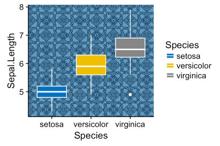
img <- png::readPNG(img.file)Combine ggplot with background image. R function:
background_image()[in ggpubr ].library(ggplot2)
library(ggpubr)
ggplot(iris, aes(Species, Sepal.Length))+
background_image(img)+
geom_boxplot(aes(fill = Species), color = "white")+
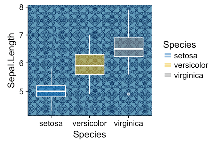
fill_palette("jco")Change the transparency of the fill in the scatter diagrams by specifying the argument alpha. The value should be in the range [0, 1], where 0 is full transparency, and 1 is the lack of transparency.
library(ggplot2)
library(ggpubr)
ggplot(iris, aes(Species, Sepal.Length))+
  background_image(img)+
  geom_boxplot(aes(fill = Species), color = "white", alpha = 0.5)+
  fill_palette("jco")
Another example, overlaying a map of France on ggplot2:
mypngfile <- download.file("https://upload.wikimedia.org/wikipedia/commons/thumb/e/e4/France_Flag_Map.svg/612px-France_Flag_Map.svg.png",
                           destfile = "france.png", mode = 'wb')
img <- png::readPNG('france.png')
ggplot(iris, aes(x = Sepal.Length, y = Sepal.Width)) +
  background_image(img)+
  geom_point(aes(color = Species), alpha = 0.6, size = 5)+
  color_palette("jco")+
  theme(legend.position = "top")
We place graphics on several pages
If you have a long list of ggplots, say n = 20, you might want to arrange them by placing them on several pages. If there are 4 graphics on a page, for 20 you will need 5 pages.
The
ggarrange()[in ggpubr ] function provides a convenient solution to arrange multiple ggplots on multiple pages. After specifying the arguments nrow and ncol, the function ggarrange()automatically calculates the number of pages it takes to fit all the graphs. It returns a list of ordered ggplots. For example, the code below
multi.page <- ggarrange(bxp, dp, bp, sp,
                        nrow = 1, ncol = 2)
returns two pages with two graphs on each. You can display each page like this:
multi.page[[1]] # Вывести страницу 1
multi.page[[2]] # Вывести страницу 2
Ordered charts can be exported to a pdf file using the function
ggexport()[in ggpubr ]:ggexport(multi.page, filename = "multi.page.ggplot2.pdf")PDF file
Multipage output can also be obtained with the function
marrangeGrob()[in gridExtra ].library(gridExtra)
res <- marrangeGrob(list(bxp, dp, bp, sp), nrow = 1, ncol = 2)
# Экспорт в pdf-файл
ggexport(res, filename = "multi.page.ggplot2.pdf")
# Интерактивный вывод
resNested relationship with ggarrange ()
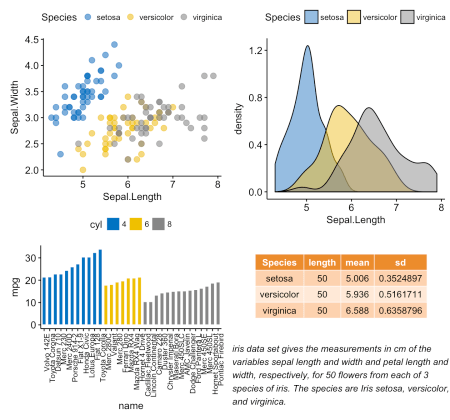
Arrange the charts created in the previous sections.
p1 <- ggarrange(sp, bp + font("x.text", size = 9),
                ncol = 1, nrow = 2)
p2 <- ggarrange(density.p, stable.p, text.p,
                ncol = 1, nrow = 3,
                heights = c(1, 0.5, 0.3))
ggarrange(p1, p2, ncol = 2, nrow = 1)
Chart Export
R function:
ggexport()[in ggpubr ]. First, create a list of 4 ggplots corresponding to the variables Sepal.Length, Sepal.Width, Petal.Length and Petal.Width in the iris dataset.
plots <- ggboxplot(iris, x = "Species",
                   y = c("Sepal.Length", "Sepal.Width", "Petal.Length", "Petal.Width"),
                   color = "Species", palette = "jco"
                   )
plots[[1]]  # Вывести первый график
plots[[2]]  # Вывести второй график и т.д.
After that you can export individual graphics to a file (pdf, eps or png) (one graphic per page). You can arrange charts (2 per page) when exporting.
Export of individual graphs in pdf (one per page):
ggexport(plotlist = plots, filename = "test.pdf")Sort and export. Set nrow and ncol to display multiple graphs on the same page:
ggexport(plotlist = plots, filename = "test.pdf",
         nrow = 2, ncol = 1)