Experiment: Is everyone really good at design?

Everyone has an opinion about design. "This is a bad logo." "This is a good logo." "This design is not worth so much." Such comments are full of any design news. How can people who are not professionals be so easily able to draw conclusions from one look?
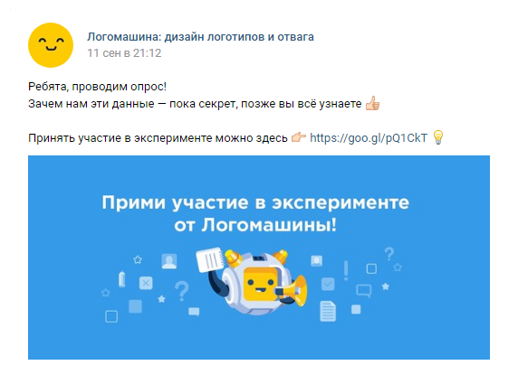
I decided to conduct a small experiment to check whether everything is really so well versed in the design, as they think.
Poll: why is the Polska Moto logo so successful?

To understand whether people can really draw the right conclusions by looking at the design, we created a survey. We asked our subscribers to describe the impression of the Polska Moto logo unknown in Russia.
This company, contrary to expectations, incredibly quickly took a leading position in the market of motorcycles. Their logo in Poland can be seen at every motor show:
Surprisingly, most people really understood why a company with such a logo came to success. In their answers, I read many flattering words about the successful combination of shapes and colors, for example:
“Bright colors and simple forms provided ease of perception and viewing of the logo, roundness attracted the eyes and attention with its perfect form, without flaws and excesses. Simple, fascinating and with a hint of perfection. ” [M, 17, marketing programmer]This is very nice, especially considering that this logo was made personally by me in a couple of minutes. But I'm not even a designer! Nevertheless, 57% of respondents tied the success of my fictional company Polska Moto with the logo. They looked for reasons in the combination of colors, similarity to Microsoft, simplicity and non-standard:
"Perhaps the idea of a harmonious combination of different elements - the four primary colors, a circle and a square - influenced, while the logo remained soft and rounded, the eye never clings." [F, 23, internet marketing]
Why is the Polska Moto logo so failed?
Perhaps I really made a very good logo and all these opinions are objective? To verify this, I divided the respondents into two groups of one hundred people with the help of the Qualtrics service. I showed my first Polska Moto logo with a success story to the first group, and the same logo with the opposite legend to another group:
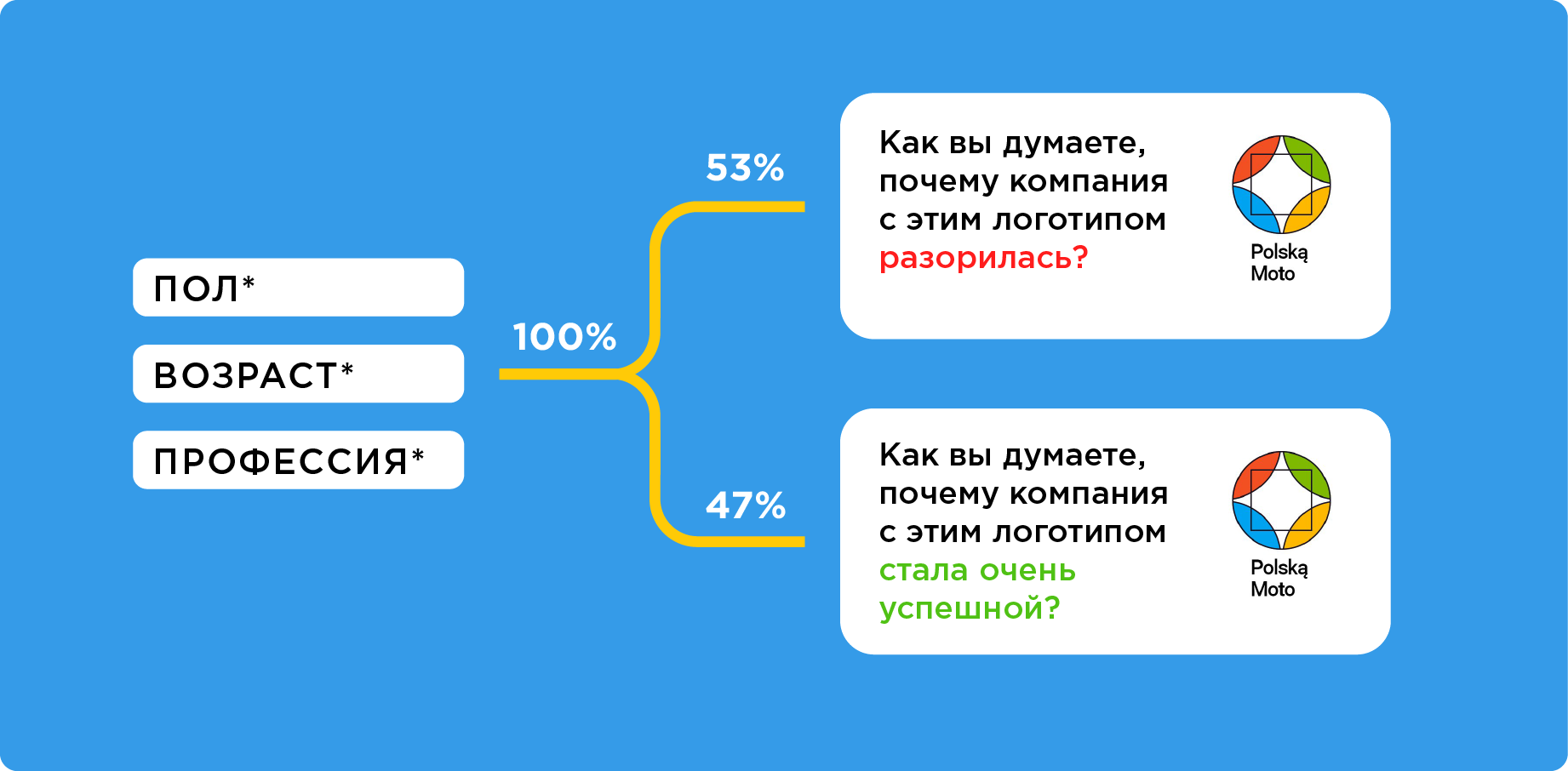
In this group, as many as 78% began to look for reasons for failure in the logo. Someone was confused by the location of the text, someone was sure that the matter was in a square, but most suggested that the matter was “the discrepancy between the logo and the field of activity”. Although our regular readers know that this is a common myth .
How to distinguish good design from bad: opinion polled

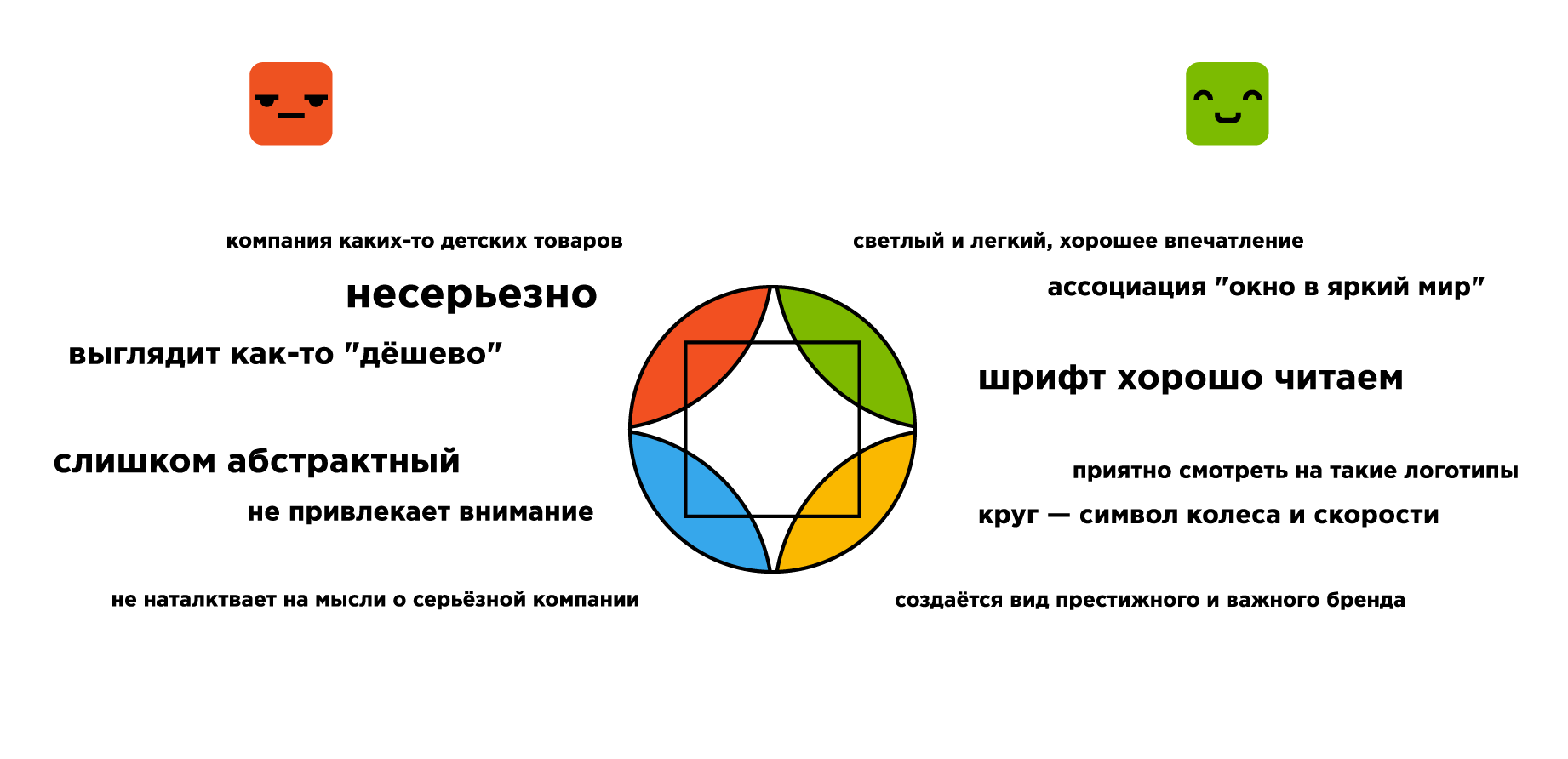
The survey had the opportunity to write "I do not understand the design," but only a few people took advantage of it. Most argued their position, and in the same features of the logo, some saw the reasons for success, others - failure.
Both groups noticed similarities with Microsoft . Is it good or bad?
Of course, bad:
The logo does not reflect the essence of the company, it is faceless and looks like hundreds of others. The first association with it is Microsoft, not the motor industry. [F, 26, freelancer]
Logo colors are too jaded. Cause a strong association with Microsoft or Google. [M, 18 years old, -]... or is it good?
Minimalist, geometry, colors correspond to Microsoft, which initially inspires confidence. [F, 17, marketer]
Association with Windows / Google (colors and geometry) [F, 22, lawyer]Groups differently perceived the fact of "inconsistency sphere":
Boring logo, does not hint at the connection with motorcycle production. The colors do not match the specialization (too bright).
It is not clear what the company does. It is more like a sphere of entertainment. [F, 23, graphic designer]
Bright logo, not built on the stereotypical ideas about motorcycles. At the same time, the appearance of a prestigious and important brand is created externally. [M, 24, freelance designer]
... the logo is not hackneyed and does not look like other logos of auto-mechanics or auto manufacturers. [F, 16, programmer]Opinions differed about the colors of the logo:
The combination of colors looks too frivolous [M, 22, -]
I believe that all the details prevented the success of the company. The shape and colors are more suitable for the circus logo [W, 30, design]
The logo resembles a kaleidoscope and causes pleasant memories from childhood. This has to itself. [F, 30, construction / housewife technician]
The simplicity of the logo and its catchyness (brightness) were easily remembered by users and guessed [M, 25, software engineer]
Surprisingly, a lot of disagreements caused a square in the center of the logo. The group with the “bankrupt company” saw the problem in it:
... I am extremely confused by the square in the center. [F, 24, design]
It seems to me that this contour of the square is absolutely superfluous here ... [F, 19, publishing student]However, the group with the “successful company” found a deep meaning in the square:
Because of the square [F, 32, design]
There is a picture with three circles on the Internet: expensive, long, high quality. And at the intersection of their result. I think in the square they also singled out that they have everything at once :) [M, 21, developer]
... 4 elements of the world (circle - the logo itself) and the versatility of this world, as inside a square. For motorcycles it is important. [F, 21, logistician and translator]Respondents could not even decide whether a simple logo or a complex one:
... it is visually complex [M, 24, Web]
Overloaded with details and colors [M, 20, student programmer]
The logo is based on simple shapes and colors [F, 25, graphic designer]
Simple, bright, memorable logo [W, 23, teacher]
Which answer is correct?
It is clear - the majority saw what they wanted to see. Someone realized that the logo was not real, and it troll us back. But I want to know the answer - is it a good design or a bad one? Would a company with such a logo be successful or not?
A quarter of all respondents answered that there is no connection between the design and development of the company at all. Maybe this is the right answer?
In fact, in our question no more sense than in: “Why did a company with such technical support become successful?”. Or: “Why did a company with such a head of the supply department go bankrupt?”. Here you need a bunch of clarifying questions: "And how much did technical support play a big role?", "And how did the supply department go?". And only with the help of a mass of additional information can we draw not only conclusions, but simply modest assumptions.
Let's return to the design: Logoshin team made hundreds of logos for various companies. We have seen projects become known or disappear without a trace. But neither we, nor anyone else will tell you how the logo design and the success of the company are connected. What would have changed if the Apple logo had not been bitten by an apple? Nobody knows. What if Apple left her old logo? Everything would have changed, but no one would say exactly how.

The logo is an important part of the identity. Identity is directly related to branding. But there are firms that have achieved success, without building a brand at all. And there are brands that attract customers with their design, stand out among competitors and sell goods at times more expensive. Focusing on branding and design is a matter of strategy. For some companies it is useless, for others - the key to success. And for most, this is just a big plus, as a quality website or a solid office in the center.
Therefore, the correct, from our point of view, answer is: “No one in the world knows what role the logo design played in the success or failure of this company”.
findings

The design is very little objective. If we asked: “Why is this program not working?”, Most would honestly say: “I don’t know, I’m not a programmer.” And the developers would open the code and find an error, if there is one.
But when we ask: “Why does this design not work?”, - everyone has an opinion. And this opinion is very easy to influence.
Therefore, all the focus groups and polls “How do you like my logo?” Are not consistent - people with a smart look argue about what no one understands at all. The same signs can be interpreted in two ways - is a simple and memorable logo in front of you or is it just primitive?
You can only say "I like the logo" or "do not like." But even here it is very easy to influence the impression - at public presentations of design, colleagues most often look at the boss and endorse him. And sometimes the boss is waiting for a “hint” from colleagues, because he does not understand that there is a high-quality design or low-grade clipart in front of him. Then the first voiced opinion sets the tone.
A simple example - the client was disappointed in the logo, because, quote: "Showed to all friends, no one liked it." Everything would be fine, but he showed the design with the words: “I drew some shit, what do you think?”. The conclusion from the whole story is simple: most of the opinions about good and bad design are based only on subjective feelings. And sensations are created not only from the sense of taste and prejudice, but also from the "halo effect" - the opinions of others and other factors.
Therefore, every time you see comments about “this logo is not worth so much” or “it was better before,” you should know that laymen are in front of you. Professionals are silent, because they know that they do not understand this.
If you want to participate in our experiments, watch the broadcasts from the office and learn something new - subscribe toLogo machine in VK . And, as always, good luck to you and your projects!
The experiment was conducted by Danila Baranov, content manager of Log Machine.