Proper design speeds up form filling
Forms on the site often carry an important mission, such as collecting contacts or payment details - what could be more valuable than this data?
The design directly affects the usability and desire of the userto transfer their credit card information to your shaggy hands to fill out one form or another.
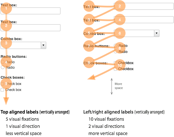
I just found a recommendation on placing signatures for input fields - it turns out that if you place them vertically, the user will be able to more conveniently and quickly fill out the required form by reducing eye movements.

It would seem pretty obvious, huh? But I did not think about this earlier.
According to the tip of the site UXMovement .
The design directly affects the usability and desire of the user
I just found a recommendation on placing signatures for input fields - it turns out that if you place them vertically, the user will be able to more conveniently and quickly fill out the required form by reducing eye movements.

It would seem pretty obvious, huh? But I did not think about this earlier.
According to the tip of the site UXMovement .
