 June 8, 2017 at 12:21
Extend, modify, and create controls on the UWP platform. Part 1

In 2006, along with .NET 3.0, developers were provided with the WPF and Silverlight software platforms. Over the next ten years, Microsoft released new versions of its operating system and their respective platforms. And so, in 2016, along with Windows 10, the Universal Windows Platform was released.
All platforms differed in varying degrees with the capabilities of the API, but the common XAML markup language for them all remained almost unchanged. Therefore, all developers, regardless of which platform they work on, face the same tasks: expanding or changing existing ones, as well as developing new controls. These are very important skills needed to develop applications that meet the requirements of design and functionality.
These tasks are due to the fact that on any platform, the developer has a limited set of controls necessary for developing applications. Its tools are elements from Microsoft (in the case of UWP - the Windows Universal Platform SDK) and from third-party suppliers or developers. Even collectively, they cannot cover all the requirements that arise when developing applications. The available controls may not suit you for a number of reasons: appearance, behavior, or functioning. Unfortunately, to this day there is no single source of information that would comprehensively and readily cover solutions to these problems. All that remains for developers for a long time is to collect information on the Internet bit by bit.
The aim of this series of three articles is to systematize ways to change, expand, and create new controls.
Part 1. Expansion of existing controls.
The first part will discuss the expansion of existing controls without interfering with their internal structure.
Assume that the general behavior and functioning of the control is comfortable with the developer, but it needs to be expanded. So, for example, the TextBox control provides the ability to enter data, but lacks the functionality of validation. The easiest way to get the desired result is to add logic to the code-behind view (View) containing this TextBox .
public sealed partial class MainPage : Page {
    public MainPage () {
        this.InitializeComponent ();
        textbox.TextChanged += Textbox_TextChanged;
    }
    private void Textbox_TextChanged (object sender, TextChangedEventArgs e) {
        // Some validation logic
    }
}
However, UWP development involves the use of the MVVM architectural pattern, one of the main goals of which is to separate logic from presentation. Therefore, it must be encapsulated either in the ViewModel of the view, or in a new control element, interaction with which will be carried out as a black box without violating the principles of MVVM.
Thus, the solution presented in the listing above is suitable only in case of great laziness of the developer, who is sure that at the subsequent stages of development it will not come back to him. In the event that such validation within the application is required in more than one place, then this is a direct sign that it is necessary to take this logic into a separate entity.
There are two ways to expand controls without interfering with their internal structure and functioning, the implementation of which can be compared with parasitism - attached properties and behaviors.
Attached Properties An
attached property is a type of dependency property defined in a separate class and attached to the target at the XAML level.
Consider the mechanism of the attached properties on the above example TextBox validation for the registration page.
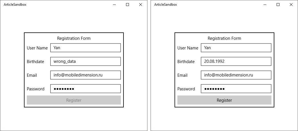
Invalid and valid registration forms
Define the TextBoxExtensions class containing the following attached properties:
1. RegexPattern- a property that receives the RegEx validation pattern string as input. If the line is empty, we believe that the validation of the input field is not required.
2. IsValid - a property containing the value of the current validation status of the input field based on the template specified in the RegexPattern property .
This class also contains the OnRegexPatternChanged method that fires when the value of the RegexPattern property changes . If its value is not empty, then we subscribe to the TextChanged event of the TextBox control, in the context of which the RegexPattern and IsValid properties work .
In the Textbox_TextChanged event handlerwe call the ValidateText method , validating the string according to the passed pattern. We assign its result to the IsValid property .
public class TextBoxExtensions {
    public static string GetRegexPattern (DependencyObject obj) {
        return (string) obj.GetValue (RegexPatternProperty);
    }
    public static void SetRegexPattern (DependencyObject obj, string value) {
        obj.SetValue (RegexPatternProperty, value);
    }
    public static readonly DependencyProperty RegexPatternProperty =
        DependencyProperty.RegisterAttached ("RegexPattern", typeof (string), typeof (TextBoxExtensions),
            new PropertyMetadata (string.Empty, OnRegexPatternChanged));
    public static bool GetIsValid (DependencyObject obj) {
        return (bool) obj.GetValue (IsValidProperty);
    }
    public static void SetIsValid (DependencyObject obj, bool value) {
        obj.SetValue (IsValidProperty, value);
    }
    public static readonly DependencyProperty IsValidProperty =
        DependencyProperty.RegisterAttached ("IsValid", typeof (bool), typeof (TextBoxExtensions),
            new PropertyMetadata (true));
    private static void OnRegexPatternChanged (DependencyObject d, DependencyPropertyChangedEventArgs e) {
        var textbox = d as TextBox;
        if (textbox == null) {
            return;
        }
        textbox.TextChanged -= Textbox_TextChanged;
        var regexPattern = (string) e.NewValue;
        if (string.IsNullOrEmpty (regexPattern)) {
            return;
        }
        textbox.TextChanged += Textbox_TextChanged;
        SetIsValid (textbox, ValidateText (textbox.Text, regexPattern));
    }
    private static void Textbox_TextChanged (object sender, TextChangedEventArgs e) {
        var textbox = sender as TextBox;
        if (textbox == null) {
            return;
        }
        if (ValidateText (textbox.Text, GetRegexPattern (textbox))) {
            SetIsValid (textbox, true);
        } else {
            SetIsValid (textbox, false);
        }
    }
    private static bool ValidateText (string text, string regexPattern) {
        if (Regex.IsMatch (text, regexPattern)) {
            return true;
        }
        return false;
    }
}
Next, we bind these properties to the input fields in the markup and set the values of the RegexPattern property .
We have a clean code-behind.
public sealed partial class RegistrationView : UserControl {
    public RegistrationViewModel ViewModel { get; private set; }
    public RegistrationView () {
        this.InitializeComponent ();
        this.DataContext = ViewModel = new RegistrationViewModel ();
    }
}
And the logic of accessibility of the registration button at the ViewModel level.
public class RegistrationViewModel : BindableBase {
    private bool isUserNameValid = false;
    public bool IsUserNameValid {
        get { return isUserNameValid; }
        set {
            Set (ref isUserNameValid, value);
            RaisePropertyChanged (nameof (IsRegisterButtonEnabled));
        }
    }
    private bool isBirthdateValid = false;
    public bool IsBirthdateValid {
        get { return isBirthdateValid; }
        set {
            Set (ref isBirthdateValid, value);
            RaisePropertyChanged (nameof (IsRegisterButtonEnabled));
        }
    }
    private bool isEmailValid = false;
    public bool IsEmailValid {
        get { return isEmailValid; }
        set {
            Set (ref isEmailValid, value);
            RaisePropertyChanged (nameof (IsRegisterButtonEnabled));
        }
    }
    private bool isPasswordValid = false;
    public bool IsPasswordValid {
        get { return isPasswordValid; }
        set {
            Set (ref isPasswordValid, value);
            RaisePropertyChanged (nameof (IsRegisterButtonEnabled));
        }
    }
    public bool IsRegisterButtonEnabled {
        get { return IsUserNameValid && IsBirthdateValid && IsEmailValid && IsPasswordValid; }
    }
}
The listing of the PasswordBoxExtensions class is omitted since repeats the TextBoxExtensions class a little less than completely and exists only for the reason that both controls are not inherited from some abstract TextInput class from which they could receive common fields and events, but from a too general Control class .
Thanks to the attached properties, we were able to expand the functionality of the existing TextBox and PasswordBox classes without interfering with their internal structure. And we did not even need to generate a new descendant class from them, which is not always possible.
Behaviors
Behaviors appeared in Expression Blend 3 with the goal of providing developers with a mechanism to solve such problems that arise on the user interface side: animations, visual effects, drag-and-drop, etc.
UWP does not ship a behavioral library with it. As part of the Expression Blend SDK, it must be installed separately, for example, through Nuget .
Suppose we are working with a FlipView control and it is required that when it is scrolled, the new element plays an appearance animation.

Behavior animation
Define the FlipViewItemFadeInBehavior class , inherited from the BehaviorT class , where T- the name of the class to which or the descendants of which you can add the desired behavior.
In it, we redefine the OnAttached method , in which we subscribe to the SelectionChanged event of an associated object of type FlipView .
In the FlipView_SelectionChanged event handler, we attach the required animation to the new element and start it. Animation playback time can be parameterized by defining the Duration property .
public class FlipViewItemFadeInBehavior : Behavior {
    public double Duration { get; set; }
    protected override void OnAttached () {
        base.OnAttached ();
        AssociatedObject.SelectionChanged += FlipView_SelectionChanged;
    }
    protected override void OnDetaching () {
        base.OnDetaching ();
        AssociatedObject.SelectionChanged -= FlipView_SelectionChanged;
    }
    private void FlipView_SelectionChanged (object sender, SelectionChangedEventArgs e) {
        var flipView = sender as FlipView;
        var selectedItem = flipView.SelectedItem as UIElement;
        Storyboard sb = new Storyboard ();
        DoubleAnimation da = new DoubleAnimation {
            Duration = new Duration (TimeSpan.FromSeconds (Duration)),
                From = 0d,
                To = 1d
        };
        Storyboard.SetTargetProperty (da, "(UIElement.Opacity)");
        Storyboard.SetTarget (da, selectedItem);
        sb.Children.Add (da);
        sb.Begin ();
    }
}
Now we are ready to add this behavior to the required controls in the markup.
xmlns:b="using:ArticleSandbox.Controls.Behaviors"
xmlns:i="using:Microsoft.Xaml.Interactivity"
Thus, we managed to bring the animation logic into a separate entity with the subsequent possibility of use through the definition in the markup.
Both of the mechanisms discussed expand the existing controls and it is important to clearly understand when and which mechanism to use.
If you need to expand the control with some kind of logic, then this is a sign that the result can be achieved through the attached properties. If the control needs to provide some kind of visual effect or animation, then you should pay attention to the behavior mechanism.
Continue to read the second part: “ Modifying Existing Controls ”
Ian Moroz, Senior .NET Developer