 June 5, 2017 at 14:38
Creating a design ecosystem for dozens of related IT solutions: a word for designers
Today we’ll tell you how it came to the need to create a single UI / UX system for different applications of one of our customers. About what principles were laid down in it and how the design ecosystem was packaged technologically.

We hope that our experience will be of interest to UI / UX designers, front-end, and also brand managers who are faced with similar tasks on their own experience.
For many years for one customer we have been doing a large number of IT projects of various degrees of complexity and focus (public / internal). Currently there are more than 30 projects. In the process there have been significant changes in the design, right up to the change of the main corporate colors. And in fact, until some point, design and development was carried out “spontaneously”, that is, they simply took and made each project “from scratch”.
The consequences for us - developers - you yourself can easily predict:
you will inevitably have a heterogeneous and constantly required new design for new modules.
For the customer, such an unsystematic approach is also deplorable:
Awareness of the futility of the current path at one point led us to the idea that we need a system. And this is how we built it sequentially.
1. Unity.
Design language is a system. And it should work as a system - I understood the principles once, and then you use them on the machine.
2. Simplicity and functionality.
Our design language is for business communication. This is not a decorative genre. Therefore:
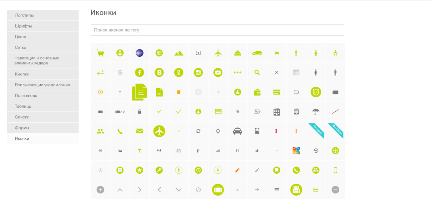
We could not completely abandon them, but we use only the very minimum necessary, and not as an independent “message”, but as an illustration of the information on the page. The icons are the same in all systems, and their list is clearly defined in the UI KIT.
3. Proactivity.
Reduce the user’s labor costs to get the result due to the fact that the UI “leads” the user along the desired path?
4. Flexibility.
A system is an organism. She is able to rebuild under new realities without collapsing.
The practical embodiment of ecosystem principles has been the creation of a single UI Kit. To typify all the interface elements, we analyzed all the projects that were once made for the customer:
In fact, the UI Kit is a continuation of the customer’s brand book, only for digital media. It contains all the standard pages, controls and their possible states, as well as a complete set of necessary icons. It allows you to perform the same tasks as a regular brand book: to increase brand awareness, to create a certain image of the company - only in “figure”.
Designers build further projects on the basis of this catalog, thinking through only things that are unique to a particular project. As a result, the designer now spends more time specifically on designing the application, working on ergonomic and usability issues, rather than styling.
Further development of the project to a greater extent falls on the shoulders of the developers. Designers act as customers, censors and controllers of the UI Kit technology shell, which frontenders are already doing. Since this article is design-oriented, we will now outline the next steps, and we will present a detailed technical story in a separate article. Continuation: “Design ecosystem: a word for front-end” - is already on the way.
A fat plus to the cash desk of the design ecosystem is the ability to reuse the code. Of course, we want to write the code once, saving time for implementation.
But we must remember that there will be more than one implementation. UI Kit is not a reinforced concrete slab and its updating will continue even after the final systems are implemented. Sometimes even after they have gone into the maintenance phase from the active development phase. Therefore, it is important to ensure that developers have the opportunity to learn about updates to the UI Kit, understand what exactly has changed and how difficult it will be to implement these changes in their project, and to evaluate and plan the work on introducing these changes.
In addition to changes in the design, errors are possible in the css embodying the designed design. And it would be good to make and correct these errors in one place, and not in every system.
The solution to this problem is quite obvious - we create a library that implements the concepts of the developed design. Physically, it looks like a bootstrap theme packaged in a private npm package. Developers install it “on top” of bootstrap and get the design they need.
Instead of long instructions, we created a demo application that shows all the features of the library and provides examples of typesetting necessary for the implementation of certain elements. In it, customers can lively “feel” this or that design idea even before it has spread to end applications. And, if necessary, make any additional requests.
Total and painless. But this will be the subject of our next story. We pass the baton to the front-end.
In the next post, we will talk about the details of the front-end part of the solution. Stay in touch.
We hope that our experience will be of interest to UI / UX designers, front-end, and also brand managers who are faced with similar tasks on their own experience.
When you need an ecosystem. Our experience
For many years for one customer we have been doing a large number of IT projects of various degrees of complexity and focus (public / internal). Currently there are more than 30 projects. In the process there have been significant changes in the design, right up to the change of the main corporate colors. And in fact, until some point, design and development was carried out “spontaneously”, that is, they simply took and made each project “from scratch”.
The consequences for us - developers - you yourself can easily predict:
you will inevitably have a heterogeneous and constantly required new design for new modules.
- If the corporate identity is changing, then you need to run and change the design of everything. But more realistic - you will have a zoo. (Priorities, resources, budgets - you will definitely be provided with it).
- Designers will need to constantly monitor the front-end. And they will have to write a lot of repeatable code (but this is a separate big story, and we will tell you about it separately)
For the customer, such an unsystematic approach is also deplorable:
- Users experience inconvenience in work. When the same person has to use several systems with a heterogeneous UX and in each of them the controls behave a little differently, frictions inevitably arise, the amount of which characterizes the UX as good or bad. This kind of “friction” is perceived by the user very painfully, because it does not allow work “in the flow”.
Since we have business systems, users are forced to use them. Nevertheless, the “productivity” of labor is clearly not at its maximum.
- The quality of communications, including marketing, the company is far from ideal.
Companies carefully monitor the compliance of all their carriers with the corporate identity. Non-digital media is described in detail in a thick brand book - from business cards to souvenir mugs in a corporate style. And the company's digital communications are often not able to regulate and lead to a single view. And so, digital media “helps” blur the brand.
Design language. Stages of creation
Awareness of the futility of the current path at one point led us to the idea that we need a system. And this is how we built it sequentially.
Stage 1. We determine the basic principles
1. Unity.
Design language is a system. And it should work as a system - I understood the principles once, and then you use them on the machine.
- Unified grid and layout of key controls.
- Common designations for sample data. Money, dates, statuses, text, time, periods ...
- Unified accents that suggest the correct sequence of actions in any application of the system.
2. Simplicity and functionality.
Our design language is for business communication. This is not a decorative genre. Therefore:
- We remove interfaces from all non-functional “beauties” that do not carry a useful function.
- We use a minimum of icons. As a rule, they do not make life easier for the user, but make them play a guessing game.
We could not completely abandon them, but we use only the very minimum necessary, and not as an independent “message”, but as an illustration of the information on the page. The icons are the same in all systems, and their list is clearly defined in the UI KIT.
3. Proactivity.
Reduce the user’s labor costs to get the result due to the fact that the UI “leads” the user along the desired path?
- We use intuitive associations.
Not everyone will immediately remember what a CVC code is, but everyone understands what “three digits on the back of a card” is, so on the online payment pages they place an image of a bank card.
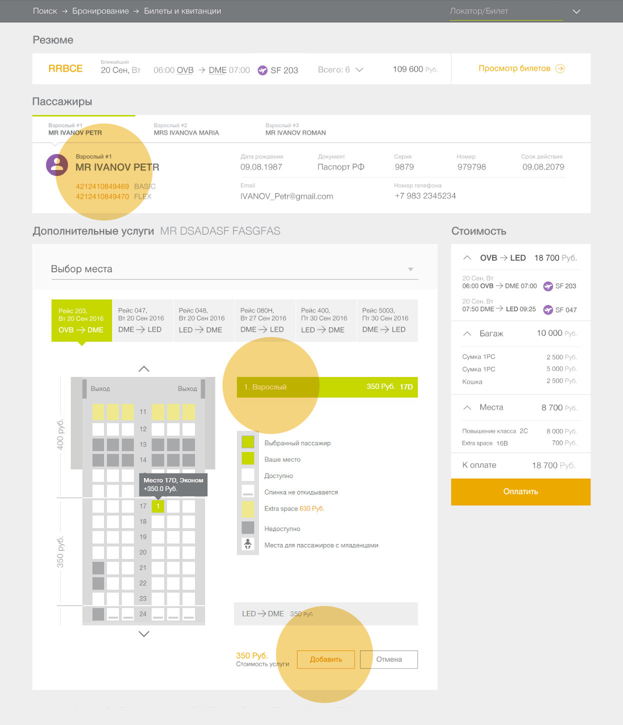
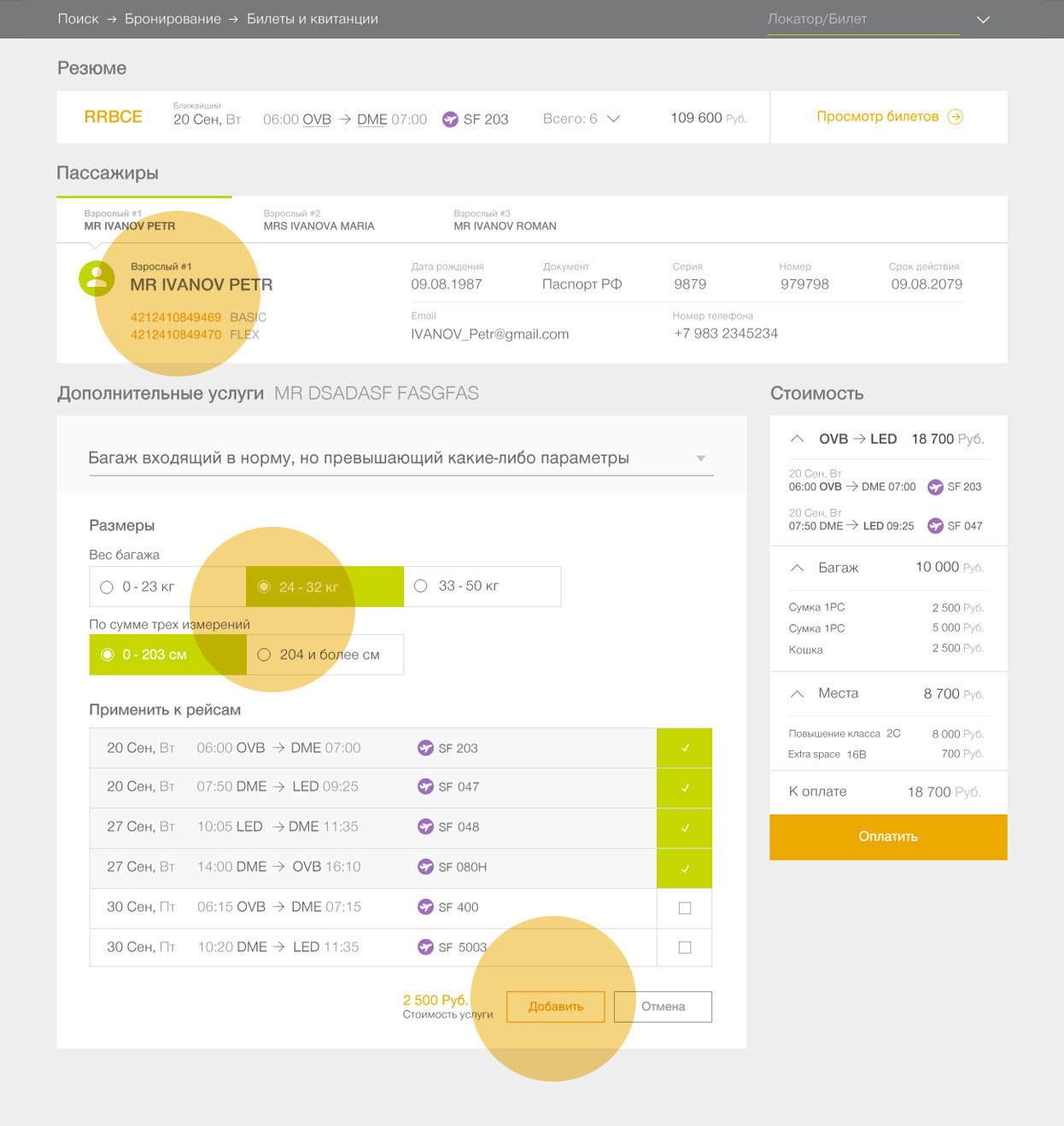
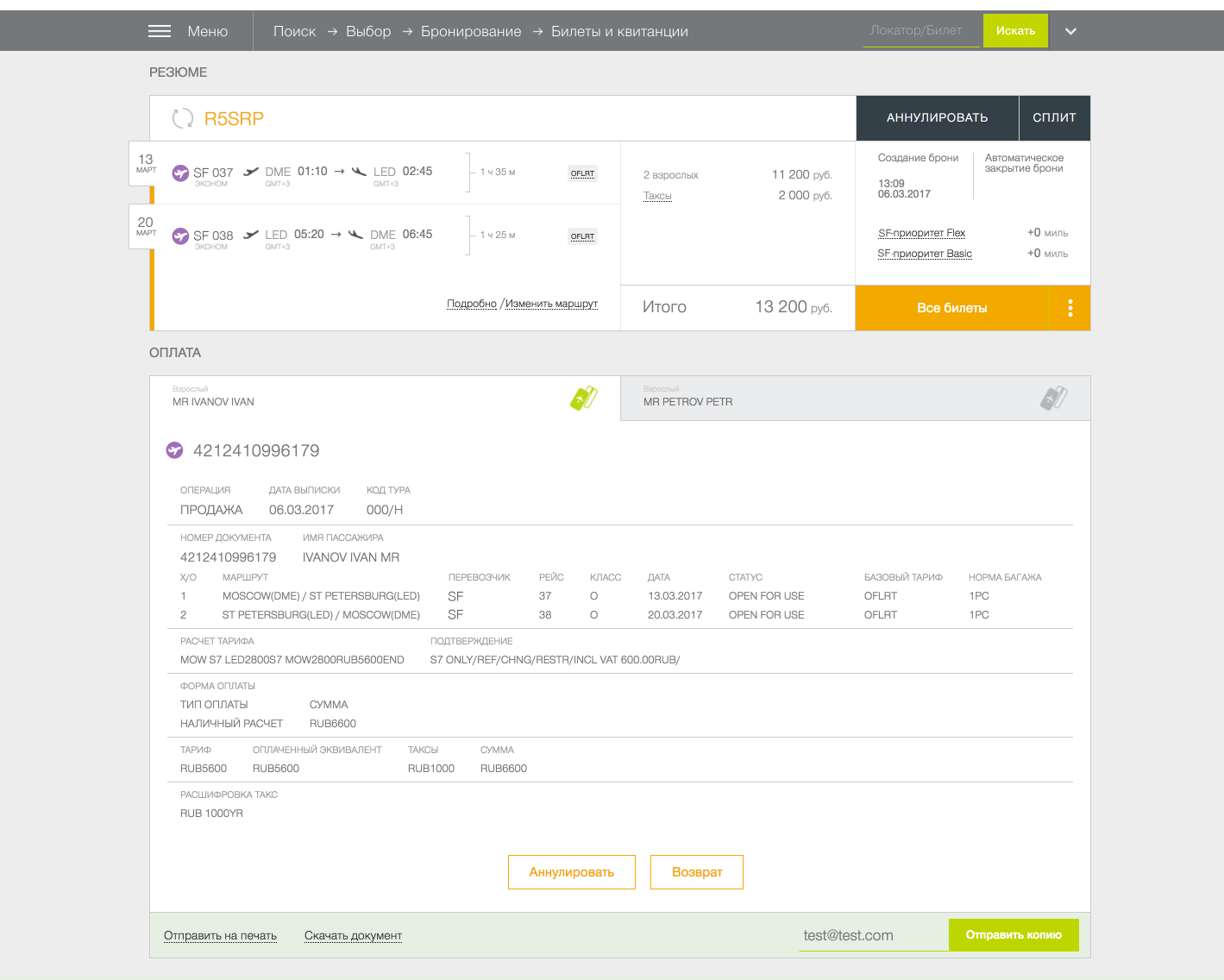
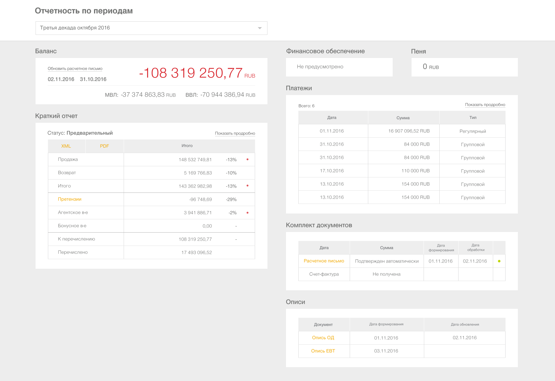
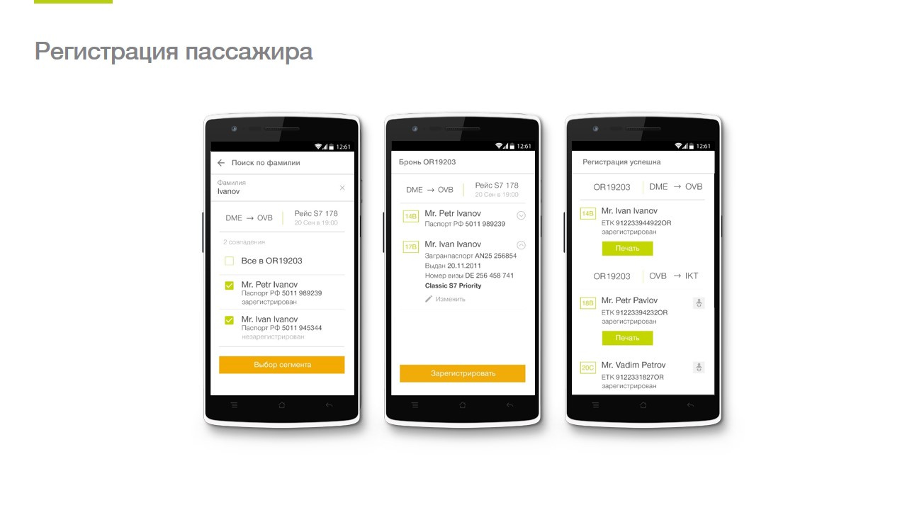
In our case, for employees of the airline who are engaged in the analysis of sold traffic, the data was displayed according to the standards for drawing up itinerary receipts (in a simple way - a ticket).
- We take into account the perception of colors by a person when choosing color schemes in interfaces.
For example, in finance it is customary to indicate red expenses. Therefore, when we create a financial system in which accountants will work, we will “color” money for them in the way they are used to. And so you need to act with each audience.
4. Flexibility.
A system is an organism. She is able to rebuild under new realities without collapsing.
- Supports the development of functionality.
- It supports different platforms - web, mobility.
- Leaves space for “creativity."
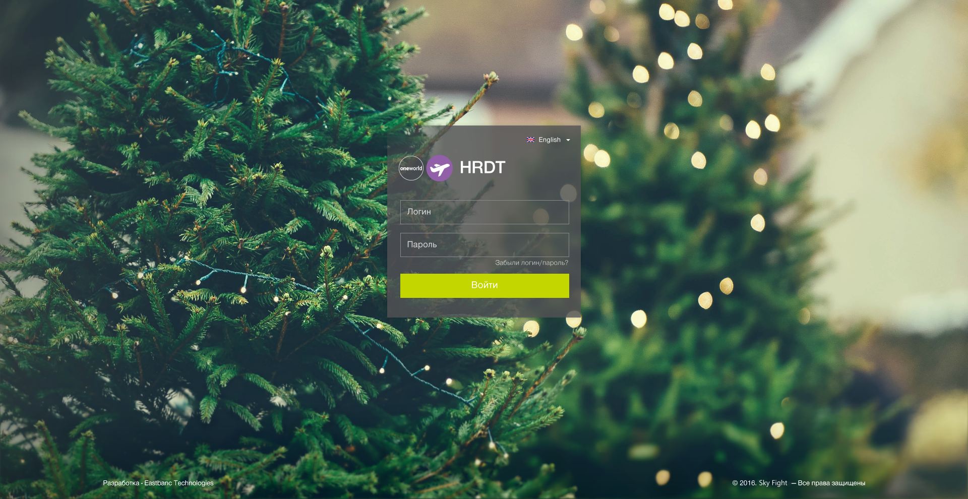
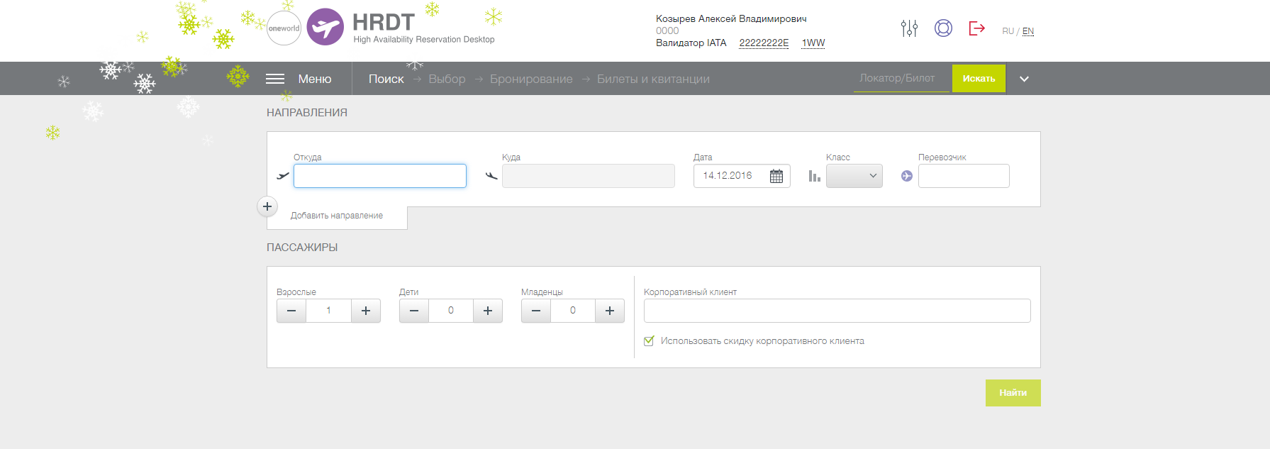
You can make a special decoration for the holidays, or a marketing campaign.
Stage 2. We collect UI Kit
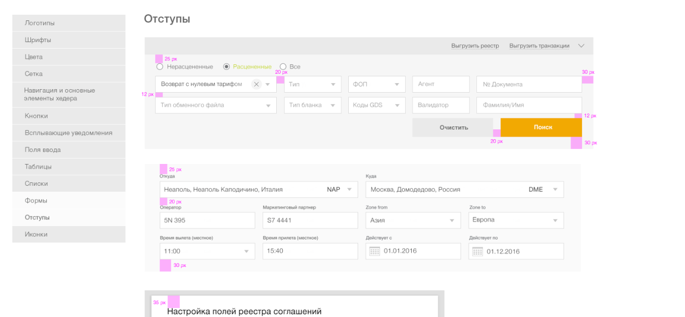
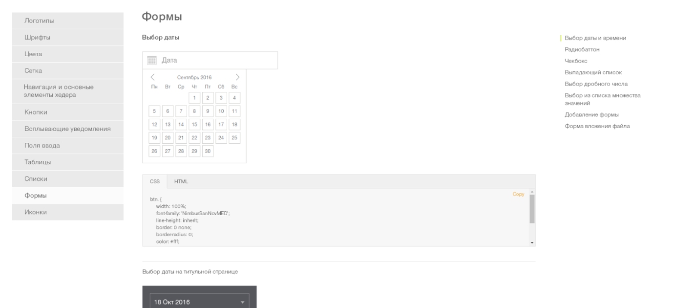
The practical embodiment of ecosystem principles has been the creation of a single UI Kit. To typify all the interface elements, we analyzed all the projects that were once made for the customer:
- highlighted all types of functionality and necessary elements,
- brought them in line with the current corporate identity of the customer, which will be relevant in the next few years,
and based on this information, they designed the UI Kit.
In fact, the UI Kit is a continuation of the customer’s brand book, only for digital media. It contains all the standard pages, controls and their possible states, as well as a complete set of necessary icons. It allows you to perform the same tasks as a regular brand book: to increase brand awareness, to create a certain image of the company - only in “figure”.
Designers build further projects on the basis of this catalog, thinking through only things that are unique to a particular project. As a result, the designer now spends more time specifically on designing the application, working on ergonomic and usability issues, rather than styling.
From design to development
Further development of the project to a greater extent falls on the shoulders of the developers. Designers act as customers, censors and controllers of the UI Kit technology shell, which frontenders are already doing. Since this article is design-oriented, we will now outline the next steps, and we will present a detailed technical story in a separate article. Continuation: “Design ecosystem: a word for front-end” - is already on the way.
Stage 3. We pack technologically
A fat plus to the cash desk of the design ecosystem is the ability to reuse the code. Of course, we want to write the code once, saving time for implementation.
But we must remember that there will be more than one implementation. UI Kit is not a reinforced concrete slab and its updating will continue even after the final systems are implemented. Sometimes even after they have gone into the maintenance phase from the active development phase. Therefore, it is important to ensure that developers have the opportunity to learn about updates to the UI Kit, understand what exactly has changed and how difficult it will be to implement these changes in their project, and to evaluate and plan the work on introducing these changes.
In addition to changes in the design, errors are possible in the css embodying the designed design. And it would be good to make and correct these errors in one place, and not in every system.
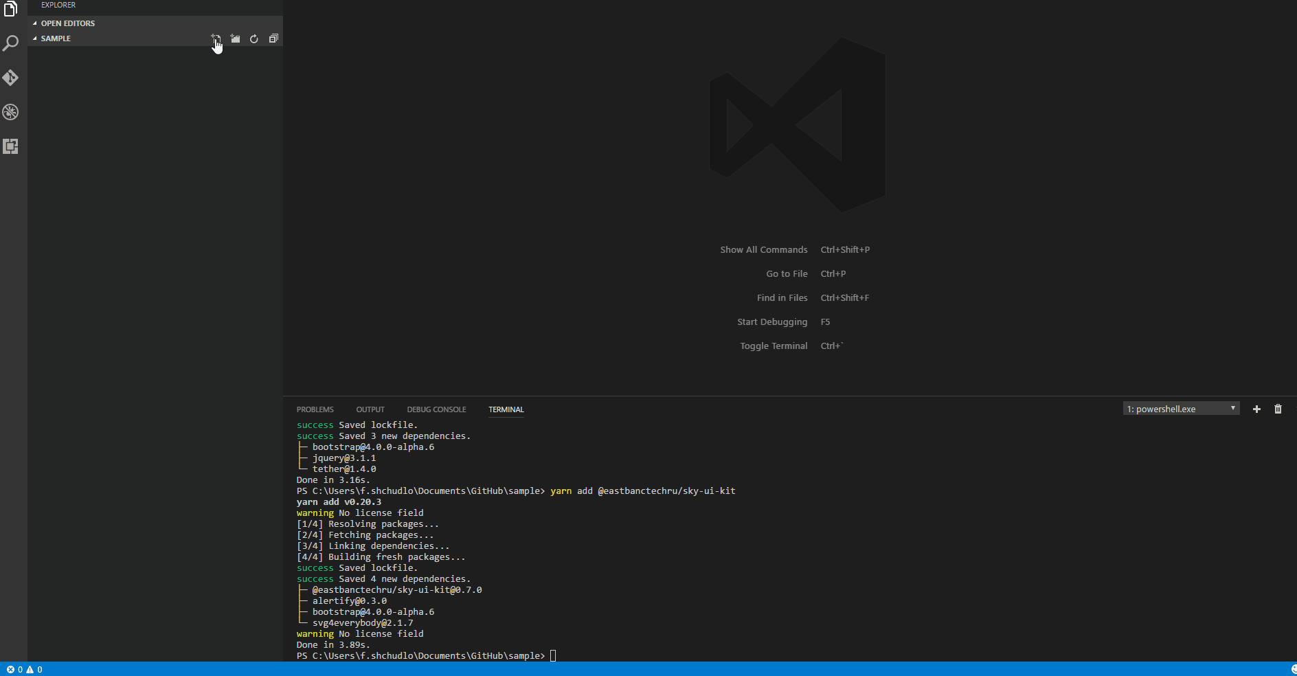
The solution to this problem is quite obvious - we create a library that implements the concepts of the developed design. Physically, it looks like a bootstrap theme packaged in a private npm package. Developers install it “on top” of bootstrap and get the design they need.
Stage 4. We create "documentation"
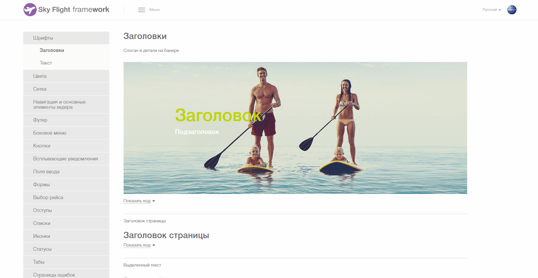
Instead of long instructions, we created a demo application that shows all the features of the library and provides examples of typesetting necessary for the implementation of certain elements. In it, customers can lively “feel” this or that design idea even before it has spread to end applications. And, if necessary, make any additional requests.
Stage 5. We provide versioning
Total and painless. But this will be the subject of our next story. We pass the baton to the front-end.
Total as a result of the design part of the project:
- We learned how to create our own design “language”, adapted to the specifics of the customer’s IT services ecosystem.
- Based on the experience of IT services of a particular customer, they turned the zoo into a single ecosystem. We developed a unified concept of UX, which will minimize “friction” when working with our systems.
- We created the UI Kit, which allows the customer to maintain and develop all their systems in a single style, and for our designers reduces the time spent on design work.
- We implemented the distribution of library updates in the form of an npm package, which, combined with competent versioning, helps to fix flaws and update the design painlessly and in isolation on each project.
- We have comprehensively illustrated the work of the library through a demo application, which allows developers to often get along not only without designers, but even without layout designers.
To be continued...
In the next post, we will talk about the details of the front-end part of the solution. Stay in touch.