Fluent Design (Non) Shifting Paradigms
At the last conference of developers from Microsoft - Build2017 , a rather interesting video was shown:
Even after viewing it a couple of times, the question remains - what exactly is Fluent Design ?
After Metro-Design, this is a new round of design evolution from Microsoft . Metro styles were introduced back in the days of Windows 8 (including Windows RT and Windows Phone 8 ), and have not been updated since then. Although new functionality appeared, there were no fundamental differences in Win10 . Since then, UWP applications have appeared , and we have passed UX taking into account all kinds of screen sizes. Now Microsoft is moving to a new state - Fluent Design. Fortunately for developers and designers, this step was thought out enough. Let's look at all aspects of the new concept.
If you saw last year's Build 2016 out of the corner of your eye , then most of the innovations will seem very familiar to you, but at the time there was no clear structure.
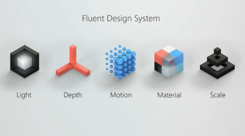
Now 5 important parts of the design are presented : Light , Depth , Motion , Material and Scale .
Prioritization is only the first step - they set the direction for development, and the video is just about that, showing more physical aspects in the real world.
Developers and designers, fortunately, do not have to face the wall of new complex guidelines. This is achieved through their step-by-step implementation, and the company is ready to share the first step in this direction.

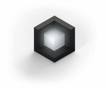
Light is presented as a tool to help the user focus, understand what the user is interacting with, and focus it on the ongoing interaction.
First step: Disclosing light.
The cursor is now a small light source that extends to nearby interface elements. However, this light can reveal the borders of the elements invisible in the shadow. This somewhat removes noise from auxiliary elements, which are revealed only when the user is interested in them.
Pressing the cursor on all elements generates a spreading light from the cursor within these elements, and this lighting varies depending on the specific interaction.
Depth develops the vision of layers in the application, but it has not only a visual component. Surrounding surround sound also helps to navigate the digital world.
First step: Promising parallax.
This tool is familiar to many, has long been used in Internet pages, but do not forget that this is now one of the pillars of the new design, and new implementation tools will be added to it. We are also talking about parallax not only in the global hierarchy of the page, but also the manifestation of the effect inside one element.


Movement has always been one of the main indications of continuous and dynamic user interaction. The user really loves when the application does not present a static picture, but shows signs of life. In addition: “It just feels good!”.
First step: Related animations.
Associated animations make it easy to configure transitions between elements with the effect of transforming one page into another without losing context for the user, and this works both ways, both at the moment of transition to a new page and at the moment of exit back. The user will always understand where he is and what he has done before.
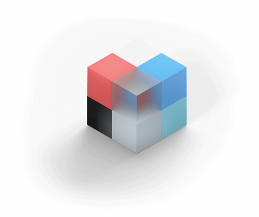
In the new concept, the designer should not perceive colors and brushes in the application as the next palette. Refusing colors we get work with materials. Materials allow you to transfer your physical properties on the screen. Materials should give a feeling of warmth, as well as reflect movements in accordance with their physical characteristics.
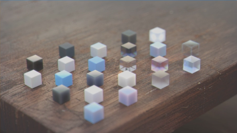
First step: Acrylic material.
Acrylic is a continuation of the once-lost glass that we first saw in Windows Vista . However, this is not just transparency with blur, but a whole set of instructions that takes into account many parameters and textures.
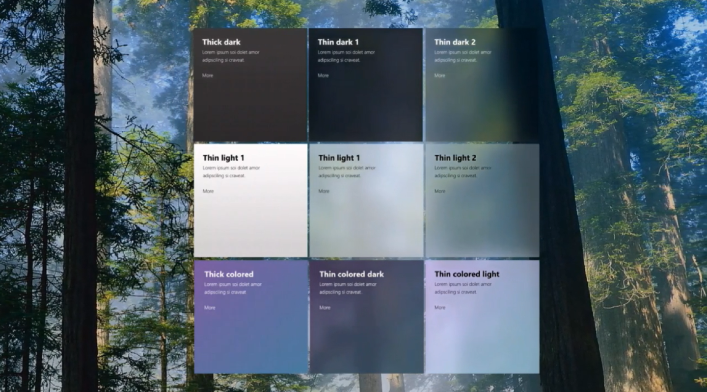
At one of the previous conferences, we already saw something similar, and then it was stipulated that the effect was achieved with the help of graphic shaders. However, as we can see now, these shaders are proprietary and each of them will consciously and gradually shape the appearance of applications in the principles of the new design.
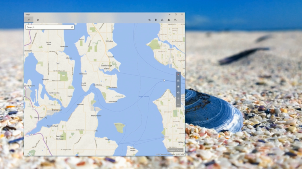
Acrylic material allows you to separate the hierarchy in the application and extends its boundaries by connecting the window with the surrounding space using transparency. However, this material can use its advantages not only with the environment, but also expanding the internal elements. As an example, it is possible to display the map on the entire available area of the window, in which the menu and title, together with the system buttons, will lie on an acrylic substrate on top of the map, which visually expands the useful area inside the application.

This item is somewhat global and means the development of UX as adaptive, responsive and scalable among the entire ecosystem of devices - from the non-display smart home systems to virtual and augmented reality systems. Controls should easily adapt to any system without significant redesign of the interface.
First step: Conscious controls.
This type of element reveals itself only when necessary. We all remember the thin scroll in mobile devices and the wide one on desktop systems. In the new design, this is one element that initially appears as a mobile version, thereby clearing the space and increasing the useful area, however, when you hover over the cursor, the scroll expands into a familiar and user-friendly element. Such a transformation allows you to effectively use the control element, while hiding in the absence of interaction a bulky and annoying look that is not needed at a particular moment, which allows you to achieve a cleaner interface as a whole. This is just one example of such controls. Similarly, an element is a text field that can receive data from the keyboard, as well as handwritten and even voice input.


The future has not come yet, however, the curtain has already been opened to us, what is hidden behind a small part of the second step in this design - these are mainly the principles of Scale, but also of Movement and Depth:
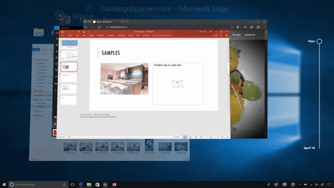
Much depends on ordinary developers with designers, because already ajar Conscious headers are a concrete implementation from the Groove application . Relying on the principles already disclosed, new elements were created that Microsoft liked so much that now they are looking at the possibility of simplifying and automating the effect achieved for the entire community.

The concept is drawn up, the elements are disclosed. With the developers shared the first steps in a new direction. Much of what you see can be embodied by old means, however, when it becomes part of the system, inevitably simple means of achieving the necessary UX will be presented . In the future, we should wait for these new tools, which will make it easier to reveal the new design paradigm from Microsoft .
We saw as many as 5 principles forming a new concept. Each of them is important, and I hope that designers will listen or at least take note of them.
Over the past couple of years Microsoftmade it clear that they seek to unlock the creative potential of users. However, as I see it, this should open up new potential among designers. Each of the principles is a systematic development of the developments of the current design in combination with available technologies and an extensive ecosystem of various devices. We get universality in the broad sense in which each of the participating elements wins, blurring its boundaries of interaction. The emergence of a new concept only contributes to the appearance of more attractive applications, creating a wide scope for imagination about the future applications based on Fluent Design .
Even after viewing it a couple of times, the question remains - what exactly is Fluent Design ?
Project neon
After Metro-Design, this is a new round of design evolution from Microsoft . Metro styles were introduced back in the days of Windows 8 (including Windows RT and Windows Phone 8 ), and have not been updated since then. Although new functionality appeared, there were no fundamental differences in Win10 . Since then, UWP applications have appeared , and we have passed UX taking into account all kinds of screen sizes. Now Microsoft is moving to a new state - Fluent Design. Fortunately for developers and designers, this step was thought out enough. Let's look at all aspects of the new concept.
If you saw last year's Build 2016 out of the corner of your eye , then most of the innovations will seem very familiar to you, but at the time there was no clear structure.
Now 5 important parts of the design are presented : Light , Depth , Motion , Material and Scale .
Prioritization is only the first step - they set the direction for development, and the video is just about that, showing more physical aspects in the real world.
Developers and designers, fortunately, do not have to face the wall of new complex guidelines. This is achieved through their step-by-step implementation, and the company is ready to share the first step in this direction.
Shine
Light is presented as a tool to help the user focus, understand what the user is interacting with, and focus it on the ongoing interaction.
First step: Disclosing light.
The cursor is now a small light source that extends to nearby interface elements. However, this light can reveal the borders of the elements invisible in the shadow. This somewhat removes noise from auxiliary elements, which are revealed only when the user is interested in them.
Pressing the cursor on all elements generates a spreading light from the cursor within these elements, and this lighting varies depending on the specific interaction.
Depth
Depth develops the vision of layers in the application, but it has not only a visual component. Surrounding surround sound also helps to navigate the digital world.
First step: Promising parallax.
This tool is familiar to many, has long been used in Internet pages, but do not forget that this is now one of the pillars of the new design, and new implementation tools will be added to it. We are also talking about parallax not only in the global hierarchy of the page, but also the manifestation of the effect inside one element.
Traffic
Movement has always been one of the main indications of continuous and dynamic user interaction. The user really loves when the application does not present a static picture, but shows signs of life. In addition: “It just feels good!”.
First step: Related animations.
Associated animations make it easy to configure transitions between elements with the effect of transforming one page into another without losing context for the user, and this works both ways, both at the moment of transition to a new page and at the moment of exit back. The user will always understand where he is and what he has done before.
Material
In the new concept, the designer should not perceive colors and brushes in the application as the next palette. Refusing colors we get work with materials. Materials allow you to transfer your physical properties on the screen. Materials should give a feeling of warmth, as well as reflect movements in accordance with their physical characteristics.
First step: Acrylic material.
Acrylic is a continuation of the once-lost glass that we first saw in Windows Vista . However, this is not just transparency with blur, but a whole set of instructions that takes into account many parameters and textures.
At one of the previous conferences, we already saw something similar, and then it was stipulated that the effect was achieved with the help of graphic shaders. However, as we can see now, these shaders are proprietary and each of them will consciously and gradually shape the appearance of applications in the principles of the new design.
Acrylic material allows you to separate the hierarchy in the application and extends its boundaries by connecting the window with the surrounding space using transparency. However, this material can use its advantages not only with the environment, but also expanding the internal elements. As an example, it is possible to display the map on the entire available area of the window, in which the menu and title, together with the system buttons, will lie on an acrylic substrate on top of the map, which visually expands the useful area inside the application.
Scale
This item is somewhat global and means the development of UX as adaptive, responsive and scalable among the entire ecosystem of devices - from the non-display smart home systems to virtual and augmented reality systems. Controls should easily adapt to any system without significant redesign of the interface.
First step: Conscious controls.
This type of element reveals itself only when necessary. We all remember the thin scroll in mobile devices and the wide one on desktop systems. In the new design, this is one element that initially appears as a mobile version, thereby clearing the space and increasing the useful area, however, when you hover over the cursor, the scroll expands into a familiar and user-friendly element. Such a transformation allows you to effectively use the control element, while hiding in the absence of interaction a bulky and annoying look that is not needed at a particular moment, which allows you to achieve a cleaner interface as a whole. This is just one example of such controls. Similarly, an element is a text field that can receive data from the keyboard, as well as handwritten and even voice input.
Future?
The future has not come yet, however, the curtain has already been opened to us, what is hidden behind a small part of the second step in this design - these are mainly the principles of Scale, but also of Movement and Depth:
- 360 video panoramas
- Conscious Headings
- Speech
- Stratification along the depth of the Z axis
- Spatial sound
Much depends on ordinary developers with designers, because already ajar Conscious headers are a concrete implementation from the Groove application . Relying on the principles already disclosed, new elements were created that Microsoft liked so much that now they are looking at the possibility of simplifying and automating the effect achieved for the entire community.
What now?
The concept is drawn up, the elements are disclosed. With the developers shared the first steps in a new direction. Much of what you see can be embodied by old means, however, when it becomes part of the system, inevitably simple means of achieving the necessary UX will be presented . In the future, we should wait for these new tools, which will make it easier to reveal the new design paradigm from Microsoft .
We saw as many as 5 principles forming a new concept. Each of them is important, and I hope that designers will listen or at least take note of them.
Over the past couple of years Microsoftmade it clear that they seek to unlock the creative potential of users. However, as I see it, this should open up new potential among designers. Each of the principles is a systematic development of the developments of the current design in combination with available technologies and an extensive ecosystem of various devices. We get universality in the broad sense in which each of the participating elements wins, blurring its boundaries of interaction. The emergence of a new concept only contributes to the appearance of more attractive applications, creating a wide scope for imagination about the future applications based on Fluent Design .