 March 6, 2017 at 17:31
How we did the ecosystem - a single “design language" for the front end of dozens of connected systems
In this post, we will talk about how we learned to speak with the user in the “language” of UI / UX design and came to the need to create a single ecosystem for different applications of one customer. And also about what technologies helped in this.
What do we mean by a single ecosystem? This is a complex of different IT solutions, web and mobile applications, united by a single "language" in which they speak with the user. For example, all Microsoft products or all Apple devices have such a language. Whatever application of the same manufacturer you open, it will repeat the logic of its “relatives”, show you familiar icons.
For companies creating digital products, a single ecosystem is a key competitive advantage. For non-digital companies that are transitioning “into numbers,” the creation of similar unified ecosystems is becoming a necessity as it offers many benefits. First of all, of course, it provides users with a uniform UX and UI in all systems, makes it easier to maintain and update systems, and improves conversion and customer satisfaction.
The development of such an ecosystem was the result of a long journey for us, which we will talk about.
A customer site, an internal site, a dozen mobile and web applications are the arsenal of digital tools of most large companies today. Updating and maintaining this huge digital economy is quite difficult, especially because of its heterogeneity. Created in different years and by different developers, all these sites and mobile phones differ in design, logic, and what are called UX and UI. This is inconvenient for both the user and the owner, and the developer who receives the order for the reengineering of all systems.
Heterogeneity is inconvenient for users. When the same person has to use several systems with heterogeneous UX and in each of them the controls behave a little differently, frictions inevitably arise, the amount of which characterizes the UX as good or bad. This kind of “friction” is perceived by the user very painfully, because it does not allow work “in the flow”.
The heterogeneity is also inconvenient for the owner himself, because heterogeneous systems are more complex and clumsy in updating. Roughly speaking, the “make me the same button” task in another application is more difficult to solve due to the fact that this other application can have its own logic, a different UI.
Here is an example of a small difference in UX between two web applications used by the same people. The difference is small, but nonetheless annoying to the user.

In the first example, the search box does not give a hint if you type in the English layout. And in the second example, the prompt is triggered. If this option was absent in both examples, then it would be even better than in this form. Because people are used to pleasant trifles in one place and not in another. Such small differences slow down the application.
A heterogeneous UI reduces the quality of communications, including marketing. Companies carefully monitor the compliance of all their carriers with the corporate identity. Non-digital media is described in detail in a thick brand book - from business cards to souvenir mugs in a corporate style. But the section on digital is often not detailed enough. Only general recommendations are given, without details on the design in a corporate style of specific application elements. This leads to heterogeneity.
But today in large companies come to the decision that their digital embodiment should be uniform in each system and accurately repeat the elements of style from offline.
For example, the UI / UX ecosystem of METRO stores is a single registration of shares on the site, in the catalog, and in the stores themselves.
METRO website:
METRO catalog:

The store itself has banners with the same design, and each product participating in the promotion has round wobblers with the same “1 + 1” design.
This uniformity allows you to make the message more memorable. Agree, with this end-to-end informing, the maximum number of customers will get to the promotional product.
The first step towards creating truly user-friendly interfaces was the fight against “beautiful pictures” that do not perform a useful function. At the dawn of the establishment of principles for working with interfaces, we encountered situations when designers offered solutions that were correct only in terms of graphic design requirements. But what is good for graphic design, sometimes for UX design is just death. You can draw an enchanting squiggle, which will lead to the creative ecstasy of the designer, but at the same time distract the user from the "Pay" button and ruin the entire page. Therefore, in our work, the key priority has become the functionality of each element.
At the next stage, we set the task of making the design proactive, guiding the user, helping to quickly find the desired option, in fact, switch to the actual UI / UX design.
One example of proactive design is the use of real-life associations that suggest, for example, what information to enter. Not every Internet user will immediately remember what a CVC code is, but everyone understands what “three digits are on the back of a card”, so on the online payment pages they place an image of a bank card.

Another example from our practice. Our task was to make a transparent form for displaying data. The users were airline employees who analyze the sold traffic. To make it easy for them to immediately navigate the data, we made a display in the form of a route receipt (a ticket - in a simple way).

Making a proactive, intuitive design - it would seem that more is needed. But in practice it turned out that this is not enough. The problem was that when working with large customers, you have to design or process a lot of interconnected systems at once, each of which has its own history, its own internal language in which it communicates with the user, and completely different UI and UX.
From the point of view of external design and compliance with the corporate style of the company, different environments also often differ. In particular, until recently, many companies did not attach much importance to whether the web application for internal use is designed correctly in terms of branding and UX convenience. However, the employee is also an “internal client”, and to provide him with the same level of service that the company provides to external clients is a good Feng Shui. In addition, the same user in practice often uses several applications of the company, both internal and external.
As a result, the next stage for us was the development of a single “language” of design for different environments in which we speak with the user.
We started to create such a “language" gradually, accumulating experience in communicating with users, systematizing ideas and rules, and now we are ready to share the main ones, in our opinion.
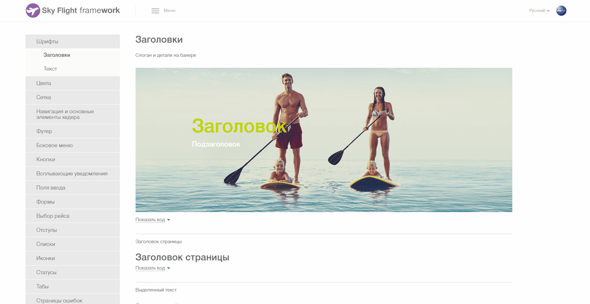
For the user to quickly navigate, “exit”, “help”, “username” should always be in one place on the site, in a mobile application, etc.
In our UI KIT, a whole section is devoted to all the various options for a header. And uniformity and continuity are clearly visible.

Similarly, the location of any information blocks is “logged”:
Money, dates, statuses, text, time, periods ...
In the example below, a certain font, size, and font are selected to indicate dates, amounts, names, text blocks and various options. And exactly the same parameters are used for similar data types in all customer applications.

For example, when accountants work with Excel, the red color usually indicates the money spent. Therefore, when we create a financial system in which accountants will work, it is important to “color” money for them the way they are used to. If you highlight red, for example, profit, then accountants are nervous because, out of habit, their brain will read the “red” numbers as financial losses.

For example, if hints and help are indicated in yellow, then all prompting elements will be indicated in yellow and no other elements will be indicated in yellow.
Here is an example of an unsuccessful color scheme, which we refused. In one of the menu systems, our layout was red. However, red is more effective for emphasis than for filling basic information with it. In the user's perception, red color indicates either a warning about a threat / error, or prompts an action (red Buy button). Therefore, we abandoned the use of red and use it only to indicate the very costs or warnings.

We came to understand that the icons often do not make life easier for the user, but make them play a guessing game. 10 years ago it was very popular to draw pictograms in interfaces. This was such a widespread practice that users considered the inevitable evil of the need to “learn” a new web application and remember what is behind this or that icon. However, in practice there are only a few dozen pictograms that the vast majority of Internet users understand unambiguously, for example, a cross in the meaning “close” or a sign more in the meaning “scroll further”
We, of course, also tried to invent an icon for each option:

But to guess what is behind each of them was possible only thanks to the tooltips:


In general, we refused to draw unnecessary pictures, now we use only the very minimum necessary. And then, they are not used on their own, but only to illustrate the information on the page.
And the list of such pictograms is clearly defined in the UI KIT.


At each point in time, the user must be pushed to certain actions, placing emphasis. As accents, a bright font color, bold or “marker” highlighting, a “pressed” button, contrasting elements against the general background, dynamic elements, volumetric elements and so on can be used — here we will not reveal America to you. For the ecosystem, it is important that all systems adhere to the same principles for setting these same emphasis.
In our case, the gray highlighting of the active blocks of the interface, green accents for the selected options, the orange color of the main buttons are used in all applications. Below are two examples of interfaces designed according to the same principles for different target audiences - partners and agents, which in some cases overlap, as agents are part of the airline’s affiliate network.
An important component of the interface has become elements that help the user understand the correct sequence of actions on the page.
Now, in all airline systems, the logic of working with the interface and its visual implementation are identical.


Практическим воплощением принципов единства экосистемы стало создание единого UI Kit для всех приложений одного из наших заказчиков. Для типизации всех элементов интерфейса наши дизайнеры провели анализ всех сделанных ранее для заказчика проектов и спроектировали UI Kit, основанный на фирменном стиле заказчика, который будет актуален в ближайшие несколько лет. В нем собраны все типовые страницы, элементы управления и их возможные состояния, а также полный сет необходимых иконок. При проектировании UI Kit’а ключевым моментом было обеспечение единого UX для всех систем.
Фактически UI Kit – это продолжение бренд-бука заказчика, только для цифровых носителей. Он позволяет выполнять те же задачи, что и обычный бренд-бук: повышать узнаваемость бренда, создавать определенный образ компании.
Based on the UI Kit, you can make any new or modify old applications. Designers build further projects on the basis of this catalog, thinking through only things that are unique to a particular project. As a result, the designer now spends more time specifically on designing the application, working on ergonomic and usability issues, rather than styling.
Below are examples of elements in the UI Kit:


An important feature of the UI Kit is that it not only regulates which elements should be required, but also leaves room for creativity, while maintaining the unity of style and uniformity of the UX.
Here is an example of New Year decoration while maintaining the uniformity of UX.


Now different systems look more predictable and understandable from the point of view of the user.
It was - it became:


Naturally, things did not end on the development of a new design. Designed designs still need to be implemented in end applications. A single design concept means that in the code from project to project there will be much in common. Such code can be written once, saving time for implementation.
In addition to saving time for implementation, this approach has another advantage. UI Kit is not a reinforced concrete slab and its updating will continue even after the final systems are implemented. Sometimes even after they have gone into the maintenance phase from the active development phase. Therefore, it is important to ensure that developers have the opportunity to learn about updates to the UI Kit, understand what exactly has changed and how difficult it will be to implement these changes in their project, and to evaluate and plan the work to implement these changes.
And the last moment. In addition to changes in the design, errors are possible in css, embodying the designed design. And it would be good to make and correct these mistakes in one place, and not in every system.
The solution to these issues is quite obvious - to create a library that implements the concepts of the developed design, which we did.
If you do not complicate things and call a spade a spade, then we just developed a theme for bootstrap and packaged it into a private npm package. Further, developers install it “on top” of bootstrap and get the design they need.
We also developed a demo application, which shows all the features of the library and provides examples of typesetting necessary for the implementation of certain elements. In it, customers can lively “feel” this or that design idea even before it has spread to end applications. And, if necessary, make any additional requests.
In general, nothing complicated. A much more interesting question is how to technically equip the development process in such a way as to solve issues with updating the UI Kit and delivering these changes to final applications. But this will be our next story.

We are developing the UI Kit for our next customer and continue to learn to speak with users in terms of the real world and make our software a continuation of this world, a simple and convenient tool.
What do we mean by a single ecosystem? This is a complex of different IT solutions, web and mobile applications, united by a single "language" in which they speak with the user. For example, all Microsoft products or all Apple devices have such a language. Whatever application of the same manufacturer you open, it will repeat the logic of its “relatives”, show you familiar icons.
For companies creating digital products, a single ecosystem is a key competitive advantage. For non-digital companies that are transitioning “into numbers,” the creation of similar unified ecosystems is becoming a necessity as it offers many benefits. First of all, of course, it provides users with a uniform UX and UI in all systems, makes it easier to maintain and update systems, and improves conversion and customer satisfaction.
The development of such an ecosystem was the result of a long journey for us, which we will talk about.
1) Let's start with the theory. Why do we need a single “design language" for different related systems
A customer site, an internal site, a dozen mobile and web applications are the arsenal of digital tools of most large companies today. Updating and maintaining this huge digital economy is quite difficult, especially because of its heterogeneity. Created in different years and by different developers, all these sites and mobile phones differ in design, logic, and what are called UX and UI. This is inconvenient for both the user and the owner, and the developer who receives the order for the reengineering of all systems.
UX issue
Heterogeneity is inconvenient for users. When the same person has to use several systems with heterogeneous UX and in each of them the controls behave a little differently, frictions inevitably arise, the amount of which characterizes the UX as good or bad. This kind of “friction” is perceived by the user very painfully, because it does not allow work “in the flow”.
The heterogeneity is also inconvenient for the owner himself, because heterogeneous systems are more complex and clumsy in updating. Roughly speaking, the “make me the same button” task in another application is more difficult to solve due to the fact that this other application can have its own logic, a different UI.
Here is an example of a small difference in UX between two web applications used by the same people. The difference is small, but nonetheless annoying to the user.
In the first example, the search box does not give a hint if you type in the English layout. And in the second example, the prompt is triggered. If this option was absent in both examples, then it would be even better than in this form. Because people are used to pleasant trifles in one place and not in another. Such small differences slow down the application.
UI issue
A heterogeneous UI reduces the quality of communications, including marketing. Companies carefully monitor the compliance of all their carriers with the corporate identity. Non-digital media is described in detail in a thick brand book - from business cards to souvenir mugs in a corporate style. But the section on digital is often not detailed enough. Only general recommendations are given, without details on the design in a corporate style of specific application elements. This leads to heterogeneity.
But today in large companies come to the decision that their digital embodiment should be uniform in each system and accurately repeat the elements of style from offline.
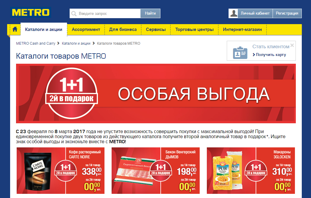
For example, the UI / UX ecosystem of METRO stores is a single registration of shares on the site, in the catalog, and in the stores themselves.
METRO website:
METRO catalog:
The store itself has banners with the same design, and each product participating in the promotion has round wobblers with the same “1 + 1” design.
This uniformity allows you to make the message more memorable. Agree, with this end-to-end informing, the maximum number of customers will get to the promotional product.
2) From beautiful pictures to creating an ecosystem
Stage 1. Beautiful pictures
The first step towards creating truly user-friendly interfaces was the fight against “beautiful pictures” that do not perform a useful function. At the dawn of the establishment of principles for working with interfaces, we encountered situations when designers offered solutions that were correct only in terms of graphic design requirements. But what is good for graphic design, sometimes for UX design is just death. You can draw an enchanting squiggle, which will lead to the creative ecstasy of the designer, but at the same time distract the user from the "Pay" button and ruin the entire page. Therefore, in our work, the key priority has become the functionality of each element.
Stage 2. Proactive design
At the next stage, we set the task of making the design proactive, guiding the user, helping to quickly find the desired option, in fact, switch to the actual UI / UX design.
One example of proactive design is the use of real-life associations that suggest, for example, what information to enter. Not every Internet user will immediately remember what a CVC code is, but everyone understands what “three digits are on the back of a card”, so on the online payment pages they place an image of a bank card.
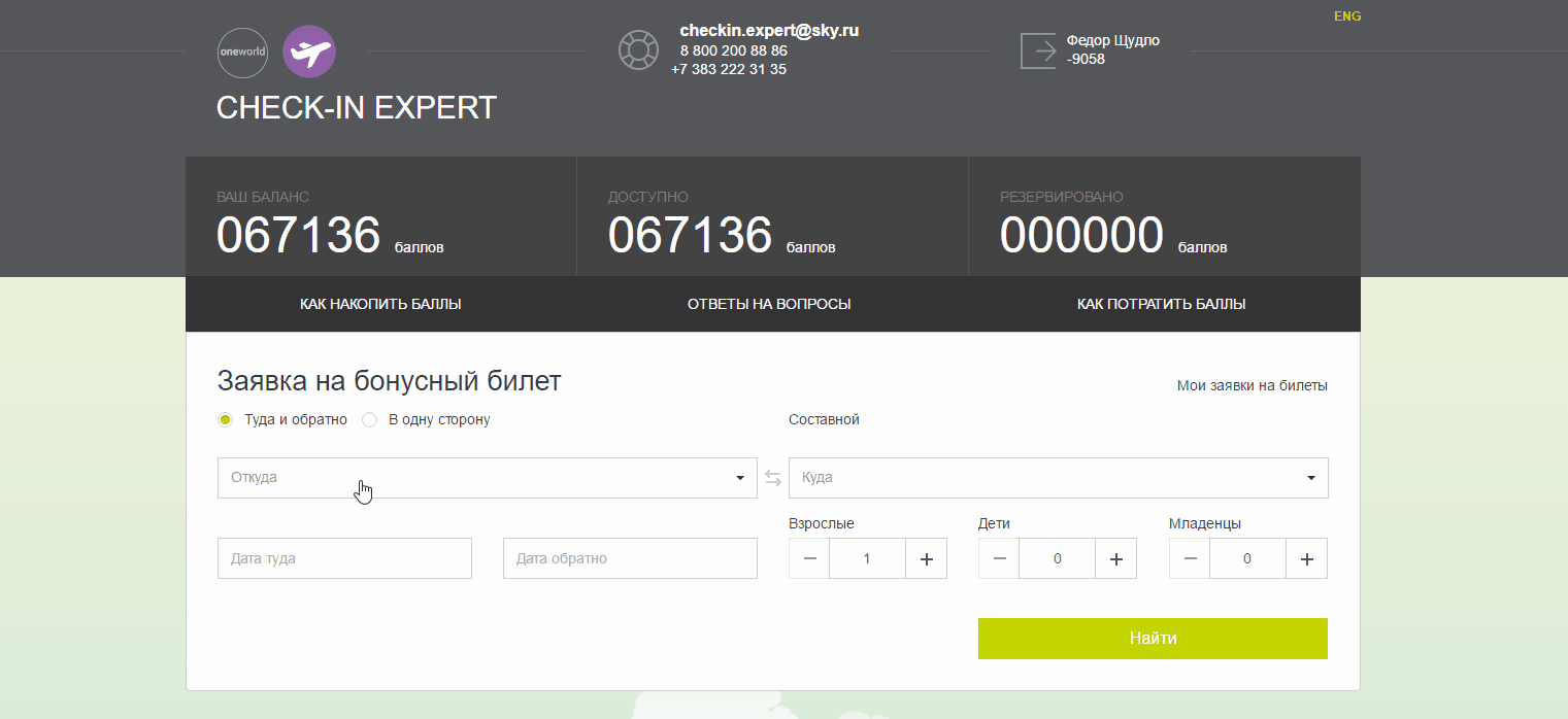
Another example from our practice. Our task was to make a transparent form for displaying data. The users were airline employees who analyze the sold traffic. To make it easy for them to immediately navigate the data, we made a display in the form of a route receipt (a ticket - in a simple way).
Stage 3. Creating your own “language” of design
Making a proactive, intuitive design - it would seem that more is needed. But in practice it turned out that this is not enough. The problem was that when working with large customers, you have to design or process a lot of interconnected systems at once, each of which has its own history, its own internal language in which it communicates with the user, and completely different UI and UX.
From the point of view of external design and compliance with the corporate style of the company, different environments also often differ. In particular, until recently, many companies did not attach much importance to whether the web application for internal use is designed correctly in terms of branding and UX convenience. However, the employee is also an “internal client”, and to provide him with the same level of service that the company provides to external clients is a good Feng Shui. In addition, the same user in practice often uses several applications of the company, both internal and external.
As a result, the next stage for us was the development of a single “language” of design for different environments in which we speak with the user.
3) The "language" of design: Basic principles
We started to create such a “language" gradually, accumulating experience in communicating with users, systematizing ideas and rules, and now we are ready to share the main ones, in our opinion.
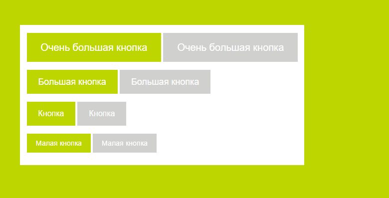
1. A single arrangement of key controls in different applications of the same ecosystem.
For the user to quickly navigate, “exit”, “help”, “username” should always be in one place on the site, in a mobile application, etc.
In our UI KIT, a whole section is devoted to all the various options for a header. And uniformity and continuity are clearly visible.
Similarly, the location of any information blocks is “logged”:
- Side Menu Page
- list page in the main body
- Big page
- A page with a large form without steps
- Large page with steps
- Search Form Page
- etc.
2. Common designations for sample data within each ecosystem.
Money, dates, statuses, text, time, periods ...
In the example below, a certain font, size, and font are selected to indicate dates, amounts, names, text blocks and various options. And exactly the same parameters are used for similar data types in all customer applications.
For example, when accountants work with Excel, the red color usually indicates the money spent. Therefore, when we create a financial system in which accountants will work, it is important to “color” money for them the way they are used to. If you highlight red, for example, profit, then accountants are nervous because, out of habit, their brain will read the “red” numbers as financial losses.
3. It is necessary to take into account the perception of colors by a person when choosing color schemes in interfaces, and for all services within the same ecosystem it is necessary to choose uniform color designations.
For example, if hints and help are indicated in yellow, then all prompting elements will be indicated in yellow and no other elements will be indicated in yellow.
Here is an example of an unsuccessful color scheme, which we refused. In one of the menu systems, our layout was red. However, red is more effective for emphasis than for filling basic information with it. In the user's perception, red color indicates either a warning about a threat / error, or prompts an action (red Buy button). Therefore, we abandoned the use of red and use it only to indicate the very costs or warnings.
4. A minimum of pictograms, and the pictograms used must be the same for all applications within the ecosystem. The key task here is to leave only those elements that are effective from the point of view of UX.
We came to understand that the icons often do not make life easier for the user, but make them play a guessing game. 10 years ago it was very popular to draw pictograms in interfaces. This was such a widespread practice that users considered the inevitable evil of the need to “learn” a new web application and remember what is behind this or that icon. However, in practice there are only a few dozen pictograms that the vast majority of Internet users understand unambiguously, for example, a cross in the meaning “close” or a sign more in the meaning “scroll further”
We, of course, also tried to invent an icon for each option:
But to guess what is behind each of them was possible only thanks to the tooltips:
In general, we refused to draw unnecessary pictures, now we use only the very minimum necessary. And then, they are not used on their own, but only to illustrate the information on the page.
And the list of such pictograms is clearly defined in the UI KIT.
5. We always emphasize the same way for different systems.
At each point in time, the user must be pushed to certain actions, placing emphasis. As accents, a bright font color, bold or “marker” highlighting, a “pressed” button, contrasting elements against the general background, dynamic elements, volumetric elements and so on can be used — here we will not reveal America to you. For the ecosystem, it is important that all systems adhere to the same principles for setting these same emphasis.
In our case, the gray highlighting of the active blocks of the interface, green accents for the selected options, the orange color of the main buttons are used in all applications. Below are two examples of interfaces designed according to the same principles for different target audiences - partners and agents, which in some cases overlap, as agents are part of the airline’s affiliate network.
6. We suggest the correct sequence of actions, and this sequence is the same for all systems.
An important component of the interface has become elements that help the user understand the correct sequence of actions on the page.
Now, in all airline systems, the logic of working with the interface and its visual implementation are identical.
4) Live embodiment: UI_Kit_ library for the customer’s product ecosystem
Ui kit
Практическим воплощением принципов единства экосистемы стало создание единого UI Kit для всех приложений одного из наших заказчиков. Для типизации всех элементов интерфейса наши дизайнеры провели анализ всех сделанных ранее для заказчика проектов и спроектировали UI Kit, основанный на фирменном стиле заказчика, который будет актуален в ближайшие несколько лет. В нем собраны все типовые страницы, элементы управления и их возможные состояния, а также полный сет необходимых иконок. При проектировании UI Kit’а ключевым моментом было обеспечение единого UX для всех систем.
Фактически UI Kit – это продолжение бренд-бука заказчика, только для цифровых носителей. Он позволяет выполнять те же задачи, что и обычный бренд-бук: повышать узнаваемость бренда, создавать определенный образ компании.
Based on the UI Kit, you can make any new or modify old applications. Designers build further projects on the basis of this catalog, thinking through only things that are unique to a particular project. As a result, the designer now spends more time specifically on designing the application, working on ergonomic and usability issues, rather than styling.
Below are examples of elements in the UI Kit:
An important feature of the UI Kit is that it not only regulates which elements should be required, but also leaves room for creativity, while maintaining the unity of style and uniformity of the UX.
Here is an example of New Year decoration while maintaining the uniformity of UX.
Now different systems look more predictable and understandable from the point of view of the user.
It was - it became:
From design to development
Naturally, things did not end on the development of a new design. Designed designs still need to be implemented in end applications. A single design concept means that in the code from project to project there will be much in common. Such code can be written once, saving time for implementation.
In addition to saving time for implementation, this approach has another advantage. UI Kit is not a reinforced concrete slab and its updating will continue even after the final systems are implemented. Sometimes even after they have gone into the maintenance phase from the active development phase. Therefore, it is important to ensure that developers have the opportunity to learn about updates to the UI Kit, understand what exactly has changed and how difficult it will be to implement these changes in their project, and to evaluate and plan the work to implement these changes.
And the last moment. In addition to changes in the design, errors are possible in css, embodying the designed design. And it would be good to make and correct these mistakes in one place, and not in every system.
The solution to these issues is quite obvious - to create a library that implements the concepts of the developed design, which we did.
If you do not complicate things and call a spade a spade, then we just developed a theme for bootstrap and packaged it into a private npm package. Further, developers install it “on top” of bootstrap and get the design they need.
We also developed a demo application, which shows all the features of the library and provides examples of typesetting necessary for the implementation of certain elements. In it, customers can lively “feel” this or that design idea even before it has spread to end applications. And, if necessary, make any additional requests.
In general, nothing complicated. A much more interesting question is how to technically equip the development process in such a way as to solve issues with updating the UI Kit and delivering these changes to final applications. But this will be our next story.
Total
- We learned how to create our own design language adapted to the specifics of the customer’s IT services ecosystem.
- Based on the experience of IT services of a particular customer, they turned the zoo into a single ecosystem. We developed a unified concept of UX, which will minimize “friction” when working with our systems.
- We created the UI Kit, which allows the customer to maintain and develop all their systems in a single style, and for our designers reduces the time spent on design work.
- We implemented the distribution of library updates in the form of an npm package, which, combined with competent versioning, helps to fix flaws and update the design painlessly and in isolation on each project.
- We have comprehensively illustrated the work of the library through a demo application, which allows developers to often get along not only without designers, but even without layout designers.
So…
We are developing the UI Kit for our next customer and continue to learn to speak with users in terms of the real world and make our software a continuation of this world, a simple and convenient tool.