Overview of innovations Android Design Support Library v28
- Transfer
Hello again.
We are approaching the launch date of our new Android Developer course , all that remains is nothing and there are some interesting materials that we share with everyone, including potential listeners.
Go.
The 28th Android Support Library was recently announced. In the current alpha version, we have access to a set of new interesting components. In this article I want to take a look at the additions that have been made to the Support Library in the form of Material View components.
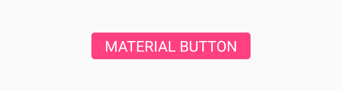
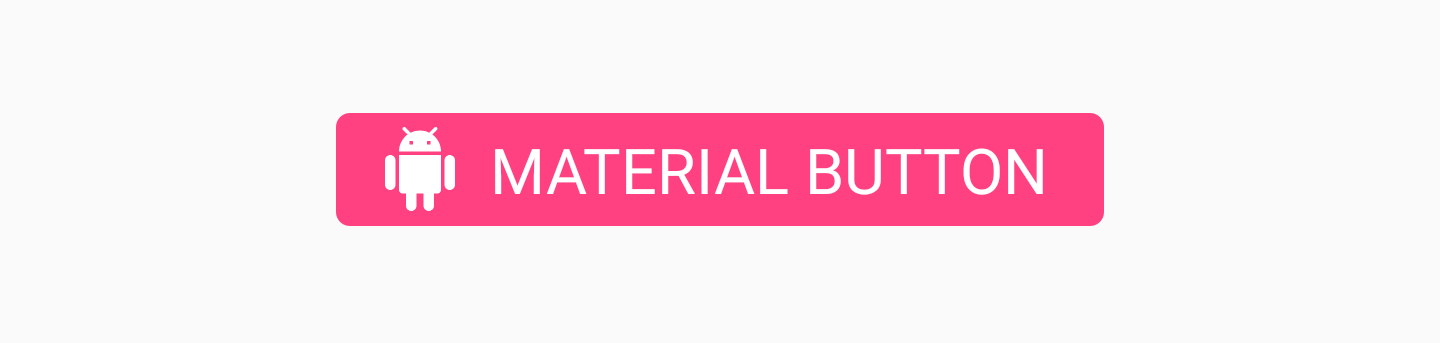
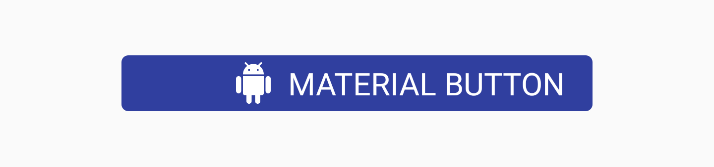
Material Button
MaterialButton is a widget that you can use to display a button in the material style in the user interface of applications. This class is inherited from the AppCompatButton class, which you probably already use in your projects, but what are the differences? By default, this button will already be framed with a material appearance without the need to customize it yourself, using the style flag. We can use the MaterialButton class as it is, because it will already have the material appearance that we need - consider it as a more convenient class.
We can add this button to our layout file as follows:
By default, this class will use the accent color of your theme to fill the background of the buttons and the white color for the text on them. If the button is not filled, then the accent color will be used for the text color on the button along with the transparent background.
If we want to add some additional styles to the button, we can do this using the MaterialButton style attribute set .


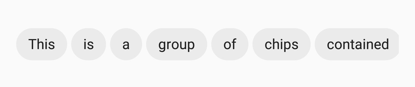
Chip Chip
component allows you to display chips in our layout. In essence, a chip is some text on a rounded background. Its purpose is to display to the user some form of a text set, which may or may not be selected. For example, chips can be used to display a list of selectable offers for a user based on the current context in your application.
We can add Chip to our layout, using, for example, an attribute
There is also a set of other attributes that can be used to further stylize a chip:


We can also hang listeners on our chip instances. They can be useful for tracking user interactions. If our chip can be chosen, most likely we will want to know when this state has been changed. We can do this with the help of a listener
The same applies if we want to listen to interactions with the delete icon. To do this, we can use the function
Chip Group
If we show a chipset to our users, we want to make sure that they are correctly grouped together in our presentation. To do this, we can use the ChipGroup view component :

If we want to use the ChipGroup , we just need to wrap our ChipView into the parent ChipGroup component :
By default, your ChipViews may seem a bit pressed together. If so, you can add spacing to child views using the following ChipGroup attributes:
We can also declare our child Chip Views displayed on the same line inside the ChipGroup container, using the attribute
In doing so, you need to wrap the ChipGroup in a scrolling view, for example
Material Card View
Probably, in our applications, we already used the component
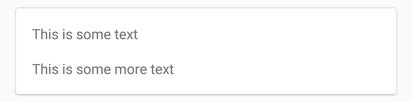
CardView can be added to your layout like this:
You can further stylize CardView using its two attributes:
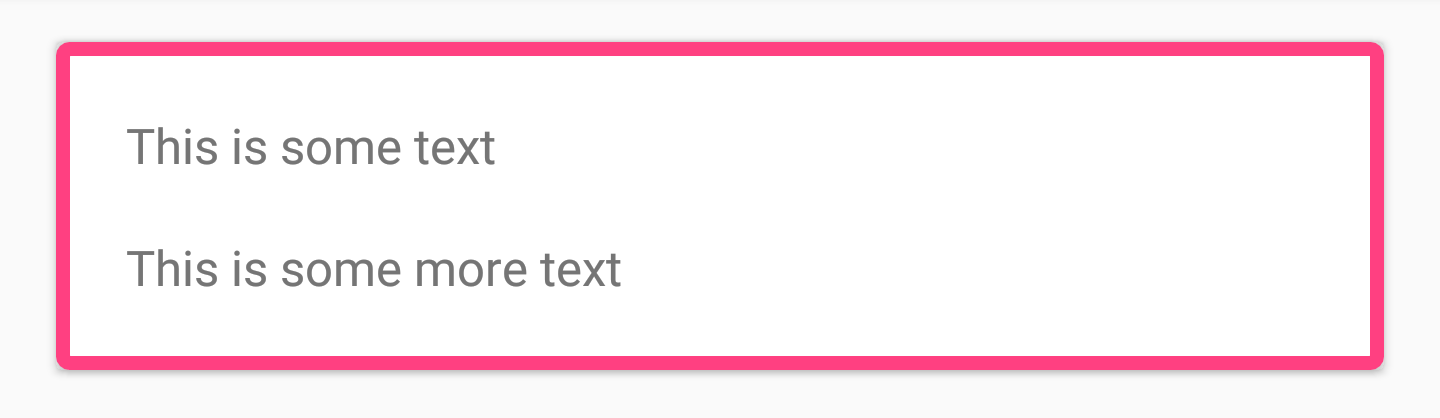
Together with these two attributes, you can also style CardView using the initially available attributes, such as
Bottom App Bar
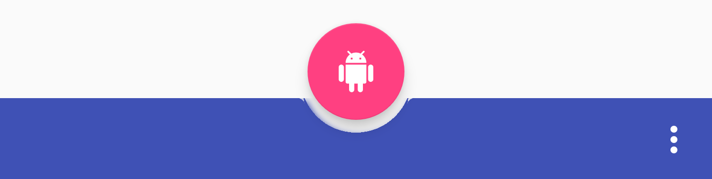
You can add
It looks like BottomAppBar should have a menu assigned to it so that it is displayed on the screen. This can be done programmatically as follows:
When it comes to styling BottomAppBar, there are a few attributes you can use.


or center:
Setting the dp value will allow FAB to move up vertically:
Conclusion
In my opinion, these are elegant additions to the Support Library. I look forward to using material-style components right out of the box, and I'm also glad to find a case where BottomAppBar can be used. I'm sure it takes some time for the Support Library version to become stable. As usual, I would like to hear your thoughts or comments about these new components!
THE END
We are waiting for your comments and questions that you can leave here or you can go to Barbara on an open day .
We are approaching the launch date of our new Android Developer course , all that remains is nothing and there are some interesting materials that we share with everyone, including potential listeners.
Go.
The 28th Android Support Library was recently announced. In the current alpha version, we have access to a set of new interesting components. In this article I want to take a look at the additions that have been made to the Support Library in the form of Material View components.
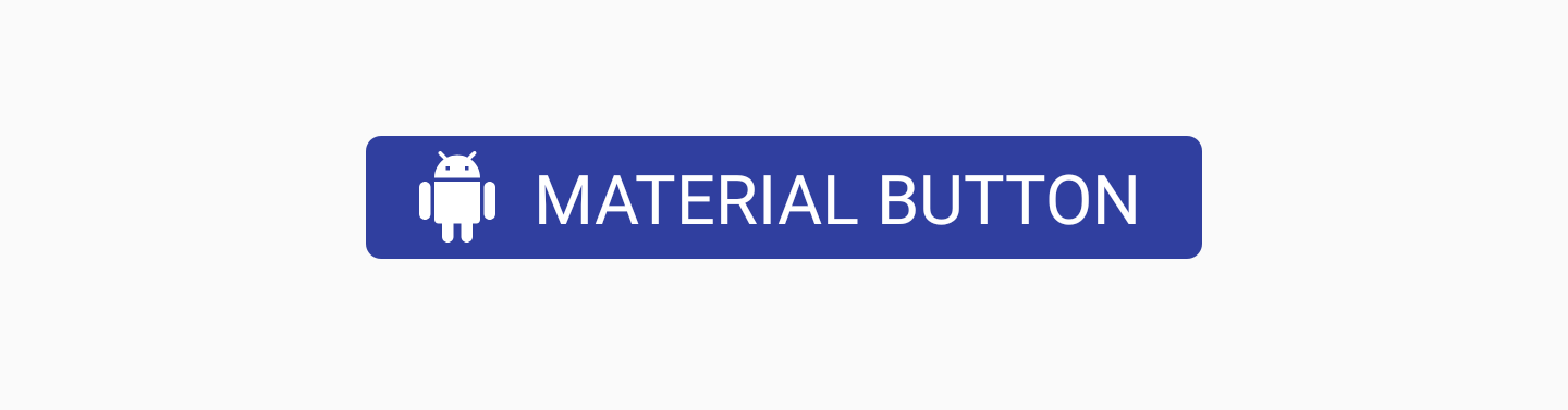
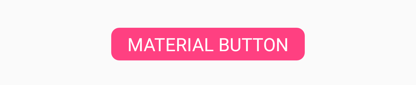
Material Button
MaterialButton is a widget that you can use to display a button in the material style in the user interface of applications. This class is inherited from the AppCompatButton class, which you probably already use in your projects, but what are the differences? By default, this button will already be framed with a material appearance without the need to customize it yourself, using the style flag. We can use the MaterialButton class as it is, because it will already have the material appearance that we need - consider it as a more convenient class.
We can add this button to our layout file as follows:
<android.support.design.button.MaterialButton
   android:layout_width="wrap_content"
   android:layout_height="wrap_content"
   android:text="MATERIAL BUTTON"
   android:textSize="18sp"
   app:icon="@drawable/ic_android_white_24dp" />
By default, this class will use the accent color of your theme to fill the background of the buttons and the white color for the text on them. If the button is not filled, then the accent color will be used for the text color on the button along with the transparent background.
If we want to add some additional styles to the button, we can do this using the MaterialButton style attribute set .
- app: icon - Used to define the displayed image at the beginning of the button.
- app: iconTint - Used to change the color of the icon defined in the app attribute: icon
- app: iconTintMode - Defines the mode that will be used to change the color of the icon.
- app: iconPadding - The indent that will be applied to the icon defined in the app attribute: icon
- app: additionalPaddingLeftForIcon - Specifies the indent to be applied to the left of the icon defined in the app attribute: icon
- app: additionalPaddingRightForIcon - Specifies the indent to be applied to the right of the icon defined in the app attribute: icon
- app: rippleColor - Button Pulsation Color
- app: backgroundTint - Used to apply a tint to the background of the button. If you want to change the background color of the button, use this attribute instead of background, so as not to violate the style of the buttons.
- app: backgroundTintMode - Used to determine which mode will be used to change the background hue.
- app: strokeColor - Button stroke color
- app: strokeWidth - Button Width
- app: cornerRadius - Used to determine the radius of the button corners
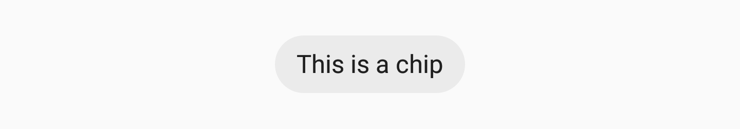
Chip Chip
component allows you to display chips in our layout. In essence, a chip is some text on a rounded background. Its purpose is to display to the user some form of a text set, which may or may not be selected. For example, chips can be used to display a list of selectable offers for a user based on the current context in your application.
We can add Chip to our layout, using, for example, an attribute
app:chipTextto set the text to be displayed on the chip:<android.support.design.chip.Chip
android:id="@+id/some_chip"
android:layout_width="wrap_content"
android:layout_height="wrap_content"
app:chipText="This is a chip" />There is also a set of other attributes that can be used to further stylize a chip:
- app: checkable - Used to declare whether a chip can be marked as selected / not selected. If disabled, chip selection behaves the same as with the button
- app: chipIcon - Used to display an icon in a chip
- app: closeIcon - Used to display the delete icon in the chip
We can also hang listeners on our chip instances. They can be useful for tracking user interactions. If our chip can be chosen, most likely we will want to know when this state has been changed. We can do this with the help of a listener
setOnCheckedChangeListener:some_chip.setOnCheckedChangeListener { button, checked -> }The same applies if we want to listen to interactions with the delete icon. To do this, we can use the function
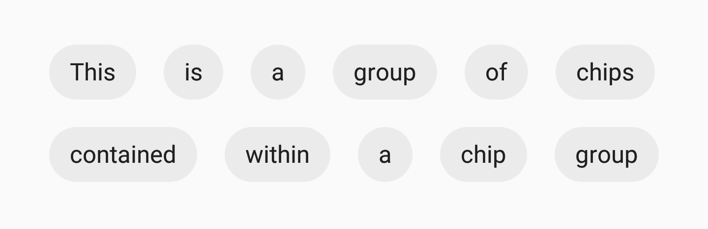
setOnCloseIconClickListener to register deletion events:some_chip.setOnCloseIconClickListener { }Chip Group
If we show a chipset to our users, we want to make sure that they are correctly grouped together in our presentation. To do this, we can use the ChipGroup view component :
If we want to use the ChipGroup , we just need to wrap our ChipView into the parent ChipGroup component :
<android.support.design.chip.ChipGroup
   android:layout_width="wrap_content"
   android:layout_height="wrap_content">
   <android.support.design.chip.Chip
       android:layout_width="wrap_content"
       android:layout_height="wrap_content"
       app:chipText="This" />
   <android.support.design.chip.Chip
       android:layout_width="wrap_content"
       android:layout_height="wrap_content"
       app:chipText="is" />
      //больше чипов...
</android.support.design.chip.ChipGroup>
By default, your ChipViews may seem a bit pressed together. If so, you can add spacing to child views using the following ChipGroup attributes:
- app: chipSpacing - Adds the distance both horizontally and vertically
- app: chipSpacingHorizontal - adds horizontal distance
- app: chipSpacingVertical - add vertical distance
We can also declare our child Chip Views displayed on the same line inside the ChipGroup container, using the attribute
app:singleLine: In doing so, you need to wrap the ChipGroup in a scrolling view, for example
HorizontalScrollView, so that your users can scroll the displayed chips:<HorizontalScrollView
android:layout_width="wrap_content"
android:layout_height="wrap_content">
<android.support.design.chip.ChipGroup
android:layout_width="wrap_content"
android:layout_height="wrap_content"
app:singleLine="true">
<android.support.design.chip.Chip
android:layout_width="wrap_content"
android:layout_height="wrap_content"
app:chipText="Some chip" />
// больше чипов...
</android.support.design.chip.ChipGroup>
</HorizontalScrollView>Material Card View
Probably, in our applications, we already used the component
CardViewat some point. The Support Library now has a component called MaterialCardView, which provides us with an out-of-the-box implementation stylized for material design. CardView can be added to your layout like this:
<android.support.design.card.MaterialCardView
   android:layout_width="match_parent"
   android:layout_height="wrap_content"
   android:layout_margin="16dp">
   ... child views ...
</android.support.design.card.MaterialCardView>
You can further stylize CardView using its two attributes:
- app: strokeColor - The color to be used for the stroke (must be set to display the stroke)
- app: strokeWidth - Stroke width
Together with these two attributes, you can also style CardView using the initially available attributes, such as
app:cardBackgroundColor, etc. The Bottom App Bar
BottomAppBar is a new component that allows us to display a component similar to a toolbar at the bottom of our layout. This allows us to display components for the user in such a way that it is easier to interact with them than, perhaps, with the standard toolbar. You can add
BottomAppBarto your layout file like this:<android.support.design.bottomappbar.BottomAppBar
android:layout_width="match_parent"
android:layout_height="wrap_content"
android:layout_gravity="bottom"
app:backgroundTint="@color/colorPrimary"
app:popupTheme="@style/ThemeOverlay.AppCompat.Light"
app:theme="@style/ThemeOverlay.AppCompat.Dark.ActionBar">It looks like BottomAppBar should have a menu assigned to it so that it is displayed on the screen. This can be done programmatically as follows:
bottom_app_bar.replaceMenu(R.menu.main)When it comes to styling BottomAppBar, there are a few attributes you can use.
- app: fabAttached - indicates whether a FAB has been attached to BottomAppBar. You can connect the FAB using the app: layout_anchor in the FAB component that you want to connect using the BottomAppBar identifier. If a FAB is attached, it will be inserted into the BottomAppBar, otherwise the FAB will remain above the BottomAppBar.
- app: fabAlignmentMode - Declares the position of the FAB that was attached to the BottomAppBar. This can be either the end:
or center:
- app: fabCradleVerticalOffset - Announces the vertical offset that will be used for the attached FAB. The default is 0dp.
Setting the dp value will allow FAB to move up vertically:
- app: backgroundTint - Used to change the hue of the presentation background. If you want to set the background color in the view, then you need to use the attribute
android:background. This will ensure the stability of the presentation.
Conclusion
In my opinion, these are elegant additions to the Support Library. I look forward to using material-style components right out of the box, and I'm also glad to find a case where BottomAppBar can be used. I'm sure it takes some time for the Support Library version to become stable. As usual, I would like to hear your thoughts or comments about these new components!
THE END
We are waiting for your comments and questions that you can leave here or you can go to Barbara on an open day .