Food Design Digest July 2016
For six years now, I have been publishing regular reviews of recent articles on the topic of interfaces, new tools and collections of patterns, interesting cases and historical stories. From the tapes of several hundred thematic subscriptions, approximately 5% of the publications worth publishing are selected, which are interesting to share. Previous materials: April 2010-June 2016 .

Testing Credit-Card Numbers In E-Commerce Checkouts (Cheat Sheet)
Andy Carter has put together a good selection of test credit card data to verify payment forms.
Mailing lists
Onboarding
ALT texts
Andrei Sundiev - Design Systems: From UI Kit to Live Guides
My colleague Andrei Sundiev described a piece of the current state of the Mail.Ru Group design system. The presentation describes very well the work with variables, current developments on live guidelines and other key aspects of unification. By the next spring, we will have material for the next version of a detailed story about our design system.
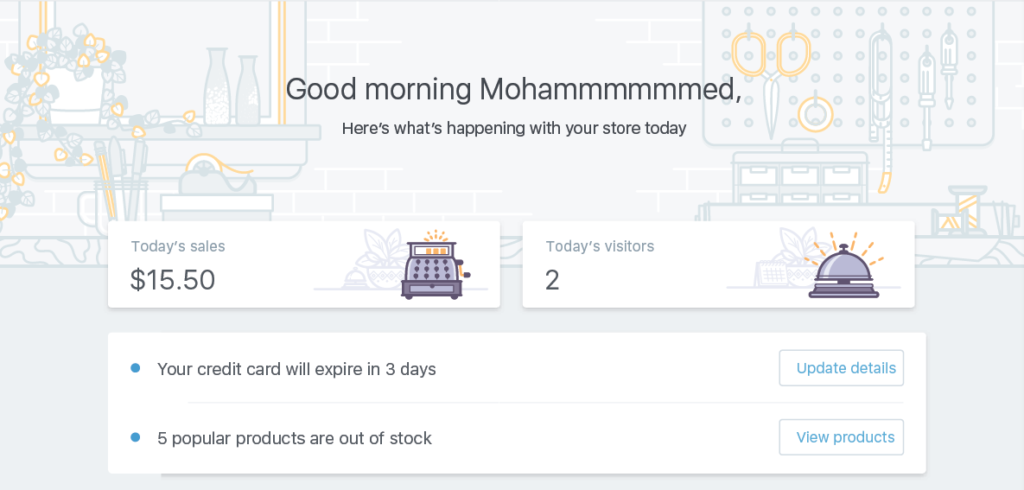
Building a New Illustration Style for Shopify
Meg Robichaud from Shopify talks about how the company created and implemented a new, unified style of illustrations and icons. Very good practical case. Pattern Lab 2.0 The second version of the framework has been released. In an article on Smashing Magazine, creators talk in detail about updates . Many interesting solutions, although integration with the main product code is still not very smooth. Demo build .
Other design systems news:
iOS 10
Material design
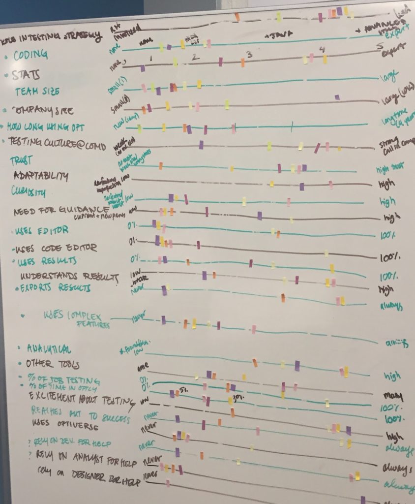
Building Personas at Optimizely
A great example of creating characters from the Optimizely team, based on qualitative and quantitative research, and used in real work. Vox Product Accessibility Guidelines An excellent checklist of general accessibility guidelines for people with disabilities from Vox Media. They want to make it open, so that anyone can make additions. Other materials on the topic:
The UX Secret That Will Ruin Apps For You
Fast Co.Design has collected product examples where deliberately slowing down the interface makes users feel calm. Request processing too fast raises concerns that the system simply did not work.
Jobs-to-be-done
Micro Moments -
AIC's Guide to Successful Mobile Marketing A translation of the Google Micro Moments Guide . It is also available as a presentation .
Content-First Prototyping
Translation of an Andy Fitzgerald article on an interesting approach to content prototyping. He set up a bunch of Excel and Jekyll static site generator with a couple of technology layers, so that he can quickly get an interactive prototype with real content and it’s very easy to update it.
Adobe xd
Sketch 39 Brings Symbol Resizing and Cloud Beta The
new version showed the rudiments of working with adaptability - symbols can have different logic when resizing. In addition, the update introduced the first version of Sketch Cloud for publishing layouts on the Internet. Translation and description of the principles of adaptability .
Other materials and plugins:
BotSociety.io - A chatbot sketch tool. Make video of a bot conversation
BotSociety tool allows you to quickly build a dialogue and check the interaction with the bot. Everything is done through a web form, the output is a video of work.
Axure RP 8
MockupEditor.com - The online mockup scene creator
An unusual service for a spectacular presentation of design. It allows you to assemble an entire scene from typical objects in which your product will be displayed on devices. Proto.io 6 The sixth generation of the instrument has been released. Work with animation has been simplified, a lot of interaction patterns have appeared, a bunch of tools for remote usability testing, and the ability to view screens in the form of a specification have appeared.

Principle
Reviews and comparisons of prototyping tools
IBM Design Research
IBM has published a user research manual. As in other design guides from the company, there is a lot of useful information on the approach, principles, cases. True, the description of specific methods refers to a third-party directory. The subtleties of selecting respondents for UX research Natalia Sprogis described in great detail the subtleties of selecting respondents for UX research. How Many Test Users? The number of respondents is determined by expectations of the accuracy of the study. There is a minimum, there is a reasonable optimum. What user researchers ought to know about informed consent

David Travis gives tips on how to get consent for user research from respondents. What to sign and what to just say.
SUS (System Usability Scale)
New scripts
Web Typography
Work with color on the web
Svg
Adaptability
Framer
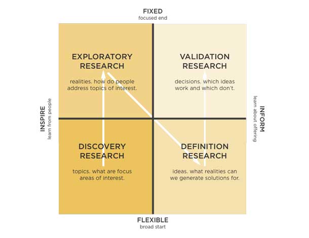
Designing Credible Studies - A Research Framework
An excellent approach by Meena Kothandaraman and Zarla Ludin to plan user research and “sell” their value to the business. Their model offers four stages of work on the product, each of which has its own value for the product manager and specific methods. Continuing the topic:
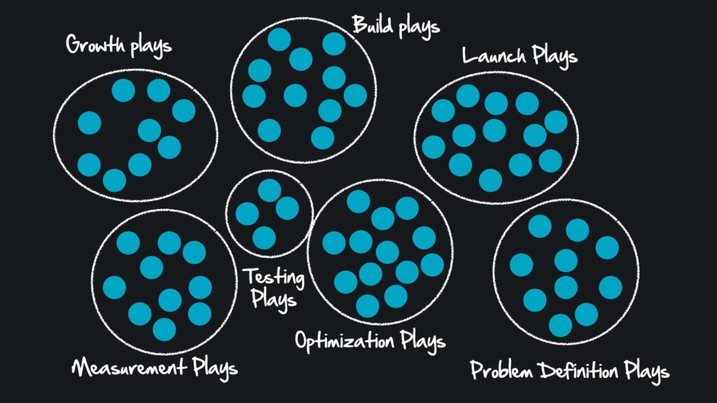
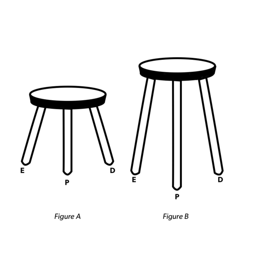
Great Products Don’t Happen By Accident
Jon Lax published an article based on his presentation, in which he offers an interesting approach to systematizing the methods of work of designers. He cites the example of American football coaches who always have a set of game games for any situation. This perfectly fits the process of working on the product. Defining Product Design - A Dispatch from Airbnb's Design Chief Alex Schleiffer, Airbnb's vice president of design, talks about how he has systematized in the company. Continuing the topic:
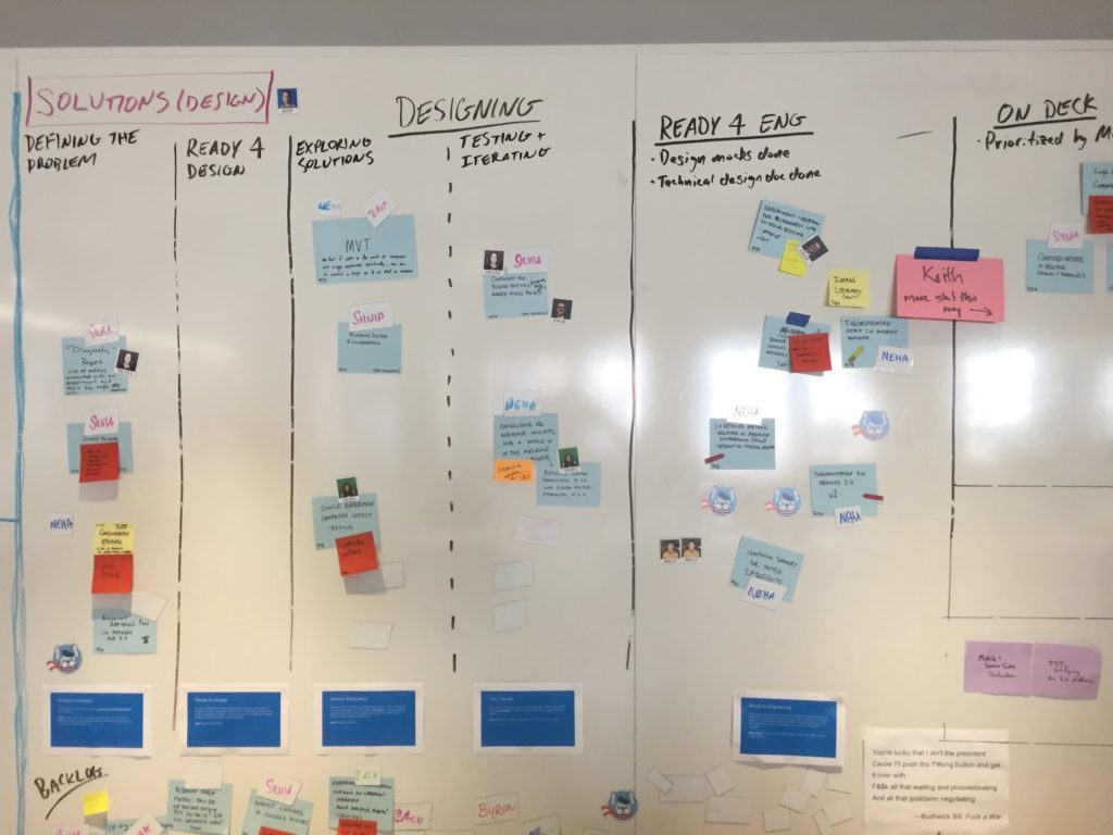
Discovery Kanban at Optimizely
How the product team Optimizely works in an iterative format. They divided the process into two parts (problem study and production), so that design and research fit well into agile development. Go Holistic - Assess the Maturity of Your Organization Via the Customer Experience Ger Joyce, Mindy Maxwell, Jay Brewer and Saurabh Dutta talk about the customer experience maturity model in the company. An Interview with Leah Buley Interview with Leah Buley about her work at Forrester. She recently left there and again works as a private consultant. Five Best Practices for Becoming a Data-Driven Design Organization, part 3
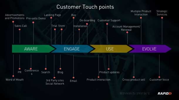
Michelle Bacigalupi describes the introduction of a systematic approach to working with user research and analytics in a well-known, but not named conferencing service. The third part of the article is dedicated to the process and hiring.
Minimum Valuable Problem
Scott Sehlhorst suggests thinking with the term Minimum Valuable Problem instead of the Minimum Viable Product. A well-described minimal solution to the problem is already a minimally sufficient product, while an early version of the product that solves the problem only by half has limited usefulness.
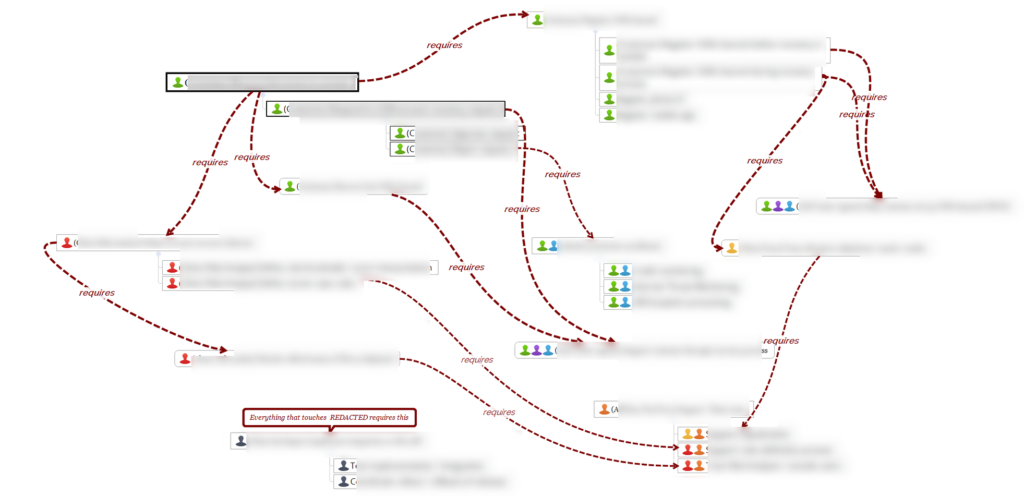
Redesign Cases
Непрошенные редизайны
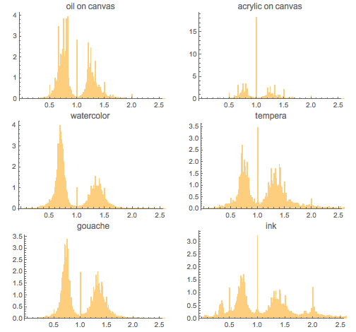
Aspect Ratios in Art - What Is Better Than Being Golden? Being Plastic, Rooted, or Just Rational? Investigating Aspect Ratios of Old vs. Modern Paintings The
coolest study of works of art on the subject of whether they follow the proportions of the golden ratio. The quick answer is no, this is not a general rule. Translation . Y Combinator's Xerox Alto: restoring the legendary 1970s GUI computer Y Combinator wants to restore the legendary Xerox Alto computer, the first commercial product with a graphical user interface. The article has a very good history of the product and the GUI in general. Great Apps Timeline Great Apps Timeline website collects different design versions of well-known mobile applications.
 Machine Learning for Designers
A cool free report / mini-book on machine learning for designers from O'Reilly. This year the topic has become especially hot and it is important for designers to understand the principles of these technologies.
The Complete Beginner's Guide To Chatbots
A Bot Making Guide by Matt Schlicht. Translation . Other materials on the topic:

Templates for UI design in VR
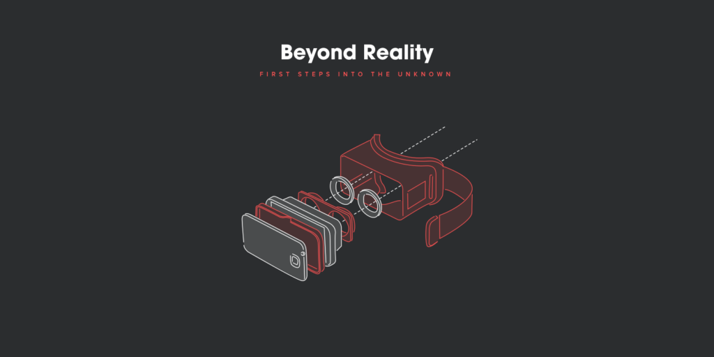
Design principles for virtual reality by Sam Applebee from Kickpush. DesignX - Complex Sociotechnical Systems Detailed article by Donald Norman and Pieter Jan Stappers on DesignX. Their understanding of the term and the essence of similar tasks over the past year has deepened. At the end of the article there is an interesting discussion with the participants of a seminar on this topic, held in December 2015 in China. Continuing the topic:
Car interfaces
Algorithmic Design
10 Emerging Digital Health Trends You Can't Miss in 2016
VentureClash Digital Medicine Trends for This Year. The most interesting for us is No. 7: special attention to improving UX. Translation .
Web Design in 4 minutes
Great simple tutorial on design basics by Jeremy Thomas. As you progress through key messages, the page turns from bare text to neatly designed. Why So Many UX Analogies? Recently, more and more controversial articles have been published in the spirit of "what the UX can learn from the Game of Thrones." Jim Ross discusses whether they are useful and why people love them so much. Careers in UX - How different organizations approach user experience design Laith Ulaby quite succinctly describes the pros and cons of working as a designer in four types of companies. Product company, agency, startup and a third-party IT organization.


Instacart Design Instacart Design
Team Blog.
Peek Inside a Facebook Design Critique
The Facebook design team is publishing a transcript of one of its critique sessions as part of a feedback initiative for third-party projects.
Jokes about designers for 400
Product Design Intensive from the Mail.Ru Group team in Britannica A
detailed report on the product design intensive in Britannica, which was supervised by Mail.Ru Group designers. Here are collected all the presentations that our team read and the educational projects that students made. Fresh links can also be tracked in the same Facebook group or receive once a month by mail . Thanks to everyone who also publishes links in it, especially Gennady Dragun, Pavel Skripkin, Dmitry Podluzhny, Anton Artemov, Denis Efremov, Alexei Kopylov, Taras Brizitsky, Evgeny Sokolov and Anton Oleinik. More and more materials appear in reviews thanks to them. Subscribe to our newsletter ! A letter arrives once a month.


Patterns and Best Practices
Testing Credit-Card Numbers In E-Commerce Checkouts (Cheat Sheet)
Andy Carter has put together a good selection of test credit card data to verify payment forms.
Mailing lists
Onboarding
ALT texts
Guidelines for platforms and companies
Andrei Sundiev - Design Systems: From UI Kit to Live Guides
My colleague Andrei Sundiev described a piece of the current state of the Mail.Ru Group design system. The presentation describes very well the work with variables, current developments on live guidelines and other key aspects of unification. By the next spring, we will have material for the next version of a detailed story about our design system.
Building a New Illustration Style for Shopify
Meg Robichaud from Shopify talks about how the company created and implemented a new, unified style of illustrations and icons. Very good practical case. Pattern Lab 2.0 The second version of the framework has been released. In an article on Smashing Magazine, creators talk in detail about updates . Many interesting solutions, although integration with the main product code is still not very smooth. Demo build .

Other design systems news:
- Translation of an article on the GE Predix design system .
- Lucid Particle Design System by Lucid Software. How designers use it for prototyping .
- The design system of US government sites has been updated .
iOS 10
Material design
- The Rivalry company is another external studio that was involved in working on material design . They also helped with the new Google logo .
User understanding
Building Personas at Optimizely
A great example of creating characters from the Optimizely team, based on qualitative and quantitative research, and used in real work. Vox Product Accessibility Guidelines An excellent checklist of general accessibility guidelines for people with disabilities from Vox Media. They want to make it open, so that anyone can make additions. Other materials on the topic:


- The story of Jordyn Castor, an Apple developer who is blind from birth .
- Addy Osmani on creating accessible interfaces . The article provides links to resources that will help in developing affordable projects.
- Shopify's Tetsuro Takara shares experience creating sophisticated spreadsheets that meet availability requirements .
The UX Secret That Will Ruin Apps For You
Fast Co.Design has collected product examples where deliberately slowing down the interface makes users feel calm. Request processing too fast raises concerns that the system simply did not work.
Jobs-to-be-done
- Chris Spiek talks about how to use jobs to be done to analyze individual product features .
- About the job stories technique used by the Intercom team . Jobs to be done has been proposed for physical products and does not always go smoothly for digital products.
Information architecture, conceptual design, content strategy
Micro Moments -
AIC's Guide to Successful Mobile Marketing A translation of the Google Micro Moments Guide . It is also available as a presentation .
Content-First Prototyping
Translation of an Andy Fitzgerald article on an interesting approach to content prototyping. He set up a bunch of Excel and Jekyll static site generator with a couple of technology layers, so that he can quickly get an interactive prototype with real content and it’s very easy to update it.
Design and design of interface screens
Adobe xd
- In the July beta, you can copy elements from Sketch, PowerPoint and InDesign, as well as export to PDF. More features in prototyping and scaling scenarios. Translation .
- Manuela Langella step by step describes the work of creating thumbnails in Adobe XD.
Sketch 39 Brings Symbol Resizing and Cloud Beta The
new version showed the rudiments of working with adaptability - symbols can have different logic when resizing. In addition, the update introduced the first version of Sketch Cloud for publishing layouts on the Internet. Translation and description of the principles of adaptability .
Other materials and plugins:
- Anthony Collurafici shows how to assemble an adaptive column grid in Sketch 39 , which will also change in steps (for example, 8px).
- Funny plugin that presents layouts in virtual reality . A few words from the author .
- Sketch Starter Guide for Beginners by Toru Nagahama and Angie Yuanmalai .
- The Prism plugin makes the document palette in one of the artboards and gives them beautiful human names .
- Reony Tonneyck gives tips on creating spreadsheets that will intelligently stretch .
- Focus plugin for personal productivity and list management improvements .
- Shapr plugin allows you to create shapes using hot keys .
BotSociety.io - A chatbot sketch tool. Make video of a bot conversation
BotSociety tool allows you to quickly build a dialogue and check the interaction with the bot. Everything is done through a web form, the output is a video of work.
Axure RP 8
MockupEditor.com - The online mockup scene creator
An unusual service for a spectacular presentation of design. It allows you to assemble an entire scene from typical objects in which your product will be displayed on devices. Proto.io 6 The sixth generation of the instrument has been released. Work with animation has been simplified, a lot of interaction patterns have appeared, a bunch of tools for remote usability testing, and the ability to view screens in the form of a specification have appeared.

Principle
Reviews and comparisons of prototyping tools
User research and testing, analytics
IBM Design Research
IBM has published a user research manual. As in other design guides from the company, there is a lot of useful information on the approach, principles, cases. True, the description of specific methods refers to a third-party directory. The subtleties of selecting respondents for UX research Natalia Sprogis described in great detail the subtleties of selecting respondents for UX research. How Many Test Users? The number of respondents is determined by expectations of the accuracy of the study. There is a minimum, there is a reasonable optimum. What user researchers ought to know about informed consent


David Travis gives tips on how to get consent for user research from respondents. What to sign and what to just say.
SUS (System Usability Scale)
Visual programming and design in the browser
New scripts
- The tracking.js library facilitates the use of computer vision techniques .
- The Barba.js library allows you to make animated transitions between the pages of the site, which makes navigation more smooth. Luigi De Rosa talks about how it works .
- Whitewater library for auto-playing videos on mobile. How does it work ?
- Chris Coyier describes the pitfalls of creating dialog boxes that meet all modern standards .
Web Typography
Work with color on the web
- The WebKit blog describes the future of web technologies that will soon be able to support extended color profile screens that are gradually appearing on the market.
Svg
- How to preserve thumbnail style when scaling . Some SVG elements may remain intact when resized.
- How to make SVG accessible to people with disabilities .
- Michael Ngo walks you through the steps for creating animated artwork in SVG .
Adaptability
Framer
- An application for viewing prototypes on iOS has been released . It costs $ 9.99.
- The Facebook team has posted its collection of scripts for Framer .
UX Strategy and Management
Designing Credible Studies - A Research Framework
An excellent approach by Meena Kothandaraman and Zarla Ludin to plan user research and “sell” their value to the business. Their model offers four stages of work on the product, each of which has its own value for the product manager and specific methods. Continuing the topic:

- Julie Zhuo talks about how designers work with metrics .
- Intercom Des Traynor writes about the importance of not getting carried away with snacks when working on a product . There are many things that are easy to do and run, but which do not give much benefit to users and businesses, while taking away the strength of the team.
Great Products Don’t Happen By Accident
Jon Lax published an article based on his presentation, in which he offers an interesting approach to systematizing the methods of work of designers. He cites the example of American football coaches who always have a set of game games for any situation. This perfectly fits the process of working on the product. Defining Product Design - A Dispatch from Airbnb's Design Chief Alex Schleiffer, Airbnb's vice president of design, talks about how he has systematized in the company. Continuing the topic:


- How the design team of the FanDuel sports app works .
- Stanley Wood, дизайн-директор Spotify, рассказывает о способах масштабирования дизайна. Два основных столпа — дизайн-система и грамотная система контроля качества. Перевод.
- Richard Banfield выложил в открытом доступе главу № 1 из своей книги «Design Leadership». Она называется «Mastering the art of leading a design organization».
Discovery Kanban at Optimizely
How the product team Optimizely works in an iterative format. They divided the process into two parts (problem study and production), so that design and research fit well into agile development. Go Holistic - Assess the Maturity of Your Organization Via the Customer Experience Ger Joyce, Mindy Maxwell, Jay Brewer and Saurabh Dutta talk about the customer experience maturity model in the company. An Interview with Leah Buley Interview with Leah Buley about her work at Forrester. She recently left there and again works as a private consultant. Five Best Practices for Becoming a Data-Driven Design Organization, part 3


Michelle Bacigalupi describes the introduction of a systematic approach to working with user research and analytics in a well-known, but not named conferencing service. The third part of the article is dedicated to the process and hiring.
Product Management and Analytics
Minimum Valuable Problem
Scott Sehlhorst suggests thinking with the term Minimum Valuable Problem instead of the Minimum Viable Product. A well-described minimal solution to the problem is already a minimally sufficient product, while an early version of the product that solves the problem only by half has limited usefulness.

Cases
Redesign Cases
- Jessie Chen talks about redesigning Lyft's taxi booking application .
- Pendar Yousefi talks about redesigning Google AdWords . Translation .
- Как Salesforce переделывали один из ключевых продуктов Sales Cloud и налаживали agile-процесс.
- Рассказ о принципах навигации в новом приложении VSCO.
Непрошенные редизайны
История
Aspect Ratios in Art - What Is Better Than Being Golden? Being Plastic, Rooted, or Just Rational? Investigating Aspect Ratios of Old vs. Modern Paintings The
coolest study of works of art on the subject of whether they follow the proportions of the golden ratio. The quick answer is no, this is not a general rule. Translation . Y Combinator's Xerox Alto: restoring the legendary 1970s GUI computer Y Combinator wants to restore the legendary Xerox Alto computer, the first commercial product with a graphical user interface. The article has a very good history of the product and the GUI in general. Great Apps Timeline Great Apps Timeline website collects different design versions of well-known mobile applications.

Trends
 Machine Learning for Designers
A cool free report / mini-book on machine learning for designers from O'Reilly. This year the topic has become especially hot and it is important for designers to understand the principles of these technologies.
The Complete Beginner's Guide To Chatbots
A Bot Making Guide by Matt Schlicht. Translation . Other materials on the topic:

Templates for UI design in VR
Design principles for virtual reality by Sam Applebee from Kickpush. DesignX - Complex Sociotechnical Systems Detailed article by Donald Norman and Pieter Jan Stappers on DesignX. Their understanding of the term and the essence of similar tasks over the past year has deepened. At the end of the article there is an interesting discussion with the participants of a seminar on this topic, held in December 2015 in China. Continuing the topic:

- Intercom's Emmet Connolly shares similar thoughts . Modern systems are becoming more complex and this requires new skills from designers.
Car interfaces
- An interesting eye-tracking-study of how a Formula 1 driver sees what is happening on the track . How the gaze runs and what it stops at.
Algorithmic Design
10 Emerging Digital Health Trends You Can't Miss in 2016
VentureClash Digital Medicine Trends for This Year. The most interesting for us is No. 7: special attention to improving UX. Translation .
For general and professional development
Web Design in 4 minutes
Great simple tutorial on design basics by Jeremy Thomas. As you progress through key messages, the page turns from bare text to neatly designed. Why So Many UX Analogies? Recently, more and more controversial articles have been published in the spirit of "what the UX can learn from the Game of Thrones." Jim Ross discusses whether they are useful and why people love them so much. Careers in UX - How different organizations approach user experience design Laith Ulaby quite succinctly describes the pros and cons of working as a designer in four types of companies. Product company, agency, startup and a third-party IT organization.


People and companies in the industry
Instacart Design Instacart Design
Team Blog.
Peek Inside a Facebook Design Critique
The Facebook design team is publishing a transcript of one of its critique sessions as part of a feedback initiative for third-party projects.
Jokes about designers for 400
- The irony over letters from customers introducing "a little bit of minor corrections . " The article has a funny chronology of correspondence between a client and a designer in this style.
Conference proceedings
Product Design Intensive from the Mail.Ru Group team in Britannica A
detailed report on the product design intensive in Britannica, which was supervised by Mail.Ru Group designers. Here are collected all the presentations that our team read and the educational projects that students made. Fresh links can also be tracked in the same Facebook group or receive once a month by mail . Thanks to everyone who also publishes links in it, especially Gennady Dragun, Pavel Skripkin, Dmitry Podluzhny, Anton Artemov, Denis Efremov, Alexei Kopylov, Taras Brizitsky, Evgeny Sokolov and Anton Oleinik. More and more materials appear in reviews thanks to them. Subscribe to our newsletter ! A letter arrives once a month.

