How the principal component analysis (PCA) works with a simple example

In this article, I would like to talk about how exactly the principal component analysis (PCA) method works from the point of view of intuition behind its mathematical apparatus. As simple as possible, but in detail.
Mathematics is generally a very beautiful and elegant science, but sometimes its beauty is hidden behind a bunch of layers of abstraction. It is best to show this beauty with simple examples that, so to speak, can be twisted, played and touched, because in the end everything turns out to be much easier than it seems at first glance - the most important thing is to understand and imagine.
In data analysis, as in any other analysis, it can sometimes be useful to create a simplified model that describes the actual state of affairs as accurately as possible. It often happens that the signs are pretty much dependent on each other and their simultaneous presence is redundant.
For example, our fuel consumption is measured in liters per 100 kilometers, and in the United States in miles per gallon. At first glance, the values are different, but in reality they are strictly dependent on each other. At a mile 1600m, and in a gallon 3.8l. One sign strictly depends on the other, knowing one, we know the other.
But much more often it happens that the signs depend on each other not so strictly and (which is important!) Not so explicitly. The volume of the engine as a whole has a positive effect on acceleration to 100 km / h, but this is not always true. And it may turn out that, taking into account factors that are not visible at first glance (such as improving fuel quality, using lighter materials and other modern achievements), the year of the car is not strong, but it also affects its acceleration.
Knowing the dependencies and their strength, we can express several features through one, merge together, so to speak, and work with a simpler model. Of course, it is most likely that it will not be possible to avoid information loss, but just the PCA method will help us minimize it.
Expressed more strictly, this method approximates an n-dimensional cloud of observations to an ellipsoid (also n-dimensional), whose semiaxes will be the future main components. And when projecting onto such axes (dimensionality reduction), the largest amount of information is stored.
Step 1. Data Preparation
Here, for the simplicity of the example, I will not take real training datasets for dozens of signs and hundreds of observations, but I will make my own, as simple a toy example as possible. 2 signs and 10 observations will be quite enough to describe what, and most importantly - why, happens in the bowels of the algorithm.
Generate a sample:
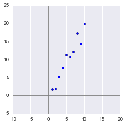
x = np.arange(1,11)
y = 2 * x + np.random.randn(10)*2
X = np.vstack((x,y))
print X
OUT:
[[  1.2.3.4.5.6.7.8.9.10.        ]
 [  2.734469084.351227227.2113298811.248726019.5810344412.0986507913.7870679413.8530122115.2900391118.0998018 ]]
In this sample, we have two features strongly correlating with each other. Using the PCA algorithm, we can easily find a feature-combination and, at the cost of a piece of information, express both of these features with one new one. So let's get it right!
First, some statistics. Recall that moments are used to describe a random variable. We need - mat. expectation and variance. We can say that mat. expectation is the "center of gravity" of magnitude, and variance is its "size". Roughly speaking, mat. expectation sets the position of a random variable, and variance determines its size (more precisely, the spread).
The process of projecting onto a vector does not affect the mean values in any way, since to minimize information loss, our vector must go through the center of our sample. Therefore, it’s okay if we center our sample - linearly shift it so that the average values of the attributes are 0. This will greatly simplify our further calculations (although it is worth noting that you can do without centering).
The inverse of the shift operator will be equal to the vector of the initial average values - it will be needed to restore the sample to its original dimension.

Xcentered = (X[0] - x.mean(), X[1] - y.mean())
m = (x.mean(), y.mean())
print Xcentered
print"Mean vector: ", m
OUT:
(array([-4.5, -3.5, -2.5, -1.5, -0.5,  0.5,  1.5,  2.5,  3.5,  4.5]),
 array([-8.44644233, -8.32845585, -4.93314426, -2.56723136,  1.01013247,
         0.58413394,  1.86599939,  7.00558491,  4.21440647,  9.59501658]))
Mean vector:  (5.5, 10.314393916)
Dispersion, on the other hand, strongly depends on the orders of values of a random variable, i.e. sensitive to scaling. Therefore, if the units of measurement of features vary greatly in their orders, it is highly recommended to standardize them. In our case, the values are not very different in orders, so for simplicity of the example we will not perform this operation.
Step 2. Covariance matrix
In the case of a multidimensional random variable (random vector), the position of the center will still be mate. expectations of its projections on the axis. But to describe its shape, only its dispersions along the axes are not enough. Look at these graphs, all three random variables have the same expectation and variance, and their projections on the axis as a whole will be the same!

To describe the shape of a random vector, a covariance matrix is needed.
This is a matrix in which the (i, j) -element is a correlation of features (X i , X j ). Recall the covariance formula:

In our case, it is simplified, since
Note that when X i = X j :

and this is true for any random variables.
Thus, in our matrix diagonally there will be variances of attributes (since i = j), and in the remaining cells there will be covariance of the corresponding pairs of attributes. And due to the symmetry of the covariance, the matrix will also be symmetric.
Note: The covariance matrix is a generalization of variance to the case of multidimensional random variables - it also describes the shape (spread) of a random variable, as well as variance.
Indeed, the variance of a one-dimensional random variable is a 1x1 covariance matrix in which its only term is given by the formula Cov (X, X) = Var (X).
So, we form the covariance matrix Σ for our sample. To do this, we calculate the variances X i and X j , as well as their covariance. You can use the above formula, but since we are armed with Python, it’s a sin not to use the numpy.cov (X) function . It takes as input a list of all the attributes of a random variable and returns its covariance matrix and where X is an n-dimensional random vector (n-number of rows). The function is excellent for calculating the unbiased dispersion, and for the covariance of two quantities, and for compiling the covariance matrix.
(Recall that in Python, a matrix is represented as a column array of row arrays.)
covmat = np.cov(Xcentered)
print covmat, "\n"print"Variance of X: ", np.cov(Xcentered)[0,0]
print"Variance of Y: ", np.cov(Xcentered)[1,1]
print"Covariance X and Y: ", np.cov(Xcentered)[0,1]
OUT:
[[  9.1666666717.93002811]
 [ 17.9300281137.26438587]]
Variance of X:  9.16666666667
Variance of Y:  37.2643858743
Covariance X and Y:  17.9300281124
Step 3. Eigenvectors and values (aigenpairs)
Okay, we got a matrix describing the shape of our random variable, from which we can get its dimensions in x and y (i.e., X 1 and X 2 ), as well as an approximate shape on the plane. Now we need to find such a vector (in our case, only one) at which the size (variance) of the projection of our sample on it would be maximized.
Note: Generalization of variance to higher dimensions is a covariance matrix, and these two concepts are equivalent. When projecting onto a vector, the variance of the projection is maximized; when projecting onto spaces of large orders, its entire covariance matrix is maximized.
So, we take the unit vector onto which we will project our random vector X. Then the projection onto it will be equal to v T X. The variance of the projection onto the vector will accordingly be Var (v T X). In general form, in vector form (for centered quantities), the variance is expressed as follows:
Accordingly, the variance of the projection:
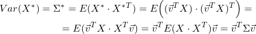
It is easy to see that the variance is maximized at the maximum value v T Σv. Here Rayleigh’s attitude will help us. Without going too deep into mathematics, I’ll just say that the Rayleigh relation has a special case for covariance matrices:
and

The last formula should be familiar with the topic of decomposing a matrix into eigenvectors and values. x is an eigenvector, and λ is an eigenvalue. The number of eigenvectors and values is equal to the size of the matrix (and the values can be repeated).
By the way, in English, eigenvalues and vectors are called eigenvalues and eigenvectors, respectively.
It seems to me that it sounds much more beautiful (and brief) than our terms.
Thus, the direction of the maximum dispersion in the projection always coincides with the eigenvector, which has the maximum eigenvalue equal to the value of this dispersion .
And this is also true for projections onto a larger number of dimensions — the variance (covariance matrix) of the projection onto the m-dimensional space will be maximum in the direction of m aigenvectors having maximum eigenvalues.
The dimension of our sample is two and the number of eigenvectors in it, respectively, is 2. Find them.
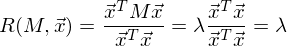
The numpy library implements the numpy.linalg.eig (X) functionwhere X is the square matrix. It returns 2 arrays - an array of eigenvalues and an array of eigenvectors (column vectors). And the vectors are normalized - their length is 1. Just what you need. These 2 vectors define a new basis for the sample, such that its axes coincide with the semiaxes of the approximating ellipse of our sample.
In this graph, we approximated our sample with an ellipse with radii of 2 sigma (i.e., it should contain 95% of all observations - which, in principle, we observe here). I inverted the larger vector (the eig (X) function directed it in the opposite direction) - the direction, not the orientation of the vector, is important to us.
Step 4. Dimension reduction (projection)
The largest vector has a direction similar to the regression line and, projecting our sample onto it, we will lose information comparable to the sum of the remaining terms of the regression (only the distance is now Euclidean, not the delta in Y). In our case, the relationship between the signs is very strong, so the loss of information will be minimal. The “price” of the projection — the variance over the smaller eigenvector — is very small, as can be seen from the previous graph.
Note: the diagonal elements of the covariance matrix show variances along the original basis, and its eigenvalues show them according to the new basis (along the main components).
It is often required to estimate the amount of lost (and stored) information. It is most convenient to present as a percentage. We take the variances along each axis and divide by the total sum of the variances along the axes (i.e., the sum of all the eigenvalues of the covariance matrix).
Thus, our larger vector describes 45.994 / 46.431 * 100% = 99.06%, and the smaller, respectively, is approximately 0.94%. Discarding the smaller vector and projecting the data to the larger one, we will lose less than 1% of the information! Excellent result!
Note: In practice, in most cases, if the total loss of information is not more than 10-20%, then you can safely reduce the dimension.
To carry out the projection, as mentioned earlier in step 3, it is necessary to carry out the operation v T X (the vector must be of length 1). Or, if we do not have a single vector, and the hyperplane, then instead of a vector v T we take the matrix of basis vectors of the V T . The resulting vector (or matrix) will be an array of projections of our observations.
_, vecs = np.linalg.eig(covmat)
v = -vecs[:,1])
Xnew = dot(v,Xcentered)
print Xnew
OUT:
[ -9.56404107-9.02021624-5.52974822-2.964812620.689338590.744066452.334334927.393079745.321274210.59672425]
dot (X, Y) is the term product (so we multiply vectors and matrices in Python)
It is easy to see that the values of the projections correspond to the picture in the previous graph.
Step 5. Data Recovery
It is convenient to work with a projection, build hypotheses on its basis, and develop models. But not always received the main components will have a clear, understandable to an outsider, meaning. It is sometimes useful to decode, for example, detected outliers in order to see what observations are behind them.
It is very simple. We have all the necessary information, namely the coordinates of the basis vectors in the original basis (the vectors onto which we projected) and the vector of means (to cancel centering). Take, for example, the largest value: 10.596 ... and decode it. To do this, multiply it on the right by the transposed vector and add the vector of means, or in general form for the whole sample: X T v T + m
n = 9#номер элемента случайной величины
Xrestored = dot(Xnew[n],v) + m
print'Restored: ', Xrestored
print'Original: ', X[:,n]
OUT:
Restored:  [ 10.1386436119.84190935]
Original:  [ 10.19.9094105]
The difference is small, but it is. After all, the lost information is not restored. Nevertheless, if simplicity is more important than accuracy, the restored value perfectly approximates the original.
Instead of a conclusion - an algorithm check
So, we disassembled the algorithm, showed how it works on a toy example, now it remains only to compare it with the PCA implemented in sklearn - because we will use it.
from sklearn.decomposition import PCA
pca = PCA(n_components = 1)
XPCAreduced = pca.fit_transform(transpose(X))
The n_components parameter indicates the number of dimensions onto which the projection will be performed, that is, up to how many dimensions we want to reduce our dataset. In other words, these are n eigenvectors with the largest eigenvalues. Check the result of reducing the dimension:
print'Our reduced X: \n', Xnew
print'Sklearn reduced X: \n', XPCAreduced
OUT:
Our reduced X:
[ -9.56404106-9.02021625-5.52974822-2.964812620.689338590.744066452.334334927.393079745.321274210.59672425]
Sklearn reduced X:
[[ -9.56404106]
 [ -9.02021625]
 [ -5.52974822]
 [ -2.96481262]
 [  0.68933859]
 [  0.74406645]
 [  2.33433492]
 [  7.39307974]
 [  5.3212742 ]
 [ 10.59672425]]
We returned the result as a matrix of observation column vectors (this is a more canonical view in terms of linear algebra), while PCA in sklearn returns a vertical array.
In principle, this is not critical, it’s just worth noting that in linear algebra it is canonical to write matrices through column vectors, and in the analysis of data (and other areas related to the database), observations (transactions, records) are usually written in rows.
Let's check the other parameters of the model as well - the function has a number of attributes that allow access to intermediate variables:
- Vector of means: mean_
- Projection vector (matrix): components_
- Dispersion of the projection axes (selective): explained_variance_
- Information share (share of the total variance):explained_variance_ratio_
Note: explained_variance_ shows the sample variance, while the cov () function calculates the unbiased variance to construct the covariance matrix !
Compare the values we obtained with the values of the library function.
print'Mean vector: ', pca.mean_, m
print'Projection: ', pca.components_, v
print'Explained variance ratio: ', pca.explained_variance_ratio_, l[1]/sum(l)
OUT:
Mean vector:  [  5.510.31439392] (5.5, 10.314393916)
Projection:  [[ 0.437743160.89910006]] (0.43774316434772387, 0.89910006232167594)
Explained variance:  [ 41.39455058] 45.9939450918
Explained variance ratio:  [ 0.99058588] 0.990585881238
The only difference is in the variances, but as already mentioned, we used the cov () function, which uses the unbiased variance, while the explained_variance_ attribute returns a selective one. They differ only in that the first one divides by (n-1) in order to get the mat. And the second divides by n. It is easy to verify that 45.99 ∙ (10 - 1) / 10 = 41.39.
All other values are the same, which means that our algorithms are equivalent. And finally, I note that the attributes of the library algorithm have less accuracy, since it is probably optimized for speed, or simply rounds the values for convenience (or I have some kind of glitches).
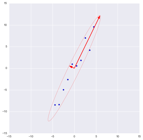
Note: the library method automatically projects on axes that maximize dispersion. This is not always rational. For example, in this figure, a sloppy decrease in dimension will result in classification becoming impossible. However, projection onto a smaller vector will successfully reduce the dimension and preserve the classifier.
So, we examined the principles of the PCA algorithm and its implementation in sklearn. I hope this article was understandable enough for those who are just starting to get acquainted with data analysis, and also at least a little informative for those who know this algorithm well. Intuitive presentation is extremely useful for understanding how the method works, and understanding is very important for the proper configuration of the selected model. Thanks for attention!
PS: Please do not scold the author for possible inaccuracies. The author himself is in the process of getting acquainted with the data analysis and wants to help those like him in the process of mastering this amazing field of knowledge! But constructive criticism and diverse experience are welcome in every way!