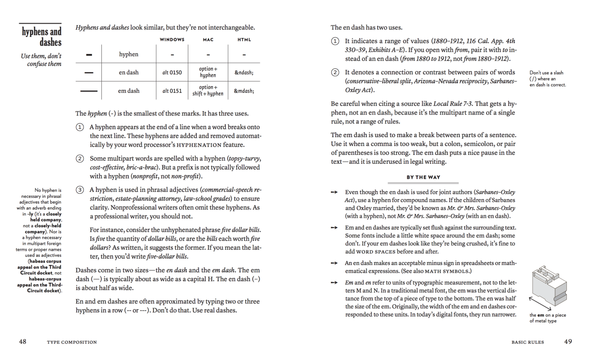
The value of multi-font design
- Transfer
I noticed that one of the features of my design style is the willingness to use, at first glance, too many different typefaces. I have seen innumerable articles about combinations and systems of using fonts, and almost everywhere it is recommended to use fewer fonts in any design. I also received such comments on my work - they say that the work is pleasant, despite the number of fonts used.
“I really like the site because it’s not afraid to break one of the first rules of the font - not to use too many different headsets. Four fonts are used, two from the sans-serif family and two from serif - Galaxie Copernicus , Interstate , Harriet and Nimbus Sans . The highlight of this design is consistency, and the Bethany Heck website uses each font consistently for its purpose. ”
- Jeremiah Schoaf, Typewolf
I regard this as a challenge. Thanks Jeremiah!
I want to argue and talk about the value of eclectic systems, and how to create a project structure in order to effectively use several fonts together.
So why do we have rules about the number of headsets used?
We can point out controversial design options with an excessive number of headsets. You can feel when the designer compensates for the inefficiency with a large set of headsets. How the waitresses at Hooters distract you from the realization that you are eating mediocre wings and the Buckle jeans trim hides your saggy backside. It is at such moments that the designs begin to look overloaded, incomprehensible or littered, and it is from here that the use of several headsets makes its bad reputation. You can not throw extra ingredients on a bad dish so that it tastes better.

The desire to fix the restrictions on the number of headsets in the rules is a sincere desire to save designers from trying to impose visual interest and fun through diversity. They are encouraged to pay attention to the headsets they use in order to try to use high-quality, heart-made fonts that are suitable in different cases. Without a crutch in the form of a set of headsets, designers can force themselves to engage in hierarchy and content. Many designers will advise you to limit yourself to two headsets in one design, while others will allow you to use a third one - just because you still can’t leave them alone.
The rule of three has logic. You choose a working headset, an isolation headset for individuality, and a third for special occasions. Headsets are like families - if you have more than three kids, then chaos is guaranteed to you. Each headset added to the design increases responsibility. She has her own needs, desires and requirements - and the more you add, the more worries you have on the path to effective visual communication.
Now I want to discuss quotes like this:
There is no point in using more than three fonts in any design (not only for the web) - and that's all, no more, sorry.
Do not confuse preferences with rules.
I see a lot of similar comments about the choice of fonts, but do not let the opinion of one designer influence your method of solving problems. In the right context, with the right typefaces in design, any number of them can work. It often turns out that designers simply want to push this argument for the sake of superiority of their opinion, and not in order to do what the users will be better. I don't think your grandmother complains about the number of fonts used in her cookbooks. This is because your grandmother is wise.
No need to do design for other designers, do it for your audience. Using multiple fonts means less compromise, and the ability to create rich and eye-catching palettes. Each headset adds nuances to your visual language, which as a result can help to clearly convey the message to the audience and create a unique aesthetic.
Building an eclectic system: making pairs
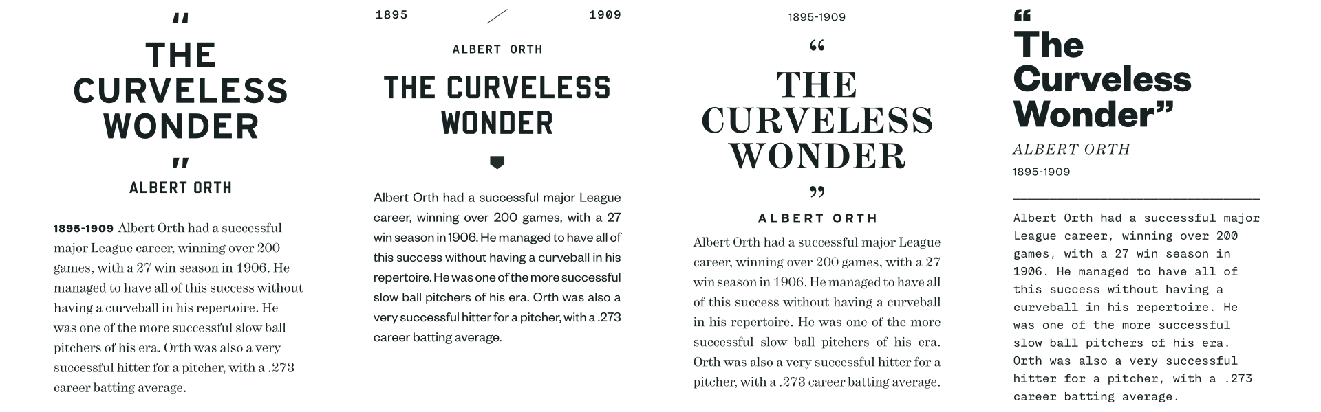
When building a headset system, you need to start with good font pairs. Sometimes this requires only the relationship of two different letters. This example corporate identity for an exhibition by Jessica Svendsen and Julia Novitch uses a great pair of Bureau Grotesque and Letter Gothic. This is such a contrasting pair that there is a risk of its dissonance, but the essence of its success is in the similar characteristics of letters - such as “r” in Letter Gothic and “a” in Bureau Grotesque. They both look lazy, like a hand hanging from a bed on a Saturday morning. Similarity in the structure of the letters is all that is required for this combination to be successful.
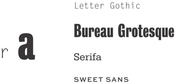
Starting with such powerful combinations, you can build systems more efficiently and add headsets to beat their original relationship. If we were to build a deeper font system based on this initial pair, the Serifa geometric block font would fit well as a starting point. It will add contrast to the width and serif style, while bringing a sense of stability and something familiar thanks to its geometric roots. A completely safe font, which with pleasure will take on the role of a more strict partner, compared to the lighter initial pair of fonts. I’ll also add Sweet Sans to this mix.because he is the BEST. It will be necessary to take into account some rules, for example, only “capital letters” and “always increased distance in width”, so that the system makes sense. Uppercase letters will provide us with a visual union with a geometric block, and long distances will connect the font with Letter Gothic.
As you can see from the example, we are based on the relationship between Letter Gothic and Bureau Grotesque. Letter Gothic on the left smoothly flows into the title on the right. Serifa rivets side menu sections, and Sweet Sans is injected to create playful details. All four headsets coexist perfectly with each other and create a unique look and feel.
However, you can break all the rules and make these fonts look disturbing and inconsistent. Attention…
Oh god, I ruined everything! We convert Bureau Grotesque to uppercase letters, and the basis of the relationship between headsets is lost, and the whole system breaks up. In the same way, switching other fonts between the “all uppercase” modes and the normal one, we lose the logic and the relationship between the fonts that make the system work. If you notice a large number of headsets used in the design, this may be due to their clumsy use that does not follow any rules.
If you notice the similarities in fonts and use them, you can create a beautiful and varied system of several fonts, which are essentially different, but work well together thanks to their clearly performed roles.
Do not be afraid of similarities
Just as you need to take into account differences in fonts, you need to correctly use similar headsets.
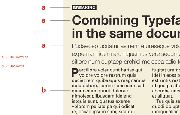
One of the most frequently repeated rules about creating pairs of headsets is to avoid pairs of headsets that are too similar, look for clearly visible differences in letter shapes. A small difference in fonts may be perceived by the audience as a mistake. The letters "a" and "g" immediately indicate the use of different fonts.
The excerpt from an Adobe article uses Helvetica and Univers, and this is an example of poor pairing because these fonts are too similar. At first glance, they are very similar, but let's analyze the headsets and understand their differences.
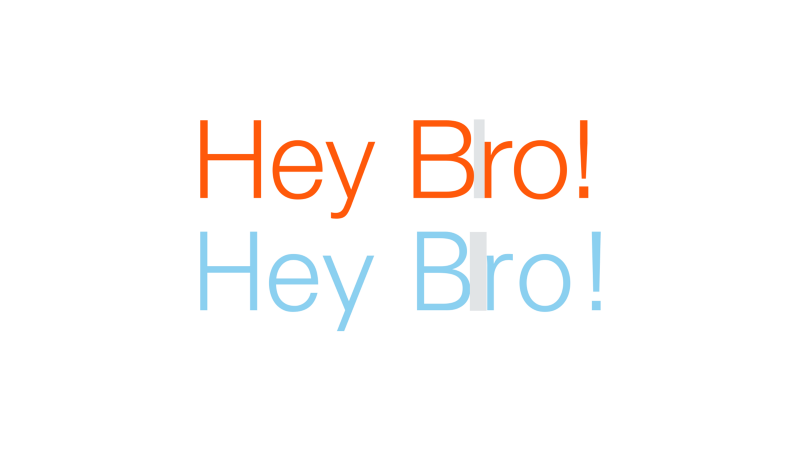
We have Helvetica above and Univers below. Helvetica is characterized by a close arrangement of letters, which is why the lines take up less space, although the letters themselves are clear and wide. Univers is relatively simple, it has no embellishments like a curl on the tail of “y”, and despite the narrower letter pattern, the strings take up more space due to the more generous letter spacing. This is especially noticeable between "B" and "r".
Having identified these differences, can we find an example justifying the use of both fonts?
We can. The design of this theatrical program shows how a couple of fonts work effectively. Helvetica performs well in headlines because of its tightly spaced letters, and the more airy Univers makes the body more readable and contrasting with the headline. If all this was framed in Helvetica, it would be so dense that it would lead to a typographical orgy. Each font uses its own strengths.
One of the keys to effective font systems is choosing similar headsets, and looking for ways in which they can demonstrate their differences. You can always show the difference between fonts in the way that you deal with them - but if the headsets are essentially different, they will remain that way. It all depends on the game on differences and similarities, in search of the right amount of characteristics shared by them and interesting contrasts.
Attention, an example from life!
Going on the exploration of the Hive Works brand, I tried to reach a mood that would refer to the history of IBM design, evoke the feeling of a scientific laboratory, and have international aesthetics to give a structure to motley styles.
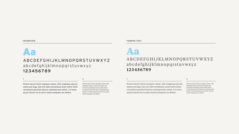
I started with Interstate and used it only in capital form. Then she added Tiempos Text for warmth, because she was worried about the coldness of the sources of my inspiration. I would like to add at least one sans serif headset, something that would be more friendly and suitable for use in uppercase and lowercase. The last two options were Caliber and Founders Grotesk , both from Klim Type Foundry .

At first glance, they are very similar. Founders is a grotesque font with a lot of friendly features. It is taller and wider than Caliber. The additional width leads to the fact that the height of the lowercase letters seems smaller, although both of them are almost identical. Caliber is already, and it was more influenced by geometric headsets such as Futura, and the ratio of the height of the lowercase to the height of the capital letters makes it more convenient and suitable for small texts.

Having tried both fonts in context, I saw that the Founders connections with the international style squeezed all the rest of the aesthetic influence on the page, and the added contrast between the height of the lower and upper letters prevented the font from working in tandem with Tiempos Text in the text. Caliber was more geometric, while retaining the grotesque qualities I needed, and brought in the technical feel I needed without too much coldness. He got along well with international influence, without being crushed by him, and all the elements came together and formed a single aesthetics. So it’s noticed, right? Caliber works best than anyone, so I just need to keep using it. So? Well…
Caliber behaved well everywhere inside the book, but he lacked the assertiveness that I wanted to achieve in the page headers. This is a beautiful headset that works great, but why should I dwell on the beautiful, if I can achieve the incredible? On a large scale, the curvaceous forms of the Founders letters look great (oh, that “g” in lower case!) And the international influence inside the book is not so strong that it will not dominate the aesthetics. The extra width of the Founders contrasts nicely with the neat and narrow introductory text in Caliber, so it was not only better suited for headings, but also helped show how Caliber was awesome with this method of use. And now, please, you have a new layer in my typographic solution.
Although I use two very similar fonts and three sans-serif headsets in the same project, they all work together and not compete with each other because I am familiar with the strengths and weaknesses of each. I know when and why I use one rather than a different font, and I set the rules based on these characteristics. If Founders were used on some pages and Caliber on others, for no rhythm or reason, it would be difficult to justify using both of them. Without a system, their use becomes meaningless.
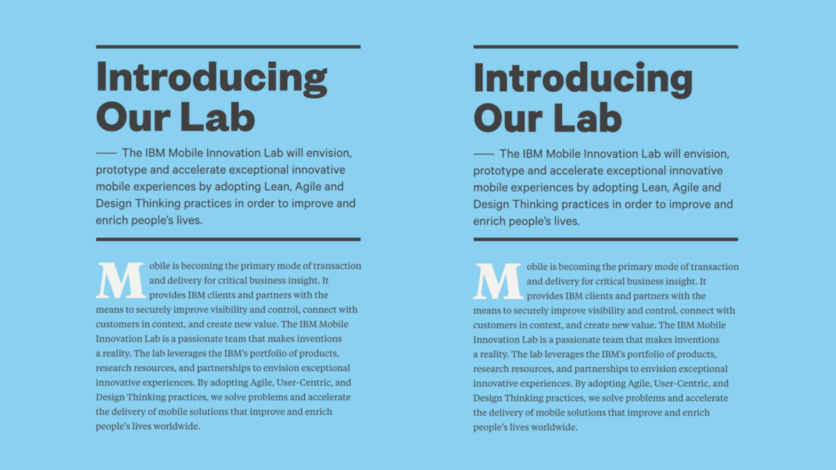
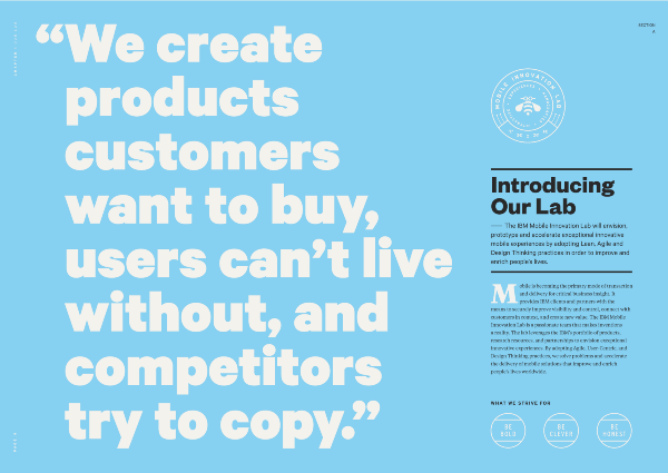
Creating an Information Hierarchy
One of the best arguments “for” is the addition of additional headsets - it will be easier for the audience to understand what kind of information they are looking at, even before they start reading. Typically, your text is a bunch of paragraphs, headings, and subheadings. Not a particularly exciting subject. And what, you just shrug and decorate this garbage? No - because you are a designer, and the essence of your work is not that. Visual design is not only what the content looks like. This is the science of making content deliver information in the most efficient way.
Your job as a designer is not to thoughtlessly stylize everything that you slip in. You need to discover life in the content and subordinate it to your will. Do not give up if you received a thoughtlessly designed text. Soak up the message and find ways to extract meaningful data in a repeatable way that not only adds flesh to your designs, but also helps your audience process the data they receive. You need to become an expert on the topic you are working on and take the place of the audience to help them find the best pieces of content. This marks the true designer.

The example above uses headsets, color, and style to divide information into meaningful pieces, allowing the audience to easily switch context from presentation to highlighted thoughts. To bring the design to such a layered look and give it nuances, a lot of work is required. Such opportunities rarely get you just like that.
You need to help your reader identify the different types of information, and after determining these levels, you can already justify a separate typographic approach to each of them. You need to earn the right to use a few pins, or you will just make visual noise.
The most extreme example I've seen is Typography for Lawyers"authored by Matthew Battery. The battery uses at least eight fonts, and it seems to me that he did great. Many designers argue that such a palette is too eclectic, and that the desired could be achieved with fewer fonts, or one superfamily of fonts Well, actually, any design can be done with fewer fonts. Any pizza will be edible without additives, but sometimes I need supreme pizza! Again, your grandmother most likely does not know what a superfamily of fonts is because she has have n Current problems - for example, to find out when the next “Test purchase” will be.
In my opinion, the book is brilliant. If we really love typography, why should we criticize someone who knew how to put together well-made fonts into a symphony that conveys the right messages well? Why is this multitude of different graphic elements allowed to emphasize differences between types of content, and fonts not?
Butterter’s book is so good because he managed to create so many options for using different styles: headings, tables, text, subtitles, tips, text excerpts. Each has its own style, and in just a few pages the reader meets them all and understands their purpose. If you feel that the hint section is especially valuable to you, you can easily find them thanks to the unique style. If they are not useful to you, you can easily skip them and concentrate on more important things.
This kind of visual separation of parts and help with orientation are the basis of systems and interface design. When a user sees an element, he must immediately understand what it is, what value he represents for him, regardless of which fonts the designer chose. So why do we shame designers who achieve this goal using a large set of headsets? To take a shapeless bunch of content, carefully build its informational structure, and then add visual differences using typography is the essence of the designer’s work. Such work should be honored. You will not violate the transparency of the glass with many different headsets, if as a result the audience pays attention to the style not because of himself, but because of the type of content that he represents.
Fonts as UI Assistants
Which text is active and which is not? Even the addition of color does not provide the necessary clarity in this matter, since part of the green is just decoration.
A good interface design is famous for a clear definition of the functions of all interactive, informative and auxiliary elements on the screen, enhancing the recognition of the value of an object, coupled with its readability. It is not only what the word says, but also what it does. Fonts are instantly recognizable auxiliary elements, and we must take advantage of this.
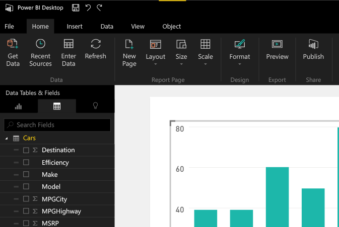
At my main job, the director of creative services at Microsoft Power BI makes us use one font, and it's awful. Segoe. Yes, he even has a terrible name.

Segoe’s problem, besides being useless, is that it’s too difficult to ask for one font to convey all the nuances that exist in a complex program. If you look at any program in the Microsoft Office suite, you will notice what kind of workload the restrictions on the number of headsets impose on the interface. There are dozens of elements on the page, all written in one font, and for the most part - of the same thickness and color. But not all of these elements have the same functionality. Part of the text describes categories and information, the other is interactive. Moreover, most of the text pretends to be interactive, although not really (for example, “Get External Data” in the upper left corner is not interactive). As a result, the eye gets tired of the flow of similar elements, and the user is not sure that he will make an element of the text until he interacts with it.
Usually, if necessary, to show the difference between the functions of the interface elements, it is customary to use frames, delimiters, colors, arrows, icons and other gadgets. The idea of using additional headsets for this purpose will be viewed with disapproval. BUT NOT IN MY HOUSE!

- Hi, I'm Segoe, and I'm the worst of all.
- Hello, I'm DIN, and I'm not so pretty.
To combat this, in Power BI, we began to include a second font in the design. DIN - a classic German headset, rectangular, a bit dense, and with beautiful numbers. It blends well with Segoe thanks to a different style that is not too distracting. However, coming up with what other font to add is only part of the solution. We still need to determine the rules for its use. How can we make sure that we use DIN not only for stylistic diversity, but as a tool to help users?
I decided that we would use it to separate interactive and non-interactive elements. In our product, there are many cases when subtitles or tags are required that are located next to interactive elements, and since the color is not a universal solution (the main color of our product is yellow, which is not consistent with the requirements for ease of use on a white background), font in these situations allows you to clearly distinguish between interactive and non-interactive, and helps to come up with a simple rule of action in such situations.
Now there are no questions about what distinguishes interactive from information better
. We now have a rule that works well in the light and dark interfaces.
Take a bite, Segoe!
You can see how such a simple change in the interface as the introduction of a new font takes on a wave of text that hits the user and splits it into pieces that are easier to digest. Words written in DIN fonts serve as information markers, complementing application commands and creating a clear separation for the user. The interface immediately becomes easier to understand and use. It's not about aesthetics, not about embellishments or adding a visual style for his own sake. The point is to help users process the information on the screen and to give them the opportunity to understand what exactly will happen each time they see text in our application.
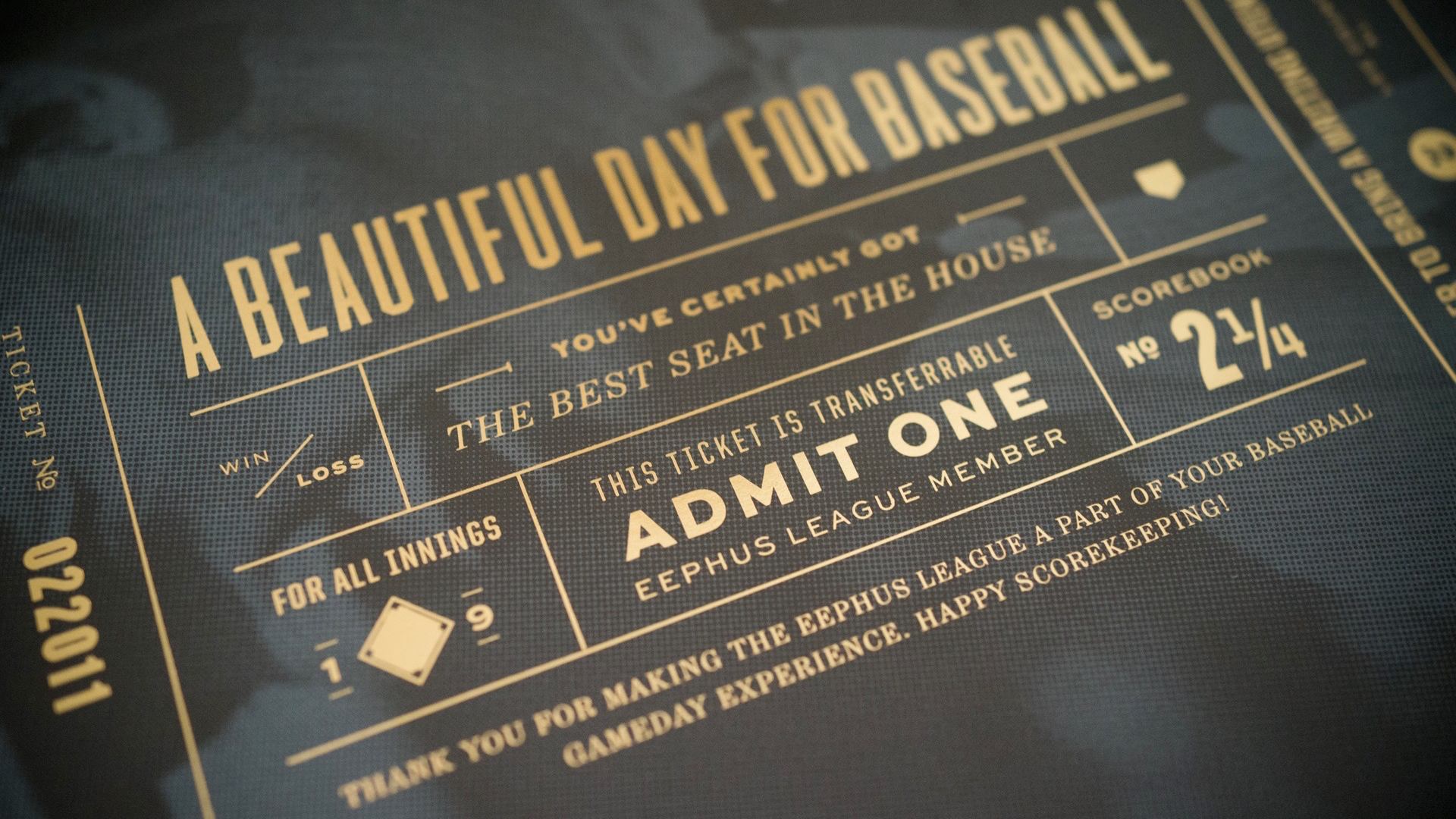
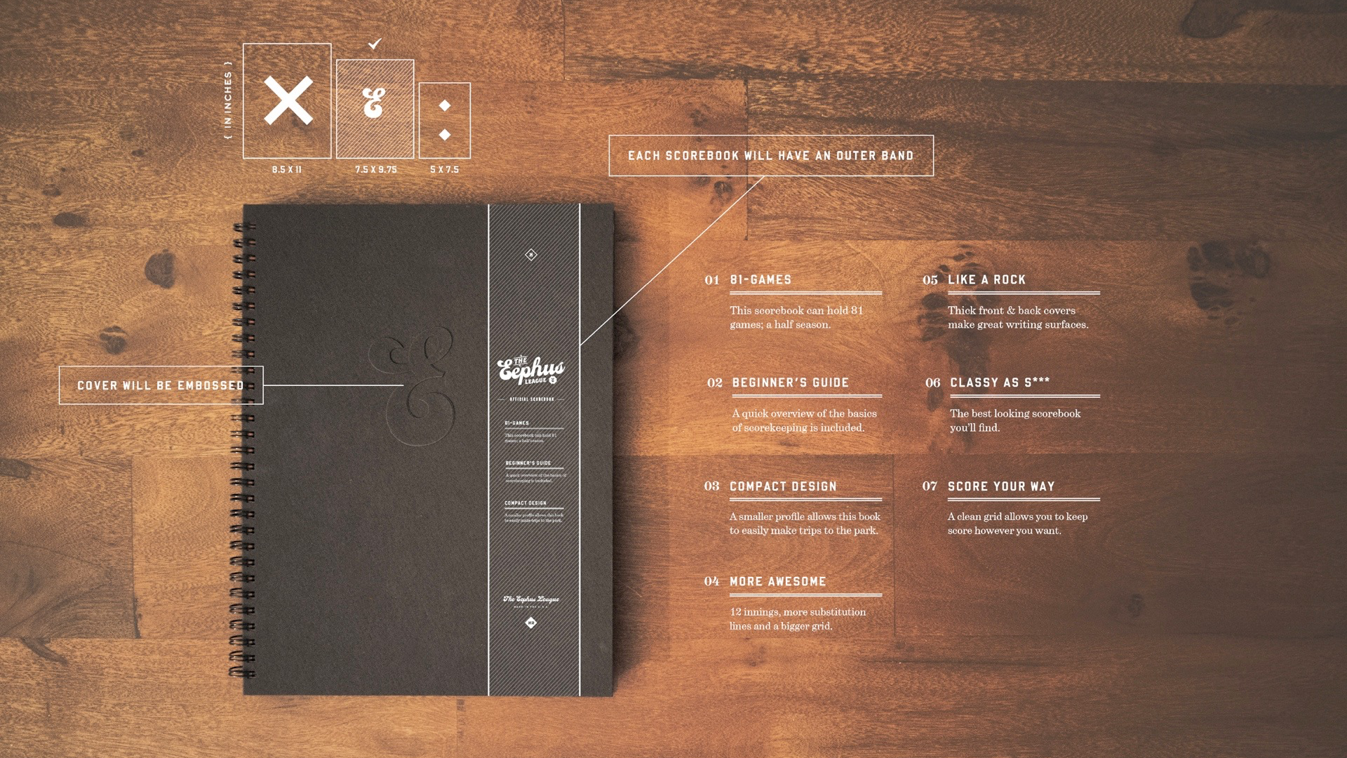
Life example: Eephus League
In parallel with all this analysis and thinking about the benefits of multi-font design, it seemed to me that I needed a good opportunity to put money on what I believe in. I had a great opportunity for this: the Eephus League website. This is a small business that I started in 2010 selling basketball related items. I will not bother you with the description, because you are designers, and for some reason despise the sport almost as much as you love one-speed bicycles and coffee.
It all started as my project as a student, and the visual language of the corporate identity and the fonts that I used changed over time. With the growth of corporate identity, I introduced a greater font variety and a more playful atmosphere.
If you thought you would avoid viewing the pictures in this section ... Well ... Sorry.
Pictures show examples of fonts used in the project over time. This is my opportunity to try out new headsets and have some fun. Today's style is a unique mixture of fonts and approaches.
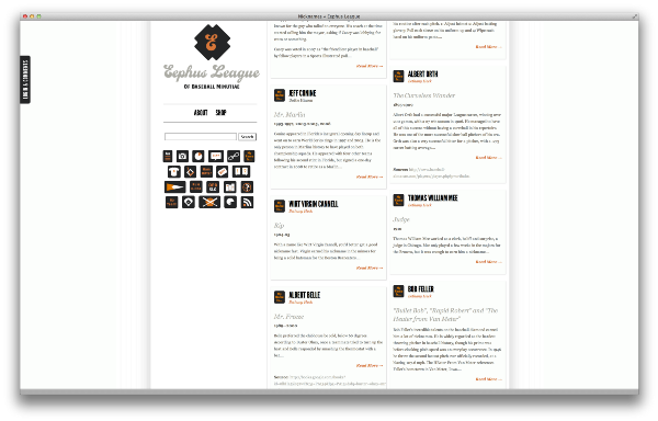
There was only one exception to this typographical paradise: the site. I made the site in the summer of 2010, being poor students with a limited number of web fonts, so it was very in need of updating. Before that, I played with different ideas about pages, but got stuck at the design stage. It was tough, and I could not find the best set of fonts I used before for the site.
No, not good enough
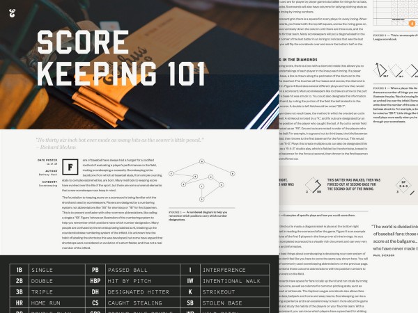
I decided to put experiments on myself in the field of experiments with fonts in order to get out of the creative swamp. The site was a great playground, because it is based on several types of posts - nicknames, quotes, statistics, jargon, patents. Each post type has its own data hierarchy and its own unique stylistic elements. I wanted to take this concept and change it even more compared to the original site. How unique can I make each of these posts without rolling the design into chaos?
Started with my favorite data type, nicknames. They are colorful, stupid and have a deep meaning, so it was important to make the design of the die reflect this mood. But most of my tricks were too cold. Having tested all the fonts that I used in the brand, I remembered that I had a pretty font lying around in the bins: Brothers .
Brothers. We all know him. It stands out so much that it is very difficult to integrate it into the project without breaking all the aesthetics, but since I had so many fonts at my disposal, I could use it as headings here and there. I did not have the risk of placing it in too many places, and at the same time, it still brought me benefit, being located in my design. This is a key argument in favor of eclectic systems. It gives you the freedom to use fonts so that they are actors performing episodic roles, adding zest to your design, without overshadowing all its other parts.
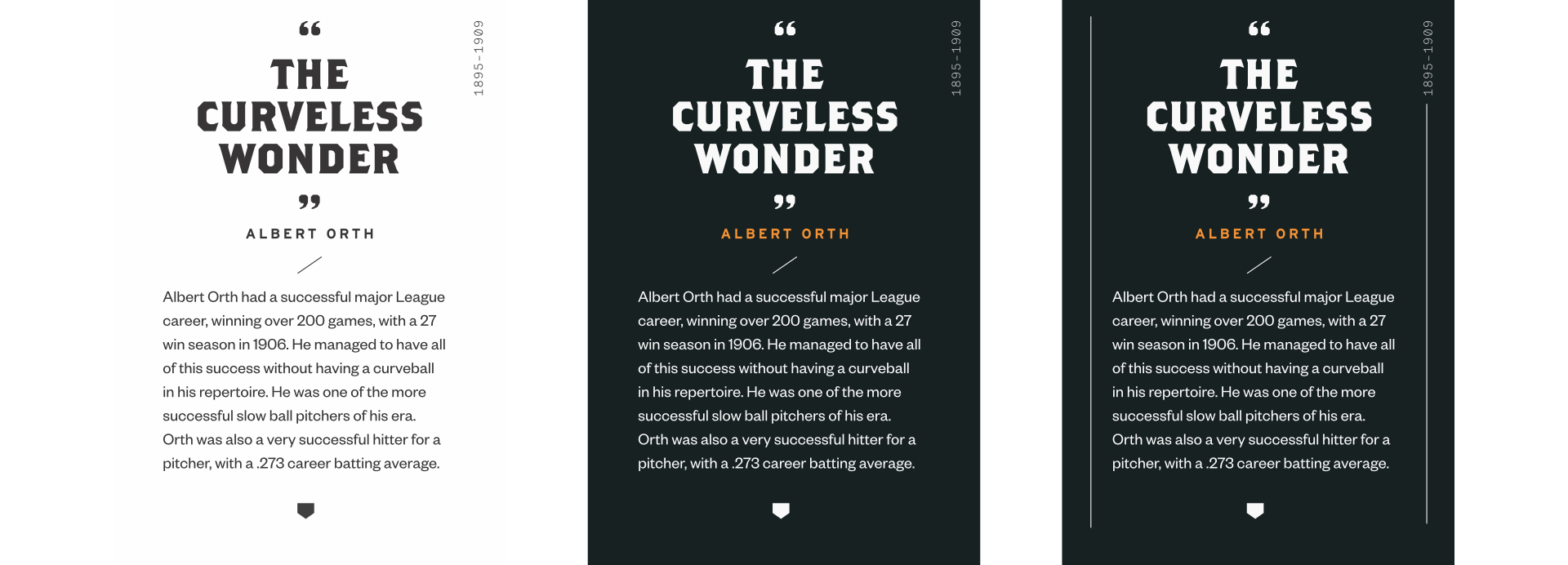
Instead of serif for the text, I chose Founders Grotesk, because I knew that it goes well with any of my other fonts. When the nickname block was finished, I got a method for making each subsequent one: the elements common to several sections will be styled the same way, and the unique data will be styled differently. Each category has its own header style and headsets reflect content.
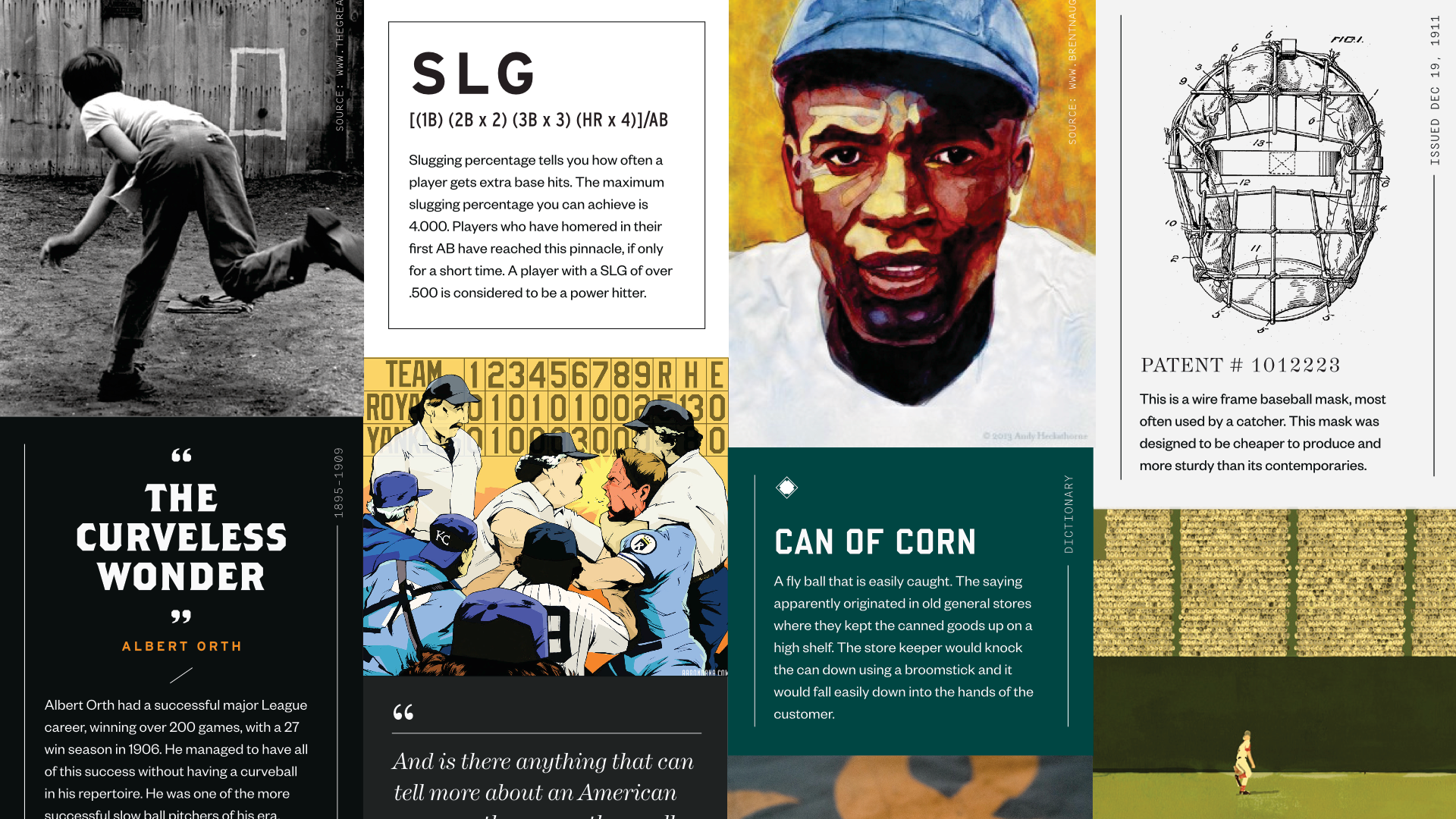
Dice statistics are impassive and strict, and correspond to the mathematics, information about which is passed to the user. Quote dice have a classic design for short quotes, and I really like patent dice - they reflect the typography you might find in old patent documents.
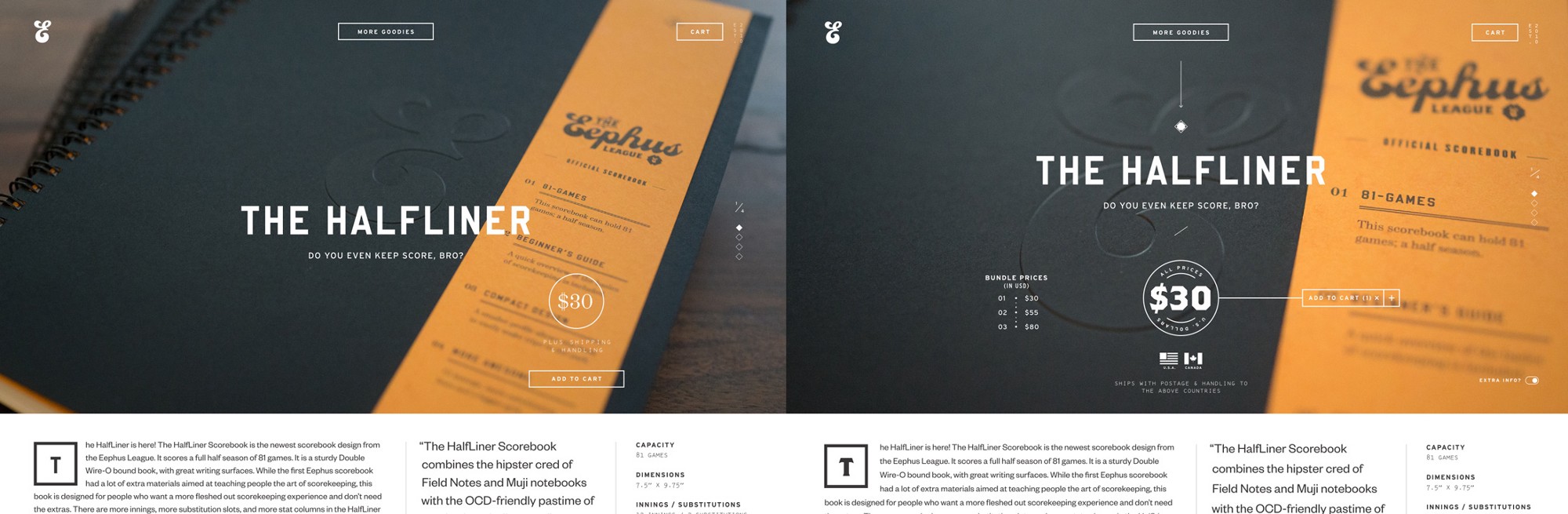
Upon completion of the exercise, I returned to the pages of the store with which I started, and redid them. The result has become much richer and corresponds to what I wanted to achieve with the style as a whole. As a result, I chose six unique fonts for the redesign of the Eephus League, and, in my opinion, the site will suffer if any of them are deleted.
By choosing these headsets as my visual language and carefully following the rules for their use, I can achieve any visual variety. I need to make sure that each type of content has its own voice, but at the same time it harmonizes with the general choir. A design result that includes many headsets will not necessarily be conflicting, awkward, or chaotic; it can be exactly as neat as single-font projects.
You need to start by creating rules, and then you earn the right to break them. Build a style library from fonts, sizes, colors, and usage rules, and use it methodically before you make exceptions. Your audience will have the advantage of enjoying the visual richness, and at the same time the opportunity to connect style and content. Then, when you decide to deviate from the set of rules, the audience recognizes this move as important, and you can play on this reaction.
Conclusion
So, grains of wisdom with which we have become acquainted today.
- It's not about the fonts themselves, but about their use;
- concentrate on differences in fonts that are identical at first glance;
- start with relationships in pairs, and then add more;
- Define the rules for using headsets and adhere to them;
- contrast in font pairs is too overrated; true contrast arises from content and hierarchy;
- if your content does not have structures of several layers, do them yourself;
- use different headsets to separate different elements;
- Use eye-catching headsets sparingly, with clear intentions.
Many thanks to everyone who has read up to this place. Each of these points can be turned into a beautiful website, but it is the combination of all these concepts that makes thinking about fonts so interesting.