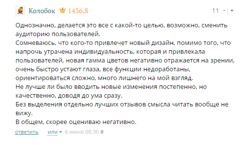
Caution, redesign: “voice of the people” vs “eye of the designer”

For many, cardinal changes evoke a feeling of a clean slate and hope for the best. In this regard, terms such as rebirthing, refactoring, rebranding, redesign and so on have become fashionable. But some are ready to write this blank sheet with arguments about how good the old version is, and demand that everything be back to square one.
Often such criticism is really reasoned and useful. Sometimes even those to whom it is directed admit this. In exceptional cases, they decide to return the same "old version". And sometimes vice versa - public opinion is completely ignored, and this, oddly enough, leads to positive results.
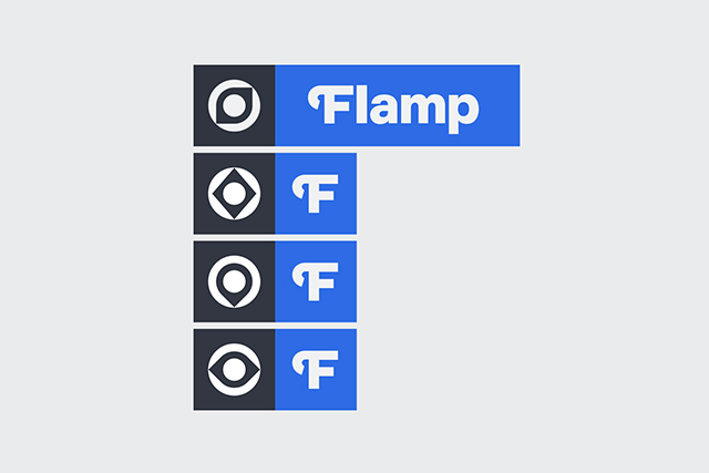
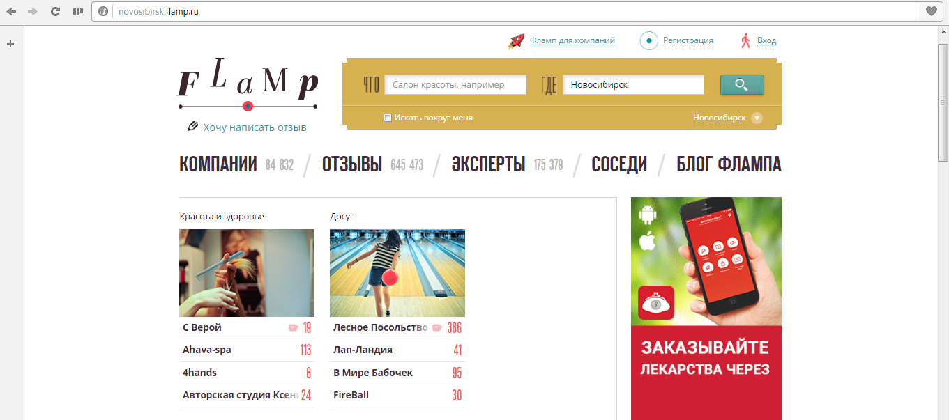
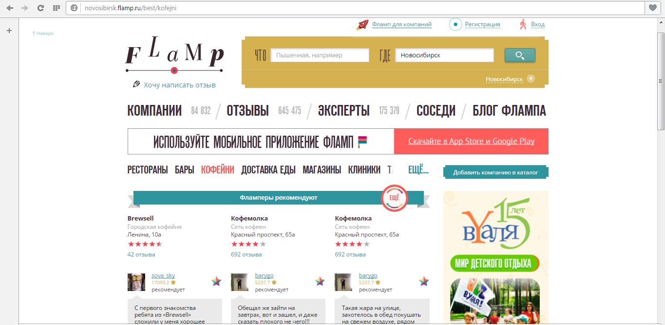
Flamp, a company and service review service, will be updated in the next few months. The service logo and its corporate identity will change. The site will be restarted with a new design and improved functionality. This is stated in a message on the "Flampe". The beta version of the new site is available to users in test mode.
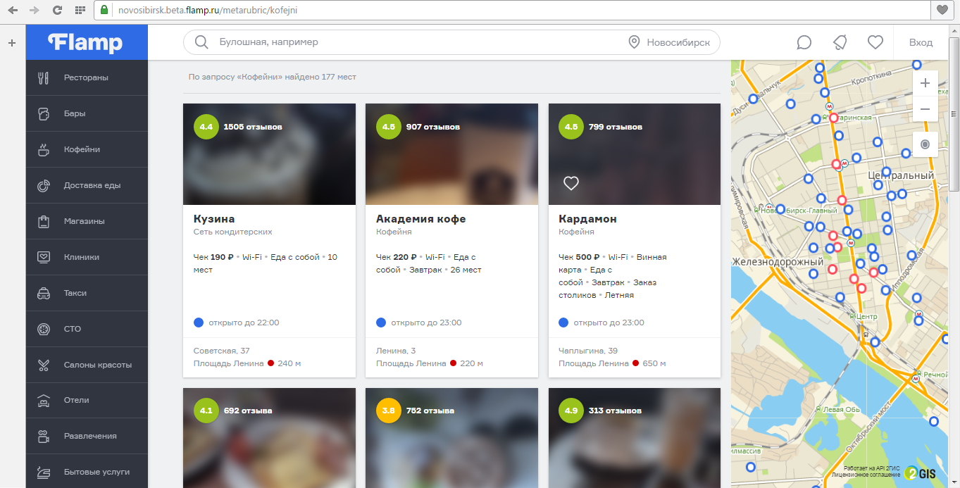
On the new main page of the updated “Flamp” there are categories and a search bar through which you can search for companies not only by name or field, but also using discovery queries - for example, “a 24-hour bar on the right bank with Wi-Fi”.
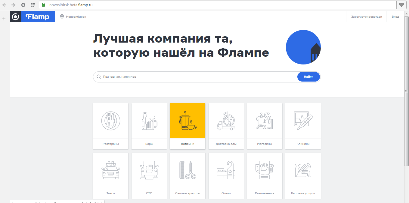
In addition, the new "Flamp" refused to display the stars rating when displaying the company's rating - instead, ratings were introduced on a five-point scale accurate to the tenth.

According to the director of the company Evgeny Vasilkov, the new “Flamp” is a compilation of ideas “with verticals and instant messengers” and the idea of “Flamp” itself about what should be the communication on the Internet between city residents and business.
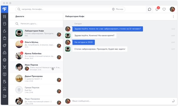
In particular, for this, developers added the ability to write a personal message to a company representative. The company representative Sergey Tomilov also added that Flamp plans to connect the possibility of ordering company services directly through the service.
“In the future, there is no place for a one-sided assessment of a company by a client - the key here is interaction. And the central idea of Flamp is to build this bridge between the client and the company, ”explained Yevgeny Vasilkov.
Meanwhile, slowly and sadly, the old lives out its daysversion of "Flamp". “Towards the fall of 2016, the new site design will completely replace the current one,” said Sergey Tomilov.
Feedback service Flamp was launched by 2GIS in 2011. At first it was available only for Novosibirsk, and by 2015 already existed in 91 cities of Russia, including in all major cities of Siberia.
According to Tomilov, at this moment the monthly audience of Flamp is more than 3.5 million people, while about 50 thousand companies have registered with the service.
However, it is likely that the service will begin to lose an audience. The news about the redesign was perceived, to put it mildly, ambiguously.
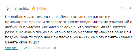
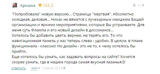
Some users suggested collecting signatures for preserving the old version of Flamp.
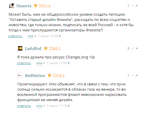
Criticism and the intention to return the old version by submitting a collective complaint resembles the story of the restart of the Kinopoisk website.
“Kina will not be”
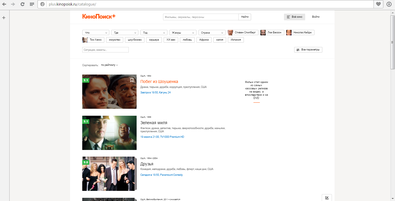
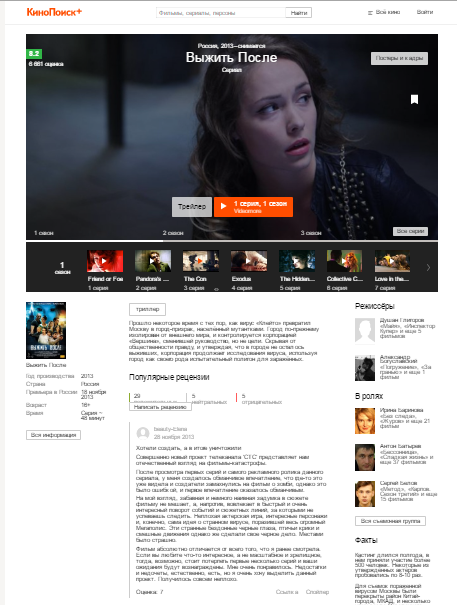
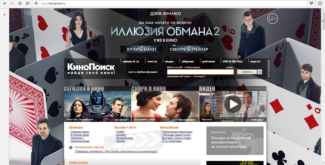
In early October 2015, Yandex demonstrated an updated movie site, Kinopoisk. The main page of the service is a personalized showcase of films and series.
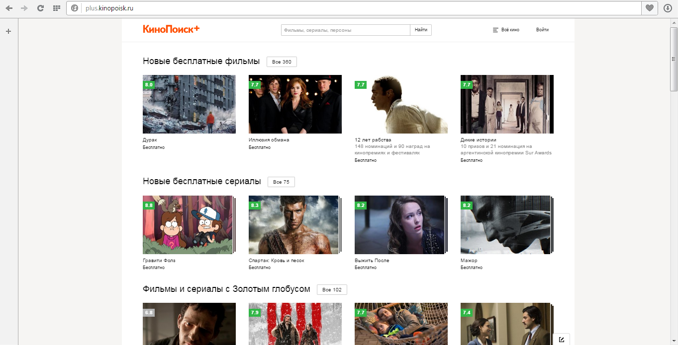
She clearly demonstrated what was going on hire and what new items appeared online. In addition, with its help it was possible to watch charts of popular films, thematic collections and the schedule of premieres.
In addition to changes in the design of the site, there have been changes in its concept. Kinopoisk turned into an online movie theater and became an aggregator of video content. The partners of the service were Amediateka, ivi.ru, Megogo, Tvzavr, Pladform, VGTRK, STS Media, Rutube, Ayyo Movies.
The service developers pinned great hopes on the recommendation system. User comments and ratings should have helped in forming the rating and served as the main factor for the recommendation system. The more often the user will give ratings, the more accurate the recommendations will be, explained in Yandex.
However, the updated version of the service was criticized by numerous users and even its formal creator Vitaliy Tatsiy:
Dissatisfied users created a petition demanding the return of the old version of the portal. After that, the management restored the previous design, but supposedly only for a while.
An updated version of the Kinopoisk.ru website lasted only four days, and Yandex lost tens of millions of rubles.
But what statement the Kinopoisk team distributed through the Yandex press service:
We foresaw that the reaction would be acute - from denial to rapture. And so it happened. When a project practically does not change over the years, the audience reacts sharply to any changes. Over 10 years, the service capabilities and design trends have changed.
Before rolling out the new version, from May to October, we showed a closed beta version to Yandex employees, which is about 6,000 people. For many of them, “KinoPoisk” is one of their favorite services, and we received a huge amount of useful feedback, as a result of which we made changes to the project. After we worked with the feedback inside, we went into the “outside world”.
Now we carefully analyze all the requests and try to answer each one. Our main task is to do everything to help users get accustomed to the new version, and continue to develop KinoPoisk thanks to the ideas and wishes of our audience.
Thanks to the persistent requirements of users, Yandex has returned the previous design of Kinopoisk.

Here is what the company's press service wrote about it:
We apologize to everyone who has difficulties with the updated KinoPoisk, and as soon as it becomes technically possible, we will open for users a version in the previous design on a separate domain. This version will work until we make sure that we have prepared all the conditions for a comfortable relocation of all our users.
At the same time, the KinoPoisk team continues to collect feedback: it is important for us to make sure that all the new functions are clear, and we have kept all the significant things that users have been asking for. We thank all KinoPoisk users for their indifference.
Going deeper into the halls of memory, we can recall another confrontation in which dissatisfied users suffered a crushing defeat.
Facebook vs Facebook Messenger users
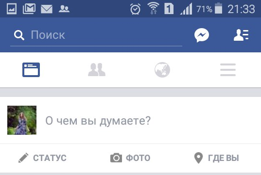
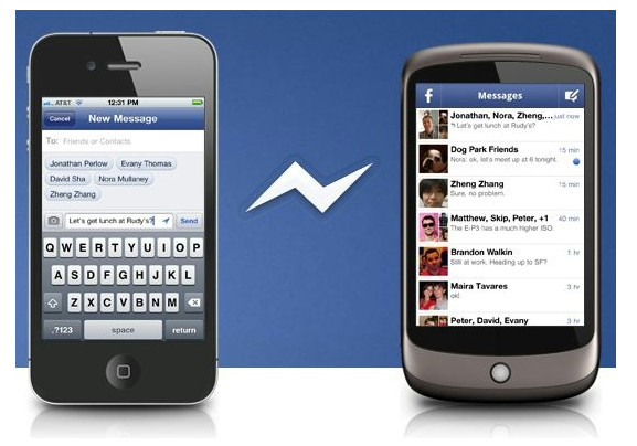
In August 2014, the social network Facebook began to gradually abandon the function of exchanging private messages in their mobile applications for the iOS and Android platforms. Mobile users who want to continue to use them to communicate on Facebook had to download a new application - Facebook Messenger .
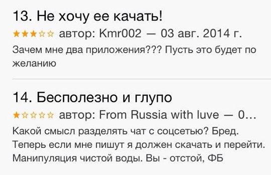
Many users have expressed their disagreement with low ratings in the Apple App Store.
Soon, Facebook Messenger took first place among the free programs in the Apple App Store in the United States. At the same time, the total rating set by users of the program is equal to one - this is the lowest rating for the application in the App Store. Such an assessment of the program put more than 5.8 thousand people out of 6.4 thousand.
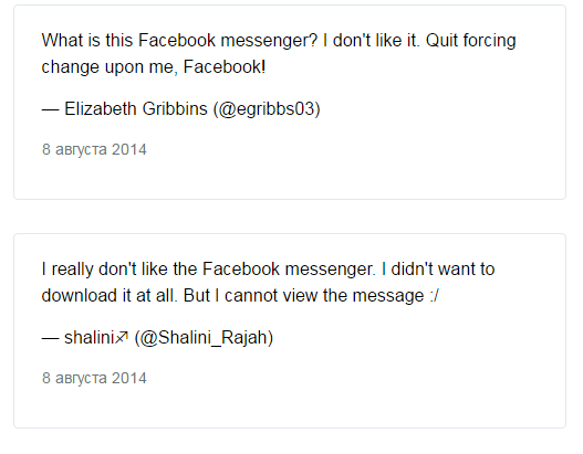
User dissatisfaction with the mandatory transition to Messenger, expressed in estimates, was manifested not only in the United States. The current version of the app on the App Store in Australia, Canada, China, France and Germany is also rated only one star, according to analyst company App Annie.
Until now, Facebook’s mobile apps have always featured a full-featured tab for private messaging. For users who have the Messenger app installed on their smartphones, Facebook has replaced the message tab with a link that launches the messenger.
As we know, despite the protests of the rebels, the messenger fit into the facebook community.
Instagram redesign
On April 9, 2012, Facebook announced the acquisition of Instagram photo service for $ 1 billion. Instagram was launched in October 2010 and until April 2012 was presented only as an application for iPhone, iPad and iPod. By the end of March 2012, the number of users of the photo service reached 30 million people.
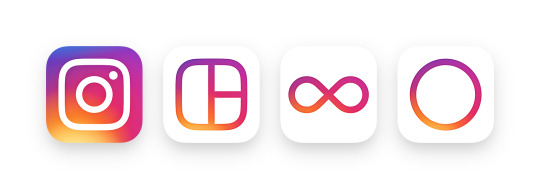
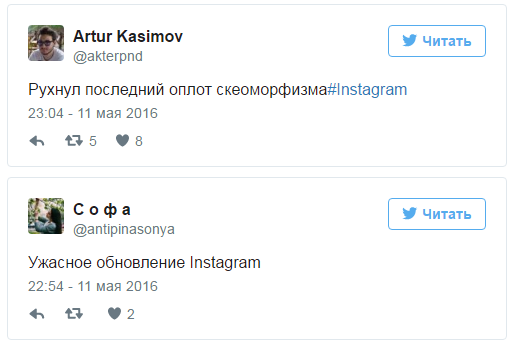
May 11, 2016 Instagram updated to the eighth version. The icon and application interface have changed dramatically. The camera has become more stylized, and the logo itself has turned into a rainbow gradient icon.
The head of the design department, Ian Spalter, told how the redesign went and why the team made these changes.
According to Spalter, Instagram has changed in five years. “Initially, Instagram was a place where people could share photos. Now this is a community divided by interests, ”says Spalter.
The team worked on the new design for a year. The original, skeuomorphic icon was one of the features of the application, but the company understood that it was out of date.
“We started with basic things - removed the ornament, simplified it, and made the icon flat and bright,” says Spalter. Designers wanted to leave something from the original icon. In their opinion, users liked the rainbow and the camera lens the most. The lens was left, and the color scheme of the entire icon was made rainbow.
Bright colors are a hallmark of the Instagram community, so the icon is made in bright and warm colors. The orange gradient changes smoothly and turns purple to the top of the icon. In the application itself, the interface has become monochrome in order to focus users on content - photos.
“The evolution of the community inspired us and we want to believe that we were able to capture the life, creativity and optimism of people who go to Instagram every day. We hope that when they see the updated icon, people will have another spark of creativity to make something beautiful and unusual, ”summarizes Spalter.
Some users of social networks negatively perceived the new design of Instagram. After changing the appearance of the application on Twitter, critical assessments of the black-and-white interface and the bright service icon began to appear.
Instagram, the last of the popular applications, abandoned the style of skeuomorphism, which gives virtual objects the appearance of real objects. The fact is that the previous service logo resembled a real retro camera.
At the moment, another social network is undergoing changes, this time a Russian one.
Sacred number "10"
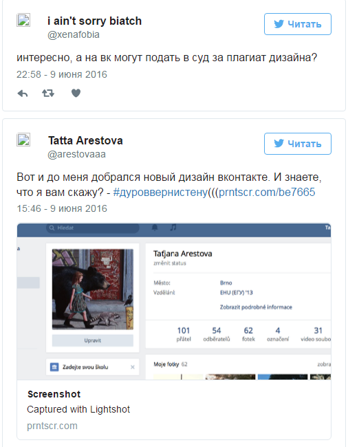
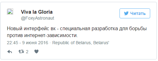
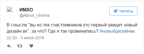
The social network "VKontakte" began the forced transfer of its users to a new design, which she introduced on April 1, 2016. The social network has updated the design of its web version for the first time in 10 years of existence.
As stated in the message, at the moment, for 10% of randomly selected users, the application is launched in a new design. Those who voluntarily switched to the new version will still be able to return to the old one for a while, until the redesign is turned on by everyone. The above 10% will not be able to do this.
Naturally, unflattering statements from "delighted" users rained down on the social network :
To which the technical support replied: “Our site will soon be 10 years old. During this time, he has come a long way: developers are constantly adding new services and improving the quality of existing ones. But you can’t move forever in small steps. There are some things that can’t be raised to the standards of tomorrow without a complete overhaul. You can find the basic information about the website redesign in the official blog of the developers. ”
One of the users dissatisfied with the mandatory installation of a new VKontakte design even created a petition on Change.org demanding that they retain the“ ability to use the old design ”and also give users“ the right to choose ".
In fairness
What will happen to Flamp and Vkontakte now is not 100% known. In fairness, it is worth noting that in all these stories there were users who positively evaluated the redesign and its consequences. On the other hand, not all designers are obliged to be guided by the majority opinion, since they are guided in their work by the opinions of experts and a small circle of proxies.
But users inspired by the Kinopoisk story have reason to hope that their comments will be taken into account at least. And especially optimistic of them, for sure, believe that the requirements will be met to return the previous version of the design.