June 2, 2016 at 17:13
What interface developers can learn from Japanese video games of the early nineties
- Transfer
I write this with light sadness, reviewing my favorite role-playing games for Super Nintendo, and I understand: the
modern user interface design has spoiled me.
And this feeling is quite common. A Hugon reader on the Quarter to Three forum writes :
When I think of console RPGs, I recall pages with a very uninformative character description and poor navigation. And I remember the tears of joy if the game had at least the simplest comparison of objects. "
Thank you," a great interface. "
In the past, I didn’t find fault with quality. When I sat in the back of my dad’s car and broke the Nokia keyboard in an attempt to prevent the snake from eating your tail, no deeper thoughts came to my mind than: “yeah!”, “super!” or "aaaaa!".
However, re-passing the classic games is not such an unpleasant task. In addition to places where no one was obviously hard on designing, I noticed a few things that are used today in very popular applications.
This article is about the development of user interaction design. Although it is now believed that its main goal is to bind the user to the product , it is dedicated to the period when it was still not so important.
I went through many games, recording the screen, and their interface and the video games themselves opened up for me in a new light. We are talking about the good and bad sides of Japanese video games of the 90s and what it is worth (or not worth it) to learn from them today.
Pulsating Circles as part of the tutorial
In the first 10 minutes of Final Fantasy III, you encounter a small flickering glimpse - which hints to any gamer that there is something to profit from here. But instead of mining, you get a short lesson - not in a booklet of instructions that no one would bother to read, but built right into the plot of the game:
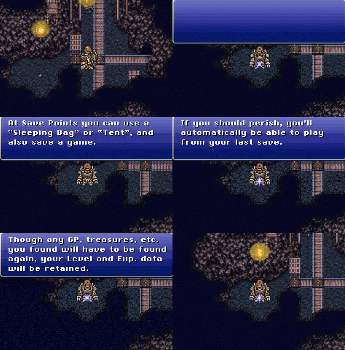
I’ve already seen how Microsoft hid the lessons teaching newcomers to the graphical interface inside the Minesweeper game to teach users to the new shell, and it seems this is another ancient example of the same approach.
In Final Fantasy III, however, this is impressive in that the accuracy matches the technique recently used by the Slack application (and many other SaaS applications).

And, since the process of initial user training in Slack has changed since then, here is a gif of the same idea in the service for managing business processes Process Street :

The idea has not changed: a point that appears for a short time and attracts attention is a spark on the floor of the cave. A tiny piece of information hidden in the interface to help users as they work, rather than being distracted by thick volumes of manual.
The decline of operating instructions and the shift to learning in the process of work is the generally accepted approach to introducing newcomers to the course of business today . It is believed that there is no need to force a new user to master themselves, if there are other ways.
Microinteractions demonstrating time and concern for the user
In an article on microinteractions, Nick Babich writes:
“Two things are well done in the best products: functions and details. Functions are what attract people to the product. Details - hold on to it. It’s the details that make the product stand out from the competition. ”
One example of a “fascinating” microinteraction is the Twitter heart icon . Previously, it was an asterisk, which, when clicked, changed color from gray to yellow; Now, as you can see, this is what happens:

There are many good arguments not to waste the time of designers on microinteractions, but in video games they, together with other elements, create an immersive effect.
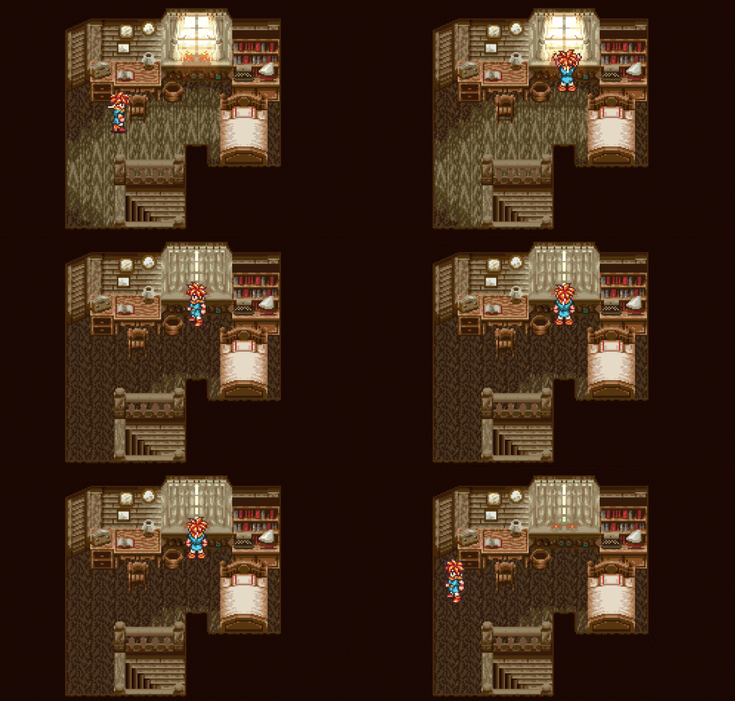
Chrono Trigger is one of several role-playing games I played for Super Nintendo, where by sticking somewhere in a random item in a regular room, you could get an interesting result. In the very first room, when your mother wakes you, you can open and close the curtains.
In the genre in which the game is mainly determined by the plot and in which realistic mechanics appear to be secondary, this is very cool. As you can see, I opened and closed the curtains as much as five times: The
menus have improved significantly (much to the delight)
You won’t be able to appreciate the wonders of modern menu navigation if you haven’t gone through some of the interfaces of the 90s.
Of course, I know that this is not the primary concern of role-playing games (and, in fact, not what they are generally criticized for), but the first Breath of Fire menu system was simply meaningless. Given that this menu is presented even before the start of the game, evaluate:
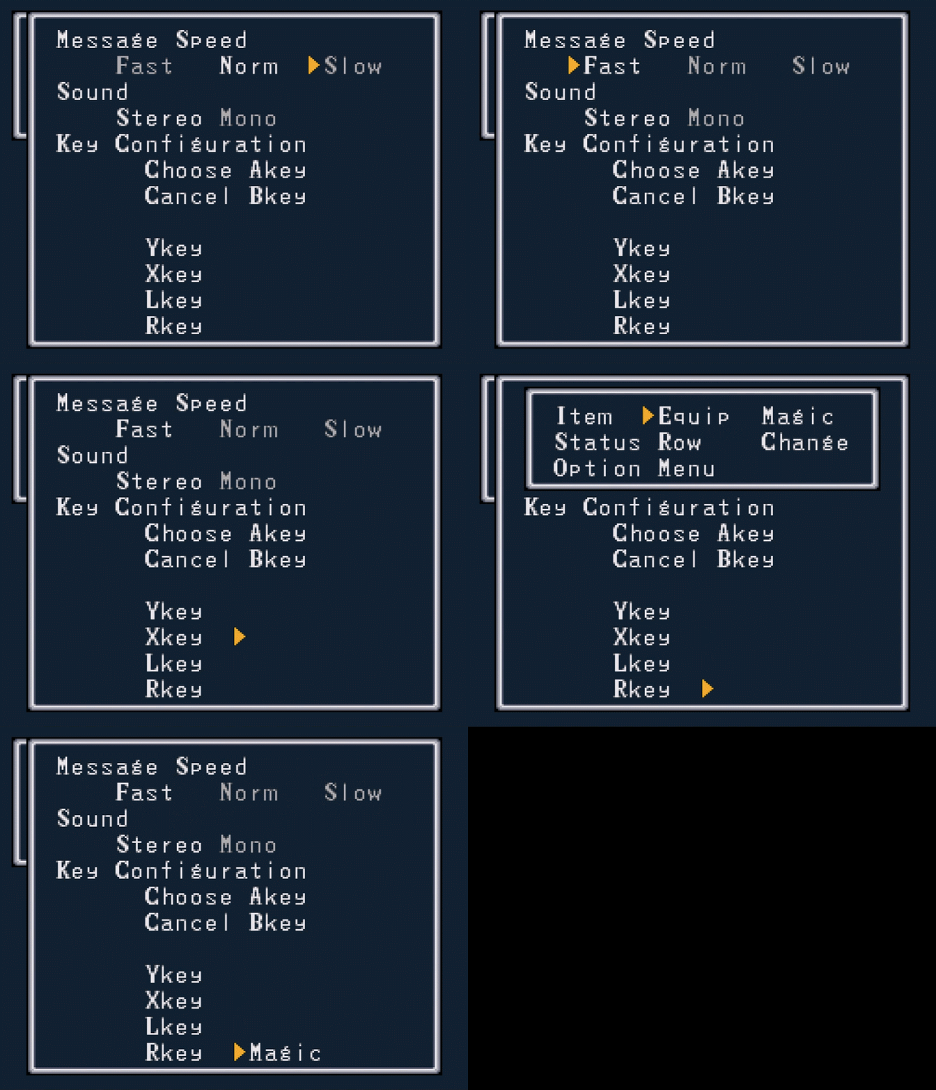
Key points:
• There is no quantitative definition of what “Fast”, “Normal”, “Slow” means.
• The key configuration section for Y, X, L, and R is misleading because the arrow is clearly floating somewhere in the middle.
• If you click “Choose” on the floating arrow, there is no explanation of what this element refers to. Why should I expect (or not expect) that Magic is attached to R? What does that even mean?
It would be much more useful not to make the choice even before the start, but to transfer it to the settings menu somewhere in the game.
It is unfair to compare the menu of the games of the 90s with the menu of modern SaaS products, but, fortunately, I did not have to do this. Here is the much better menu in the Super Mario series: Legend of the Seven Stars - a role-playing game known for its elegant design:
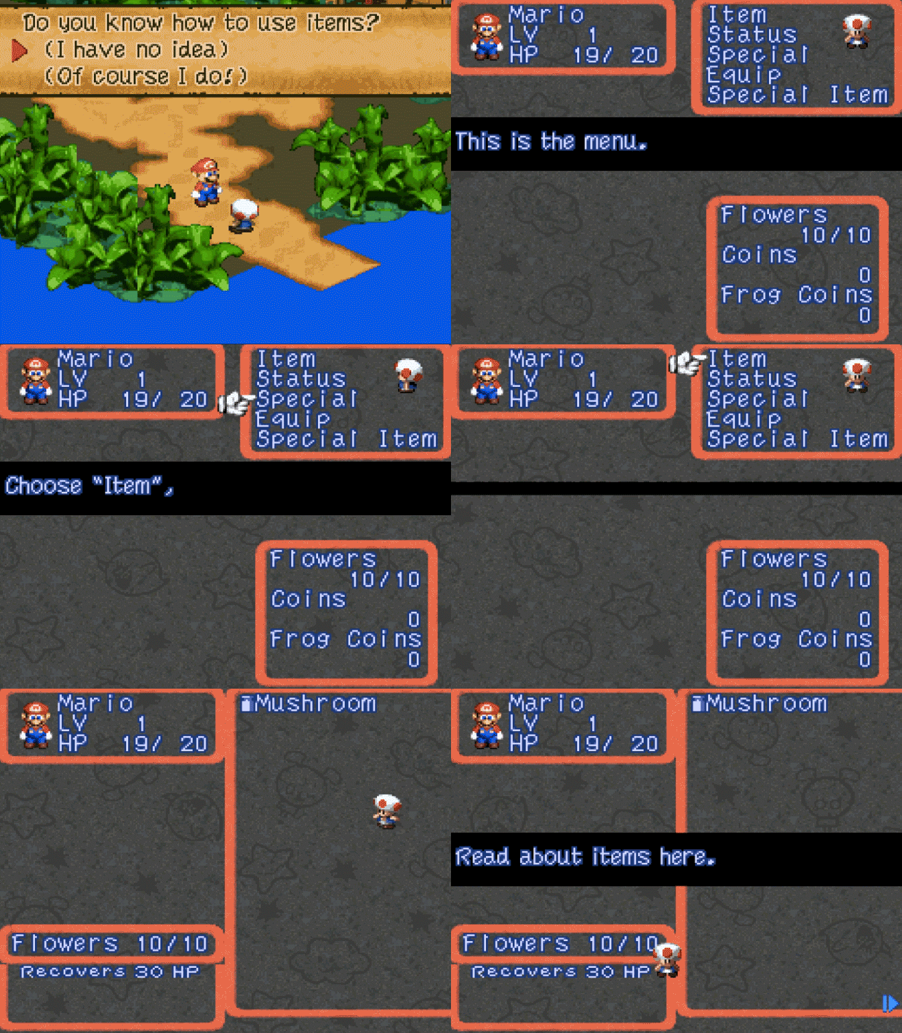
The game even comes with a little primer for beginners, unlike the menu in Breath of Fire that appeared before I even I’d see what the game looks like.
Reasonable defaults for user data
Thanks to social networks, more intelligent design and the understanding that no one wants to have an empty profile photo or spend time filling out all the details, applications, when you subscribe to them, often pull up automatically information such as an avatar and full name. Take Medium as an example :

As Samuel Hullick points out in his analysis of the process of adapting users of the Peach social network , this is much better than a gray silhouette and [name not specified].
Here is the precursor to this approach from Chrono Trigger. Politely indicating your default name, I’m ready to rewrite it from left to right using the cursor if you want to select another name:

This reduces friction in relations with the gamer at the most critical moment - the first time you use it .
Indication of the interactive parts of the screen
In the most general words, the user interface consists of two groups of elements: with which you can and cannot be interacted with.
Poorly designed interfaces do not allow us to immediately understand whether the element in question is interactive or designed to display data or simply serve as an decoration.
With Super Nintendo games, the question of which parts of the screen you can interact with is sometimes solved by trial and error, but unlike applications with a free form of control (mouse / touch screen), the number of options is limited by the ability to move the cursor using the arrow keys. If you cannot move your cursor to any area of the screen, then you cannot interact with elements on it.
This leads to obscure interfaces, like the one I looked at earlier in Breath of Fire - how could I know that there is an input field there?
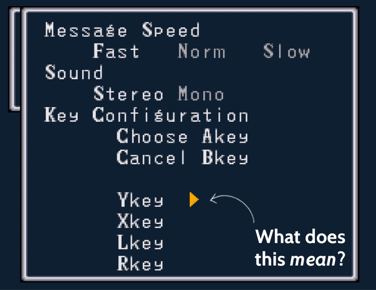
Just like Final Fantasy III shows how much of the environment is interactive, modern applications also work.
See how interactive UI elements are shown in Peach (left) andBuffer (right): The

user on the screen with mouse or touch controls can click anywhere theoretically. The inconvenient menu in Breath of Fire shows that interactions can be misleading even when places for a “click” are limited. The seductive Peach button looks designed to be clicked, but clicking on it gives an error message. Buffer maintains balance by showing gray buttons for non-interacting buttons.
Tell a story to attract user attention
Every classic Final Fantasy game has the same structure. As in Shakespeare’s plays, you find yourself right in the middle of the story, only with an inscription in the start window that sets the context, such as: “Why is this all?”
The story unfolds during an extremely slow, lasting 5-10 minutes video screensaver with sprites wandering around and with links to many names and places that you have no idea about.

But these are fantasy stories, right?
They don’t have a starting point in time, and even if they follow the simplified format “This is me! I’m from a city called X ”, then be prepared that you will be thrown into the universe, the existence of which you never knew before. (In an earlier article, I wrote about why striving to greatly surprise your user is not a good idea.)
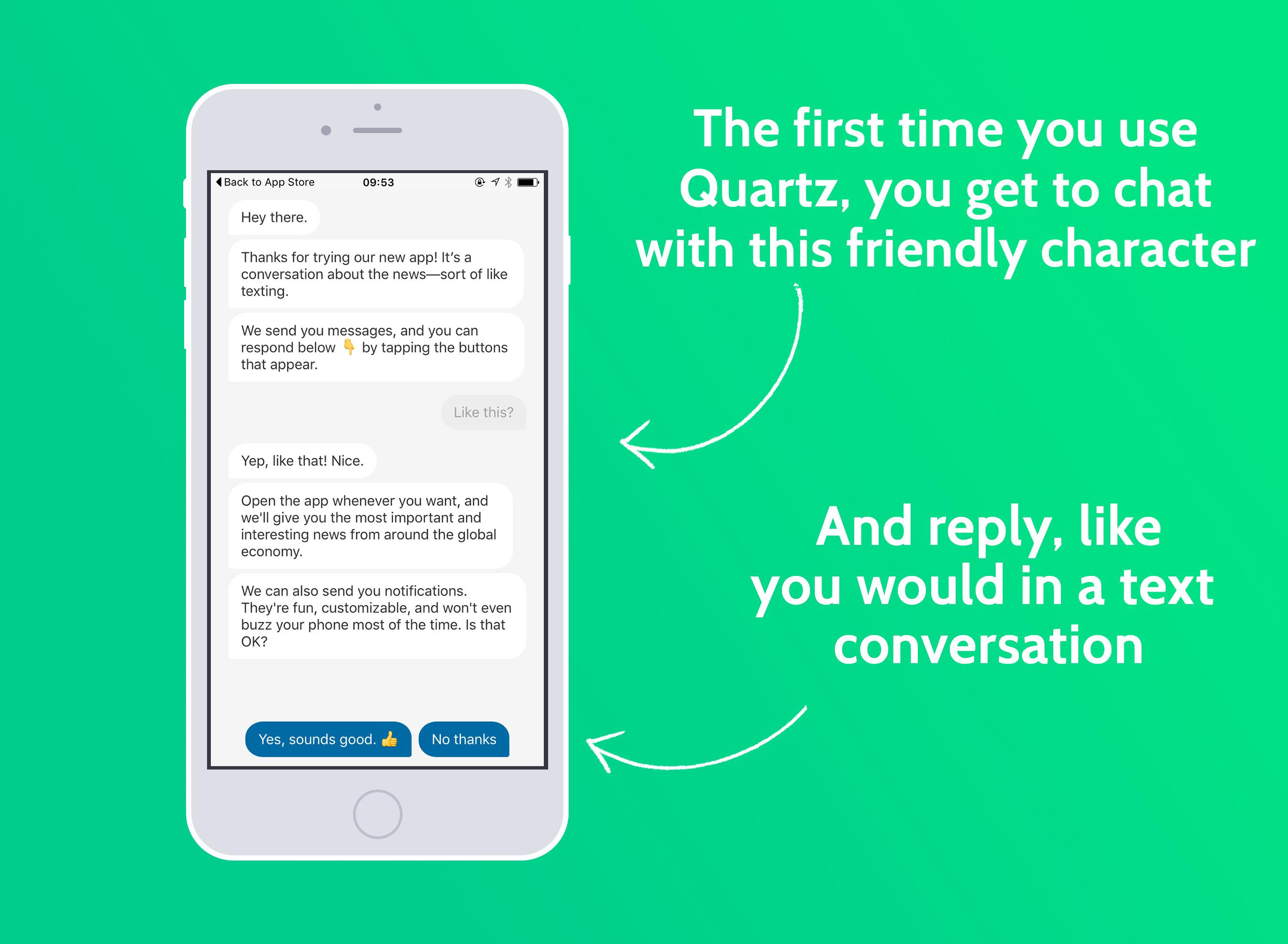
The same situation occurs when starting a new application. Part of the user adaptation processweakens this initial shock. Quartz does a good job with the application in a familiar environment - text chat - with talkative artificial intelligence.
And yet, did the 90s games care about the interface?
Putting aside some obvious failures, such as Dragon Age 6 and Breath of Fire, it seems that the SaaS application interface has borrowed a lot from the past. Some applications, such as Duolingo and Habitica , are under the direct influence of old-school role-playing games.
It would be unfair to say that the games of the 90s did not care about the interface, but unlike today - 14 years after it was releasedthe first basic tutorial on interface development - the priority of interface issues was low.
While Super Nintendo technology limited the complexity and elegance of games running with it, they look awkward only because we are spoiled by carefully licked modern interfaces with a bunch of “goodies”.
In the end, until today I have never complained about the Final Fantasy interface - I sat down and silently chopped into it until 4 in the morning.