June 2, 2016 at 13:07
A Year With Runkeeper: Analyzing and Visualizing Your Travel Information
- Transfer

Translation of Bernat Espigulé-Pons post " A Year of Runkeeper: Analysis and Visualization ".
The code in the article can be downloaded here , and additional files here . Many
thanks to Kirill Guzenko. KirillGuzenko for help in translating and preparing the publication.
Almost a year ago, I decided to record all my movements using Runkeeper , and now I want to present several options for visualizing my annual activity. The project turns out to be simple: I will upload data on my movements from Runkeeper, and analyze / visualize it in Wolfram Language . This animation (see below) shows my movements around Barcelona, and I will show you how to do the same.

Following the directions on this page , I export my data from Runkeeper. There is another way - to connect my Runkeeper account to Wolfram Language using the ServiceConnect function. True, with this function you can analyze only 25 movements, so this time I will export the data manually.
So, as a result, I got a ZIP file with a couple of CSV files, and also all of my previously recorded GPX files. First of all, I will save the laptop (Mathematica file) in the directory in which I unpacked the archive, and then assign this directory as the main one:
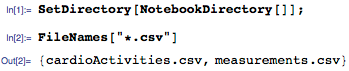
Now let's look at the first line of the file “cardioActivities.csv”:

In Runkeeper, you can take several measurements with different elements at once. To correctly interpret these values, I use the SemanticImport function with the following column types:
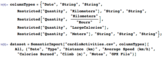
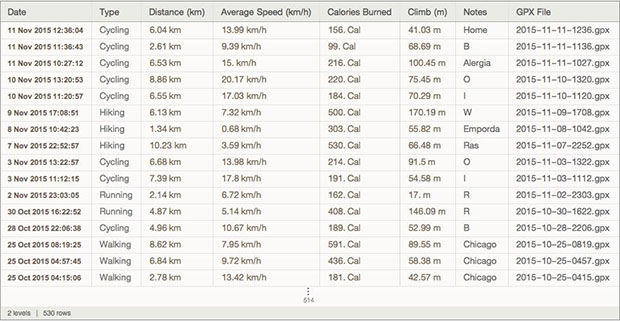
As a result, I get a Datasetan object that is easy to analyze. Let's work with the data:
1. Calculate how many times and how I traveled:
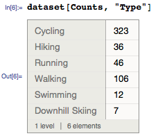
2. Calculate the average distance:

3. Construct a histogram of all distances:

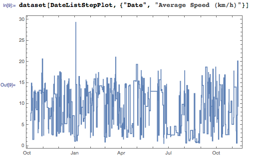
4. Use the DateListStepPlot function to visualize the average speed:
5. Choose a trip longer than 10 miles:


6. Find out how many times I would climb Mount Everest:

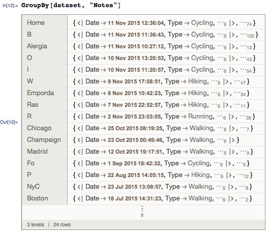
7. Group the types of activities according to their description:
8. Select the events marked “Boston” and import their GPX files:

9. On the map, we will mark the start points for all modes of transportation:
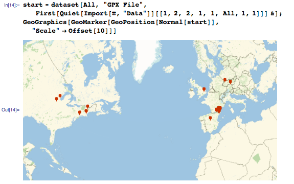
10. And last but not least: We use the TimelinePlot function for all types of movement:
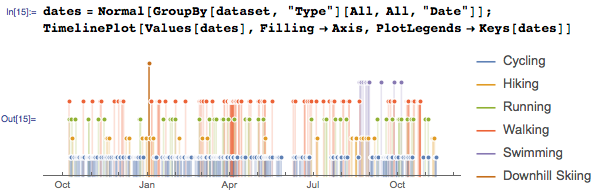
So far, so good. Next we need to pull the data from the GPX files. Using the Import and GeoGraphics functions , we will build a GPS track, marking it with a black line.

But I also want to get data on the height at which I was and the speed at which I was moving. The Import function has the “Data” option , which allows you to access the GPX file of a common form for Wolfram Language (lists, lines, etc.):

This document contains a list of height points and time stamps fixed using the GeoPosition function . Since I’m only interested in points, I defined a function that finds my location and used the TimeSeries functionto determine the height at which I was:

These GPX data represented in the form of association ( Association ) with a pair of keys:
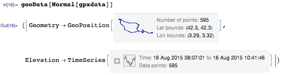
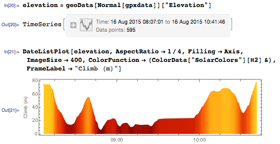
Now it is possible to create a graph DateListPlot , dyed, depending on the function value (height).
Or we ’ll use the “Geometry” parameter : use the Rescale function for the points of elevation, and then color the GPS track depending on the height:

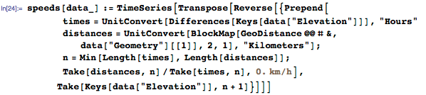
Now, using this data, we can calculate the instantaneous speed. Sander Huisman, member of the Wolfram Communityrecently showed how to calculate instantaneous speed and colorize a GPS track. Below is the function that I defined for calculating time series of instantaneous speed from GeoPosition points and time series of climbs:
Now, let's recall the previous example: DateListPlot can tell me when I made a stop during a trip:
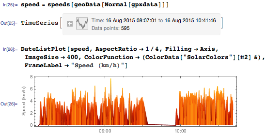
During these short breaks, I stopped to take pictures rock formations that inspired Salvador Dali himself . Let's make a map of these stops by coloring the GPS track according to speed:

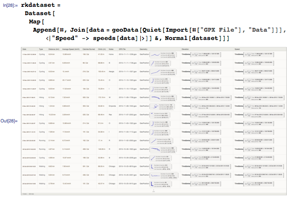
Теперь, когда я могу обозначать точки своего местонахождения, высоту подъема и определять мгновенную скорость движения, можно объединить все это в новый набор данных:
Год назад я переехал из сельской местности в Барселону:
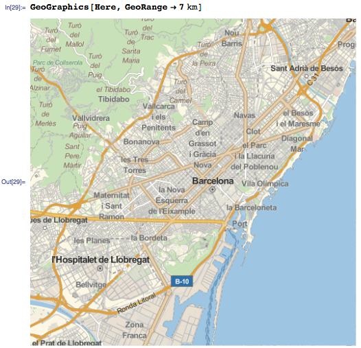
Чтобы обозначить мои передвижения в Барселоне, я мог бы использовать функции GeoWithinQ или GeoDistance, но сейчас эти функции не понадобятся: я сделал пометки к моим передвижениям по городу:

Сначала я хочу убедиться, что все мои передвижения будут обозначены на черно-белой единообразной карте без пометок, и затем нанесу на карту свои передвижения с помощью функции GeoGraphics. Для этого я добавил дополнительные опции GeoStyling для GeoBackgroundto make the background gray shades. I also added a GeoScaleBar and limited the segment on the map using the GeoRange function :
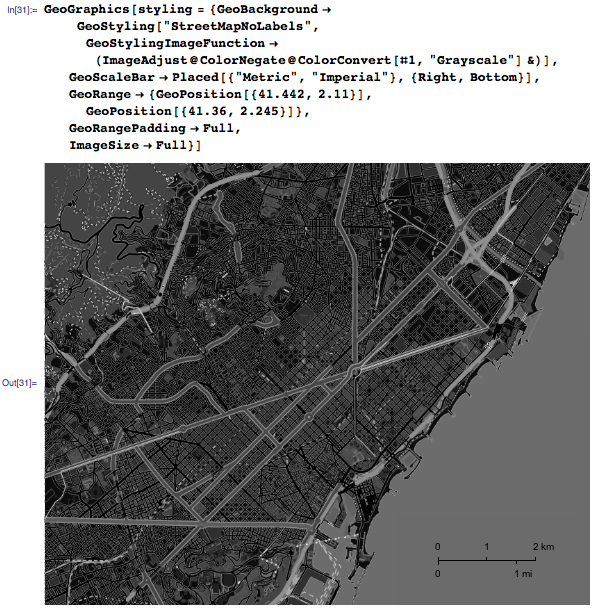
In my opinion, it looks good. Map all recorded movements:
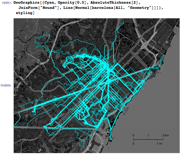
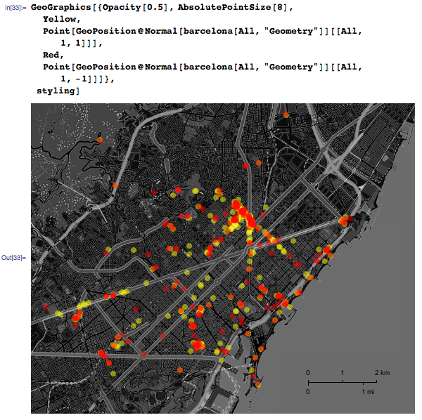
I covered almost the entire city! If I plotted only the start (yellow) and red (end) points, it would become clear where I live. In most cases, I traveled from one point to another using the city’s bicycle-sharing system :
Now let's build a route that will allow us to visit all these places again in the shortest possible time:
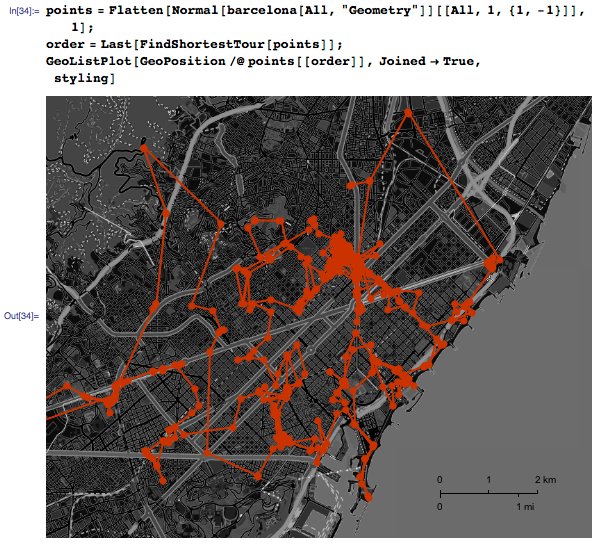
To visit all of them, you need to drive about 170 km:

Not bad, if you compare with how much I have run over the year:

What else have I noticed when using Runkeeper over the course of the year: my path from point A (house) to point B (center of the capoeira) is constantly changing. The fact is, I'm still not sure that getting there by bike is best. The TravelDirections function will help you look at the data in a new way:
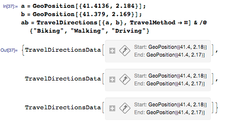
Let 's draw “TravelPath” for three different values of TravelMethod's travel method - “Biking” (on bicycle) (green), “Walking” (on foot) (blue), and “Driving” (driving) ) (red); however, it’s not only a simple way to get from point A to point B: the TravelDistance
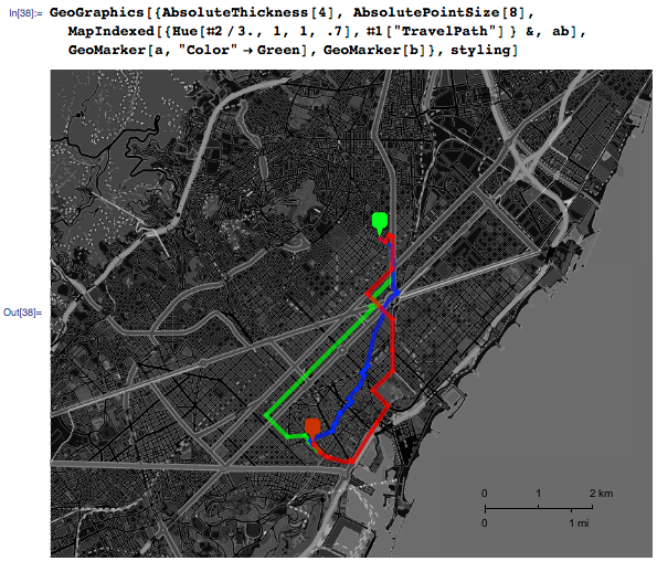
function tells us that the “Walk” path is the shortest:

However, this path passes through the center of Barcelona - Ciutat Vella (the old city), which is a maze of medieval streets with restrictions for pedestrians, so it will take me an hour to get from point A to point B. TravelTime shows that the path “On "bike" faster: I

must say that over the past year I tried various ways to get to point B by bike. My favorite now is the “driving” path, marked in red:

Now let's build the schedules of all 55 trips, colored according to the travel time.
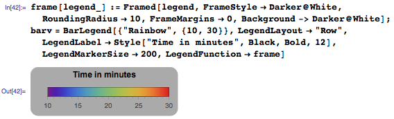
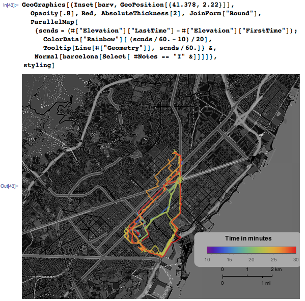
The blue / green paths are closest to the Walk option , and it looks like these are the shortest paths to point B. My record is about 13 minutes:

The average travel time is close to that predicted by TravelDirectionsData :

Using this data, I can travel in time throughout the past year. In my next articles on GeoGraphics , I’m going to colorize GPS-tracks according to the speed of movement and add dates for each type of movement using the Tooltip function :
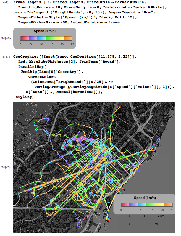
Now you can take each of the movement options individually and animate all my trips and trips around Barcelona for the year.
Animation code is available at the end of this article in CDF format. I suggest using it to analyze your data from Runkeeper. Need more ideas? Pay attention to article (the link to the translation published on Habré) "Chasing yourself, or a great way to start your day . "
For questions about Wolfram technologies, write to [email protected]