A bit about UX and UI in the Ridewithme app
We are the developers of the Ridewithme app. Our goal was to create an application so that people from all over the planet could unite for joint sports. We will start our blog of the story about how to choose the functionality of the application and what in the end turned out to fit in the interface. For those who are interested in the topic of developing mobile applications and services, welcome!
We came up with the idea of a cool service, and we immediately started drawing UI to make it beautiful. We could not get past these rakes, I really wanted to quickly pick up the prototype. This led to the fact that we redesigned the interface about five times. And each time it seemed to us that it was very cool, but if you still screw it, it will be absolutely beauty. Then it was decided to do everything from scratch and the process went more constructively. We started with the functionality:
After compiling the main functionality, we switched to the side one:
Creating such a list immediately put everything in its place. We realized on which windows what is better to place, how to act in the interests of the user and proceeded to a more detailed analysis of future application windows.
We developed UI applications based on ease of use. It sounds corny, but we have an application for every day, that’s why we need an interface with a minimum of animation, pop-ups and other things. Maybe this is too harsh a statement, many will not agree, I'm sure, but at this stage, it seemed reasonable to us to make a bias on simplicity. Armed with Apple guidelines, we got to work.
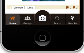
The first problem was the choice between the side menu and the tapbar.
pictures for comparison (unfortunately, our sketches were not left):

We calculated the final number of main application windows. There were five of them, and in order to save money, we decided to use the tapbar (saving user tapes, of course). At any time, you can get to another application window without too much flick. I advise everyone, if possible, to abandon the side menu in their application.
So, after choosing the main hierarchy of windows, the time has come for features. I won’t talk about small ones (for example, the filter window looks nowhere more standard), but I’d like to go into some more.
Map with events - this idea haunted me. It seemed to me that this is the most important feature and I wanted to highlight it. I decided that we should beautifully display it with animation and this is what came of it:

Pins with the name of the event are placed on the map, when you tap on the annotation of the pin, you can go to the detailed information about the event and subscribe. Thus, you can see where this or that event will happen nearby. The solution with animation makes it possible to remove an extra menu item and at the same time it is convenient for the user to place the feature.
When viewing detailed information about the event, the user sometimes needs to get directions to the venue, we solved this problem with a mini-map and tap. When the user goes into the details of the event, he sees a mini-map (on a small screen it is not very usable), when taped, he gets into a map with a walking route, which should help when leaving the car or metro.

For a list of events, we have been looking for our chip for a very long time. I wanted something unusual, and, taking a break from a bunch of libraries and ideas, I settled on the usual TableView with sports icons. Not everyone will understand this decision, but I will try to explain. In the application, I was most afraid of an overabundance of animation and the severity of the perception of information. We wanted to make an application for every day, for those who are constantly on the move and who are quickly tired of pop-up information. My opinion is controversial, I have not yet decided whether I found the same view, in any case, we do not stop and work on the interface constantly.
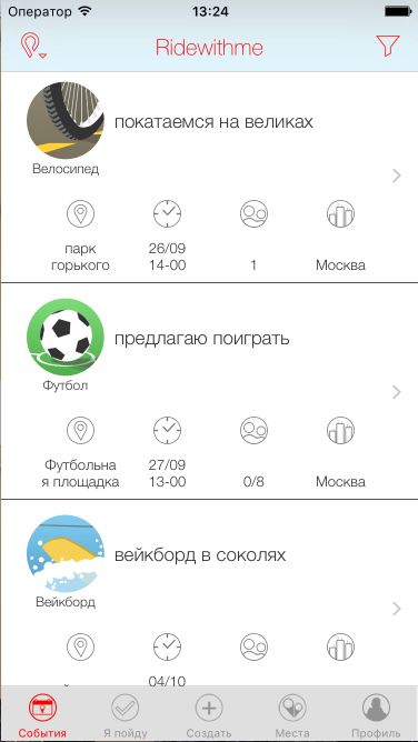
Here I want to show changes in the appearance of the list of events over time, some links have been lost, but I will show what I managed to find:
First option:

Second:
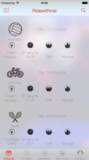
Final:
If you looked at the screenshots, you already saw how we experimented with the bluer. I personally really like this effect and wanted to use it. But in the end, we refused it, due to the fact that on the whole screen it does not look.
PS we will definitely continue the cycle of articles if you like them. Write in the comments about what it would be interesting to read.
How it all started with UX
We came up with the idea of a cool service, and we immediately started drawing UI to make it beautiful. We could not get past these rakes, I really wanted to quickly pick up the prototype. This led to the fact that we redesigned the interface about five times. And each time it seemed to us that it was very cool, but if you still screw it, it will be absolutely beauty. Then it was decided to do everything from scratch and the process went more constructively. We started with the functionality:
- List of events. The user will definitely want to see a list of everything that people offer.
- List of Subscriptions. List of events the user has already subscribed to.
- Create an event. Event creation window.
- List of places. View good places, add your own, this should be implemented here.
- Profile. Look at yourself, add data about yourself.
After compiling the main functionality, we switched to the side one:
- Filter
- Login
- List of cities, countries, etc.
- Map
- Route to the place
Creating such a list immediately put everything in its place. We realized on which windows what is better to place, how to act in the interests of the user and proceeded to a more detailed analysis of future application windows.
Go to the UI
We developed UI applications based on ease of use. It sounds corny, but we have an application for every day, that’s why we need an interface with a minimum of animation, pop-ups and other things. Maybe this is too harsh a statement, many will not agree, I'm sure, but at this stage, it seemed reasonable to us to make a bias on simplicity. Armed with Apple guidelines, we got to work.
The first problem was the choice between the side menu and the tapbar.
pictures for comparison (unfortunately, our sketches were not left):
We calculated the final number of main application windows. There were five of them, and in order to save money, we decided to use the tapbar (saving user tapes, of course). At any time, you can get to another application window without too much flick. I advise everyone, if possible, to abandon the side menu in their application.
So, after choosing the main hierarchy of windows, the time has come for features. I won’t talk about small ones (for example, the filter window looks nowhere more standard), but I’d like to go into some more.
Map
Map with events - this idea haunted me. It seemed to me that this is the most important feature and I wanted to highlight it. I decided that we should beautifully display it with animation and this is what came of it:
Pins with the name of the event are placed on the map, when you tap on the annotation of the pin, you can go to the detailed information about the event and subscribe. Thus, you can see where this or that event will happen nearby. The solution with animation makes it possible to remove an extra menu item and at the same time it is convenient for the user to place the feature.
Places and map again
When viewing detailed information about the event, the user sometimes needs to get directions to the venue, we solved this problem with a mini-map and tap. When the user goes into the details of the event, he sees a mini-map (on a small screen it is not very usable), when taped, he gets into a map with a walking route, which should help when leaving the car or metro.
Feed
For a list of events, we have been looking for our chip for a very long time. I wanted something unusual, and, taking a break from a bunch of libraries and ideas, I settled on the usual TableView with sports icons. Not everyone will understand this decision, but I will try to explain. In the application, I was most afraid of an overabundance of animation and the severity of the perception of information. We wanted to make an application for every day, for those who are constantly on the move and who are quickly tired of pop-up information. My opinion is controversial, I have not yet decided whether I found the same view, in any case, we do not stop and work on the interface constantly.
Here I want to show changes in the appearance of the list of events over time, some links have been lost, but I will show what I managed to find:
First option:
Second:
Final:
If you looked at the screenshots, you already saw how we experimented with the bluer. I personally really like this effect and wanted to use it. But in the end, we refused it, due to the fact that on the whole screen it does not look.
PS we will definitely continue the cycle of articles if you like them. Write in the comments about what it would be interesting to read.