December 29, 2015 at 10:10
Why is percentile calculation not working as you expect?
- Transfer
Often customers ask us about the p99 metric (99th percentile).
This is definitely a reasonable request and we plan to add similar functionality to VividCortex (I'll talk about this later). But at the same time, when customers ask about it, they mean something very specific - something that can be a problem. They are not asking for the 99th percentile for some metric, they are asking for a metric for the 99th percentile . This is common for systems such as Graphite , but all this does not give the result that is expected from such systems. This post will tell you that you may have misconceptions about percentiles, the exact extent of your misconceptions, and what you can do right in this case.
(This is a translation of the articlewritten by Baron Schwartz .)
In the past few years, many people have immediately started talking about the fact that there are a number of problems in monitoring by average values. It is good that this topic has now begun to be actively discussed, since over time the average values of the parameters in monitoring have been generated and adopted without any close analysis.
Averages are a problem and hardly help when it comes to monitoring. If you just watch the averages, you will most likely miss the data that has the greatest impact on your system: when you look for any problems, the events that are especially important to you by definition will be outliers. There are two problems with average values in the case of emissions:
So when you average a metric in a system with errors, you combine the worst: you are already observing an unusual state of the system, but at the same time you see nothing unusual.
By the way, the work of most software systems is teeming with extreme emissions.
Viewing outliers in the long tail by frequency of occurrence is very important because it shows you exactly how poorly you send requests in some rare cases. You will not see this if you work only with the middle ones.
As Amazon's Werner Vogels said at the re: Invent opening: the only thing the averages can tell you is that you serve half your customers even worse. (Although this statement is absolutely correct in spirit, it does not quite reflect reality: it would be more correct to say about the median (it’s the 50th percentile) - this metric provides this property)
Optimizely published a post in this post a couple of years ago. She perfectly explains why averages can lead to unexpected consequences:
Brendan Gregg also explained this well :
Percentiles (quantiles - in a broader sense) are often extolled as a means to overcome this fundamental drawback of mean values. The meaning of the 99th percentile is to collect the entire set of data (in other words, the entire collection of system measurements) and sort them, then discard the 1% of the largest and take the largest value from the remaining. The resulting value has two important properties:
Of course, you are not required to choose exactly 99%. Widespread options are the 90th, 95th and 99.9th (or even more nine) percentiles.
And now you assume: averages are bad, and percentiles are excellent - let's calculate percentiles by metrics and store them in our storage for time series storage ( TSDB )? But it’s not so simple.
There is a big problem with percentiles in time series data. The problem is that most TSDBs almost always store aggregated metrics at time intervals, rather than the entire sample of measured events. Subsequently, TSDBs average these time metrics in a number of cases. The most important:
And here the problem appears. You are again dealing with averaging in some form. Percentile averaging does not work, because in order to calculate the percentile on a new scale, you must have a complete sample of events. All calculations are actually incorrect. Percentile averaging makes no sense. (The consequences of this may be arbitrary. I will come back to this later.)

Unfortunately, some common open-source monitoring products incite the use of percentile metrics, which in fact will then be resampled when saved. For example, StatsD allows you to calculate the desired percentile and then generates a metric with a name like foo.upper_99 and periodically drops them for saving in Graphite. Everything is fine if the discreteness of time during viewing does not change, but we know that this still happens.
A misunderstanding of how all these calculations occur is extremely common. Reading the comment thread on this StatsD GitHub ticket illustrates this very well. Some comrades there talk about things that have nothing to do with reality.

Perhaps the shortest way to identify a problem would be to say this: Percentiles are calculated from a collection of measurements and should be recounted completely every time this collection changes. TSDBs periodically average data over various time intervals, but at the same time do not store the original sample of measurements.
But, if the calculation of percentiles really requires a full selection of original events (for example, each time each web page loads), then in this case we have a big problem. The problem of "Big Data" - it will be more accurate to say so. That is why the true calculation of percentiles is extremely costly.
There are several ways to calculate * approximate percentiles that are almost as good as storing a complete sample of measurements and then sorting and calculating them. You can find a lot of scientific research in various areas including:
The essence of most of these decisions is to approximate the distribution of the collection in one way or another. From the distribution information, you can calculate the approximate percentiles, as well as some other interesting metrics. Again from Optimizely’s blog, you can give an interesting example of the distribution of response times, as well as the average and 99th percentile:
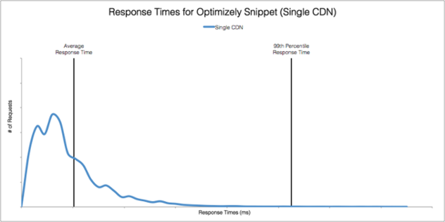
There are many ways to calculate and store approximate distributions, but histograms are especially popular because of their relative simplicity. Some monitoring solutions support histograms. Circonus, for example, is one of those. Theo Schlossnagle, CEO of Circonus, often writes about the benefits of bar charts.
Ultimately, having a distribution of the original collection of events is useful not only for calculating percentiles, but also allows you to identify some things about which percentiles cannot say. In the end, the percentile is just a number that is just trying to reflect a lot of information about the data. I won’t go as far as Theo did when he tweeted that “99th is no better than average”, because here I agree with percentile fans that percentiles are much more informative than average values in representing some important characteristics of the original sample. Nevertheless, percentiles will not tell you as much about the data as more detailed histograms. The Optimizely illustration above contains an order of magnitude more information than any single number can do.
The best way to calculate percentiles in TSDB is to collect range metrics. I made such an assumption, since many TSDBs are in fact just key-value collections sorted by timestamps without the ability to store histograms.
Range metrics provide the same capabilities as a sequence of histograms over time. All you have to do is select the limits that will separate the values by ranges, and then calculate all the metrics separately for each of the ranges. The metric will be the same as for the histogram: namely, the number of events whose values fall into this range.
But in general, choosing ranges for separation is not an easy task. Usually a good choice would be ranges with logarithmically progressive sizes or ranges that provide storage of coarse values to speed up calculations (at the cost of not counting smoothly growing counters). But ranges with the same dimensions are unlikely to be a good choice. For more information on this topic, see Brendan Gregg .
There is a fundamental contradiction between the amount of data stored and their degree of accuracy. However, even a rough allocation of ranges provides a better representation of the data than the average. For example, Phusion Passenger Union Stationshows range latency metrics for 11 ranges. (It does not seem to me at all that the illustration is visual; the value along the y axis is somewhat confusing, in fact it is a 3D graph projected in a 2D nonlinear way. Nevertheless, it still gives more information than the average value could give.)
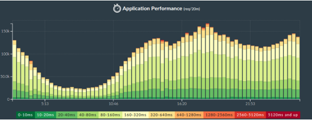
How can this be implemented using popular open-source products? You must define ranges and create columns in the form of stacks as in the picture above.
But calculating the percentile from these data will now be much more difficult. You will have to go through all the ranges in the reverse order, from large to smaller, adding up the counters of the number of events along the way. As soon as you get the sum of the number of events greater than 1% of the total, it is this range that will store the value of 99% percentile. There are many nuances here - lax equalities; how to handle borderline cases, what value to choose for the percentile (range above or below? or maybe in the middle? or maybe weighed on everyone?).
In general, such calculations can be very confusing. For example, you can assume that you need 100 ranges to calculate the 99th percentile, but in fact, things could be different. If you have only two ranges and 1% of all values falls into the upper range, then you can get 99% percentile and so on. (If this seems strange to you, then think about quantiles in general; I believe that understanding the essence of quantiles is very valuable.)
So it's not all simple. This is possible in theory, but in practice it depends heavily on whether the store supports the necessary types of queries to obtain approximate percentiles by range metrics. If you know the repositories in which this is possible - write in the comments (on the author’s site - approx. Per. )
The good thing is that in systems like Graphite (that is, in those that rely on the fact that all metrics can be freely averaged and resampled), all range metrics are absolutely resistant to these types of transformations. You will get the correct values because all calculations are commutative with respect to time.
The percentile is just a number, as is the average. The average displays the center of mass of the sample, the percentile shows the mark of the upper level of the specified fraction of the sample. Think of the percentiles as traces of the waves on the beach. But, although the percentile reflects the upper levels, and not just the central trend as an average, it is still not so informative and detailed in comparison with the distribution, which in turn describes the entire sample.
Meet, there are heatmaps - which are actually 3D graphs in which the histograms are rotated and aligned together over time, and the values are displayed in color. Again, Circonus provides an excellent example of visualizing heatmaps .
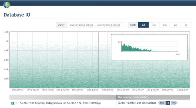
On the other hand, as I know, Graphite does not yet provide the ability to create heatmaps using range metrics. If I’m wrong and this can be done using some kind of trick - let me know (to the author of the article - approx. Per. ).
Heatmaps are also great for displaying the shape and density of delays in particular. Another example of a heat map for delays is the Fastly streaming delivery summary .
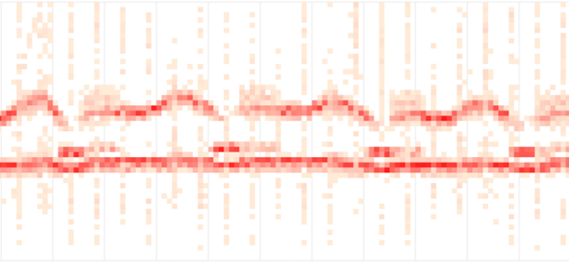
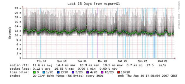
Even some ancient tools that you already seem primitive can create heatmaps. For example, Smokeping uses dimming to display ranges of values. Bright green indicates the average:
Well, after all the difficulties and nuances mentioned that should be taken into account, perhaps the good old StatsD metric upper_99 for showing percentiles does not seem so bad to you. In the end, it is very simple, convenient and ready to use. Is this metric really so bad?
It all depends on the circumstances. For many use cases, they are great. I mean, in any case, you still limit yourself to the fact that percentiles do not always describe the data well. But if this doesn’t matter to you, then the biggest problem for you is oversampling of these metrics, which will mean that you will then observe incorrect data.
But measurements are generally the wrong thing- in any case, and in addition, a lot of essentially wrong things nevertheless are still somehow useful. For example, I could tell that a good half of the metrics that people are looking at are actually already knowingly distorted. For example, load average for systems is indicative. This parameter is undeniably useful, but as soon as you find out exactly how this “sausage” is made , you will probably experience a shock at first. (There is an excellent article on the Habré about computing LA - approx. Per. ) In the same way, many systems in a similar way compressedly display various metrics of their performance. Many of the metrics from Cassandra are the result of the Metrics library (Coda Hale) and are actually floating averaging (exponentially weighted floating average ), to which many people have persistent disgust .
But back to the percentile metrics. If you save the p99 metric and then reduce and view the average version over a long period of time - although it may not be “right” and it may even be that the graph will be very different from the real value of the 99th percentile, but what it will be wrong, does not necessarily mean that this schedule cannot be used for the desired purposes, namely to understand the worst cases in the interaction of users with your application.
So it all depends on the case. If you understand how the percentiles work and that it is wrong to average the percentiles, and it suits you, then storing the percentiles can be permissible and even useful. But here you are introducing a moral dilemma: with this approach, you can greatly confuse unsuspecting people (perhaps even your colleagues). Look at the comments on the ticket on StatsD once again: a lack of understanding of the essence of the process is directly felt.
Let me draw a not-so-good analogy: I sometimes use things from my refrigerator that I would never have suggested to others. Just ask my wife about it. (The author’s wife - approx.) If you give people a bottle that says “alcohol,” and it contains methanol, these people will go blind. But some will ask: “what kind of alcohol is contained in this bottle?” You better stick to the same measure of responsibility in relation to such issues.
At the moment, our TSDB does not support histograms and we do not support the calculation and saving of percentiles (although you can just send us any of your metrics , if necessary).
For the future, we plan to support the storage of high resolution range metrics, that is, metrics with a large number of ranges. We will be able to implement something similar, since most of the ranges are likely to be empty and our TSDB will be able to efficiently process sparse data (it is also likely that after averaging over time they will no longer be so sparse - approx. Per.) This will give us the opportunity to produce histograms once a second (all our data is stored with a resolution of 1 second). Range metrics will be rescritized to 1-minute resolution after the period specified in the settings, which is set to 3 days by default. In this case, the range metrics will be resampled to a 1-minute resolution without any mathematical problems.
And in the end, from these range metrics we get the opportunity to get any percentile you want, show an error estimate, show a heat map and show a distribution curve.
It will not be quick to implement and will require a lot of effort from the engineers, but the work has begun and the system has already been developed with all this in mind. I can’t promise when exactly this will be realized, but I consider it necessary to talk about our long-term plans.
The post turned out to be somewhat longer than I intended at first, but I touched on a lot of topics.
I hope all this was useful to you.
This is definitely a reasonable request and we plan to add similar functionality to VividCortex (I'll talk about this later). But at the same time, when customers ask about it, they mean something very specific - something that can be a problem. They are not asking for the 99th percentile for some metric, they are asking for a metric for the 99th percentile . This is common for systems such as Graphite , but all this does not give the result that is expected from such systems. This post will tell you that you may have misconceptions about percentiles, the exact extent of your misconceptions, and what you can do right in this case.
(This is a translation of the articlewritten by Baron Schwartz .)
We give up the middle
In the past few years, many people have immediately started talking about the fact that there are a number of problems in monitoring by average values. It is good that this topic has now begun to be actively discussed, since over time the average values of the parameters in monitoring have been generated and adopted without any close analysis.
Averages are a problem and hardly help when it comes to monitoring. If you just watch the averages, you will most likely miss the data that has the greatest impact on your system: when you look for any problems, the events that are especially important to you by definition will be outliers. There are two problems with average values in the case of emissions:
- The averages hide emissions and you do not see them.
- Outliers shift average values, so that in a system in which outliers exist, the average values no longer reflect the normal state of the system.
So when you average a metric in a system with errors, you combine the worst: you are already observing an unusual state of the system, but at the same time you see nothing unusual.
By the way, the work of most software systems is teeming with extreme emissions.
Viewing outliers in the long tail by frequency of occurrence is very important because it shows you exactly how poorly you send requests in some rare cases. You will not see this if you work only with the middle ones.
As Amazon's Werner Vogels said at the re: Invent opening: the only thing the averages can tell you is that you serve half your customers even worse. (Although this statement is absolutely correct in spirit, it does not quite reflect reality: it would be more correct to say about the median (it’s the 50th percentile) - this metric provides this property)
Optimizely published a post in this post a couple of years ago. She perfectly explains why averages can lead to unexpected consequences:
“Although averages are very easy to understand, they can also lead to extreme misconceptions. Why? Because monitoring the average response time is like measuring the average temperature of a hospital. While what really bothers you is the temperature of each of the patients, and especially which of the patients needs your help in the first place. ”
Brendan Gregg also explained this well :
“As a statistical characteristic, average values (including arithmetic mean) in practical application have many advantages. However, the ability to describe the distribution of values is not one of them. ”
Forward to the percentiles
Percentiles (quantiles - in a broader sense) are often extolled as a means to overcome this fundamental drawback of mean values. The meaning of the 99th percentile is to collect the entire set of data (in other words, the entire collection of system measurements) and sort them, then discard the 1% of the largest and take the largest value from the remaining. The resulting value has two important properties:
- This is the largest value of the values that are obtained in 99% of cases. If this value, for example, is a measurement of the loading time of a web page, then it reflects the worst case of service, which is obtained at least 99% of visits to your service.
- This value is resistant to really strong outliers that occur for a variety of reasons, including measurement errors.
Of course, you are not required to choose exactly 99%. Widespread options are the 90th, 95th and 99.9th (or even more nine) percentiles.
And now you assume: averages are bad, and percentiles are excellent - let's calculate percentiles by metrics and store them in our storage for time series storage ( TSDB )? But it’s not so simple.
How exactly do TSDBs store and process metrics
There is a big problem with percentiles in time series data. The problem is that most TSDBs almost always store aggregated metrics at time intervals, rather than the entire sample of measured events. Subsequently, TSDBs average these time metrics in a number of cases. The most important:
- They average metrics if the discreteness of time in your request differs from the discreteness of time that was used when aggregating data while saving. If you want to display a metric chart for the day, for example, 600px wide, then each pixel will reflect 144 seconds of data. This averaging is implicit and users have no idea about it. But in fact, these services should have displayed a warning!
- TSDBs average data when they are stored for long-term storage at a lower resolution, which is what happens in most TSDBs.
And here the problem appears. You are again dealing with averaging in some form. Percentile averaging does not work, because in order to calculate the percentile on a new scale, you must have a complete sample of events. All calculations are actually incorrect. Percentile averaging makes no sense. (The consequences of this may be arbitrary. I will come back to this later.)
Unfortunately, some common open-source monitoring products incite the use of percentile metrics, which in fact will then be resampled when saved. For example, StatsD allows you to calculate the desired percentile and then generates a metric with a name like foo.upper_99 and periodically drops them for saving in Graphite. Everything is fine if the discreteness of time during viewing does not change, but we know that this still happens.
A misunderstanding of how all these calculations occur is extremely common. Reading the comment thread on this StatsD GitHub ticket illustrates this very well. Some comrades there talk about things that have nothing to do with reality.
- Susie, how much is 12 + 7?
- Billion!
- Thanks!
“... uh, but that kind of thing can't be true?”
- she said the same thing about 3 + 4
Perhaps the shortest way to identify a problem would be to say this: Percentiles are calculated from a collection of measurements and should be recounted completely every time this collection changes. TSDBs periodically average data over various time intervals, but at the same time do not store the original sample of measurements.
Other ways to calculate percentiles
But, if the calculation of percentiles really requires a full selection of original events (for example, each time each web page loads), then in this case we have a big problem. The problem of "Big Data" - it will be more accurate to say so. That is why the true calculation of percentiles is extremely costly.
There are several ways to calculate * approximate percentiles that are almost as good as storing a complete sample of measurements and then sorting and calculating them. You can find a lot of scientific research in various areas including:
- histograms that divide the entire collection of events by ranges (or baskets) and after that calculate how many events fall into each of the ranges (baskets)
- approximate stream data structures and algorithms (counting sketches, “sketchs”)
- repositories that select from a collection of events to provide rough answers
- solutions with time, quantity or both limitations
The essence of most of these decisions is to approximate the distribution of the collection in one way or another. From the distribution information, you can calculate the approximate percentiles, as well as some other interesting metrics. Again from Optimizely’s blog, you can give an interesting example of the distribution of response times, as well as the average and 99th percentile:
There are many ways to calculate and store approximate distributions, but histograms are especially popular because of their relative simplicity. Some monitoring solutions support histograms. Circonus, for example, is one of those. Theo Schlossnagle, CEO of Circonus, often writes about the benefits of bar charts.
Ultimately, having a distribution of the original collection of events is useful not only for calculating percentiles, but also allows you to identify some things about which percentiles cannot say. In the end, the percentile is just a number that is just trying to reflect a lot of information about the data. I won’t go as far as Theo did when he tweeted that “99th is no better than average”, because here I agree with percentile fans that percentiles are much more informative than average values in representing some important characteristics of the original sample. Nevertheless, percentiles will not tell you as much about the data as more detailed histograms. The Optimizely illustration above contains an order of magnitude more information than any single number can do.
Even better percentiles in TSDB
The best way to calculate percentiles in TSDB is to collect range metrics. I made such an assumption, since many TSDBs are in fact just key-value collections sorted by timestamps without the ability to store histograms.
Range metrics provide the same capabilities as a sequence of histograms over time. All you have to do is select the limits that will separate the values by ranges, and then calculate all the metrics separately for each of the ranges. The metric will be the same as for the histogram: namely, the number of events whose values fall into this range.
But in general, choosing ranges for separation is not an easy task. Usually a good choice would be ranges with logarithmically progressive sizes or ranges that provide storage of coarse values to speed up calculations (at the cost of not counting smoothly growing counters). But ranges with the same dimensions are unlikely to be a good choice. For more information on this topic, see Brendan Gregg .
There is a fundamental contradiction between the amount of data stored and their degree of accuracy. However, even a rough allocation of ranges provides a better representation of the data than the average. For example, Phusion Passenger Union Stationshows range latency metrics for 11 ranges. (It does not seem to me at all that the illustration is visual; the value along the y axis is somewhat confusing, in fact it is a 3D graph projected in a 2D nonlinear way. Nevertheless, it still gives more information than the average value could give.)
How can this be implemented using popular open-source products? You must define ranges and create columns in the form of stacks as in the picture above.
But calculating the percentile from these data will now be much more difficult. You will have to go through all the ranges in the reverse order, from large to smaller, adding up the counters of the number of events along the way. As soon as you get the sum of the number of events greater than 1% of the total, it is this range that will store the value of 99% percentile. There are many nuances here - lax equalities; how to handle borderline cases, what value to choose for the percentile (range above or below? or maybe in the middle? or maybe weighed on everyone?).
In general, such calculations can be very confusing. For example, you can assume that you need 100 ranges to calculate the 99th percentile, but in fact, things could be different. If you have only two ranges and 1% of all values falls into the upper range, then you can get 99% percentile and so on. (If this seems strange to you, then think about quantiles in general; I believe that understanding the essence of quantiles is very valuable.)
So it's not all simple. This is possible in theory, but in practice it depends heavily on whether the store supports the necessary types of queries to obtain approximate percentiles by range metrics. If you know the repositories in which this is possible - write in the comments (on the author’s site - approx. Per. )
The good thing is that in systems like Graphite (that is, in those that rely on the fact that all metrics can be freely averaged and resampled), all range metrics are absolutely resistant to these types of transformations. You will get the correct values because all calculations are commutative with respect to time.
Outside of the percentiles: heatmaps
The percentile is just a number, as is the average. The average displays the center of mass of the sample, the percentile shows the mark of the upper level of the specified fraction of the sample. Think of the percentiles as traces of the waves on the beach. But, although the percentile reflects the upper levels, and not just the central trend as an average, it is still not so informative and detailed in comparison with the distribution, which in turn describes the entire sample.
Meet, there are heatmaps - which are actually 3D graphs in which the histograms are rotated and aligned together over time, and the values are displayed in color. Again, Circonus provides an excellent example of visualizing heatmaps .
On the other hand, as I know, Graphite does not yet provide the ability to create heatmaps using range metrics. If I’m wrong and this can be done using some kind of trick - let me know (to the author of the article - approx. Per. ).
Heatmaps are also great for displaying the shape and density of delays in particular. Another example of a heat map for delays is the Fastly streaming delivery summary .
Even some ancient tools that you already seem primitive can create heatmaps. For example, Smokeping uses dimming to display ranges of values. Bright green indicates the average:
But is it really bad to keep percentile metrics?
Well, after all the difficulties and nuances mentioned that should be taken into account, perhaps the good old StatsD metric upper_99 for showing percentiles does not seem so bad to you. In the end, it is very simple, convenient and ready to use. Is this metric really so bad?
It all depends on the circumstances. For many use cases, they are great. I mean, in any case, you still limit yourself to the fact that percentiles do not always describe the data well. But if this doesn’t matter to you, then the biggest problem for you is oversampling of these metrics, which will mean that you will then observe incorrect data.
But measurements are generally the wrong thing- in any case, and in addition, a lot of essentially wrong things nevertheless are still somehow useful. For example, I could tell that a good half of the metrics that people are looking at are actually already knowingly distorted. For example, load average for systems is indicative. This parameter is undeniably useful, but as soon as you find out exactly how this “sausage” is made , you will probably experience a shock at first. (There is an excellent article on the Habré about computing LA - approx. Per. ) In the same way, many systems in a similar way compressedly display various metrics of their performance. Many of the metrics from Cassandra are the result of the Metrics library (Coda Hale) and are actually floating averaging (exponentially weighted floating average ), to which many people have persistent disgust .
But back to the percentile metrics. If you save the p99 metric and then reduce and view the average version over a long period of time - although it may not be “right” and it may even be that the graph will be very different from the real value of the 99th percentile, but what it will be wrong, does not necessarily mean that this schedule cannot be used for the desired purposes, namely to understand the worst cases in the interaction of users with your application.
So it all depends on the case. If you understand how the percentiles work and that it is wrong to average the percentiles, and it suits you, then storing the percentiles can be permissible and even useful. But here you are introducing a moral dilemma: with this approach, you can greatly confuse unsuspecting people (perhaps even your colleagues). Look at the comments on the ticket on StatsD once again: a lack of understanding of the essence of the process is directly felt.
Let me draw a not-so-good analogy: I sometimes use things from my refrigerator that I would never have suggested to others. Just ask my wife about it. (The author’s wife - approx.) If you give people a bottle that says “alcohol,” and it contains methanol, these people will go blind. But some will ask: “what kind of alcohol is contained in this bottle?” You better stick to the same measure of responsibility in relation to such issues.
What exactly does VividCortex do?
At the moment, our TSDB does not support histograms and we do not support the calculation and saving of percentiles (although you can just send us any of your metrics , if necessary).
For the future, we plan to support the storage of high resolution range metrics, that is, metrics with a large number of ranges. We will be able to implement something similar, since most of the ranges are likely to be empty and our TSDB will be able to efficiently process sparse data (it is also likely that after averaging over time they will no longer be so sparse - approx. Per.) This will give us the opportunity to produce histograms once a second (all our data is stored with a resolution of 1 second). Range metrics will be rescritized to 1-minute resolution after the period specified in the settings, which is set to 3 days by default. In this case, the range metrics will be resampled to a 1-minute resolution without any mathematical problems.
And in the end, from these range metrics we get the opportunity to get any percentile you want, show an error estimate, show a heat map and show a distribution curve.
It will not be quick to implement and will require a lot of effort from the engineers, but the work has begun and the system has already been developed with all this in mind. I can’t promise when exactly this will be realized, but I consider it necessary to talk about our long-term plans.
conclusions
The post turned out to be somewhat longer than I intended at first, but I touched on a lot of topics.
- If you plan to calculate percentiles for a certain interval and subsequently save the result in the form of time series - as some existing repositories do - you may not get exactly what you expect.
- Accurate percentiles are computationally intensive.
- Approximate percentiles can be calculated from histograms, range metrics, and other useful computing techniques.
- Such data will also allow distributions and heatmaps to be issued, which will be even more informative than simple percentiles.
- If all this is not available right now or you cannot afford it, go ahead, use percentile metrics, but remember the consequences.
I hope all this was useful to you.
PS
- Someone mentioned on Twitter about the effect: “oops, pntnko, it turns out I’m doing everything somehow wrong. But I switched to calculating the percentage of requests that are executed in a time smaller / larger than the specified value and save this metric instead of the previous one. ”But this also does not work. The approach of calculating averages by shares (and percentage is a share) still does not work. Instead, keep a metric of the number of requests that are not completed in the desired time. This will work.
- I could not immediately find an excellent post from Theo on this topic. Here it is: http://www.circonus.com/problem-math/