How to draw graphs and charts in Atlassian Confluence

Atlassian Confluence is a powerful solution for deploying the Enterprise Wiki in an organization (although there are no technical problems with using it at home - a license for 10 users costs only $ 10 a year). And personally, I like Confluence because it has a friendly interface and allows you to intuitively edit content, easily complementing it with visual components, which allows you to get beautiful and easy-to-view pages in the end. By the way, this post is also written in Confluence.
As many people know, visualization has a big impact on how content is perceived. Recently, there has been a clear trend in any social networks and thematic communities: if your post does not contain visual information, for example, the same pictures with cats, few will read it. And if it is also longer than one page ... So, you need to use graphics. And here I refer to the post of comrades from DevExpress , where they gave interesting facts about visualization (alas, without proofs, but the numbers in my opinion are very similar to the truth):
- 90% of information a person perceives through vision
- 70% of sensory receptors are in the eyes
- about half of the neurons of the human brain are involved in the processing of visual information
- 19% less when working with visual data using cognitive brain function, which is responsible for processing and analyzing information
- 17% higher productivity of a person working with visual information
- 4.5% better recall detailed visual information
Considering the obvious usefulness of competent visualization and the corporate focus of Confluence, let's try to draw a little right on the wiki pages. You can draw a lot of things there, but “out of the box” functionality allows you to draw graphs and insert pictures. But this will not stop us, because in the Atlassian ecosystem, third-party vendors produce a huge number of add-ons for every taste and color, and even the coolest and most expensive product can be taken and tried for free for a month. And so, if the memory serves, up to six times in a row, which gives you completely legal half a year to think it over, it will be easier to start denying the add-on for yourself or
Charts in Confluence
As I mentioned above, drawing out of the box is not very successful. But, if we turn our attention to add-ons, then there are many of them for drawing various kinds of diagrams. Let's try to consider those that are most widely heard and the first fell into the caring hands of search results. This list includes:
- Confluence Diagramming by Creately
- Draw.io Diagrams for Confluence
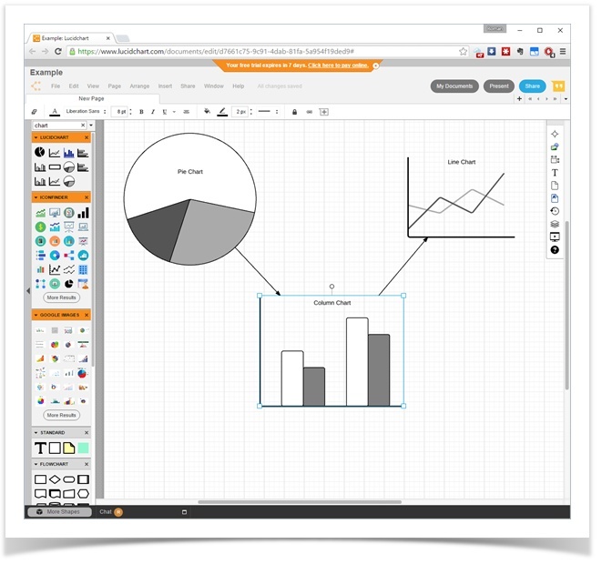
- Lucidchart for confluence
- Gliffy Diagrams for Confluence
- Graphviz Diagrams for Confluence
The first four products, from my point of view, are very similar to each other. Perhaps he even had the fact of “borrowing” certain elements of functionality from each other. They understand the Visio format, which allows us not to puzzle over the question “why do we need to redraw all our diagrams” - you can simply import the existing files. The process of drawing diagrams is also very similar - elements from the image libraries are added to the page, links between them, and signatures. Many of the add-on providers offer to use their web-based diagrams.
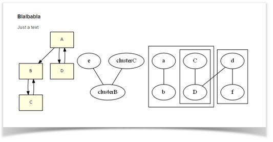
Graphviz Diagrams by Bob Swift stands somewhat apart. This product violates the Atlassian ecosystem principles, where everything is implemented very simply and intuitively, but it has its own special charm. Yes, you will need to not only add the addon to Confluence, but also install the graphviz graph visualization library on your server . But then you can use the powerful DOT language to automatically visualize your data (there are probably people on the Habr who cannot imagine life without graphs and DOT).
Examples of how to draw diagrams using add-ons for Confluence and web versions of diagrams:
What unites these add-ons is the fact that using any of them you can draw good-looking diagrams and diagrams (or simply import from Visio), but they somehow didn’t have any graphics. Either such functionality (plotting according to a table with data) is absent, confining itself to the schematic representations of the plots, or it is inconveniently implemented and it will be difficult for an ordinary user to use this.
An example of how to use the DOT language and the Graphviz library:
A -> B
C -> B
B -> C
D -> A
A -> D
e;
subgraph clusterA {
    a -- b;
    subgraph clusterC {
        C -- D;
    }
}
subgraph clusterB {
    d -- f
}
d -- D
e -- clusterB
clusterC -- clusterB
It is difficult to say which addon is better to choose. Most likely, some secondary things for the functional will affect the choice. For example, the ability to work on a server autonomously without Internet access or flexible licensing, which allows you to not immediately buy 500 licenses in a large organization, where five people are engaged in drawing such diagrams. Nowadays, the price of a license is often critical. I tried to reduce the main non-functional characteristics to a table:
| Well no | Yes | Not | $ 2000 / no | Yes | Not | |
| Yes Yes | Yes | Not | $ 3000 / Free | Yes | Yes | |
| Yes Yes | Yes | Yes | Flexible / Free | Yes | Yes | |
| Yes Yes | Not | Not | $ 6000 / $ 3000 | Yes | Yes | |
| Well no | Not | Not | $ 580 / no | Not | Not |
Charts in Confluence
Googling " confluence charts ", on the first page I got this (frankly, sparsely):
- Chart Macro from Atlassian (best of all, this product is already included in the Confluence «out of the box" and do not need to pay extra for it)
- Table Filter and Charts by StiltSoft
- Lucidchart (this product was mentioned above, unfortunately, you can’t draw graphics quickly and conveniently with it, otherwise it would be my favorite unambiguous)
Therefore, we will consider the first two.
In any case, in order to draw a graph, you need a table with data. This table can appear in Confluence in completely different ways, for example, being created from scratch, imported from CSV, copy paste from Excel, and even generated from a DBMS query using SQL for Confluence . How the data is formed in the table is not critical, they just have to be. And from the existing data, we can build graphs.
Chart Macro from Confluence
This is a macro built into Confluence that can draw the following types of graphs:
- Pie chart
- Bar chart
- 3D Bar Chart
- Time series chart
- XY Line Chart
- XY Area Chart
- Area charts
- Gantt chart
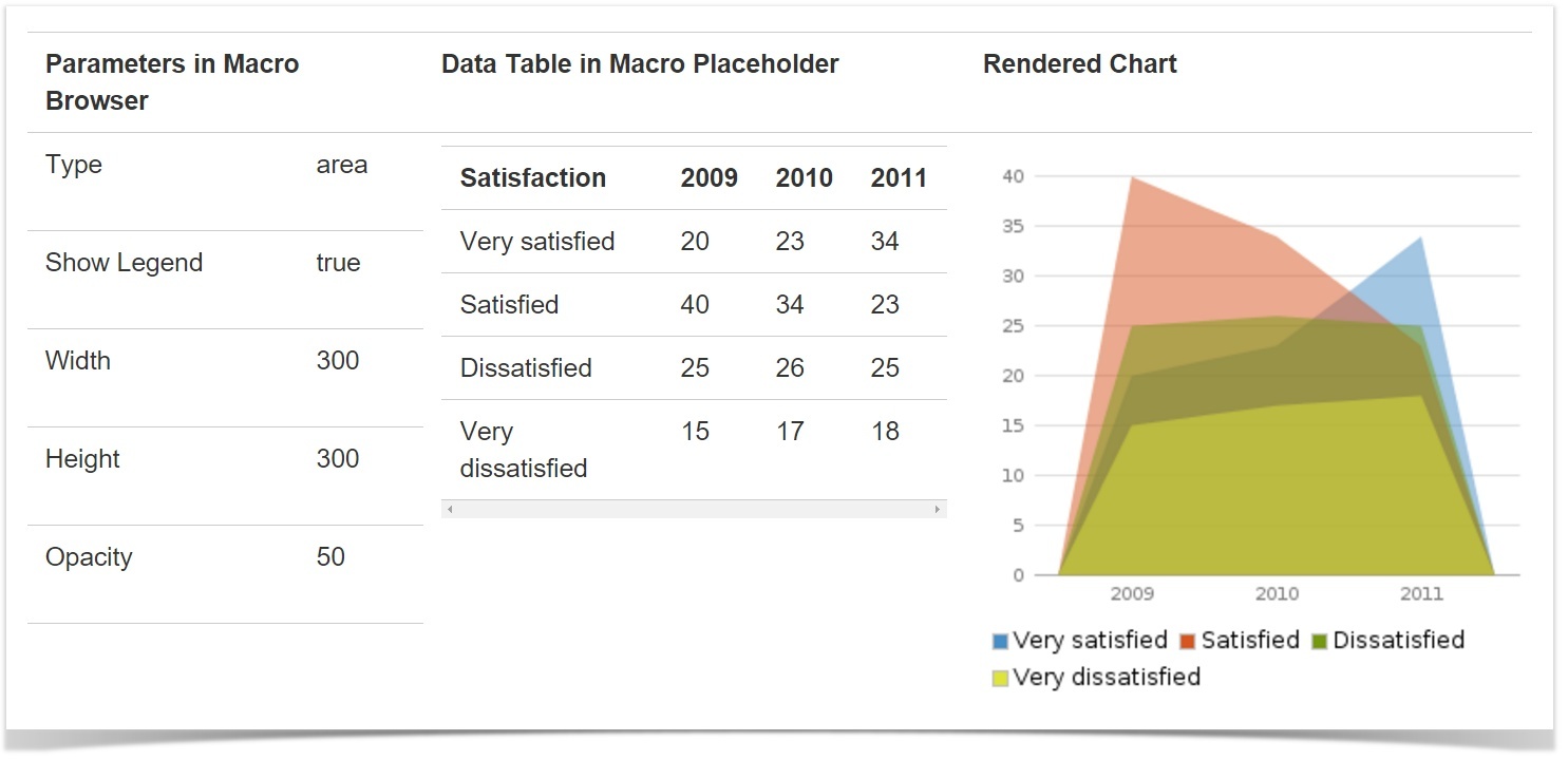
The macro has a large number of settings to make your chart look exactly the way you need it. It covers all common scenarios in which you need to draw graphs, but there is a fly in the ointment (even two) - this is a mandatory transition to page editing mode, even if you only need to slightly change the graph settings, and a huge number of these settings that an unprepared user can to scare. True, these spoons are complemented by a barrel of honey - free of charge and documentation with examples, which allows you to understand how it works and build the simplest graphs.
Here’s how, for example, the Area chart looks:
... but like this 3D Bar chart:

... you can see the ratio of sales of different fish in the form of a visual Pie chart (pie chart):
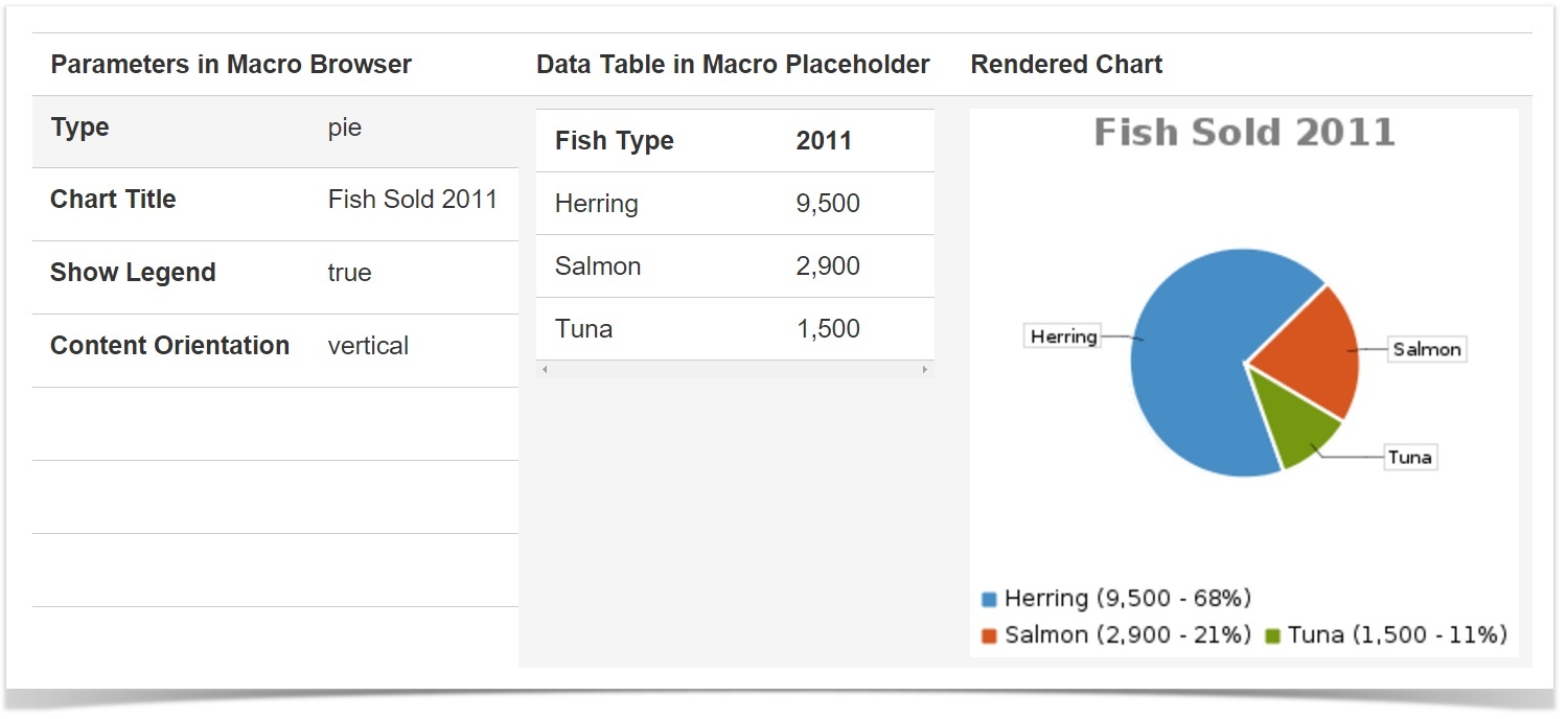
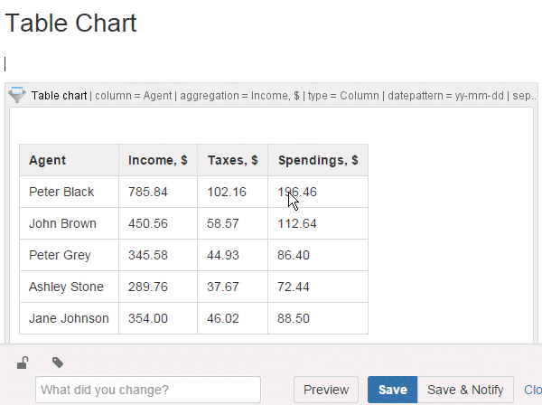
Table filter and charts
The addon is developed by StiltSoft , which is Atlassian Expert and Atlassian Verified Vendor. It has its pros and cons. In the pros, I note the following:
- the addon not only allows you to build graphs, but also has a powerful table filtering mechanism (and even knows how to build pivot tables with data aggregation)
- very easy to configure
- settings can be changed directly from the view mode without going into the page editing mode (and save them from the view mode)
- schedule can be downloaded in one click
But, as usual, there should be a minus. It is only one - you have to pay for the addon (the process of installing the addon in Confluence is very simple and it is difficult to consider it a minus).
The addon offers us three macros:
The first one allows you to filter complex tables in Confluence on the fly right from the view mode. Filtering is also in edit mode, which can sometimes be convenient. The Pivot Table macro allows you to build a pivot table that contains aggregated and summarized values from large tables with duplicate values. And finally, the most interesting is Chart from Table. Here he is able to draw graphs, here is a list of possible graphs:
- Pie
- Donut
- 3D Donut
- Column
- Stacked column
- Bar
- Stacked bar
- Line
- Area
- Time line
- Time area
Chart Examples Using Chart from Table
Already familiar with the Charts pie chart about fish:
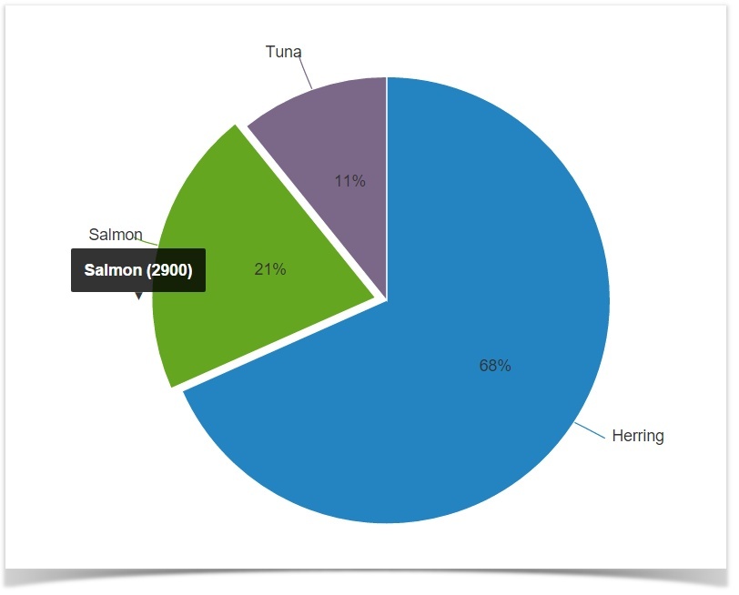
| Fish type | 2011 |
|---|---|
| Herring | 9500 |
| Salmon | 2900 |
| Tuna | 1500 |
This is what a graph like stacked column looks like ( Google claims that it is a histogram):
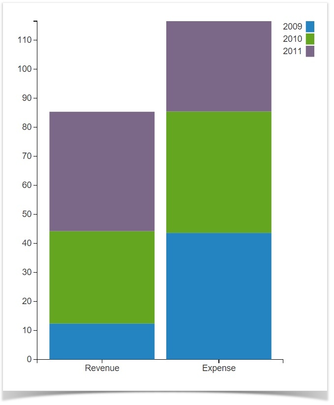
| 2009 | 2010 | 2011 | |
|---|---|---|---|
| Revenue | 12.4 | 31.8 | 41.1 |
| Expense | 43.6 | 41.8 | 31.1 |
... and this is what a multi-column chart looks like:
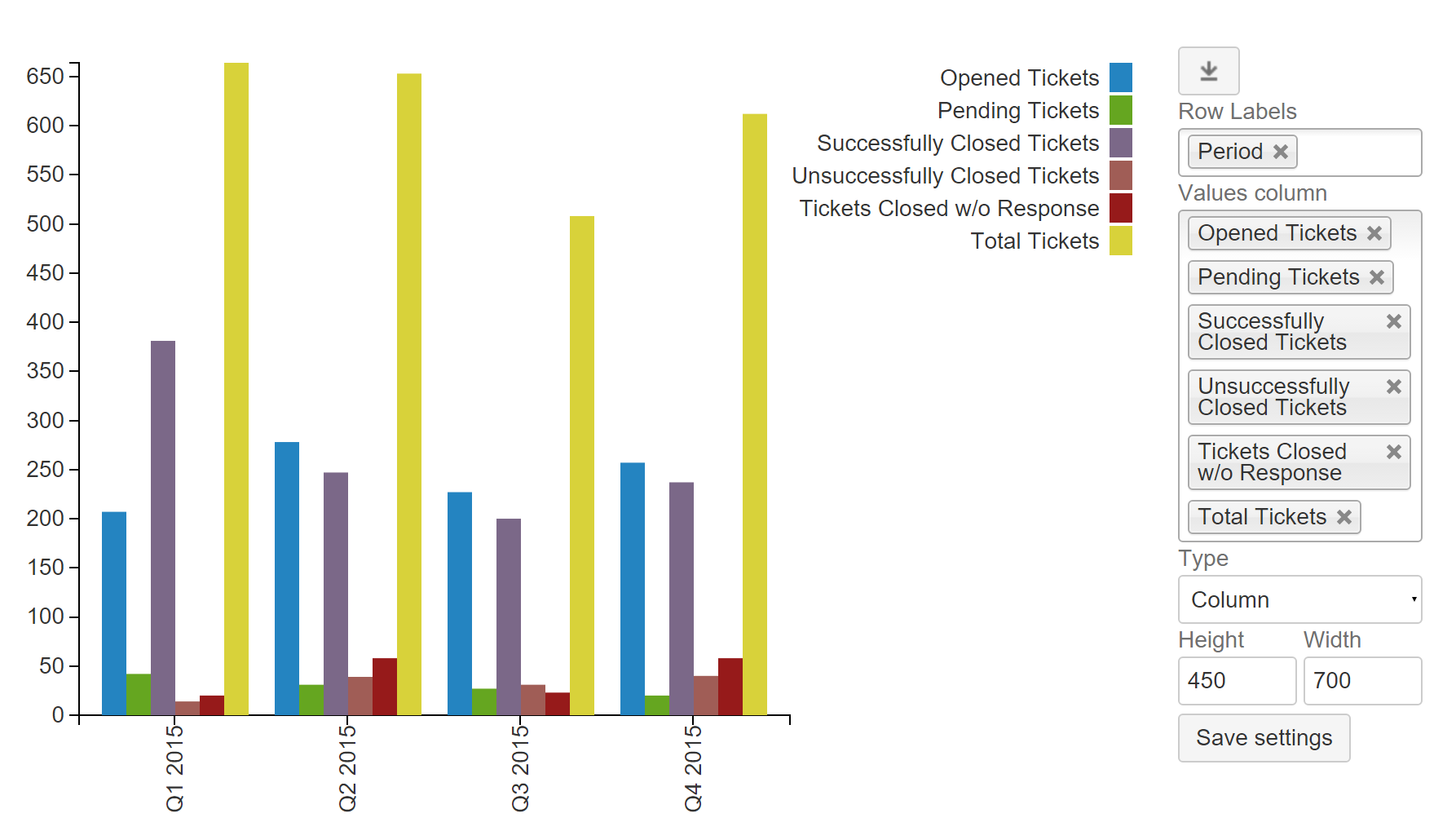
| Q1 2015 | 207 | 42 | 381 | 20 | 14 | 664 |
| Q2 2015 | 278 | 31 | 247 | 58 | 39 | 653 |
| Q3 2015 | 227 | 27 | 200 | 23 | 31 | 508 |
| Q4 2015 | 257 | 20 | 237 | 58 | 40 | 612 |
The resulting graph can be downloaded in one click as a picture, or you can directly change the graph settings from the viewing mode using the settings panel. The settings panel can be hidden, as well as the table with the source data.
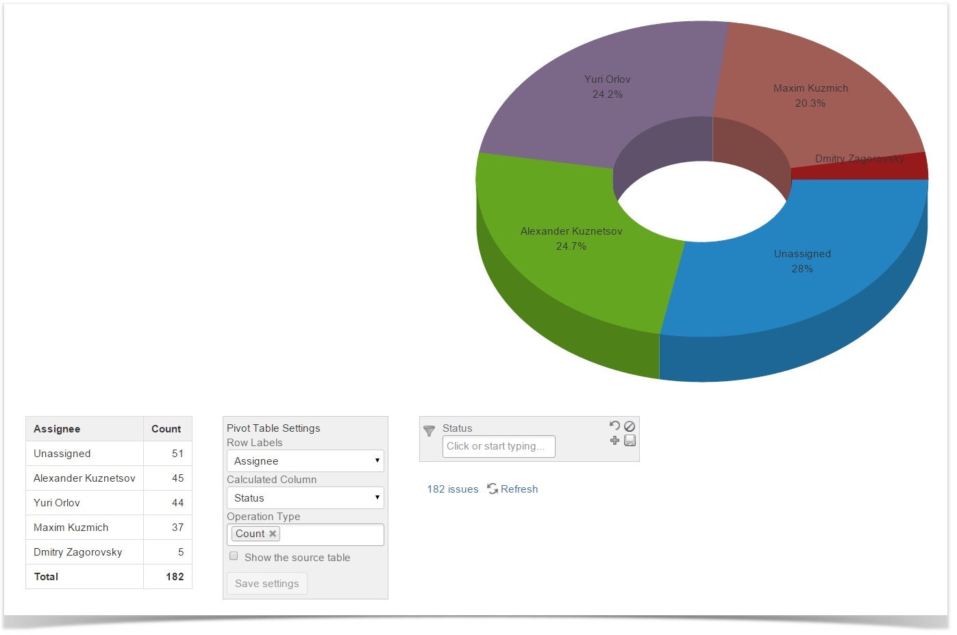
K-to-k-combo!
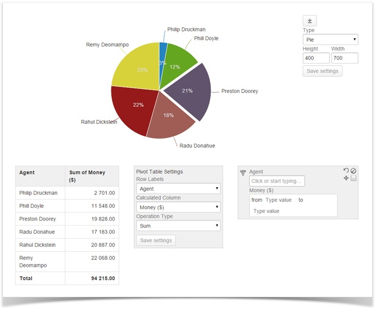
The flesh itself, directly affecting the topic of graphs. Addon components (three macros included in the set - graphs, filtering and summary tables) can be safely and skillfully combined. That allows you to build graphs that are already inaccessible to the standard Charts macro in a fairly easy and relaxed manner. You can easily plot a chart using a filtered pivot table, for example. To do this, put the table in the Table Filter macro (here it will be possible to filter the data, reducing its amount), then put the Table Filter with the table in the Pivot Table macro (he will build a pivot table), and put the resulting design as a cherry on the cake in the Chart from macro Table (this macro will draw a graph). It sounds scary, the design is similar to the death known to everyone according to Koshcheev’s tales. Nonetheless,
After we have once built a hierarchy of data and macros - we can change the filtering settings of the source data, the settings of the pivot table and the schedule settings right from the page view mode - everything will be immediately recounted and redrawn. Settings can be saved right away, or you can play around and leave as is - the page will return to its original state when it reloads.
Wait, what about JIRA?
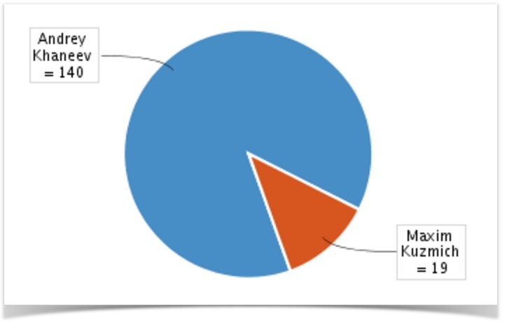
And here the Atlassian guys have a solution right out of the box. To get started, if you haven't configured it yet, you'll need an application link between Confluence and JIRA, the standard for Atlassian products. After that, Confluence will be able to receive data from JIRA. To visualize this data, the JIRA Charts macro is included in Confluence (which, by the way, supports JIRA filters and even jql queries to get the data you need). And for graphical display of the received data, there are three types of graphs:
- Pie Chart from JIRA (Standard Pie Chart)
- Created vs Resolved Chart from JIRA (created and solved tasks)
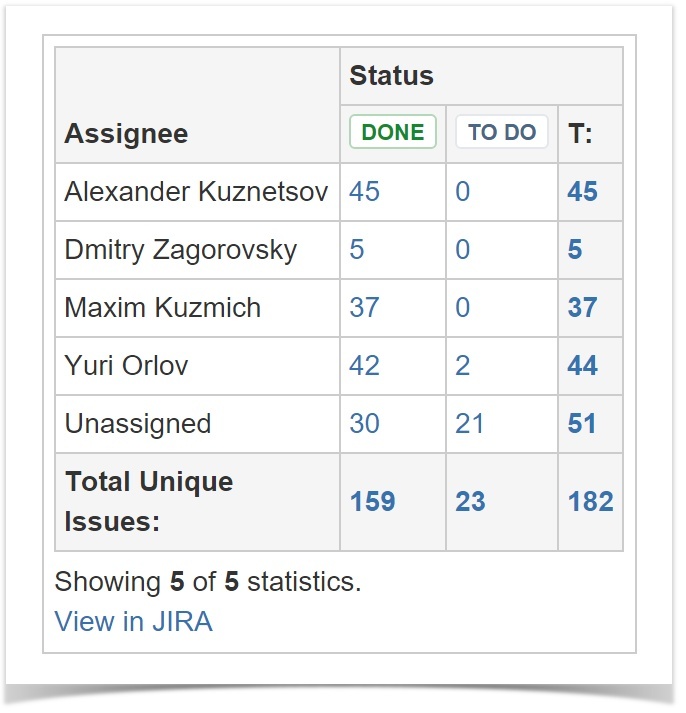
- JIRA Two-Dimensional Chart
An example of a standard pie chart that reflects the quantitative ratio of tasks by comrades who performed them:
... and here is a comparative diagram of created and solved tasks:

An example of a two-dimensional diagram (in fact a simple table):
Of course, the data obtained from JIRA can be processed and rendered using the macros included in Table Filter and Charts. You can, of course, apply filters already in the process of obtaining data from JIRA, so as not to drag and then not filter the excess. And you can simply tighten the minimally filtered data and filter it in place, then bring it to the format of the pivot table and plot the graph either by the original filtered data or by the resulting pivot table. And if something does not look as expected - carefully and quickly change the settings for filters or graphs. Combo!
Instead of a conclusion
Skills for proper data visualization, when all the graphs and pictures are in place and help, and do not interfere with the perception of information, need to be developed. But with good tools, it’s much easier to develop them, because you will have less to be distracted by the drawing process itself. I hope that after this article someone will cease to consider Confluence another dull corporate Wikipedia and will begin to use the full power of this solution, involving others in the process.