Why did Apple come up with and introduce the new San Francisco font in iOS?
- Transfer

Apple has used the Helvetica font set as a system font for iOS since the launch of the first iPhone. They also replaced them with Lucida Grande on Mac OS X, starting with version 10.10 of Yosemite. So why now has Apple decided to get rid of the world's favorite font?
iOS 9 became officially available to everyone, and a new font family called San Francisco unobtrusively replaced Helvetica Neue.

Helvetica (left) and San Francisco (right)
At this point, they were already in use on the Apple Watch. Now, San Francisco has become a single standard font for all platform products: Apple Watch, iPhone, iPad and Mac.
Apple has used the Helvetica family as a system font for iOS since the launch of the first iPhone. They also replaced them with Lucida Grande on Mac OS X, starting with version 10.10 of Yosemite. So why now has Apple decided to get rid of the world's favorite font?
Small size - Helvetica weak spot
It is believed that Helvetica is not suitable for small texts. When Helvetica replaced the previous family on Mac OS X Yosemite, many designers found this replacement unsuitable.

“Helvetica sucks” from Erik Spiekermann's blog.
You can see the small readability of Helvetica as follows. Type in small text and “blur” it. At the same time, some of its fragments “mix” so that it becomes difficult to parse their contents. They say that Apple developed the San Francisco family just to make Apple Watch's smaller text more legible.
However, the resolution of modern smart devices exceeds the resolution of the print edition, and texts on the iPhone are far from always as small as on the Apple Watch. Why then did Apple replace not only the Apple Watch, but also iOS and Mac OS X?
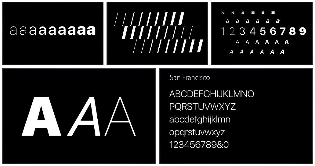
San Francisco - diverse
San Francisco fonts have many features that make them easy to read. In fact, the San Francisco variant for the Apple Watch and the variant for iOS / Mac are two different fonts.
The font family called “SF” is used for iOS / Mac, while the Apple Watch uses “SF Compact”. You can notice the difference by the example of rounded letters, such as 'o' and 'e'. The vertical lines in SF Compact are made flatter than in SF.

This difference leads to the fact that in the text typed using SF Compact, the indentation between characters increases, which as a result makes the text more legible when reading it from small devices, such as the Apple Watch.
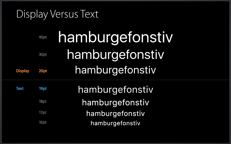
In addition to this, each of the families is divided into two further subfamilies: “Text” and “Display”. Apple calls it “Optical Sizes.” The Text subfamily is for small text, while Display is for large text.
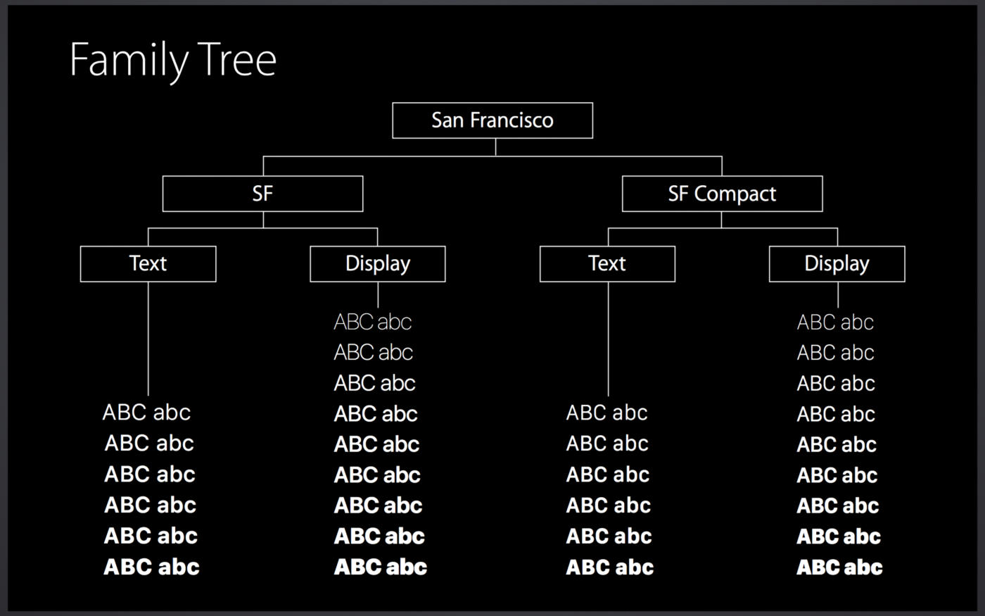
San Francisco Font Family
As mentioned above, in grotesque fonts (or chopped), such as Helvetica, the two letters next to each other “mix”, and letters such as 'a', 'e', 's' become very similar to each other with small text sizes.
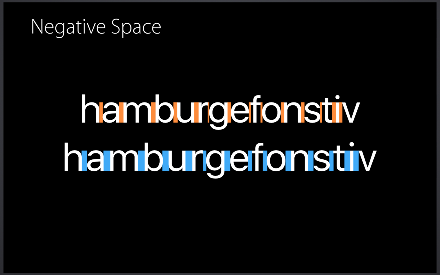
Comparison of the indentation between characters in the fonts of the Display and Text subfamilies Comparison of the indentation between the characters of the Display and Text

subfamilies on the example of a separate character
The Subfamily Text, while it is conceived that the indentation between the characters in it is increased compared to the characters of the Display subfamily, andthe gaps in them are expanded to improve readability with small text sizes.
San Francisco is dynamic
One of the great things about San Francisco is that the headset is dynamically optimized. Display and Text replace each other according to the size of the displayed text. The threshold here is 20pt.
Designers and engineers do not need to worry about choosing the right option from the family. Just add the system font to UILabel, for example. The system itself will determine which headset you need.
However, what really impresses San Francisco fonts is the way they display colons. Usually in other fonts we see it directly above the bottom line, so in cases where it is located between the numbers, the colon is not centered vertically. However, in fonts of the San Francisco family, such alignment occurs automatically.

Automatically align the colon vertically in the center
San Francisco came to us from the digital age
As you can see, San Francisco fonts are designed and thought out to easily read text of any size and on any device.
Helvetica, which they replaced, was created in Switzerland in 1957, when there were no digital devices. Nevertheless, it is still used by many companies as a corporate font, and, no doubt, will be used in the future as a good classic font.
San Francisco, by contrast, is a modern font. His headset changes dynamically, according to context. It can be called a kind of "native font" of the digital era.