How we created the new VoxImplant logo
 Greetings! How is a good logo different from a bad one? Not one thousand articles have been written about this, hundreds of rebrandings have been analyzed, and even there is a whole business lynch. We are creating a platform for developers, so our logo should be easily recognizable at conferences, adequately integrated into articles and educational materials, and lay well on the general concept of a cloud platform for telephony. I really like the GitHub logo: a nice mix of an octopus and a cat impresses developers, and the logo can be easily modified for different tasks. If possible, I try to borrow competent decisions: to create our logo I decided to figure out what else, except for a cat, you can cross an octopus. Under the cut is the story of the development of the new VoxImplant logo, from checking the concept to roll-up stands and stickers on laptops.
Why would I cross an octopus?

We immediately decided that we would cross with an animal. First of all, GitHub did it very well. Secondly, pets traditionally evoke positive emotions, which perfectly matches our very wide audience. The selected animal should at least theoretically be combined with an octopus (an elephant probably will not fit), be minimally cute (a drop fish is also not our choice) and somehow be associated with our area of activity - cloud voice telephony.
The keyword “cloudy” sharply narrowed the range of available animals to birds, and “voice” to parrots. Google Images for the keyword “octoparrot” showed the theoretical possibility of crossbreeding.
How to cross?
Octocat is crossed end-to-end and performed quite schematically. The authors play on the hand that both animals are covered with skin. The situation with the birds is more complicated due to their plumage, so butt-crossing will look unnatural or at least weird. The search for bald birds and tentacles covered with feathers showed that my imagination was rich, but that was of little use.
The name of the VoxImplant brand came to the rescue, the second part of which hinted that tentacles might not be very native. Knowing now which way to dig, my imagination quickly depicted a gallery of little animals with metal tentacles growing from unexpected places, plus shared creatively refined shots from Transformers and Chip and Dale from childhood. The preliminary idea was finally formed: on the logo there will be a parrot with mechanical tentacles.
And who will draw it all?
A common mistake in delegation is the choice of an artist, who is generally a master of his craft, but is not suitable for this particular work. There is an opinion that “tyzhprogrammer” can develop anything from a website to firmware to a microwave, and “tyzhkhudozhnik” can draw anything. The harsh truth of life is that a good artist, who has been writing illustrations for historical novels for the last few years, will not be able to beautifully draw a parrot logo with metal tentacles.
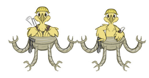
You need to look for an artist who already has extensive experience in drawing in the right field. Logos, comic book style, and little animals are a good reason to look at DeviantArt, one of the world's largest venues where artists showcase their work and are ready to freelance a bit. Plus, I had an interesting option for birds in reserve: remember these guys who regularly publish their adventures on Habré in the field of developing a multi-user browser game about birds? Not to say that the creation of logos is their main profile, but given the ready-made base of illustrations, which suits me perfectly, I decided to discuss with the guys the possibility of cooperation on mutually beneficial conditions.
How sketches were drawn
How does work with an artist begin? With the description in your own words, what exactly needs to be done, and the speed of understanding by the performer of the needs of the customer depends on the accuracy of the description: for a large number of details the artist will always say thanks and will try to take them into account already at the stage of the first drafts.
My description looked like this
As I already said, the developers liked the github concept with an octopus, so I want to cross a parrot with an octopus. This to some extent symbolizes our cloud service (octopus) voice telephony (parrot).
The name "voximplant" is meant to make tentacles mechanical (the color of the metal?). It also removes the questions of a sigil from a parrot's tentacles instead of legs - this is an implant, it sits on it. Or in it.
Regarding the parrot itself - since we are making a cloud telephony platform for developers, it may make sense to design a parrot for an engineer - a characteristic yellow overalls there, tools. But here I can hardly advise anything - the imagination should tell the artist what a parrot should look like, equipped with mechanical tentacles in its place and engaged in telecommunications and providing voice and video communications. It should be nice and like web developers :).
In response, the artist prepares a number of sketches within the framework of his experience and understanding of the task, and the sketches are created in such a way that you can immediately show variations on various elements (object position, size, contrast) and, in the process of coordination, combine parts of the illustration from the suggested options, when the customer and the contractor already see a possible result. A few days later I received just such a set of sketches:

It is important to understand that the sketching process is iterative, the first time few people manage to “catch” the customer’s vision. Having received the first options, you should not panic, but clearly state what you like and what you don’t. Having selected the first and fourth sketches, I sent the next comment pack.
comments

Very pretty. I think it will be good to combine the first and fourth options: in the first variant the correct placement of the tentacles, in the fourth - good colors and a nice parrot. What do the guys think about this?
Pretty quickly, the artist assembled a hybrid image:
You can already look at it without fear :). But the options are still far from my inner ideal. In order for the lower “implant part to look organically”, it must be well inscribed in the bird. How to explain this to the artist?
I take a sheet of paper and draw a sketchy outline
Wings, legs ... The main thing is the beak! And tentacles
The artist again quickly made another sketch - the long-term experience of drawing anthropomorphic birds for an online game affects. A bonus is a parrot without tentacles, so that I can evaluate the diameter of the loin:

Already seems to be true. Little things remained: the head of the parrot should clearly show that it is a parrot, and the tentacles need to be made more beautiful.
I send the artist another list of improvements
I have only two design questions left. First - do we need to depict a parrot strictly in full view? I looked and showed sketches to several colleagues, a full-face parrot is not always perceived as a parrot, because the shape of the beak is not visible, and the head of all birds is more or less the same :)
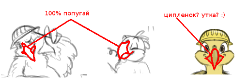
I can’t imagine how you can beat this, maybe the guys will tell me what? Expand a little, or something else specific to a parrot - a crest there is a thread, a little change in the shape of the beak?
And the second question is simpler, about tentacles - now they are deployed in all directions, in the final picture I would like him to lean on them and hold them in tentacles ... Well, for example, smartphones. It is not necessary to draw them in detail, a box with screens will be more than enough.
New sketches, look already much nicer:

I choose the option I like and give the go-ahead for drawing.
File finalization
All that came before that was draft sketches. After one of them was approved, the artist proceeded to painting. First, a vector outline was made:

Then we discussed and approved the fill colors, and the artist drew the details:

And finally, the finished vector version:

Organizational conclusions

A month ago, the new logo went through baptism of fire at AngelHack. The developers, as I expected, liked it :).
Summarizing this story, I would like to note that when creating a logo, and indeed any illustrations, there are two important stages. First, you need to find the right artist based on his previous works. The option “well, they are pros, they’ll draw what we’ll say” is not always rolling. Secondly, it will take many iterations. And it is highly desirable that only one person makes decisions on your part. You can consult with any number of people, but only the decision maker should have a vision of what he wants to get as a result. Otherwise, the approval and revision stage may turn into a fascinating game “spoiled phone” several months long :).