A story of light and shadow in one small but proud game
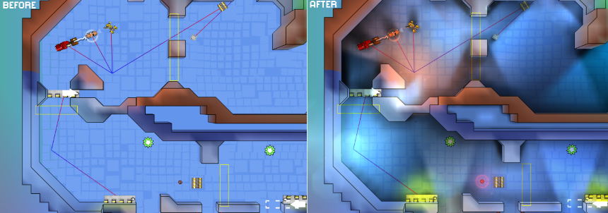
In short, the essence of the article can be illustrated as follows:
Below is a small history of the implementation of lighting in the game with improvised means.
They are greeted, as you know, by clothes, and when the team does not have the art director, or even just an artist, an ordinary programmer has to dodge in different ways.
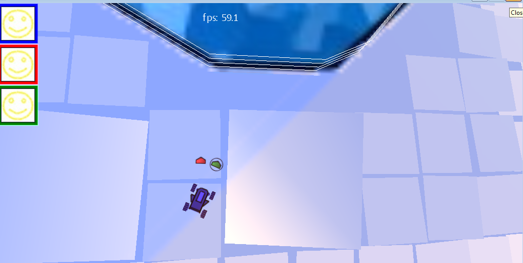
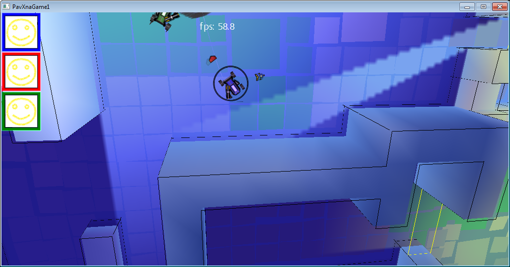
At the moment when the game looked like in the picture below, it became clear that you need to add something that visually makes a more varied, lively picture, and at the same time get by with the skills of a programmer:

Technical conditions at the time of the start of work were as follows:
- 2012
- XNA Framework 4.0 Refresh. Rich Profile, which does not allow the use of its shaders.
- Mobile phone based on Windows Phone 7: Nokia Lumia 800 (2011)
- Everything should give out 60fps on the phone and leave a good margin for the rest of the game logic (AI, physics, music)
This is to say that the power is limited, so I had to save it where possible.
Go!
Day 0. The prototype of the lighting in the game
For starters, just to test the idea itself, it was decided to draw the lighting by hand. This is a minimum of work:
The output turned out something like this:
On this screen is not so obvious, but, nevertheless, it became more pleasant to look. So, it’s decided, we’re doing the lighting.
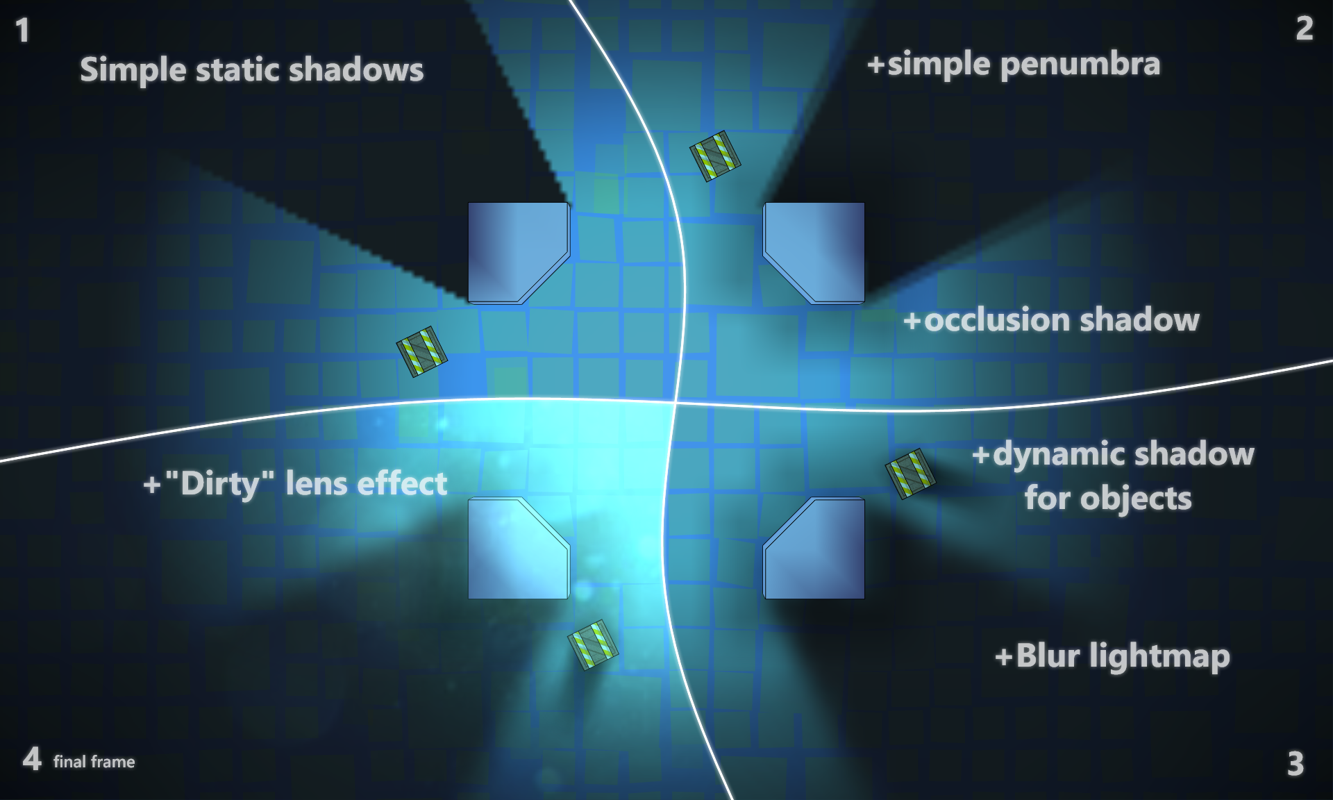
Day 1: Simple static shadows
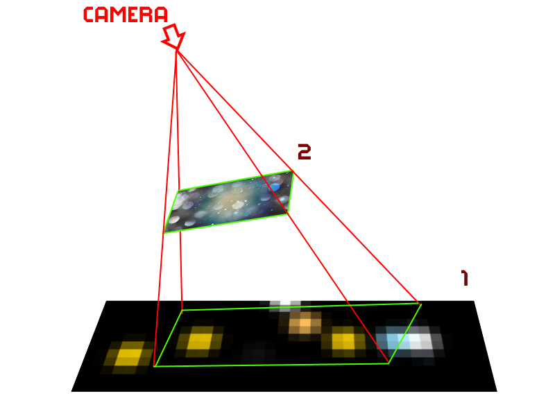
Since the game is essentially 2D and the camera almost always looks at the same angle, we make the most simple and static lighting:
When loading a level, a lighting texture is generated that is drawn on top of the level, since the game is “almost” 2d, need no geometry sweep. Since 3D geometry is all static, its lighting is “baked” in the color of vertices.
The generation of the light texture buffer is quite simple:
For each light source:
The result looks interesting, albeit harsh.
Day 2: Add partial shade.
Usually the light source is not point, which means the shadow from it is not quite clear, and moreover it tends to be more and more blurry with increasing distance from the source.
Here, the idea was spied on by the excellent FEAR game. For each light source, the light map is drawn several times with a slight offset, and more precisely by turning relative to the light source.
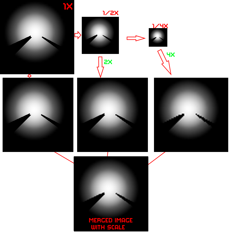
Day 3: Smooth shadows
Here, we just blurred the texture for lighting a bit.
Since the game is mobile, and shaders are very limited, it was decided to use the hardware interpolation capabilities.
To get slightly smoother shadows:
The idea was to mix more “intellectually” in order to further emphasize the sharpness of the shadow at the beginning and the blur of partial shade. But the result of even a simple mixing + partial shade from the last paragraph seemed to us sufficient, and we settled on this option.

Day 4: Occlusion shadow
To create the illusion of self-shadowing of the walls, I had to use another texture (for the benefit of low resolution), which was helped by the distance map: a map in which the distance to the nearest wall is recorded in each cell.
For example, here is a physical level map where the walls are shown in red:

Level map + Distance grid (blue - the wall is close, white - the wall is far):

Map + Occlusion shadow:

In this texture, the pixel color was chosen according to a simple rule: if the distance to the nearest wall is greater than a certain threshold value, it is a transparent color, otherwise black. Since the texture is small (1 pixel per 1 cell ~ 1.5m), smooth transitions between colors are provided by hardware interpolation when the texture is increased (it stretches about 50 times). And due to the fact that all the walls in the game are square and located strictly on the grid, the small size of the texture does not create any visual artifacts.
Or in the game:
The difference, as you can see, is not striking, but the picture seems to add depth.
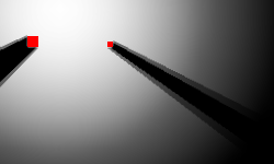
Day 5. Dynamic shadows
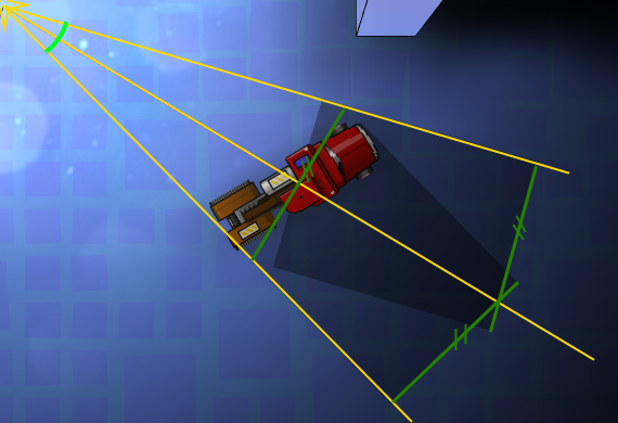
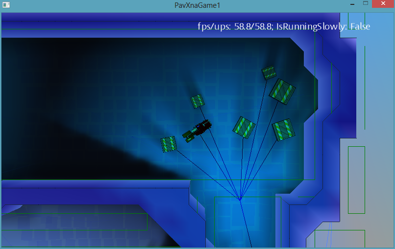
Static shadows are good, and dynamic shadows are better. That's just to spend a lot of resources, neither their own, nor machine desire was not. The idea was to use 1-2 sprites per one dynamic shadow and change only the angle and scale, depending on the relative location of the object and the light source. And due to the fact that all game objects are rectangular, the calculation of all this is not so complicated. There is no need to trace the rays in size. The shadows are approximate, so it’s enough to draw a rectangular shadow with a width equal to the projection of the overall rectangle [it is highlighted in red in the screenshot below] on the axis perpendicular to the beam from the light source to the center of the object.
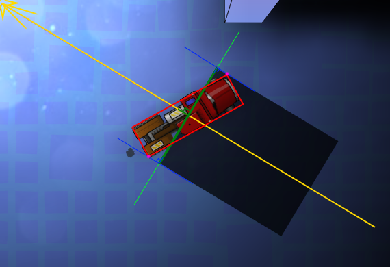
And to get a cone, draw two sprites with rotation based on the angular size of our object.
For the shadow sprite, a 4x4 pixel texture with a gradient was used (the red dot is the center of rotation).
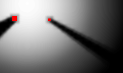
As a result, we get something like this:
Due to the gradient on the texture, we get partial shade, and since two textures are drawn with the usual alpha blending, we get a more saturated shadow in the center.
And, as an example, comparing a static shadow and a dynamic one:

Some tricks:
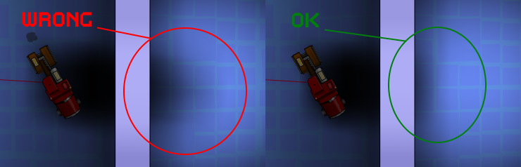
1. Since our shadow is simplified and does not take walls into account, care must be taken that it does not “shine through” the walls. For this, again, Distance grid came in handy. For each object, the maximum shadow length was limited by the value from Distance grid + the minimum wall size. Of course, this leads to the not quite correct behavior of these shadows near the walls, but this effect is much less noticeable than the artifact of the species.
2. At a small distance from the light source, the angular size becomes too large for the two rendered textures to “simulate a shadow” without breaking. There are two options: either increase the number of renderings, or if a certain angle is exceeded, lead the shadow into transparency until it disappears completely. We chose the second option as more economical in terms of resources.
3. At a great distance from the light source, two shadow textures practically merge when rendering, therefore, when exceeding a certain angular size of the object, one drawing with x2 alpha is enough.
4. As you can see, this implementation of the shadows only work adequately with one light source, so if there are more sources, then we just .... don't show the shadow.
5. Corollary of 4. Since the light source for such shadows is always one, the unpleasant effect of a sharp change in the shadow will occur when it changes (or disappears). To get rid of it, it’s enough to add a smooth transition: that is, the old shadow goes into transparency for some time, and the new (if necessary), on the contrary, appears from full transparency. The game is dynamic, so such transitions most often do not particularly attract attention with their unnaturalness.
Day 6. The effect of dirty lenses
The final touch was the addition of a full-screen effect of the “dirty lens” look.
This turned out to be not so simple in the absence of full access to the shaders and the need to maintain performance.
Method # 1 is quick and easy.
They took the texture of dirty glass and used a blend mode, which manifests itself in bright areas.
And although this method was quick and in some situations it allowed to get the desired picture:

In many situations, the result was sad:
The reason for this behavior is understandable, we do not take into account the actual illumination of the area, but simply use the pixel color. Therefore, on cards with contrast lighting, everything looks more or less, but on well-lit everything is terrible.
Method # 2 is slow but beautiful.
We draw into the buffer all the light spots from all light sources (smaller and without taking into account the shadows) in the camera projection, then draw the dirty glass texture with blend mode from method # 1. After that we already use the received buffer.
However, rendering an additional buffer every frame is far from fast. The advantage of a separate buffer is that it can not be updated every frame, but only when the camera moves, but even after such optimizations, the performance on mobile devices was far from desired.
Method # 3 - fast and beautiful
We didn’t have full access to the shaders, but there was access to one preinstalled dual texture shader. It mixes two textures taking into account texture coordinates through multiplication (more precisely, through Modulate2X blend mode blogs.msdn.com/b/shawnhar/archive/2010/08/04/dualtextureeffect.aspx) The first texture was a prepared texture containing all the light spots that interest us (due to the fact that the game is essentially 2d, it is enough to prepare it once for a level), the second is dirty glass. And the only thing that needs to be updated every frame is the texture coordinates of the first texture. They are calculated by projecting the screen into the coordinates of texture 1 (these are simply world coordinates with scale).
The final result, in fact, does not differ from method 2, but it does not require extra draws to the buffer.
Total:
Thus, for the final frame we needed:
Below is a small history of the implementation of lighting in the game with improvised means.
They are greeted, as you know, by clothes, and when the team does not have the art director, or even just an artist, an ordinary programmer has to dodge in different ways.
At the moment when the game looked like in the picture below, it became clear that you need to add something that visually makes a more varied, lively picture, and at the same time get by with the skills of a programmer:
Technical conditions at the time of the start of work were as follows:
- 2012
- XNA Framework 4.0 Refresh. Rich Profile, which does not allow the use of its shaders.
- Mobile phone based on Windows Phone 7: Nokia Lumia 800 (2011)
- Everything should give out 60fps on the phone and leave a good margin for the rest of the game logic (AI, physics, music)
This is to say that the power is limited, so I had to save it where possible.
Go!
Day 0. The prototype of the lighting in the game
For starters, just to test the idea itself, it was decided to draw the lighting by hand. This is a minimum of work:
- We take a map and draw light and shadows manually in paint
- We use the resulting texture as the so-called lightmap
- We select the correct mixing mode.
If anyone is interested, I used a simple, non-overexposed Blend Mode with the following options
ColorSourceBlend = Blend.Zero,
AlphaSourceBlend = Blend.Zero,
ColorDestinationBlend = Blend.SourceColor,
AlphaDestinationBlend = Blend.SourceColor,
ColorBlendFunction = BlendFunction.Add,
AlphaBlendFunction = BlendFunction.Add,
AlphaSourceBlend = Blend.Zero,
ColorDestinationBlend = Blend.SourceColor,
AlphaDestinationBlend = Blend.SourceColor,
ColorBlendFunction = BlendFunction.Add,
AlphaBlendFunction = BlendFunction.Add,
The output turned out something like this:
On this screen is not so obvious, but, nevertheless, it became more pleasant to look. So, it’s decided, we’re doing the lighting.
Day 1: Simple static shadows
Since the game is essentially 2D and the camera almost always looks at the same angle, we make the most simple and static lighting:
When loading a level, a lighting texture is generated that is drawn on top of the level, since the game is “almost” 2d, need no geometry sweep. Since 3D geometry is all static, its lighting is “baked” in the color of vertices.
The generation of the light texture buffer is quite simple:
For each light source:
- Clear the temporary buffer
- We draw a lighting texture into the temporary buffer (an ordinary gradient circle using a color blending of the light source), then we apply absolutely black shadows for obstacles falling into the lighting area
- The resulting temporary buffer is mixed with a common lighting buffer (using the usual additive blend)
The result looks interesting, albeit harsh.
Day 2: Add partial shade.
Usually the light source is not point, which means the shadow from it is not quite clear, and moreover it tends to be more and more blurry with increasing distance from the source.
Here, the idea was spied on by the excellent FEAR game. For each light source, the light map is drawn several times with a slight offset, and more precisely by turning relative to the light source.
Day 3: Smooth shadows
Here, we just blurred the texture for lighting a bit.
Since the game is mobile, and shaders are very limited, it was decided to use the hardware interpolation capabilities.
Example
To get slightly smoother shadows:
- We draw the original texture several times with a smaller scale (1/2, 1/4, etc.) into different buffers
- Mix all these buffers with the appropriate scale (2 for texture ½ size, 4 for texture ¼, etc.) using additive blend mode and alpha 1 / N, where N is the number of buffers
The idea was to mix more “intellectually” in order to further emphasize the sharpness of the shadow at the beginning and the blur of partial shade. But the result of even a simple mixing + partial shade from the last paragraph seemed to us sufficient, and we settled on this option.
Day 4: Occlusion shadow
To create the illusion of self-shadowing of the walls, I had to use another texture (for the benefit of low resolution), which was helped by the distance map: a map in which the distance to the nearest wall is recorded in each cell.
For example, here is a physical level map where the walls are shown in red:
Level map + Distance grid (blue - the wall is close, white - the wall is far):
Map + Occlusion shadow:
In this texture, the pixel color was chosen according to a simple rule: if the distance to the nearest wall is greater than a certain threshold value, it is a transparent color, otherwise black. Since the texture is small (1 pixel per 1 cell ~ 1.5m), smooth transitions between colors are provided by hardware interpolation when the texture is increased (it stretches about 50 times). And due to the fact that all the walls in the game are square and located strictly on the grid, the small size of the texture does not create any visual artifacts.
Or in the game:
The difference, as you can see, is not striking, but the picture seems to add depth.
Day 5. Dynamic shadows
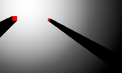
Static shadows are good, and dynamic shadows are better. That's just to spend a lot of resources, neither their own, nor machine desire was not. The idea was to use 1-2 sprites per one dynamic shadow and change only the angle and scale, depending on the relative location of the object and the light source. And due to the fact that all game objects are rectangular, the calculation of all this is not so complicated. There is no need to trace the rays in size. The shadows are approximate, so it’s enough to draw a rectangular shadow with a width equal to the projection of the overall rectangle [it is highlighted in red in the screenshot below] on the axis perpendicular to the beam from the light source to the center of the object.
And to get a cone, draw two sprites with rotation based on the angular size of our object.
For the shadow sprite, a 4x4 pixel texture with a gradient was used (the red dot is the center of rotation).
As a result, we get something like this:
Due to the gradient on the texture, we get partial shade, and since two textures are drawn with the usual alpha blending, we get a more saturated shadow in the center.
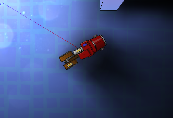
And, as an example, comparing a static shadow and a dynamic one:
Some tricks:
1. Since our shadow is simplified and does not take walls into account, care must be taken that it does not “shine through” the walls. For this, again, Distance grid came in handy. For each object, the maximum shadow length was limited by the value from Distance grid + the minimum wall size. Of course, this leads to the not quite correct behavior of these shadows near the walls, but this effect is much less noticeable than the artifact of the species.
2. At a small distance from the light source, the angular size becomes too large for the two rendered textures to “simulate a shadow” without breaking. There are two options: either increase the number of renderings, or if a certain angle is exceeded, lead the shadow into transparency until it disappears completely. We chose the second option as more economical in terms of resources.
3. At a great distance from the light source, two shadow textures practically merge when rendering, therefore, when exceeding a certain angular size of the object, one drawing with x2 alpha is enough.
4. As you can see, this implementation of the shadows only work adequately with one light source, so if there are more sources, then we just .... don't show the shadow.
5. Corollary of 4. Since the light source for such shadows is always one, the unpleasant effect of a sharp change in the shadow will occur when it changes (or disappears). To get rid of it, it’s enough to add a smooth transition: that is, the old shadow goes into transparency for some time, and the new (if necessary), on the contrary, appears from full transparency. The game is dynamic, so such transitions most often do not particularly attract attention with their unnaturalness.
Day 6. The effect of dirty lenses
The final touch was the addition of a full-screen effect of the “dirty lens” look.
Reference
This turned out to be not so simple in the absence of full access to the shaders and the need to maintain performance.
Method # 1 is quick and easy.
They took the texture of dirty glass and used a blend mode, which manifests itself in bright areas.
blend fashion example
ColorSourceBlend = Blend.DestinationColor,
AlphaSourceBlend = Blend.DestinationColor,
ColorDestinationBlend = Blend.One,
AlphaDestinationBlend = Blend.One,
ColorBlendFunction = BlendFunction.Add,
AlphaBlendFunction = BlendFunction.Add,
AlphaSourceBlend = Blend.DestinationColor,
ColorDestinationBlend = Blend.One,
AlphaDestinationBlend = Blend.One,
ColorBlendFunction = BlendFunction.Add,
AlphaBlendFunction = BlendFunction.Add,
And although this method was quick and in some situations it allowed to get the desired picture:
In many situations, the result was sad:
The reason for this behavior is understandable, we do not take into account the actual illumination of the area, but simply use the pixel color. Therefore, on cards with contrast lighting, everything looks more or less, but on well-lit everything is terrible.
Method # 2 is slow but beautiful.
We draw into the buffer all the light spots from all light sources (smaller and without taking into account the shadows) in the camera projection, then draw the dirty glass texture with blend mode from method # 1. After that we already use the received buffer.
However, rendering an additional buffer every frame is far from fast. The advantage of a separate buffer is that it can not be updated every frame, but only when the camera moves, but even after such optimizations, the performance on mobile devices was far from desired.
Method # 3 - fast and beautiful
We didn’t have full access to the shaders, but there was access to one preinstalled dual texture shader. It mixes two textures taking into account texture coordinates through multiplication (more precisely, through Modulate2X blend mode blogs.msdn.com/b/shawnhar/archive/2010/08/04/dualtextureeffect.aspx) The first texture was a prepared texture containing all the light spots that interest us (due to the fact that the game is essentially 2d, it is enough to prepare it once for a level), the second is dirty glass. And the only thing that needs to be updated every frame is the texture coordinates of the first texture. They are calculated by projecting the screen into the coordinates of texture 1 (these are simply world coordinates with scale).
The final result, in fact, does not differ from method 2, but it does not require extra draws to the buffer.
Total:
Thus, for the final frame we needed:
- A) Once at the start of the card
- Calculate static lighting map
- Calculate shading map for occlusion shadow
- Prepare a buffer of bright dots for the effect of dirty lenses
- Prepare a cache of the nearest light source for all points for dynamic shadows
- B) For each frame
- Draw a static lighting map
- Calculate the angle and width of dynamic shadows and draw 1-2 sprites on an object
- Prepare a buffer of bright dots for the effect of dirty lenses
- Project 4 points into world coordinates, update texture coordinates, and draw one texture with a dual texture shader for the dirty lens effect