June 16, 2015 at 22:00
Understanding the grid in Adobe Illustrator
- Transfer
- Tutorial
From translator
Hi% username%!
This translation seems to complement my previous publication about Pixel Perfect , without which it would be incomplete, especially since the original article about Pixel Perfect refers to the original article of this translation.
The material is designed for beginners, and tells a little about two things:
- Avoiding the problem, because of which in your layouts the distance between elements or guides begins to include fractional parts of pixels;
- How to use prototyping grids in Adobe Photoshop and Adobe Illustrator.
This material is interesting to me from the point of view that I would be very grateful if at the very beginning of my work as an interface designer, someone would tell me about the pixel grid. Therefore, I hope that I will make it easier for someone by publishing this translation.
Like last time, one of the goals why I am writing this article in Habr (and not limited to, for example, translating to Tuts +) is to compile useful links on the topic after the translation. I urge the hawkers to also share their thoughts and tools that you use when creating grids, maybe some other editors. One friend of mine friend commented on the previous article in such a way that, of course, the material is cool, but he uses Sketch himself, and there it is all out of the box. Tell us what you use?
By the way, although the article is about Adobe Illustrator, in Adobe Photoshop you can also use a pixel grid, and pixel snapping, and your own custom grid.
Summary
- To enable / disable the grid in Adobe Illustrator / Photoshop, press Ctrl + '
- To enable / disable guides in Adobe Illustrator / Photoshop, press Ctrl +;
Let's go.
Understanding the grid in Adobe Illustrator
Today, Adobe Illustrator is one of the most popular vector editors. This is such a tremendous program, and if you are a beginner, it can take quite a while if you delve into what a button or option is responsible for.
It turns out that some features are overlooked by beginners, and I would like to share one of them with you. Personally, I would be very happy if someone would tell me about this topic at the time when I was a beginner.
Yes, I'm going to tell you about Grid.
What is a grid?
As in the study of any other question, let us first give a definition of the term being studied.
If you look at the Merriam-Webster online dictionary, a grid is a network of evenly spaced vertical and horizontal lines (for example, to position points on a map).
An even more complete definition can be found on Wikipedia, because there it is just given from the point of view of graphic design: “A grid is a space (usually two-dimensional) that consists of a series of intersecting straight lines (vertical, horizontal or angled) or curves guides that are used to organize content. The grid serves as a basis, thanks to which the designer can place various graphic elements (images, symbols, paragraphs of text) on the layout in the correct order so that they look nice on the layout, are easy to read. The grid is also used to build relationships between different graphic elements, for example, to determine the ratio of the sizes or locations of different elements relative to each other, or relative to the canvas.
By the way, the grid of Adobe Illustrator consists only of strictly vertical and horizontal lines. If you need curves or some other more complex grids for work, then you can create them using guide-guides, which is actually quite simple.
Why is grid knowledge important?
We gave a general idea of what the Grid is. But why should she use it at all? If you repeat briefly again, then the Grid is what helps us arrange the elements relative to each other and expose the relationship between the sizes and locations of objects. The grid, as it were, offers us the rules by which we can arrange objects on the layout, and most importantly, structure the content.
In addition, Grid as a tool helps designers create Pixel Perfect images, which is very important (in my opinion, it is absolutely necessary) when creating images for different devices with different screens.
Before I delve into the story of how the Grid helps to create truly high-quality sharp images, I would like to briefly talk about some key points that distinguish two types of images - digital images on the screen, and printed images.
Digit VS Printing
It's no secret that digital images on screens are much different than printed images on paper. Each type of image has its own color scheme (RGB for digital images and CMYK for printed images), and each type has its own output resolution (screen resolution and print resolution). All this makes a difference in how these two types of images are created, especially how curved, curved lines are obtained.
Digital screens have their own resolution and their own pixel grid (on any screen, square pixels are arranged one after another in rows). This means that in order to create some kind of curved line, we simply make some pixels translucent (alpha channel) in these sections of the curvature, and this is called smoothing, which artificially helps us recreate the curve on the monitor screen.
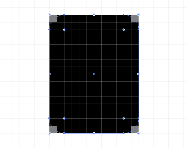
The printer, in turn, depends on the size of the paper and its resolution when printing, which means that if you have a high print resolution, the printer will perfectly print a curved line for you. This is because the printer can print dots on paper in several layers, i.e. the printer does not need to be tricky with the translucency of the pixels, unlike the screen of an electronic device.
Using bindings
One of the most interesting questions that can be raised in this thread. If you use snapping, you are telling Illustrator to align your objects on the canvas to your grid or pixel grid.
Remember I recently hinted at a Pixel Perfect image? Now that you know what the difference between printed and digital images displayed on the screen is, it's time to tell about what, in my opinion, the main role of the Grid.
I’m sure that you have probably seen various illustrations on Dribbble or Behance with super-sharp images. Personally, I always wondered how the author managed to draw such clear lines? As it turned out, this is not unusual! He or she simply tied all objects to a pixel grid and created each element with integer pixel values!
Just in case, I’ll clarify that by integer values I mean numerical values without fractional parts, i.e. for example, if we are going to draw a rectangle, then we will draw it with a width of 200 pixels and a height of 100 pixels, rather than 200.84 pixels by 99.8 pixels.
Expanded Grid Concept
A picture is better than a thousand words. Let me try to show you an example of how to set up a grid. Let's do the step-by-step algorithm that you will do each time you create a new project in Illustrator. I'm sure you will like it.
Step 1
When starting any new project in Illustrator, we always start with the settings for a new document. Let's open Illustrator and create a new document with the following settings:
- Number of Canvases: 1
- Width: 800 pixels
- Height: 800 pixels
- Units: pixels
On the advanced settings tab:
- Color Mode: RGB
- Rasterization Resolution: 300 PPI
- Equate new objects to the pixel grid: checked

Note: you probably noticed that we set the values for the rasterization effect to 300 PPI, although we are going to use our design on the monitor screen. Let's just say that if we use larger resolution values, then it will not be very noticeable on the screen, but if it suddenly happens that you want to print what you painted (until you pay attention to the fact that we created the document in RGB), that's all your effects like shadows will come out in poor quality if the PPI value is less than 300.
In fact, you can change the PPI value at any time if you go to Effect> Document Raster Effects Settings .
Step 2
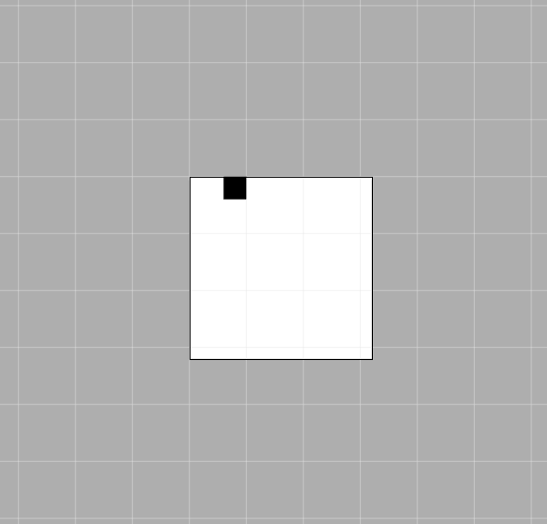
After you have set up your document, create a black square measuring 100x100 pixels , and place it exactly in the upper left corner of the Canvas using the Align palette .

Step 3
To understand how the grid works, let's look at this. Open the menu View> Show Grid (or press Ctrl + „), and then the standard 1000x4 grid appears on the screen.
Step 4
Now we see the grid, but how does it work? Let's try moving the little box with the arrows on the keyboard and see what happens.
Our little square will move a few pixels with each click, nothing special. Nothing happens because we did not enable the Snap to Grid option .
Let's undo our last steps, return the box to its place, and go to the menu View → Snap to Grid (Shift + Ctrl + Y) , and then try again to move our object.
Now we can see the difference. Try moving the object to understand what is happening. Each movement of the square occurs with reference to the horizontal or vertical line of the Grid.
Let's see why Illustrator behaves this way, try to understand the Grid device. As I said earlier, there are predefined Grid settings, here they are:
- Grid step every: 1000px
- Divisions inside the grid step: 4
What do these settings really mean?
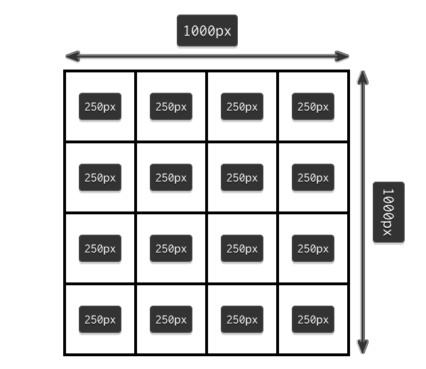
It is very easy, see. After every 1000 pixels, Illustrator will draw a cell divided into 4 parts (thereby a 2x2 grid will appear inside the cell), i.e. we will get cells, each of which is 1000 x 1000 pixels in size , and in turn is divided into 4 more cells with sizes of 250 x 250 pixels ( 1000/4 = 250 ).
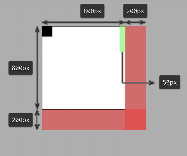
Because our canvas has dimensions of only 800x800 pixels (that is, three squares of a grid of 250 pixels each completely fit and 50 pixels still remain ), the snap will work on the top and left of this space, which fits in 1000 x 1000 pixels. And the lower and right part of the space on the line with a thickness of 200 pixels , highlighted in red, remains unused.
Now if we go back to our little black square, we will see that it sticks only to the grid lines that are located 250 pixels from each other, despite the fact that the square itself is 100x100 pixels . If the black square were 250x250 pixels in size , then it would occupy an entire cell of the grid, and would jump exactly into one of 16 small cells.
Grid Settings
I hope that in the previous step you will understand everything about how grids work, but you should understand that in different projects you will have to configure different grids for different needs, depending on the size of your canvas, and how and by what By law, you want to place your elements on canvas.
For myself, I decided that using the minimum possible values is the most convenient, and if you combine the full power of the Grid and the PathFinder tool, I get the ability to super-quickly place all my objects in a way that suits me.
My grid settings are as follows:
- Grid line every: 1 pixel
- Divisions inside the grid step: 1
If you want to experiment and customize the Grid for yourself, you just need to go to the menu Edit> Preferences> Guides & Grid and configure everything the way you want.

Rapid prototyping using a mesh
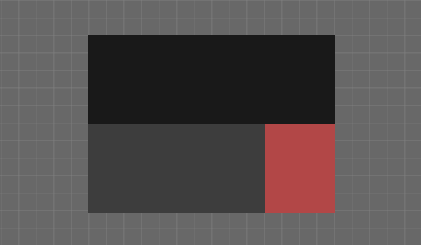
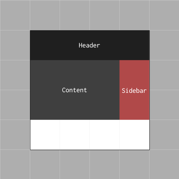
Let's do a little exercise and try to make a quick prototype of a website using a grid every 800 pixels , divided into 4 steps on a canvas with a size of 800 x 800 pixels .
Yes, I know that the default minimum size for a website these days is 960 pixels, but I just want to show you a small example of how we can use the grid for rapid prototyping.
Step 1
Create a rectangle 800x200 pixels in size and place it on top of our canvas, colorize it with # 191919 color . Now take the Text tool and sign this element as the Heading of our website.
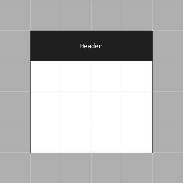
Note: If you have smaller elements that do not have to be snapped to the grid, in our example these are label texts for rectangles, just select them, go to the View menu and uncheck the Snap to Grid option .
Step 2
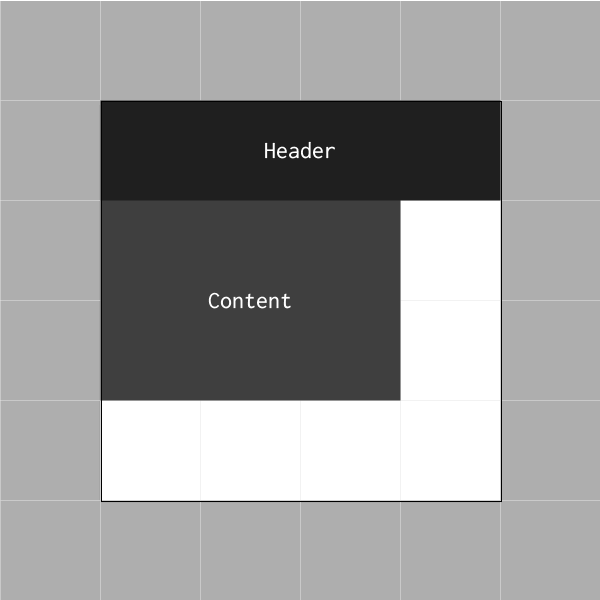
Create a small rectangle with a size of 600x400 pixels and color # 191919 and try to place it using the buttons on the keyboard on the left side of our canvas, right under the header. This element should also be signed, it will be Content.
Step 3
Let's create an object of a smaller size of 200x400 pixels with the color # B24747 and then place it on the right side, to the right of the content, and then sign it with Sidebar .
Step 4
We complete our prototyping by adding the last element 800x200 pixels and color # 191919 . Place this rectangle at the bottom of the canvas and call it Footer.

Roughly speaking, in just a few seconds we were able to sketch out a site layout. It's great to spend so little time on such things, is it?
Dual binding
Before you rush to experiment with the grid, I would like to tell you about the difference between Snap to custom grid and Snap to pixel grid .
By default, if you create a new document, the Preview mode is usually set to Default. This means that what you create is what you see. (That is, you see the vector as it is, not upset). In this case, the Snap to option refers to the Grid that you are setting, and the Grid depends on the values that you set in the parameters.
If you enable Pixel Preview ( View → Pixel Preview) and zoom in on the image, Illustrator will show you the pixels that make up your vector image. When snap mode is turned on by pixels , each click on the keyboard arrows will move your object by a fixed number of pixels, which is set in the Keyboard Increment settings .
Note: Yes, you can enable Keyboard Increment for any number of pixels that is convenient for you. This option is located in the menu Edit> Preferences> General> Keyboard Increment .

The key difference between the two methods of snapping is that if you somehow created an object with non-integer sizes, for example 200.9x60.40 pixels , snapping to pixelswill change this, and it will automatically round your values.
I recommend that if you create objects in snap to grid mode , always switch to Pixel Previe w mode and check if your objects fit into the Pixel grid normally. In this case, by the time you finish working on your design, you will get a sharp, high-quality image, and you will not have to solve any problems.
Useful resources
- Чои Вин. Как спроектировать современный сайт. Профессиональный веб-дизайн на основе сетки. б.м.: Питер, 2012.
Существует множество книг про сетки. популярные и не очень, но я читал именно эту, поэтому именно её и рекомендую. Здесь по шагам очень подробно описывается процесс разработки универсальной сетки (которая в готом варианте раздаётся много где). Вобщем-то после прочтения точно всё встаёт на свои места, становится понятно что, почему и зачем. - 960 Grid System — один из всевозможных готовых наборов сеток. Здесь есть уже созданные шаблоны макетов под все популярные редакторы вроде Photoshop, Illustrator, InDesign и т.д. Список очень большой, ознакомьтесь.
- GuideGuide и Griddify — плагины для Photoshop для создания сеток.