System approach to speed: online measurements at the frontend
The Yandex speed command manually optimizes search results. Doing it blindly is difficult and often just useless. Therefore, the company has built an infrastructure for collecting metrics, testing speed and analyzing the data. Andrei Prokopyuk, a
Yandex interface developer, knows which metrics should be used and how to optimize everything . ( Andre_487 ). At the core of the material is Andrei’s speech at the HolyJS conference . Under the cut - and video, and text version of the report.

Yandex search output consists of many different blocks, classes of responses to user requests. More than 50 people work for them in the company, and so that the issuance rate does not fall, we constantly look after the development.

No one will argue that users like the fast interface more than the slow one. But before you begin to optimize, it is important to understand how this will affect the business. Do I need to spend time developers to accelerate the interface, if it does not affect the business metrics?
To answer this question, I will tell two stories.
Having arranged an experiment with fonts, we found that the average content rendering time deteriorated by 3%, by 62 milliseconds. Not so much, if you take it for a delta in a vacuum. The noticeable delay to the naked eye begins only with 100 milliseconds - and yet the time until the first click immediately increased by one and a half percent.
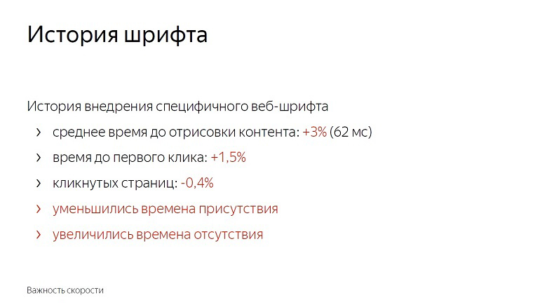
Users began to interact with the page later. The number of clicked pages has decreased by almost half a percentage point. Reduced the time of presence on the service and increased the time of absence.

We did not roll out the feature with fonts. After all, these numbers seem small until you remember the scale of the service. In reality, one and a half percent - hundreds of thousands of people.
In addition, speed has a cumulative effect. For one update with a share of unclipped - 0.4% will follow more and more. In Yandex, similar features roll out dozens per day, and if you don’t fight for each share, it’s not long to go down to 10%.
This story is connected with the fact that we inline a lot of static content on the page.
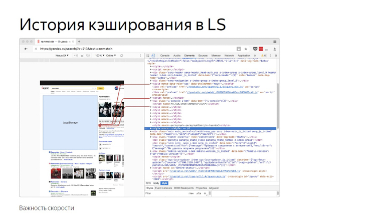
Due to the high variability, we cannot compile it into one bundle or deliver it with external resources. Practice has shown that with inline delivery, JavaScript rendering and initialization occur most quickly.
Once we decided that it would be a good idea to use the browser’s storage. Put everything in localStorage and on subsequent logins to the page, load from there, and not transfer over the network.
Then we focused mainly on the “HTML size” and “HTML delivery time” metrics and got good results. As time went on, we invented new ways to measure speed, gained experience and decided to double-check, to conduct a reverse experiment, turning off optimization.

The average HTML delivery time (the key metric for optimizing development) has increased by 12%, which is a lot. But at the same time, the time was improved before the header was rendered, before content parsing began and before JavaScript was initialized. Also reduced the time to first click. The percentage of it is small - 0.6, but if you remember the scale ...

Turning off the optimization, we got a deterioration in the metric, noticeable only to specialists, and at the same time - an improvement noticeable to the user.
From this we can draw the following conclusions:
Firstly, speed really affects business and business metrics.
Secondly, optimization should be preceded by measurements. If you introduce something, having badly measured, it is likely that you will not do anything useful. The composition of the audience, the park of devices, interaction scenarios and networks are different everywhere, and you need to check what exactly will work for you.

Once upon a time, Ash from the evil dead taught us to shoot first, then think or not think at all. In speed so do not.
And the third point: measurements must reflect the user experience. For example, HTML size and delivery time are poor speed metrics, because the user does not sit with devTools and does not select the service with less delay. But what kind of metrics are good and correct - let's tell further.
Dimensions should start with a few key metrics, which, unlike, for example, the size of HTML, are close to user experience.

If TTFCP (time to first contentfull paint) and TTFMP (time to first meaningful paint) denote the time to the first rendering of the content and the time to redrawing of the significant content, then the third one - the time to initialization of the framework should be explained.
This is the time when the framework has already passed through the page, collected all the necessary data and hung handlers. If the user clicks somewhere at that moment, he will receive a dynamic response.
And the last, fourth metric, the time before the first interactivity, is usually referred to as time to interactive (TTI).
These metrics, unlike html size or delivery time, are close to user experience.
To measure the time when a user saw the first content on a page, there is a Paint Timing API, which is currently available only in chromium. Data from it can be obtained as follows.
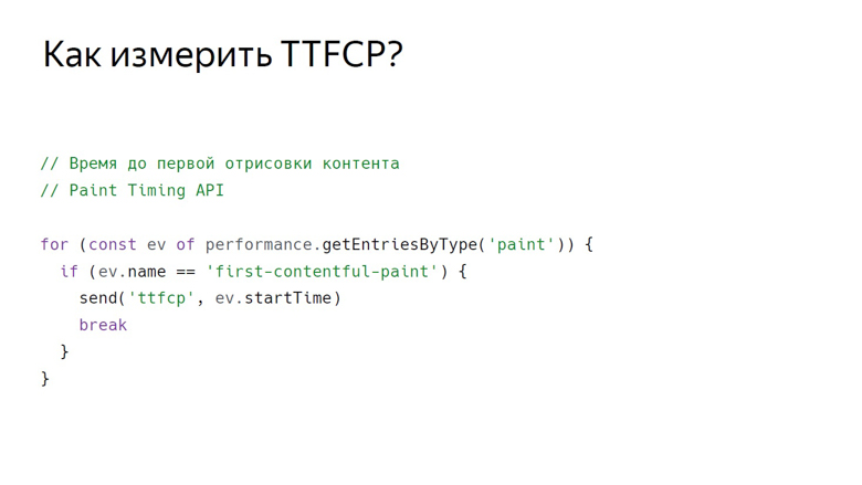
With this challenge, we get a set of events about drawing. So far, two types of events are supported: first paint - any drawing and firstcontentfull paint - any rendering of content that is different from the white background of the empty tab and background content of the page.
So we get an array of events, filter the firstcontentfull paint and send it with some ID.
There is no event in the Paint Timing API that signals that significant content has been drawn on the page. This is due to the fact that such content on each page is different. If we are talking about video service, then the main thing is the player, in search results - the first non-advertising result. There are a lot of services, and a universal API has not been developed yet. But here in the course are good, proven crutches.
In Yandex, there are two schools of crutches for measuring this metric: using RequestAnimationFrame and measuring with InterceptionObserver.
In RequestAnimationFrame, rendering is measured using an interval.
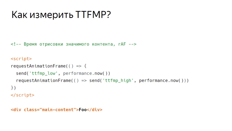
Suppose there is some meaningful content. Here is a div with a main-content class. There is a script in front of it where RequestAnimationFrame is called twice.
In the callback of the first call we write the lower limit of the interval. In the second callback, the top one. This is due to the frame structure that the browser renders.

The first is the execution of JavaScript, then the analysis of styles, then the calculation of Layout, rendering and composition.
Callback, calling RequestAnimationFrame, is activated at the same stage as JavaScript, and the content is drawn in the last segment of the frame during composition. Therefore, in the first call we get only the lower limit, which is noticeably distant in time from the output of pixels on the screen.
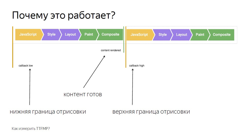
Place two frames side by side. It can be seen that at the end of the first one the content was rendered. We write down the lower bound of RequestAnimationFrame, called inside the first callback, and call the callback in the second frame. Thus, we obtain the interval from JavaScript, called in the frame where the content was rendered, and to JavaScript in the second frame.
Our second crutch works differently with the same content. This time the script is placed below. In it, we create an InterceptionObserver and subscribe to domNode.
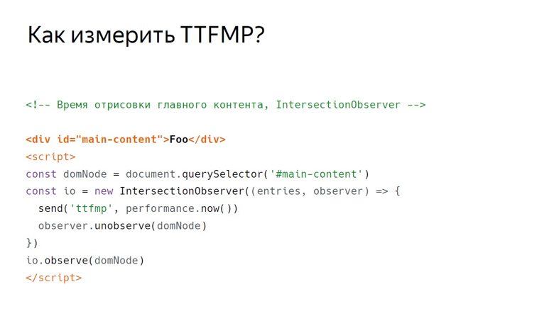
In this case, no additional parameters are passed, so we measure its intersection with the viewport. This time and record as the exact time of rendering.
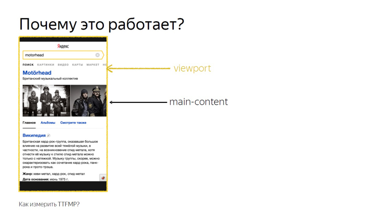
This works because the intersection of the main content and viewport is considered the intersection that the user sees. This API was designed to know exactly when a user saw an advertisement, but our research showed that this also works on non-ad units.
Of these two methods, it is still better to use RequestAnimationFrame: its support is wider, and it is better tested by us in practice.
Imagine a framework that has a certain “init” event to which you can subscribe, but remember that in practice JS Inited is both a simple and complex metric.

Simple - because you just need to find the moment when the framework has finished work on the arrangement of events. Difficult - because this point has to be looked for independently for each framework.
TTI is often confused with the previous metric, but in fact it is an indicator of the moment when the main browser thread is released. During page loading, many tasks are performed: from drawing various elements to initializing the framework. Only when it is unloaded does the time come before the first interactivity.
The concept of long (long) tasks and the Long Task API helps to measure this.
First about the long tasks.

Between the short tasks indicated by arrows, the browser can easily squeeze in the processing of a user event, for example, input, because it has a high priority. But with the long tasks indicated by the red arrows, this will not work.
The user will have to wait until they run out, and only after the browser has put the processing of its input for execution. In this case, the framework can already be initialized, and the buttons will work, but slowly. Such a deferred response is a rather unpleasant user experience. The moment when the last Long Task is completed and the stream is empty for a long time, the illustration begins at 7 seconds and 300 milliseconds.
How to measure this interval inside javascript?
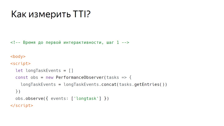
The first step is conditionally designated as the opening body tag, followed by the script. This is where PerformanceObserver is created, which is subscribed to the Long Task event. Inside the callback PerformanceObserver, event information is collected into an array.

After collecting the data, it is time for the second step. It is conventionally designated as a closing body tag. We take the last element of the array, the last long task, look at the end of its execution and check whether enough time has passed.
In the original work on this metric in the role of a constant taken 5 seconds, but the choice is not justified. It was enough for us 3 seconds. If it takes 3 seconds, we count the time before the first interactivity, if not, setTimeout and check for this constant again.
Data must be obtained from customers, processed and presented in a convenient form. Our concept of sending data is quite simple. It is called a counter.
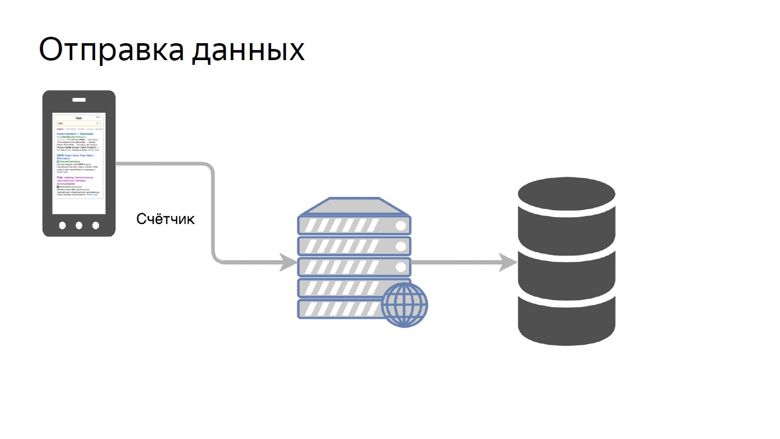
We transfer the data of a certain metric to a special handle on the back end and collect it in the storage.
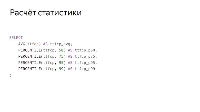
Here, data aggregation is conditionally designated as a SQL query. Here are the main aggregations, which we usually count by speed metrics: arithmetic average and group of percentiles (50th, 75th, 95th, 99th).
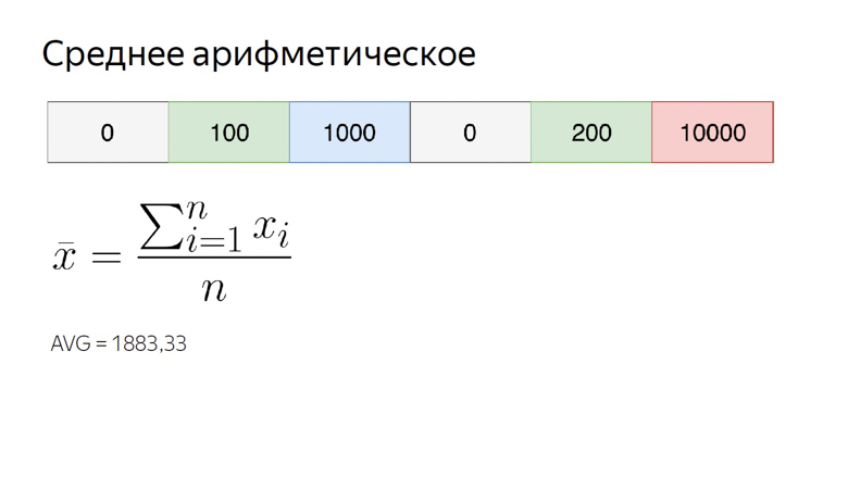
The arithmetic average of our number range is almost 1900. It is noticeably larger than most of the elements of the set, because this aggregation is very sensitive to outliers. This property is still useful to us.
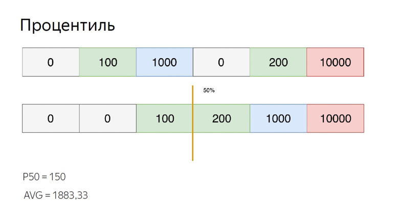
To calculate percentiles for the same set, sort it and put a pointer to a percentile index. Suppose the 50th, which is also called the median. We fall between the elements. In this case, you can get out of the situation in different ways, we will calculate the average between them. We get 150. When comparing with the arithmetic average, it is clearly seen that the percentiles are insensitive to emissions.
We consider and use these features of aggregations. The sensitivity of the arithmetic mean to emissions is a disadvantage if you try to evaluate user experience with it. After all, there can always be a user connecting to the network, for example, from a train, and spoil the sample.
But the same sensitivity is an advantage when it comes to monitoring. In order not to miss an important problem, we use the arithmetic mean. It is easily shifted, but the risk of false positives in this case is not such a big problem. It is better to look than to overlook.
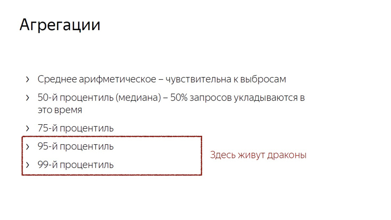
In addition, we consider the median (if we tie it to the time metrics, the median is an indicator of the time at which 50% of the requests fit) and the 75th percentile. 75% of requests fit into this time, we take it as an estimate of the overall speed. The 95th and 99th percentiles are considered to evaluate the long, slow tail. These are very large numbers. 95th is considered the slowest query. The 99th percentile has anomalous indicators.
It makes no sense to count the maximum. This is the road to madness. After calculating the maximum, it can happen that the user waited for the page to load, 20 years.
Considering the aggregation, it remains only to apply these numbers, and the most obvious thing you can do with them is to represent them in the form of graphs.
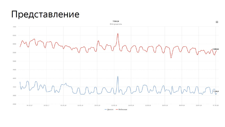
On the graph, our real metrics are time to first contentfull paint to search. The blue line reflects the dynamics for desktops, the red line for mobile devices.
The speed graphs have to be constantly monitored, and we assigned this task to the robot.
Because velocity metrics are volatile and constantly fluctuate with different periods, monitoring needs to be fine tuned. For this we use the concept of discord.
Disorder - the moment when a random process changes its characteristics, such as variance or expectation. In our case, this is the average sample. As mentioned, the average is sensitive to emissions and is well suited for monitoring.
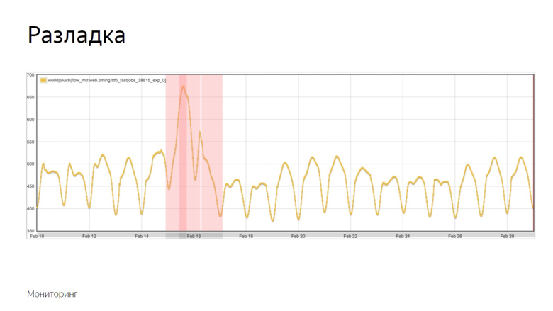
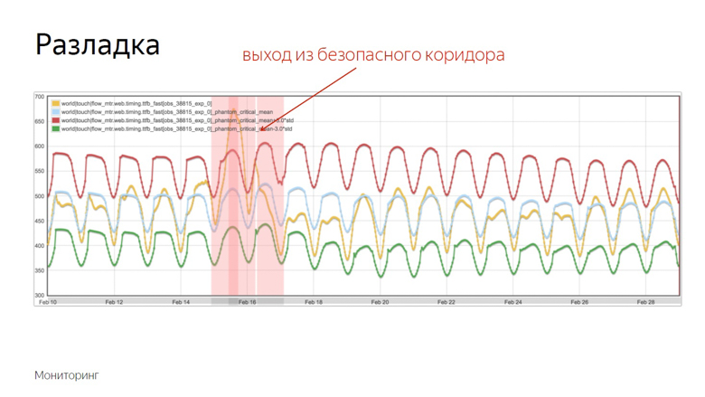
Here is an example of the graph where the discord occurred and the robot recorded the incident. How did he distinguish this moment from a number of other fluctuations? To understand this, we impose additional data.

The yellow graph is a metric indicator, and blue is a moving average with a fairly large period. Red - average plus three standard deviations. Green is the same, only with a minus sign.
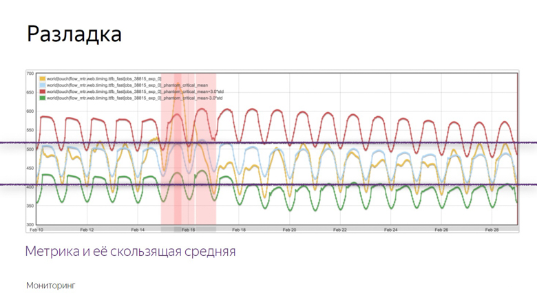
Red and green indicators form a safe corridor. As long as the metric and the moving average fluctuate between them - everything is normal, these are ordinary fluctuations. But once they leave the safe zone, monitoring is triggered.
All that was discussed was the work with the speed data of an already running project, but I want to measure the speed of individual features before sending them to a big production. To do this, we use A / B testing - comparing metrics for the control and experimental groups.
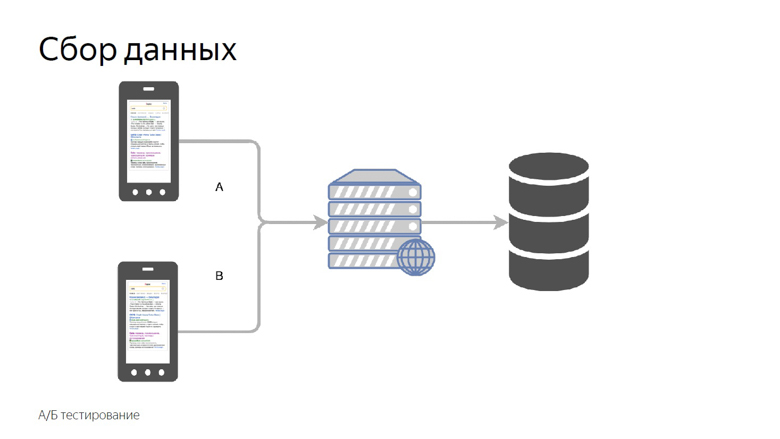
We divide users into control and experimental groups. The readings of each slot are collected separately, aggregated and tabulated.
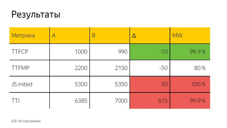
In A / B testing, as a rule, the arithmetic mean is also used. Here we see the delta and, to accurately determine whether it is a coincidence or a significant result, a statistical test is applied.

It is designated as “MW” because the Mann-Whitney test is used in the calculation. With its help, the so-called "percentage of correctness" is calculated. This indicator has a threshold after which we take the delta as correct. Here it is set at 99.9%.
When the test reaches this value, the delta is marked in the interface with a color. We call it prokraskoy. Here we see a green, that is, a good color for time to first contentfull paint. Time to first meaningful paint does not reach this value, that is, the delta is also good, but not 99.9%. Trust her completely impossible. Upon initialization of the framework and time to interactive, there is confidently a bad red coloring. From this you can make the same conclusion as in the case of fonts.

You can implement speed measurements in yourself in two ways. The first is to make all your own.

A handle for receiving data from clients, a backend that puts it all into a database, MongoDB, PostgreSQL, MySQL, any DBMS (they have aggregations out of the box), plus one of many open-source solutions - to draw graphs and arrange monitoring.
The second solution is to use the Yandex Metrika or Google Analytics analytics systems. On the example of "Yandex Metrics" it looks like this.
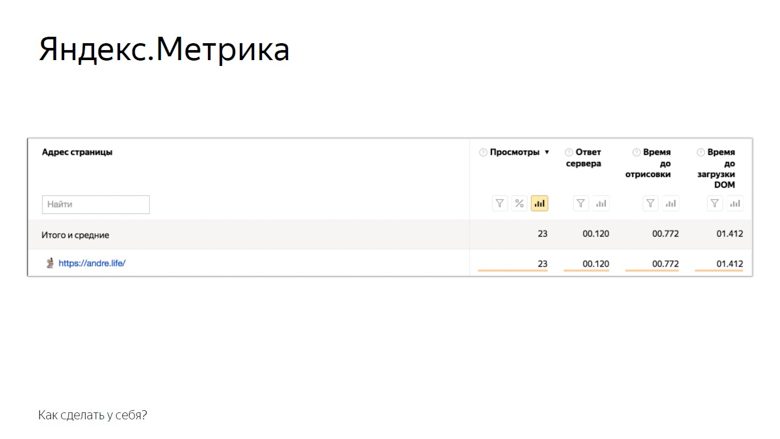
Here are the metrics that the metric provides to the user out of the box. Of course, this is not all mentioned, but something. The rest can be added manually through user parameters. Also available A / B testing and monitoring.
The concept of online speed measurement, which we described, is known as RUM - Real User Monitoring. We love her so much that we even drew a logo with a cool rock and roll umlaut.

This approach is good because it is based on numbers from the real world, those indicators that your service audience has. With the help of metrics, you supposedly receive feedback from each user. So start optimizing and do not stop.
Yandex interface developer, knows which metrics should be used and how to optimize everything . ( Andre_487 ). At the core of the material is Andrei’s speech at the HolyJS conference . Under the cut - and video, and text version of the report.

In a couple of this report on online measurements there is a report by Alexey Kalmakov (also from Yandex) on offline measurements, in his case there is no text version, but video is available .
Yandex search output consists of many different blocks, classes of responses to user requests. More than 50 people work for them in the company, and so that the issuance rate does not fall, we constantly look after the development.

No one will argue that users like the fast interface more than the slow one. But before you begin to optimize, it is important to understand how this will affect the business. Do I need to spend time developers to accelerate the interface, if it does not affect the business metrics?
To answer this question, I will tell two stories.
The history of the introduction of a specific web font on the issue
Having arranged an experiment with fonts, we found that the average content rendering time deteriorated by 3%, by 62 milliseconds. Not so much, if you take it for a delta in a vacuum. The noticeable delay to the naked eye begins only with 100 milliseconds - and yet the time until the first click immediately increased by one and a half percent.

Users began to interact with the page later. The number of clicked pages has decreased by almost half a percentage point. Reduced the time of presence on the service and increased the time of absence.

We did not roll out the feature with fonts. After all, these numbers seem small until you remember the scale of the service. In reality, one and a half percent - hundreds of thousands of people.
In addition, speed has a cumulative effect. For one update with a share of unclipped - 0.4% will follow more and more. In Yandex, similar features roll out dozens per day, and if you don’t fight for each share, it’s not long to go down to 10%.
LS Caching History
This story is connected with the fact that we inline a lot of static content on the page.

Due to the high variability, we cannot compile it into one bundle or deliver it with external resources. Practice has shown that with inline delivery, JavaScript rendering and initialization occur most quickly.
Once we decided that it would be a good idea to use the browser’s storage. Put everything in localStorage and on subsequent logins to the page, load from there, and not transfer over the network.
Then we focused mainly on the “HTML size” and “HTML delivery time” metrics and got good results. As time went on, we invented new ways to measure speed, gained experience and decided to double-check, to conduct a reverse experiment, turning off optimization.

The average HTML delivery time (the key metric for optimizing development) has increased by 12%, which is a lot. But at the same time, the time was improved before the header was rendered, before content parsing began and before JavaScript was initialized. Also reduced the time to first click. The percentage of it is small - 0.6, but if you remember the scale ...

Turning off the optimization, we got a deterioration in the metric, noticeable only to specialists, and at the same time - an improvement noticeable to the user.
From this we can draw the following conclusions:
Firstly, speed really affects business and business metrics.
Secondly, optimization should be preceded by measurements. If you introduce something, having badly measured, it is likely that you will not do anything useful. The composition of the audience, the park of devices, interaction scenarios and networks are different everywhere, and you need to check what exactly will work for you.

Once upon a time, Ash from the evil dead taught us to shoot first, then think or not think at all. In speed so do not.
And the third point: measurements must reflect the user experience. For example, HTML size and delivery time are poor speed metrics, because the user does not sit with devTools and does not select the service with less delay. But what kind of metrics are good and correct - let's tell further.
What and how to measure?
Dimensions should start with a few key metrics, which, unlike, for example, the size of HTML, are close to user experience.

If TTFCP (time to first contentfull paint) and TTFMP (time to first meaningful paint) denote the time to the first rendering of the content and the time to redrawing of the significant content, then the third one - the time to initialization of the framework should be explained.
This is the time when the framework has already passed through the page, collected all the necessary data and hung handlers. If the user clicks somewhere at that moment, he will receive a dynamic response.
And the last, fourth metric, the time before the first interactivity, is usually referred to as time to interactive (TTI).
These metrics, unlike html size or delivery time, are close to user experience.
Time to firstcontentfull paint
To measure the time when a user saw the first content on a page, there is a Paint Timing API, which is currently available only in chromium. Data from it can be obtained as follows.

With this challenge, we get a set of events about drawing. So far, two types of events are supported: first paint - any drawing and firstcontentfull paint - any rendering of content that is different from the white background of the empty tab and background content of the page.
So we get an array of events, filter the firstcontentfull paint and send it with some ID.
Time to first meaningful paint
There is no event in the Paint Timing API that signals that significant content has been drawn on the page. This is due to the fact that such content on each page is different. If we are talking about video service, then the main thing is the player, in search results - the first non-advertising result. There are a lot of services, and a universal API has not been developed yet. But here in the course are good, proven crutches.
In Yandex, there are two schools of crutches for measuring this metric: using RequestAnimationFrame and measuring with InterceptionObserver.
In RequestAnimationFrame, rendering is measured using an interval.

Suppose there is some meaningful content. Here is a div with a main-content class. There is a script in front of it where RequestAnimationFrame is called twice.
In the callback of the first call we write the lower limit of the interval. In the second callback, the top one. This is due to the frame structure that the browser renders.

The first is the execution of JavaScript, then the analysis of styles, then the calculation of Layout, rendering and composition.
Callback, calling RequestAnimationFrame, is activated at the same stage as JavaScript, and the content is drawn in the last segment of the frame during composition. Therefore, in the first call we get only the lower limit, which is noticeably distant in time from the output of pixels on the screen.

Place two frames side by side. It can be seen that at the end of the first one the content was rendered. We write down the lower bound of RequestAnimationFrame, called inside the first callback, and call the callback in the second frame. Thus, we obtain the interval from JavaScript, called in the frame where the content was rendered, and to JavaScript in the second frame.
InterceptionObserver
Our second crutch works differently with the same content. This time the script is placed below. In it, we create an InterceptionObserver and subscribe to domNode.

In this case, no additional parameters are passed, so we measure its intersection with the viewport. This time and record as the exact time of rendering.

This works because the intersection of the main content and viewport is considered the intersection that the user sees. This API was designed to know exactly when a user saw an advertisement, but our research showed that this also works on non-ad units.
Of these two methods, it is still better to use RequestAnimationFrame: its support is wider, and it is better tested by us in practice.
JS Inited
Imagine a framework that has a certain “init” event to which you can subscribe, but remember that in practice JS Inited is both a simple and complex metric.

Simple - because you just need to find the moment when the framework has finished work on the arrangement of events. Difficult - because this point has to be looked for independently for each framework.
Time to Interactive
TTI is often confused with the previous metric, but in fact it is an indicator of the moment when the main browser thread is released. During page loading, many tasks are performed: from drawing various elements to initializing the framework. Only when it is unloaded does the time come before the first interactivity.
The concept of long (long) tasks and the Long Task API helps to measure this.
First about the long tasks.

Between the short tasks indicated by arrows, the browser can easily squeeze in the processing of a user event, for example, input, because it has a high priority. But with the long tasks indicated by the red arrows, this will not work.
The user will have to wait until they run out, and only after the browser has put the processing of its input for execution. In this case, the framework can already be initialized, and the buttons will work, but slowly. Such a deferred response is a rather unpleasant user experience. The moment when the last Long Task is completed and the stream is empty for a long time, the illustration begins at 7 seconds and 300 milliseconds.
How to measure this interval inside javascript?

The first step is conditionally designated as the opening body tag, followed by the script. This is where PerformanceObserver is created, which is subscribed to the Long Task event. Inside the callback PerformanceObserver, event information is collected into an array.

After collecting the data, it is time for the second step. It is conventionally designated as a closing body tag. We take the last element of the array, the last long task, look at the end of its execution and check whether enough time has passed.
In the original work on this metric in the role of a constant taken 5 seconds, but the choice is not justified. It was enough for us 3 seconds. If it takes 3 seconds, we count the time before the first interactivity, if not, setTimeout and check for this constant again.
How to process the data?
Data must be obtained from customers, processed and presented in a convenient form. Our concept of sending data is quite simple. It is called a counter.

We transfer the data of a certain metric to a special handle on the back end and collect it in the storage.

Here, data aggregation is conditionally designated as a SQL query. Here are the main aggregations, which we usually count by speed metrics: arithmetic average and group of percentiles (50th, 75th, 95th, 99th).

The arithmetic average of our number range is almost 1900. It is noticeably larger than most of the elements of the set, because this aggregation is very sensitive to outliers. This property is still useful to us.

To calculate percentiles for the same set, sort it and put a pointer to a percentile index. Suppose the 50th, which is also called the median. We fall between the elements. In this case, you can get out of the situation in different ways, we will calculate the average between them. We get 150. When comparing with the arithmetic average, it is clearly seen that the percentiles are insensitive to emissions.
We consider and use these features of aggregations. The sensitivity of the arithmetic mean to emissions is a disadvantage if you try to evaluate user experience with it. After all, there can always be a user connecting to the network, for example, from a train, and spoil the sample.
But the same sensitivity is an advantage when it comes to monitoring. In order not to miss an important problem, we use the arithmetic mean. It is easily shifted, but the risk of false positives in this case is not such a big problem. It is better to look than to overlook.

In addition, we consider the median (if we tie it to the time metrics, the median is an indicator of the time at which 50% of the requests fit) and the 75th percentile. 75% of requests fit into this time, we take it as an estimate of the overall speed. The 95th and 99th percentiles are considered to evaluate the long, slow tail. These are very large numbers. 95th is considered the slowest query. The 99th percentile has anomalous indicators.
It makes no sense to count the maximum. This is the road to madness. After calculating the maximum, it can happen that the user waited for the page to load, 20 years.
Considering the aggregation, it remains only to apply these numbers, and the most obvious thing you can do with them is to represent them in the form of graphs.

On the graph, our real metrics are time to first contentfull paint to search. The blue line reflects the dynamics for desktops, the red line for mobile devices.
The speed graphs have to be constantly monitored, and we assigned this task to the robot.
Monitoring
Because velocity metrics are volatile and constantly fluctuate with different periods, monitoring needs to be fine tuned. For this we use the concept of discord.
Disorder - the moment when a random process changes its characteristics, such as variance or expectation. In our case, this is the average sample. As mentioned, the average is sensitive to emissions and is well suited for monitoring.

Here is an example of the graph where the discord occurred and the robot recorded the incident. How did he distinguish this moment from a number of other fluctuations? To understand this, we impose additional data.

The yellow graph is a metric indicator, and blue is a moving average with a fairly large period. Red - average plus three standard deviations. Green is the same, only with a minus sign.

Red and green indicators form a safe corridor. As long as the metric and the moving average fluctuate between them - everything is normal, these are ordinary fluctuations. But once they leave the safe zone, monitoring is triggered.

Check for speed features
All that was discussed was the work with the speed data of an already running project, but I want to measure the speed of individual features before sending them to a big production. To do this, we use A / B testing - comparing metrics for the control and experimental groups.

We divide users into control and experimental groups. The readings of each slot are collected separately, aggregated and tabulated.

In A / B testing, as a rule, the arithmetic mean is also used. Here we see the delta and, to accurately determine whether it is a coincidence or a significant result, a statistical test is applied.

It is designated as “MW” because the Mann-Whitney test is used in the calculation. With its help, the so-called "percentage of correctness" is calculated. This indicator has a threshold after which we take the delta as correct. Here it is set at 99.9%.
When the test reaches this value, the delta is marked in the interface with a color. We call it prokraskoy. Here we see a green, that is, a good color for time to first contentfull paint. Time to first meaningful paint does not reach this value, that is, the delta is also good, but not 99.9%. Trust her completely impossible. Upon initialization of the framework and time to interactive, there is confidently a bad red coloring. From this you can make the same conclusion as in the case of fonts.

How to make at home?
You can implement speed measurements in yourself in two ways. The first is to make all your own.

A handle for receiving data from clients, a backend that puts it all into a database, MongoDB, PostgreSQL, MySQL, any DBMS (they have aggregations out of the box), plus one of many open-source solutions - to draw graphs and arrange monitoring.
The second solution is to use the Yandex Metrika or Google Analytics analytics systems. On the example of "Yandex Metrics" it looks like this.

Here are the metrics that the metric provides to the user out of the box. Of course, this is not all mentioned, but something. The rest can be added manually through user parameters. Also available A / B testing and monitoring.
Conclusion
The concept of online speed measurement, which we described, is known as RUM - Real User Monitoring. We love her so much that we even drew a logo with a cool rock and roll umlaut.

This approach is good because it is based on numbers from the real world, those indicators that your service audience has. With the help of metrics, you supposedly receive feedback from each user. So start optimizing and do not stop.
Announcement finally. If you liked this report with HolyJS 2018 Piter , you will probably be interested in the upcoming HolyJS 2018 Moscow , which will be held November 24-25 . There you can not only see many other JS reports, but also ask after any speaker in the discussion area. And tomorrow, from November 1, ticket prices will rise to the final, so today is the last opportunity to buy them at a discount!
