MailChimp UX Team: Enhancements and Iterations [end of book]
- Transfer
[ TL; DR ]
[ 1st part of the book ]
[ 2nd part of the book ]
[ 3rd part of the book ]
[ 4th part of the book ]
[ 5th part of the book ]
[ 6th part of the book ]
[ 7- I am part of the book ]
Iterations and balance between quantity and quality of functions
Jason Beard
Recently, one company sent a check with the payment of the promised compensation to my old address - and this is not the first time. “These are their problems, and they must do this!” My wife shouted, dissatisfied with what was happening. Although I was also upset, but I could not help sympathizing with the team that was supposed to resolve this issue.
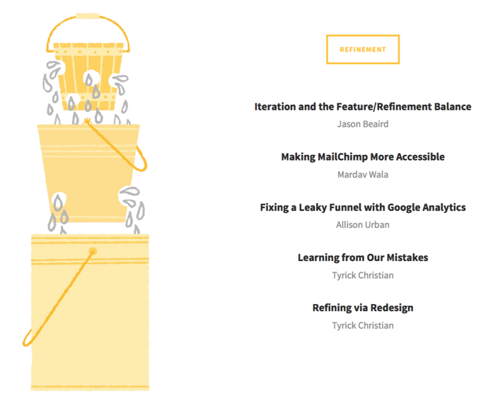
When users stumble upon a bug or when some application features confuse them and take their time, their confidence in your product decreases. In addition, as a result, the load on the support desk increases. You can imagine holes in a bucket: large ones reduce confidence quickly, and many small ones slowly and gradually. One way or another, when trust is undermined, it can no longer be returned.
Even though we constantly put all our efforts into our application, MailChimp is not immune from bugs. And I am ready to admit that in our “bucket” there were both large and small “holes”.
Look for "holes", protect your "bucket"
When you work on one thing every day, you can simply overlook weaknesses. And sometimes seemingly harmless omission can lead to undesirable consequences. That is why our UX team relies on interviews, surveys, analytics and other research methods in order to find defects in the application. In addition, we try to pay attention to each of the feedback channels that our users can use to express their opinions or dissatisfaction.
We look at social networks such as Twitter and Facebook, comments on blog posts, and our support team tags all messages and mail to help us detect common problems. And as Aaron Walter, our UX director wrote, we learned about the reasons for the sharpest decline in trust when we polled users who left us.
Set priorities and fix bugs
Getting feedback is easy, but viewing and choosing what to respond to is not so easy. If we took into account every comment, tweet, letter, message on the network or by fax (in fact, of course, we do not accept feedback by fax), we would have so many tasks that the team physically could not cope with all. Many companies simply hire more people to fix every bug, but this approach has its limits, and in this case there may be problems with usability. Not all of the proposals we received should be implemented, as they may be contradictory or will help only a few users. Instead, our research team carefully monitors feedback and reports only the most common and interesting requests.
If you look at our log files 5 weeks after the release, you will see a lot of comments with the words “fixed”, “debugged”, “improved”, “configured” and “changed”. It is in these areas that the most requests are received. Some bugs, text errors or problems with the output of data that affect the progress of work are also eliminated between the stages of release.
Turn your weaknesses into strengths
MailChimp attracts a lot of attention when we have new, unusual features, so it’s easier to focus on them than to gradually improve something. However, often a new feature is just a rethinking of some part of the application that has not been updated for a long time. It is on such tasks that our team likes to work most of all, from UX researchers to our amazing development team. The introduction of new functions gives us great pleasure, even if they are just a rethinking of the old.
Take time to improve
Sometimes you need to slow down, set aside new ideas, and do some adjustments and improvements. Reducing the queues of tickets is not a priority task, and no one will write about it in our blog, but radical changes and smooth improvements are equally important for us. At least once a year, we launch a version of the product that has only been finalized and improved over the previous one. For us, the most successful period for this release is the time of vacations. At the same time, we are making a plan of what opportunities will appear for the next release.
Think locally ... and globally
When we search for bugs and improve, we just might not notice something or see the whole picture: how our changes affect the experience of using MailChimp in general. Work on new large-scale projects allows us to see the whole picture, but sometimes we miss small details, cannot predict how people will deal with them, or discover for ourselves what we did not notice before. The most important thing is that we continue to pay attention to all this, so our "bucket" is getting bigger and better - there are fewer and fewer "holes" in it.
How we made MailChimp more affordable
Mardav Vala
We are fortunate that our customers give us valuable feedback, not only about what works well in MailChimp, but also about what works poorly. I will give an example. Not so long ago, a client named Justin Romak , who cannot see, informed us that he was having problems with accessibility on the control panels and in the lists of subscribers.
“Email marketing is extremely important both for my business and for the clients with whom I interact every day,” Justin told us. - Since I am blind and depend on the technology of scoring text on the screen, it is not always easy for me to find the option that I need and which is fully available. However, the MailChimp team did pretty well at that. ”
Luckily, Justin had asked a similar question before and offered his help in improving MailChimp. He was not too lazy and sent us several videos showing problem areas in the application. After viewing these records and reading several articles [ 1 , 2 , 3 ], we realized that we can significantly improve the application’s special features if we focus on 2 goals: creating and providing context for elements using the functions and properties of the WAI-ARIA standard or attribute title in HTML, and to ensure that all markup is semantically correct. (At that time, these tricks were not applied when creating mailing lists in MailChimp, where we used layout with div blocks).
Control Panel Improvement
Even before receiving messages from Justin, we began to improve the accessibility features of the MailChimp control panel. These minor but effective tweaks added context to the panel elements used by narrators to read text.
All items on the MailChimp panel are displayed using “rack” patterns consisting of semantically correct list items, including a checkbox, a heading with a link to additional information, and a drop-down list with a list of tasks. In addition, some control panels contain a subscriber counter, as well as a clickthrough rate counter.
At that time, additional information in the panel about the type of campaign and the name of the list did not clarify the purpose of these elements. The campaign type “Normal” and the list name “Test 1” were not entirely clear. To solve the problem, we used the aria-label attribute to add a description of the campaign and information about the list. Thanks to this, Narrator was able to voice the text following the words “campaign type” or “list name”. We also added the aria-label attribute to the icons on the dashboard so that the current status of the campaign is announced.
Despite the fact that the subscribers' counts and click-through rates were recorded semantically correctly, the Narrator annotated the numbers and the corresponding signatures separately, so it was difficult to perceive the information. To avoid this, we hid subscriber information and clickability from the Narrator, and then added the information back as aria-label attributes to the parent container. Now the announcer pronounces the numbers and their captions together.
Subscriber List Improvement
While working on improving accessibility features, we noticed that we also need to redo the list of subscribers. Now it is presented in the form of a semantically competent data table. As shown in this example , our list of subscribers can be scrolled horizontally, and only one column to the left remains fixed. Initially, we used the th, thead, and tbody tags in conjunction with this docked column, but because of this, VoiceOver voiced 2 names for each column. VoiceOver users had to work with the table, completely shifted to the left. To solve the problem, we now use only the elements with the td tag in the table and assign the columnheader role to the column headers. Yahoo! video helped us with these changes.on introducing accessibility tables.
Moreover, we applied the title attribute to the checkboxes on the subscriber’s profile page, which allowed Narrator to pronounce the subscriber’s mail address if there was a checkbox on the checkbox. We also set up a customer activity rating list for accessibility opportunities using ARIA roles and signatures (take a look at the CodePen list of subscribers).
Total
Ensuring semantic consistency and adding descriptions to elements are fairly simple tricks that can make your application work together with the narrator as a pleasure for the user. In the case of JavaScript, it is recommended to use one of the available frameworks. We use Dojo and all UI widgets with built-in accessibility features from its UI library.
After all the corrections, we asked Justin's opinion and received his positive answer: “Nothing bothers and does not look strange. Everything is read as expected. I like!"
Fixing customer churn with Google Analytics
Allison Urban
As a web analyst, I work a lot with data visualization. One of my favorite tools is Next Page Paths in Google Analytics. This small report shows where users go after viewing a specific page. If we talk about UX, then this is one of the fastest ways to determine when users stop moving through the conversion funnel.
I’ll give an example with an account activation funnel. After the user has registered, he needs to pass a check on the correct captcha before entering his account. The sequence of actions that we expected to see in Google Analytics looked something like this: registration> successful registration> receiving confirmation> login.mailchimp.com.
However, we found that 32% of users after successful registration try to go directly to login.mailchimp.com, bypassing receipt of confirmation. If you could log into your account without a captcha check, there would be no problems, but this check is required. It turns out that earlier it was possible to go to your account before the completion of the captcha-check, but our developers forbade this transition for security purposes.
So why did someone keep trying to log into their account on their own instead of following the instructions to confirm receipt? Just because users were attracted to the bright "Login" button. After we removed it from the successful registration page, the percentage of users who go directly to the confirmation page increased from 63% to 79%. Our support team began to receive 25% less requests for account activation, and as a result, we began to receive fewer such issues than ever.
Not bad for a few minutes spent researching.
Learning from our mistakes
Tyrik Christian
In golf it is very difficult to get into the hole the first time. Even for years practicing to improve their swing, golfers are still confronted with obstacles independent of them: wind, terrain, uneven surface. Golfers take this into account. That is why they do not get stuck every time on a hit after the first hit: they do everything possible to bring the ball as close to the hole as possible.
Designers are faced with similar difficulties looking at a blank page. Working on sketches, business processes, vocabulary, and style is simply impossible at the same time. Instead, we break down every task and gradually move forward, satisfying the needs of our users. We do not try to succeed in everything at once. We use an iterative approach.
In 2013, the MailChimp UX team began a massive redesign of their web application. Mobile web application traffic was growing rapidly, and a study of user audiences showed that people wanted to access MailChimp from multiple devices and at different times, wherever they were. Interviews with customers and an in-depth study of the impact of mobile devices on modern culture have helped us draw up a MailChimp development plan. In order to tell our team a story about the user experience that we would like to recreate, we wrote a script, hired actors and recorded a short video about the use cases and workflows of our future application. The video showed not a new interface, but only methods of working with it.
From that moment, our goals became clear, and we could start design. We developed ideas for screens of any size — from phone to computer — and therefore decided to create a library of patterns already described by my colleagues in this book. In the course of our work, we were rather engaged not in the development of one brilliant idea, but in the gradual implementation of several different ideas, until we came to a better solution.
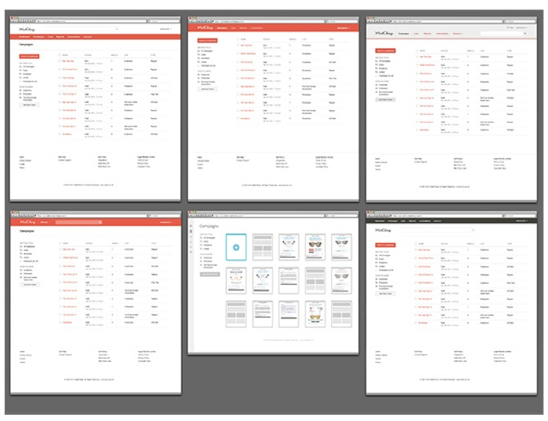
When working with the MailChimp application, users receive a brief overview of the main data of their account from several control panels. In the redesign process, we experimented with tables and pictures to find a way to better represent this data. After several weeks of experimentation, we decided that we had interesting ideas, but we were not sure that they would be followed by suitable solutions. The tables were clear but boring. Pictures looked good - they “enlivened” the lists and reports and made it easy to work with campaigns - but they took up a lot of space, and because of them, the information was not too compact. They were beautiful, but impractical.
We took a step back and looked at how the information was presented on the control panels. Everything was quite good: each line was read easily. Actions were predictable and content could be easily viewed. We knew that this pattern can only be improved with a number of improvements, without completely redoing the design.
Then we made sketches of each “staff” in the Reports, Campaigns, Lists and Answering Machine panels. We started by formatting the text of the headers and metadata and gradually added elements such as buttons, checkboxes and status indicators. After several iterations with the sketches, we could move on to working with Photoshop. It was not difficult to create the initial version of the blocks, as for each element we had certain patterns set. The Campaign page turned out to be the most problematic: we wanted to make the state indicator visually attractive, but we had to take into account factors such as the structure of the content and the choice of color scheme. As a result, after a series of iterations, we decided that we would use icons to display the status of each campaign using the appropriate colors.
After they were created and minor corrections, we almost did not fix anything since the redesign. In fact, the elements were so well matched that we implemented them on other pages throughout the application, including the Templates and File Manager panels. Since the content on these pages does not differ much, it made sense to use a single style for the entire application. Of course, not everything was perfect. After the first release, we received feedback from our users. We listened to them and responded to their comments.
For example, before a redesign, the report panel displayed the total number of views and clicks; after the redesign, the report panel displayed click-through rates for each campaign. Having learned the opinions of users, we compromised and began to display the total number of views and clicks at the user's request. The creation and improvement of "rails" is just one of the options for applying an iterative approach in our redesign. The same process was used when working on other elements of the pattern library, as well as in all business processes and on every page of the MailChimp application.
Today, before making changes to the application, we carefully analyze the feedback from our customers, which directed us on this path. Sometimes we hear words of gratitude, sometimes complaints. One way or another, we learn something new after the changes and respond to feedback. As a result, such a dialogue between the user and the team increases efficiency and, I hope, brings pleasure to users.
Improvement through redesign
Tyric Christian
In November 2012, I was asked to look at MailChimp as an adaptive application. Due to the fact that there are few such large-scale adaptive applications as MailChimp, I did not have many sources of inspiration. I packed my things from my desk and moved from the UX team’s office to another room, along with DesignLab, a marketing team, and several marker boards. Already here, our creative director, Ron Lewis, commissioned me to engage in research and design without any restrictions.
This was my first adaptive project. MailChimp is a large-scale application, and I was the only UI designer in the team. How was I going to deal with all this?
For starters, I needed to do one study. I re-read Ethan Marcott's Responsive Web Design, looked at Brad Frost's collection of adaptive design patterns, and studied examples of responsive layouts in responsive layout and responsive sites themselves. In addition, I attached inspirational design solutions to our office wall: examples of colorful illustrations, fonts, and patterns.
At the end of this study, I realized that it would be easier to start the process with redesigning the MailChimp pattern library - a system of elements, rules, and relationships used in developing and designing an application.
Varieties of the basic elements of the pattern library
Typography templates
As soon as we agreed on a small set of patterns, I began to design the application navigation - this would help to create a framework for its [application] of further development. Our goal was to create a fairly flexible navigation that would work on any device, to some extent support co-branding capabilities and, first of all, solve search issues so that users can access the information they need at any time.
After several attempts to implement horizontal navigation, I realized that it is not suitable for all devices. In the end, I chose vertical navigation, which was suitable for any screen size, since a regular column with navigation on a large display could be minimized to a menu button on a small screen. When I understood this, I tried a few more options, we agreed on the chosen direction with the team, and this navigation option was handed over to the developers so that we could get a working prototype.
Examples of horizontal navigation early in the redesign process
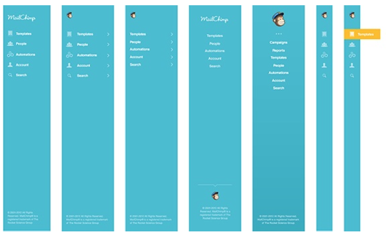
Vertical navigation design options
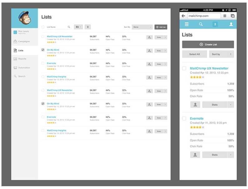
Then I began to learn different ways to display content in MailChimp. After working with the library of patterns, I thought about how to rebuild the grid and various modules for different screen sizes. The first thing that occurred to me was to create two design options for pages with control panels: in the form of blocks and a list. The first option would be suitable for new users, attracting their attention, and the second could be used by experienced users to access a simple and informative table.

Example of displaying information in the form of a list and in the form of blocks on a campaign control panel

Tile templates for a block format for displaying information on campaign control panels, list panels, and report panels
For several weeks I experimented on tiles while the rest of the team created prototypes of the pattern library. We wanted to make the lists more “live”, but for this it was necessary to add avatars of subscribers, for the implementation of which we were not yet ready. We thought about displaying information for each of the client’s campaigns, but this would only make sense if each letter was radically different from the rest, which is not always the case. When displaying information in a list format, adaptive tables were not too colorful and hardly suitable for small screens.
After several weeks of experimentation and discussion, we decided to change course. Federico and I discussed the previous design, and came to a consensus. We liked the idea of a practical table, and we decided to make the content sortable, quickly view and flip both vertically and horizontally. As soon as we understood this, it became clear that we needed lists, stylized in the form of tables, or "reiki" (Fed talked about them earlier). Soon we realized these ideas in the form of sketches, designs and prototypes.
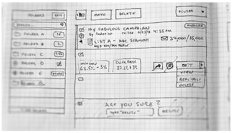
Sketches Federico
Created sketches and design were transferred to colleagues to create a prototype
After the prototypes of the lists, reports, campaigns and answering machine were created, I proceeded to design several pages of the site. Compared to the design of the pattern library, this task was much easier than I thought: the hardest work was done, and I just had to develop small elements for several pages. We went through countless iterations before getting the finished design of the new MailChimp. We immediately discarded ideas that seemed original, but did not meet the needs of users. It’s not easy at times to leave ideas that you have put so much effort into and move on, but this is just part of the creative process. Large-scale collaborative projects like this one are taught to be humble.
The redesign of MailChimp gave us invaluable experience, which made us review our creative processes and think about how they can be improved. We learned how to work more effectively with other teams and how to see a holistic picture of the user experience. The new MailChimp is now launched, but there is something to work on. What I love about application development is that they can always be made even better.
Sources
From the Mailchimp team:
- UX Newsletter
- Twitter MailChimp UX Team
- MailChimp Pattern Library
- DesignLab Blog
- Voice & Tone Website
- "Web design. Developer's Guide »Jason Beard
- Well Done Nicole Fenton and Kate Kiefer Lee
- Smart Data John Foreman
- Emotional Web Design by Aaron Walter
- UX Design by Aaron Walter
Books:
- Remote Study Nate Bolt and Tony Tulatimute
- "The Basics of Style in Typography" Robert Bringhurst
- “Stop exploring” Eric Hall
- Universal Design Methods by Bruce Huntington and Bella Martin
- “Don't Make Me Think” Steve Krug
- Universal Design Principles by William Lidwell, Critina Holden, and Jill Butler
- “Interviewing Users” Steve Portigall
- “Storytelling in Interface Design” by Whitney Kesenbury and Kevin Brooks
- UX Design by Russ Unger and Caroline Chandler
- Web Form Design Luke Wroblewski
[Materials on project management and startup development in our blog on Megamozg.ru ]